%201.webp)
02
AI Snaps
.svg)
.svg)
01
Our Work

03
About Us
05
Contact Us
06
Client Success

07
Blogs
08
Careers
Book A Call


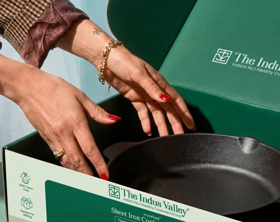
Indus Valley is a Tamil Nadu-based cookware brand built around the idea that the materials you cook with matter as much as what you cook. Their range spans stainless steel pressure cookers, cast iron kadai, and multi-piece cookware sets, all positioned at the intersection of health, durability, and everyday practicality for daily use at home. The brand targets Indian households that have started paying closer attention to what their cookware is made of, but aren't ready to pay a luxury premium for it.
Confetti Design Studio partnered with Indus Valley to redesign their packaging system from the ground up. The goal wasn't a cosmetic refresh, but was to build something that could carry the brand's credibility clearly onto a retail shelf, survive expansion across SKUs and geographies, and make a health-focused cookware brand look and feel exactly like what it is.
The Indian cookware aisle is unforgiving because dozens of brands compete for the same shelf position, and most of them look nearly identical with busy layouts, stock imagery, and a wall of feature icons that all say the same thing. In that context, a brand with genuinely better materials and a real health story was disappearing into the background.
Indus Valley's existing packaging had a structural problem. It was trying to say everything at once and none of it was making sense without overwhelming their target consumers. The product itself, which was the actual reason someone should reach for it, was competing for attention with too many icons, inconsistent layouts, and information that nobody was reading it in the right order either.
The specific problems Confetti identified:

Packaging that read as mass-market despite the product being anything but
No clear information hierarchy across the front, side, and back panels
A cluttered visual system that made quick shelf scanning nearly impossible
Inconsistency across SKUs, with no design logic tying the range together
Poor shelf visibility in a crowded retail category
A health and safety story buried under generic design choices
A system that couldn't scale to new variants or a Pan-India rollout
The core issue was a misalignment between what the product actually was and what the packaging was communicating. A brand serious about healthy cooking deserves packaging that makes that seriousness visible.
Confetti approached this as a packaging-led brand repositioning. The redesign wasn't about making things look nicer, but was about making the product do the talking, and then building a system around it that was consistent, scalable, and clear enough to work the moment someone picks it up off a shelf.
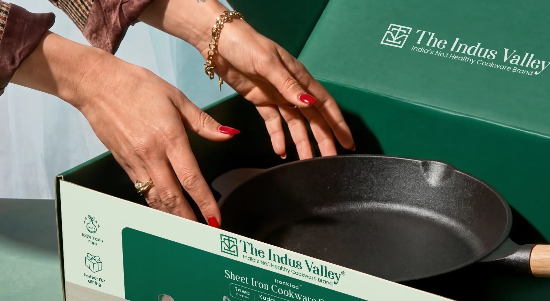
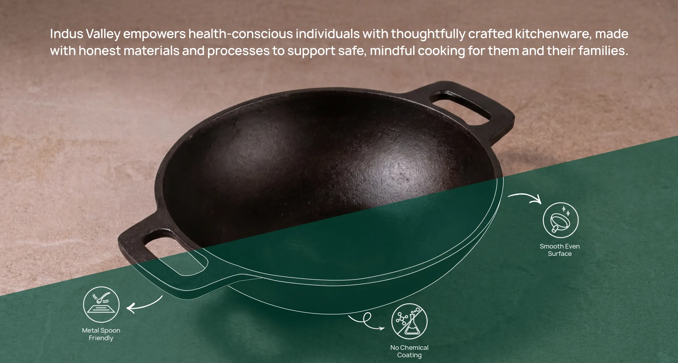
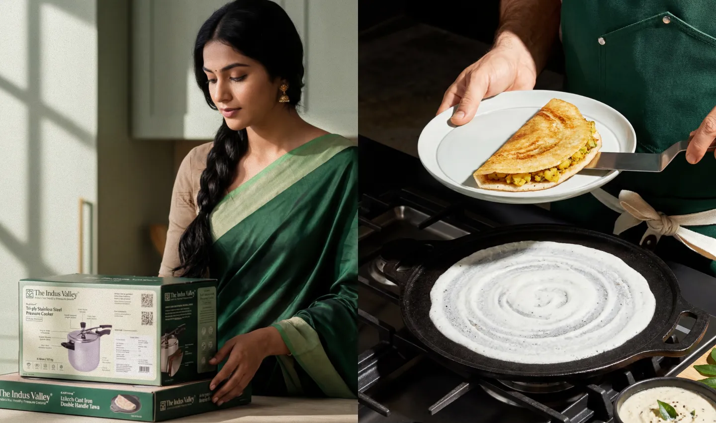
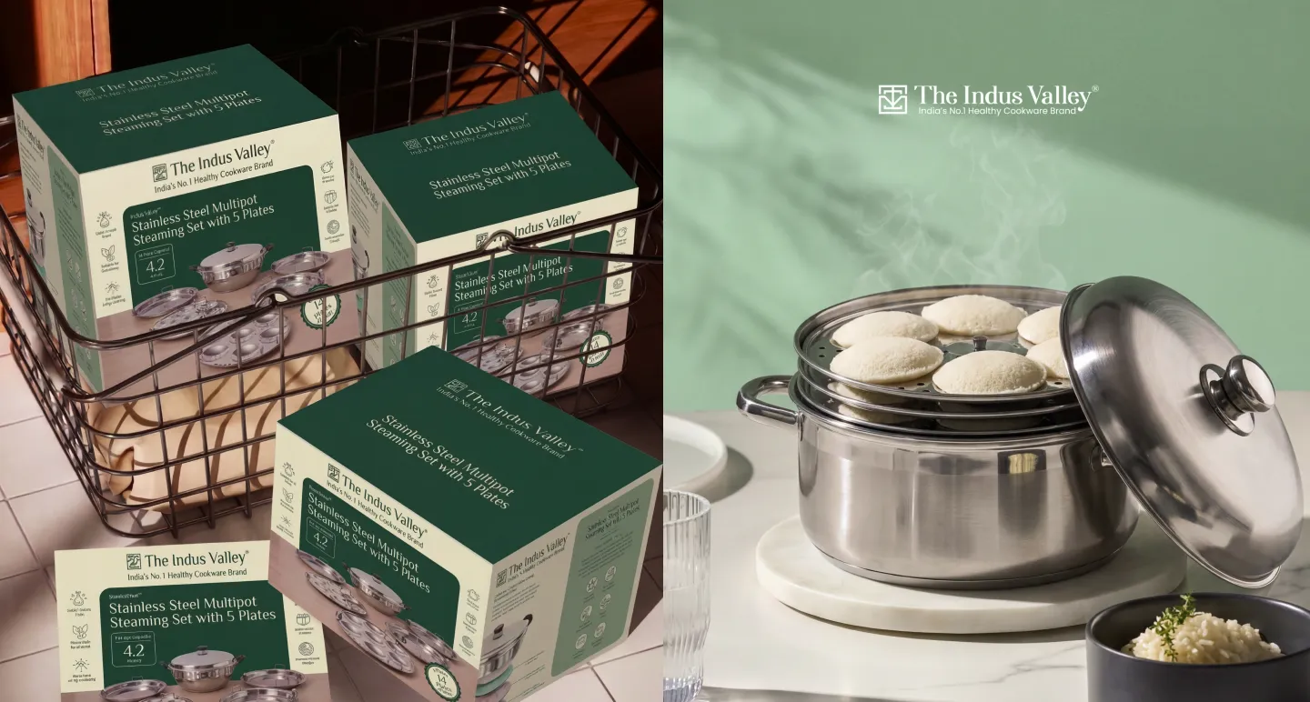
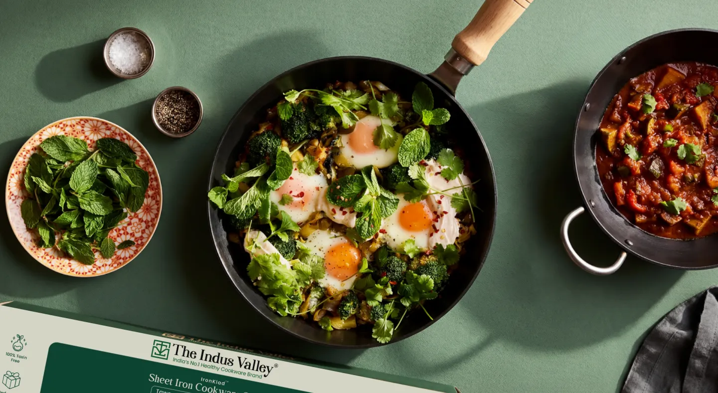
The most important decision in the redesign was the simplest one: put the product front and centre, and get everything else out of the way. The cookware itself is well-made, visually strong, and immediately communicates quality when you actually see it. The old packaging was burying it, while the new system gives the product the prominence it earns, with high-quality imagery that lets the material quality, the build, and the sheen of the steel do the convincing.
Confetti restructured the information across every panel with a clear logic: product first, brand second, features third, technical detail fourth. The front panel focuses on attraction. The side panels carry feature communication. The back handles everything that needs more explanation. A consumer walking down an aisle gets what they need at a glance. One who picks it up and turns it over gets the detail they want. The sequence matters, and nothing was left to chance.
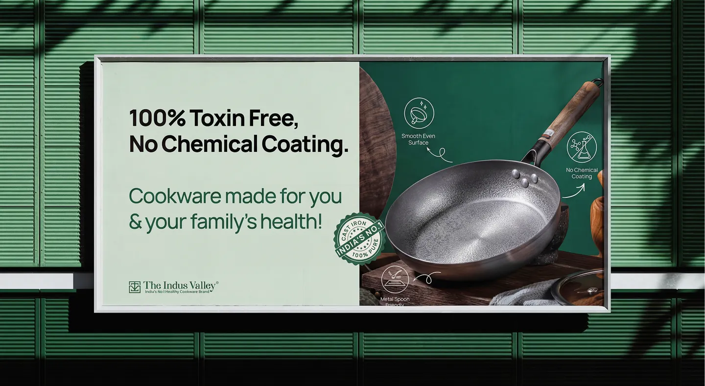
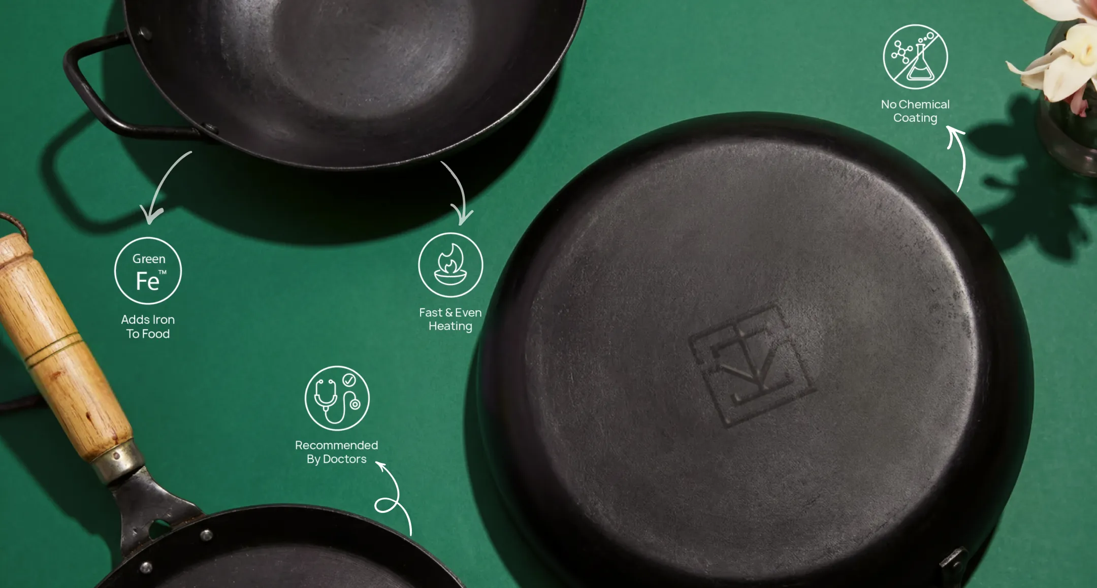
The colour system anchors on deep green, a considered choice that connects directly to the brand's health positioning without having to spell it out. It reads as trustworthy and premium without drifting into the cold, sterile feel that some health brands fall into. Balanced against cleaner neutrals, the palette gives the packaging a settled, confident quality. Typography was chosen for retail legibility at distance. Icons were stripped back, redrawn with cleaner geometry, and reduced to only what earns its place on the pack.
Every surface of the packaging was designed with intent. There are no throwaway panels, no back-of-box dead zones. The structure works from every angle because retail doesn't give you control over how a product is positioned. A box on a shelf might be seen from the front, the side, or at an angle, and the system was built to perform across all of them. Instruction booklets and product pamphlets were redesigned in the same visual language, so the brand experience continues past the point of purchase.
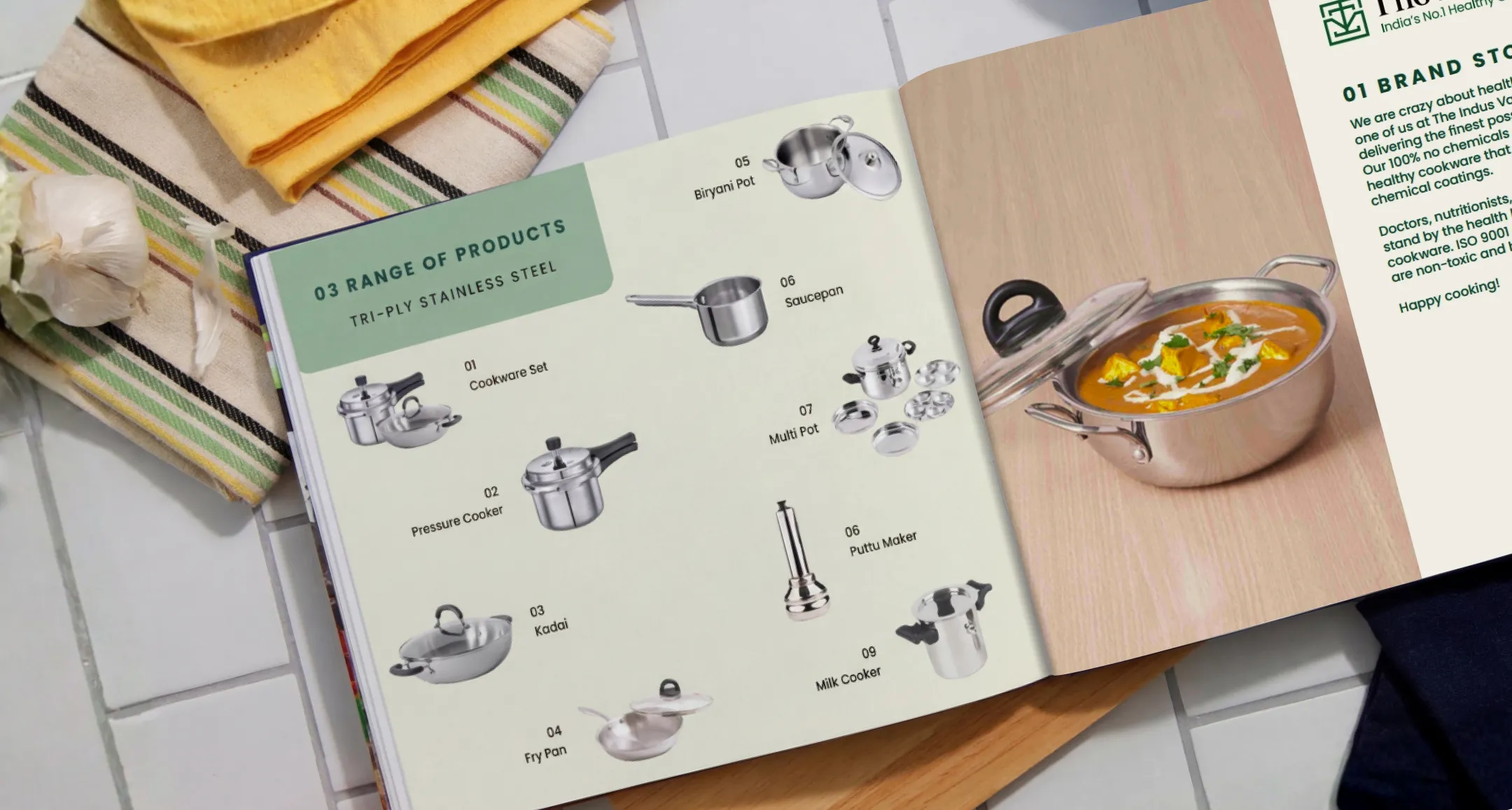
Indus Valley isn't a single-SKU brand. Their range spans pressure cookers, kadai, multi-piece sets, and combo packs, with more on the way. The packaging system Confetti built was designed from the start to adapt across product types without losing its cohesion. New SKUs can be introduced without redesigning from scratch. The structure, colour logic, and icon system are flexible enough to absorb growth while keeping the shelf presence unified.
Before the redesign, Indus Valley had a product worth buying and packaging that wasn't helping anyone arrive at that conclusion. The shelf presence was weak, the brand story was buried, and the design system had no room to grow. The packaging now reads immediately as premium, not mass-market. The product sits front and centre, the health story lands without explanation, and the visual language is consistent enough to hold together as the range expands. On a crowded retail shelf, it stands apart from competitors without resorting to the usual tricks of bright colours and feature overload.
More practically, it's a system that actually works at scale. New variants slot into the structure. Marketing assets pull from a coherent visual language. The brand looks the same whether a consumer encounters it in a Chennai supermarket or an e-commerce listing. That kind of consistency is what allows a regional brand to expand with confidence rather than patching its way through growth.
If you're building a product brand in a competitive retail category and the packaging isn't pulling its weight, Confetti can show you exactly what it takes to fix that.


.svg)
.webp)


.svg)
.svg)
.webp)
.webp)

.webp)
.svg)