%201.webp)
02
AI Snaps
.svg)
.svg)
01
Our Work

03
About Us
05
Contact Us
06
Client Success

07
Blogs
08
Careers
Book A Call


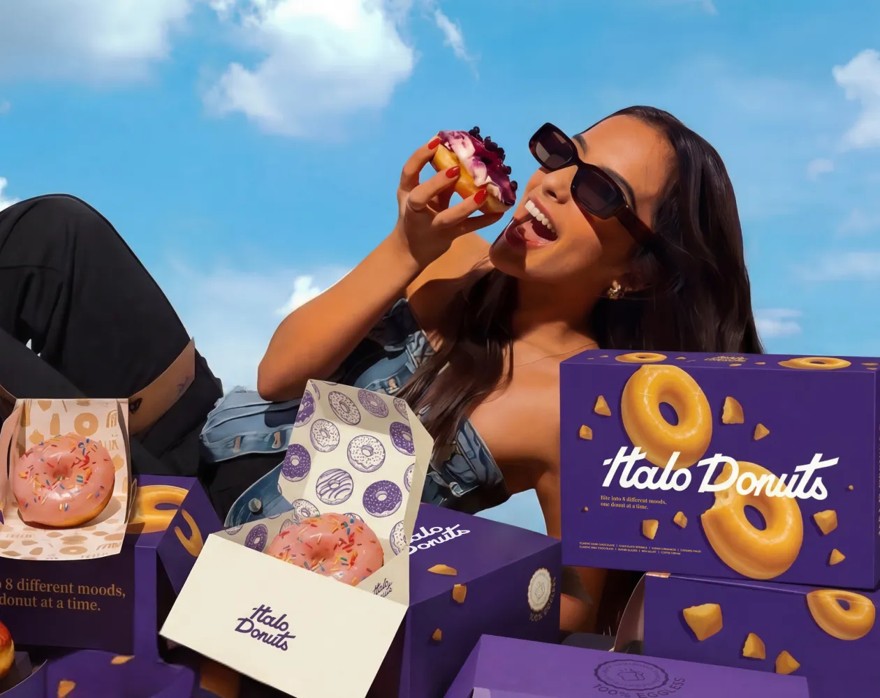
Halo Donuts was created to turn everyday indulgence into something more considered. Inspired by the form of a donut and the symbolism of a halo, the brand sits between comfort and craft, familiar flavours presented with intention and charm. Confetti partnered with Halo Donuts to build a brand world that feels light, warm and slightly surreal. The objective was not to create another loud donut brand like Krispy Kreme, Mad Over Donuts, Theobroma, Donut Magic and Cookie Man, but to design an experience that feels calm, joyful and emotionally inviting across packaging, visuals and in-store touchpoints.
The donut category is visually noisy with leading brands like Mad over Donuts & Krisy Kreme that are worldwide famous for their variety of doughnuts. Many brands rely on excess colour, novelty flavours or loud personalities to stand out. Halo Donuts needed a different approach. The challenge was to build a brand that felt premium without becoming distant, playful without becoming childish, and memorable without relying on visual chaos. Beyond the product, the brand needed a clear emotional identity that could translate consistently across packaging, illustrations and everyday interactions.
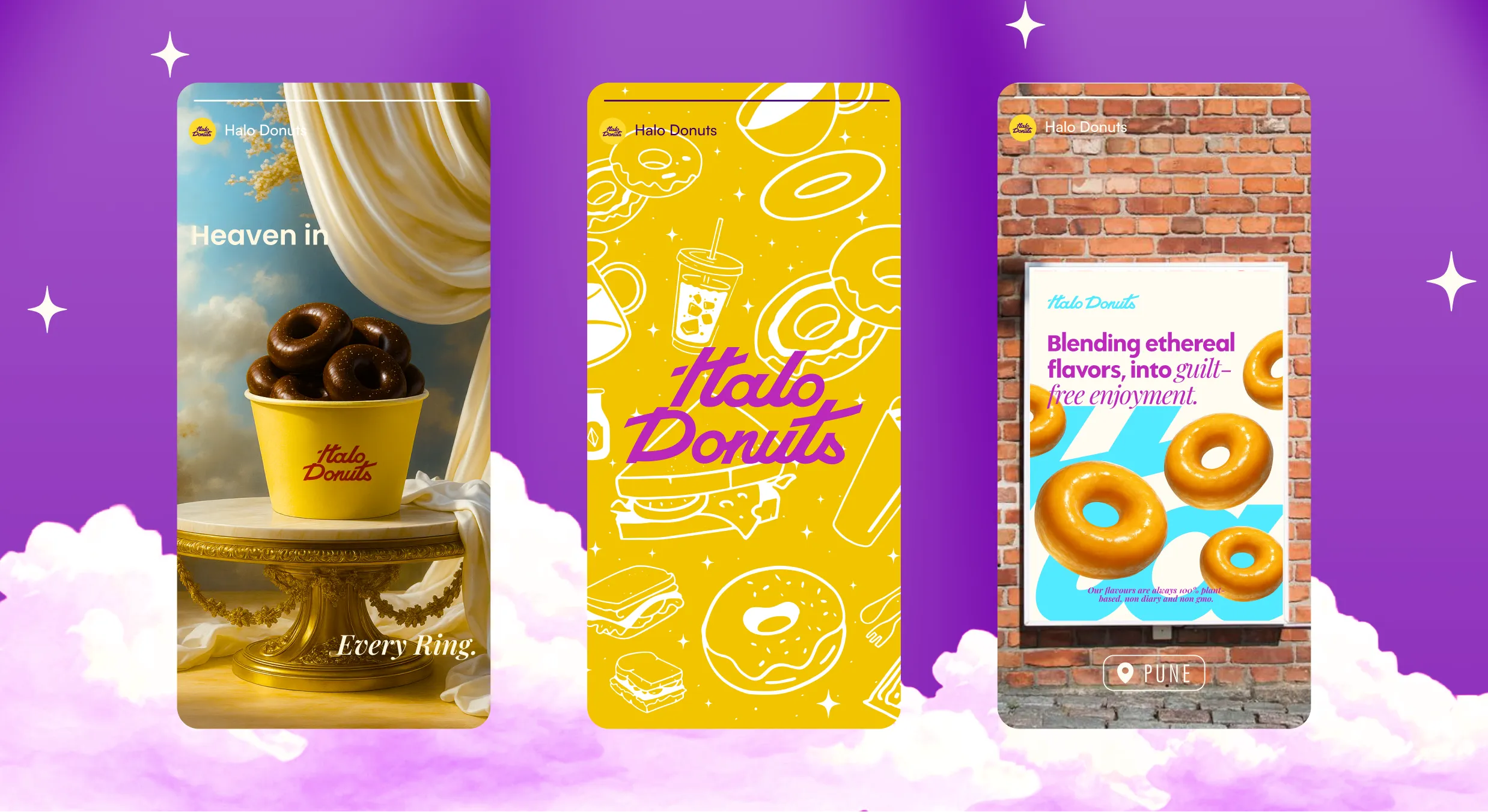
We began by defining how Halo Donuts should feel, not how it should look. The brand needed to feel comforting, slightly unreal, and quietly joyful. Like stepping into a space that softens the day. From there, every design decision followed. The celestial reference of the halo became a subtle anchor rather than a literal theme. We focused on rhythm, warmth and restraint, allowing the brand to breathe and their storytelling to take the centre stage. Instead of forcing attention like the competing patisserie and donut brands in their niche, the identity invites it, through considered visuals, expressive illustration, thoughtful and compelling storytelling and a tone that feels human rather than performative.
Halo Donuts is positioned as more than a snack. It is an experience designed to feel special without requiring a special occasion. The brand lives at the intersection of craft and accessibility, offering donuts that feel thoughtful, well made and emotionally comforting. It is for people who value small pleasures done well.
Halo Donuts speaks to individuals who enjoy aesthetic spaces, slow moments and well considered food. From young professionals and creatives to families and regular café visitors, the brand appeals to those who value atmosphere as much as flavour. Halo Donuts becomes part of daily rituals, coffee breaks, shared boxes, quiet treats, moments that don’t need justification.

The strategy focused on creating a brand people remember for how it made them feel. Rather than chasing trends, Halo Donuts was built to be recognisable through consistency, tone and visual language. By prioritising experience over excess, the brand positions itself for long term relevance. One that people return to not because it is loud, but because it feels familiar, comforting and well considered.
Halo Donuts speaks with ease. The voice is friendly, confident and slightly cheeky, but never forced. It avoids exaggerated excitement, empty slogans or overly sweet clichés.
Every line is written to feel natural, like a conversation rather than a campaign. The tone reflects the product itself, indulgent, comforting and made with care.
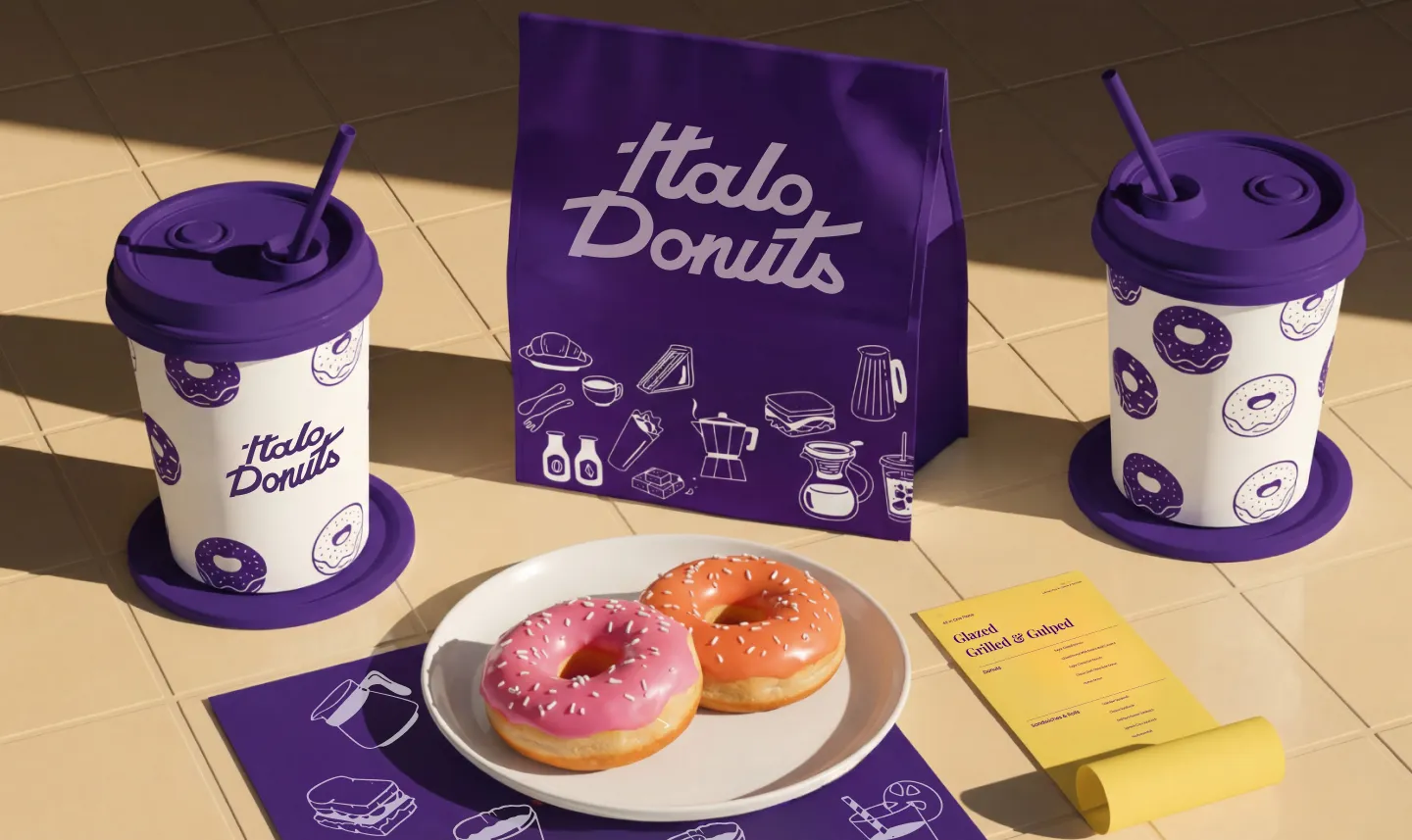
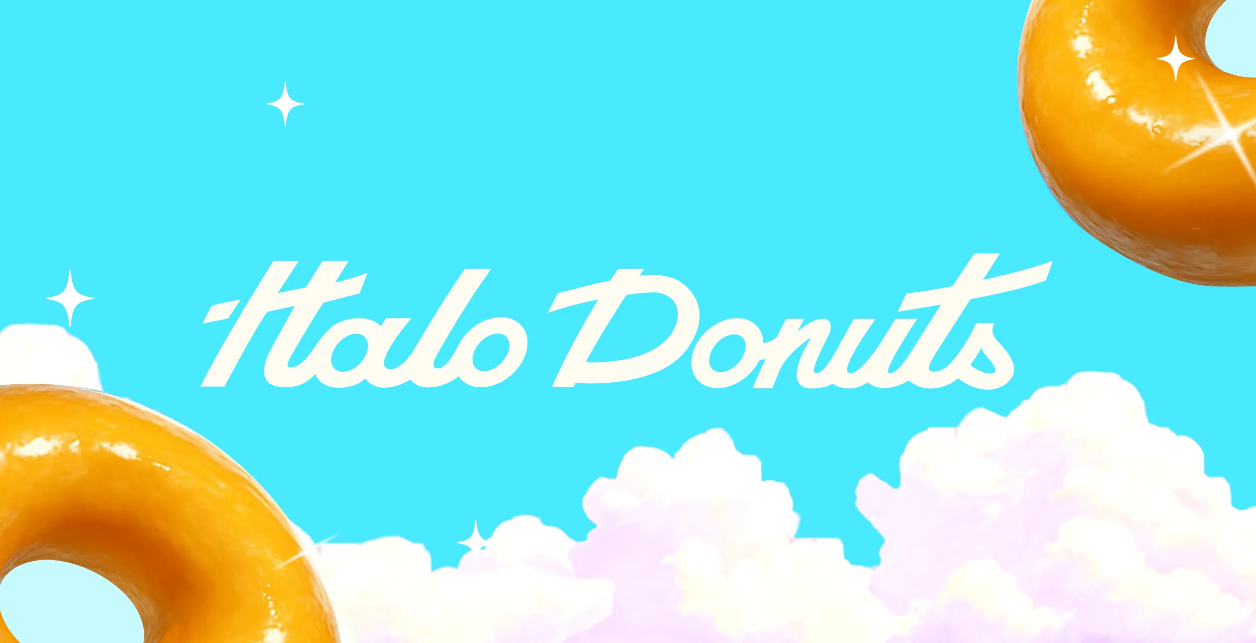
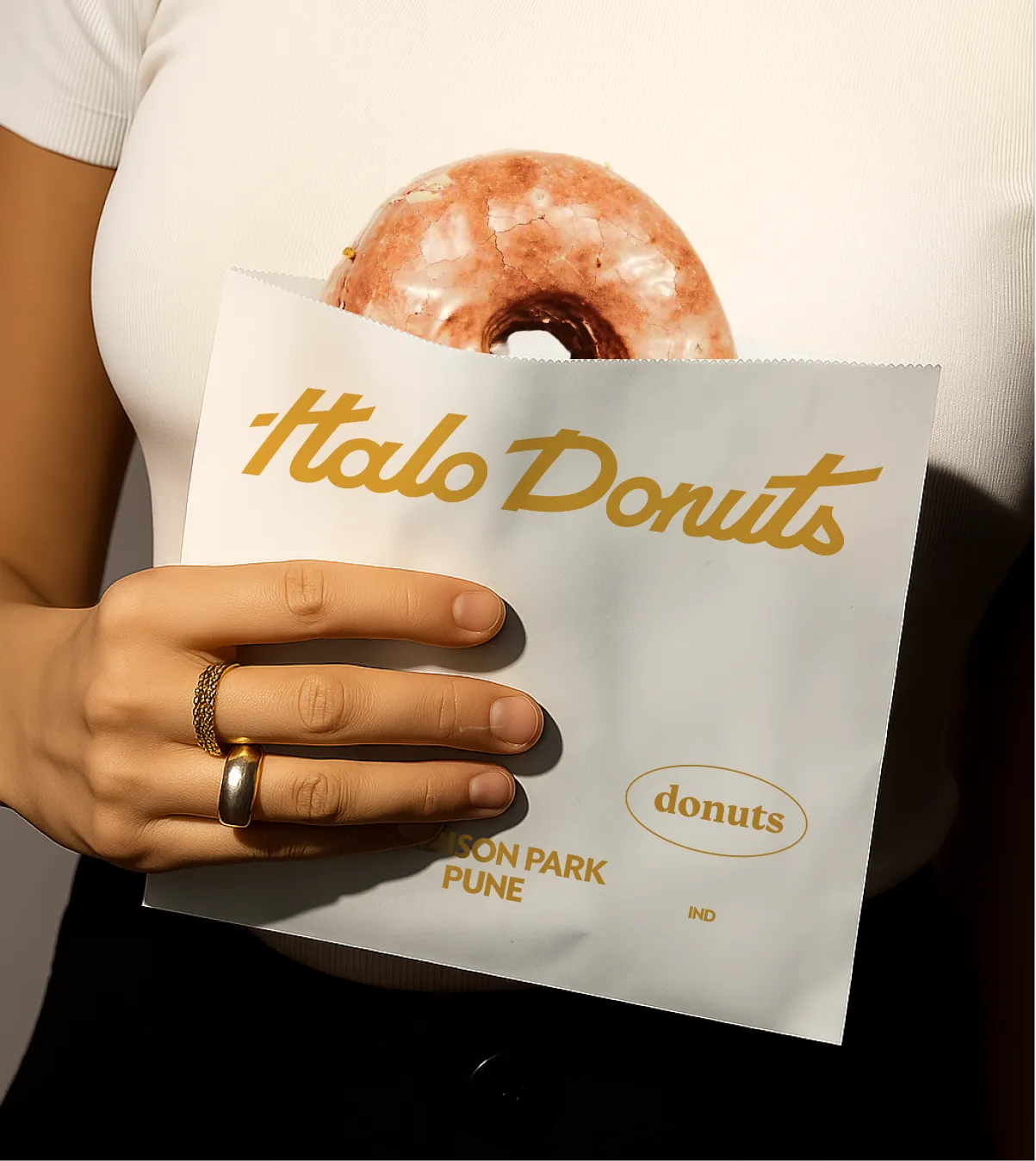
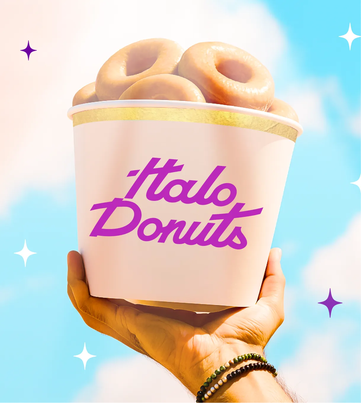
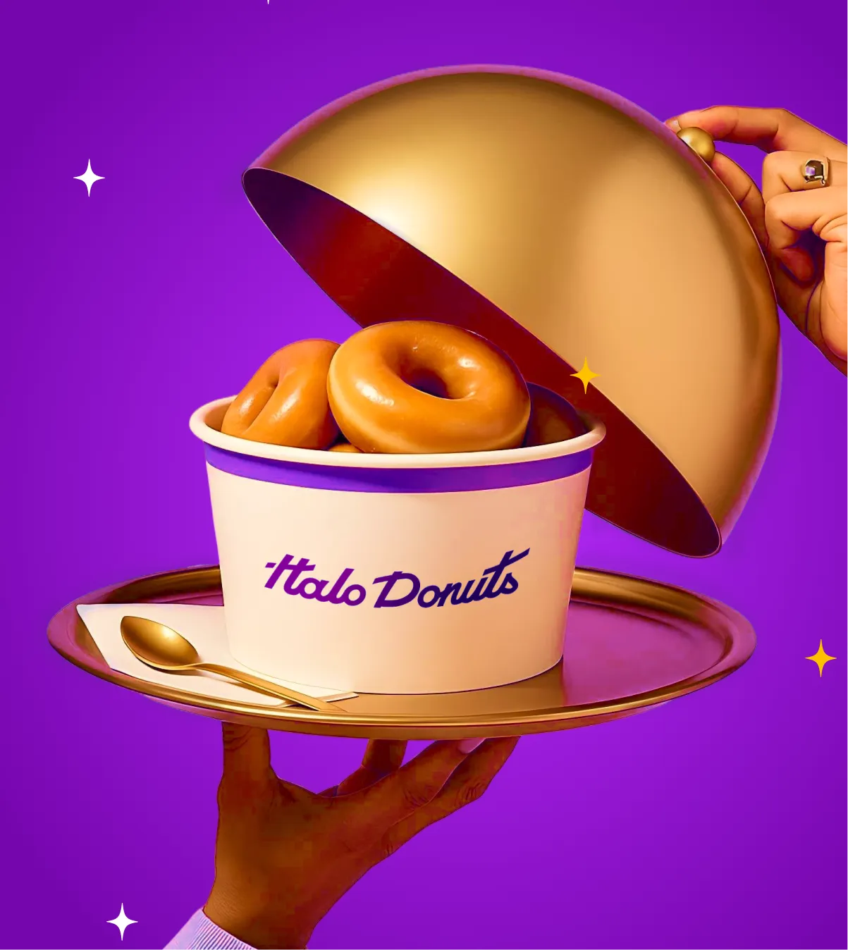
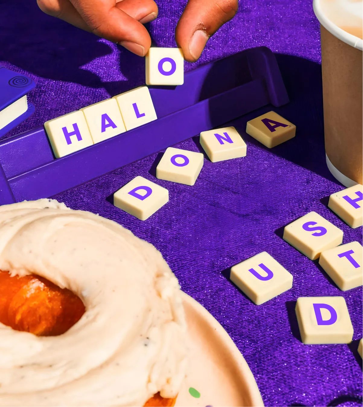
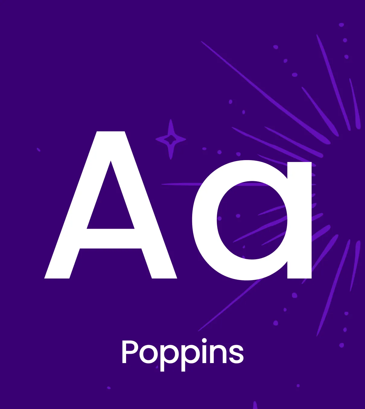
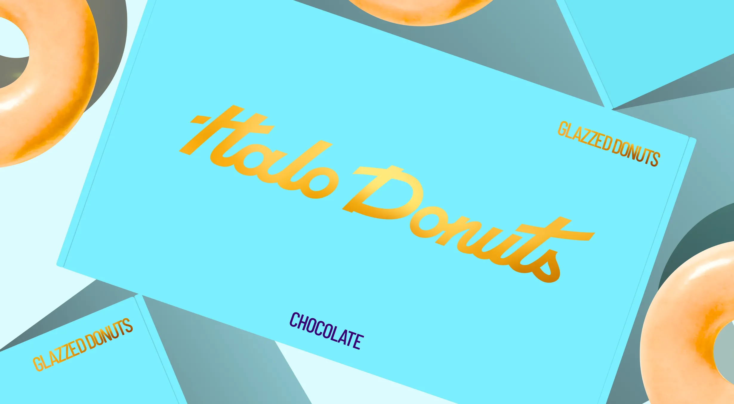
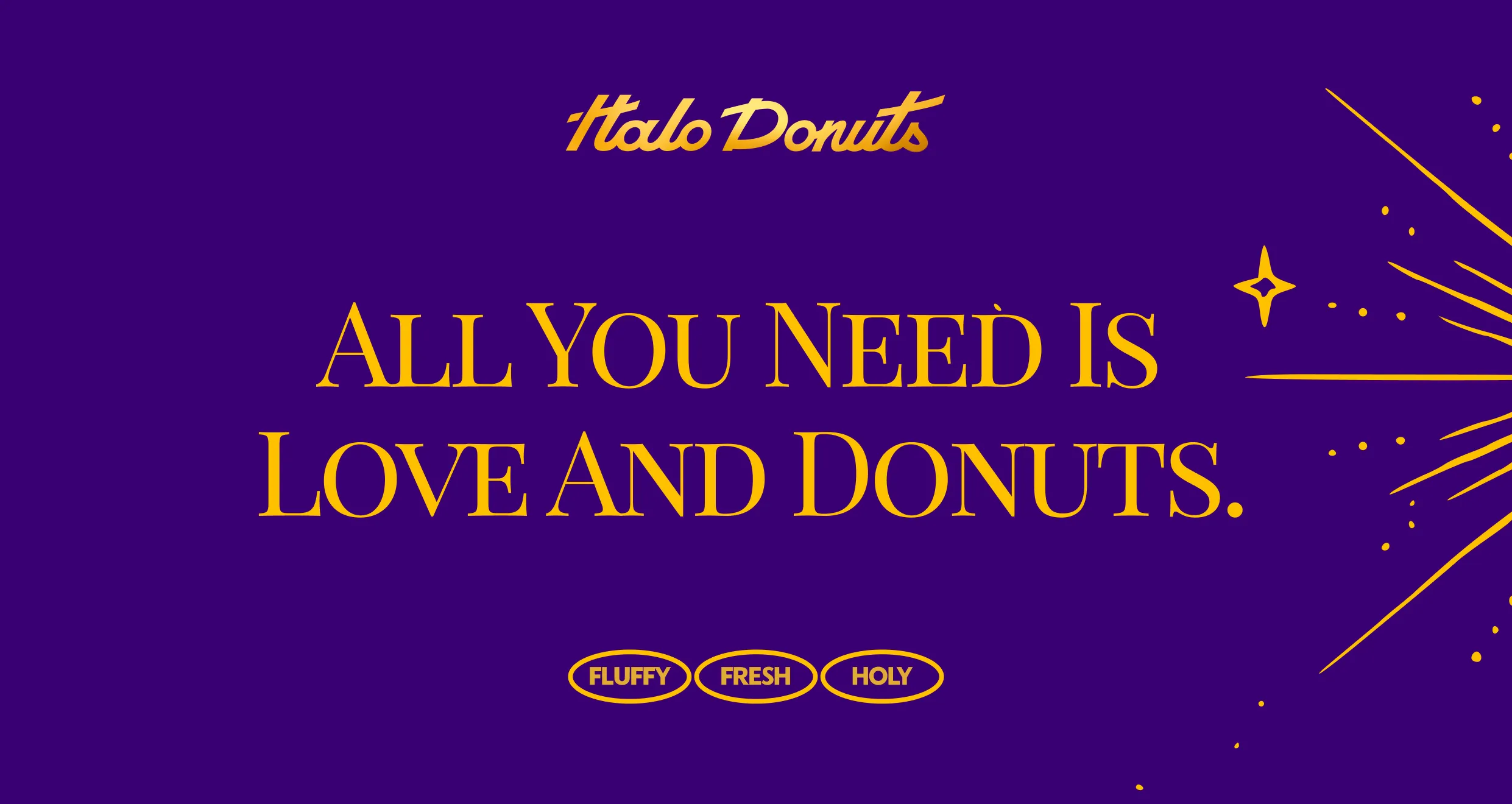
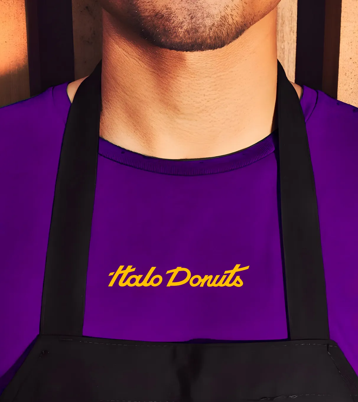
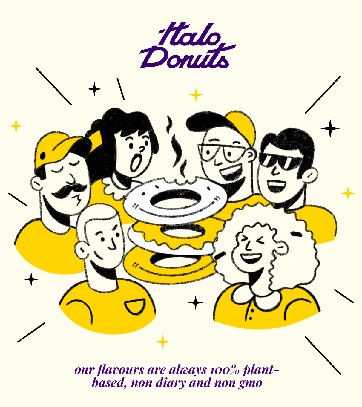
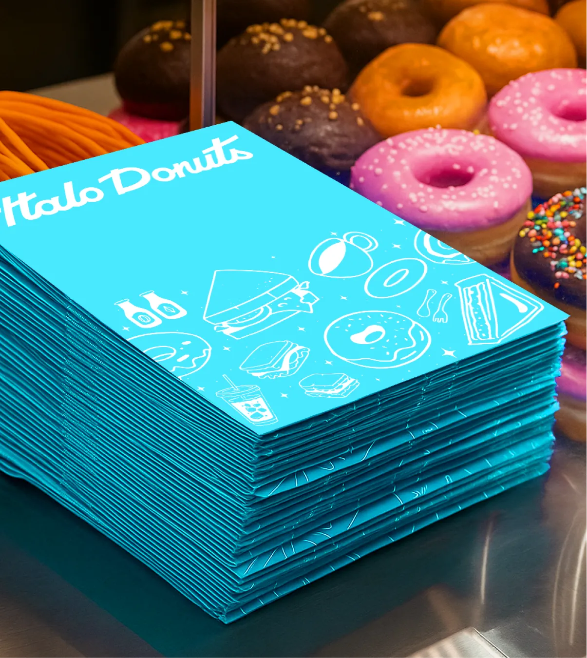
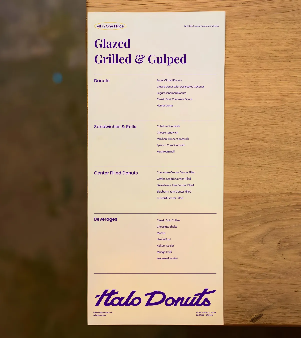
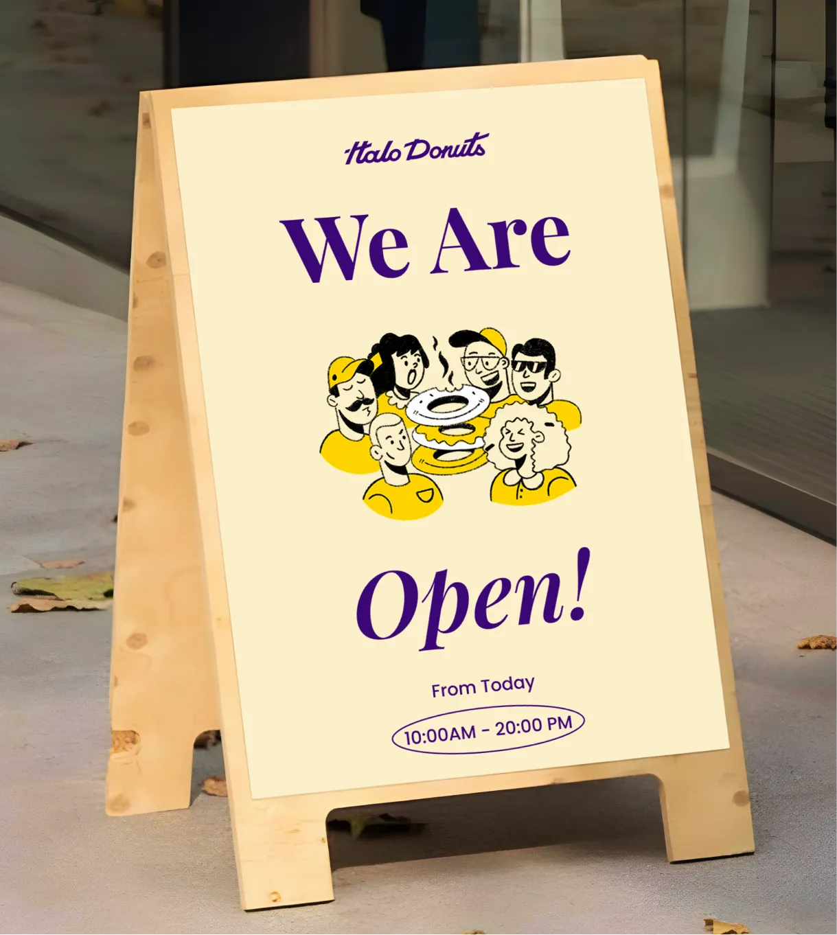
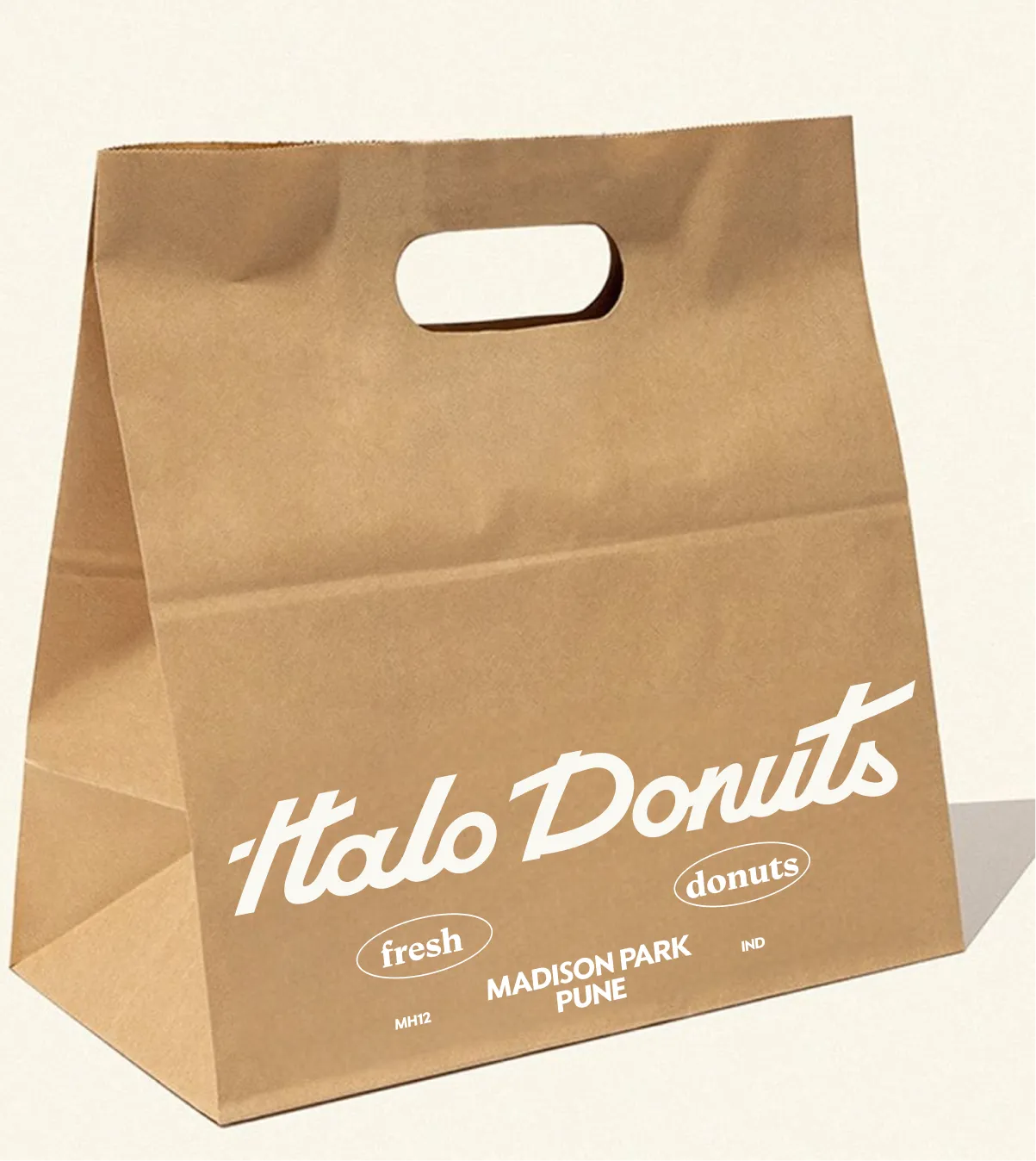
The visual identity balances nostalgia with clarity. The custom hand drawn script logo brings personality and movement, while remaining legible and distinct. A rich primary palette of purples, creams and golds establishes warmth and indulgence, while the extended colour system allows flexibility across campaigns and seasons without losing cohesion. Typography combines modern structure with editorial softness, and illustration plays a key role in bringing character into the brand. The illustrated world feels inclusive, expressive and human, reinforcing the brand’s emotional core.


.svg)
.webp)

.svg)
.svg)
.webp)
.webp)

.webp)

.svg)