%201.webp)
02
AI Snaps
.svg)
.svg)
01
Our Work

03
About Us
05
Contact Us
06
Client Success

07
Blogs
08
Careers
Book A Call


NutriPro began with a simple idea: what if kitchen appliances could be as dynamic and forward-thinking as the people who use them?
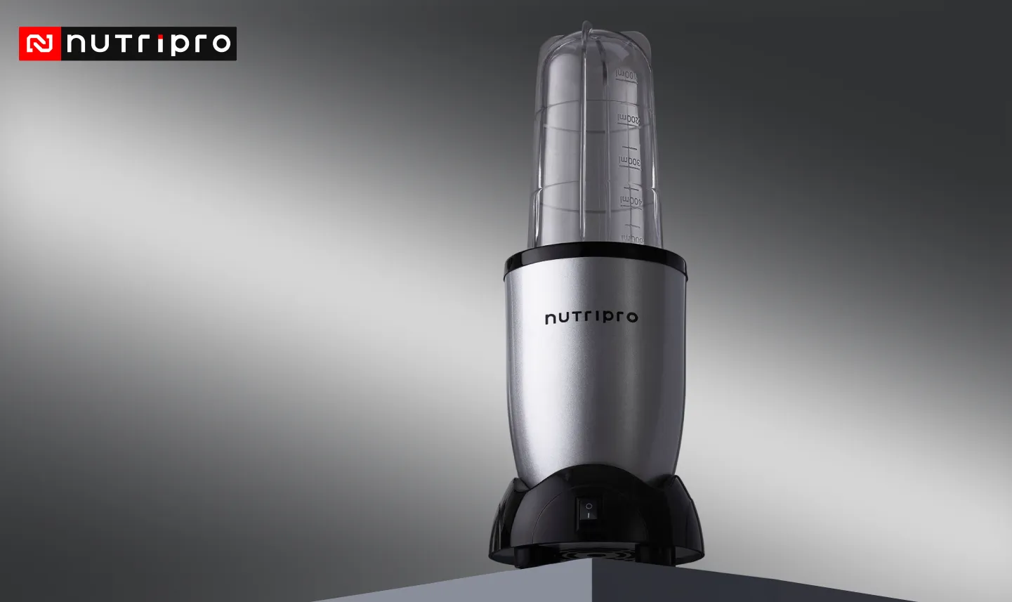
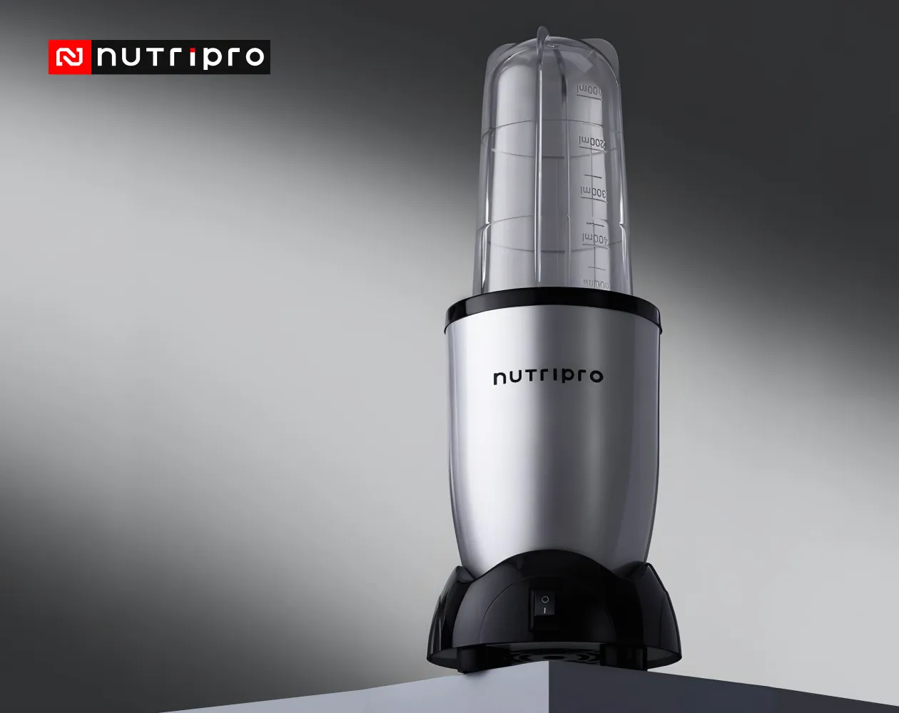
Born from Cookwell Domestic Appliances Limited, NutriPro started its journey with the Nutri Blender — a sleek, powerful tool that quickly became a favorite among health-conscious, time-starved consumers. But this was just the beginning. As lifestyles evolved and wellness took center stage, so did we. NutriPro grew into a brand that didn’t just help people cook — it helped them live better. We expanded our offerings to include air fryers, multi-kettles, and a range of modern appliances designed to make healthy cooking effortless, fast, and fun. We exist for the go-getters, the creatives, the fitness lovers, and the foodies. For the ones who are always online, always exploring, always upgrading. Our community is young, energetic, and deeply connected to the values of health, style, and self-expression.
At NutriPro, we don’t believe in one-size-fits-all solutions. We believe in building a brand you can trust, flaunt, and feel proud to be part of. With each product, we aim to deliver not just performance, but purpose — appliances that look good, work hard, and fit seamlessly into your modern lifestyle.
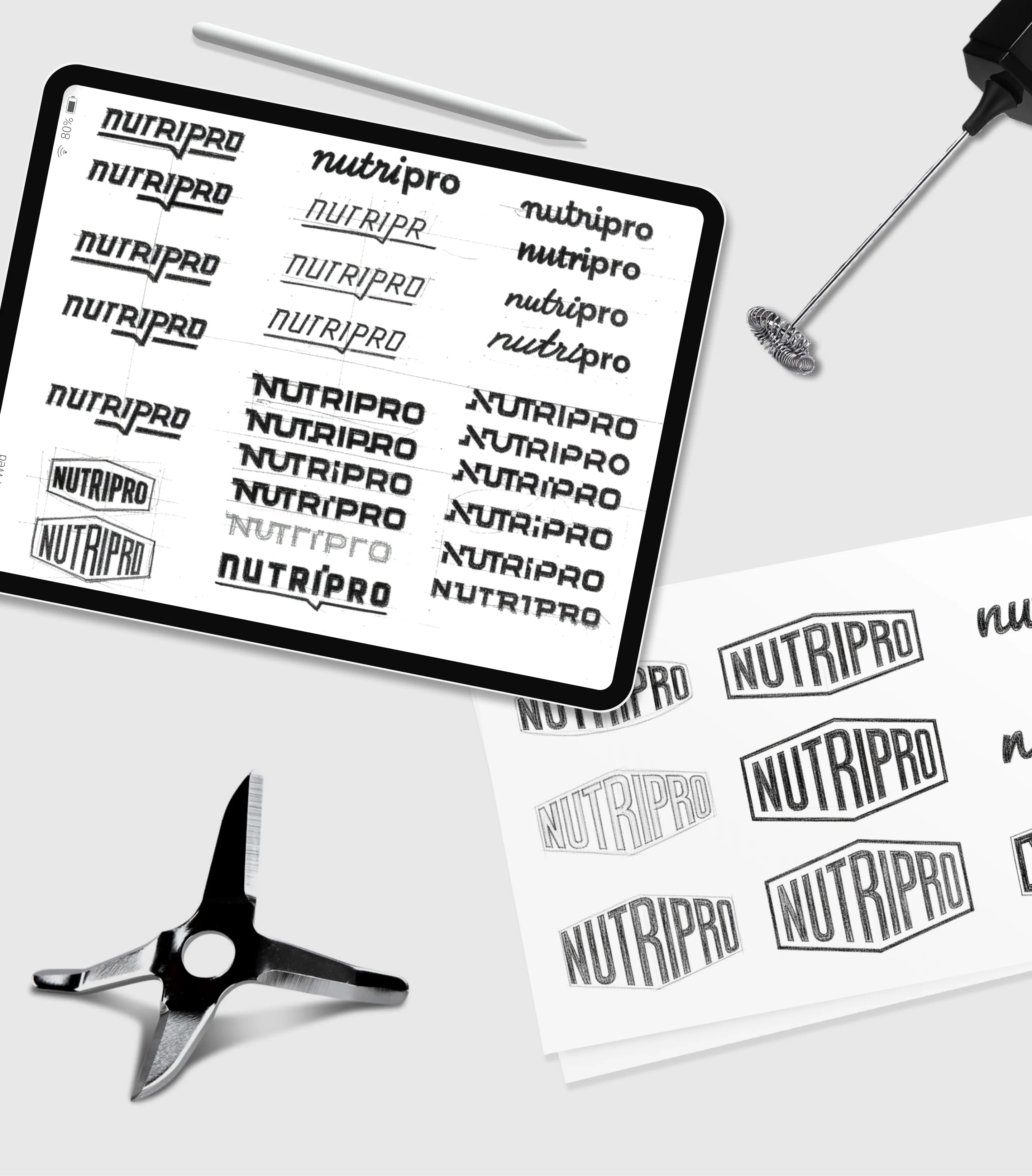
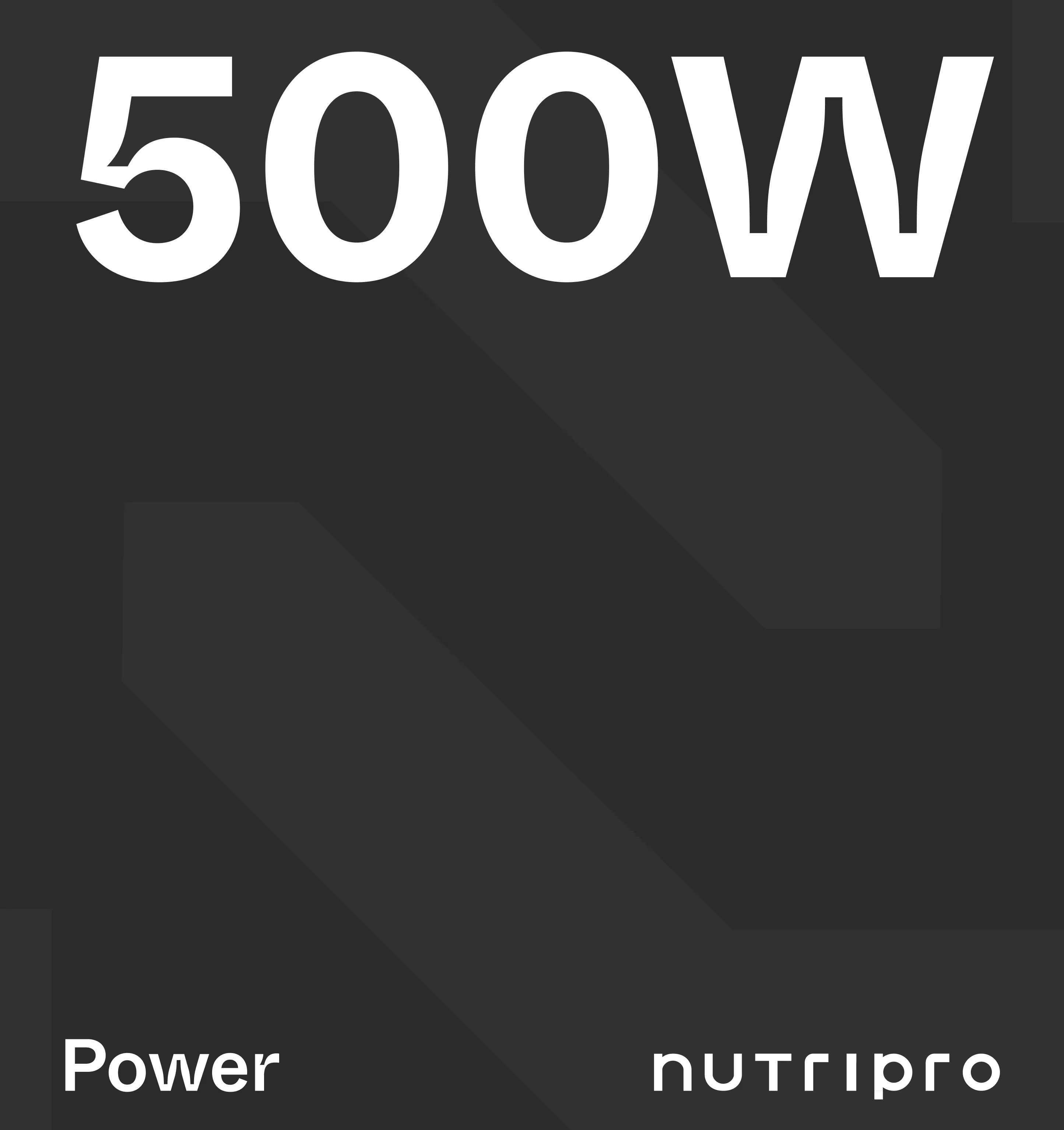
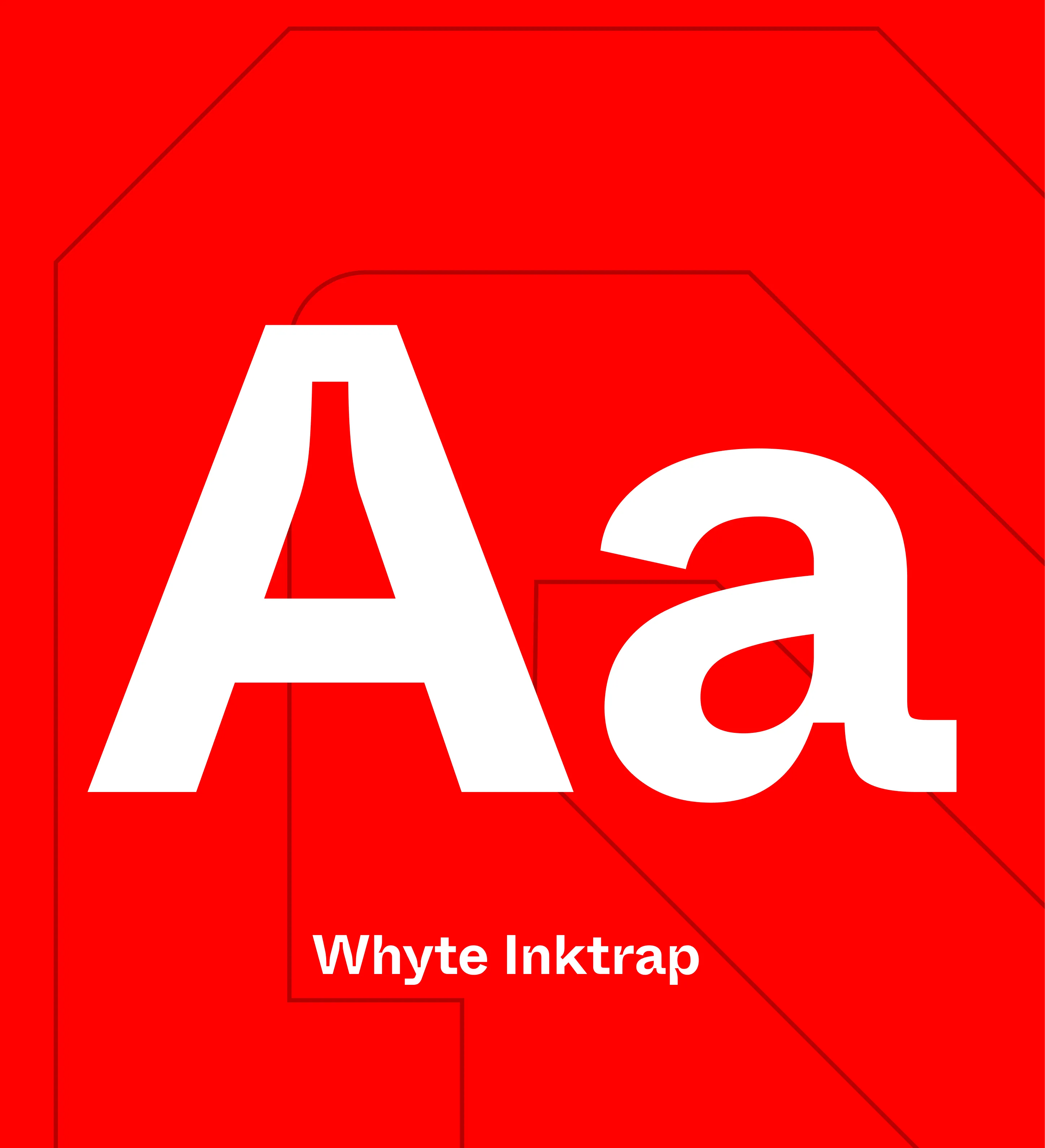
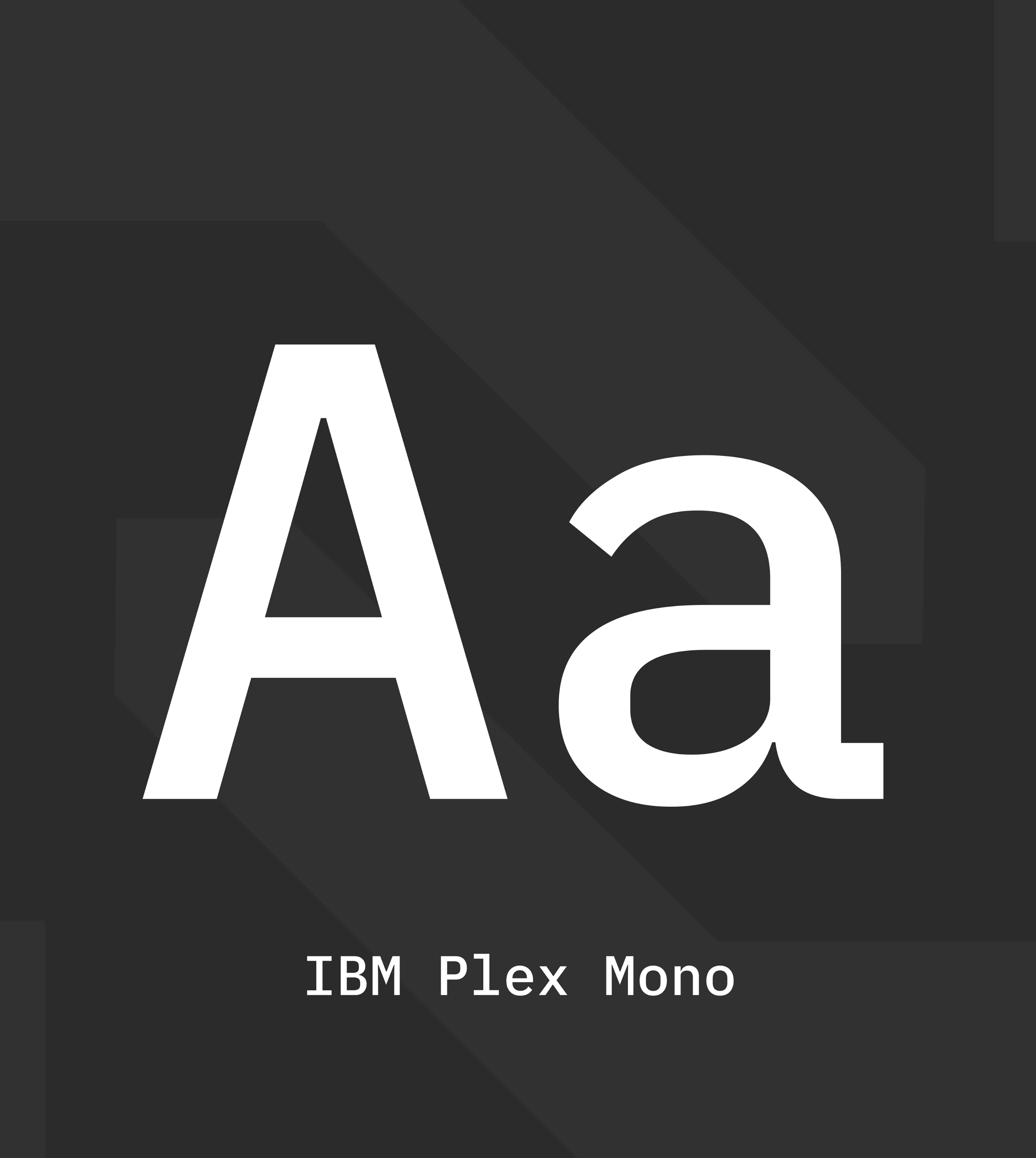
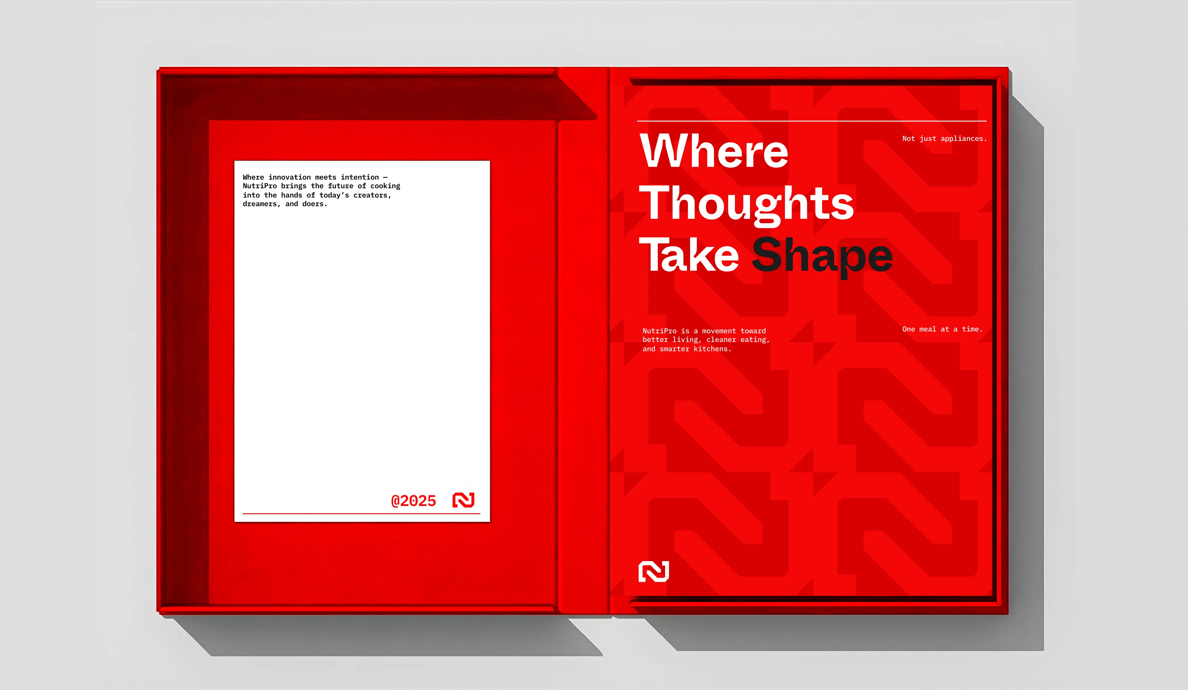
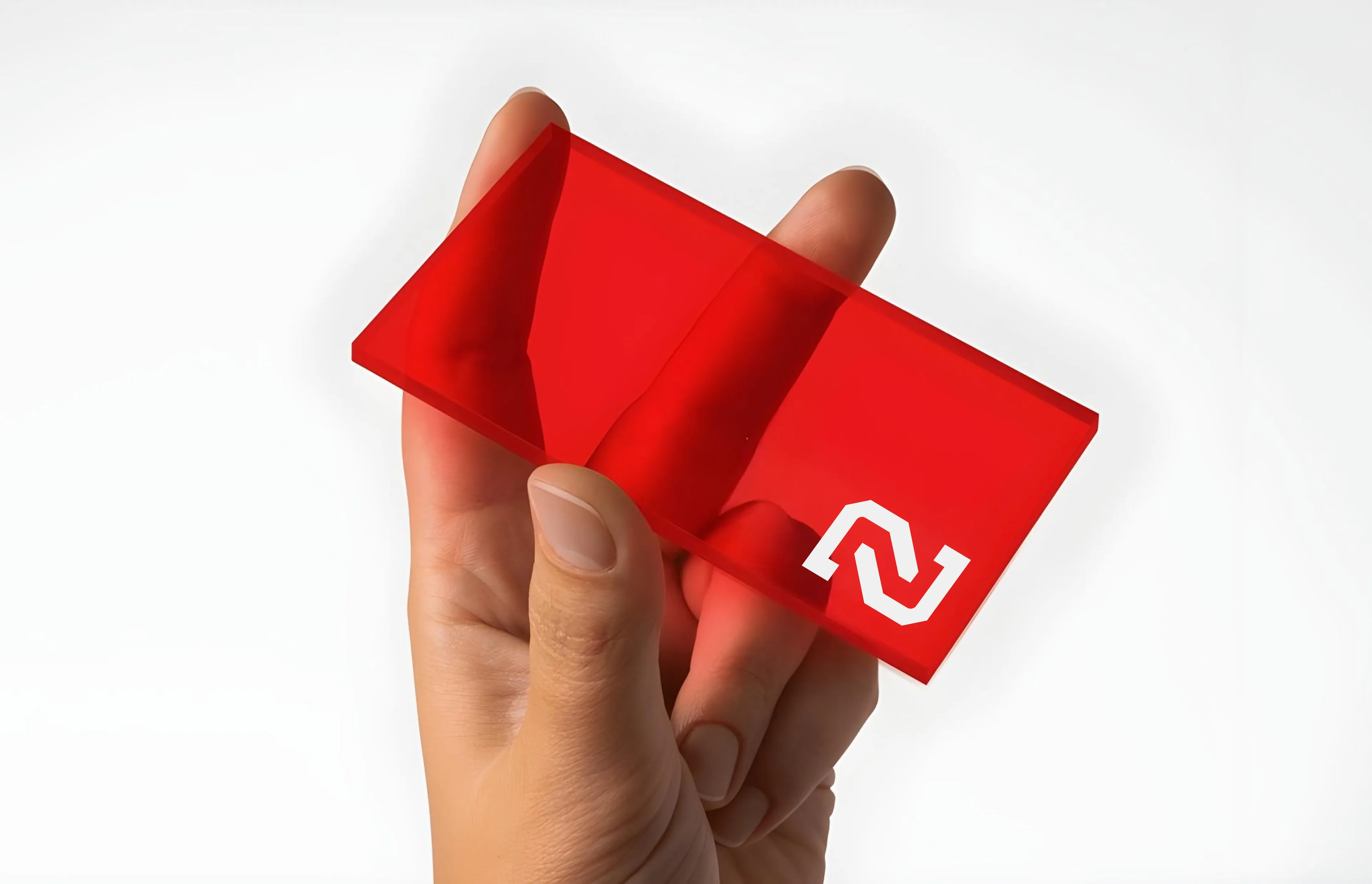
Confetti designed a visual system that mirrors the tech-driven essence of NutriPro. The primary logo, a sleek wordmark and monogram, reflects precision, confidence, and next-gen functionality. The color palette uses crimson red, charcoal black, dark gray, and white to signal performance and power, paired with secondary tones like electric indigo, eco green, and vivid yellow for a burst of energy. Typography blends futurism and clarity through Whyte InkTrap and IBM Plex Mono, creating a bold visual presence. Custom patterns, graphic systems, and photography direction all reinforce a brand built for the future clean, sharp, dynamic, and deeply aligned with modern living.
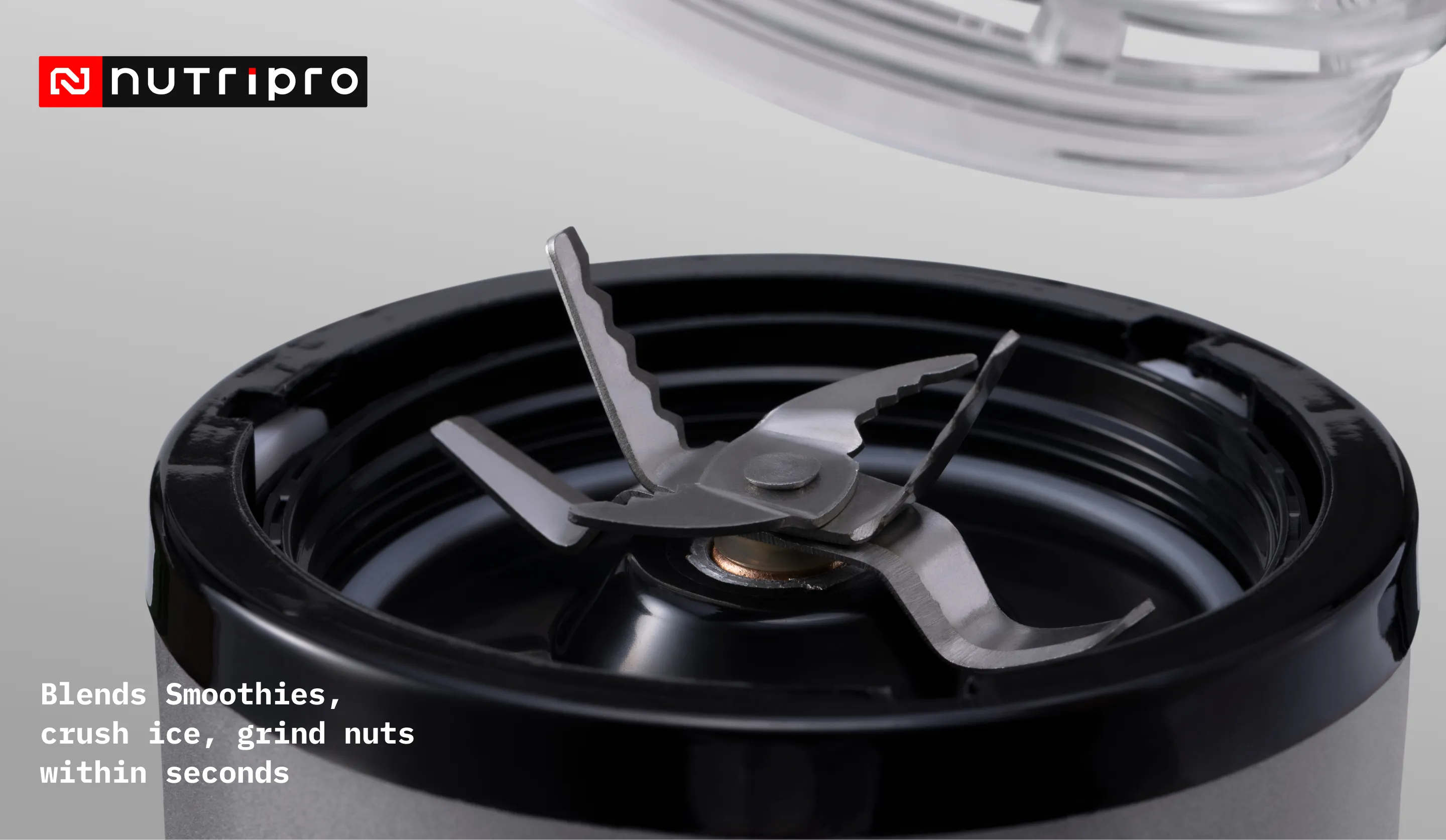
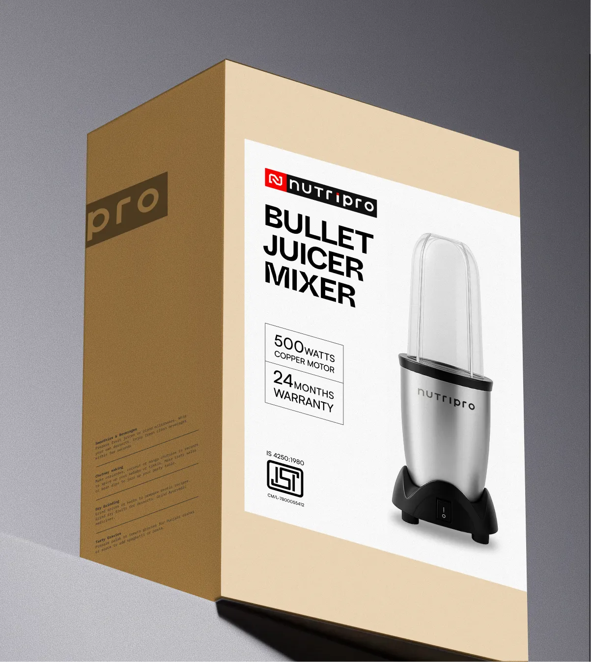
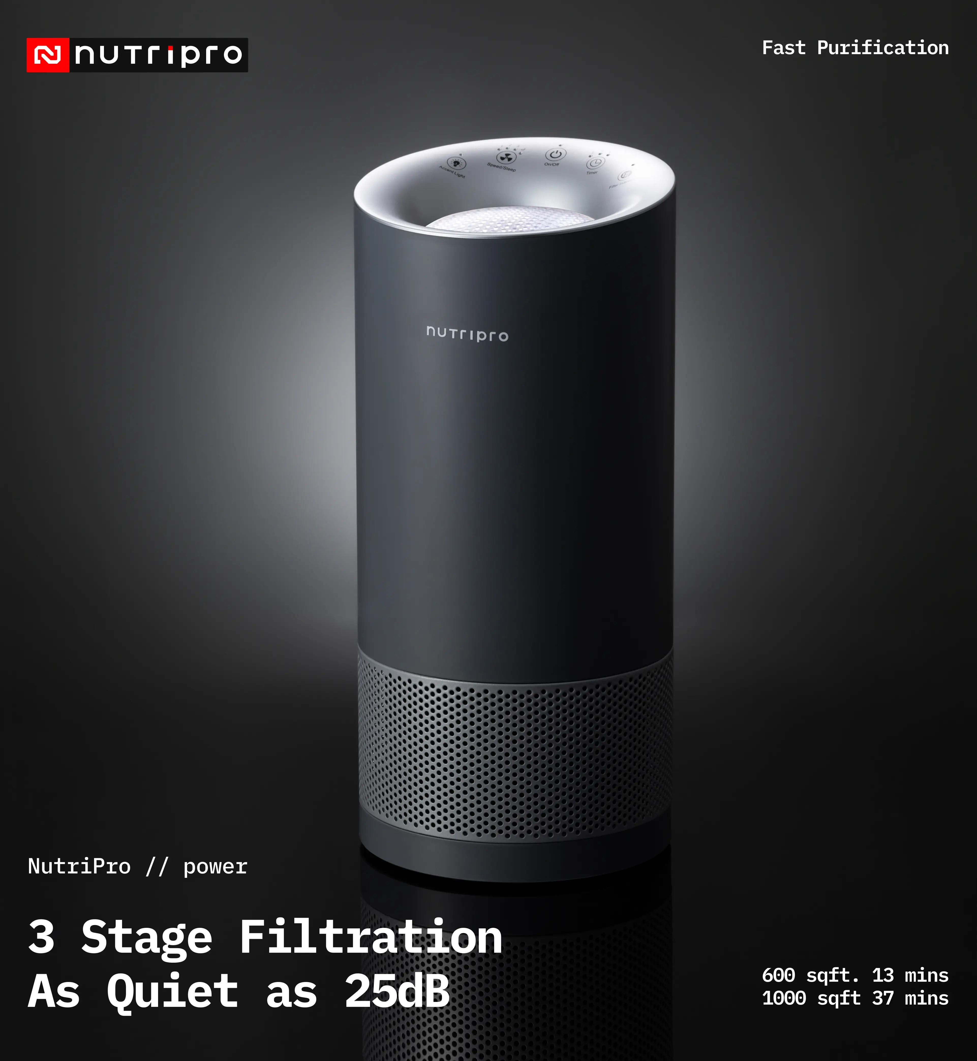
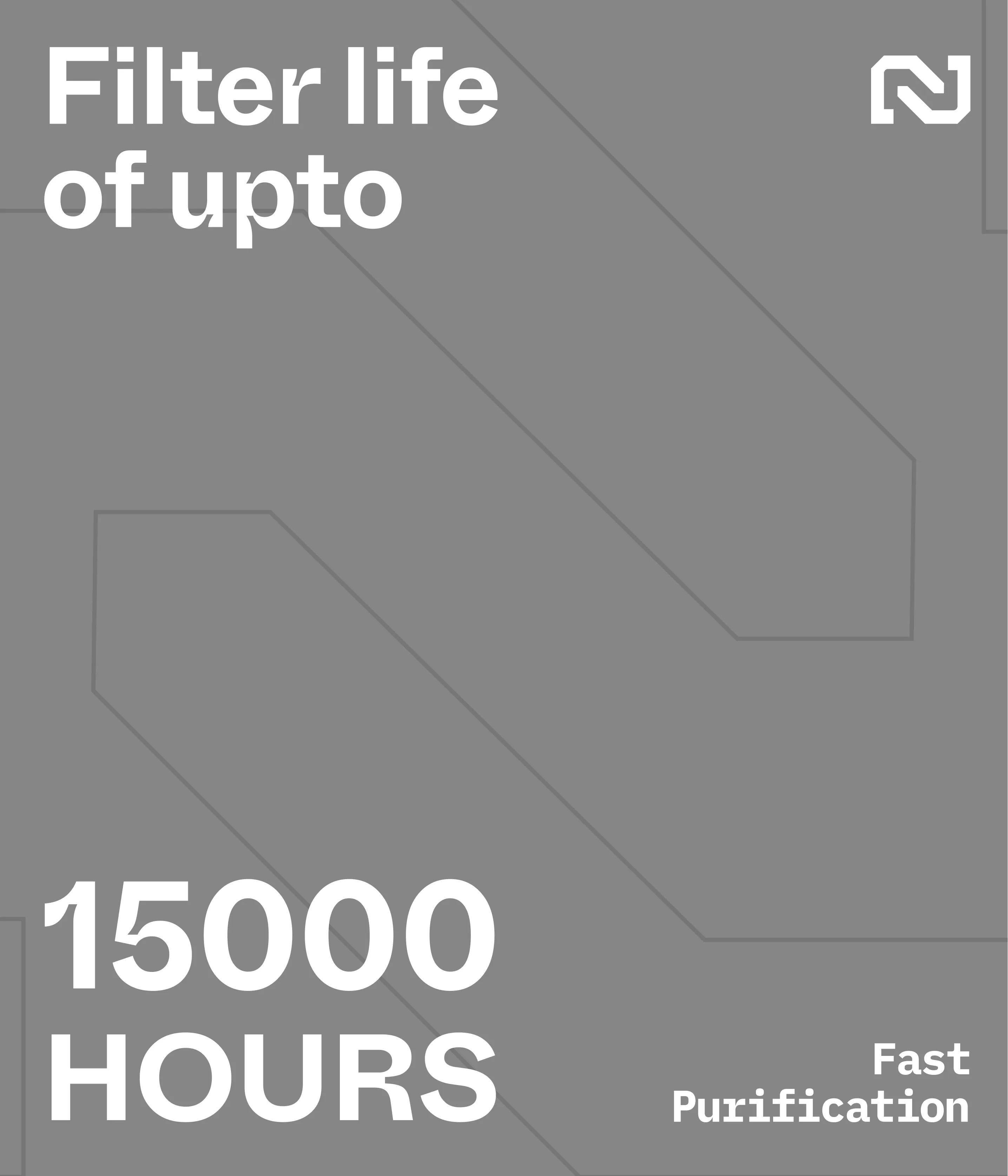
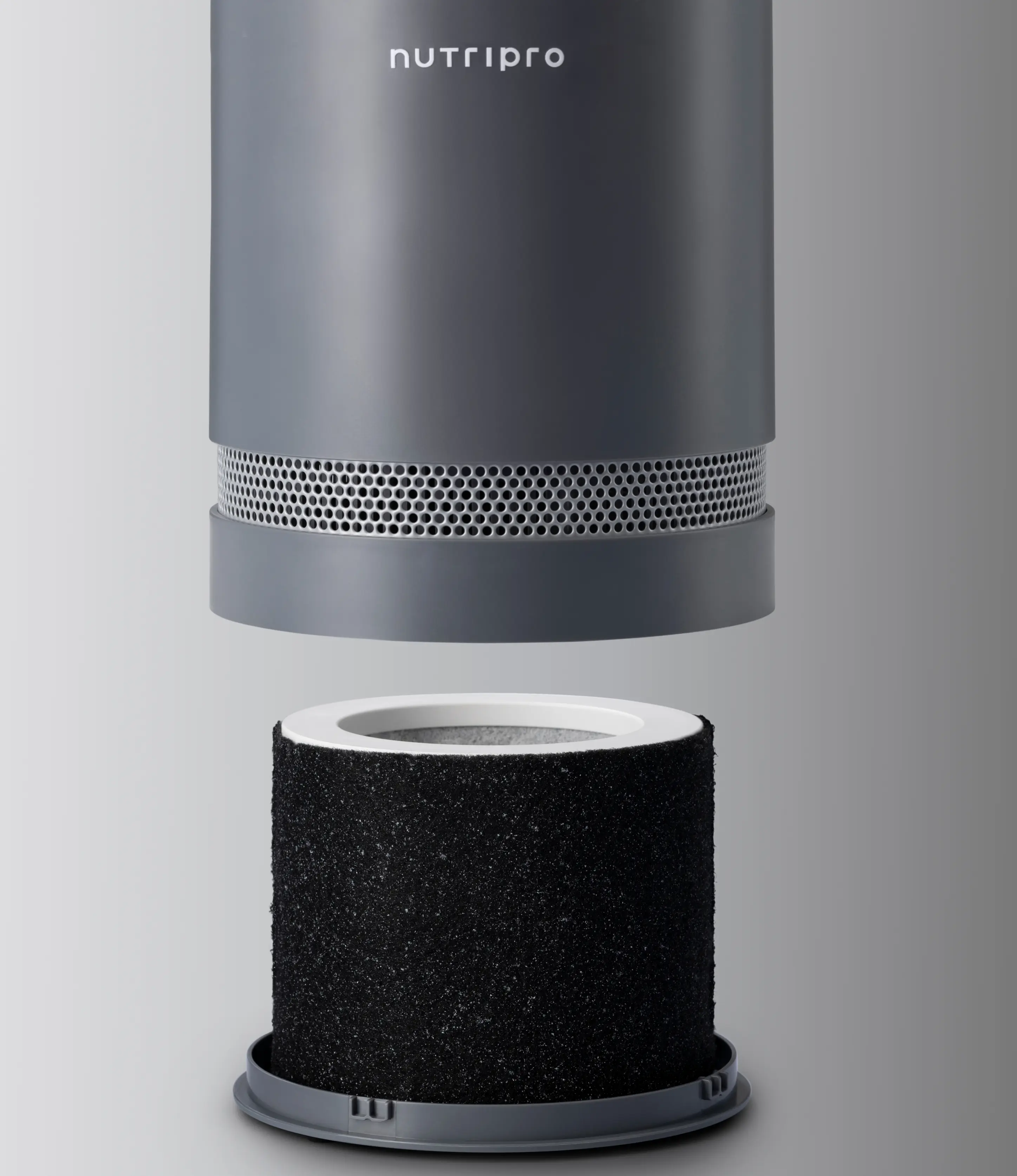
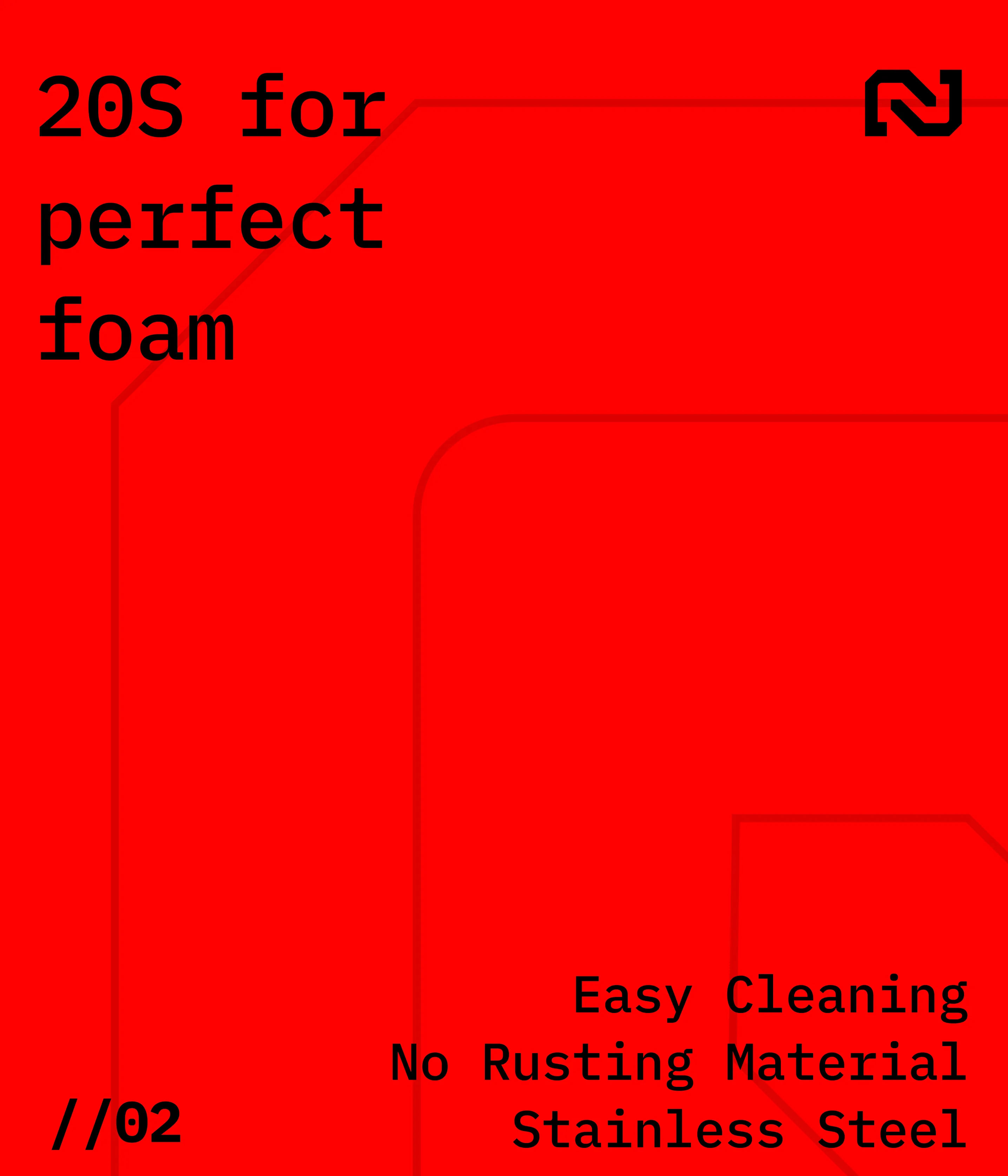
NutriPro’s packaging was designed to look as sharp and purposeful as the appliances inside it. We built a system that reflects the brand’s tech inspired identity without feeling cold or overworked: clean greys, whites and black anchored by NutriPro’s punch of red. Every box is structured to make the product instantly recognisable, with clear photography, legible typography and layouts that prioritise function over clutter. Since the brand offers multiple appliances, we created a flexible sticker system that changes with each product whether it is a blender, mixer, frother or bullet juicer keeping the range consistent while still easy to navigate. We also explored bold patterns and geometric forms that bring energy and movement to the packs without overpowering the design. The result is packaging that feels modern, practical and a system that stands out on shelf while staying true to the brand’s next generation aesthetic.
.webp)

.webp)
.webp)
.webp)


.svg)
.webp)

.svg)
.svg)
.webp)
.webp)

.webp)
.svg)