%201.webp)
02
AI Snaps
.svg)
.svg)
01
Our Work

03
About Us
05
Contact Us
06
Client Success

07
Blogs
08
Careers
Book A Call


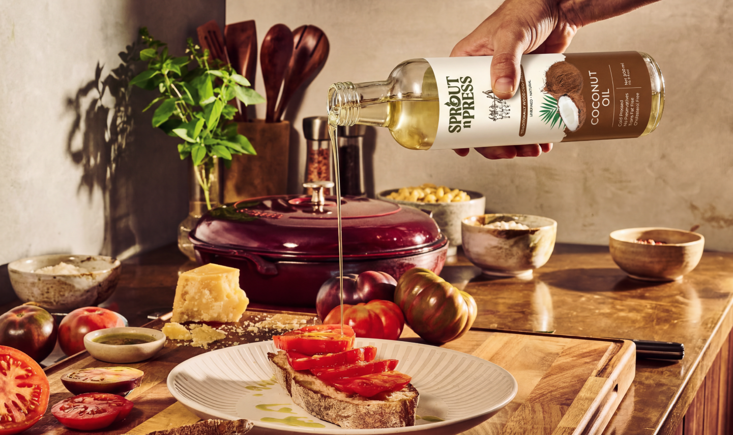
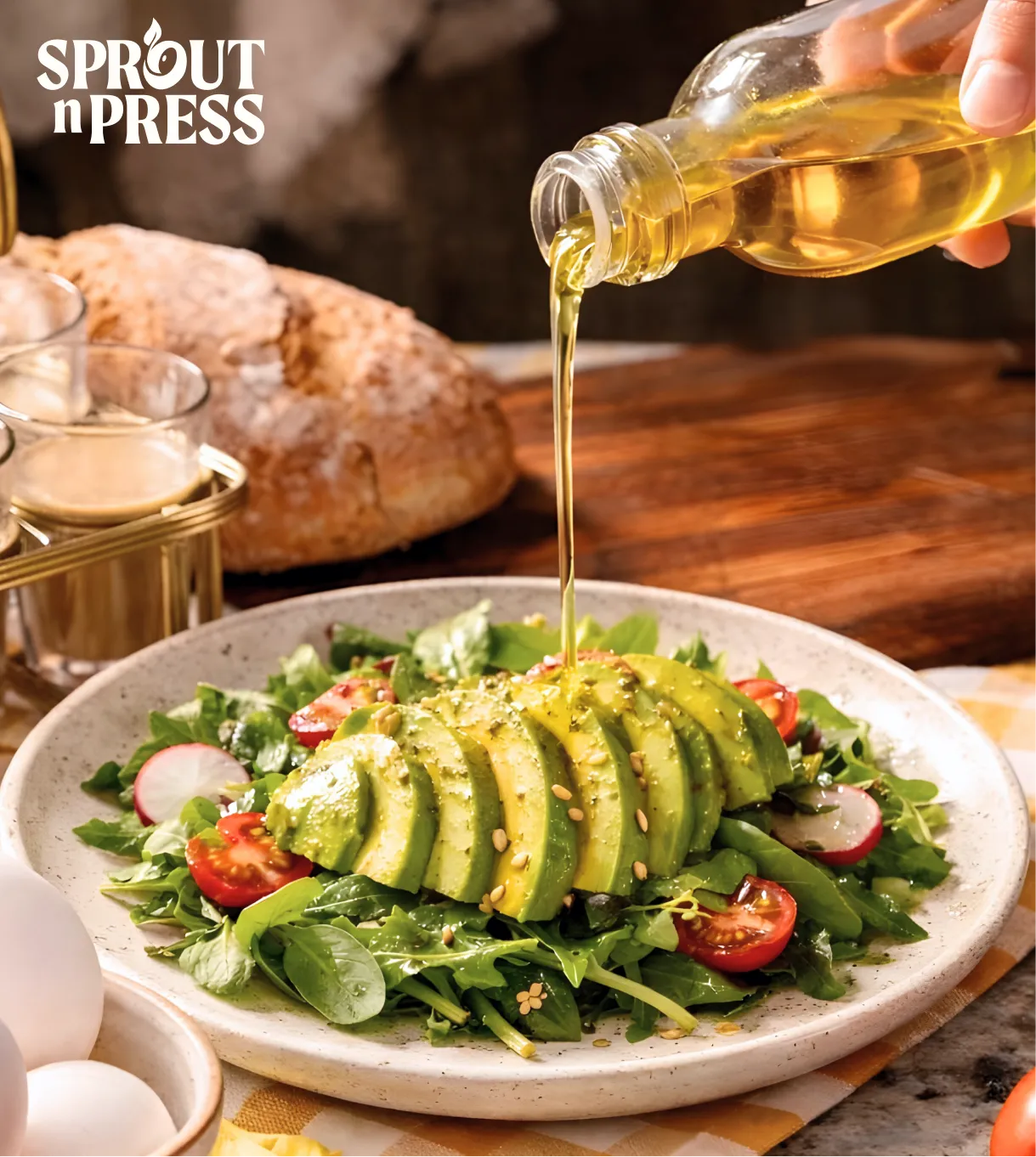
Sprout and Press is a clean label nutrition brand built on the belief that food should nurture the body, the planet and the people who share it. Specialising in cold pressed oils and heritage millets, the brand brings together traditional extraction methods, responsible sourcing and a philosophy that views food as a deeper connection to nature. Confetti partnered with Sprout and Press to shape a warm, grounded and authentic identity that reflects their purpose driven approach. The goal was to create a brand that feels both premium and deeply human, capable of uniting families and communities through pure, nutrient rich ingredients designed for all ages and all lifestyles.
The world of cooking oils and health staples is crowded with products that speak only to utility, price or trend. Sprout and Press was born with a different intention: to reintroduce nourishment as an experience rooted in nature, ethics and shared well being. The challenge was to create an identity that communicates this philosophy with clarity and emotion. The brand needed to feel trustworthy yet warm, artisanal yet contemporary, and grounded yet elevated enough to stand out among mass market competitors. It also needed to appeal across age groups, reinforcing the idea that one pure oil can nourish every member of a household, from children to elders.
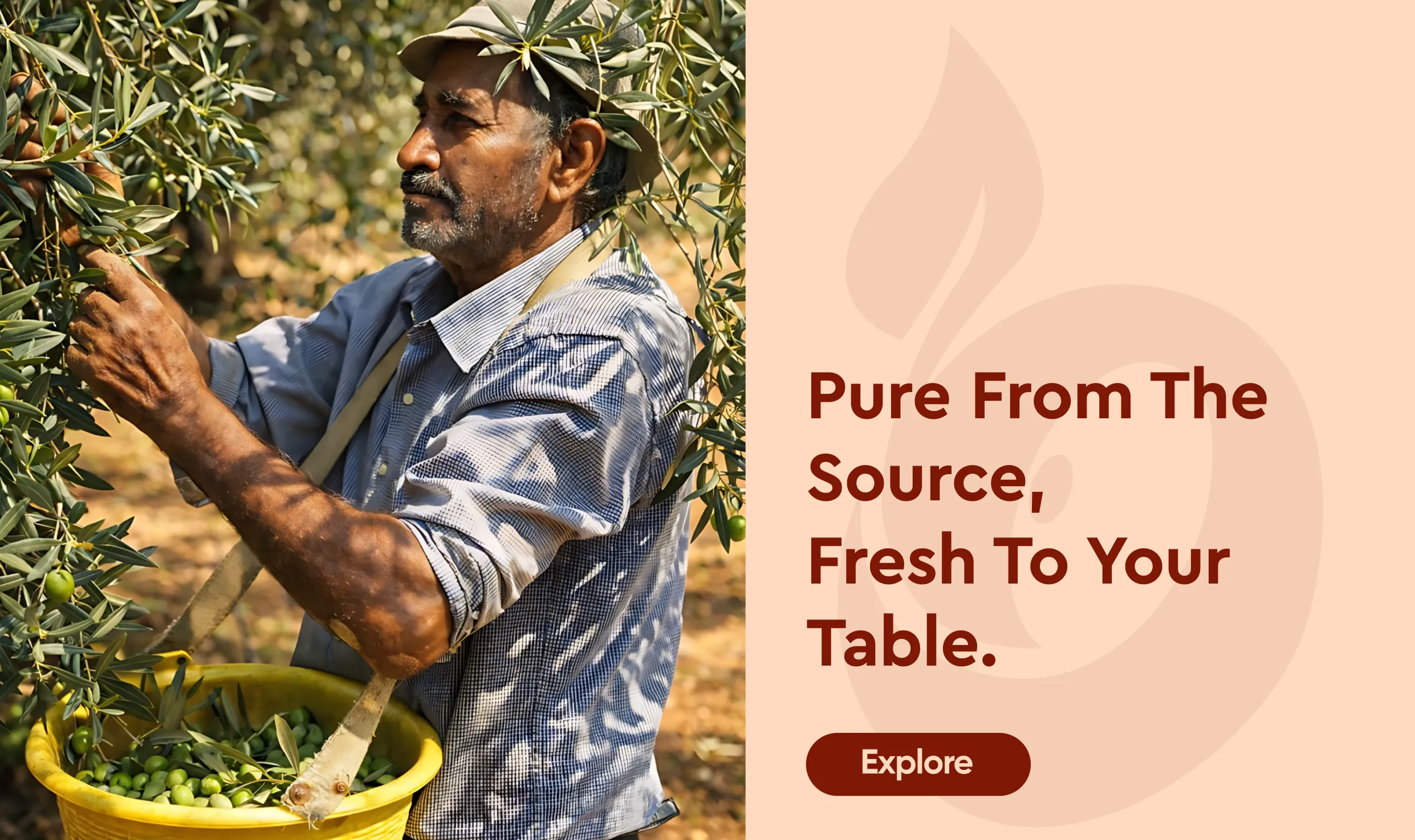
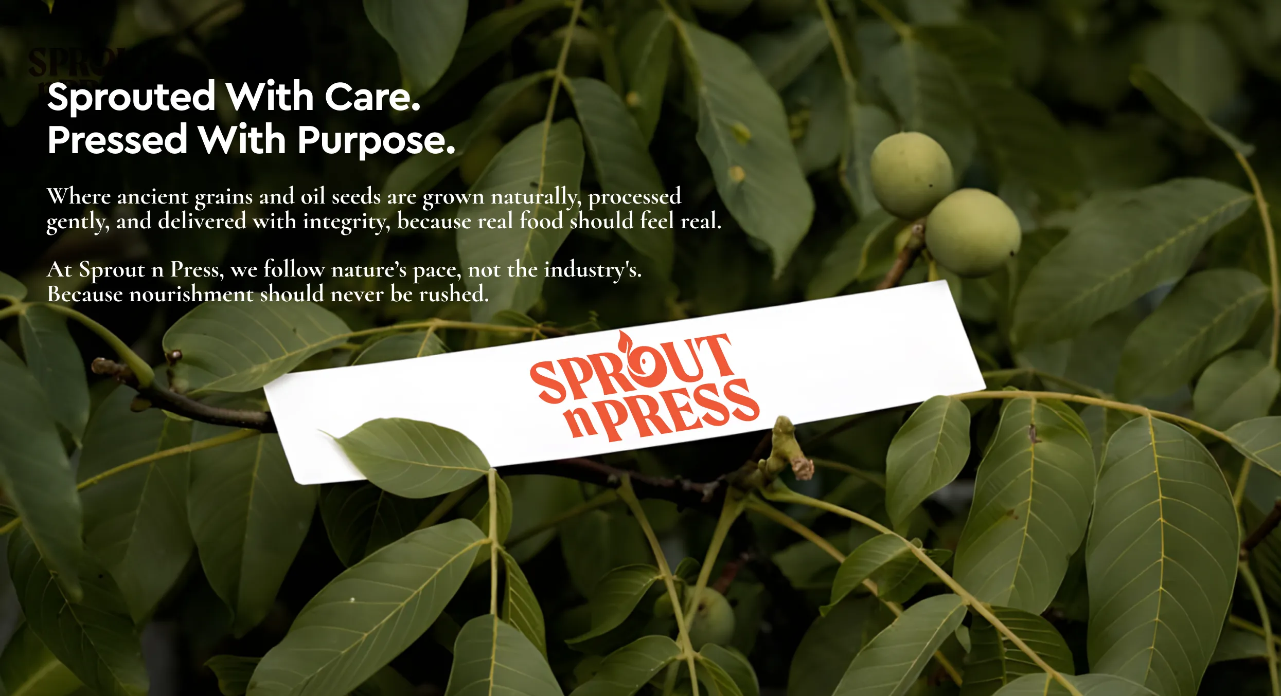
Confetti approached Sprout and Press with a simple thought: nourishment is a shared ritual. Whether it is a five year old or an eighty year old, the same oil can bring everyone to the same table. We crafted an identity that honours tradition while feeling modern and accessible. Every visual and verbal element was designed to echo the brand’s philosophy of purity, connection and care. From the sprouting seed symbol in the logo to the warm earthy palette, the system reflects a brand that is grounded in nature and dedicated to conscious living. The result is a brand that feels nurturing, trustworthy and rooted in purpose.
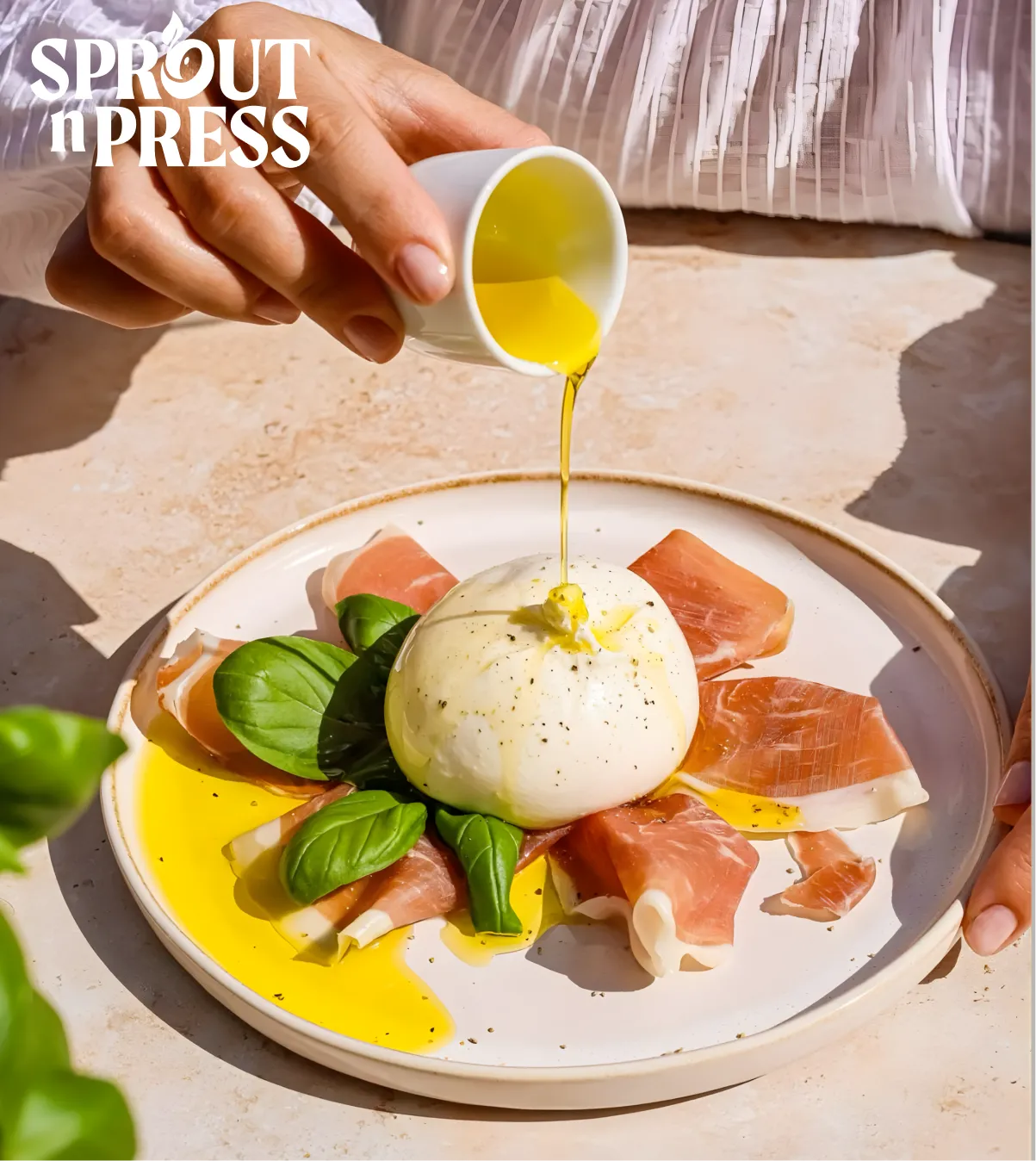
Sprout and Press is positioned as a premium yet accessible brand that leads with authenticity and purpose. It offers cold pressed oils and millets that are thoughtfully sourced, minimally processed and created for those who value mindful nutrition. The positioning emphasises the brand’s role in bringing people together through food that heals, strengthens and honours the earth. It reflects a return to simple, honest nourishment that benefits the body and the planet in equal measure.
Sprout and Press speaks to health conscious individuals, families and communities who seek purity, sustainability and ethical sourcing in their everyday ingredients. These are people who read labels, choose tradition over trend and look for products that align with their lifestyle values. From young parents choosing healthier options for their children to older adults prioritising digestive wellness, Sprout and Press appeals to all age groups. It becomes the universal cooking companion that supports vitality, balance and a shared commitment to mindful living.

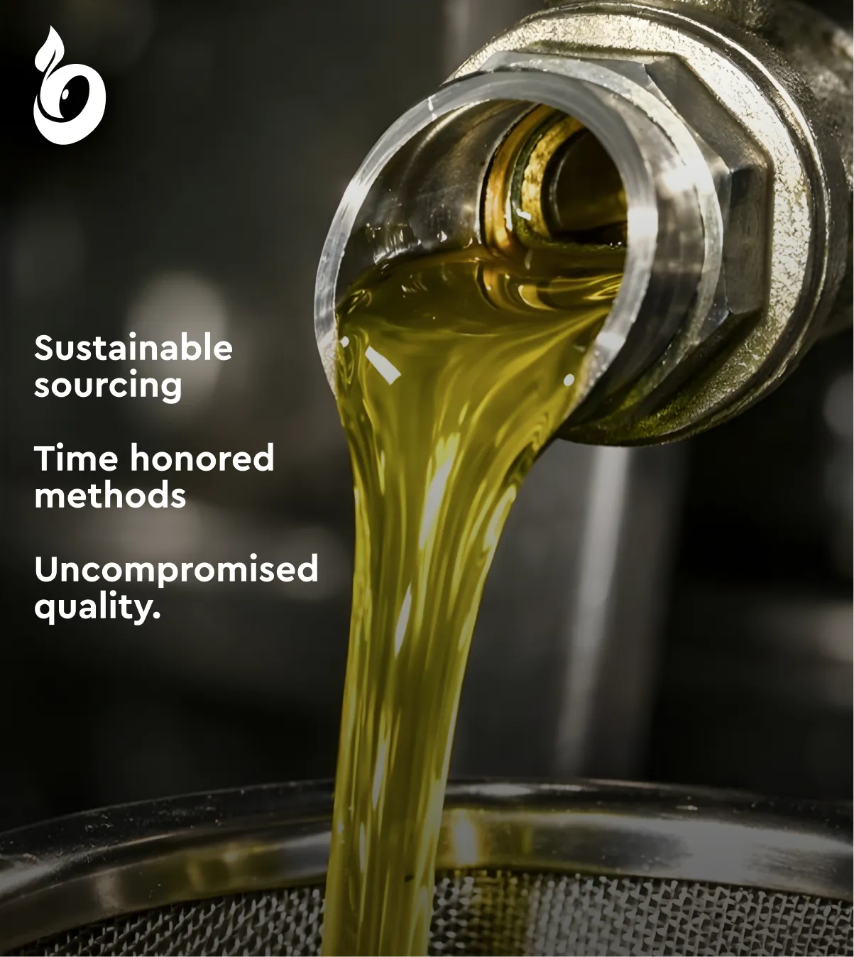
Confetti built the Sprout and Press strategy around its mission to transform the way people experience food. The brand stands for clean label nutrition, ethical sourcing and a heartfelt connection to nature. The long term vision positions Sprout and Press as a pioneering force in the wellness and food space, recognised for its authenticity and transparency. With a focus on community centric messaging, sustainable practices and heritage driven innovation, the brand aims to lead a movement back to mindful nourishment. Every product and communication reinforces one principle: real food should enrich both people and the planet.
Sprout and Press speaks with the calm confidence of a brand rooted in the earth. The tone is sincere, reassuring and always human. It avoids exaggeration and instead focuses on purity, care and connection. The language celebrates the journey of each ingredient from soil to bottle, highlighting sustainable sourcing, traditional cold pressing and the intention behind every product. It brings a sense of ritual and warmth, reminding users that nourishment is more than consumption; it is a celebration of what nature offers.
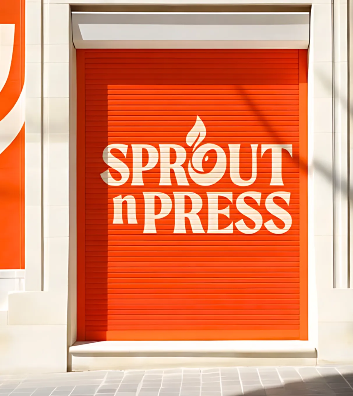
Confetti created a visual system that mirrors the essence of Sprout and Press: warm, organic and deeply rooted in nature. At the heart of the logo is a stylised sprouting seed formed within the O, symbolising growth, vitality and natural beginnings. The upward motion of the sprout represents life, nourishment and the philosophy of food that heals from within.
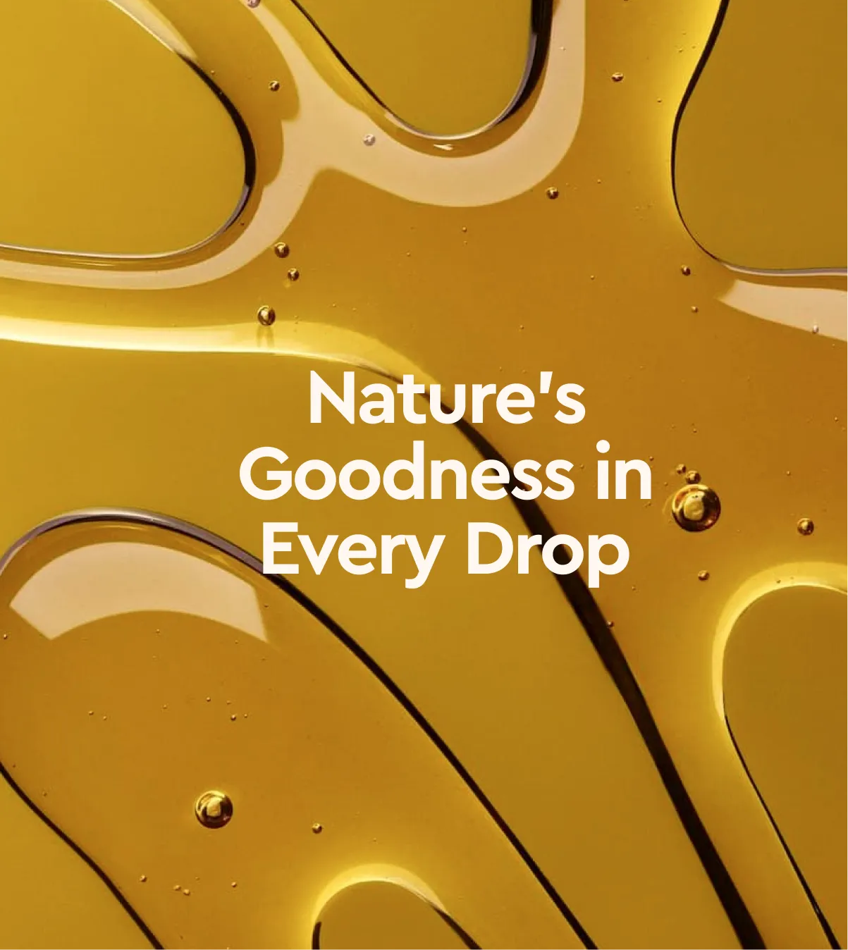
The colour palette blends earthy browns, fiery oranges, olive greens and warm neutrals, creating a grounded yet premium look. The chosen typefaces, Cera Pro Bold and Cormorant Bold, add a sense of heritage and elegance while remaining clean and readable across packaging and digital touchpoints. The packaging system reflects the spirit of the brand. It feels artisanal yet refined, modern yet rooted in tradition. Every bottle becomes a vessel that carries not just oil, but a story of purity, craft and conscious nourishment.


.svg)
.webp)

.svg)
.svg)
.webp)
.webp)


.webp)


.svg)