Problem
The challenge is to rebrand Palak Notes as Miduty, establishing a scientific approach and commanding trust as a well-regarded brand. Transitioning seamlessly, the goal is to resonate with the target audience, establishing Miduty as a trusted authority in self-care.
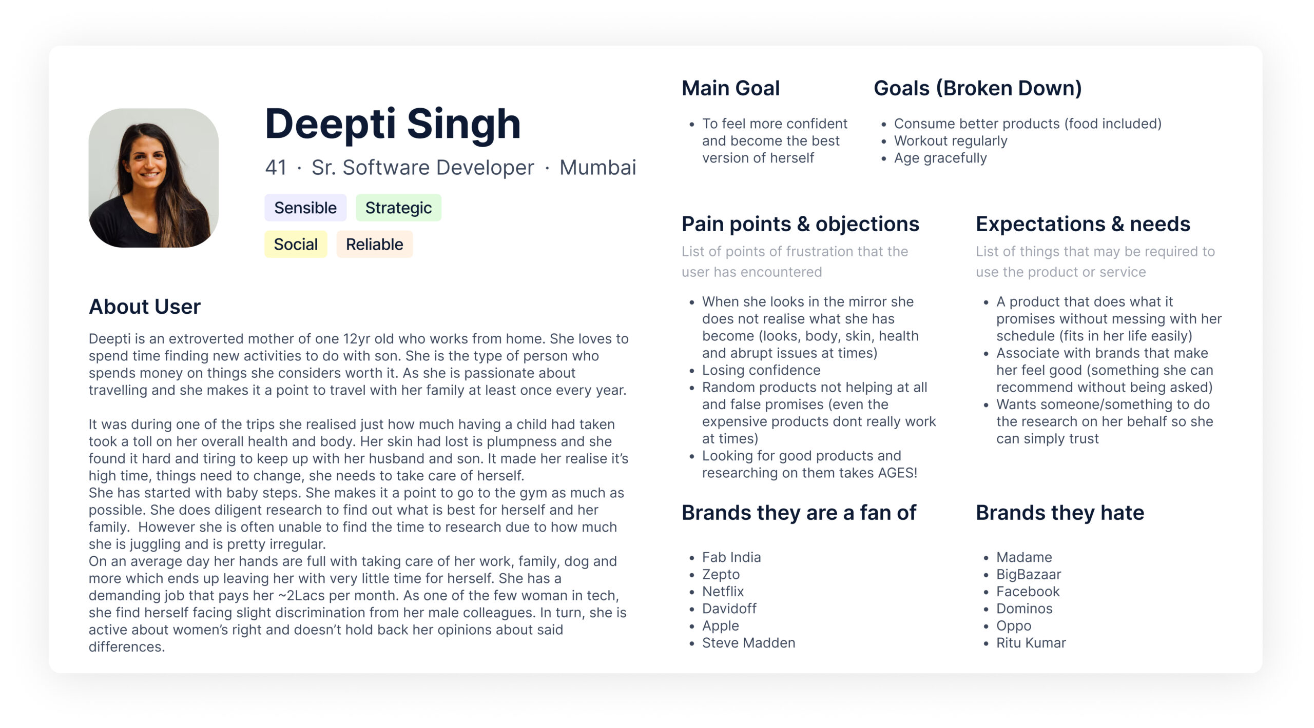
User personal
Positioning Statement
For quality-conscious women seeking confidence and holistic well-being, Miduty is a trusted companion on their journey of self-love, growth, and healing.
By harnessing the power of science and offering transparent, well-researched supplements, Miduty empowers women to embrace their best selves, making self-care a seamless part of their busy lives.

Brand Personality
Brand archetype: The Caregiver
This brand concept centers around Miduty, the Caregiver archetype, with a focus on scientific understanding, education, and empowerment. Miduty strives to create a sense of community and growth for quality-conscious women. By providing well-researched self-care products, Miduty aims to instill confidence and support women in their journey of self-love, healing, and transformation. With a transparent and trustworthy approach, Miduty becomes a reliable companion, helping women navigate their busy lives while prioritizing their well-being and becoming the best version of themselves.

Brand look and feel :
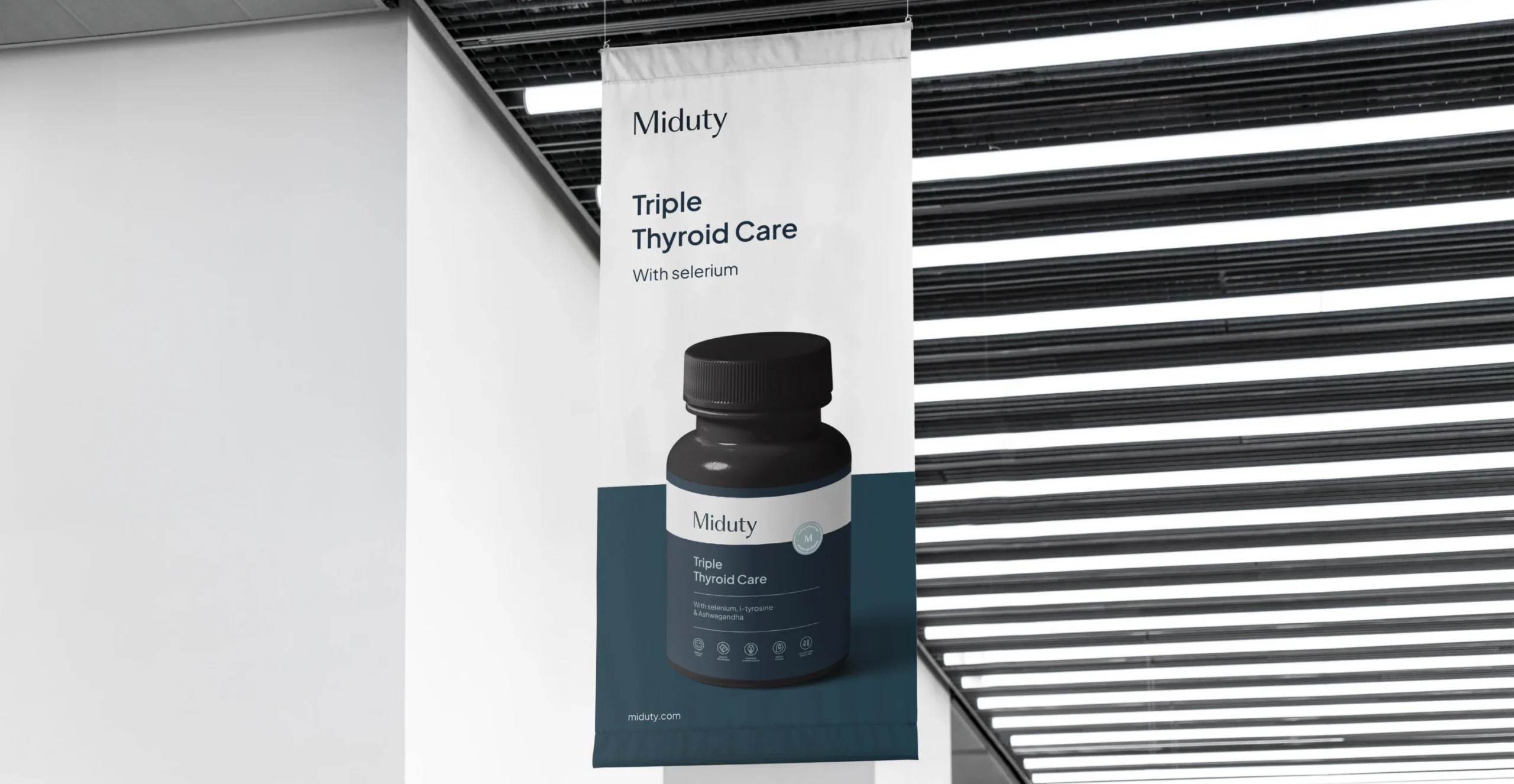
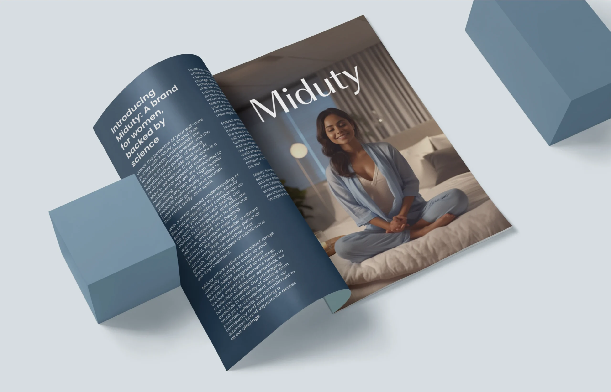
Miduty’s brand look and feel exudes a harmonious blend of sophistication, tranquility, and professionalism. The design aesthetics embody a clean and modern approach, instilling a sense of trust and reliability. The visual elements convey a serious and scientific demeanor, while also evoking a peaceful and subtle ambiance. Miduty’s focus on transparency, positivity, and value is reflected in its visual identity. With a sleek and contemporary style, Miduty appeals to quality-conscious women seeking self-care solutions that are grounded in expertise and a commitment to their overall well-being.

Brand Values

Moodboard
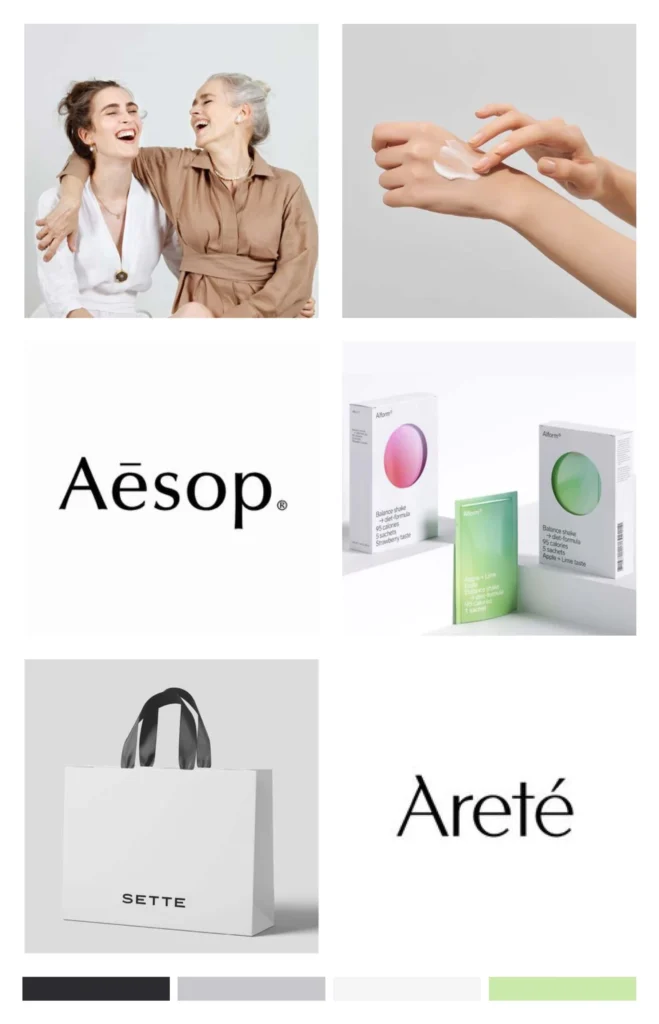
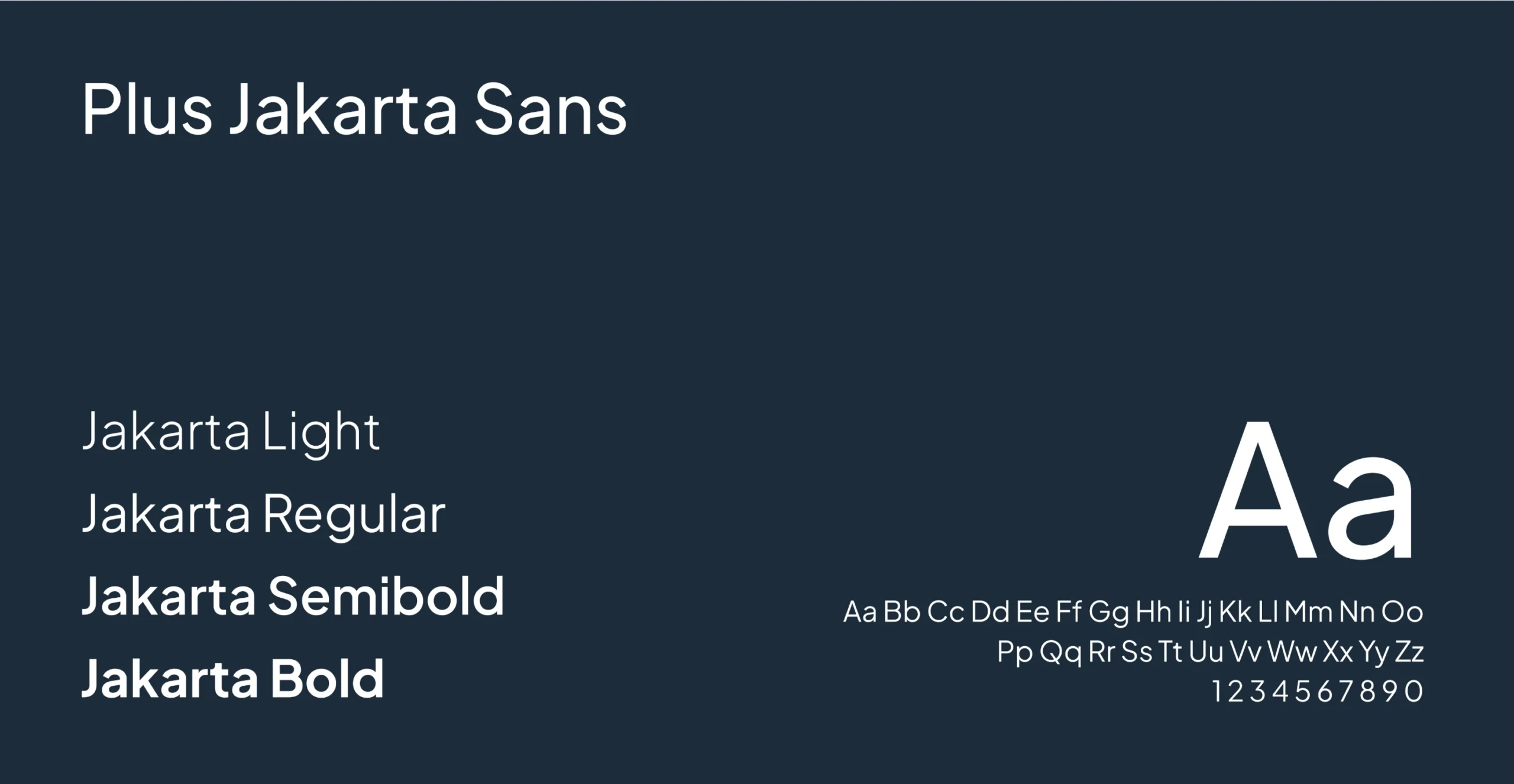
The Miduty moodboard exudes a clean, scientific vibe with a touch of timeless elegance. It combines serious and sophisticated elements while maintaining an energetic feel. The logo features a mid-contrast serif typeface, adding a touch of refinement, while clean san-serif typefaces ensure overall readability and seamless pairing. The visuals embody Miduty’s commitment to transparency, reliability, and the well-being of quality-conscious women.
The Logo

Idea behind the logo
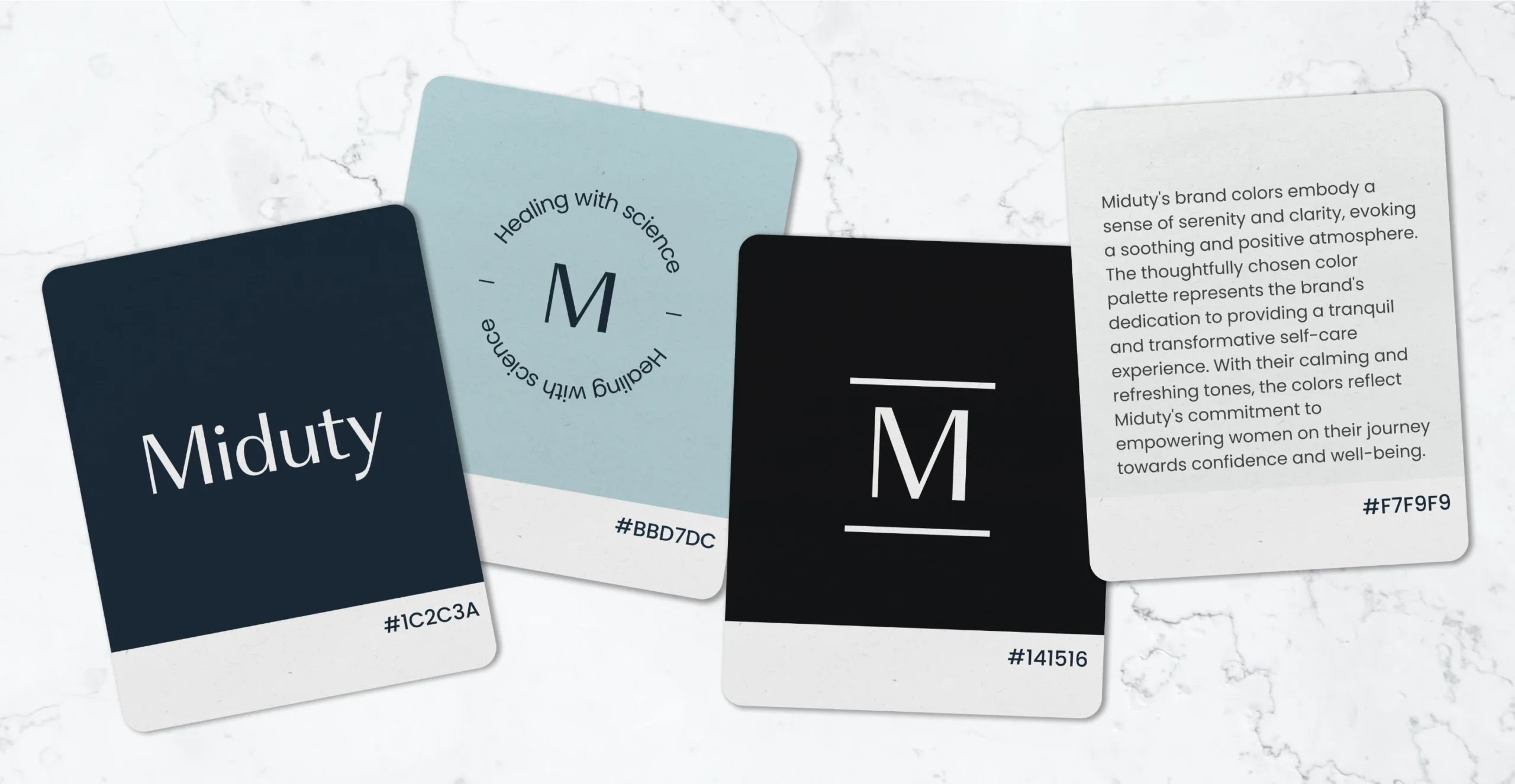
The logo of Miduty encapsulates the essence of the brand with simplicity and sophistication. It combines elements that symbolize scientific understanding, empowerment, and growth. Through slight personalizations to the san-serif typefaces, the logo adds a touch of uniqueness while maintaining a clean and modern aesthetic. It represents Miduty’s commitment to transparency, reliability, and the holistic well-being of quality-conscious women.
Typeface
Brand in use
