
Problem
To develop a vibrant and playful branding and packaging strategy for Coasters that resonates with their target audience and sets them apart from competitors.
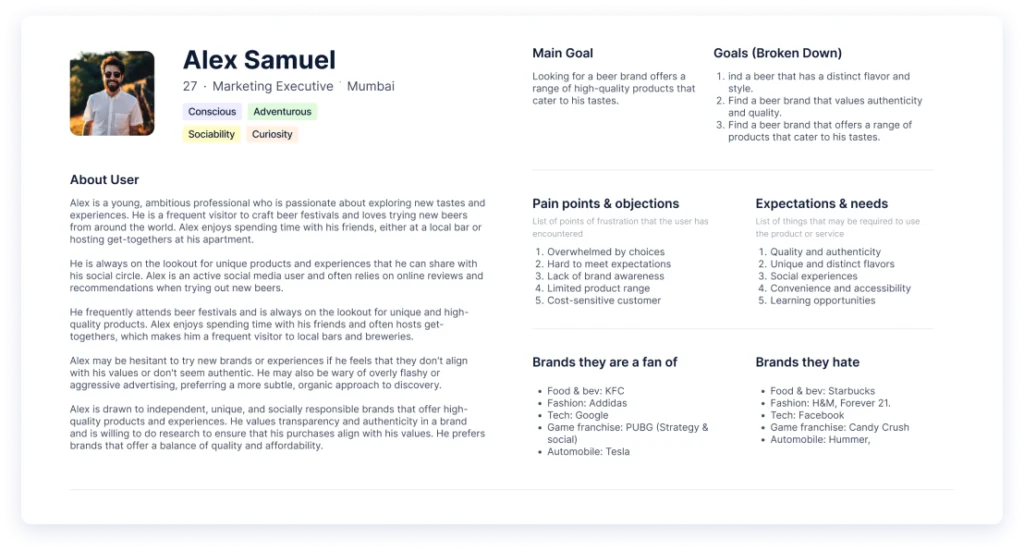
User Persona
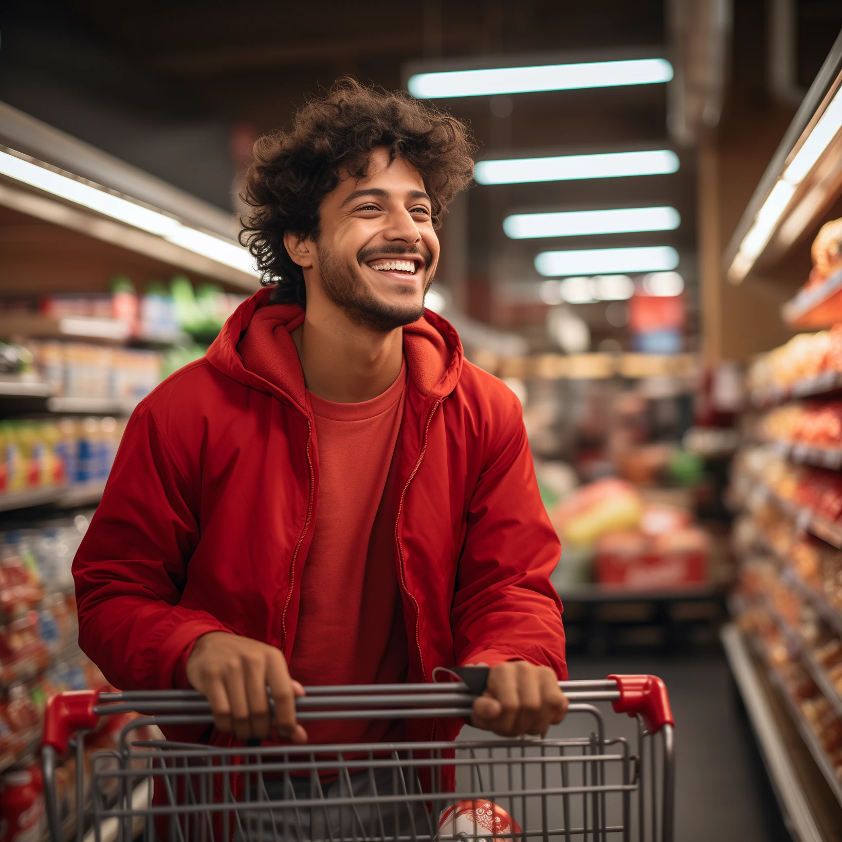
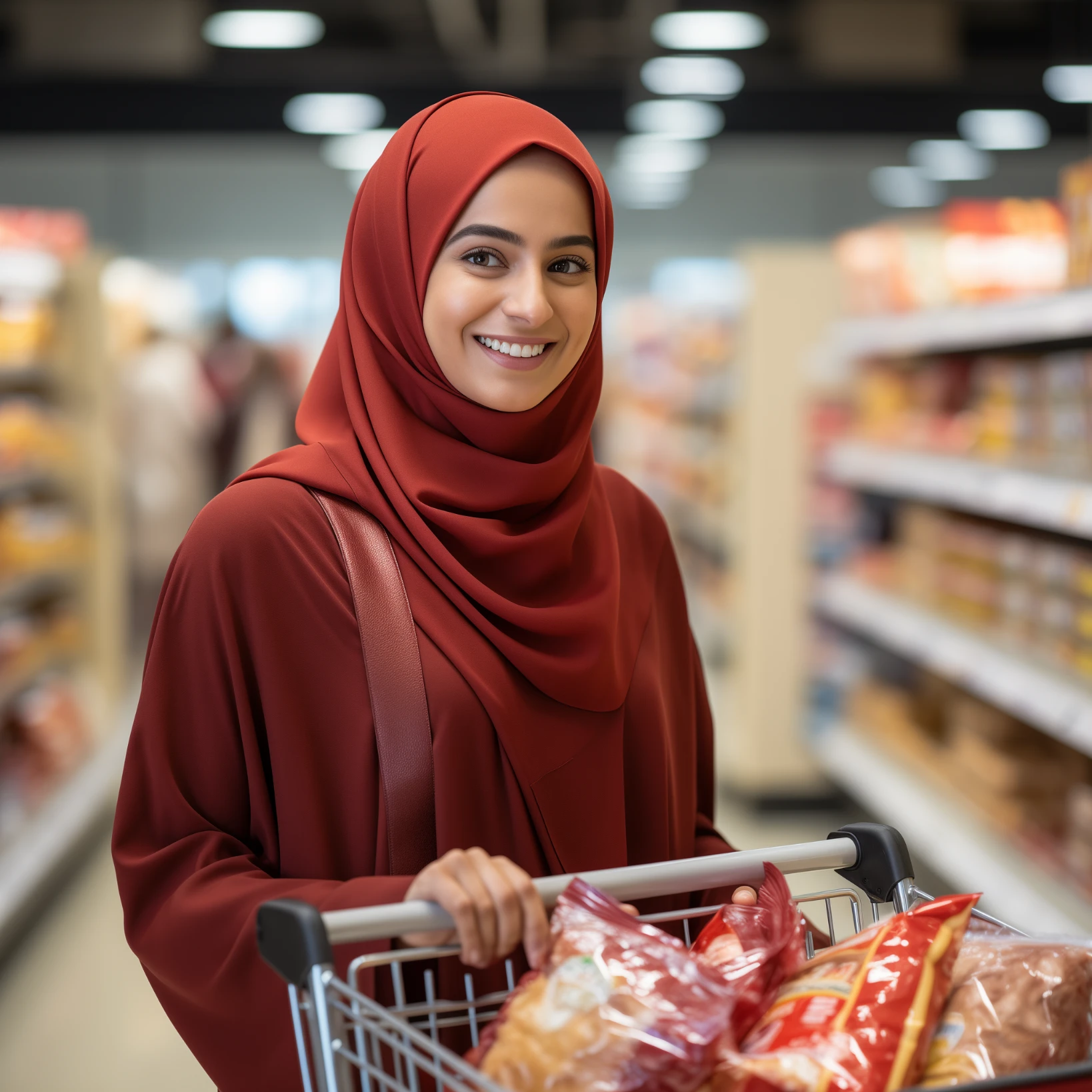
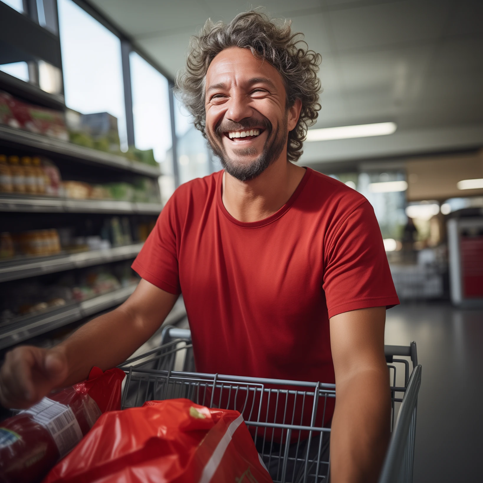
The target Users for Coasters Craft Beer is made up of people between the ages of 21 and 35 who are enthusiastic about discovering new flavours and sensations. These individuals are youthful and daring, looking for distinctive and excellent goods that represent their values and particular style.
Positioning Statement
Coasters is a brand that offers a variety of distinctive and delectable beers that are expertly created using locally sourced, organic ingredients for craft beer fans who value quality, authenticity, and sustainability. For beer lovers looking for a premium, genuine, and socially conscious experience, Coasters is the go-to option thanks to its dedication to social responsibility and community involvement.
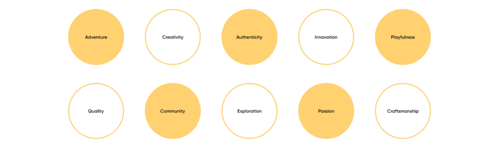
Brand Personality
Brand archetype : Explorer
As an explorer brand archetype, Coasters represents a spirit of exploration and a readiness to take chances in search of novel and thrilling experiences.
Beer fans who are curious and look for uncommon and genuine experiences are drawn to Coasters. The company’s emphasis on using organic, locally produced products and dedication to social responsibility and community involvement support its positioning as an explorer brand that prioritizes sustainability and moral behaviour.
Whether it’s a daring new beer flavour or an unusual local event, Coasters encourages its patrons to venture beyond their comfort zones.
Brand look and feel :
With its lively, playful, and upbeat brand, Coasters brings levity and playfulness to the craft beer experience. Bright colours, humorous visuals, and catchy taglines are used by the company to make its products seem exciting and engaging. Events and promotions at Coasters are intended to be participatory and interesting, enticing patrons to try new things and socialise with like-minded beer fans.

Brand Values
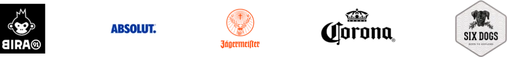
Competitive Analysis
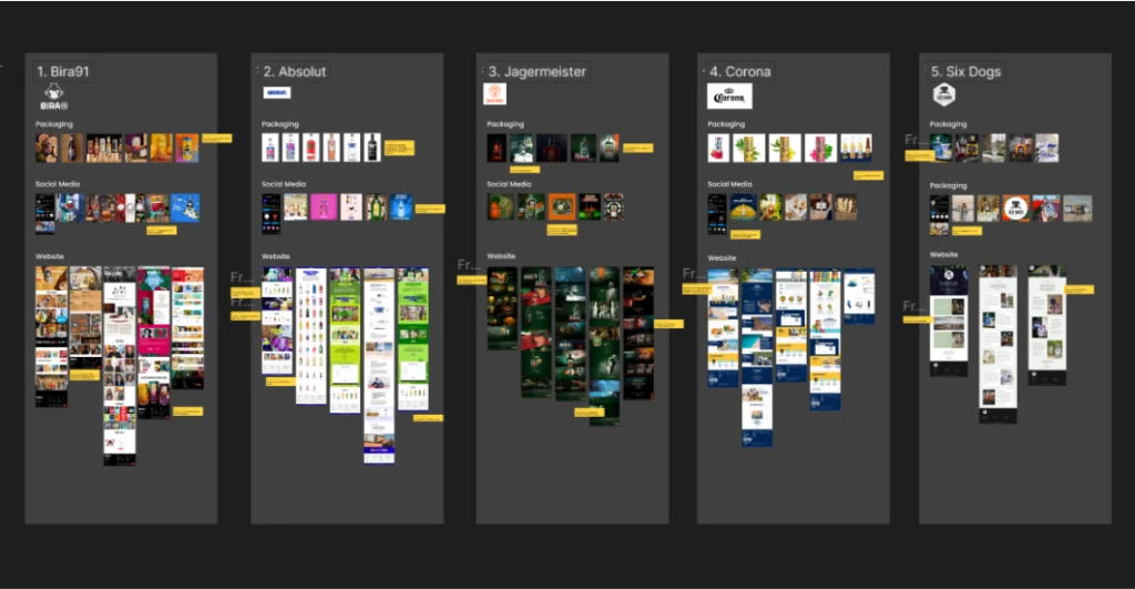
By analyzing the competition in the market, we were able to have a deeper understanding of the industry and the style in which these competitors appealed to the customers. This allowed us to come to an understanding to visualize how the brand should appeal. The study was not only among companies that made craft beer but on other alcohol brands too.
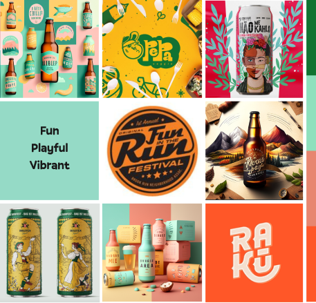
Moodboard
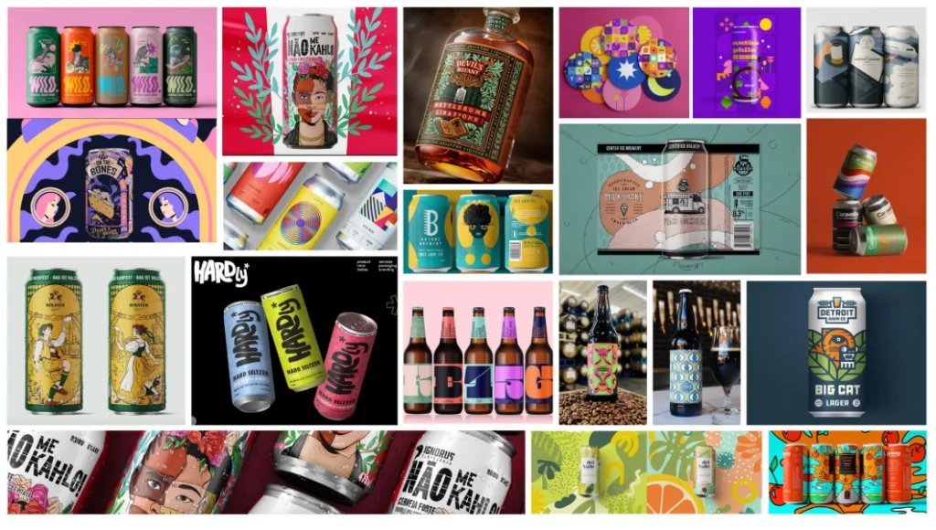
A moodboard was made to graphically represent how the company’s character, core beliefs, and aesthetic preferences would be visualized. It includes illustrations, colour schemes, typography, and textures that inspire a sense of quality, adventure, and playfulness.
Ideation

After mood boards were done, the ideas were conceptualized as sketches from which the ones that fits better with the brand was selected and discussed to come to a final concept.
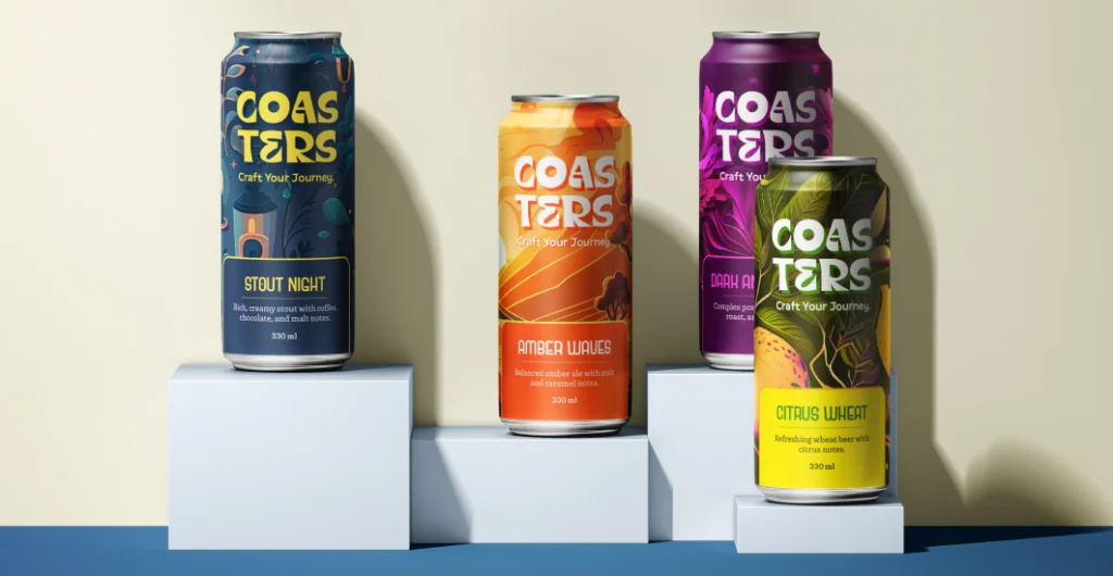
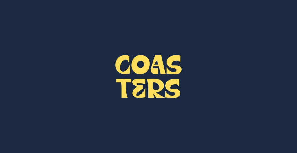
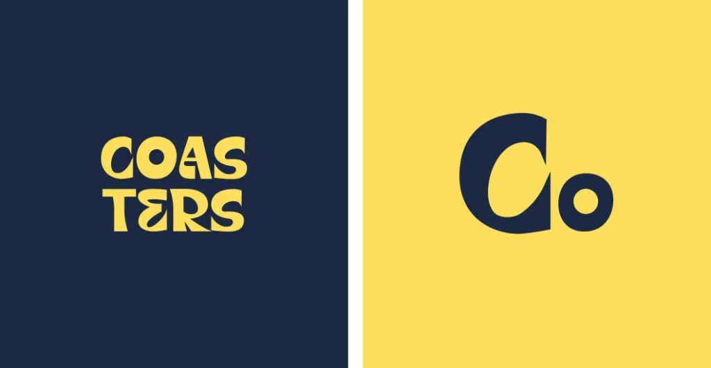
The Logo
Different Lockups
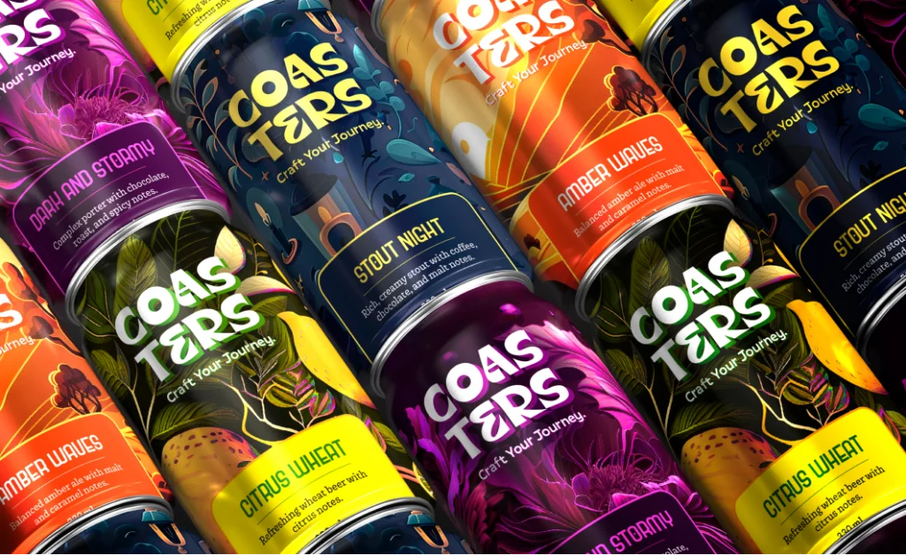
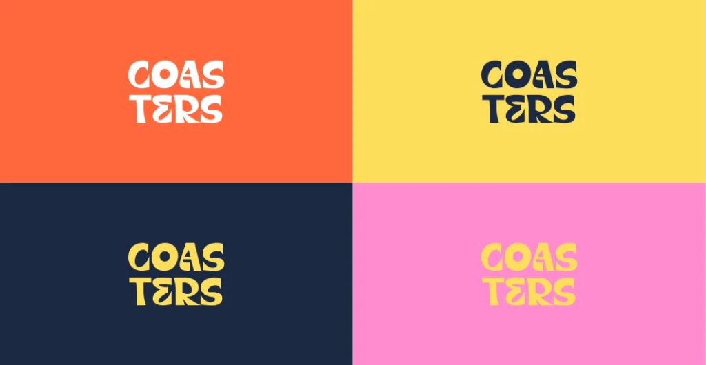
Colour combinations
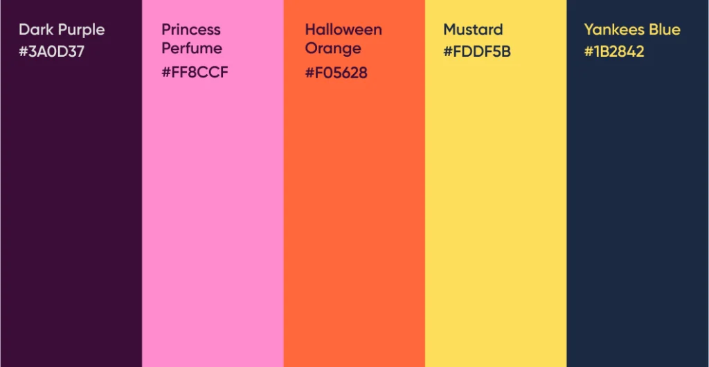
Colour pallete
Typeface
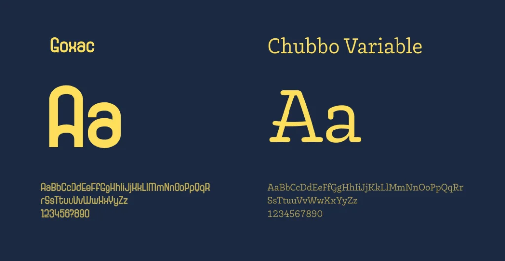
The primary typeface is Goxac, it is used for the main headings and the secondary typeface is Chubbo Variable, it is used for the body text.
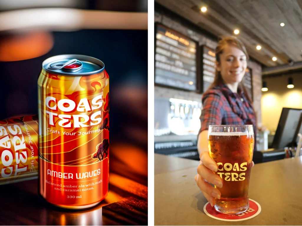
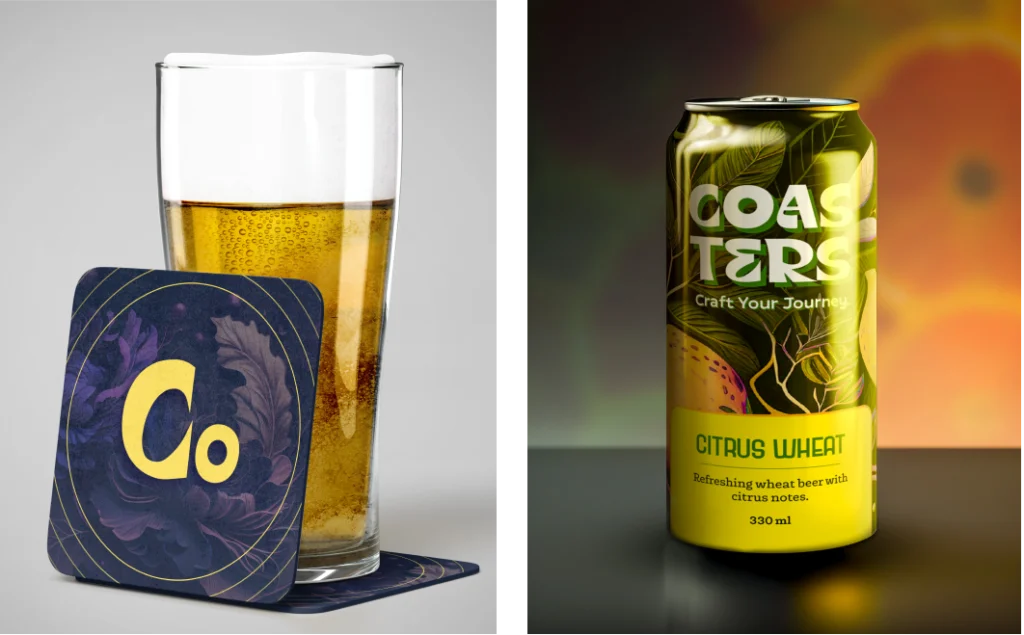
Brand in use