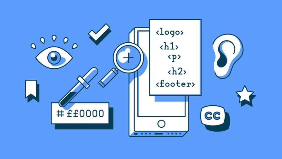
No matter what stakeholders or other product influencers tell us, it is our responsibility as designers to speak up for the end user. This implies that every time we log on to our computers, we must leave our prejudices outside, set aside our relationships with friends and family, and concentrate entirely on the project at hand and the vast, varied audience we’re releasing it to.
We must constantly consider design accessibility. When designing for everyone, one must occasionally stand up for people with disabilities and refuse to accept a sexier design or a client’s vision for the appearance and feel of their product.
Making navigation easy to use and including adequate onboarding to educate users about features they may not be familiar with are both crucial when designing for older individuals and shall play a huge role in design accessibility.
While younger users who have grown up surrounded by technology might be eager to jump right in and begin exploring a new app or user interface, many older adults are reluctant to do the same.
Certain physiological and cognitive changes occur as humans age and are essentially inevitable. Although many people over the age of sixty have spent practically their entire adult lives around technology, these physiological and cognitive changes must be taken into account.
However, as the population ages, more “seniors” will be accustomed to technology and will only require adjustments for genuine physiologic and cognitive changes. For interface design for older folks to be successful, UX and UI designers must be aware of these changes and think more about design accessibility.
Primary Age-related difficulties for Seniors

Vision
It becomes challenging for many older folks to read web pages and apps that contain small fonts or low-contrast features. One in four people over the age of 80 and 37 million people over the age of 50 suffer from visual loss. Diabetes, macular degeneration, or age-related cataracts are the usual causes of severe vision loss. Reduced contrast sensitivity, diminished color perception, and decreased near-focus are the main problems mentioned.
Physical aptitude
It can eventually become difficult to click on smart targets with a mouse due to decreased dexterity and fine motor skills. Users’ cognitive information processing slows down as they age. The identical task is typically completed more slowly than before.
Hearing
A person may eventually begin to have trouble distinguishing between different sounds and hearing high-pitched sounds. Receiving and interpreting clear auditory input becomes difficult, especially when background music is playing at the same time.
Mental capacity
As adults reach their 60s and 70s, their thinking and learning processes usually begin to slow down. Reduced short-term memory and problems with concentration make it harder or impossible to do internet tasks like navigating web pages.
Design Accessibility Considerations for Older Adults

Motivation
Users who are older might not regard technology as a normal part of their lives. The majority of them only see it as a tool; they need to understand the advantages of using an app or website. Gamification attracts users in younger age groups, although seniors anticipate value from the software.
They want easier lives through the experience of technology. That is one of the factors contributing to the popularity of medical apps among older adults.
Devices
In general, older folks favor tablets over smartphones. Only 18 percent of older persons own smartphones, while 27 percent of them own tablets or e-readers. Larger screen sizes make navigation and reading easier.
Trust and Safety
Seniors are far more vigilant about security and data privacy than younger users. It can be more difficult to win their trust, thus it’s critical to make any registration procedure as straightforward and transparent as possible and just request the most necessary details.
On the other hand, senior users may unintentionally and openly share information. Any program they use should prevent them from unintentionally sharing critical information.
Best Practices
-
Introduce product features gradually over time rather than all at once since short-term memory and episodic memory are particularly susceptible.
-
One attention at a time will produce greater outcomes than breaking up screens into multiple actions.
-
Provide detailed feedback on execution and progress
-
Set up alerts and reminders to serve as prompts for repetitive behaviors.
-
Put subtitles on any audio or video.
-
Make it apparent how to return to the main page or use breadcrumbs
-
No graphics or photos with text layered on top
-
To reduce distraction, simple uncomplicated backdrops are preferable.
-
Be unambiguous; state the product’s objective in detail.
Do Not Assume
-
Question what you previously understood about user interface design.
-
Older Adults do not comprehend features like scrolling or search capabilities.
-
The older adults do not understand familiar acronyms or abbreviations (especially those with dementia)
-
Long-form language and in-depth content are acceptable for older adults as long as they don’t have to divide their focus because they have significantly longer attention spans than younger people.
-
Less comprehensible are icons and symbols, particularly the hamburger menu. Always use language alongside icons and symbols when using them.
Fonts

Illustration by René Bieder
-
If it’s possible, let individuals change the text size themselves.
-
The minimum font size should be 16 px
-
The finest typefaces to use are sans serifs.
-
Some more: Helvetica, Roboto, Arial, Futura, Avant-Garde, and Verdana.
-
Do not combine different typefaces.
-
Do not use condensed typefaces.
-
Make a clear hierarchy using type weight (bold v regular).
Colors

-
Don’t use blue for crucial interface elements.
-
Avoid using color to communicate a message.
-
For people who are color blind, red and green are the most difficult to distinguish.
-
The best is high contrast, especially when it comes to color value (navy & light blue or black & white).
-
To ensure your designs are still readable, use online visual impairment simulators and convert them to grayscale.
Selecting a device

-
Avoid using gadgets with small screens; older folks are the main tablet users.
-
Touch interfaces improve senior performance (finger tapping declines later than some other motor skills).
Every generation ultimately runs the risk of encountering the same challenges until technology can be completely tailored and we can think of design accessibility as the major driving force. The mass-produced, universal user experiences must be abandoned.
Design professionals will be able to adjust user experiences to meet the needs and preferences of certain people thanks to personalization. Each of us will require more accessible technology than ever that can fulfill our needs and evolve with us as we become older and our physical and cognitive capacities change.


