People often think that design sprung into existence during the Industrial Revolution but did you know that it came into the palms of existence when prehistoric humans created art and design by firelight? We didn’t know either.
Stones were incised with designs about 15,000 years ago. It was like throwing stones into the air that landed in the water, leaving many ripples behind. The same ripples that, in some way, gave way to modern design.
Essentially, the real purpose of design hasn’t changed which is to communicate important ideas and messages. In this article, we’re going to take a look at what visual hierarchy means and the 6 principles of Visual Hierarchy you must know.
What is Visual Hierarchy
Well, it’s a daily term that designers use and is one of the design principles that explain how you should arrange elements in the design. It’s helpful especially to designers and developers because it lays out a logical mannerism to each element. This makes your design to be easily understood.
The reason why visual hierarchy is important is that it’s key in information architecture, another designer term that you shouldn’t be afraid of. It sets up a clear path for the user’s attention by organizing elements from most important to least.
With a good visual hierarchy, the user’s eye is automatically directed to the order of viewing elements inside a design. They don’t have to look for a map or guidance on how to consume design.
Visual Hierarchy Principles
Every element of visual design has a characteristic that defines its importance and the visual weight associated with it. A general rule of visual hierarchy is that the element with the most visual weight grabs the most user attention. Let’s see what are the principles of visual hierarchy.
Size

People notice the biggest objects first, even we do. This is why in the structure of a webpage H1 is the largest, H2 smaller than that, and H3, H4 smallest. According to Fitt’s Law, large interactions are easier to digest because users don’t have to spend a lot of time and energy from their attention economy.

As someone once said, bigger is better, large elements of your design are what’s most noticeable and they carry the strongest message.
Color and Contrast

The best trick up a designer’s sleeve is the color palettes they use in a design element. Bold and contrasting colors incite attention and emphasize a point. CTA buttons, error messages, prompts, and pop-ups stand out if you choose the right color.

Duo-tones have been trending and increasing in popularity for a while because of this. The color principle of visual hierarchy can help you create rhythm and balance in your creations.

However, if you end up using too many, it could make your work appear unorganized and cause cognitive overload.
Alignment

Alignment is fundamental when designing a web page because it creates order and gives you hints about where everything should be. Good alignment can help elements feel associated with each other and content that is similar also benefits from alignment.
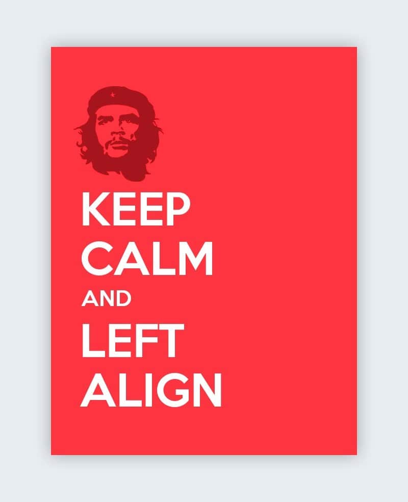
If we imagine a table of data from Microsoft Excel and remove the borders, our brain can still associate the columns and rows because of the alignment present in the data.
Proximity

Alignment is super, but proximity is super duper. Although they may seem similar, according to the principle of proximity if you place elements close to each other it can compel the reader to think that they are related.
In doing so, many genius designers leverage the power of a good headline and attach other text to it. This results in an increase of attention toward the later attached elements.
Whitespace
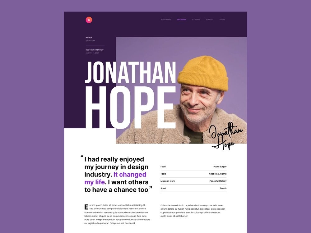
Rooms with more space feel nicer, right? That’s what whitespace does for the visual hierarchy in the design. More room to breathe or more space around an element will make it stand out, resulting in more attraction toward the element. This is probably why people often say to use good whitespace around your CTAs.
Texture and Style

Textures and styles are different than the other visual hierarchy principles because they focus on the decorative property of your design. Regardless of textures being usually associated with aesthetics, they affect the visual hierarchy of your design. They can make or break it.
If you add texture the right way, then you can draw your user’s attention to where you place that texture.
