%201.webp)
02
AI Snaps
.svg)
.svg)
01
Our Work

03
About Us
05
Contact Us
06
Client Success

07
Blogs
08
Careers
Book A Call


Need Help In Building Your Brand?
Click the button below & book a call with our founder directly.

Rishabh Jain
Managing Director
The cost of bad packaging design goes far beyond just looking unprofessional. It quietly drains sales, inflates operational expenses, and erodes the brand trust you've worked hard to build. Most brands don't see it until the damage is already done.
This blog covers five ways poor packaging design costs you money: lost sales, brand equity erosion, supply chain overheads, customer lifetime value loss, and the steep price of fixing it all with a redesign.
Bad packaging design isn’t just about ugly visuals. It’s a structural failure that hurts your brand, and your operations.
Bad packaging design happens when form defeats function, or function ignores psychology.
Let’s break it down:
If a shopper can't identify your product category, brand name, and primary benefit within 3 seconds, your design has already failed.
Cluttered layouts, competing focal points, and misaligned information hierarchy are the most common structural failures.
The consumer's eye doesn't know where to land. Without a clear reading order, attention moves on to the product next to yours.
Colour communicates before words do. A premium product packaged in muddy, low-contrast, or off-brand colours reads as cheap, regardless of what's inside.
Brand inconsistency across SKUs is equally damaging.
When your shampoo, conditioner, and body wash look like they come from three different companies, you lose the cumulative shelf presence that boost brand recognition and repeat purchase.
Decorative fonts on ingredient lists. Reversed-out white type at 6pt. Low-contrast text on busy backgrounds.
These aren't just aesthetic complaints. In regulated categories like food, pharma, personal care typography errors create compliance risk.
In all categories, they reduce the speed at which a shopper can extract the information they need. Slow information = lost sales.
In e-commerce and quick commerce, your packaging is a 200×200-pixel thumbnail competing for attention on a screen.
Designs that work beautifully in-store often fail completely online. Intricate illustration, dark backgrounds, and small logos disappear at thumbnail scale. The shopper sees an unclear image and clicks past.
Material choice, box dimensions, and structural integrity are design decisions.
A box that's too large for its product costs more to ship. A material that offers poor cushioning leads to transit damage.
A design that ignores recyclability signals the wrong values to a conscious consumer.
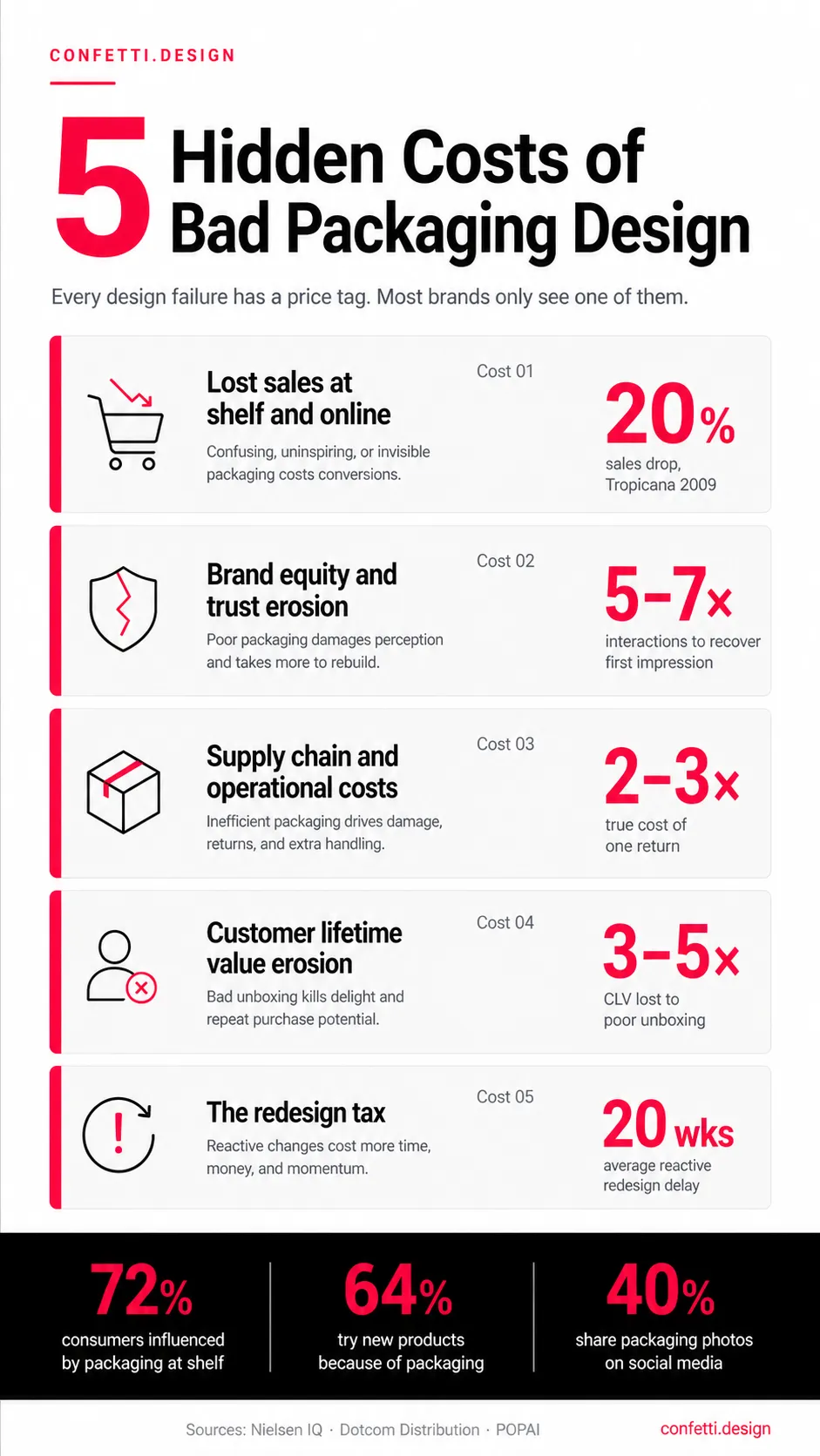
Talking of the cost of bad packaging design, first comes the financial impact.
📉Lost First Time/ Impulse Purchases
Research shows that 72% of U.S. consumers say packaging design influences their purchasing decisions
Bad visual hierarchy means your product blends into the background. Weak shelf presence sends customers to competitors.
In e-commerce, the damage is even more direct. A grainy product image with vague packaging, means a user will scroll past.
For a brand without mass advertising budgets, packaging is the primary sales tool. If the design doesn't create instinctive appeal, that sale goes elsewhere.
This is especially true for launches. A new product has no purchase history to lean on. Design does all the heavy lifting.
📉The 3-Second Shelf Rule
Eye-tracking studies consistently show that on retail shelves, your packaging has roughly 2–3 seconds to earn a glance, and maybe another 5 to convert that glance into a pick-up.
In that window, your packaging must: register the brand, communicate the product type, and signal the right price point and quality level, without the consumer reading a single word.
Designs that fail this test aren't just underperforming. They're functionally invisible.
📉Refund Rates and Negative Reviews
Poor packaging design also actively generates costs through returns and review damage.
When packaging overpromises what's inside (through misleading imagery, size illusions, or exaggerated claims), the consumer who buys once won't buy again.
Worse, they often return the product and leave a review.
One-star reviews citing "not as advertised" or "looked different online" are, in most cases, packaging design failures. Each one costs the brand a return, a lost customer, and a public credibility dent.
📉E-Commerce and the Digital Shelf Penalty
On Amazon and DTC platforms, conversion rates vary substantially based on primary image quality.
Brands that test and optimise their thumbnail design using clear brand logos, strong contrast, and minimal text usually see meaningful conversion lifts versus those that simply photograph their existing retail packaging.
The mistake most brands make is assuming a packaging design that works in-store will translate online. It almost never does without deliberate optimisation.
📉Lost Repeat Purchases
Here’s the long bleed. A customer who receives a damaged box, or struggles to open your package, or sees cheap materials that contradict your brand promise, they don’t complain. They just don’t come back.
Customers who have a thoughtful packaging experience are 50% more likely to repurchase within 90 days. Flip that around. Bad packaging slashes your customer lifetime value by half.
EXAMPLE: The Tropicana Case
In 2009, Tropicana redesigned its Pure Premium orange juice packaging, spending millions on a sleek modern look. Sales dropped 20% in two months.
The company lost nearly $30 million in revenue and was forced to revert to the original design.
The sales impact of bad packaging is visible. The brand equity impact is slower and harder to track. This makes it easier to ignore, and far more damaging over time.
👎Bad Unboxing Erodes Repeat Purchase
The first physical interaction a consumer has with your brand is the moment they open their purchase.
A damaged product, excessive void fill, collapsed corners, or packaging that's genuinely difficult to open. They not only disappoint but actively erode the likelihood of a second purchase.
The average customer lifetime value (CLV) for a mid-market consumer brand is typically 3–5x the first transaction value. Bad packaging that causes a single negative experience can eliminate that multiplier entirely.
👎Social Media Amplification of Bad Packaging
In the age of unboxing videos, bad packaging gets broadcast. A boring or frustrating unboxing experience isn’t just a lost marketing opportunity, it’s negative word-of-mouth you can’t track.
One negative video with 10,000 views erodes trust across an entire category segment. There’s no PR fix for this.
Unboxing frustration threads on Reddit, "packaging shame" posts, and damage-on-arrival photos spread far faster than positive reviews.
👎Lost CLV vs Design Investment
Customer lifetime value (LTV) is the total profit a customer generates over their relationship with your brand. Good packaging drives LTV up. Bad packaging craters it.
If your average CLV is ₹15,000 and bad packaging causes even a 10% increase in churn from first-time buyers, you're losing ₹1,500 per lost customer.
At 500 customers per month, that's ₹7.5 lakh in monthly CLV erosion, far more than the cost of a packaging redesign.
This is the calculation most brands never make. They compare the redesign cost against the design fee. The real comparison is against the revenue the bad design is consistently destroying.
👎Packaging and Brand Trust
Consumer psychology research consistently shows that negative first impressions require approximately 5–7 positive interactions to overcome.
If your packaging creates a weak or negative first impression, every subsequent touchpoint carries the weight of reversing that initial signal. Strong packaging removes that burden entirely.
At Confetti, we've seen brands turn this around. A clear packaging system, consistent visual hierarchy, and material choices that match your brand promise are equity-building assets.
Read our deep dive on how packaging directly impacts brand valuation and equity to understand the financial mechanics.
Beyond the sales floor and the consumer's hands, bad packaging creates a layer of operational costs that most brands don't fully account for until they're already paying them.
⚠️Product Damage in Transit and Return Costs
Inadequate structural design leads to crushed, broken, or contaminated products and the cost of each damaged unit is rarely just the product value.
For e-commerce brands, the true cost of a return includes: return shipping, processing labour, product inspection, repackaging, restocking or write-off, and the customer service interaction.
Packaging that prevents transit damage is a cost reduction tool.
⚠️Inefficient Dimensions and DIM Weight Charges
Carriers charge by dimensional weight (DIM), when the package volume exceeds a threshold.
Poorly sized packaging like oversized boxes, excessive void fill, non-standard dimensions adds per-shipment charges that compound at scale.
Example: For a brand shipping 10,000 units per month, an avoidable ₹30 DIM surcharge per package adds ₹3 lakh in monthly freight costs. Annually, that's ₹36 lakh.
Getting packaging dimensions right is a design decision with a measurable financial return.
⚠️Regulatory Non-Compliance Fines
Missing mandatory label information, incorrect font sizes on nutrition panels, absent allergen warnings, or non-compliant safety symbols trigger consequences that range from retailer rejection to regulatory action.
In India, FSSAI requires specific label elements on all packaged food products. Non-compliance can result in product seizure, recalls, and fines.
In regulated categories like cosmetics and pharma, compliance failures at the design stage can delay market entry entirely, costing months of revenue.
⚠️Sustainability Penalties
Packaging with excess plastic, non-recyclable materials, or no clear sustainability signal is increasingly triggering consequences.
It can cause consumer rejection, retailer delisting (particularly in premium and natural channels), and regulatory pressure under EPR frameworks now being enforced across markets including India.
⚠️Warehouse and Labour Inefficiency.
Poor packaging slows down your entire operation.
Incorrect packaging design causes delays, detention fees, and bottlenecks at loading docks. If a box adds 3–5 seconds per unit on a high-volume line, the labour cost quickly outweighs any material savings.
Overpackaging like using larger boxes than necessary reduces stacking efficiency, limits pallet density, and increases handling time.
Operators spend more time searching for the right packaging size, forming boxes manually, and correcting errors. When packaging isn't automation-ready, your throughput drops and your labor costs rise.
Fixing bad packaging after launch is always more expensive than getting it right the first time.
Here’s why: you don’t just pay for new artwork. You pay for the damage already done, lost sales, operational chaos, and a hole in your brand equity, plus the cost of the fix itself.
The cost of a professional packaging redesign involves more than design fees. Here's a realistic breakdown:
If the design problem is severe enough to require urgent replacement, you face a write-off decision on existing printed stock.
For brands carrying 3–6 months of packaging inventory which is standard when ordering at volume from printers, this is a direct loss.
Add the cost of emergency print production on a compressed timeline, and the financial impact of a reactive redesign can be 2–3x a proactive one.
When a SKU undergoes a significant design change, many retailers treat it as a new product listing.
That means slotting fees, updated planogram submissions, potential de-listing during transition, and shelf reset costs that brands absorb.
For brands selling through organised retail like supermarkets, modern trade, pharmacies, this is a real and often underestimated cost category.
A well-managed packaging redesign runs 8–20 weeks from brief to print-ready artwork. Complex projects, regulatory review requirements, and multiple stakeholder approval cycles extend that timeline.
During those weeks, you continue selling with packaging that is actively costing you sales. The delay itself has a revenue value that almost no one calculates when approving a redesign budget.
Getting packaging right at launch is not a luxury. It is the lowest-cost path.
Here are real brands that paid the price for bad packaging:
Twice in fifteen years, Tropicana redesigned its orange juice packaging. Twice, customers revolted.
In 2009, the brand spent about $35 million on a minimalist redesign (removing the iconic orange-with-straw image).
Sales plunged ~20% within two months, leading to a ~$30 million revenue loss.
They reverted quickly, with total costs (including redesign and rollback) exceeding $50 million.
In 2024, they tried again, slimming down bottles and reducing volume.
This sparked backlash over "shrinkflation," with double-digit sales drops and share losses to rivals like Simply Orange.
The lesson? Don’t assume new equals better. Test your packaging redesign before you roll it out. Every time.
Amazon’s original packaging was huge. Customers hated plastic clamshells, wire ties, and boxes within boxes.
The complaint rate was high enough to launch an initiative: Frustration-Free Packaging.
The fix? Eliminate 36 inches of wire ties and 1,576 square inches of inserts per unit.
The result: waste elimination of over 244,000 tons of packaging material and 500 million boxes. Customer satisfaction improved. So did Amazon’s bottom line. This was an operational fix for a structural problem.
Gap's logo cost (2010): $100M in goodwill lost in a week
Though a logo rather than packaging, the principle is identical: design changes that ignore consumer emotional equity trigger immediate backlash.
Gap replaced its iconic blue box logo with a generic sans-serif design. No warning. No testing. Within a week, customer outrage flooded social media.
The company reverted to the original design. Estimated cost: $100 million in lost goodwill, plus the sunk cost of production, marketing, and agency fees.
In November 2025, the company was ordered by the New South Wales Supreme Court to pay $120,000 in fines plus $75,000 in legal costs.
The error, which involved incorrectly labeling refrigerated almond and oat milk with shelf-stable UHT (Ultra High Temperature) storage instructions, directly resulted in a serious public health incident, including a case of botulism that required a victim to be hospitalized for six months.
The court acknowledged the error was "inadvertent" and caused by human error during the design proof-reading process, yet the company was held fully liable for the significant impact on consumer safety.
In July 2021, this South African company recalled approximately 20 million units of its KOO and Hugo's canned vegetable products due to a side-seam welding defect that risked secondary microbial contamination
The estimated financial impact: R500 million to R650 million (roughly ₹250–325 crore). That’s inventory write-offs, logistics, lost margin, all because the packaging seal failed.
Whether it's Tropicana, or the dozens of DTC brands that launch on Amazon with high-resolution studio shots that collapse into unrecognisable thumbnails, the root causes are consistent:
Every one of these failures is a process failure as much as a design failure. Better process prevents them.
You don't need to wait for a sales slump or a bad batch of reviews to know your packaging is underperforming.
These are the signals and tests that tell you earlier:
Run your existing packaging through these questions:
Answering "no" to any of these is a risk that likely has a financial consequence attached.
Physical planogram testing: placing your packaging prototype on a shelf board with competitor products and observing how real shoppers interact with it.
It is one of the highest-return testing activities available to a brand.
For digital, A/B testing your primary product image on your own website or Amazon listing costs almost nothing and delivers direct conversion data.
Run your current image against a redesigned thumbnail and measure the difference before committing to a full redesign.
These are low-cost interventions. The cost of not doing them can be very high.
Your existing data is a packaging audit tool most brands underuse.
The data is already there. You just have to read it as design feedback.
If any of these apply to your brand, a professional packaging review is worth the investment:
The cost of a professional audit is always lower than the cost of a post-launch redesign.
Packaging design is a distinct discipline. It's not brand design with a 3D render applied.
It requires knowledge of print production, material behaviour, retail psychology, shelf dynamics, regulatory requirements, and digital shelf optimisation, simultaneously.
Generalist design agencies regularly produce packaging that looks strong on screen and underperforms in-store. Not because the designers lack talent, but because they're optimising for the wrong environment.
A packaging specialist like Confetti works from the retail and digital shelf backwards. Every visual decision is made in the context of where the design will actually live, under fluorescent retail lighting, next to 20 competitors, or in a 200-pixel thumbnail on a mobile screen.
At Confetti, every packaging project begins with a commercial brief. Who is the buyer? Where does the product sell? What does the price point need to signal? What must the design achieve on shelf and online?
The visual work follows the strategy. This sequencing is what separates packaging that performs from packaging that simply looks good in the presentation.
Confetti delivers print-ready files with verified dielines, correct colour profiles (CMYK/Pantone as required), material specifications, and production notes , coordinated with your print partners.
No expensive surprises at the printer. No delays because the artwork wasn't set up for the process.
If you're unsure whether your current packaging is costing you sales, start with a packaging audit.
It's a focused review of your existing design against commercial, retail, digital, and compliance criteria, with specific, actionable findings.
Book a call with our team. Tell us what’s breaking. We’ll tell you what needs fixing.
What are the consequences of bad packaging design?
Bad packaging design results in lower shelf pick-up rates, higher return rates, negative reviews, and long-term brand trust erosion. Operationally, it can trigger regulatory fines, excessive shipping costs from inefficient dimensions, and transit damage claims. Consumers who can't identify or connect with a product don't buy it and those who buy once based on misleading packaging rarely buy again.
Does packaging design really affect sales?
Yes. Consumers try a new product because its packaging caught their attention. On e-commerce platforms, primary image quality directly affects click-through and conversion rates. Research across product categories consistently shows meaningful conversion differences between strong and weak packaging design on digital shelves.
How do I know if my packaging design is hurting my brand?
Look at these signals: low conversion rate on your digital product listings, high return rates with "not as expected" or "damaged" notes, weak shelf velocity versus similarly priced competitors, and consumer confusion about what your product actually is. A structured packaging audit measuring your design against retail, digital, and compliance benchmarks will confirm or dismiss the risk with specific findings rather than guesswork.
How does bad packaging affect brand perception?
Poor packaging signals low quality before the customer even touches the product. 68% of consumers reject products due to poor packaging quality. The unboxing experience directly determines whether customers share photos, leave reviews, or buy again. Bad packaging destroys brand equity silently, customers leave without complaint.
How often should I review my packaging?
Audit your packaging every 12–18 months, or whenever you notice rising return rates, stagnant sales on quick commerce, or negative reviews mentioning “packaging.” Don’t wait for a crisis. A packaging audit costs far less than fixing a recall.
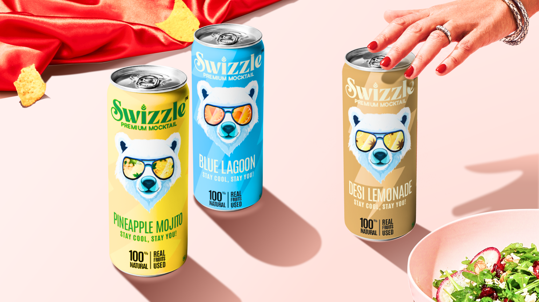
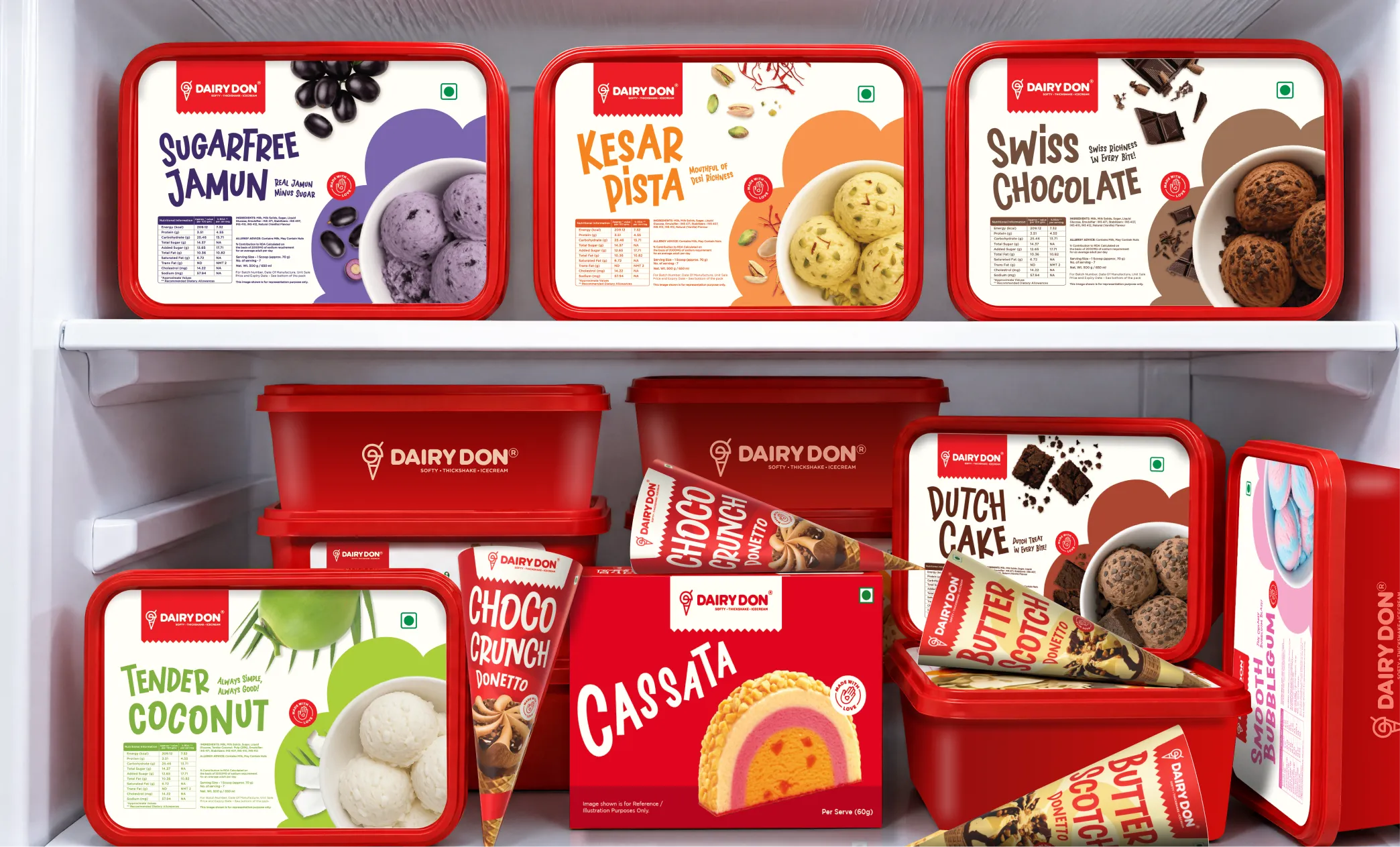
Want strategic branding and packaging like this for your business?


.webp)
.webp)


.webp)
.webp)
.webp)
.webp)
.webp)


.svg)
.webp)
.svg)
.webp)