%201.webp)
02
AI Snaps
.svg)
.svg)
01
Our Work
03
About Us
04
Brand Audit
05
Contact Us
06
Client Success
12
07
Blogs
08
Careers
Book A Call
.svg)



.svg)
Need Help In Building Your Brand?
Click the button below & book a call with our founder directly.

Rishabh Jain
Managing Director
Organic food branding has a credibility problem. Years of greenwashing have taught customers to question every "natural" label.
This Confetti guide breaks down why organic branding is really a trust design problem, not a colour palette problem, and how to build packaging and identity that actually earns belief.
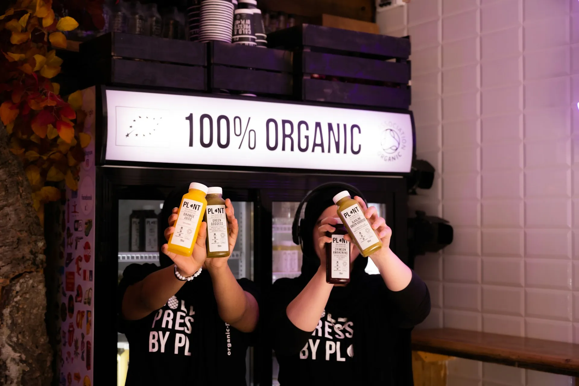
Organic food branding appears straightforward, but in reality, it is one of the most challenging categories to build because consumers are no longer persuaded by aesthetics alone. They expect proof, transparency, and consistency before they are willing to trust a brand or pay a premium.
The challenge is not simply creating a brand that looks organic. It is creating one that is genuinely credible.
👉Trust Is Harder to Earn Than Ever
Unlike subjective promises like "premium quality," terms such as organic, chemical-free, or naturally grown are regulated in many markets, so branding and packaging must reflect reality.
At the same time, years of greenwashing have made shoppers more skeptical, meaning certification logos alone rarely build trust.
Brands such as Two Brothers Organic Farms in India reinforce their credibility by combining recognised certifications with detailed information about their farming processes and ingredient sourcing.
👉Standing Out in a Visually Crowded Category
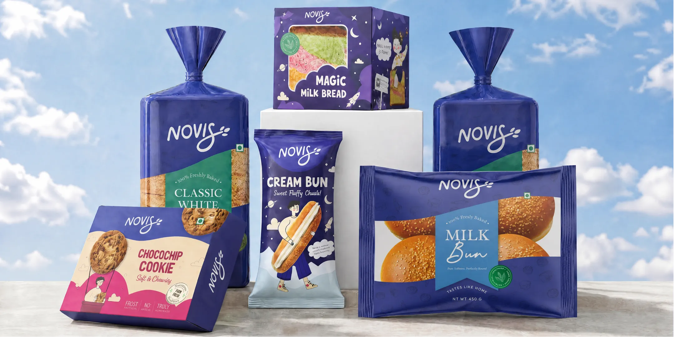
Many organic products rely on the same visual cues—green packaging, leaf icons, kraft textures, handwritten fonts, and rustic illustrations—making it difficult to stand out. While these elements support an organic image, they are no longer enough to differentiate a brand.
Successful organic brands build distinction through a unique brand story, memorable packaging, and a consistent visual identity. Brands like 365 by Whole Foods Market and Yeo Valley Organic show how clean design, strong typography, and clear information hierarchy can inspire trust without relying on predictable organic design clichés.
👉Justifying the Premium Price
Organic products often cost more due to farming practices, certification, lower yields, and stricter quality standards. Consumers are willing to pay a premium only when they understand the value behind it.
Branding needs to clearly communicate this. Without that clarity, a premium product may simply seem overpriced.
👉Packaging Has to Work Harder
Packaging is often the first, and sometimes only interaction a customer has with an organic food brand. It must quickly communicate authenticity, build trust, explain the product, and stand out on both retail shelves and digital storefronts.
Effective organic packaging features clear certification marks, readable product information, transparent ingredient and sourcing details, strong visual hierarchy, premium design, and sustainable materials where practical.
👉Certification and Compliance Add Complexity
Organic branding depends on certification, making compliance a core branding consideration rather than just an operational requirement.
In India, certified organic food brands typically need certification under NPOP or PGS-India and must follow FSSAI labeling and advertising rules.
👉Supply Chain Challenges Affect Brand Perception
Organic supply chains are often fragmented, with seasonal production, limited volumes, and greater dependence on smaller farming communities. Stock shortages, inconsistent quality, or changes in sourcing can quickly erode consumer trust, especially for premium products.
Strong organic brands work closely with suppliers and communicate honestly about seasonal variations instead of making promises they cannot consistently deliver.
👉Balancing Proof and Emotion
The most successful organic food brands recognise that branding has two equally important jobs. It must create an emotional connection while providing credible evidence that the product genuinely delivers on its promises.
Design attracts attention, but transparency builds confidence. Storytelling creates interest, but certification, traceability, and consistent product quality create long-term loyalty.
👉Organic vs. Natural Line
In India, "organic" is a regulated claim that requires certification under NPOP or an APEDA-recognized body. Using it without certification can invite action under FSSAI rules and the Consumer Protection Act.
"Natural," however, has no equivalent certification requirement, making it easier but riskier to use loosely. Before building a brand around either claim, identify whether your product is certified organic, transitioning to certification, or simply free from certain ingredients.
Each position demands distinct messaging to avoid legal issues and protect brand credibility.
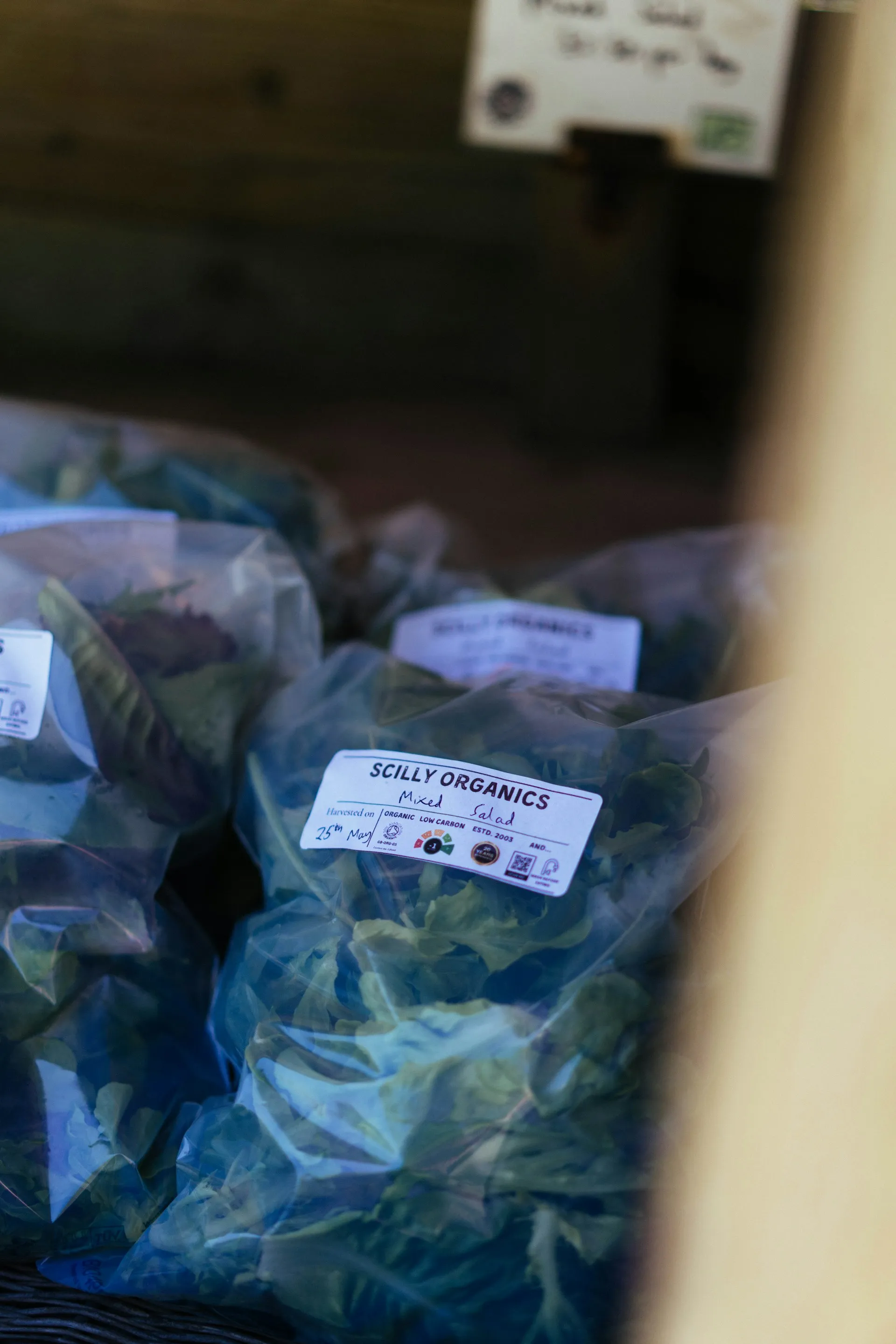
Building a successful organic food brand requires more than certification and earthy packaging.
Here are the core elements needed:
A clear mission and set of values is the foundation of any organic brand.
Unlike conventional food brands, organic brands are expected to stand for something beyond profit. The mission must answer three questions:
📌Example: Patagonia Provisions' mission is to "build a regenerative food system"is a clear, specific purpose that guides every business decision.
Two Brothers Organic Farms exists to prove that organic farming in India can be transparent, traceable, and commercially viable.
💡A mission that is specific and credible becomes the brand's North Star, guiding product development, sourcing decisions, packaging design, and communication. A generic mission ("we believe in healthy food") is only a filler.
Sustainability alone no longer works as a selling point, it is either taken for granted, perceived as inauthentic, or simply not relevant enough.
Successful organic brands lead with taste, health, and positive lifestyle, not just purpose.
The story must answer: What's in it for me? Consumers want to know why a product is better and what makes it special
📌Example: NaPuOr was born from a mother's quest for wholesome nutrition for her child—a personal story that is structurally authentic.
Yeo Valley Organic's expansion from dairy into meat succeeded because the brand's regenerative farming narrative provided the logic for category expansion.
💡 In a market where consumers are skeptical of organic claims, storytelling humanises the brand and creates a connection that cannot be replicated by competitors. Authentic stories are remembered.
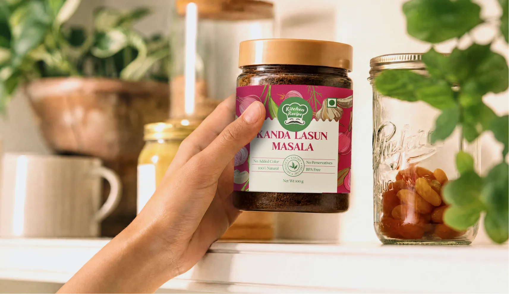
Many organic brands default to the same visual language: earth tones, leaf motifs, and rustic typography.
The result is a category that visually blends together. Successful organic brands break these conventions.
📌Example: Wild Oats, relaunched as an "activist" organic brand, rejected bucolic greens and nostalgia for a "raging red palette and reform".
Organic Traditions' first total redesign in 25 years centred on a unified visual identity system with updated photography and a clean approach to flavour callouts.
💡 A distinctive visual identity signals confidence and differentiation. When a brand looks like every other organic brand, it loses the opportunity to be noticed and remembered.
Certification is the foundation. It signals that the brand has met established standards for production without synthetic pesticides, GMOs, or artificial additives. In India, the Jaivik Bharat logo distinguishes certified organic products from non-organic ones.
But certification alone is no longer enough. The real differentiator is what the brand does beyond certification: transparent sourcing, clean-label formulations, and responsible manufacturing practices.
📌Example: Two Brothers Organic Farms holds ECOCERT, USDA Organic, and NPOP certifications, yet still sought independent Glyphosate Residue-Free Certification because certification alone does not address consumer anxiety. The brand recognised that in India, consumers are skeptical of organic claims and want proof beyond the label.
💡 Certification establishes baseline credibility. But it is no longer sufficient. Brands must go beyond certification to earn consumer trust.
Organic packaging must communicate purity, sustainability, and value within seconds. The most effective designs do this through:
📌Example: Many organic brands now use minimal, recyclable, or compostable packaging. The packaging itself becomes a statement of the brand's commitment to sustainability.
💡 Inconsistent values, a brand that claims to care about the environment but uses excessive plastic packaging, creates a credibility gap that consumers notice and distrust.
The way a brand speaks is as important as how it looks.
A consistent brand voice, whether warm and approachable, authoritative and scientific, or activist and disruptive, builds recognition and trust over time.
📌Example: The Whole Truth's voice is direct, transparent, and unflinching,matching its "100% transparent" positioning.
Yeo Valley Organic's voice is rooted in regenerative farming, communicating expertise without preaching.
💡 Inconsistent voicesounding like a different brand on packaging, social media, and website, creates confusion and erodes trust. A clear, consistent voice signals confidence and intentionality.
Transparency is not a marketing tactic, it is a structural commitment. The most successful organic brands invest in systems that make their claims verifiable.
📌Example: 24 Mantra Organic built a QR-code-enabled supply chain allowing consumers to trace products to specific farms. The brand's "focus on integrity became central to the brand's positioning".
Two Brothers Organic Farms uses independent third-party testing to prove glyphosate-free status, recognising that certification alone does not address consumer anxiety.
💡 When brands make their supply chain visible and verifiable, they earn trust that competitors cannot replicate. Transparency signals confidence, a brand that has nothing to hide invites scrutiny rather than avoiding it.
At Confetti, we build organic food brands that deliver on every element. We start with strategy, defining what organic means for your category and audience.
We design packaging that signals trust instantly, build systems that scale across product lines, and create identities that break category conventions. Because in organic food, branding is not about looking organic. It is about proving it.
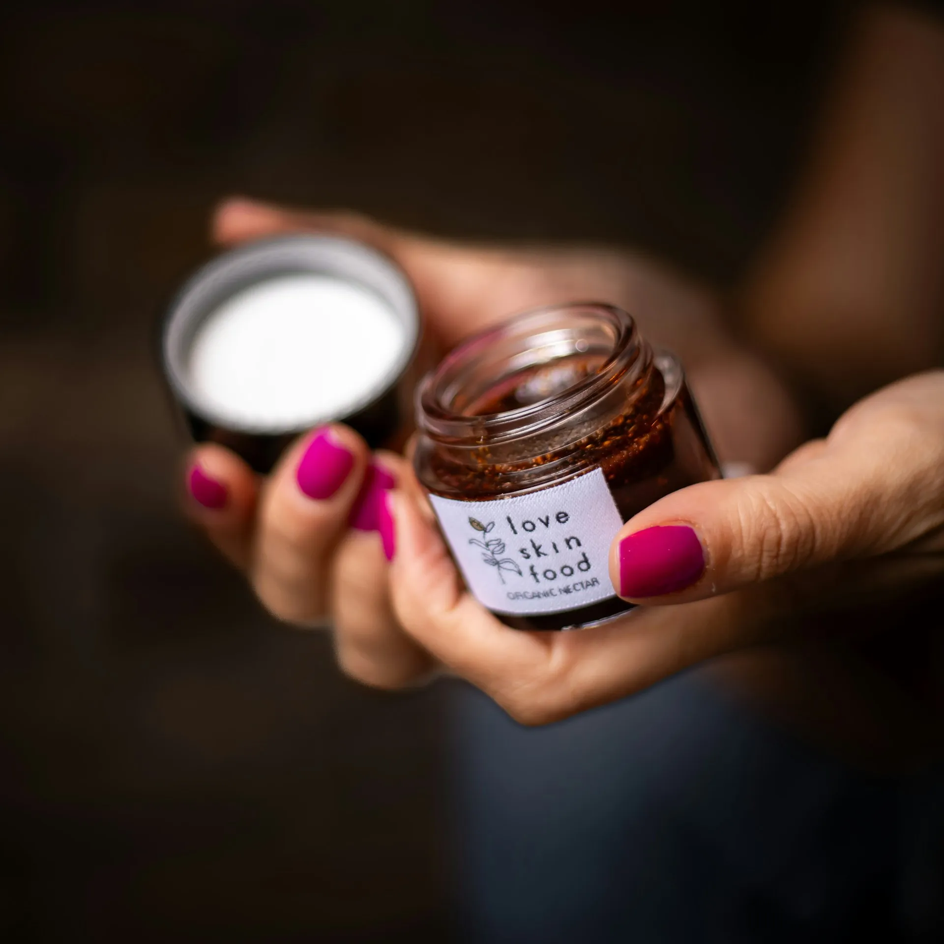
Building an organic food brand requires consistent efforts and strategic actions. Some of the most actionable strategies that work include:
Treating your target audience as one unified segment is the fastest route to irrelevant messaging and wasted marketing spend.
Understanding who is buying organic and why is the foundation of any effective branding strategy:
Health-Conscious Consumers
These consumers seek clean, safe food free from pesticides, synthetic fertilisers, antibiotics, and GMOs.
They value functional benefits, read labels carefully, and look for products that match dietary needs like vegan, gluten-free, or dairy-free. Organic certification builds trust by signalling quality and safety.
Eco-Conscious Buyers
They choose organic for environmental reasons, including soil health, biodiversity, animal welfare, and sustainable farming.
They see sustainability as a core value. This segment is highly committed and contributes disproportionately to organic sales.
Families
Families, especially new parents, drive organic adoption through concerns around health and safety. Organic baby food is often an entry point.
They seek trusted products that are nutritious, safe, and free from harmful additives, while valuing convenience and accessibility.
Premium Shoppers
They see organic as a lifestyle choice and a symbol of quality. They seek unique flavours, premium ingredients, and products aligned with their values.
For them, organic represents not only health but also identity, status, and conscious consumption.
Millennials and Gen Z
Younger consumers are among the strongest organic buyers, driven by health, wellness, sustainability, and transparency.
They pay close attention to product claims and prefer brands that share clear information about sourcing and ingredients. In India, millennials are a major growth segment for organic products.
Specialty Retail Customers
Specialty retail shoppers are highly engaged organic consumers who seek discovery, education, and brand connection.
They shop through organic stores, farmers’ markets, and specialty retailers, valuing authenticity and deeper relationships with brands.
💡Your audience is not "everyone who buys organic." It is a specific segment with specific motivations. Define which segment you are targeting. Then design your packaging, messaging, and channel strategy for that segment.
Organic food trust is built on proof, not promises. The best brands make certifications and trust signals visible through their design system—on shelves and screens alike.
Make Certifications Visible
If your product is certified, let consumers see it immediately: position where they are easy to spot and read
In India, marks such as Jaivik Bharat, NPOP, or India Organic, internationally rUSDA Organic or the EU Organic logo.
A prominent certification mark communicates confidence. Hiding it in fine print simply turns proof into a compliance exercise.
Replace Generic Claims with Specific Evidence
Consumers increasingly question vague statements such as "naturally sourced" or "farm fresh." Specificity is far more persuasive.
Instead of saying:
❌"Sourced from Indian farms."
Say:
✅"Made with certified organic turmeric sourced from farms in Sangli, Maharashtra."
Naming regions, farming communities, or production methods gives shoppers something tangible to trust. It also reinforces authenticity while supporting your brand story.
Use Traceability as a Competitive Advantage
QR codes and digital traceability tools allow them to verify sourcing, view batch information, learn about farmers, or understand the product journey from farm to shelf.
When packaging cannot be handled before purchase, digital verification becomes one of the strongest trust builders available.
Traceability shifts the conversation from "Trust us" to "See it for yourself."
Create a Clear Visual Hierarchy
Every package competes for attention in just a few seconds. The information customers need most should appear first.
A cleaner layout makes important information easier to find and increases perceived credibility.
Use Icons to Simplify Information
Well-designed icon systems help consumers process information quickly, especially in retail environments:
The key is restraint. Every icon should communicate verified information rather than act as decorative packaging graphics.
Build Trust in Layers
A practical trust hierarchy looks like this:
Most organic food brands look remarkably similar. The challenge is not that the cues are wrong. It is that they are no longer distinctive.
Stop Following Category Clichés
Looking like every other organic brand weakens recognition instead of strengthening it. Consumers do not need another leaf illustration to understand a product is organic. They need a brand they can instantly recognise and remember.
Organic Traditions invested in a timeless typographic identity and a cleaner packaging system that communicates credibility without relying on familiar visual shortcuts.
Build a Consistent Design System
Organic brands often expand into multiple product categories, flavours, or formats, making consistency essential.
Rather than redesigning every SKU independently, create a flexible visual identity system with consistent rules for:
A strong system improves recognition, simplifies future product launches, and creates a more premium shelf presence.
Let Colour Organise Rather Than Decorate
Green does not need to dominate every package. Instead, use colour strategically to help shoppers navigate your range.
Assigning colours by product type, ingredient, or flavour makes the portfolio easier to understand while creating stronger shelf impact.
Waah Organic uses colour as a structural navigation tool rather than simply reinforcing "natural" associations. The result is packaging that feels organised, modern, and easy to shop.
Choose Illustration or Photography with Purpose
Visual assets should communicate something unique about your brand.
Yeo Valley Organic uses unique illustrations to differentiate product ranges while reinforcing its playful brand personality.
Waah Organic uses bold food photography to showcase finished dishes, making taste and quality easier for consumers to imagine.
The right choice depends on your brand positioning, but whichever direction you take, consistency matters more than following trends.
Design Around Your Brand Story
A brand sourcing spices from Kerala, coffee from Coorg, or millets from Rajasthan already has a richer story than generic "green equals healthy" branding can communicate.
Regional ingredients, local craftsmanship, farming communities, or distinctive production methods can inspire colours, patterns, illustrations, and photography that competitors cannot easily copy.
Specificity creates memorability.
Design for Every Buying Environment
Organic packaging must perform equally well:
A design system that only works in one environment limits brand recognition.
Schafflerhof Farm, for example, uses a structured packaging system with consistent white branding panels that improve logo visibility across retail, farm stores, digital channels, and marketing materials.
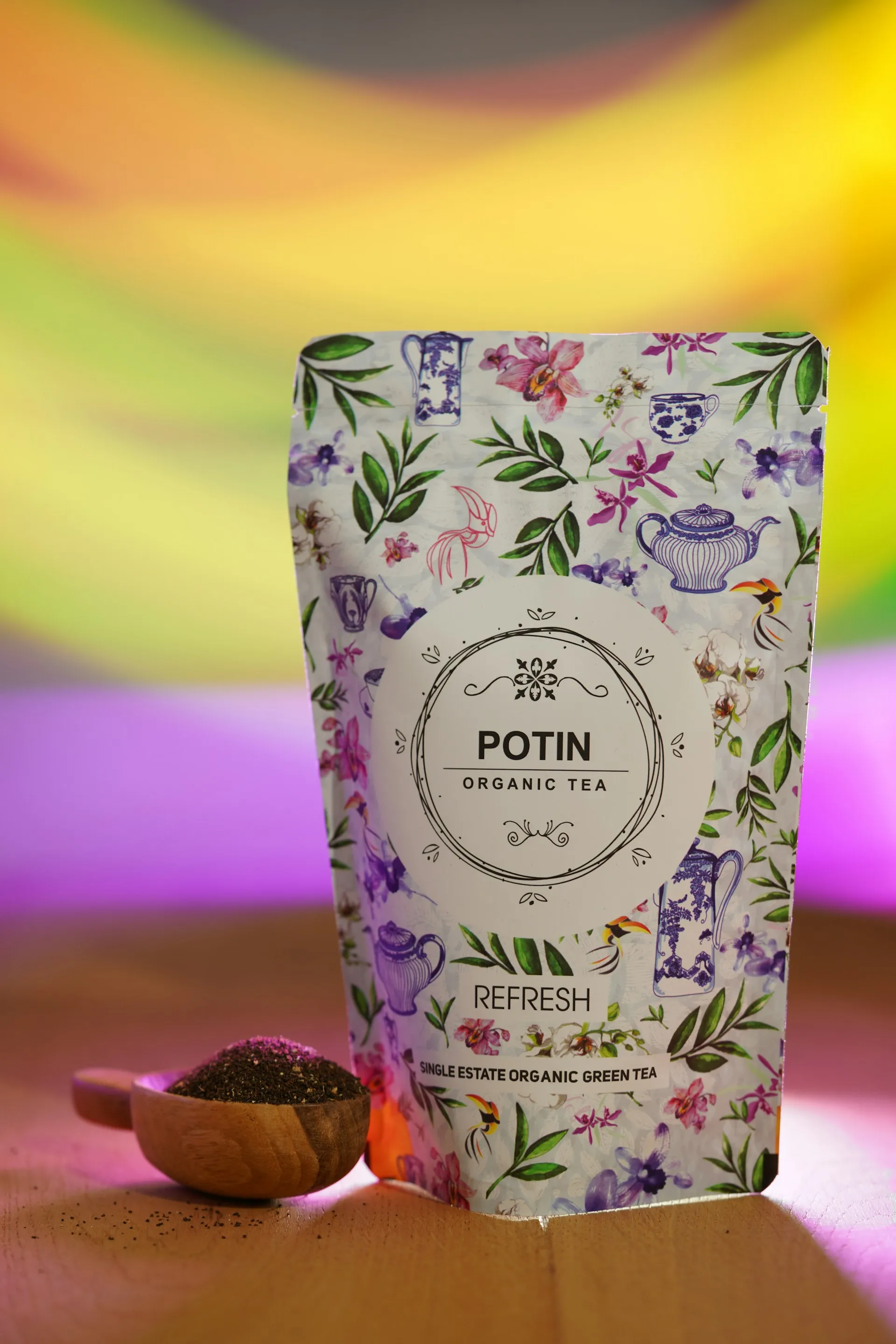
The best organic food brands do not try to be everywhere at once. They choose distribution channels that reinforce their positioning, pricing, and customer experience.
Mass-market and discount retailers
They are the primary growth engines for volume in the organic category, leveraging private label to set aggressive price floors. For brands positioned at accessible price points, these channels provide the scale needed to compete.
Specialty, natural, and e-commerce channels
They defend premium margins through curation and discovery. Premium organic brands use these channels to maintain perceived value while reaching the right consumers.
Quick commerce
It has become a critical growth engine. Bharat Organics expanded to quick commerce platforms like Zepto, Blinkit, and Swiggy before launching its own D2C platform.
Akshayakalpa complements its subscription-led D2C model with quick commerce platforms and an expanding offline retail footprint.
Direct-to-consumer
D2C builds the strongest relationships. Two Brothers Organic Farms generates 70% of domestic revenue through its own website, reducing dependence on marketplace commissions.
Bharat Organics launched its D2C platform after validating demand through retail and quick commerce.
Export markets
They offer significant opportunity. For export-focused businesses, branding must balance Indian authenticity with globally recognisable packaging, certifications, and quality standards.
Two Brothers is using fresh funding to expand retail presence across the US, Middle East, and UK. 24 Mantra derives nearly half its revenue from exports, largely to the US and Middle East.
Match Your distribution strategy must match your positioning. The most successful organic brands use multiple channels strategically.
In organic food, your most loyal customers are your most credible signal of authenticity. When consumers truly trust your brand, the label matters less.
Community is not built through transactions. It is built through education, transparency, and genuine connection.
Experiential Retail
It deepens community engagement. Pure & Sure launched an experiential cafe and store in Bengaluru that brings together certified organic grocery retail, a farm-to-table café, and a community engagement platform.
The space reinforces the brand's mission to make organic food "accessible, transparent, and trustworthy for everyday Indian households".
Consumer Education
Two Brothers Organic Farms is "focused entirely on education, on helping consumers understand why organic food from verified farmer" matters.
Organic India's campaign encourages consumers to "question organic labels and seek proof of authenticity," reinforcing that "authenticity must be earned, not claimed".
In-person Activations
It converts first-time visitors into repeat shoppers. Community engagement through in-store workshops and apartment activations has proven effective in organic retail, where "recommendations from friends and family" remain the most powerful conversion tool.
Create experiences. Make your customers feel like they are part of something larger than a transaction. The brands that build genuine communities earn loyalty that competitors cannot replicate.
Organic products carry a significant price premium, usually 30-100% higher than conventional alternatives.
This premium offers pricing power and value accretion.
Clear health and environmental benefits
Premium pricing works only when consumers perceive clear benefits. The brand must articulate what justifies the premium: better ingredients, cleaner sourcing, transparent supply chains, or verified health outcomes.
Build a value ladder
The value ladder allows consumers to enter at accessible price points and trade up category by category. ITC's 24 Mantra spans over 140 organic products, serving households looking to convert their entire pantry.
Challenge the premium assumption
Do this where strategically viable. Some organic retailers have launched "Organic and Affordable" initiatives, pricing organic staples on par with or below conventional options.
This approach challenges the notion that organic comes at a premium and expands the addressable market.
Use product tiering
This helps capture different segments. Akshayakalpa commands "an unusual brand premium even for its basic products" through distinct organic positioning, clean labels, and traceability.
The brand's premium is built on differentiation, not just certification.
Sustainability is now an expectation in organic food. But simply claiming sustainability is not enough. Consumers need signals they can see, understand, and verify.
Packaging must be as sustainable as the product inside
Organic consumers are primed to care about environmental impact. Packaging that is excessive, non-recyclable, or made from virgin plastics contradicts the brand's values.
Material innovation is the new frontier
Biopolymer-based antimicrobial active packaging can reduce food spoilage, extend shelf life, and minimise reliance on petroleum-based plastics. 100% bio-based PLA packaging that is industrially compostable is becoming commercially viable.
Certifications signal sustainability commitment
Organic India earned the Regenerative Organic Certified® label across multiple teas and supplements, a certification that adds "a level of transparency and verification". The ROC™ label signals commitment beyond basic organic certification.
Regulatory pressure is mounting
By 2030, all packaging in the EU must be recyclable by design. Soil Association approval now demands significantly higher chemical, compostability, and transparency rules than basic organic regulations require. Brands that invest in compliance now will be ahead of regulation later.
Organic food packaging must communicate trust, quality, and differentiation. The most effective packaging achieves this through deliberate design choices.
Clear and Honest Labeling
Organic food already carries a higher level of trust, so "vague wording, cluttered claims, or unclear certification displays can undermine confidence even when the product itself is strong". Consumers want information they can verify quickly.
Visual frames drive purchase intention
Research confirms that organic food labels have a visual frame effect that can drive consumption decisions through food association of safety. Adding visual frames to organic labels significantly enhances consumer purchase intention by activating safety associations.
Icon systems communicate instantly
Ayuraura's packaging incorporates a clear icon system: 100% Organic, No Additives, Gluten Free, and Non-GMO, giving health-conscious consumers "instant confidence at a glance". Simple, recognisable icons reduce cognitive load and accelerate purchase decisions.
Restraint signals confidence
Hive Origins built its visual system around "controlled restraint instead of decorative storytelling".
A consistent earthy palette of deep brown and muted honey gold evokes warmth and natural depth while avoiding the bright commercial colours of mass-market brands.
Pharmaceutical cues signal precision
Eleology's organic extra virgin olive oils use squat proportions, dark glass, and restrained labels that "evoke pharmaceutical packaging, signalling care, precision, and accountability". These bottles are designed as "functional vessels, not lifestyle objects".
High contrast and clear hierarchy are non-negotiable
Use high-contrast, highly readable fonts and a clear visual hierarchy that highlights your strongest selling point. Earth tones and whites imply freshness but need strong contrast to pop.
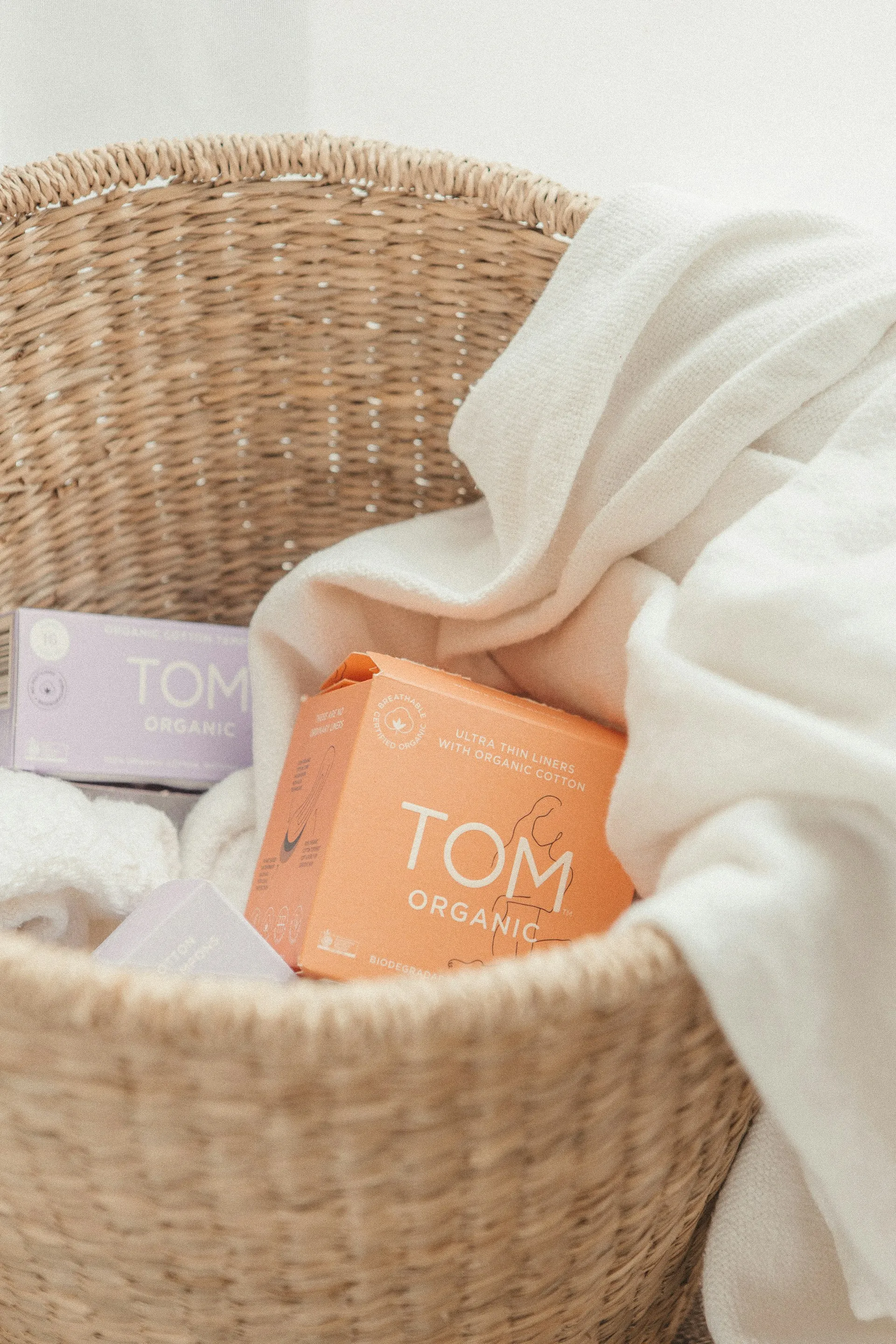
We treat organic branding as a trust problem first and a design problem second.
✅ We understand the trust architecture of organic food. Before we design anything, we map certification status, sourcing and farm story, ingredient transparency, mandatory FSSAI information, and traceability systems. Trust needs to be visible before it can be felt.
✅ We build systems that scale across categories. Our packaging systems hold together across multiple SKUs while flexing where needed. The brand stays recognisable, even as the portfolio grows.
✅ We treat packaging as a credibility signal. Icons for "100% Organic," "No Additives," and "Non-GMO" communicate faster than words. White space signals purity. Restraint signals confidence. We design packaging where certification marks are prominent, sourcing claims are specific, and proof points are immediately legible.
✅ We design for the shelf, digital, and quick commerce. The same trust signals must survive a retail shelf, a quick commerce listing image, and a social media thumbnail. We design systems that work everywhere.
✅ We deliver beyond the design. Confetti is built for your business, not just our portfolio, design that looks great but doesn't earn its keep is just expensive decoration. We bring together design, content, digital, packaging, and marketing under one roof.
A handful of recurring mistakes show up across organic food brands at nearly every stage, from first-time founders to established companies expanding into the category.
⚠️ Using "organic" language or imagery before certification is secured
This is the costliest mistake on the list. Locking positioning, packaging copy, and even the brand name around "organic" before NPOP or APEDA certification is confirmed creates real legal exposure and often forces an expensive rebrand once the gap becomes visible.
⚠️ Leaning entirely on visual cliché instead of specific, checkable proof
Green, leaf icons, and kraft paper texture have been used so extensively across the category that they've stopped functioning as differentiation. A brand relying on these cues alone, without backing them with certification prominence or sourcing specificity, blends into a crowded shelf instead of standing out on it.
⚠️ Burying certification marks in fine print
A certification mark sized and positioned at the end communicates the opposite of confidence, even when the underlying compliance is solid. Treating certification as a selling point, not a legal formality, changes how prominently it should appear.
⚠️ Inconsistent trust signals across channels
A strong sourcing story on a brand's website means little if the same product's quick commerce listing image and physical packaging fail to carry any of that same specificity. Trust signals need to survive compression to thumbnail size, not just look good in a full-resolution brand deck.
⚠️ Overclaiming beyond what certification actually covers
Some brands stretch a legitimate organic certification into broader implied claims like "chemical-free," "100% pure," "completely natural," that the certification doesn't actually guarantee. Overclaiming risks a credibility backlash.
⚠️ Neglecting organic packaging compliance beyond aesthetics
Organic brands must ensure packaging materials meet certification standards. Neglecting compliance creates risk that no amount of design can fix.
⚠️ Assuming price parity with conventional products is a victory
Competing on price alone undermines the value proposition of organic. Organic brands must justify their premium through visible proof, not just price competition.
⚠️ Launching a single SKU and calling it a brand
A single SKU lacks the portfolio depth to build the kind of loyalty that makes organic brands defensible. Consumers who trust an organic brand across multiple categories become advocates. Consumers who buy a single product remain transactional.
What makes organic food branding different from regular food branding?
Organic branding carries an extra burden of proof. Beyond typical positioning work, it has to visually and legally substantiate a specific, regulated claim, which means certification marks, sourcing transparency, and traceability tools do more brand-building work than colour or imagery alone.
Can I call my product "organic" without certification in India?
No. In India, the term "organic" is legally protected and requires certification from an accredited body such as NPOP for domestic products or APEDA-recognized certification for exports. Using the term without certification risks penalties for misleading labeling under India's Consumer Protection Act.
How is "organic" different from "natural" in food branding?
"Organic" is a certified, legally regulated term requiring accredited certification. "Natural" has no equivalent certification requirement in India, though it's under increasing regulatory scrutiny. Brands often blur this distinction in marketing language, which creates both legal risk and consumer trust problems.
Why do so many organic food brands look the same?
Decades of green colour palettes, leaf icons, and handwritten typography have become category shorthand, but overuse has made these cues less distinctive and, increasingly, associated with marketing rather than substance. Differentiation now comes from specificity and restraint, not more of the same cliché.
What certifications should appear on organic food packaging?
Relevant marks include NPOP certification for domestically sold organic products, APEDA certification for exports, and the FSSAI logo and license number required on all food packaging in India. These should be placed with visual prominence, not buried as compliance fine print.
How can a new organic brand build trust quickly?
Lead with specific, checkable proof rather than general claims. Certification marks, named sourcing locations, and traceability tools like QR codes that show a product's journey build more credibility faster than visual cues alone, especially for a brand without existing recognition.
Does organic packaging need to look different for quick commerce versus retail shelves?
Yes. Trust signals that work at full size on a retail shelf, detailed sourcing copy, certification marks, need to be simplified and prioritized for quick commerce thumbnails, where only the most essential trust cue will actually be visible before a purchase decision is made.
Want strategic branding and packaging like this for your business?





.webp)
.webp)


.webp)
.webp)
.webp)
.webp)
.webp)







.svg)
.webp)