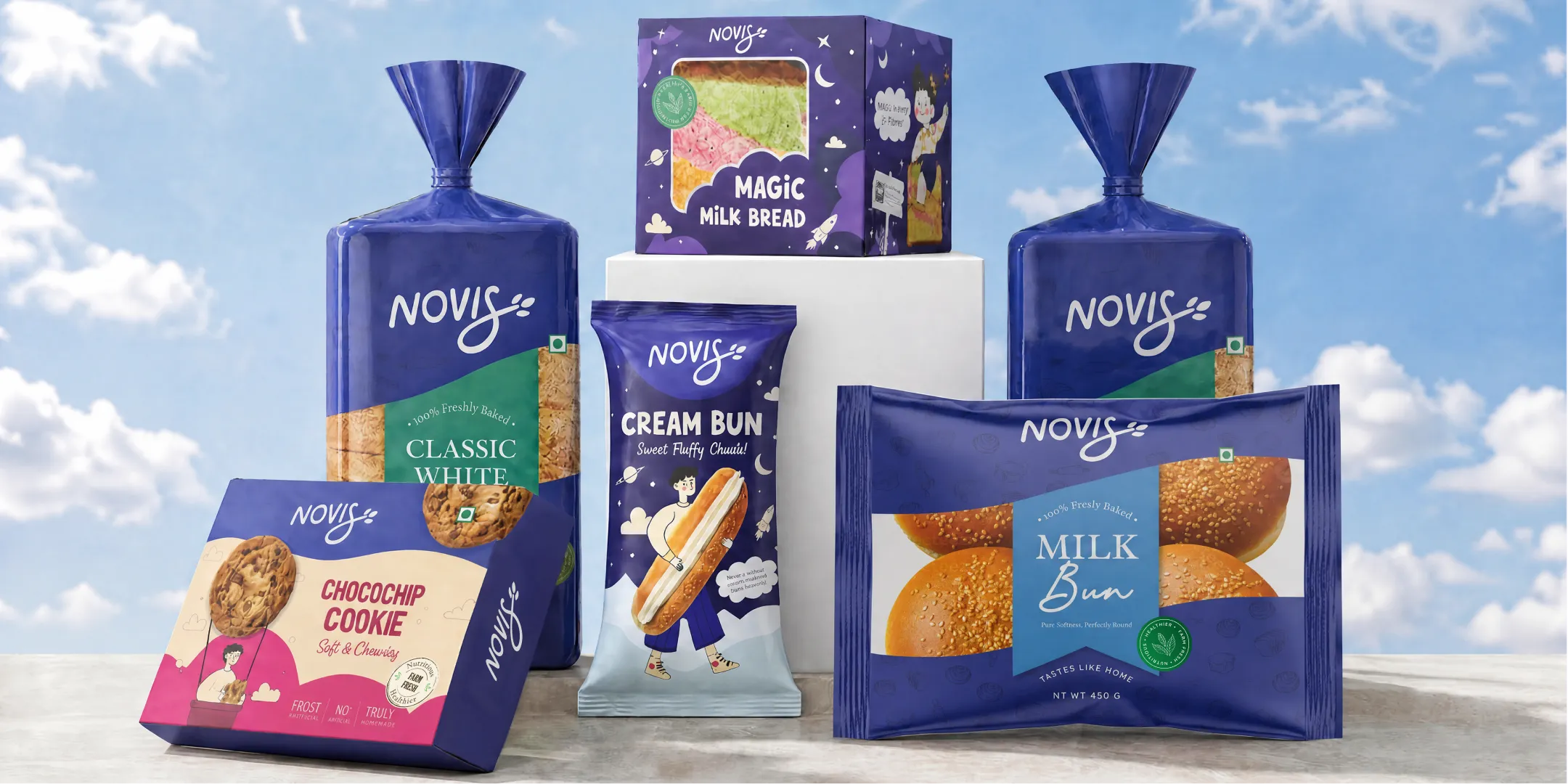
%201.webp)
02
AI Snaps
.svg)
.svg)
01
Our Work
03
About Us
04
Brand Audit
05
Contact Us
06
Client Success
12
07
Blogs
08
Careers
Book A Call
.svg)



.svg)
Need Help In Building Your Brand?
Click the button below & book a call with our founder directly.

Rishabh Jain
Managing Director
Streetwear brand guidelines are the one thing most founders in this category actively resist building. It feels like the opposite of the culture they're selling, rules for a business built on rebellion.
This guide breaks down why that instinct is wrong, what actually belongs in a streetwear guidelines document, and how to keep culture intact while scaling drops, collabs, and merch.

Many founders worry that brand guidelines will make their label feel rigid or corporate. In reality, the opposite is true. For a streetwear brand, well-defined guidelines create enough structure to keep the identity recognisable while leaving plenty of room for creative expression.
That flexibility is crucial because streetwear operates differently from traditional fashion. Brands regularly launch capsule collections, artist collaborations, limited editions, and digital-first campaigns.
Unlike a brand that ships one core product line year-round, a streetwear brand is asking its identity to survive dozens of separate creative decisions a year, often made by different people, on different deadlines.
Without a clear identity system, inconsistencies can accumulate and weaken brand recognition. One badly executed collab tee, one off-brand Instagram template, one hangtag from a rushed vendor, and months of visual equity start to erode.
According to Lucidpress's State of Brand Consistency Report, consistent branding can increase revenue by up to 33%. In a market where brands compete across social media, marketplaces, and physical retail, consistency becomes a competitive advantage.
Here’s a quick look at how traditional and streetwear brand guidelines differ:
Heritage vs. Cultural Relevance
Traditional fashion guidelines prioritise consistency across seasons and markets to reinforce heritage. Streetwear, however, exists in rapidly changing cultural spaces where trends, collaborations, and communities evolve constantly.
Streetwear guidelines should define the non-negotiables like logos, typography, colours, tone of voice, and core values, while leaving room for experimentation. This balance allows brands like Bluorng to remain recognisable despite constantly changing collections.
Visual Identity Extends Beyond the Logo
In streetwear, graphic design is often part of the product itself. Typography, illustrations, garment labels, patches, stickers, packaging, photography, and social content all shape how people recognise the brand.
As a result, guidelines should document the broader visual system, including graphic styles, photography, print treatments, motion, packaging, and garment details, not just logo usage.
Modular Systems Support Growth
Unlike traditional manuals designed to cover every application, streetwear guidelines work best as modular systems. Core identity elements remain consistent while seasonal graphics, campaign aesthetics, and supporting visuals evolve.
This approach makes it easier to expand into collaborations, pop-ups, new product categories, and retail experiences without losing brand recognition.
Community Shapes the Brand
Streetwear brands communicate with communities rather than simply selling to customers. Collaborations, user-generated content, music, skate culture, gaming, and local events all influence how the brand is perceived.
Effective guidelines help collaborators create work that feels authentic while maintaining a cohesive identity.
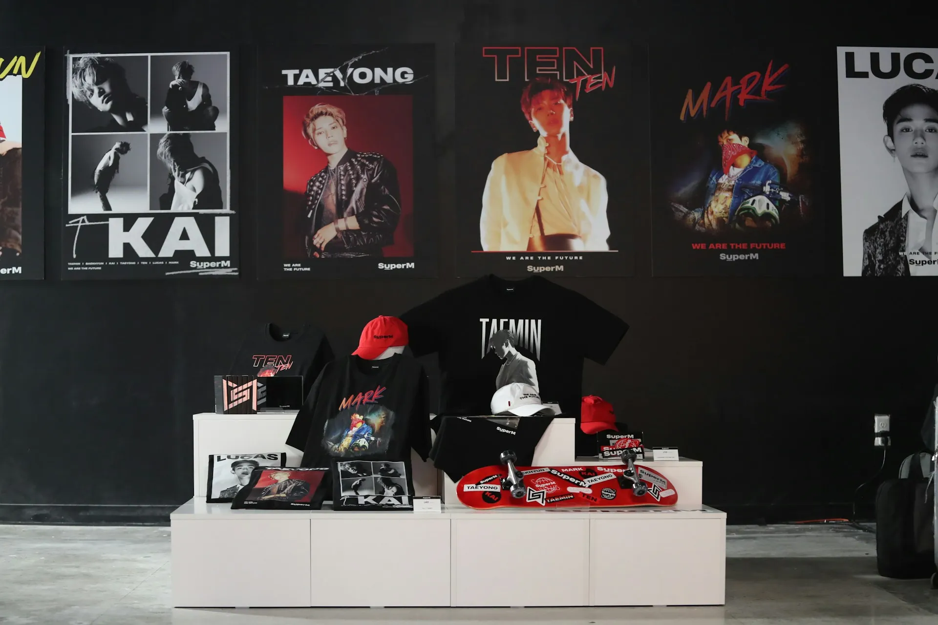
A well-structured streetwear brand guidelines document becomes a creative operating manual. It protects the brand's core identity while giving teams confidence to experiment without diluting what makes the brand distinctive.
Here's what a complete system actually covers:
Streetwear is not just fashion, it is a lifestyle, a culture, and a statement. Your brand identity is a reflection of your unique style, the culture you represent, your target audience, and the values that drive your brand.
Before defining colours or typography, the guidelines should explain what the brand stands for and the culture it represents.
Streetwear communities quickly recognise brands that have a clear identity versus those simply following trends. This section helps every creative decision stay aligned with the original vision.
The visual identity establishes the non-negotiable elements that customers instantly recognise. Rather than documenting only logo usage, a complete system should include:
Logo System
Primary mark, approved lockups, minimum clear space, and scaling rules for print, digital, and small-format merch like hang tags and woven labels.
Because streetwear logos often appear on woven labels, neck tags, embroidery, and social profile images, they should be tested at very small sizes, not just large mock-ups.
Typography
A primary and secondary typeface, but with a specific streetwear twist: most strong identities pair a disciplined, locked wordmark with looser, drop-specific display type that can flex season to season.
Confetti's guide on typography in branding covers how type choices carry brand personality even before a customer reads a single word, which matters even more in a category where fonts often do as much identity work as the logo itself.
Many successful labels maintain a consistent wordmark while allowing more expressive display typography for seasonal collections.
Colour System
Streetwear colour palettes can be bold and disruptive. Bad Apple's palette drew from rebellion, Poison Ink, Red Apple, Parchment, Green Apple, Forbidden Land.
Symplwear embraced a monochromatic palette with subtle tonal variations for a minimalist, grounded identity.
Also, instead of documenting only brand colours, define how colour evolves. Include:
This creates consistency without preventing experimentation.
Graphic Language
Streetwear identities rely heavily on graphics. Define the principles behind:
The objective is not to make every collection look identical but to ensure every release still feels like it belongs to the same brand.
A strong identity system demonstrates how branding works in the real world rather than leaving suppliers to interpret it.
Streetwear brand guidelines must show how the identity comes to life across every physical and digital touchpoint.
Showing practical examples significantly reduces inconsistencies during production.
Streetwear is built through collaboration with artists, with other brands, with the community.
The most successful streetwear brands often prefer to collaborate directly with artists from their primary community.
This creates authenticity that cannot be manufactured. The guideline should support this by providing clear parameters for how the brand identity can be adapted for artist collaborations, capsule collections, and brand-to-brand partnerships.
Instead of treating collaborations as exceptions, the guidelines should establish rules for them. Define:
Non-Negotiable Elements
Every collaboration needs clear guardrails. The guideline must identify which elements of the brand identity are sacred: the logo, the core colour palette, the brand voice. These cannot be altered, regardless of the partner. Everything else is negotiable.
Flexible Elements
The guideline must define which elements can flex in a collaboration. This might include:
The most effective guidelines include templates for collaboration briefs. These templates ensure that every partnership starts with the same strategic foundation, clear objectives, defined scope, and a shared understanding of what the brand stands for.
Approval Processes
The guideline must define how collaborations are approved. Who has final sign-off? What is the review process? How are conflicts resolved? Clarity here prevents the kind of misalignment that turns a promising partnership into a reputational risk.
Think of these as controlled flexibility rather than unrestricted creativity.
This modular approach allows each collection to feel fresh while remaining unmistakably connected to the parent brand.
In streetwear, quality is paramount. Your products need to live up to the hype you are creating around them. Guidelines must bridge the gap between design and manufacturing.
Production standards should specify:
These guidelines help maintain consistency across multiple manufacturers and production partners.
Poor printing, inconsistent embroidery, incorrect labels, or low-quality packaging can weaken premium positioning regardless of how strong the creative work is.
Every brand guideline should establish clear principles that protect the brand's identity.
In streetwear, however, those principles should act as guardrails that encourage consistency while leaving room for creativity, not rigid rules that limit expression. Include:
Document all usage rules clearly. Include visual examples of correct and incorrect usage. Make it easy for anyone working with the brand to understand what is allowed and what is not.
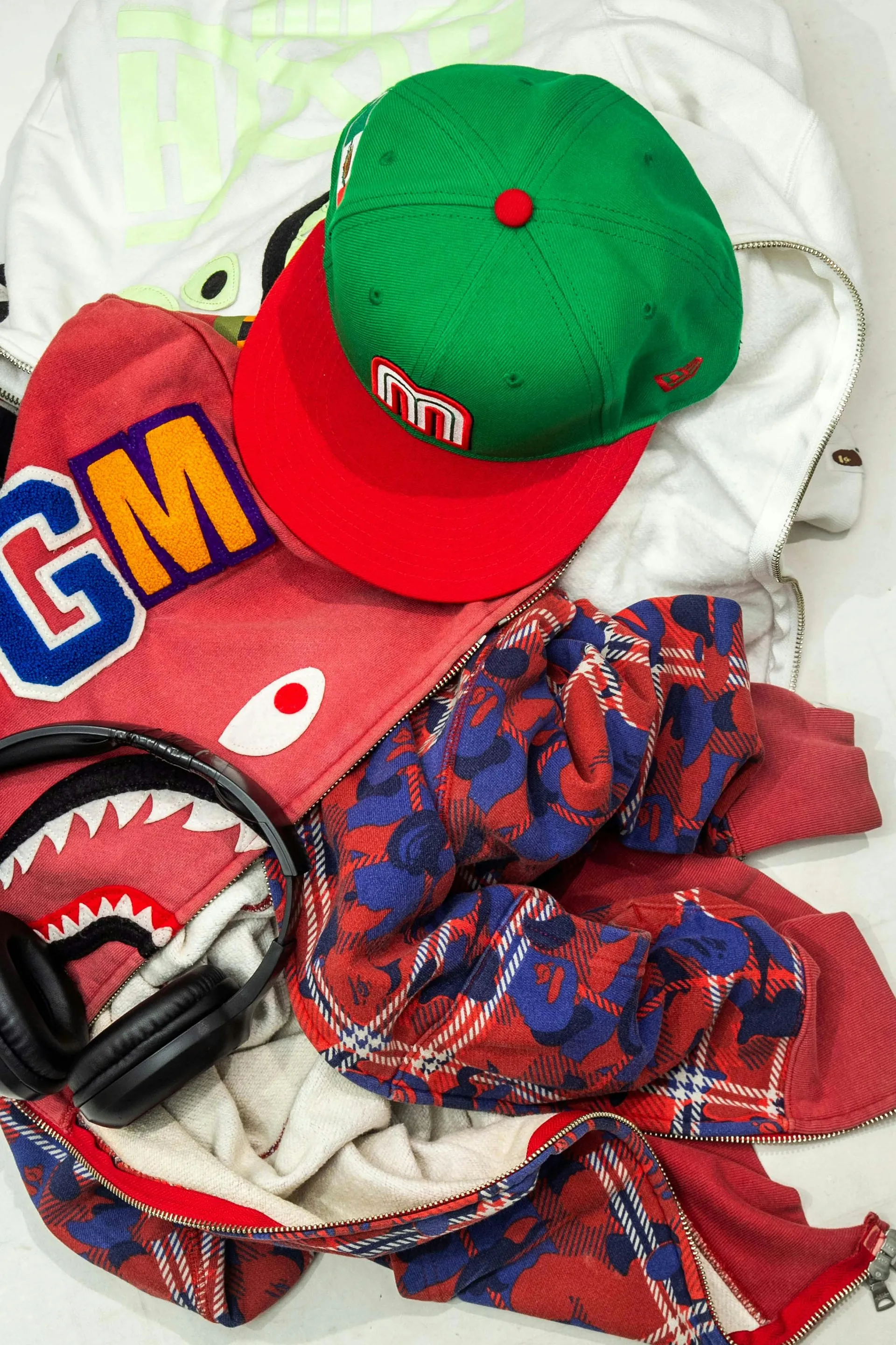
One of the simplest ways to make a streetwear brand guidelines document usable is to divide every brand element into two categories.
This approach gives creative teams clear boundaries while encouraging innovation where it matters most.
Ultimately, a streetwear brand guidelines document should function as a living identity system rather than a static PDF.
When the foundations are clearly defined and the flexible elements are intentionally managed, every drop, collaboration, retail experience, and social campaign contributes to building long-term brand equity instead of fragmenting it.
The rules, the audience, and the culture for Streetwear and fashion are different from other industries.
At Confetti, we understand this, and build brands that belong:
✅ We understand category creation
Bluorng priced a sweatshirt at ₹20,000 without heritage or celebrity backing, a cultural argument that Indian design deserves the same premium as an imported logo. We know how to build brands that create categories, not just enter them.
✅ We build visual systems that command premium
We treat every consumer touchpoint: casting, 3D motion graphics, retail spatial experience, as a single, unified design problem. The clothing feels premium because the entire world around it feels premium.
✅ We design for streetwear's unique logic
Gully Labs built a bilingual name that communicates both Indian street culture and design intelligence. Comet built a silhouette-based identity, the comet-star shape, so that the product itself becomes marketing. In sneaker culture, design recall is everything.
✅ We create systems that enable collaboration
Streetwear thrives on limited drops, artist collaborations, and community engagement. Comet's 600-pair drops, never restocked, create a FOMO loop that mirrors global brands. We build guidelines that enable partnerships without fragmenting the brand's core identity.
✅ We craft verbal identity that feels like culture
Desi Minimals needed words that mirrored its clothing: soft, minimal, grounded. Slosh & Co needed to sound like your funniest friend, sharp, cocky, and weirdly comforting. The voice didn't try to explain the brand. It was the brand.
✅ We handle every touchpoint, digital and physical
Garment labels, hangtags, packaging, woven patches, screen-printed graphics, social templates, website experience. We design for the smallest common denominator and ensure the brand holds up everywhere.
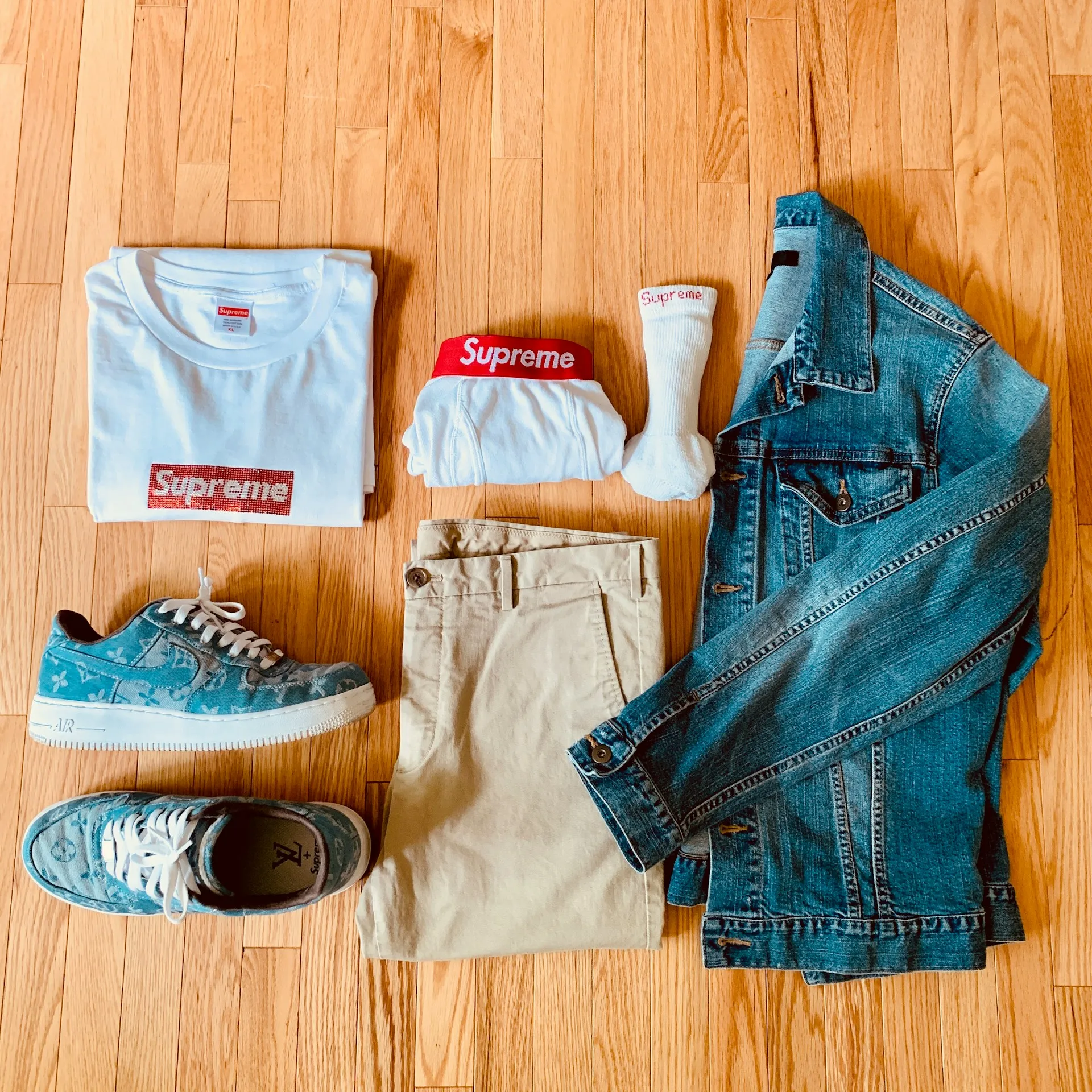
Supreme's identity is built on the idea that recognition comes from repetition, not variety. The brand relies on a small set of protected assets including a bold box logo, a limited colour palette, and consistent typography, rather than introducing new graphic elements each season.
The guidelines are intentionally restrictive, specifying logo proportions, colour usage, and clear space while leaving little room for interpretation.
This disciplined approach gives Supreme remarkable flexibility. Whether the logo appears on a hoodie, skateboard, or luxury collaboration, it remains unmistakably Supreme because the core identity never changes.
💡Lesson: A simple identity is often more powerful than a complex one. Strong guidelines protect consistency by defining fewer elements exceptionally well.
Off-White demonstrates that a brand can be recognised without relying on its logo. Instead, it created a library of distinctive visual assets, including diagonal stripes, quotation marks, cross-arrow graphics, and industrial zip ties.
Each element performs a specific role within the identity and appears consistently across products, packaging, campaigns, and collaborations.
Because these assets are used repeatedly, they become recognisable in their own right. The role of the guidelines is to define how each graphic element is applied, combined, and adapted without weakening the overall system.
💡Lesson: A brand can be recognised through multiple signature assets, not just its logo. Guidelines should document every distinctive visual code.
Bad Apple's identity is driven by attitude rather than aesthetics alone. Every element, from its imperfect logo and rebellious colour palette to its typography, packaging, and copywriting, supports the same narrative of disruption.
The visual identity feels deliberately rough, while the brand voice remains sharp, playful, and confrontational.
Rather than treating packaging and messaging as supporting materials, Bad Apple makes them part of the brand experience.
Pizza boxes, collectible inserts, and unconventional labels reinforce the same personality customers encounter online and in the product itself.
💡Lesson: Brand personality should influence every design decision. Guidelines should define behaviour and attitude alongside visual elements.
Symplwear takes the opposite approach to many streetwear brands by embracing minimalism as its defining characteristic.
A restrained palette, clean typography, generous white space, and a scalable logo create an identity that feels deliberate rather than understated. Every design decision reinforces clarity instead of decoration.
The value of the guidelines lies less in prescribing visual complexity and more in protecting restraint. They establish when not to add graphics, colours, or effects, ensuring the brand maintains the quiet confidence that differentiates it in a crowded market.
💡Lesson: Minimalism only works when applied consistently. Guidelines should protect restraint as carefully as they protect logos and colours.
Stüssy built an iconic identity around a single handwritten signature. Decades later, that authentic mark continues to define the brand across products, retail, and collaborations.
Instead of reinventing its identity, Stüssy built decades of recognition around the same signature and its connection to surf, skate, and music culture.
The brand's collaborations, retail strategy, and visual language all reinforce this heritage instead of competing with it. The identity evolves through context rather than redesign.
💡Lesson: One distinctive visual asset can sustain an entire brand. Guidelines should prioritise protecting the elements that make the identity unique.
BAPE approaches branding as an interconnected system of recognisable symbols rather than a single identity mark.
The APE HEAD, ABC CAMO, BAPE STA, BABY MILO, and Shark Hoodie each function as independent brand assets while contributing to a larger visual ecosystem. Customers recognise these elements individually and collectively.
The guidelines must therefore govern an entire family of assets—defining how patterns, characters, logos, and colours work together across products and collaborations. This structure allows BAPE to innovate continuously without sacrificing recognition.
💡Lesson: A strong identity can consist of multiple signature assets. Brand guidelines should define how each one works individually and together.
A few patterns show up again and again in streetwear brands that get this wrong, and most of them trace back to timing or over-control rather than a lack of design talent.
⚠️Locking guidelines too early
Before a brand has enough drop history to know what its real visual DNA actually is, guidelines end up documenting a guess instead of a proven identity. Founders sometimes commission a full guidelines document right after their first collection ships, based on a single set of design decisions that haven't been tested against real customer response yet.
Two or three drops later, the brand has usually found its actual voice, and the original guidelines feel like they were written for a different company.
⚠️Over-specifying graphic content
Locking down every visual detail removes the flexibility that makes each drop feel new, which defeats the purpose of streetwear identity in the first place.
If a guidelines document dictates exact illustration styles, specific stock photography treatments, or rigid layout grids for every graphic tee, designers end up fighting the rules instead of using them. The goal is protecting the few elements that must never change, not micromanaging the ones that are supposed to.
⚠️No collab protocol
Without clear rules for partnerships, logo misuse and diluted identity in joint products becomes almost inevitable.
This usually surfaces after the fact, when a partner brand's design team has already produced assets that stretch, recolour, or crop the logo in ways that would never pass internal review. By then, the damage is already printed and shipped.
⚠️Guidelines that stop at apparel
Packaging, merch, and digital templates get ignored, and those are exactly the touchpoints most likely to drift first, because they're often handled by different vendors, different freelancers, and different internal teams than the core apparel line.
⚠️No version control
Vendors and freelancers keep working from outdated files, and small inconsistencies stack up across every new production run. A logo tweak made six months ago might never reach a vendor still working from the original brief, and nobody notices until a full batch of merch arrives with the wrong lockup.
Before locking any guideline decision, ask a simple readiness question: is there a genuine second version of this identity worth defending yet, or is it still too early to write rules for something that hasn't been tested in the market.
Guidelines built too early cost more to fix later than guidelines that simply arrive a few months later than a founder originally wanted.
What should streetwear brand guidelines include?
A complete document covers the logo system with clear space rules, typography for both wordmark and graphic use, a core colour palette with room for seasonal extensions, graphic and photography treatment, tone of voice, and application rules for merch, packaging, and digital templates.
How are streetwear brand guidelines different from a standard brand style guide?
Streetwear guidelines protect a small set of non-negotiables while leaving room for constant reinvention across drops and collabs. A standard corporate style guide is usually built for uniform consistency alone, without accounting for the fast-moving drop culture that defines how streetwear brands operate.
Do streetwear brands really need guidelines, or does that kill authenticity?
Guidelines protect authenticity rather than restrict it. The brands with the strongest cultural equity run tight internal systems behind seemingly loose, culture-driven output. Without guidelines, fast production cycles and collaborations dilute the exact visual identity that built the brand's recognition to begin with.
When should a streetwear brand create its brand guidelines?
Guidelines work best once a brand has enough drop history to understand its real visual identity, not just its founding concept. Locking rules too early often forces a rebrand later, once the identity that genuinely resonates with customers becomes clear through actual market response.
How do you keep brand consistency across streetwear collaborations?
Define a clear collab protocol before any partnership starts. Decide which brand elements are protected, like logo geometry and core palette, how the two identities can share space without diluting either one, and use a briefing checklist with every external partner or vendor before production begins.
What's the biggest mistake brands make with streetwear guidelines?
Over-specifying graphic content. Locking down every visual detail removes the flexibility that makes each drop feel fresh, which works against what a streetwear identity actually needs. Strong guidelines protect only the essential non-negotiables and leave the rest open to reinterpretation.
How much does it cost to create streetwear brand guidelines?
Cost depends on how many application points need coverage, apparel, packaging, digital, and merch. A guidelines document built at the end of a full identity design process, once every element has been tested against real drops, typically costs less than building one prematurely and revising it later.
Want strategic branding and packaging like this for your business?





.webp)
.webp)


.webp)
.webp)
.webp)
.webp)
.webp)







.svg)
.webp)