Brand Audit

The Ordinary Brand Audit

Rishabh Jain
October 28, 2026
6 Minutes
October 28, 2026
6 Minutes
No items found.
No items found.
This is some text inside of a div block.
Posted On
Estimated Reading Time
6 Minutes
Category
Brand Audit
Wrriten By
Nimisha Modi

Book a call and get unlimited revisions for your project!

Book A Call
A stylized pink thunderbolt or lightning icon
Get Instant Response

Need Help In Building Your Brand?

Click the button below & book a call with our founder directly.

Rishabh Jain

Managing Director

Book A Call

The Ordinary | Confetti's Verdict ⭐⭐⭐⭐⭐

Attribute Details
Confetti Rating ⭐⭐⭐⭐⭐ (5 / 5)
Brand The Ordinary
Year Founded Launched August 2016, parent company DECIEM founded 2013
Industry Skincare, Actives-Led
Founders Brandon Truaxe and Nicola Kilner, co-founders of DECIEM
Headquarters Toronto, Canada
Revenue $300 million in sales by 2017, $460 million in the 12 months to January 2021
Current Scale Named among Estee Lauder's fastest-growing brands in fiscal 2026
Parent Company The Estee Lauder Companies, full ownership from 31 May 2024, total investment approximately $1.7 billion

Confetti Design Studio has analysed the naming system, packaging and pricing architecture of The Ordinary. It is the Toronto brand that decided to call a product Niacinamide 10% + Zinc 1% and in doing so made a generation of consumers fluent in skincare chemistry. 

Launched in August 2016 with 27 products at once under parent company DECIEM. Founded in 2013 by Brandon Truaxe and Nicola Kilner. It reached $300 million in sales by 2017 and $460 million in the year to January 2021. 

The Estee Lauder Companies invested in early 2017 and took a majority stake in 2021. Then completed full acquisition on 31 May 2024 for a total investment of roughly $1.7 billion. 

The audit looks at whether a brand's naming and packaging can keep standing for honesty and simplicity, now that it's owned by one of the very companies it once positioned itself against. This audit is as per September 2026.
The Ordinary Brand Strengths: What the Brand Gets Exceptionally Right 💪

1. The Name Is the Formula 🧪

For nearly a century, beauty naming followed the same playbo

ok. 

An evocative name, a vague promise of a benefit, and the real ingredients tucked away in a tiny type nobody ever reads.

But The Ordinary broke that pattern. 

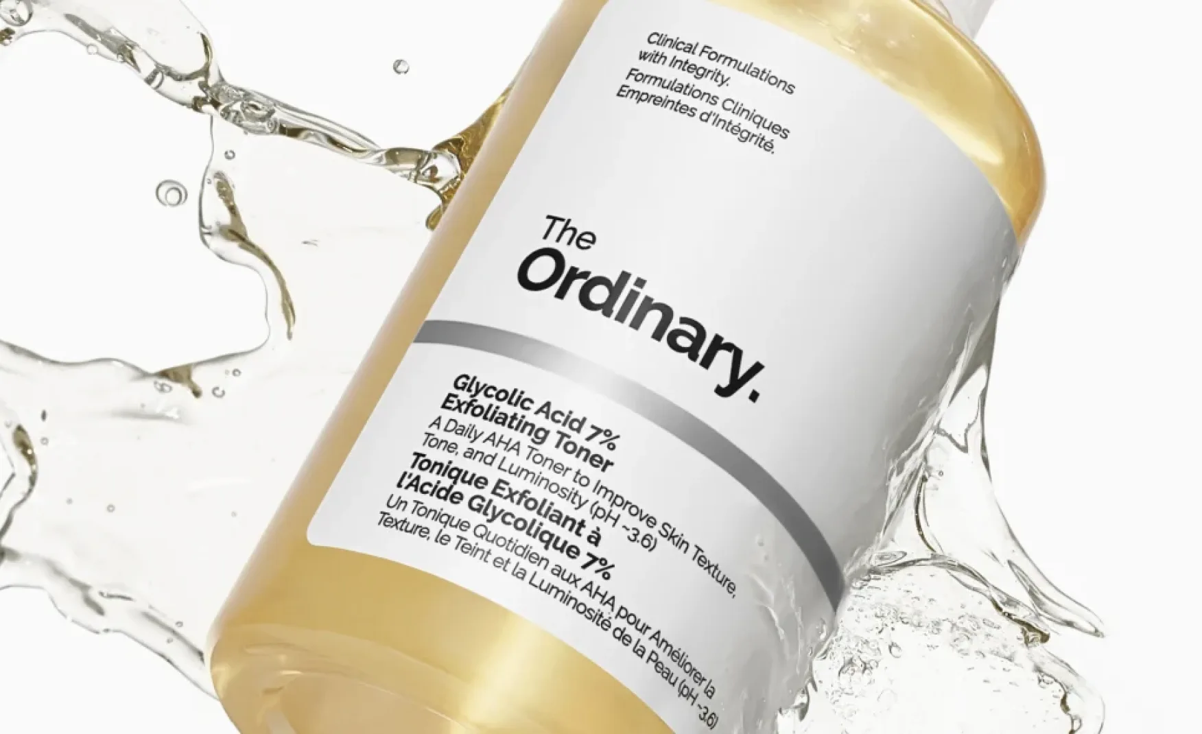
It named its products after what's actually in them, and how much like Niacinamide 10% + Zinc 1%. That choice does something powerful. A customer who buys Niacinamide 10% + Zinc 1% actually learns what niacinamide is. 

The Ordinary taught an entire generation how to read skincare labels, a shift brands like Minimalist and The Derma Co are still benefiting from in India today.

That same naming choice also created an advantage. 

When someone searches "niacinamide serum," The Ordinary is quite literally the product they're searching for. It shows in the numbers too, independent data puts the brand's visibility score at 99 out of 100, with around 5.4 million monthly site visits. 
2. The Design That Backs Up the Promise 🤍 

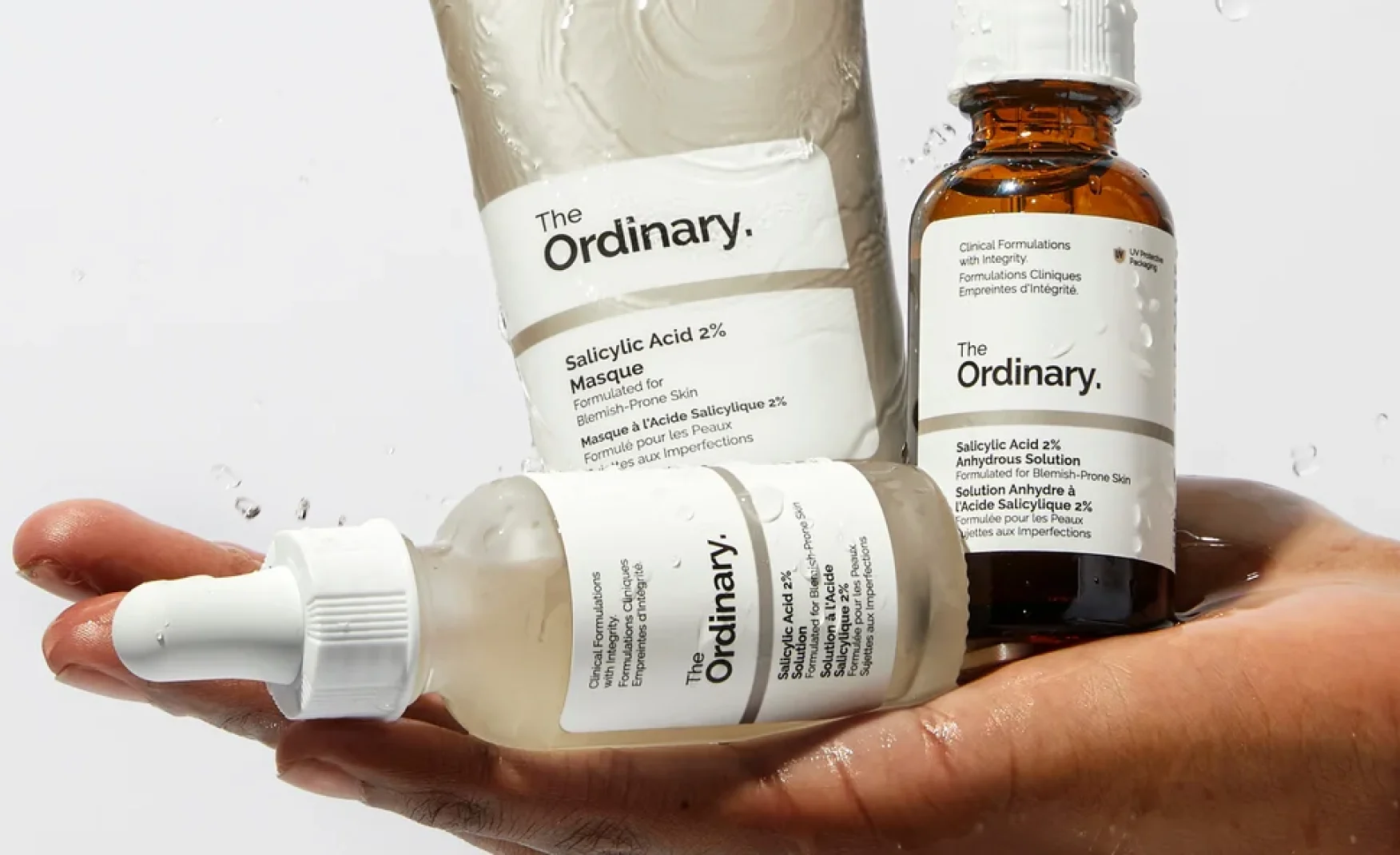
Prestige skincare packaging usually exists to justify a price. Weight, finish, foil, even the satisfying resistance of a cap, all of it is designed to make you feel like you're paying for something special.v

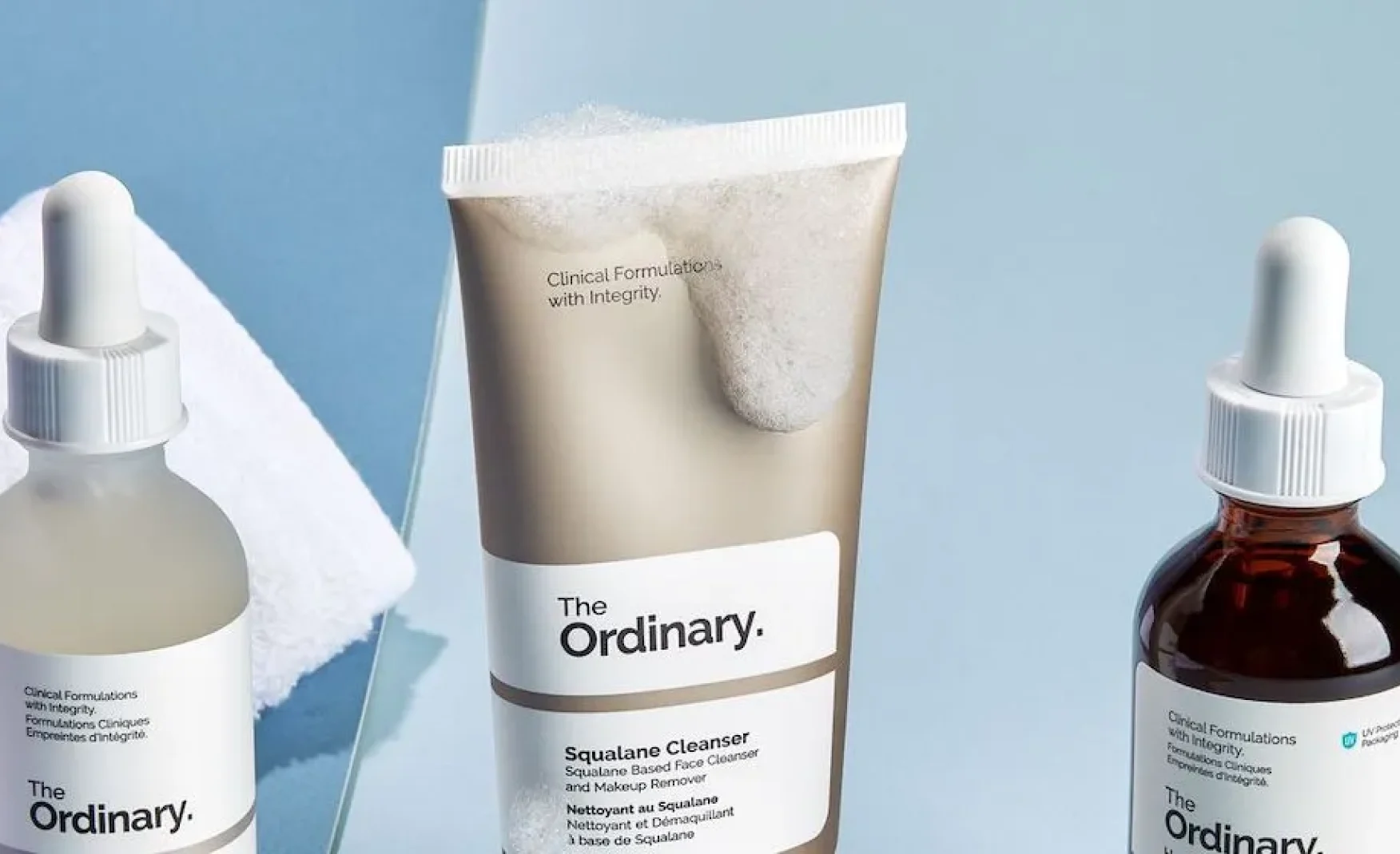
The Ordinary came up with Plain white and off-white. Small, utilitarian type with no imagery at all. And for many products, just a simple glass vial with a dropper.

The plain packaging is the whole point.

If a brand says you’re paying for ingredients, not marketing, it has to show it. A heavy, glossy box that looks expensive would tell you the opposite.

The logo works the same way, black text on white, with no colour and no flourishes. It’s as straightforward as the box it sits on.

Even the dropper earns its place. It looks clinical and since it gives you one drop at a time, a bottle goes further.

The logo, the box and the dropper are all saying the same thing.

3. Pricing That Explains Itself 💷 

Most brands treat pricing as an output that feels heavily calculated and positioned and never well explained to the end user.

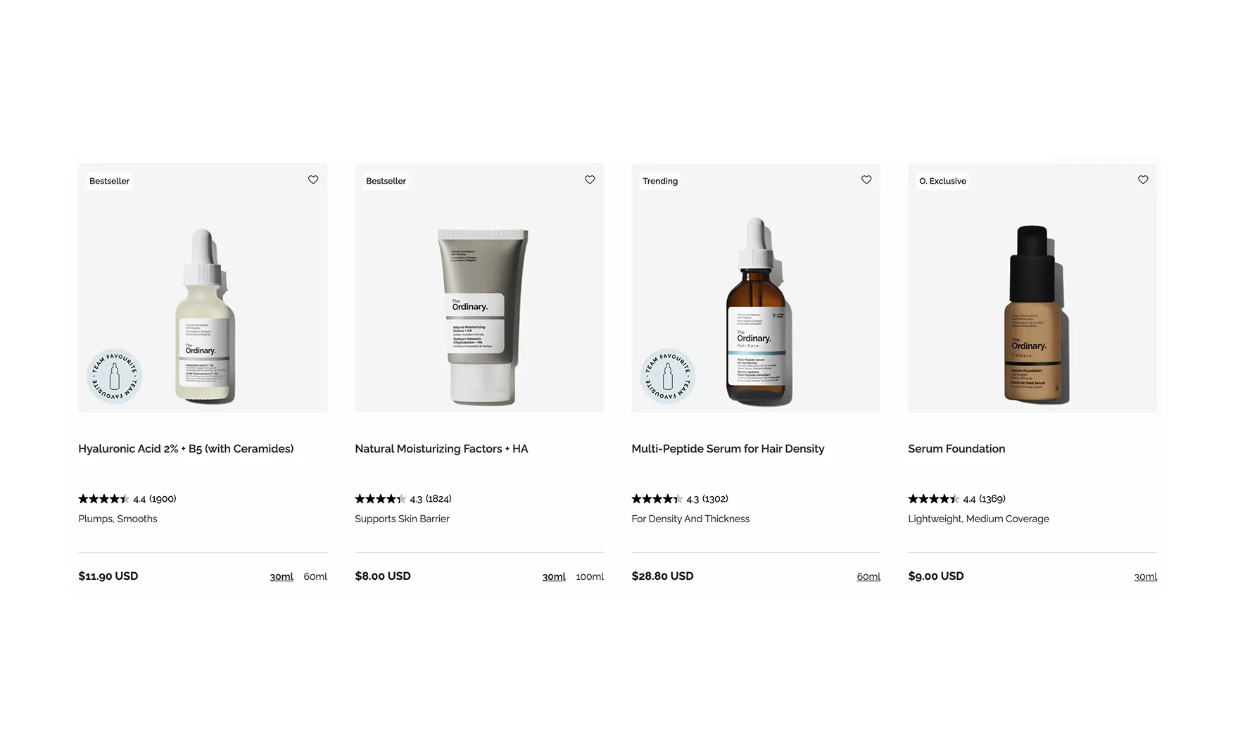
The Ordinary made its pricing the point. Products historically sat at roughly $7 to $10 against category equivalents at $30 to $100.

More importantly, the brand actually explained its thinking out loud. Price comes down to ingredient cost and formulation, not marketing spend. Nicola Kilner says luxury should mean authenticity, whatever the price tag happens to be.

The brand has also stayed honest even when it was uncomfortable. In 2022 and 2023, when prices went up, they explained why, pointing to inflation and rising costs, instead of just quietly raising prices and hoping nobody noticed.

A brand built on transparency actually being transparent about its own price hikes is rare.
Does your pricing tell a story customers can repeat?
Talk to our team about pricing, naming and packs that agree. 
  • Discuss your project in detail
  • Get our expert advice, completely for free
  • Ask any questions you may have
Book A Call
Book A Call

4. Launching With Twenty-Seven Products 📦

There's a well-known strategy of launching with just one product, so people focus all their attention on it.

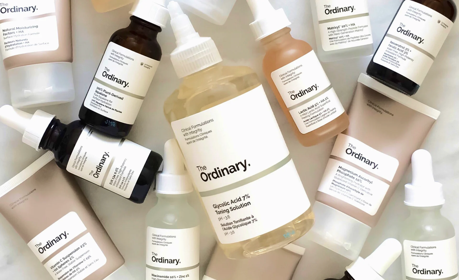
But The Ordinary did the opposite. In August 2016, it launched with 27 products at once, because if you're selling a whole system, you need to show up as a system. A single serum would have made The Ordinary look like just another product on the shelf, instead of a real challenge to how skincare gets priced and sold. 

The way the range is organised backs this up too. 

Products aren't grouped by "ritual" or by skin concern, the way most beauty brands do it. They're grouped by active ingredients, the way a chemist would think about them. 

That means customers can build their own routine, piece by piece, instead of buying a pre-packaged set at whatever price the brand decides.

The results speak for themselves. Sephora picked up the line in 2017, the same year The Ordinary crossed $300 million in sales. And DECIEM grew fast too, from around 200 employees to more than 1,300.
5. A Company That Survived Its Own Crisis 🕊️

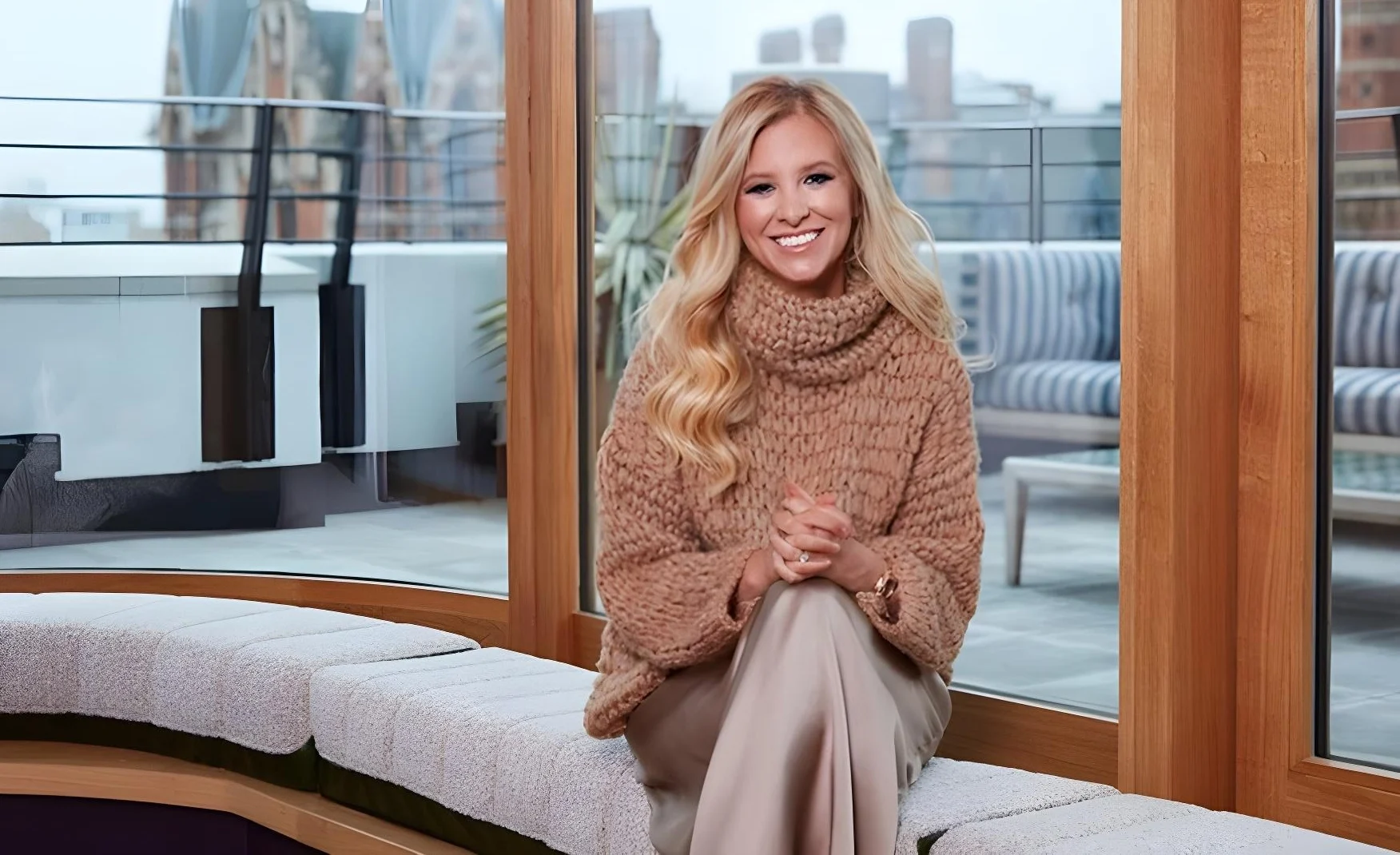
Brandon Truaxe co-founded the company in 2013. But in October 2018, amid a period of real public instability, an Estée Lauder lawsuit removed him as CEO. He passed away in January 2019.

Nicola Kilner, who'd co-founded DECIEM alongside him, stepped in as sole CEO that same month and rebuilt the company from there. 

During the 2020 pandemic, she committed to no layoffs, gave pay premiums to staff working on-site, and brought in mental health counselling across the business.

DECIEM survived because the brand's promise never lived in one founder's personality. It lived in the formula, and in the price on the label.
6. A Name That Was Really the Whole Strategy 📛 

Beauty brands usually chase the extraordinary. Miracle claims. Serums that promise to transform skin overnight. 

So the name "The Ordinary" was, in its own way, a small act of defiance. 

Everything about the brand comes back to one simple idea, good skincare is about getting the job done. A product earns your trust when it does what it says it will, and most of the time that is all you really want from it.

That is the thinking behind the name “ordinary.” The products have plain names that tell you what is inside. The claims stay modest and truthful, so you know what to expect each time you use them. Each product is made to do one job well, and it gets on with that job quietly.

This feels refreshing in an industry that has long leaned on big promises, glamorous packaging and a lot of showmanship. 

“Ordinary” keeps everything honest, clear and easy to understand, so people can pick what they need and see the results for themselves.

You can see it in how the brand talks about its products: backed by research, made by real chemists, built for function. It leaves out anything the skin doesn’t need, which is the brand living up to its own name.

The pricing fits the same idea. The Ordinary keeps its language plain and its prices low, because good skincare should be something anyone can reach, understand and trust.
7. Credibility Comes With Education 🔍

Niacinamide 10% + Zinc 1% is a name that only means something if you know what niacinamide does. The Ordinary knows this, and instead of leaving shoppers to work it out alone, the brand has made teaching a part of what it does.

The range is large and organised by ingredient, so some people need help knowing what to pair together and in what order. For years, outsiders filled that gap: creators, comparison sites and Reddit threads. Now the brand is stepping in itself.

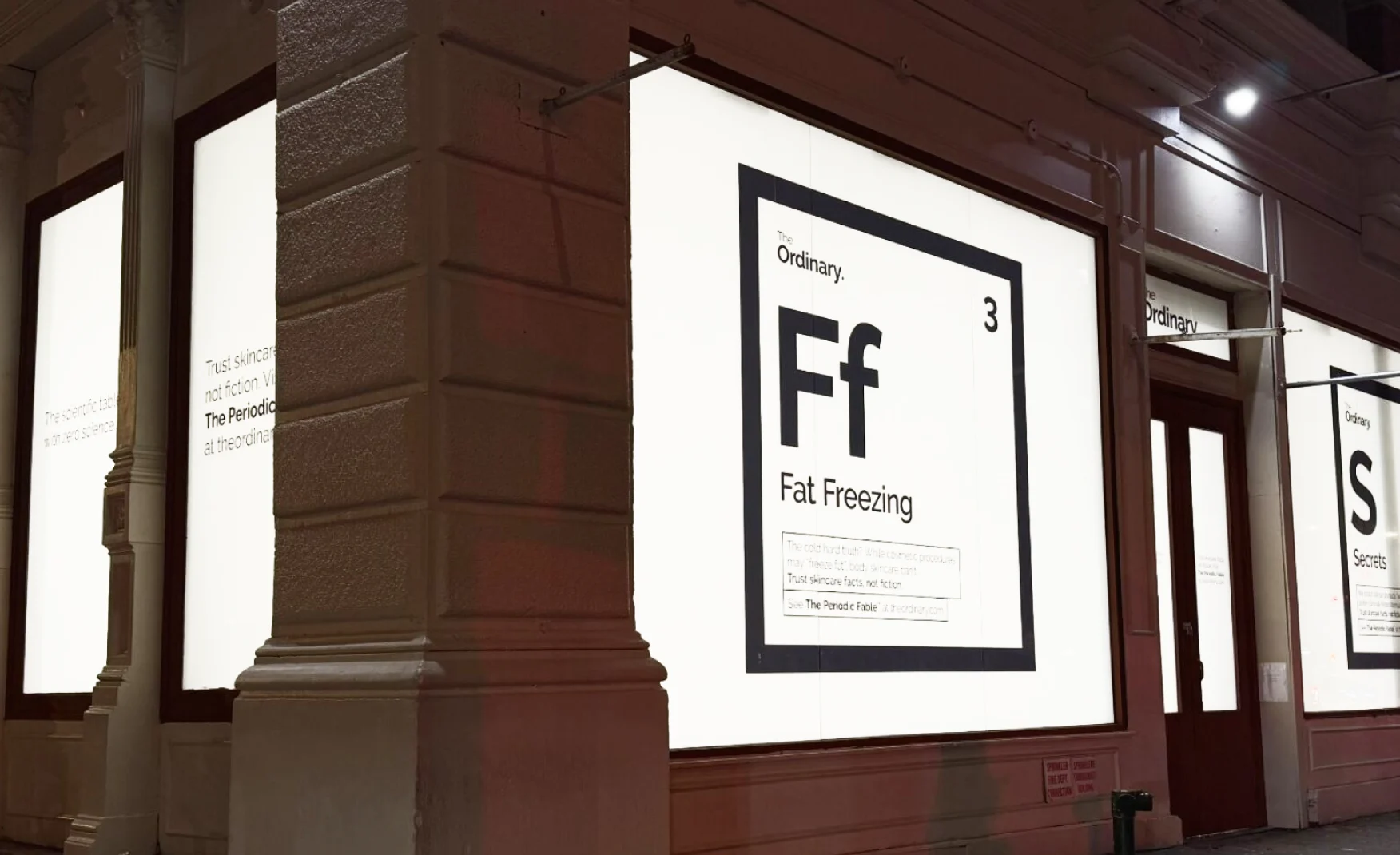
In January 2025, it launched The Truth Should Be Ordinary, a free digital archive that busts skincare myths. In February 2026, it opened a lab-inspired pop-up in Shoreditch, where people could talk to its scientists face to face.

Both show a brand that wants to explain its own products and not leave that job to the internet. That fits the same idea as everything else: if you tell people the truth plainly, they can decide for themselves.
The Ordinary's Growth Challenges and Areas to Watch ⚠️

1. The Price Promise Is Hard to Keep ⚠️

The promise was simple: you pay for what is in the bottle, not for the marketing. That is a hard promise to keep for years, because costs keep climbing. Ingredients, shipping and wages all get more expensive.

Most brands can raise prices and nobody minds. The Ordinary is in a different position, because its low prices were the proof. The gap between its prices and the rest of the category showed shoppers that the category had been overcharging. If that gap shrinks, the proof gets weaker, and people start to doubt whether the promise still holds.

So the challenge is what happens when costs rise. Even a small increase gets read as a broken promise.
2. It Is Now Owned by the Establishment It Was Built Against ⚠️

Estee Lauder completed its acquisition of DECIEM on 31 May 2024, for a total investment of roughly $1.7 billion.

It's also worth remembering, it was Estée Lauder's own lawsuit that removed the founder back in October 2018.

To be fair to everyone involved, the brand hasn't actually changed much since the acquisition. Products are still named the exact same blunt way, straight ingredient and percentage. No softer, prettier names have crept in. The pricing logic hasn't shifted either. So far, at least on paper, Estée Lauder has left the brand alone to keep being exactly what it always was. 

But there's still a real tension here, and it's not about anyone doing anything wrong. It's structural. The Ordinary's whole identity was built in opposition, standing against an industry that priced products on mystique and mystery. And now, that same brand sits inside one of the biggest companies in that very industry.
How Confetti Sees The Ordinary's Next Chapter 💡

H3: Keep Doing What Works, Even Under Estée Lauder 🌱

The Ordinary is already doing the right things, so the best advice is to keep doing them.

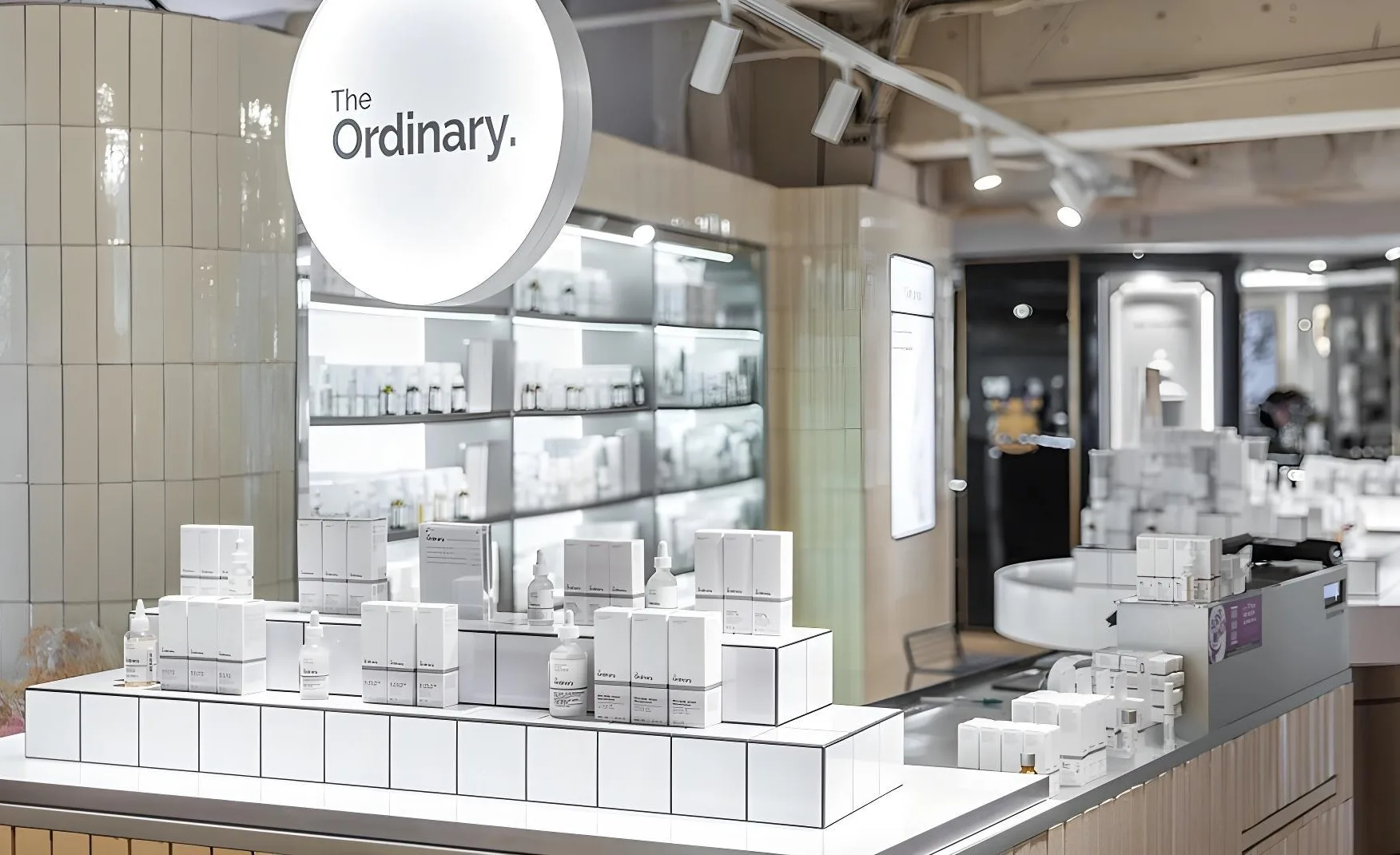
Plain black text on white, simple boxes, lab-style droppers. It all says one thing that is ‘you pay for what’s inside the bottle’. People spot it from across a shelf and trust it before reading a word. 

The brand shows the product, explains it simply and lets real people share real results. Keep working with creators who are clear and honest. 

The Ordinary began by standing up to big beauty brands, and now it sits inside one. Staying true to themselves and how they started with open ingredients, fair prices, and plain words is important.

The Ordinary Verdict and Confetti Rating ⭐

The Ordinary made one of the most important branding decisions in modern skincare. 

Naming a product Niacinamide 10% + Zinc 1%. Pricing it far below what others charged. Packing it like it came from a lab and not a beauty counter. All three said the same thing that is ‘you can handle the truth’.

And it worked. The brand grew to $460 million by 2021, and today it's one of Estée Lauder's fastest-growing names. 

But its real impact goes beyond its own sales. It created an entire generation of customers who now actually understand skincare ingredients, and every "actives" brand since has been selling to that same educated customer.

The next chapter is about the price gap that once made The Ordinary feel like a moral stand is slowly shrinking. And the brand is now fully owned by exactly the kind of company it once positioned itself against.

Confetti Rating: ⭐⭐⭐⭐⭐ (5 / 5)

If you are building a skincare brand in this crowded market it takes more than a good product. It takes a clear story. At Confetti, we turn what you believe into a name, a price and a pack that all say the same thing. Get in touch with our team at Confetti.    

Want strategic branding and packaging like this for your business?

Book A Call
Share:

Other Brand Audits

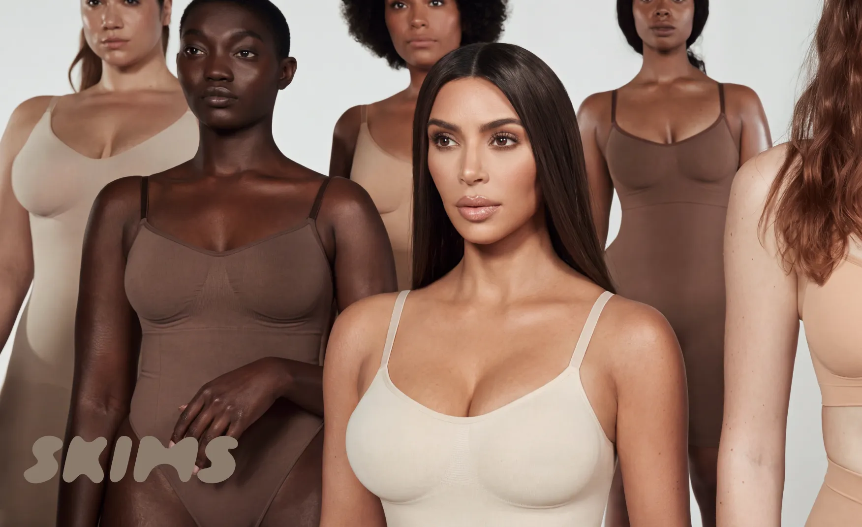
Kim Kardashian built Skims on a new category name and a shade range that matches every skin tone, then won over the NBA and Nike in six years.

Author:
Rishabh Jain

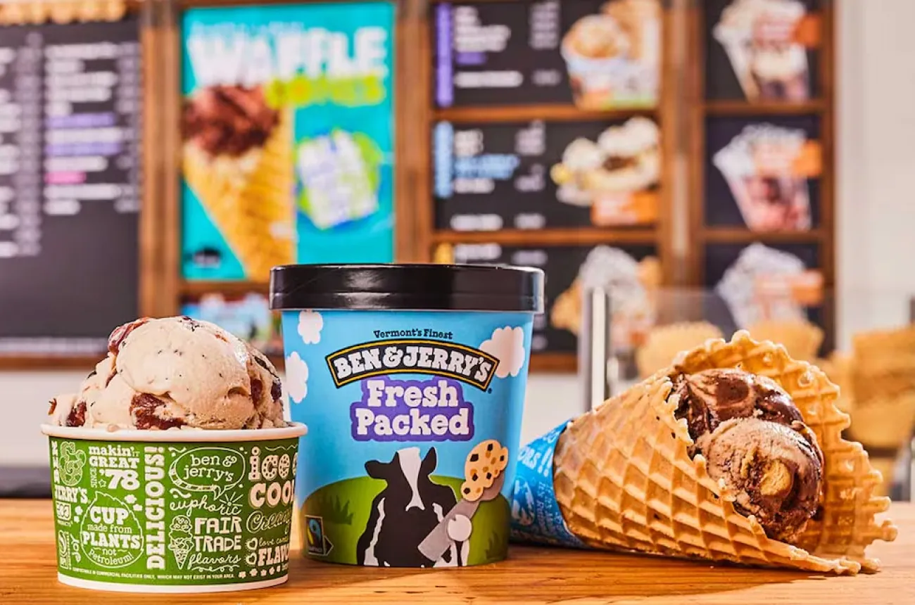
Ben & Jerry's kept its hand-drawn lettering, Vermont cows and punning flavour names on every pint for forty years, and made that packaging the voice of its mission.

Author:
Rishabh Jain

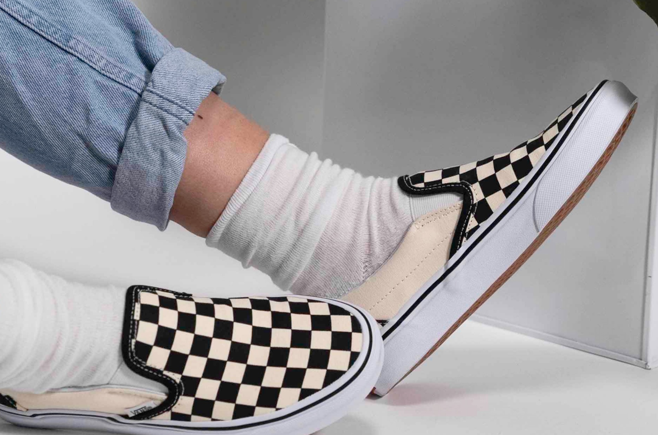
Vans built a visual system from a waffle sole, a sidestripe and a checkerboard that its customers helped draw, and now has to protect it from overexposure.

Author:
Rishabh Jain

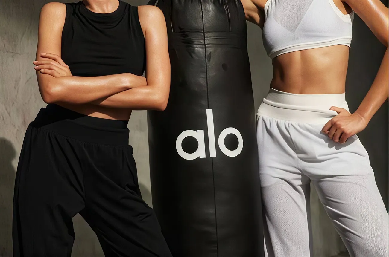
Alo Yoga built every flagship to be filmed first and shopped second, gave the brand a name that's actually a whole philosophy, and let retail itself become the brand's storyteller.

Author:
Rishabh Jain

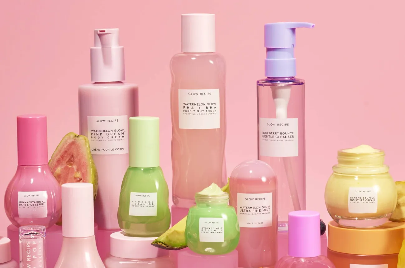
Glow Recipe took a single idea, make every product look like the fruit it's named after, and turned it into one of skincare's most recognisable packaging systems.

Author:
Rishabh Jain

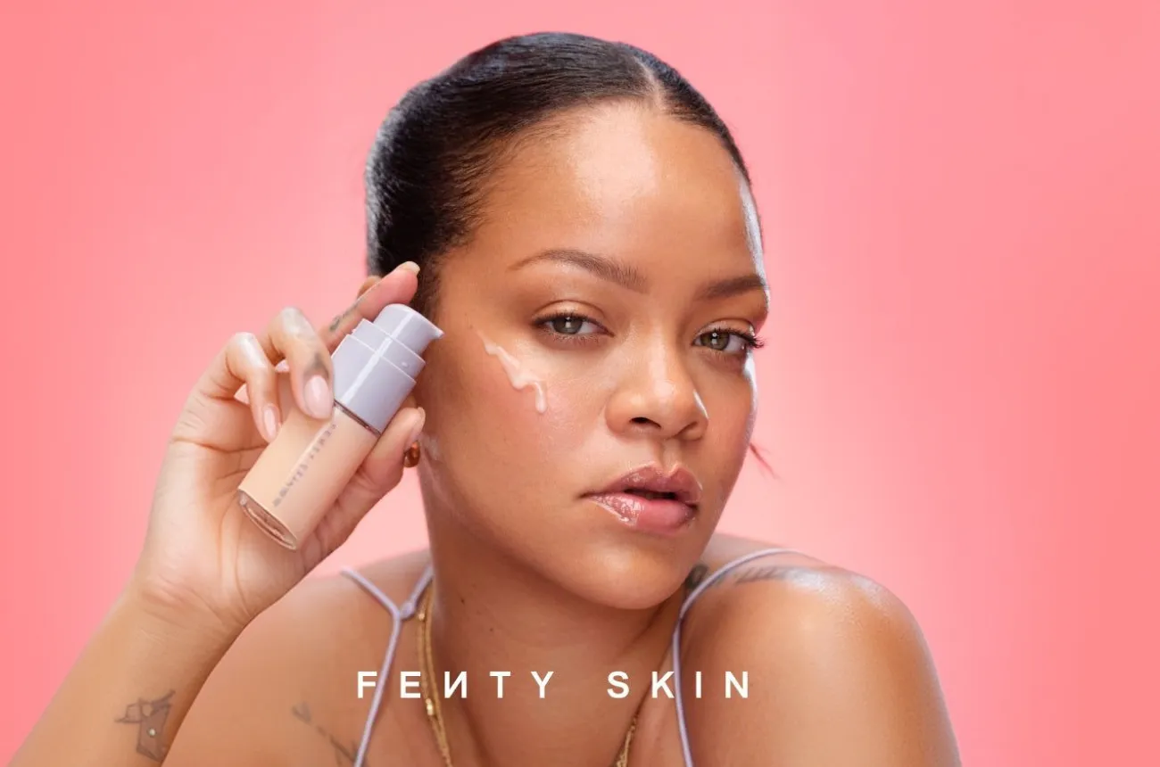
Fenty Beauty turned forty shades into an industry standard and a hexagon into a packaging system that has held five categories together for eight years, and still has more it could say.

Author:
Rishabh Jain

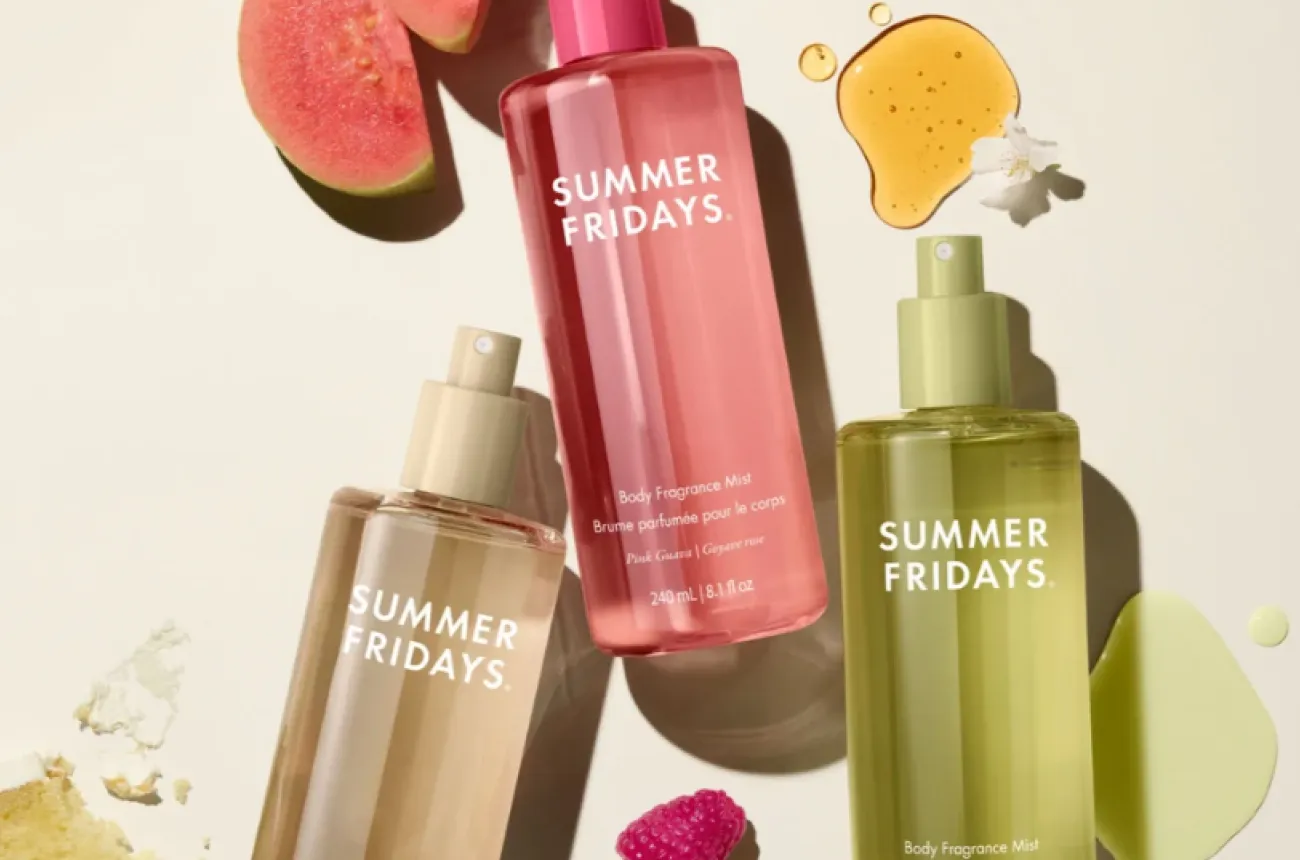
Summer Fridays named itself after a feeling instead of a product, then designed every pack to photograph better and now has to defend that exact look from everyone copying it.

Author:
Rishabh Jain

Lululemon built its premium on something customers could feel for themselves, not just believe. This audit looks at what's left of that promise now that leggings, stores and leadership are all being tested at once.

Author:
Rishabh Jain

Kayali made a generation start layering perfumes, a real shift, and the brand's whole identity. Now they've carried that idea into body care. But competitors already copied the playbook. The real question is whether Kayali can still own "layering" before it becomes industry wide.

Author:
Rishabh Jain

WishCare's name splits neatly into a promise and a discipline, and the packaging on its shelf does not carry the same idea.

Author:
Rishabh Jain

ClayCo designed a platform built to hold every beauty ritual on earth, and three years in, it still only tells Japan’s story, and even that one is slipping.

Author:
Rishabh Jain

NIC built a well-run house of ice cream brands, and gave its flagship label a name that keeps doing marketing work for a rival called Naturals.

Author:
Rishabh Jain

Foxtale is the upcoming skincare brand with colour coded packaging that customers can spot before reading the label, and now has to prove that colour can carry a brand once everyone else copies it.

Author:
Rishabh Jain

Rhode built a billion dollar exit on three products and one food led idea, and sold it for $10M in e.l.f Beauty in just 11 days.

Author:
Rishabh Jain

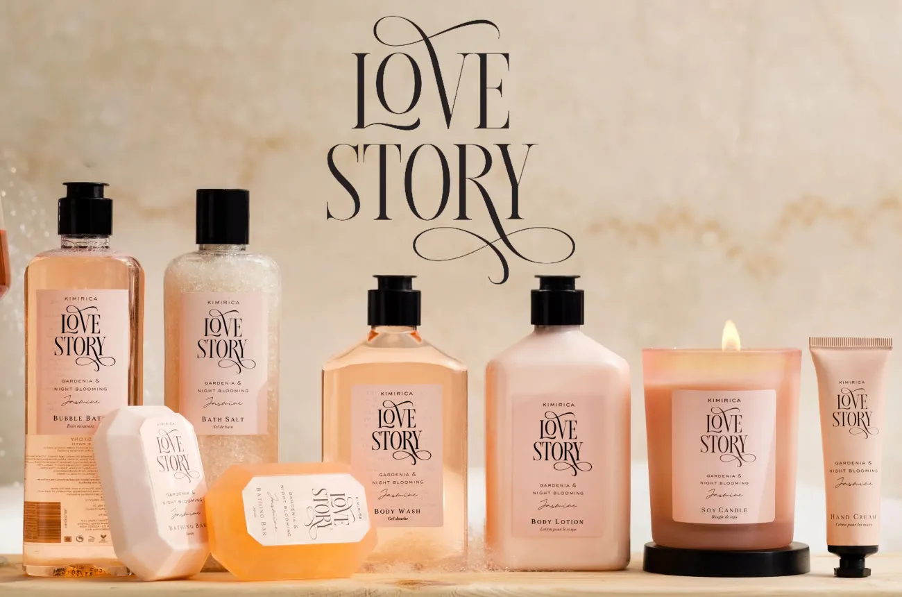
How Kimirica turned five-star hotel amenities into a bootstrapped Rs 300 crore vegan luxury bath and gifting brand.

Author:
Rishabh Jain

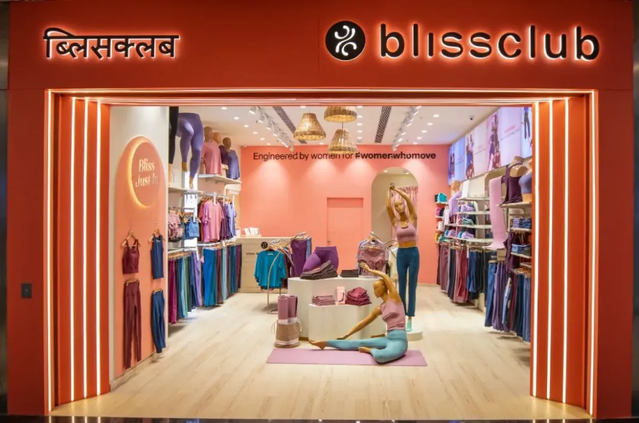
How BlissClub built India's most talked-about women's activewear brand from a WhatsApp community, and why profitability is now the harder game.

Author:
Rishabh Jain

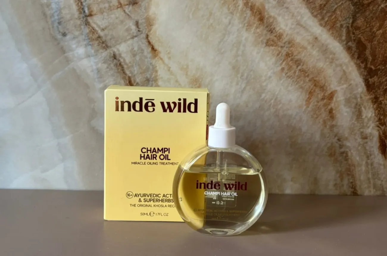
How Inde Wild became the first homegrown Indian brand to sell out at Sephora US through founder-led branding and a modern take on Ayurveda.

Author:
Rishabh Jain

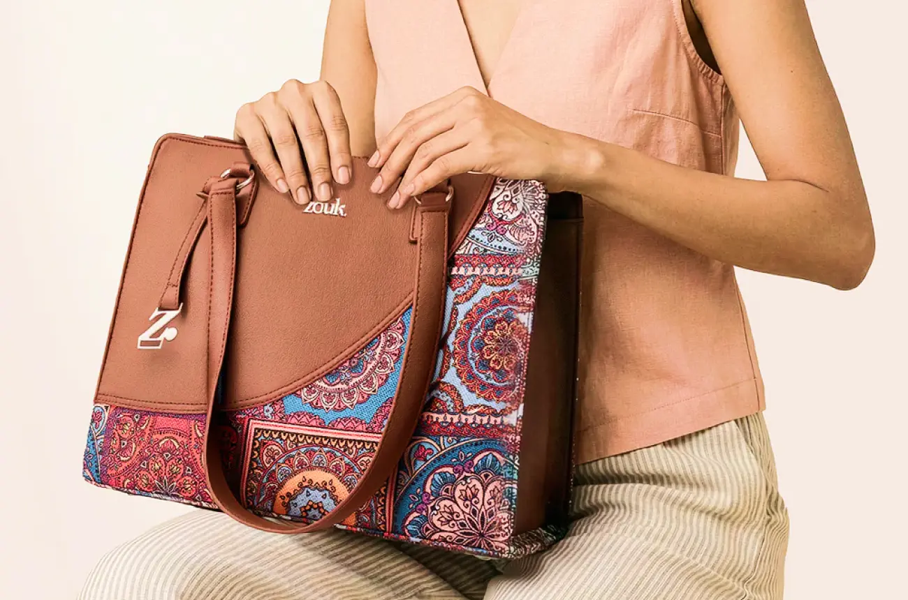
How Zouk built a Proudly Indian, PETA-approved bag brand by turning Indian handicraft into modern everyday carry, and why becoming iconic is the next design problem.

Author:
Rishabh Jain

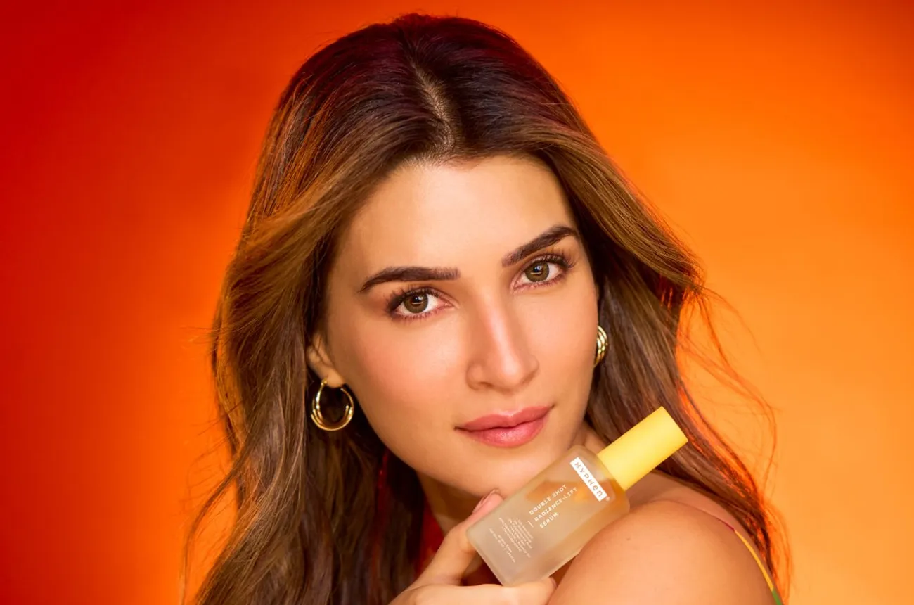
How Hyphen used Kriti Sanon as a co-founder rather than a mascot to build a skincare brand in two years, and why credibility is now its real battle.

Author:
Rishabh Jain

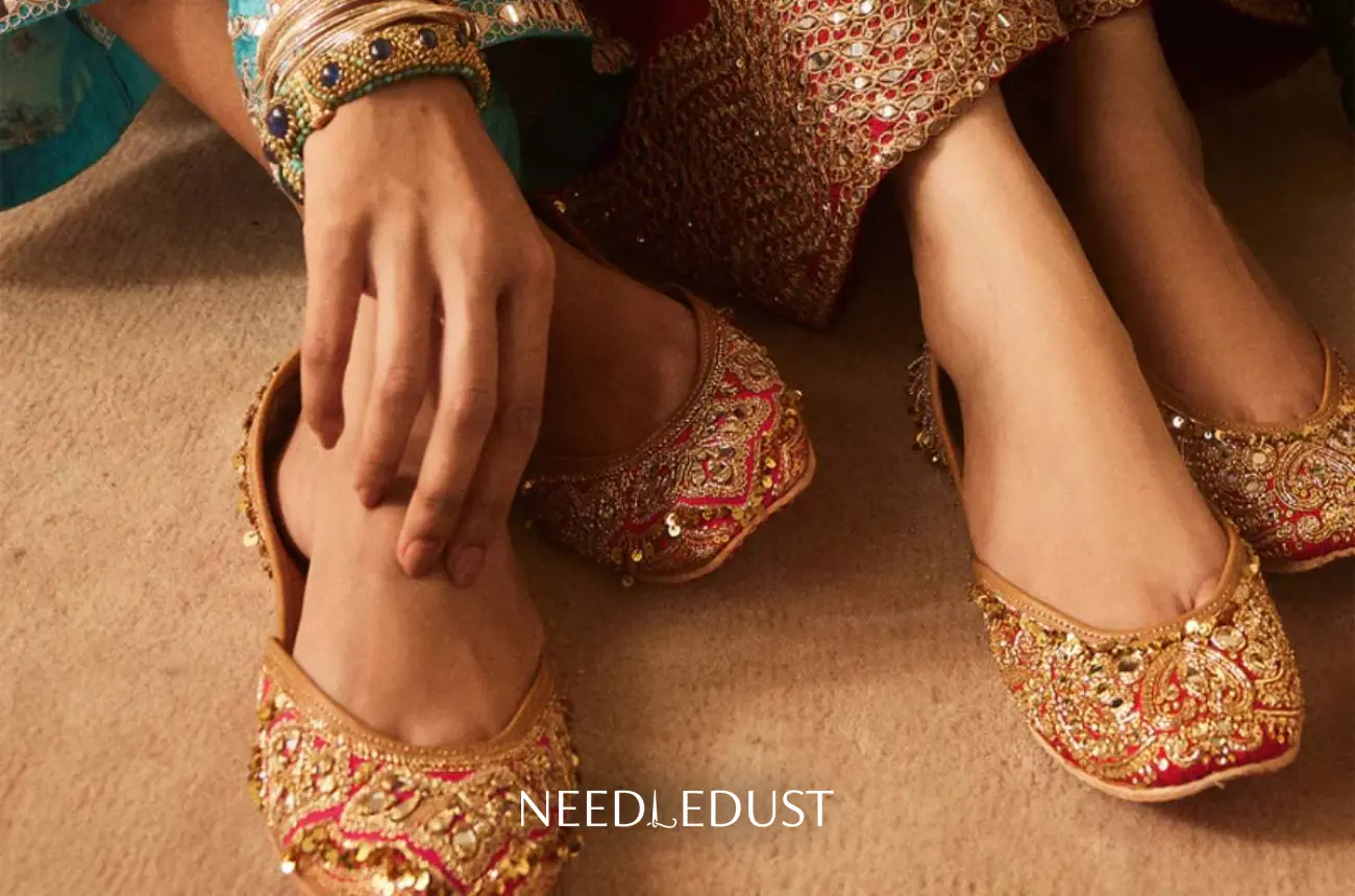
How Needledust turned the traditional jutti into a luxury, celebrity-worn shoe, and why growing beyond the occasion is its next design problem.

Author:
Rishabh Jain

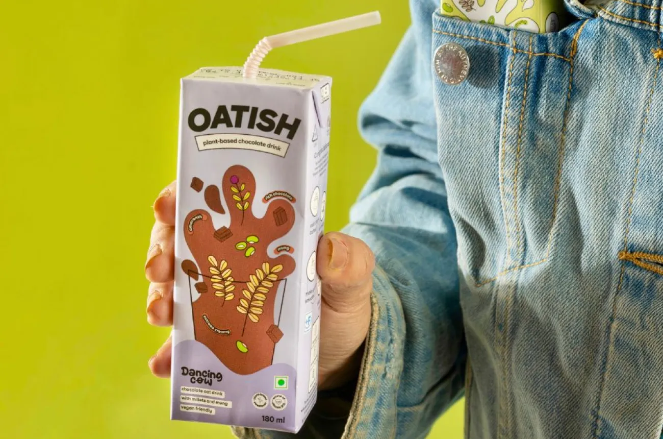
How Dancing Cow turned animal rescue into an alt-dairy brand, and why its two names now compete for the same shelf.

Author:
Rishabh Jain

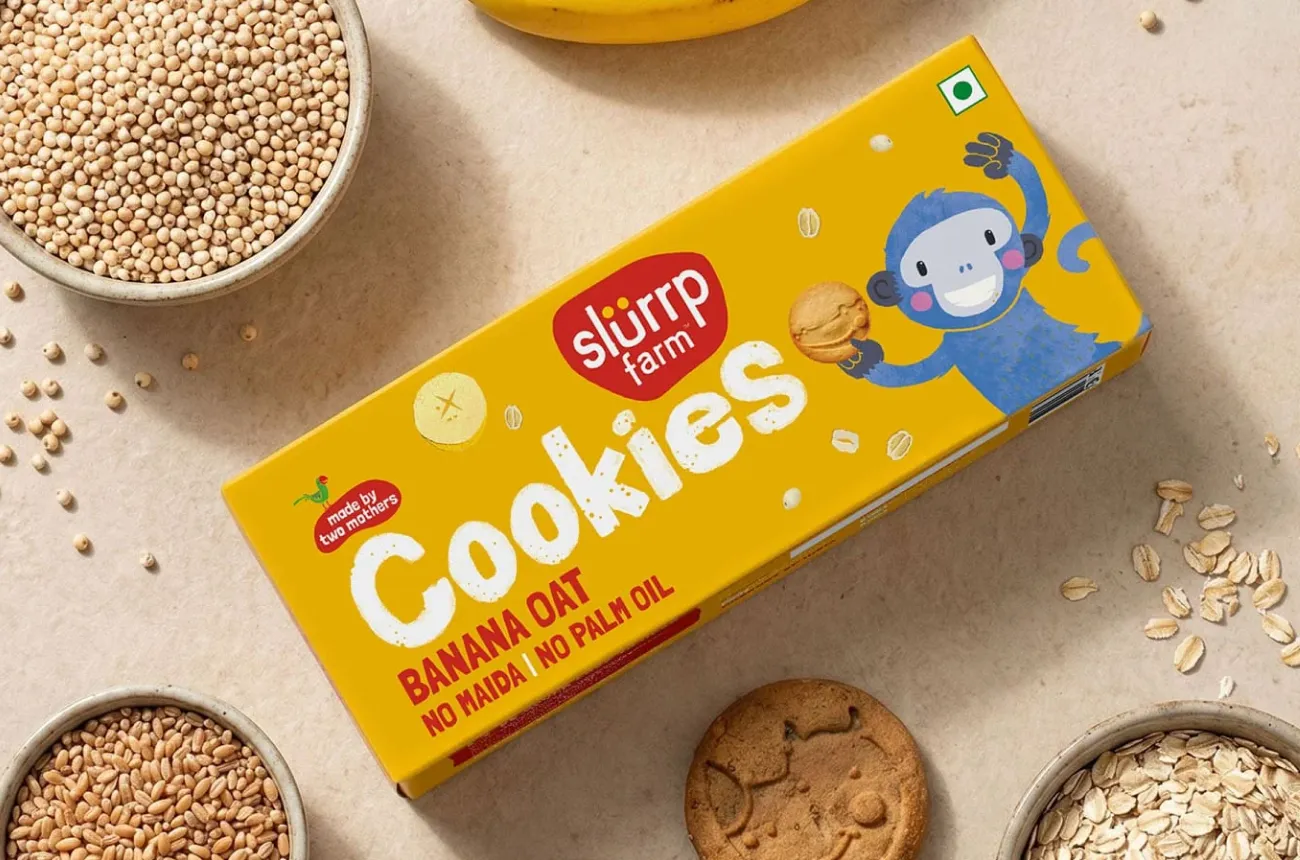
How Slurrp Farm made millets a children's food category through design-led packaging and a parent community it built itself.

Author:
Rishabh Jain

How Soulflower turned two decades of aromatherapy expertise into India's best-selling online hair oil, and why coherence is now its design challenge.

Author:
Rishabh Jain

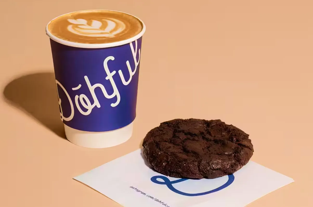
How Dohful turned soft-baked cookies and a candid founder newsletter into India's most intimate D2C brand, and why its offline pivot is the real test.

Author:
Rishabh Jain

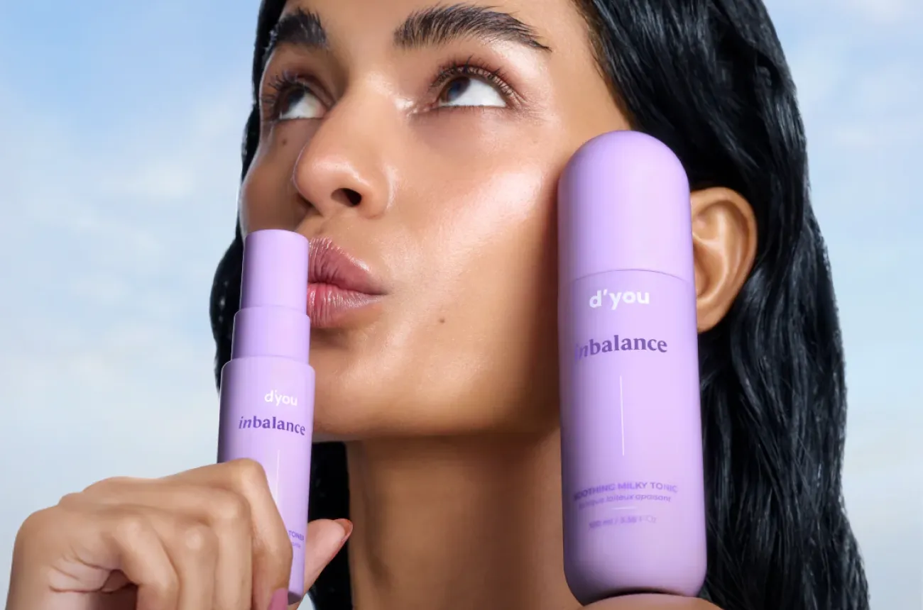
How d'you turned a single 11-active serum into a bootstrapped, profitable cult skincare brand by making the formula the whole brand.

Author:
Rishabh Jain

Cosmix built one of India's cleanest supplement brands through root-cause formulation and founder-led education, and earned a Marico buyout doing it.

Author:
Rishabh Jain

XYXX has cracked distribution in a way almost no premium Indian menswear brand has, but that same reach is now the thing putting its premium identity at risk.

Author:
Rishabh Jain

Bombay Shirt Company built a genuine zero inventory business on the promise that a shirt made for you fits better than one made for everyone, and now it has to prove that promise still holds across 40 stores.

Author:
Rishabh Jain

Palmonas turned a Bollywood actor into an equity holding co-founder and rode that bet to 40x revenue growth, but the brand behind the face still looks like every other demi-fine label on the shelf.

Author:
Rishabh Jain

India built the luxury Ayurveda category around Kama, and the brand is now watching a rival it once matched get bought outright by a global beauty giant.

Author:
Rishabh Jain

How Plix grew to Rs 436 crore by solving a format problem before a formulation problem, built a browse-by-plant experience no competitor has matched.

Author:
Rishabh Jain

How Benne built a Rs 350 crore brand story from a 12-seater dosa café in Bandra by picking one product, doing it obsessively well, and letting the queues tell the rest of the story.

Author:
Rishabh Jain

How Bummer built the first genuine personality in Indian innerwear, survived Ashneer Grover's "doglapan" moment on national television, and still has the most important question in front of it: how does a brand this loved become a business this large?
Author:
Rishabh Jain

How Nicobar built India's most disciplined lifestyle brand by refusing to raise capital, discount, or borrow a design language from anywhere else, and why it has become the quiet reference point for an entire generation of Indian founders.

Author:
Rishabh Jain

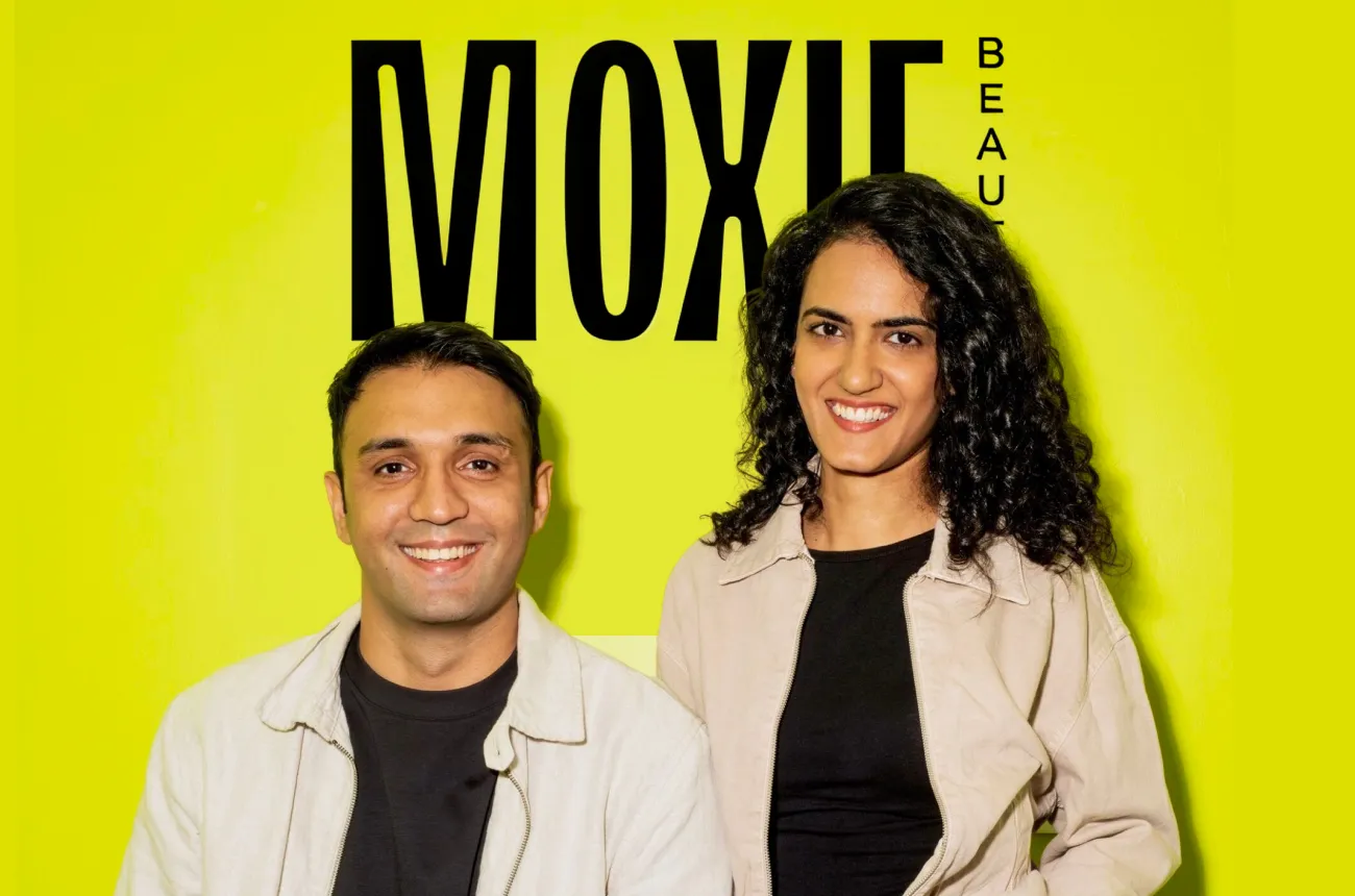
How Moxie Beauty told Indian women with curly and wavy hair something the global haircare industry had never bothered to say: it was never your hair, it was always the product.

Author:
Rishabh Jain

How Forest Essentials turned ancient Indian Ayurveda into a Rs 585 crore global luxury brand, and why the full Estée Lauder acquisition announced in March 2026 is the most consequential moment in its 25-year history.

Author:
Rishabh Jain

How Sleepy Cat built India's most coherent sleep brand by doing the one thing its better-funded rivals forgot: staying obsessively focused on sleep, and nothing else.

Author:
Rishabh Jain

How Country Bean made flavoured coffee India's softest entry into specialty before anyone else thought the market was ready, and why the brand that opened the category needs a next act before the market moves fully past it.

Author:
Rishabh Jain

How Nuuk is filling the gap between Dyson and cheap imports with design-first home appliances built for modern Indian homes, and why the brand identity now needs to move as fast as the product has.

Author:
Rishabh Jain

How Poppi turned colour, a founding story, and a TikTok community into a USD 1.95B acquisition by PepsiCo and why its biggest design challenge now has nothing to do with the can.

Author:
Rishabh Jain

How ZYN used design precision and sport sponsorship to make nicotine feel like a premium lifestyle choice, and what that reveals about the power and limits of branding.

Author:
Rishabh Jain

How OLIPOP made gut health fun instead of clinical, built a USD 1.85B brand that turned down acquisitions from both Coke and Pepsi, and became the last serious independent in a category that consolidated around it.

Author:
Rishabh Jain

How Gully Labs made Indian streets the design brief, built a Noida factory before most investors believed in it, and raised Rs 35 crore to prove the category is real.

Author:
Rishabh Jain

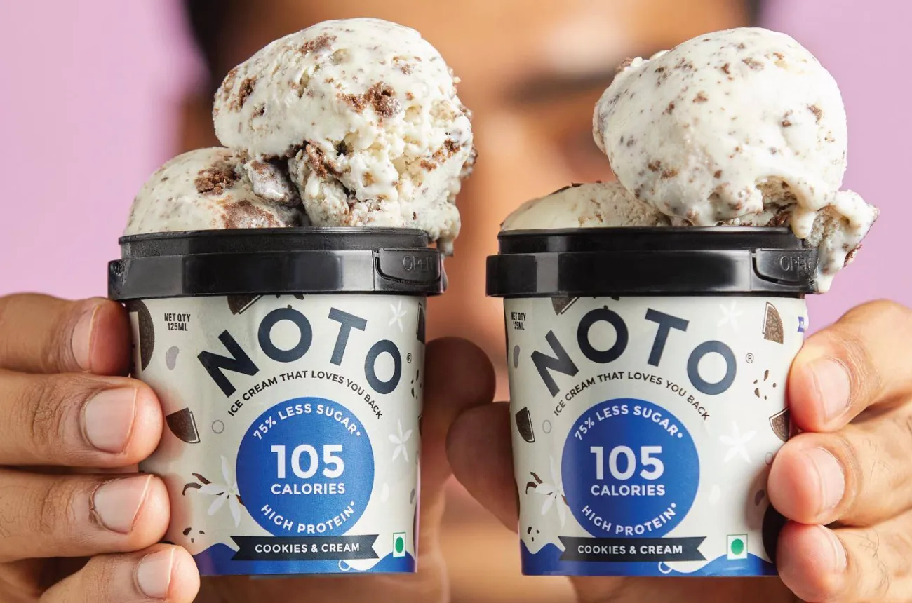
How NOTO spotted India's guilt-free ice cream opportunity before anyone else, earned 87 investors across eight rounds, and why the packaging and portfolio focus need to catch up with the founding insight before the competition does.

Author:
Rishabh Jain

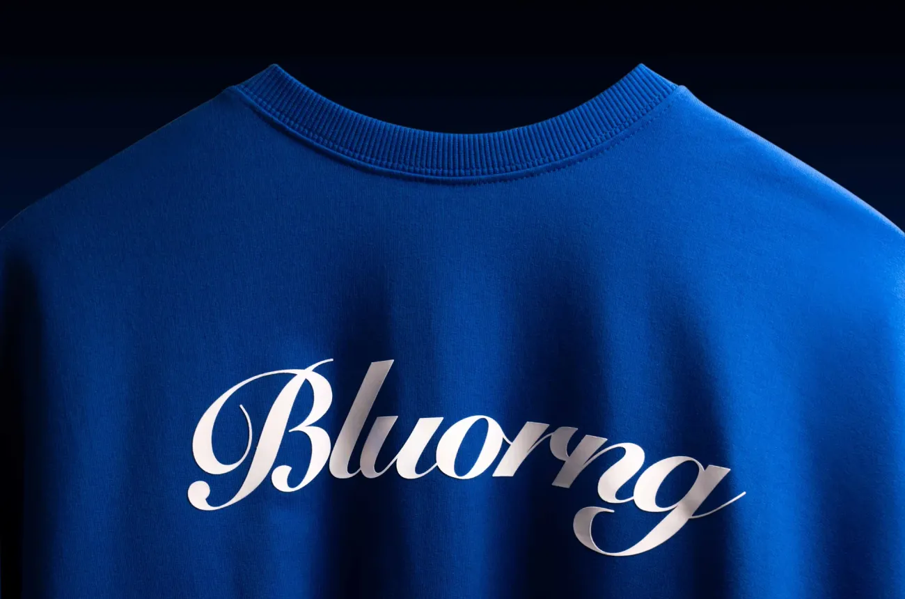
How Bluorng proved that Indian streetwear does not need a Western reference point to command Rs 20,000 for a sweatshirt, and what it means for every brand building in a category that did not exist before they arrived.

Author:
Rishabh Jain

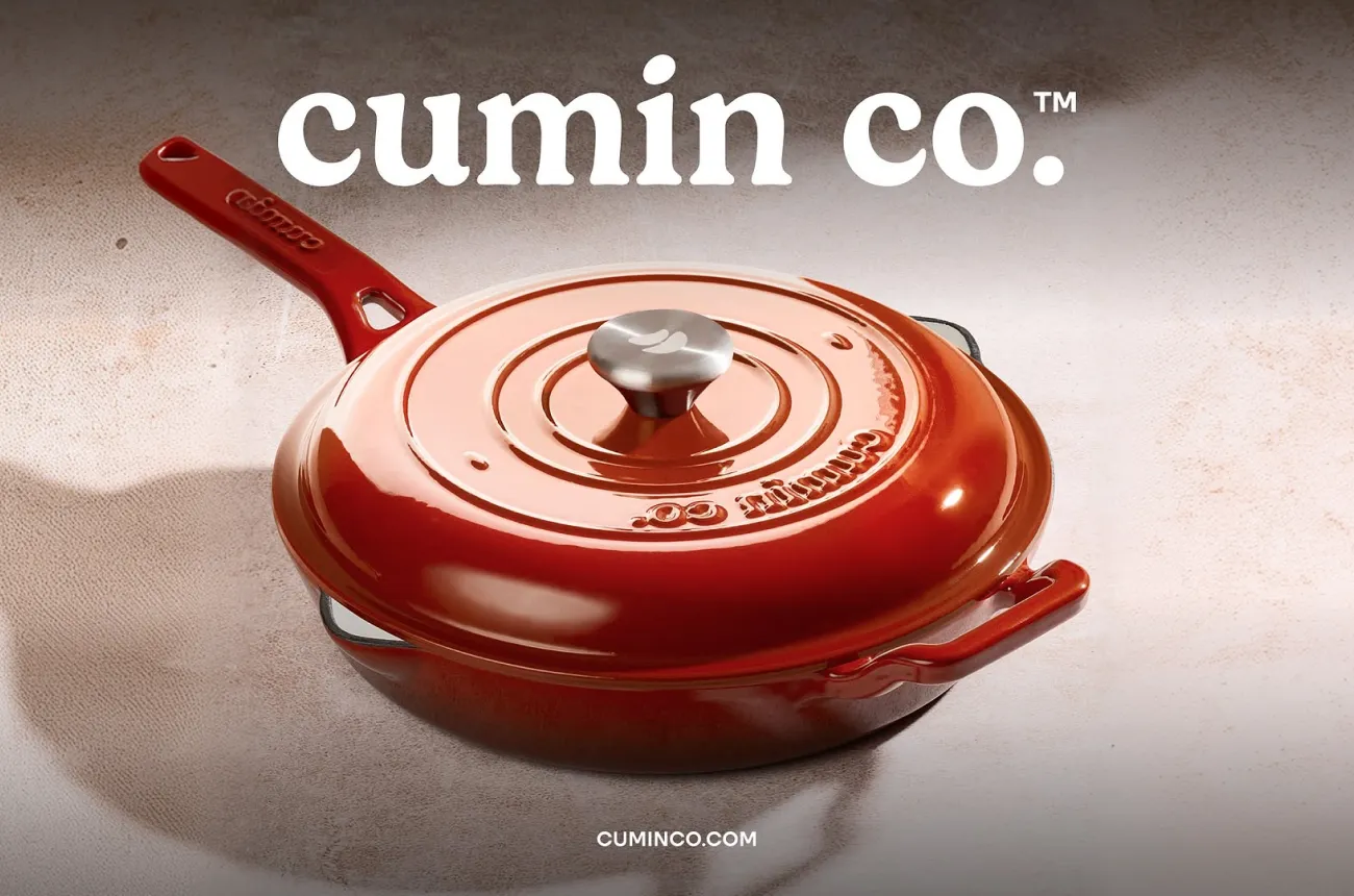
How Cumin Co consolidated India's scattered cookware market with patented technology and design so good that people ask where to buy it, and why the brand building work is what comes next.

Author:
Rishabh Jain

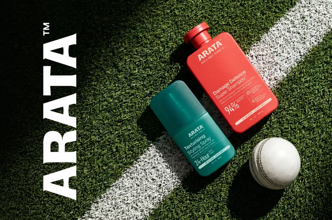
How Arata built a 1.5 million customer haircare business on product quality and quick commerce reach alone, and why both Unilever and L'Oréal invested in it.

Author:
Rishabh Jain

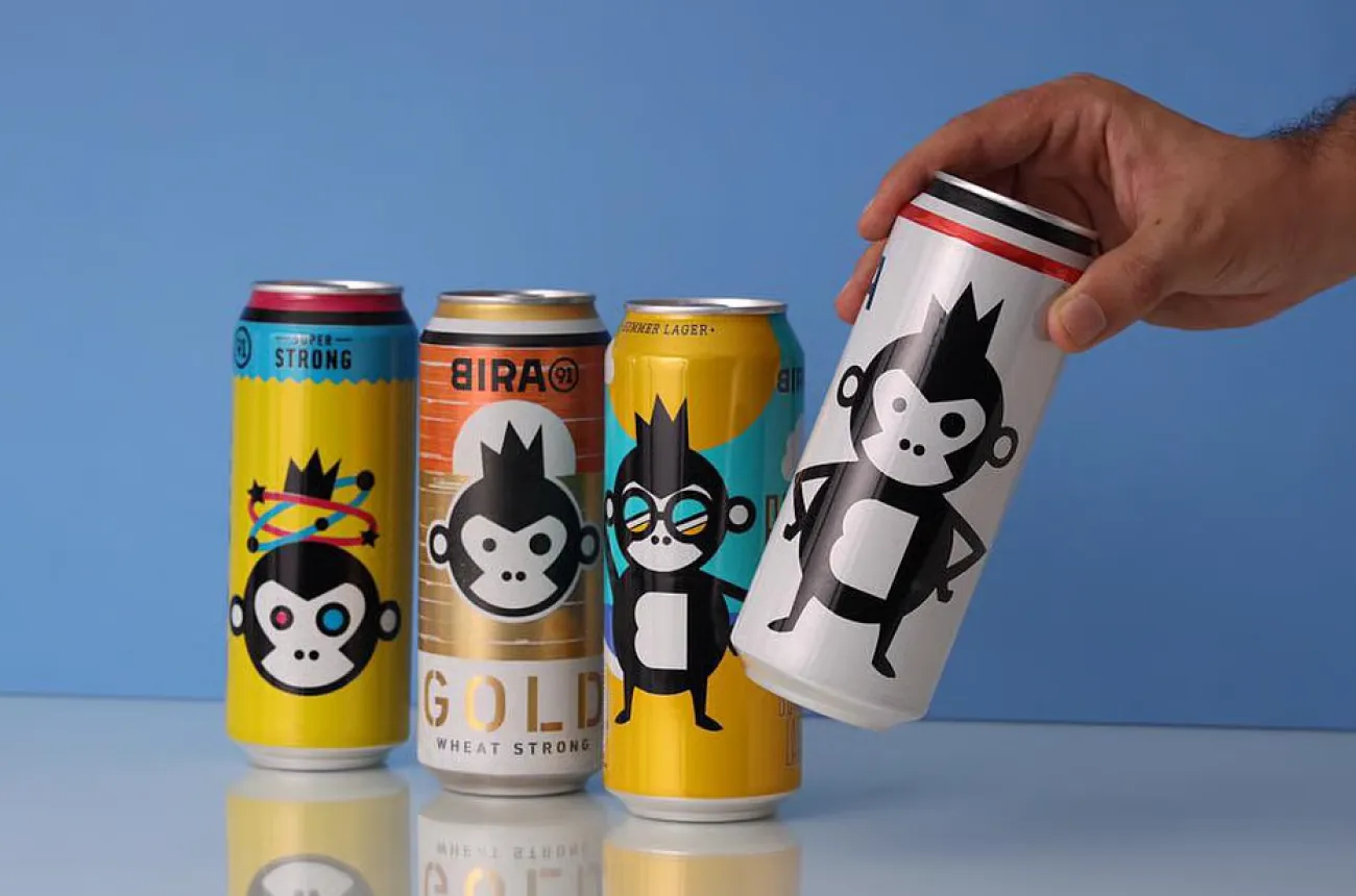
How Bira91 created India's craft beer category, became the default drink of a generation, and why the brand's cultural achievement and the business's financial crisis are two entirely separate stories.

Author:
Rishabh Jain

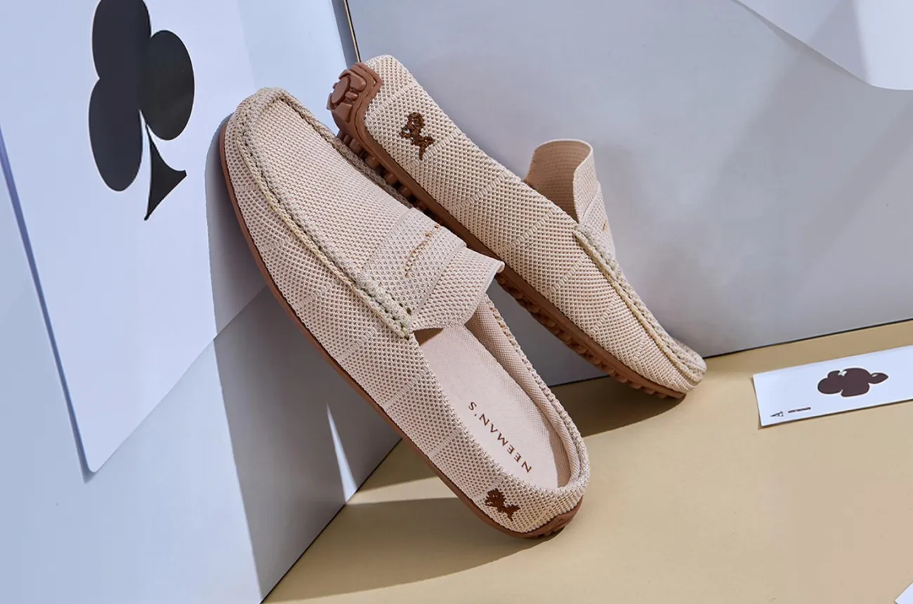
How Neeman's democratised sustainable footwear for India rather than premium-ising it, and why the brand identity has not yet caught up with the product's ambition.

Author:
Rishabh Jain
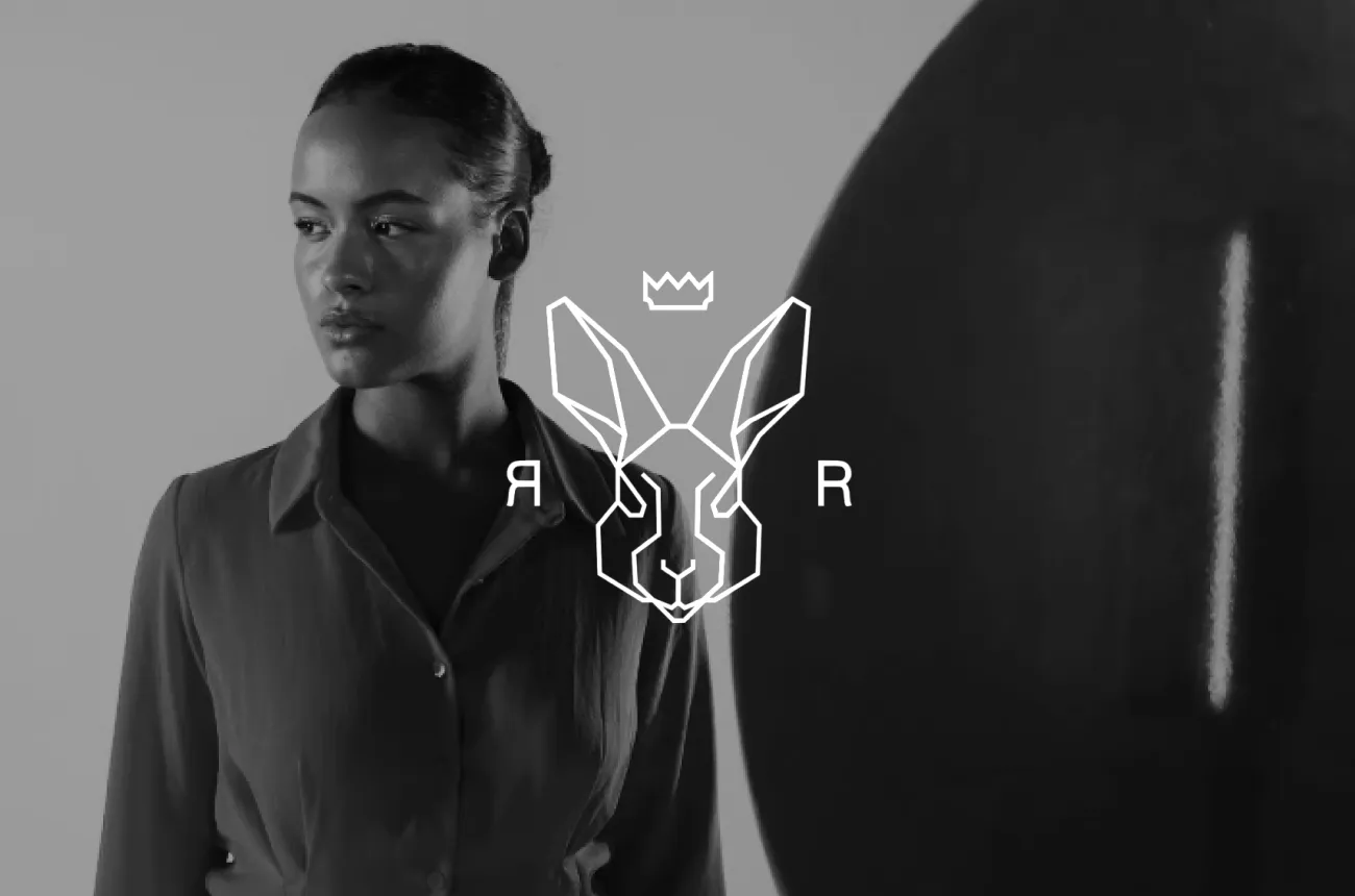
Rare Rabbit Brand Audit By Confetti Design Studio

How Rare Rabbit built India's most commercially serious premium fashion brand on product restraint, a tier 2-3 city strategy nobody talked about, and a monogram that does more brand work than any billboard could.

Author:
Rishabh Jain

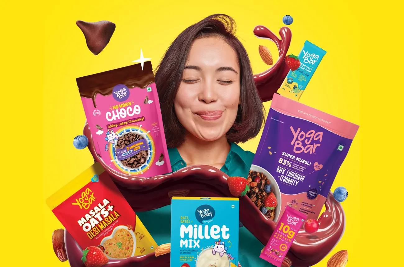
How Yogabar built a decade of consumer trust on ingredient honesty, scaled to Rs 201 crore through ITC's distribution reach, and now faces its most important brand question yet.

Author:
Rishabh Jain

How Jaipur Rugs built the most powerful Indian luxury story in the world through 40,000 artisans, Paris Fashion Week, and a founder who started with a Rs 5,000 loan.

Author:
Rishabh Jain

How Snitch went from Rs 11 crore to Rs 900 crore in five years by building the fastest trend pipeline in Indian menswear, and why the next Rs 900 crore requires something the machine cannot produce by itself.

Author:
Rishabh Jain

Mokobara made Indian luggage worth wanting. Whether it can hold its ground as the scrutiny grows is the next design problem to solve.

Author:
Rishabh Jain

How the Comet sneakers brand is building hype in India through iconic design, limited drops and streetwear culture.

Author:
Rishabh Jain

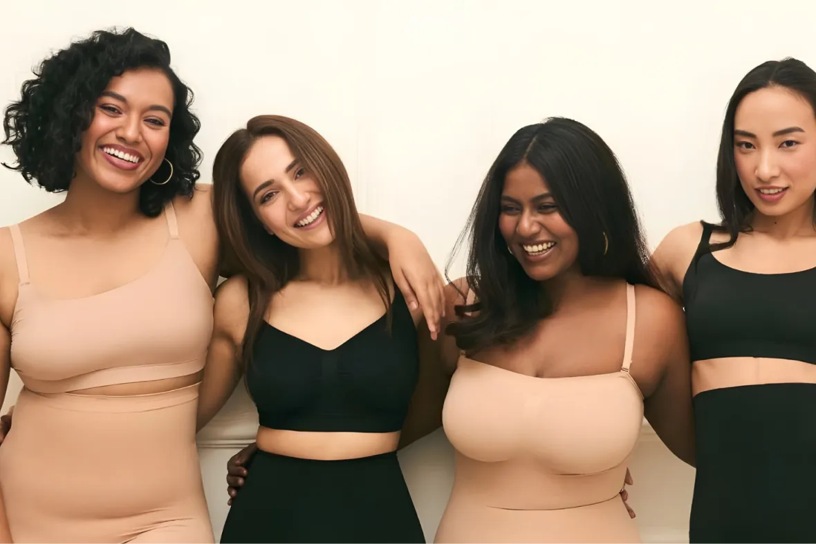
How UnderNeat is normalising shapewear in India through influencer-led branding, real women, and category-first storytelling.

Author:
Rishabh Jain

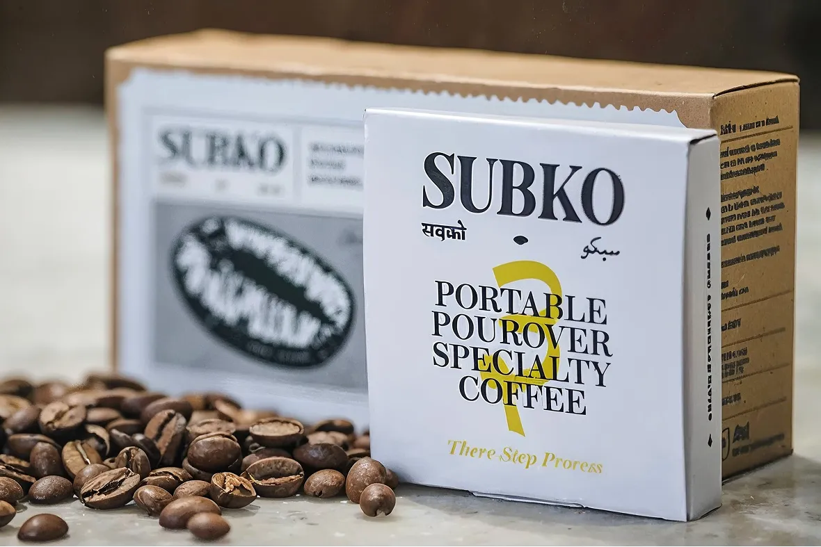
How Subko turned specialty coffee into a South Asian cultural movement: a Confetti brand audit.

Author:
Rishabh Jain

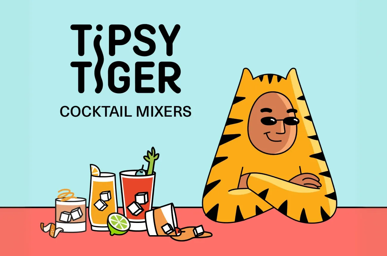
How Tipsy Tiger built a cocktail mixer brand with more personality than most funded competitors, and what it needs to do to translate that identity into breakout commercial scale.

Author:
Rishabh Jain

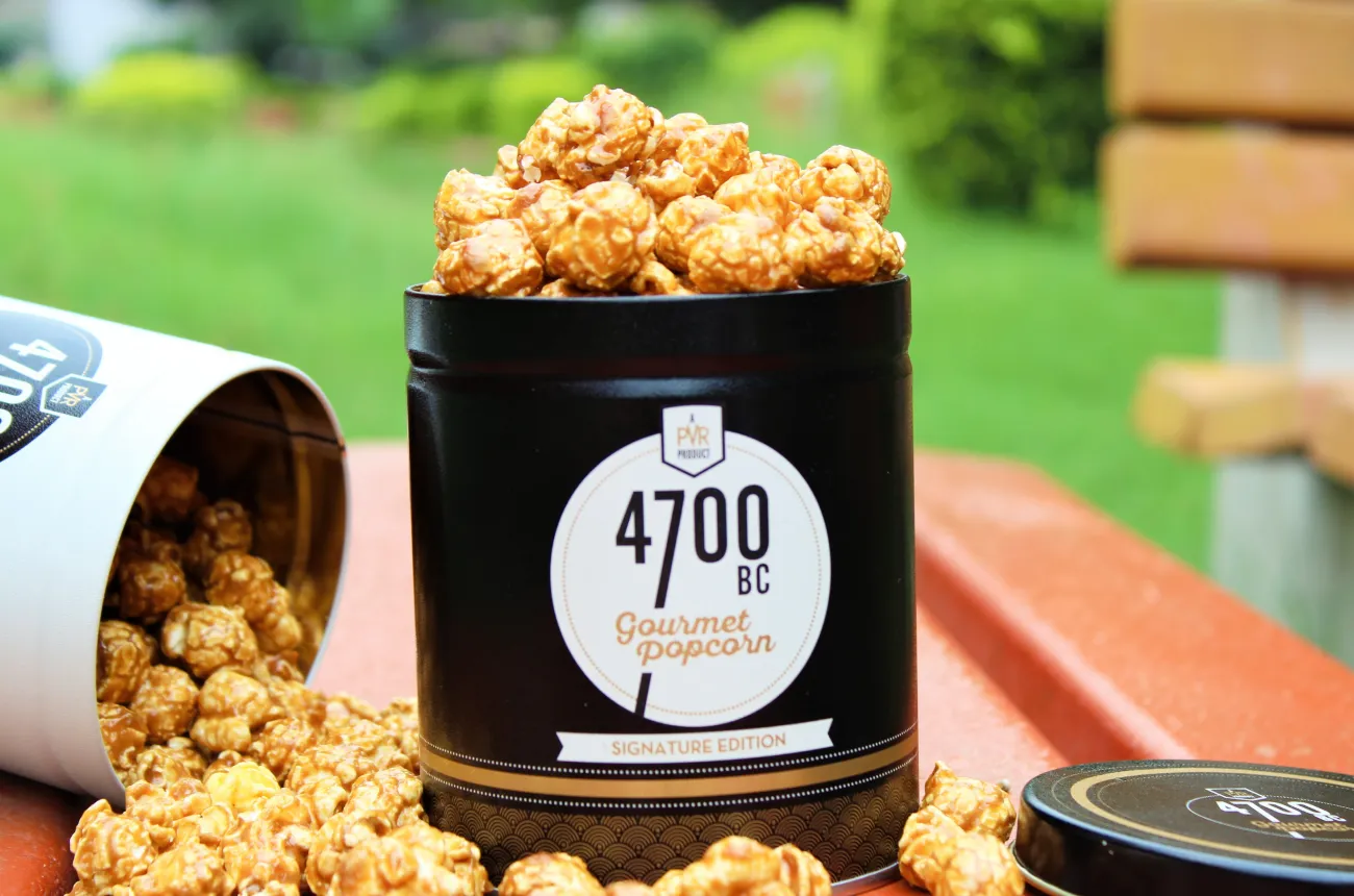
4700BC turned a commodity snack into a gourmet category, attracted PVR INOX and then Marico, and built the most disciplined brand identity in Indian premium snacking.

Author:
Rishabh Jain

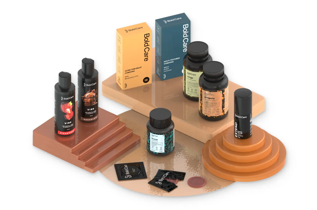
Bold Care turned one of India's most stigmatised categories into a Rs 100 crore conversation. The next chapter is about proving the brand can convert attention into sustainable profit.

Author:
Rishabh Jain

Bombay Shaving Company scaled faster than most Indian D2C brands ever will. The question now is whether the brand system can catch up with the ambition.

Author:
Rishabh Jain

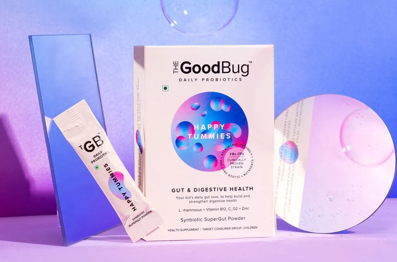
How The Good Bug made gut health feel like a lifestyle choice rather than a medical prescription, and why brand consistency is now the most important product it needs to build.

Author:
Rishabh Jain

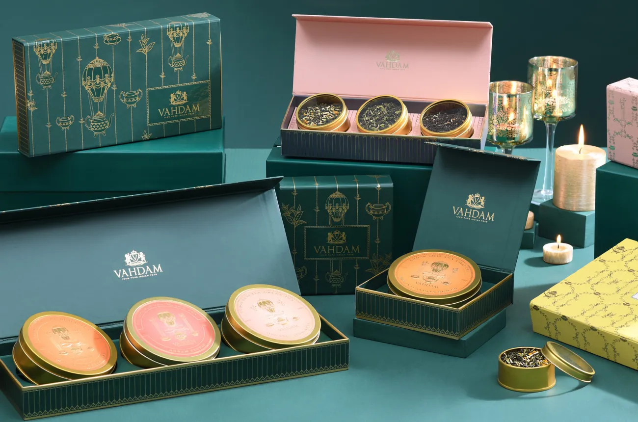
How Vahdam built a globally scaled Indian tea brand by controlling the supply chain from plantation to doorstep, without losing what makes it Indian.

Author:
Rishabh Jain

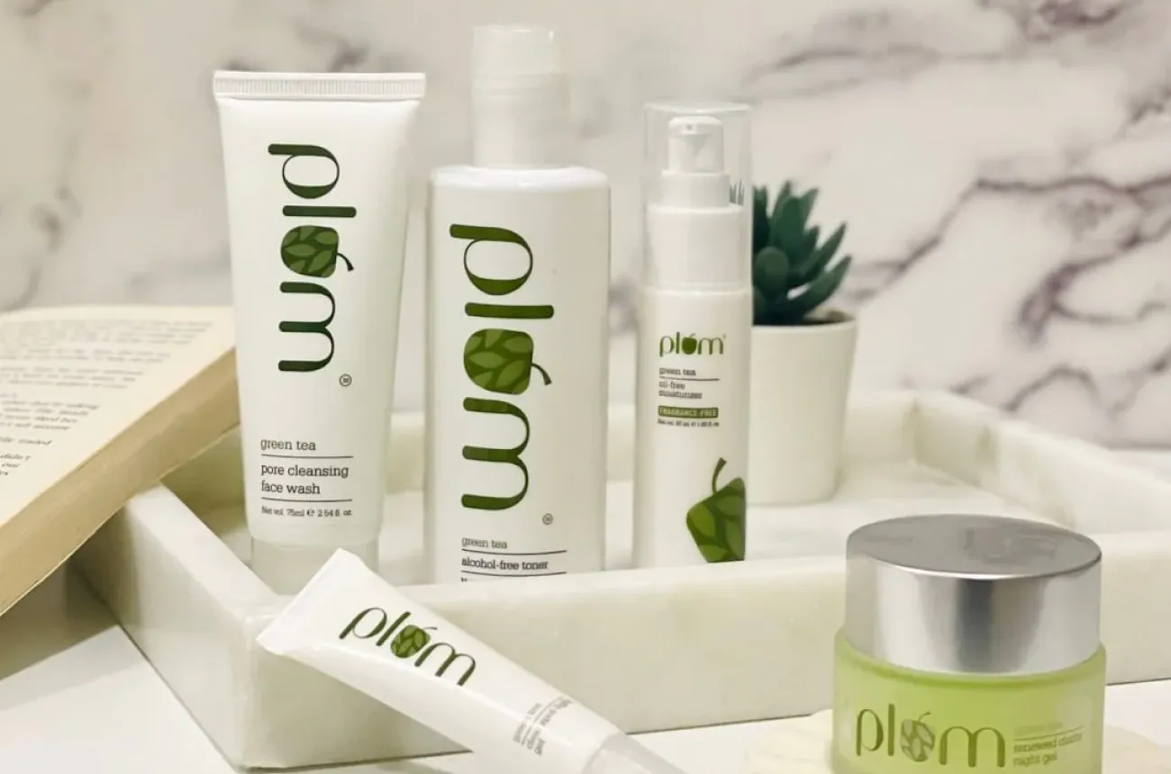
How Plum turns simplicity and functional design into a skincare staple, and what it takes to go from dependable to iconic.

Author:
Rishabh Jain

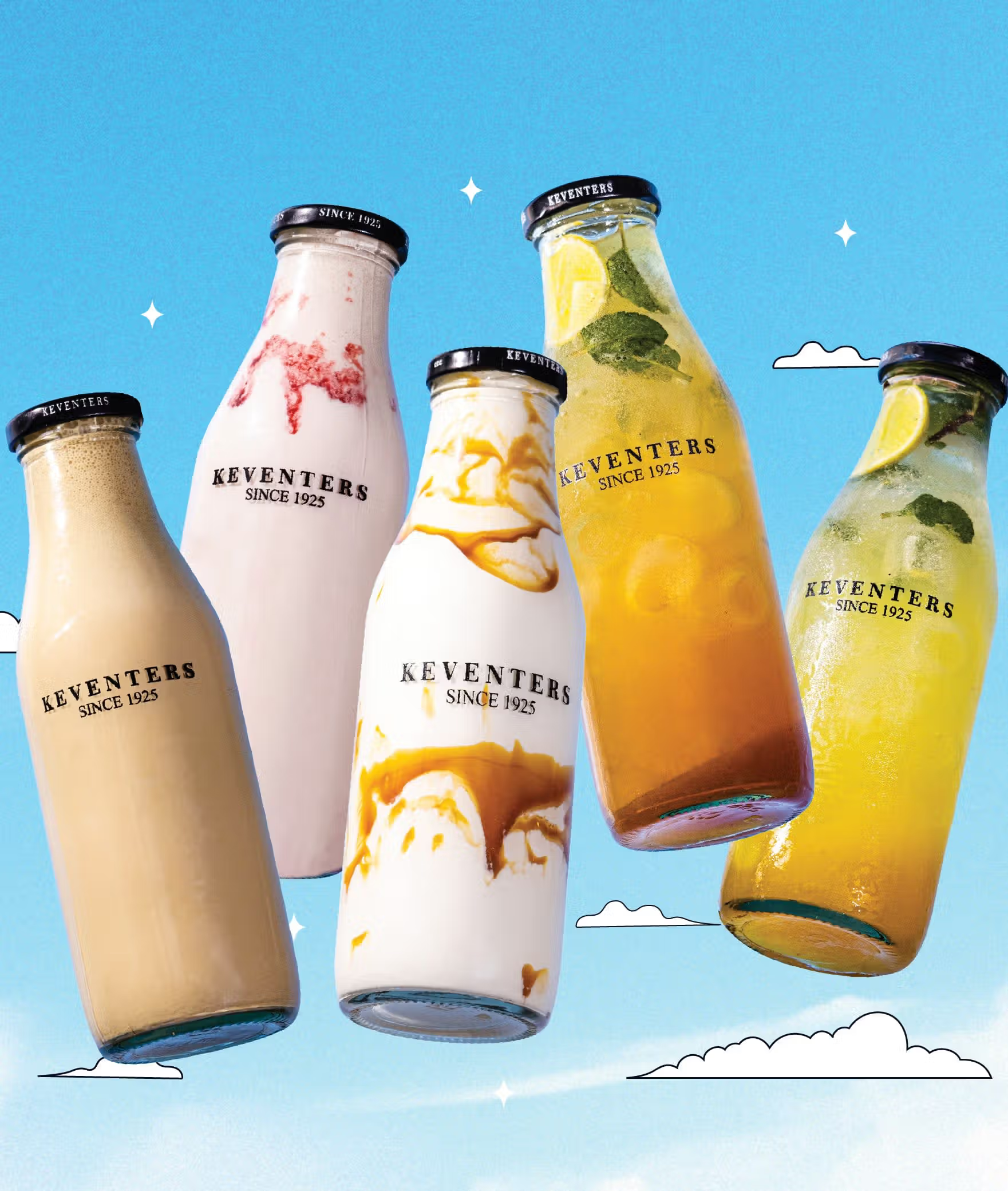
How Keventers blends a century of legacy with contemporary design to stay timelessly relevant in India's crowded indulgence category.

Author:
Rishabh Jain

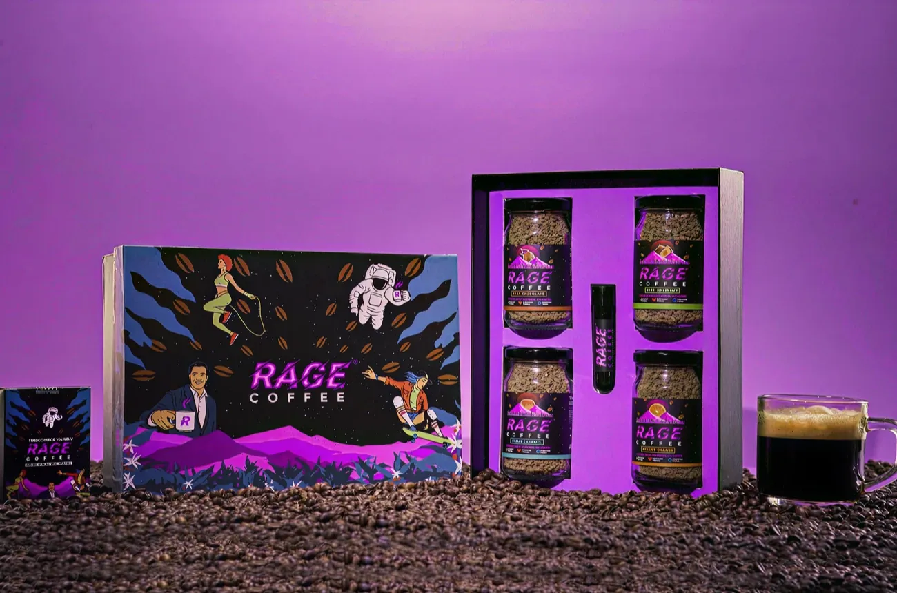
A closer look at how bold naming and visual cues turn coffee into an adrenaline experience, and why Rage Coffee has not fully committed to the promise its name makes

Author:
Rishabh Jain

How Sleepy Owl made cold brew a habit for urban India, and why staying interesting is now the harder challenge.

Author:
Rishabh Jain

How MyMuse made sexual wellness feel safe, modern, and completely normal for India.

Author:
Rishabh Jain

What happens when cocktail culture is designed for real homes, real parties, and real drinkers.

Author:
Rishabh Jain

How Indri became India's most awarded single malt by designing for all five senses, not just the glass.

Author:
Rishabh Jain

A look at how focus, simplicity, minimalism and intention built an unmistakably premium coffee experience.

Author:
Rishabh Jain

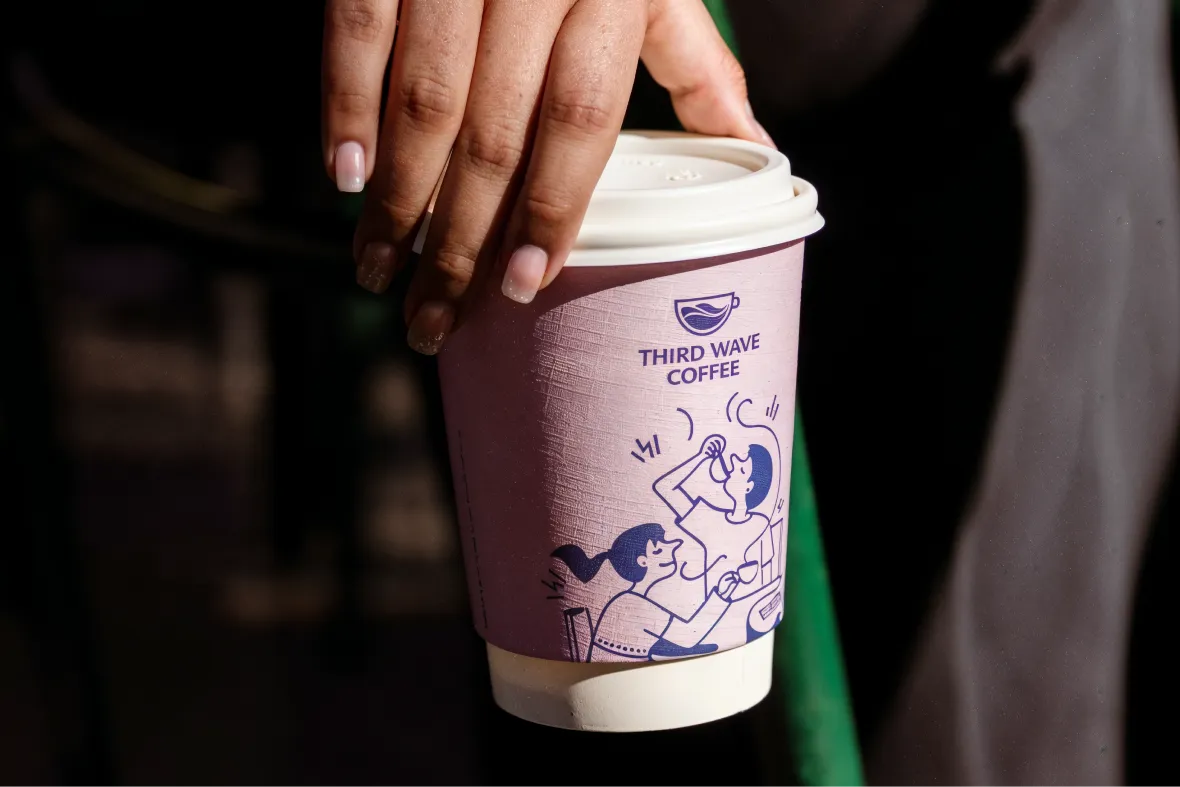
Third Wave Coffee put specialty coffee on the Indian map. The harder question now is whether it can protect the philosophy that made the name mean something.

Author:
Rishabh Jain

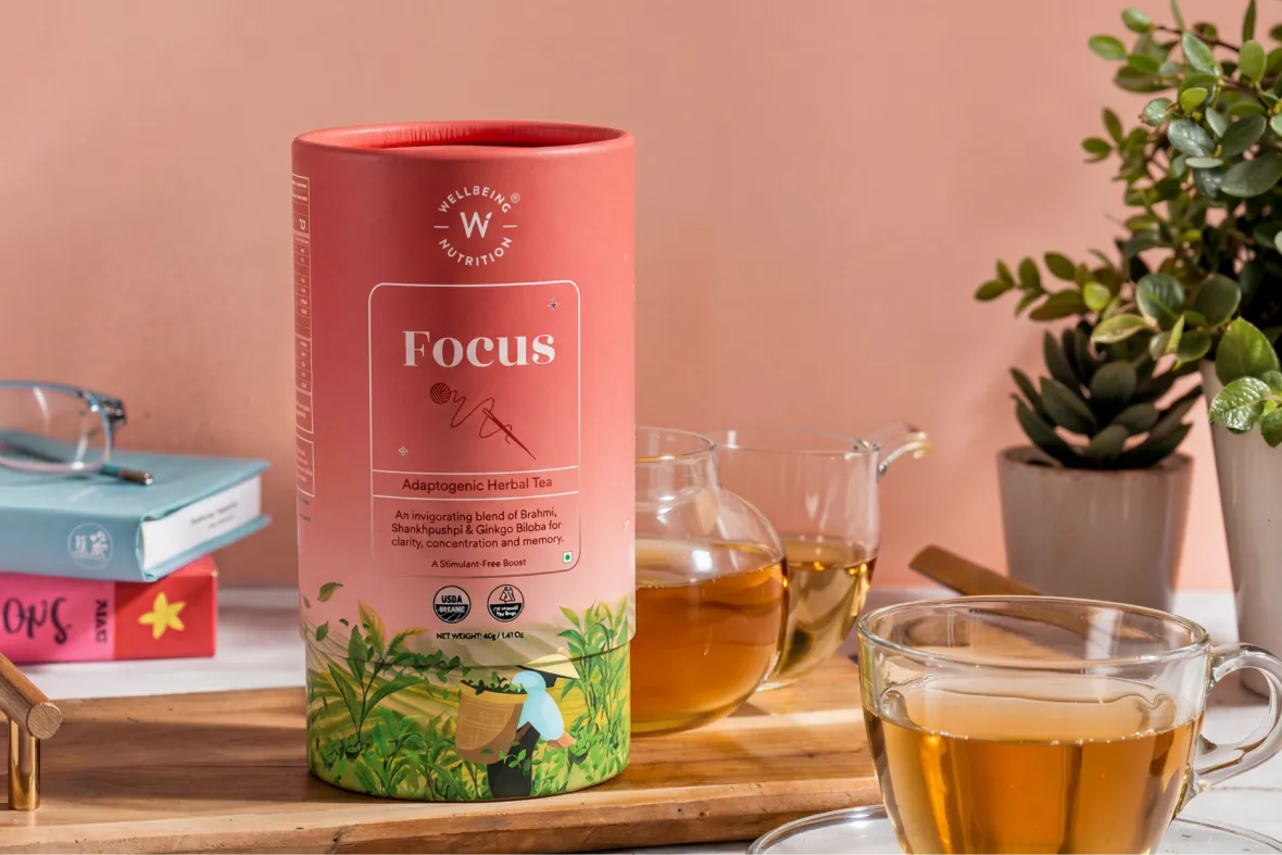
How Wellbeing Nutrition built a design system flexible enough to serve every age group without losing the plot.

Author:
Rishabh Jain

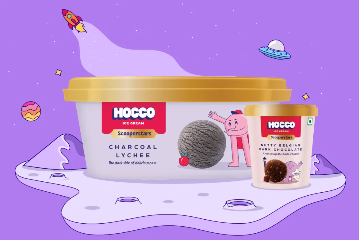
How Hocco reimagined indulgence through playful design, bold naming, and a joyful brand language that India's frozen aisles had never seen before.

Author:
Rishabh Jain

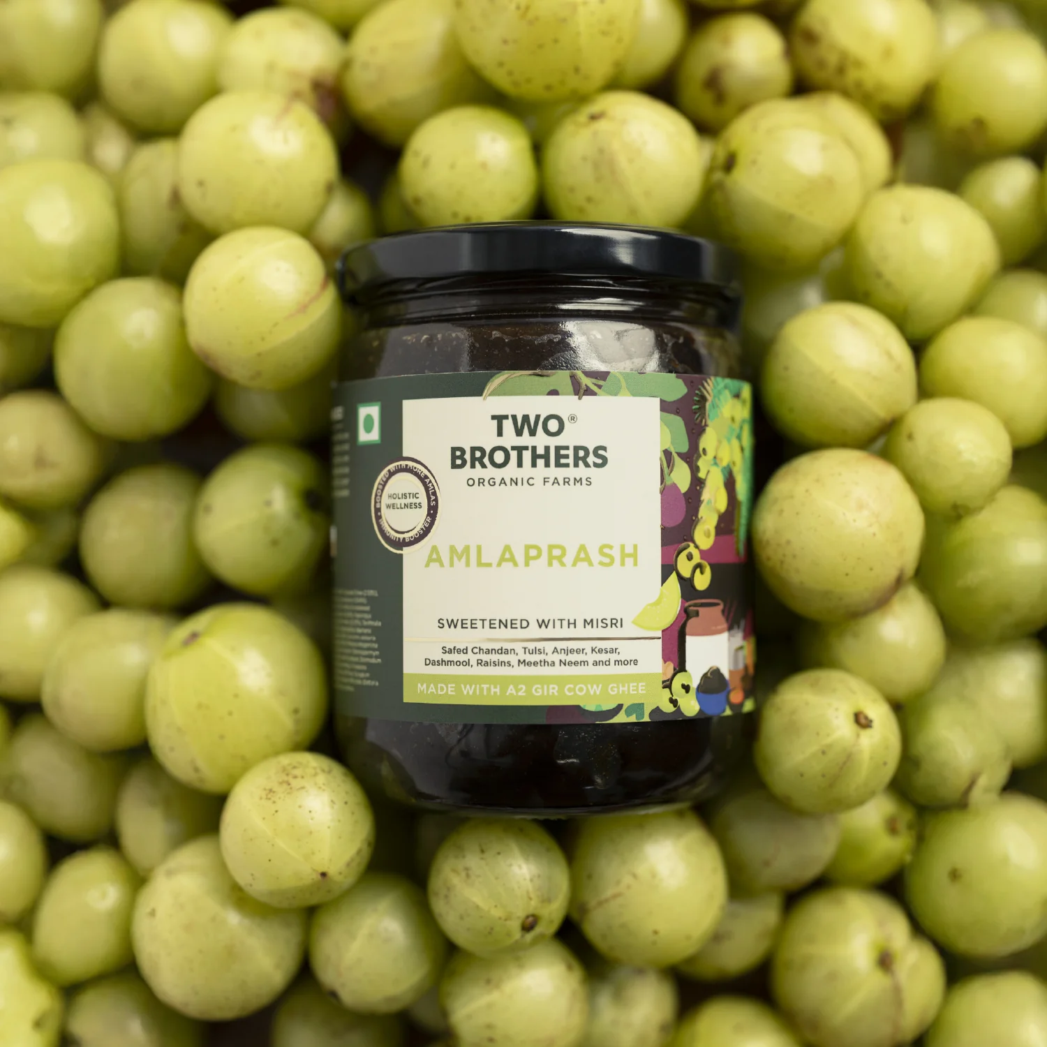
A closer look at how Two Brothers translates farm-first values into a trusted, premium identity.

Author:
Rishabh Jain

How The Whole Truth turned honesty into a design system, a business model, and a transparency movement.

Author:
Rishabh Jain

How SuperYou became India's fastest-growing celebrity D2C snack brand by making protein mainstream, not niche.

Author:
Rishabh Jain

How Paper Boat bottled childhood and sold it back to a generation, and why the next decade demands something more than memory.

Author:
Rishabh Jain

A closer look at how Phool reimagines a traditional ritual through sustainable design, storytelling, and modern luxury.

Author:
Rishabh Jain

How Mamaearth found the sweet spot between Patanjali and the Western beauty giants, and why that middle ground is getting harder to hold.

Author:
Rishabh Jain

Let’s Build The Next Big Thing

Portrait photo of Rishabh Jain, Founder of Confetti, smiling and sitting down.
Rishabh Jain's signature
Rishabh Jain
Founder @Confetti
Get Started
A stylized pink thunderbolt or lightning icon
Get Instant Response
We’re looking forward to talk to you!
There was an error in form submission.
Please try to submit the form again.

Global Recognition

The logo for the publication PACKAGING OF THE WORLD, featuring the word 'PACKAGING' in bold black capital letters and 'OF THE WORLD' in a smaller font size.
ITC Bingo Chatpat Kairi is featured in ‘Packaging Of The World', 2025
A product photograph showing a green bottle of 'Bingo! Chatpat Kairi' drink, surrounded by glasses of mango juice, a woven basket filled with raw green mangoes, and slices of mango.
The logo for the World Brand Design Society, which includes a black geometric symbol, the Royal Coat of Arms of the United Kingdom, and the words 'WORLD BRAND DESIGN SOCIETY'.
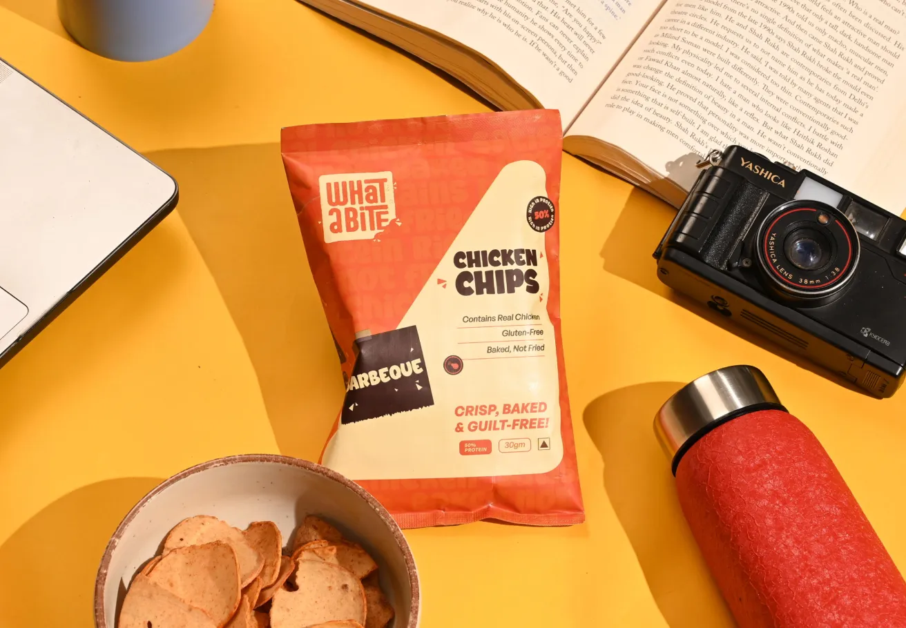
WhatABite is featured in ‘World Brand Design Society’, 2025
Close-up of a bag of orange-red 'WhatABite Chicken Chips (Barbecue)' resting on a bright yellow surface, surrounded by a laptop, an open book, a black vintage-style camera, a red thermos, and a small white bowl holding some of the chips.
The logo for the packaging editorial Dieline, represented by a black circle containing a stylized white 'D' shape.
AIM Nutrition is featured on ‘Dieline, 2025’, a globally reputed packaging editorial
A flat lay photograph of several products from AIM Nutrition's 'MeltinStrips' line, including blue boxes for 'Sleep' and white boxes for 'Beauty,' along with small orange sachets for 'Energy,' all scattered on a light background
The logo for the publication PACKAGING OF THE WORLD, featuring the word 'PACKAGING' in bold black capital letters and 'OF THE WORLD' in a smaller font size.
ITC B Natural is featured in ‘Packaging Of The World', 2025
A light green bottle of B Natural Tender Coconut Water sits on a blue and white patterned tile table next to a half coconut shell filled with a drink and garnished with a grapefruit slice and rosemary. The background is a bright seaside landscape with a blue ocean and distant cliffs.
The logo for the publication PACKAGING OF THE WORLD, featuring the word 'PACKAGING' in bold black capital letters and 'OF THE WORLD' in a smaller font size.
Pawsible Foods is featured in ‘Packaging Of The World', 2025
A smiling Golden Retriever dog wearing a green tag, leaning on a table next to a large green box of Pawsible Foods Core Wellbeing Nutritional Topper and a stainless steel bowl containing the food. The background is a blurred, lush green outdoor setting.
The logo for the publication PACKAGING OF THE WORLD, featuring the word 'PACKAGING' in bold black capital letters and 'OF THE WORLD' in a smaller font size.
Miduty is featured in ‘Packaging Of The World', 2025
A set of three black-lidded supplement bottles from the Miduty brand, labeled Estrogen Balance, Liver Detox, and Methyl B-12 & Folate, displayed against a sleek, light blue, clinical-style background.
The logo for the publication PACKAGING OF THE WORLD, featuring the word 'PACKAGING' in bold black capital letters and 'OF THE WORLD' in a smaller font size.
Swizzle is featured in ‘Packaging Of The World', 2025
A visually striking product photo featuring three cans of Swizzle Premium Mocktails (Pineapple Mojito, Blue Lagoon, and Desi Lemonade), each bearing a polar bear mascot wearing sunglasses. They are arranged on a pink surface next to a red cloth and a bowl of salad, with a hand reaching for the can on the right.
The logo for the publication PACKAGING OF THE WORLD, featuring the word 'PACKAGING' in bold black capital letters and 'OF THE WORLD' in a smaller font size.
ITC Bingo Chatpat Kairi is featured in ‘Packaging Of The World', 2025
A product photograph showing a green bottle of 'Bingo! Chatpat Kairi' drink, surrounded by glasses of mango juice, a woven basket filled with raw green mangoes, and slices of mango.
Like what you see?
Let's discuss your project
Book A Call