%201.webp)
02
AI Snaps
.svg)
.svg)
01
Our Work

03
About Us
05
Contact Us
06
Client Success

07
Blogs
08
Careers
Book A Call


Need Help In Building Your Brand?
Click the button below & book a call with our founder directly.

Rishabh Jain
Managing Director
Sensory branding goes beyond using colours and logos. It involves engaging a combination of senses to create a memorable brand connection and build loyalty.
This guide covers what sensory branding actually is. We take you through how to audit your brand's current sensory footprint, which senses matter most by category, and how to build a sensory identity that works across different platforms.

Sensory branding is a strategy that engages two or more of the five senses: sight, sound, touch, smell, and taste, to create emotional associations that drive brand recall and purchase behaviour.
Instead of just telling customers about a product, you invite them into an immersive experience.
Think about the satisfying snap of a Kit Kat bar, the distinct shape of a Coca-Cola bottle, or the calming scent in a high-end spa. All of these are carefully designed sensory cues that strengthen your brand identity.
💡Sensory branding works by building subconscious shortcuts between a sensory cue and a brand memory.
Your brain does not process “I see a logo, I feel a texture, I hear a sound.” It processes a unified impression. And that impression bypasses rational thought.
So, when a consumer touches a package with a soft-touch matte finish, their brain processes "premium". When they smell a particular fragrance, the signal travels directly to the limbic system, the part of the brain that governs emotion and memory. No other stimulus works this fast or this deep.
The goal is to create positive feelings and memories that customers associate with your brand. When done right, this five senses branding strategy helps differentiate you from competitors, foster customer loyalty, and make your brand unforgettable.
💡Sensory branding has direct commercial implications.
According to research published in the Harvard Business Review, multi-sensory environments increase consumers' willingness to pay and strengthen brand memory.
For FMCG and D2C brands competing in a crowded retail and ecommerce environment, it is one of the most underused competitive advantages available. And only very few brands act on this beyond choosing a colour palette.
In a retail environment, the average purchase decision in a low-involvement category takes 3–7 seconds. Visual information is processed fastest, but it is also the most competitive channel, every brand invests in it.
Touch, smell, and sound are less saturated. That means the opportunity cost of ignoring them is high, and the cost of engineering them well is lower than most founders expect.
Before building a sensory strategy, you first need to know where you honestly stand.
Here’s what we call a Sensory Footprint Audit.
It's a simple self-assessment: 5 questions, one per sense, scored across three tiers:
☑️Intentional (designed deliberately as part of brand strategy)
☑️Accidental (exists but was never strategized)
☑️Absent (no touchpoint exists).
At Confetti, when we do this test with clients, most clients discover they are investing 90% of their sensory budget in sight. The remaining four senses are either accidental or completely absent.
This is a gap and an opportunity.
The research supports this directly. Studies have found that multisensory congruence: when two or more sensory cues align and reinforce each other, significantly increases perceived product quality and purchase intention.
Example:
A D2C fashion jewelry brand in Mumbai has a strong visual identity. But, customers kept returning items because the packaging felt cheap: thin cardboard, flimsy inserts.
The brand had never considered tactile branding.
After switching to a weighted box with soft-touch lamination and a ribbon pull tab, return rates dropped. No change to the product. Just the sensory footprint.
So, sensory branding is not about doing more. It's about making what you do feel coherent.
Our senses are powerful gateways to our emotions and memories.
The smell of freshly baked bread might transport you back to your grandmother's kitchen, or a particular song might remind you of a summer vacation. This connection is what makes sensory branding so effective.
💡When a brand engages multiple senses, it creates a richer, more memorable experience that is stored more deeply in the brain.
This is because sensory information is processed in the emotional center of our brain. A pleasant scent can improve a person's mood, and a thoughtful texture can make a product feel more luxurious and valuable.
This is the core of emotional branding through packaging; it’s not just about selling a product, but about creating a feeling that customers want to experience again and again.
Vision still dominates at shelf and on screen.
Sight is the sense that gets overinvested while being under-leveraged. Every brand on every shelf uses visual identity. Colour, typography, shape, imagery: these are the essentials.
Most brands invest in looking good. Few invest in looking right for the specific emotional response they want to trigger.
Visual branding can work through these elements:
👁️Color psychology: different hues trigger different emotional states and category associations. Bright, bold colors can create excitement and draw attention, while soft pastels can feel calming and gentle.
👁️Spatial hierarchy: what the eye goes to first on a package determines what information lands.
👁️Shape recognition: distinctive silhouettes are processed faster than text. The unique, curved design of a Fanta bottle, inspired by the act of squeezing an orange, is not only easy to recognize but also fun to hold, making the visual experience more engaging.
👁️Contrast and motion: in digital environments, animation and visual tension drive scroll-stopping behavior.
👁️Special printing techniques: add a layer of visual surprise. Thermochromic inks, which change color with temperature, can reveal a hidden message when a beverage can is chilled.
👁️Glossy highlights: draw the eye to a specific detail, while a clean, minimalist design can communicate simplicity and sophistication.
Brands must leverage these associations, make a lasting impact and earn customers. At Confetti we align with this and treat brand identity design as visual language as a strategic decision, not an execution task.
Touch often determines purchase decisions more than any other sense because it validates quality claims physically. Texture adds a layer of depth and encourages physical interaction, making the experience more intimate.
When a consumer picks up a product, the brain registers material weight, surface texture, structural rigidity, and closure mechanics within milliseconds. This is the reason why premium material packaging is critical for luxury branding.
These inputs generate an immediate quality judgment that is very difficult for rational evaluation to override. If a package feels cheap, a consumer will not believe the premium price claim, regardless of what the label says.
Touch is the truth-teller.
The specific tactile signals and what they communicate:
👆Soft-touch matte laminate: Modern premium. Common in beauty, wellness, and lifestyle categories. Communicates "considered, clean, contemporary."
👆Embossing/debossing: Craft and heritage. Adds physical depth to a logo or pattern. Communicates "made with intention."
👆Foil stamping: Ceremony and luxury. Used selectively, foil everywhere dilutes the signal. Best used for a single key element (logo, hero claim, graphic accent).
👆Raw kraft/uncoated board: Sustainability, honesty, artisan character. Communicates "nothing to hide."
👆Corrugated micro-flute: Structural integrity with an honest material story. Used effectively by D2C brands shipping fragile products.
👆High-gloss UV spot varnish: Creates visual and tactile contrast, a specific element lifts off the surface. Used for shelf standout.
👆Unique materials: Using materials like wood, metal, or fabric can make a package stand out and align with a brand's natural or industrial aesthetic.
Creating packaging that feels as good as it looks is a cornerstone of effective multisensory packaging design.
Feeling inspired to add a tactile dimension to your brand? As a specialized branding agency, we can help you choose the right materials and finishes. Book a call with our experts to get started

Talk to Confetti experts about sensory branding strategies that translate to brand loyalty and purchases.
Book a Strategy Call
Sound is the most underrated sense in branding. A 3-second audio logo increases brand recognition by up to 96% when paired with visual identity.
The reason is neurological. Sound bypasses rational filters and attaches directly to emotional memory.
Intel’s bong, or Netflix’s ta-dum: you can hear them as you read this.
Sound operates through two distinct channels:
🔊Sonic identity: Jingles, brand mnemonics, sonic logos. Amul's jingle, Lijjat Papad's advertising audio, Airtel's four-note melody (composed by A.R. Rahman, now one of the most recognized sonic logos in the world) are sonic brand assets with measurable equity.
🔊Material sound: The sounds a product or package makes during normal use. The snap, the click, the crinkle, the pour. The Kit Kat "snap" is an engineered sound that Nestlé has built entire campaigns around.
The click of a Zippo lighter is a sound trademark. The hiss of a soda can opening is Coca-Cola's packaging system communicating "fresh, sealed, quality." The satisfying pop of a blister pack communicates pharmaceutical seriousness.
For D2C brands, the unboxing sound sequence is a brand moment. The sound of tissue paper being peeled back, the click of a magnetic closure, the rustle of a structured inner tray, these sounds are experienced at the peak emotional moment of the customer relationship (first physical contact with the product).
For app-based brands, notification sounds are sonic branding assets. PhonePe's payment confirmation sound, Google Pay's chime, these act like brand signals.
Brands can intentionally design sound into their packaging. The distinct rattle of a Tic Tac container is so recognizable it has become part of the product's charm.
When designing your multisensory packaging design, consider the sounds of opening, closing, and using the product. A quiet, smooth opening might suit a luxury skincare brand, while a crinkly, loud wrapper could be perfect for a fun, energetic snack.
Smell is neurologically unique. It is the sense most closely linked to memory, making it an incredibly powerful tool in sensory branding strategies.
Approximately 75% of all emotions generated each day are triggered by smell, and consumers are 100 times more likely to remember something they smell compared to something they see, hear, or touch
While it’s a natural fit for food, beverage, and beauty brands, other industries can use it too. Scented inks or materials can add a subtle, surprising element to the unboxing experience.
Imagine a box for a swimsuit that has a faint scent of coconut, instantly transporting the customer to a tropical beach.
The applications exist across a spectrum of cost and complexity.
👃Brand experience level: retail stores that use a custom ambient scent see measurably increased dwell time and purchase conversion.
Le Méridien hotels in India use a custom "old books and parchment" scent in their lobbies, a sensory signal aligned with their brand positioning of "cultural discovery."
👃Product level: fragrance is the product for personal care and wellness brands. The question is whether the scent is generic-to-category or distinctive-to-brand.
A shampoo that smells like coconut oil is communicating "natural" a category signal. A shampoo with a proprietary fragrance blend that consumers come to associate specifically with that brand is building an olfactory asset.
👃Packaging level: scented inserts, scented tissue, scented cards, these are low-cost, high-impact sensory touchpoints for D2C brands.
A small scented card in an unboxing kit costs a fraction of what it adds to the perceived luxury of the experience.
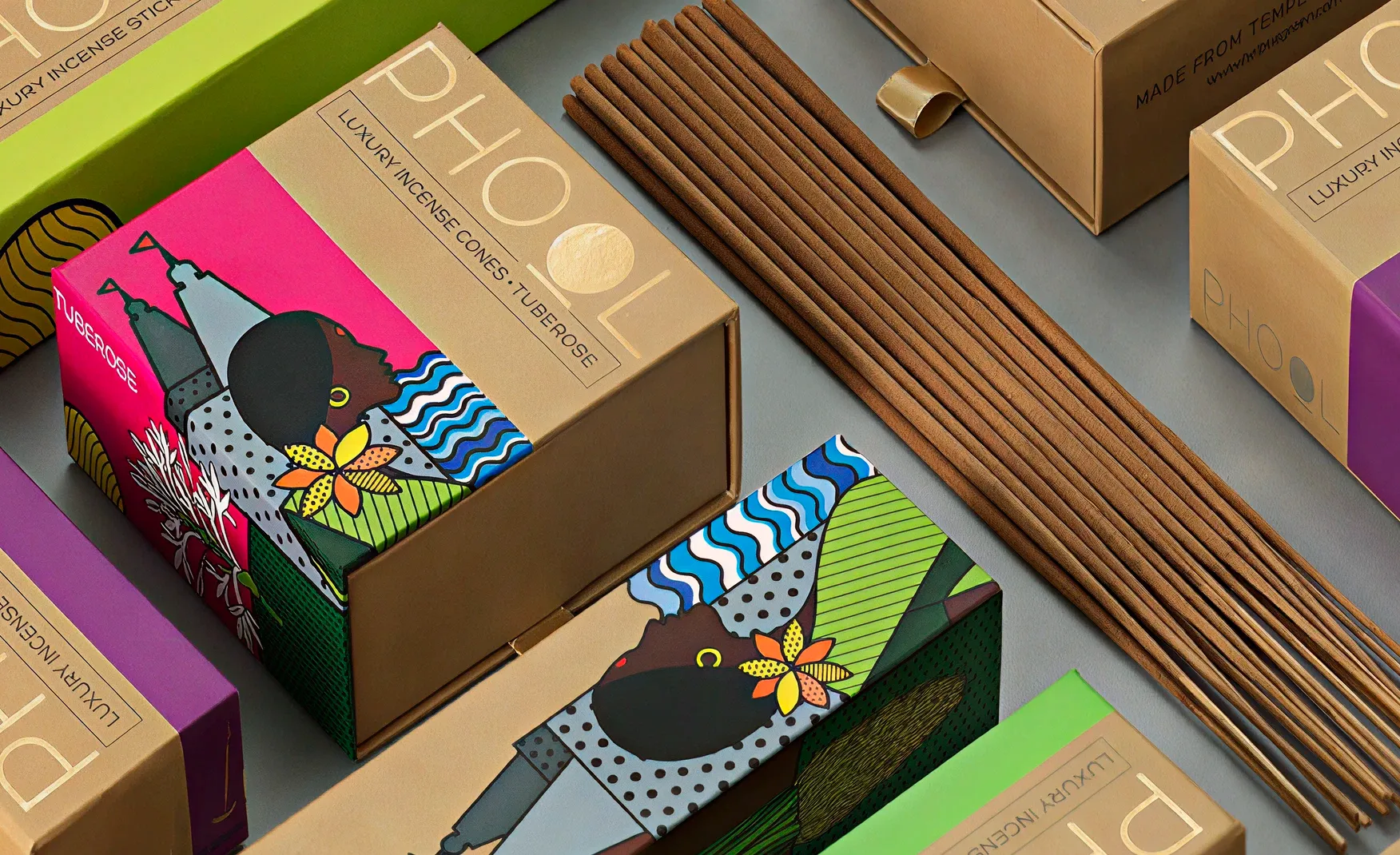
Example: Phool's luxury incense packaging doesn't just contain a product that smells, the packaging material and the presentation reinforce the olfactory brand promise before the product is even opened. The scent that escapes on first opening is choreographed.
For Indian FMCG brands, the challenge is scent consistency at scale. A signature fragrance must remain identical across production batches, manufacturing partners, and seasonal formulation variations.
This requires upstream specification work, but that's a production constraint, not a reason to avoid the strategy.
⚠️The risk: smell is easy to get wrong. Overpowering scents or mismatched fragrances create negative associations faster than any other sense. Less is almost always more.
Taste is the most category-specific of the five senses, but its application is broader than most brands assume.
For food and beverage brands, flavor consistency is brand identity. For coffee brands, the relationship between taste, smell, and brand identity is inseparable.
Blue Tokai and Subko occupy adjacent but distinct positions in Indian specialty coffee and their taste profiles are as much a part of that distinction as their visual identities.
For non-food brands, taste branding happens through designed brand experiences rather than the product itself. The mints at a hotel checkout.
The complimentary chai served at the beginning of a premium tailoring consultation. The samples offered at a cosmetics counter. These are taste-based brand experiences that create memory associations.
For Indian FMCG brands, there is a particularly powerful opportunity that almost no brand is exploiting strategically: flavor regionalization. A mango-forward formulation for summer.
A cardamom note for winter. Masala flavors calibrated to specific regional markets. The taste calendar can be a brand calendar, creating seasonal sensory associations that drive repeat engagement.
💡For non-food brands, taste is often irrelevant and that is fine. DO NOT force a sense where it does not belong. Not every brand needs to activate every sense. The goal is coherence, not completeness.
Different categories demand different sensory priorities.
A wellness supplement brand that invests heavily in sonic branding but ignores the tactile quality of its packaging has misallocated its sensory budget.
A coffee brand that engineers perfect flavor and ignores scent has missed the most obvious category signal available.
The framework below maps sensory priority by category.
✅Primary senses are the highest-impact investment for that category.
✅Must haves are the senses every competitor uses, necessary but not differentiating.
✅Opportunity marks the channel most underused by category incumbents.
💡Your category dictates your sensory hierarchy, but it does not limit it.
A supplement brand in a category full of visual-only packaging that invests in a distinctive tactile finish and a proprietary product scent is not doing something unusual, it is doing what every serious brand in adjacent categories (luxury skincare, premium personal care) already does.
The opportunity exists precisely because the category norm is low.
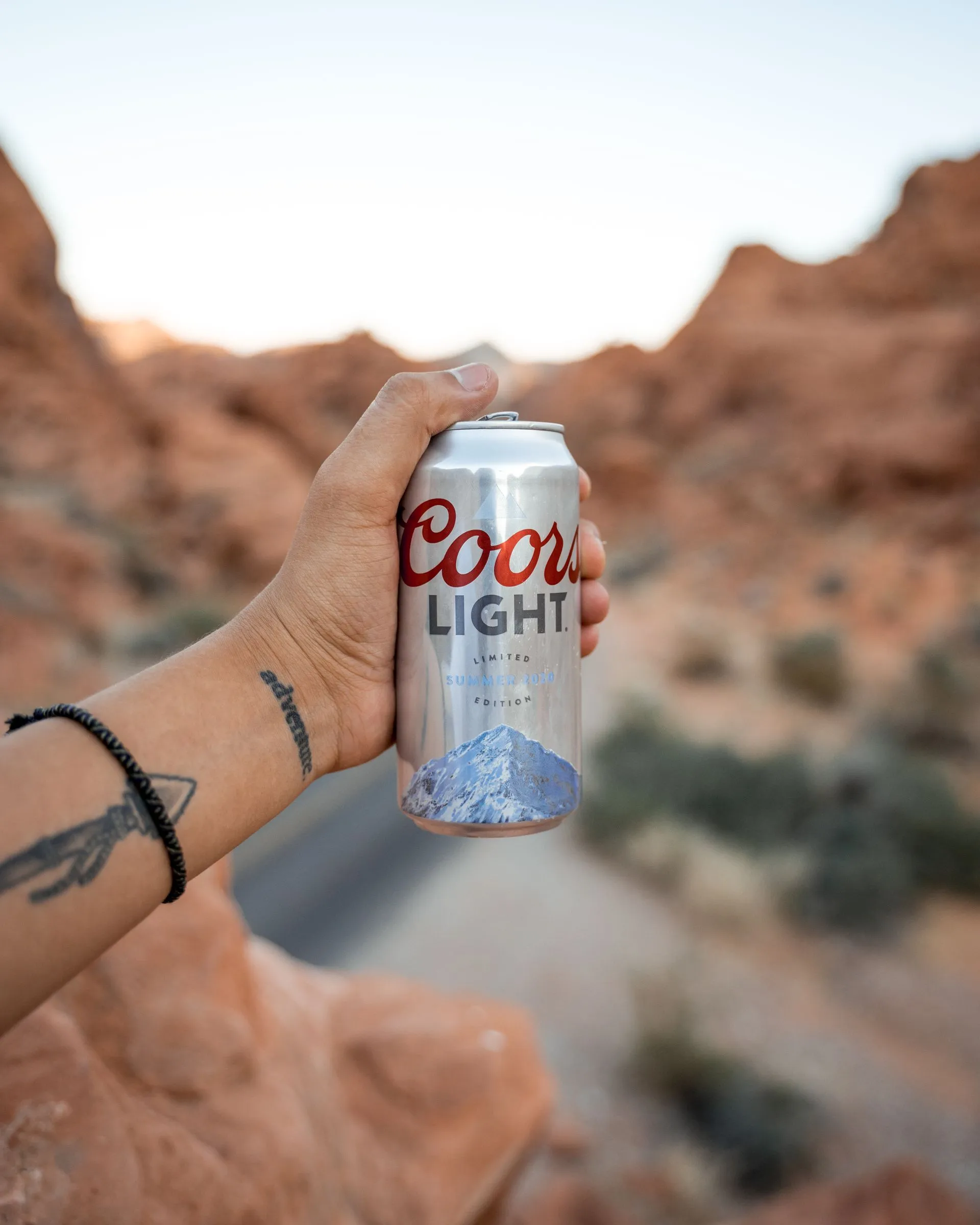
Some of the world's most successful brands are masters of five senses branding:
The brand turned a functional requirement, drinking beer cold, into an interactive visual experience.
By using temperature-sensitive thermochromic ink, the mountains on the can turn from grey to vibrant blue when the beer reaches the optimal drinking temperature of 39°F (4°C).
It gamified the drinking experience and removed the guesswork for the consumer. The phrase "the mountains are blue" became a cultural shorthand for a cold beer, providing Coors with a massive point of differentiation in a crowded market.
The ice cream brand designed its tubs to be squeezed, allowing customers to "crack" the thick chocolate shell that encases the ice cream.
This interactive and satisfying sound and touch experience has become a beloved brand ritual.
Coca-Cola has used thermochromic inks on its cans that reveal colorful ice cubes when the can is chilled to the perfect temperature.
This adds a fun, interactive visual element that signals refreshment.
The Kikkoman soy sauce bottle is an icon of packaging design. Its shape is not only visually distinct but also perfectly ergonomic, fitting comfortably in the hand.
The dripless spout provides a clean pour every time, enhancing the user experience through thoughtful design.
The magnetic resistance of an iPhone box lid is designed. The startup chime is designed. The weight of the device is designed. The smooth-to-click keyboard (on MacBook) is designed.
Apple's products are the reference case for systematic sensory brand management, every sense is inventoried and managed intentionally.
Singapore Airlines activates all five senses in a unified system. Their signature scent, Batik Flora, features six flowers native to Singapore, designed to evoke a “familiar warm welcome.” The scent is infused into hot towels, cabin air, and crew perfume.
Visual identity draws from the same batik motif. Sound design reinforces the same warm, premium positioning. Sensory coherence across every touchpoint creates a brand experience that feels inevitable, not accidental.
In 2025, India officially recognized its first olfactory trademark for a floral fragrance reminiscent of roses applied to tyres.
Sensory cues can now be legally protected as brand assets in India, making investment in olfactory branding commercially defensible.
Blenders Pride Packaged Drinking Water introduced “Reserved Experiences,” a cultural platform positioning flavour as a multi-sensory journey unfolding through sight, sound, touch, aroma, and atmosphere across cities in India.
Sensory branding can anchor brand repositioning, not just product packaging.

Most brand guidelines only cover colours and fonts. A sensory identity requires a multi step approach:
Start with one question: what single emotion should your brand trigger in under 3 seconds?
Not "premium." Not "trustworthy." Those are attributes, not emotions. Think: calm, excitement, nostalgia, confidence, or belonging.
This emotion becomes your sensory anchor. Every sensory cue you design must reinforce this feeling. Map that feeling or emotion to the senses most capable of delivering it in your category.
Examples:
⚠️Common mistake: brands try to evoke multiple emotions at once. Sensory branding works when it is singular and consistent.
Run the Sensory Footprint Audit introduced above.
Score every consumer touchpoint: retail packaging, D2C and ecommerce packaging, in-store display (if applicable), digital product listing, unboxing experience, the product itself, across all five senses.
Be ruthless about the distinction between Intentional and Accidental.
If you picked a material because it just felt right, that’s accidental. If you picked it because you know how it supports your brand, that’s intentional.
Do not try to activate all five senses everywhere. That is expensive and often confusing for the consumer.
Instead, map your customer journey and identify which senses naturally dominate at each stage.
Allocate your budget accordingly and invest where the return is clearest.
Most brands overinvest in visual touchpoints and underinvest in the moments where other senses actually decide the sale.
This is where most attempts fail.
Brands pick a nice scent, a satisfying texture, and a pleasant sound, but these cues do not reinforce each other. The consumer experiences sensory dissonance instead of a unified impression.
The rule: each cue must echo the same brand emotion.
For a luxury brand, that means:
A youth-focused snack brand in comparison:
The point is coherence, not individual excellence.
Sensory equity is built through repetition.
One-time sensory experiments like a special festival pack, a limited-edition texture, do not build sensory brand memory. They are campaigns.
If you introduce a sensory element, you must be able to maintain it. A scent you cannot replicate at scale is worse than no scent.
A tactile finish you cannot afford on every SKU creates inconsistency that undermines the premium signal you are trying to build.
Design for the baseline, then elevate. Get your core sensory identity right at the main product pack level first. Layering on premium unboxing experience elements comes after.
Sensory branding must be testable. You cannot assume a texture or scent works without consumer validation.
Testing methods:
Once validated, embed sensory specifications into your brand guidelines. Include:
💡Most brands have visual guidelines, only a handful have sensory ones. That gap is your competitive advantage.
For every brand we work with, whether it's a first-launch D2C brand or an established FMCG label, we do not add sensory elements as decoration. We engineer them as decision triggers.
Most agencies start with a logo. We start with the moment the customer touches your brand. Then we work backwards.
Our process runs on three principles.
⭐Material before visuals: The packaging structure and finish determine what any design can achieve. Soft-touch communicates differently than matte.
Weight signals quality before a word is read. We identify materials before finalizing a single graphic.
⭐Haptic integration as standard: For AIM wellness, we designed an unboxing around a Zippo lighter mechanism. The customer feels the product before seeing it.
That tactile cue closes the sale. For Bingo Chatpat Kairi, we used tropical green and yellow, bilingual Devanagri, and truck-art illustration, but the bottle had to feel right in hand. Material weight, structure, and finish were decided together with visuals, not after.
⭐Test in real conditions: Not internal approvals. Shelf pick-ups. Unboxing recordings. The hesitation moment when a customer decides yes or no.
We also do not do everything. No random scent. No trendy sound. Every sensory cue answers one question: does this make the brand more recognizable, more desirable, or more memorable within three seconds?
If the answer is no, we do not do it. If the answer is yes, we build it into your brand guidelines like any other strategic asset.
That is how sensory branding stops being a nice-to-have and starts driving purchase decisions.
❌Treating sensory branding as a luxury
Good tactile and sensory details often cost little compared to the value they add. The real investment is in strategy and choosing the right specifications.
❌Adding sensory elements without a reason
A scent, texture, or finish should reinforce your brand. Random choices can confuse customers and weaken trust. Every sensory cue should support your brand promise.
❌Being inconsistent across products and channels
Customers should recognize the same brand feeling across every SKU and purchase channel. Different packaging experiences for the same brand can dilute brand identity.
❌Ignoring the digital experience
For many customers, packaging is first seen online. If key sensory cues aren't visible or understandable on a mobile screen, much of their impact is lost. Always test packaging in real marketplace thumbnails and product listings.
❌Confusing novelty with branding
A special-edition pack creates short-term excitement. Sensory branding creates long-term memory through consistent repetition. Repeated sensory cues build recognition, trust, and repurchase over time.
❌Hedonic Overload
Too much sensory stimulation can feel overwhelming rather than memorable.Find the right sensory intensity for your brand and avoid excess.
❌Overlooking cultural differences
Scents and sounds can trigger different reactions across markets and audiences. Test sensory elements with local consumer groups before scaling.
What are the five senses used in sensory branding?
Sensory branding strategically engages all five human senses to create a holistic brand experience. These are:
How does sensory branding impact customer loyalty?
It creates deeper emotional connections by linking your brand to positive feelings and memories. This memorable experience makes customers more likely to choose your brand again, fostering strong, long-term loyalty.
Can small businesses afford sensory packaging design?
Yes, absolutely. Small businesses can start with cost-effective options like textured paper sleeves, uniquely shaped labels, or stickers with special finishes to add sensory appeal without a large investment.
Small brands cannot outspend incumbents on advertising but a distinct sensory branding element can create brand equity that advertising spend cannot replicate. It adds up with every purchase occasion.
The key is to choose 1–2 senses that are strategically most valuable for your category and execute them consistently, rather than trying to engineer all five simultaneously on a limited budget.
What materials can add texture to packaging?
Several materials can create a memorable tactile experience for customers. Some popular options include:
How do I test my packaging for sensory appeal?
You can gather feedback through user testing, where you observe how consumers interact with your packaging. Focus groups and customer surveys are also effective for collecting opinions on different textures, sounds, and visual designs.
What is the difference between sensory branding and sensory marketing?
Sensory branding is the consistent sensory identity a brand builds over time, the specific texture, sound, or scent that becomes permanently associated with the brand through repetition.
Sensory marketing is a tactical use of sensory stimuli to influence a specific purchase decision at a specific moment. Sensory branding is a long-term strategic asset. Sensory marketing is a campaign execution.
Want strategic branding and packaging like this for your business?


.webp)
.webp)


.webp)
.webp)
.webp)
.webp)
.webp)


.svg)
.webp)
.svg)
.webp)