%201.webp)
02
AI Snaps
.svg)
.svg)
01
Our Work

03
About Us
05
Contact Us
06
Client Success

07
Blogs
08
Careers
Book A Call


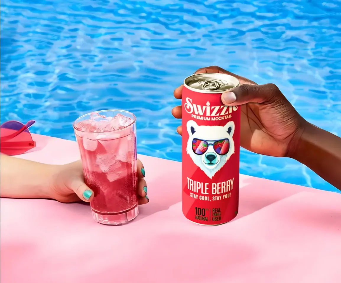
On Amazon, Flipkart, Nykaa, Myntra, and Ajio, a product is not encountered as a physical object. It is encountered as a thumbnail. A small, compressed tile in a grid of competing products, viewed on a mobile screen, often while scrolling quickly. The packaging decisions that drive trial in that environment are entirely different from the ones that drive it in a retail aisle.
Brands that have figured this out are immediately recognisable in any online grid. Plum's serums and moisturisers use bold colour blocks and high-contrast labels that stay legible even at the smallest listing sizes. Dot & Key uses distinct colour coding across ranges so products are differentiable at a glance without reading a word. The Whole Truth's packs prioritise strong typography and minimal clutter so the brand name and product type are instantly visible without zooming in. These are not aesthetic coincidences. They are deliberate packaging decisions made specifically for online discovery, and they compound with every impression a consumer has of the brand while scrolling.
At Confetti Design Studio, online packaging is never designed for the full-size artwork view and then tested on screen as an afterthought. It is designed for the screen from the beginning.
The most significant shift in online packaging is the loss of physical scale. On an e-commerce platform, a 1 kg protein powder and a 100 g protein powder appear almost identical in size. Weight, height, and shelf dominance become irrelevant. Everything is reduced to a small visual tile, and the packaging has to communicate the brand, the product, and the reason to click within that constraint.
Packaging that depends on texture, embossing, subtle gradients, or fine print detailing may perform beautifully offline but lose all impact in a grid-based digital layout. What works online is clarity, contrast, strong hierarchy, and immediate recognisability. The fewer elements fighting for attention, the better the pack tends to perform at thumbnail scale.
In a physical store, shelf placement and pack size give brands a degree of natural dominance. Online, every brand appears at the same size, in the same format, next to every competitor in the category simultaneously. A coffee brand like Sleepy Owl has to hold its own next to every other coffee brand in a search result, without the advantage of a larger footprint or a prominent shelf position. That is a meaningfully different competitive context, and it requires packaging designed with that reality in mind.
The majority of online purchases in India happen on mobile. That means the primary viewing context for most e-commerce packaging is a screen smaller than a paperback book, often in variable lighting conditions, often while doing something else. Packaging designed without accounting for that context is packaging designed for a customer who does not exist in the volume brands need.
At Confetti, packaging for online sales is designed and tested specifically for digital retail behaviour, not adapted from an offline design at the end of the process. The strategic foundation remains consistent with our broader packaging approach.
Even for online-first brands, material decisions matter. They affect how the product photographs, how it travels through logistics, and how it feels when it arrives. We identify materials that support the brand's positioning, perform through courier and fulfilment processes, and photograph well across the product imagery the brand will need for its listings.
For D2C and courier-based delivery, the unboxing moment carries significant brand weight. It is often the first physical interaction a customer has with the brand, and it is one of the most shared moments in consumer content. We design for that interaction deliberately, using the same four-point unboxing framework applied across our packaging process, so the experience feels considered rather than incidental.
Online or offline, we never design just the front panel. The full packaging system, front, sides, and back, is designed as a cohesive whole. For online brands, back of pack and side panel design also matters for product photography, lifestyle imagery, and the secondary images that appear in a listing after the hero shot.
Once the front of the pack is designed, we create mock screens for the specific marketplaces where the product will be listed, whether that is Amazon, Flipkart, Nykaa, Myntra, Ajio, or a brand's own D2C site. In these mock screens, the client's product is placed alongside competing brands from the same category, exactly as a consumer would encounter it while browsing or searching.
This is where the real evaluation happens. We test whether the brand name is readable at thumbnail size, whether the product category is instantly clear, and whether the pack stands out or disappears when viewed next to competitors. Issues that are completely invisible when reviewing full-size artwork become obvious the moment the pack is seen in a real listing context, and catching them at this stage rather than after the product goes live is one of the most valuable parts of the process.
Confetti’s team is trusted by global leaders, and it’s time we join forces with you to create your Iconic brand!
Tap the button below and talk to our founders directly.
.webp)

Online packaging underperforms most often when it is approved in the wrong context, or when the online environment is treated as an extension of offline rather than a fundamentally different design challenge.
E-commerce and quick commerce have fundamentally changed how brands are discovered in India. For many FMCG and D2C brands, the majority of new customer acquisition now happens through digital retail channels, where the packaging is the primary brand touchpoint before a purchase decision is made. There is no salesperson, no shelf talker, no in-store promotion. There is the listing image, and everything the packaging communicates within it.
In that context, packaging that performs online is not a nice-to-have. It is a direct commercial variable. Brands that have cracked this, like The Whole Truth, Dot & Key, and Mamaearth, have built enormous online market share partly because their packaging works as hard in a grid as it does in a store. Brands that have not find themselves investing heavily in advertising to drive traffic to listings that do not convert at the rate they should. At Confetti, online packaging is built with that commercial reality in mind from the first design decision to the final approval.
Every online packaging project at Confetti is shaped by the specific platforms, category dynamics, and consumer behaviour relevant to the brand we are working with. We bring digital realism into the process early, test against real marketplace conditions, and deliver packaging designed to perform where online buying decisions are actually made.
If you are launching on e-commerce, scaling a D2C brand, or finding that your current packaging is not converting the way it should online, that is the conversation worth having. Get in touch with Confetti to talk about online packaging design for your category.
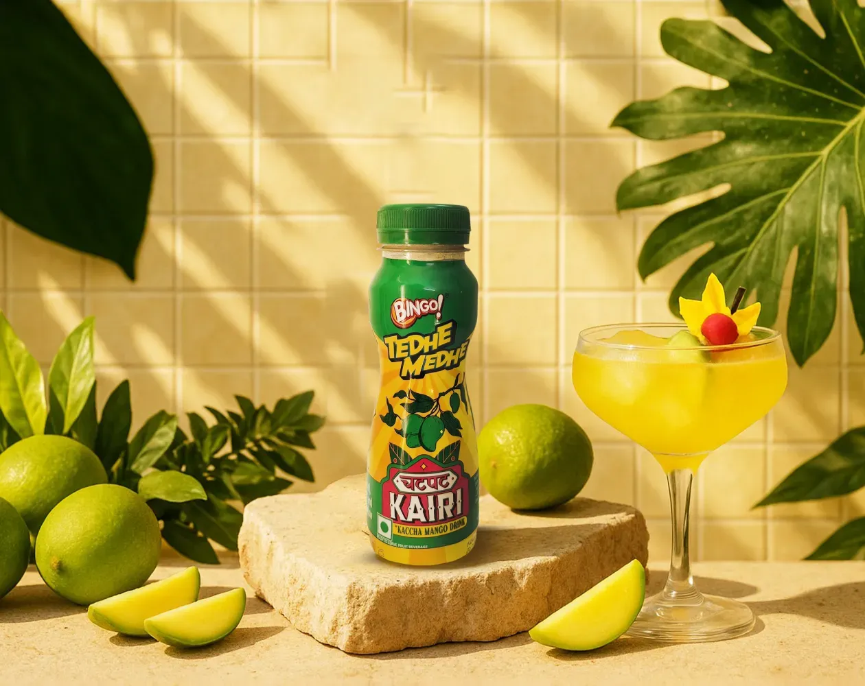
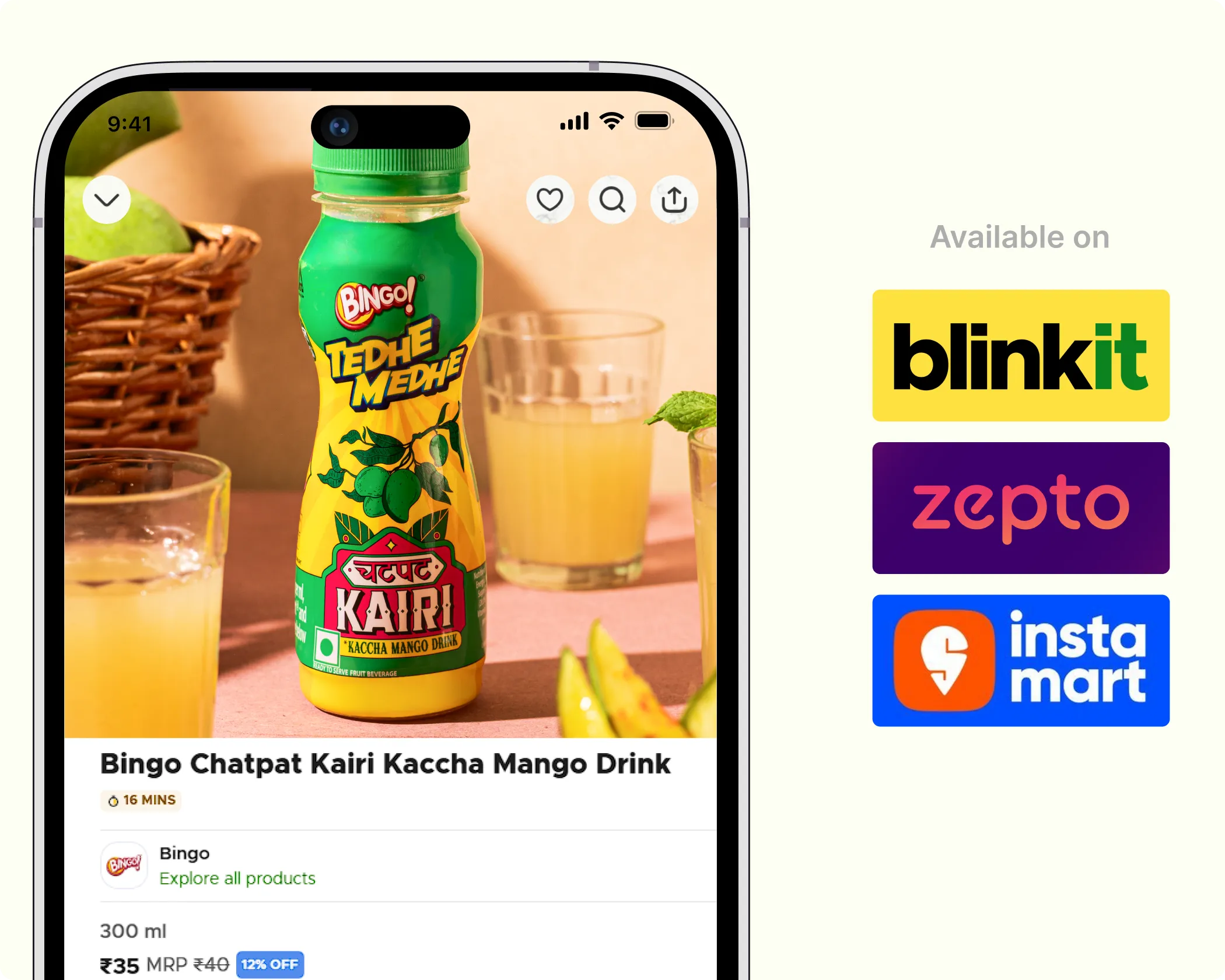
We worked with Bingo (by ITC) to help them launch India’s next viral beverage; Aam Panna
%201.webp)
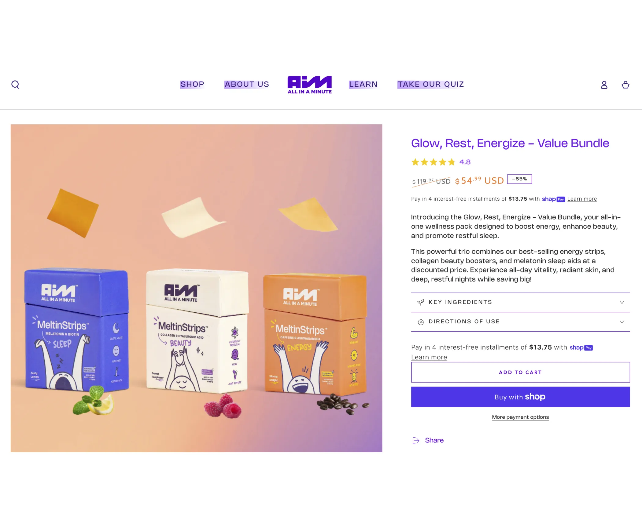
Global award-winning Identity & packaging design for US's health & lifestyle startup AIM Nutrition
-p-2000%201.webp)
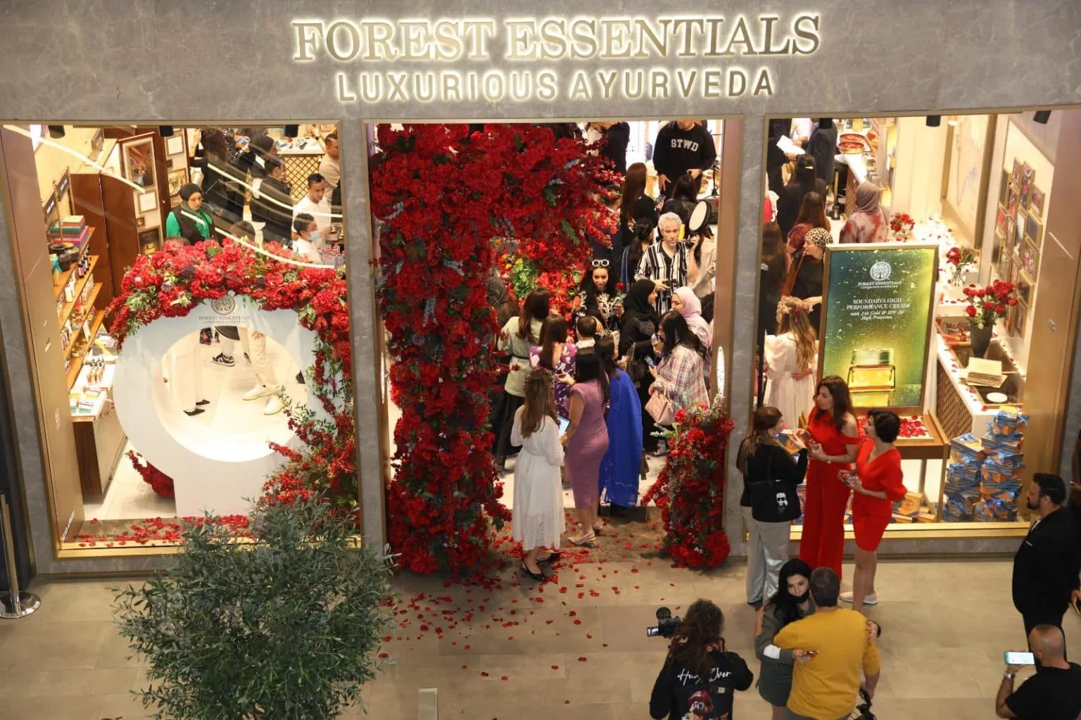
Building India’s fastest growing D2C supplements brand, Miduty by redesigning their branding, packaging & e-commerce website
Packaging for e-commerce has to win attention on a screen before it ever gets held. Unlike retail shelves, every product competes in the same grid, often reduced to a small thumbnail with very little context around it. That means clarity, contrast, and legibility matter far more than subtle detail. Many D2C brands are designed with this in mind from the start. Minimalist, for example, prioritises clear hierarchy and readable typography so the pack still makes sense at a glance on a phone screen.
At Confetti, e-commerce considerations are built in early, so packaging performs in digital environments without compromising the physical experience. If you’re unsure whether your product should be optimised for shelf or screen first, hopping on a short call with our experts can help define where your primary sales channel really sits.
At thumbnail size, packaging has very little time to communicate. Colour contrast, logo clarity, and a simple visual hierarchy become critical, because fine details disappear on smaller screens. If a customer can’t immediately recognise the brand or understand what the product is, they’re unlikely to click through. That’s why strong e-commerce packaging often looks simpler than its retail counterpart.
You can see this approach in brands like Olly, which uses bold colour blocks to stand out even at small sizes. At Confetti, we test packaging at real thumbnail dimensions on app and marketplace screens, not just in mockups. If you want to see how your pack actually performs on a phone screen, hopping on a short call with our team allows us to review it in context.
Packaging that looks great in hand can still struggle online, which is why it needs to be tested in the environments where it will actually be sold. We place mockups into real e-commerce contexts such as Amazon, D2C websites, and category marketplaces to see how they hold up against competitors, pricing cues, and platform layouts. This quickly reveals whether the pack is clear, clickable, and recognisable, or whether it fades into the grid.
At Confetti, this kind of performance testing is built into design validation and usually takes around one week, so issues are caught before launch rather than after. If you want to simulate real e-commerce conditions and understand how your packaging will actually perform on screen, getting on a quick call with our experts is the easiest way to walk through that process.
Yes, the same packaging design can work across both online and offline channels, but only when it’s built as a flexible system rather than a single fixed layout. The core cues need to stay consistent, while details adapt to context. What works on a shelf from three metres away isn’t always what works at thumbnail size, so the design has to stretch without losing recognition.
Brands like Skims do this well by maintaining a strong, minimal visual language that translates cleanly across retail, e-commerce, and social platforms. At Confetti, we design packaging systems that are channel-adaptive from the start, not retrofitted later. If you’re trying to decide whether one packaging system can realistically serve all your sales channels, getting on a short call with our experts can help assess that before design choices are locked in.
Online marketplace testing should happen before final artwork is locked, while there’s still room to adjust without disrupting timelines or budgets. Testing early shows how the packaging performs in real digital environments, where scale, clutter, and platform layouts can quickly expose weaknesses. At Confetti, this testing runs alongside offline checks and usually takes around one week, helping us align both channels before sign-off. If you want to plan this efficiently without slowing the project down, hopping on a short call with our team can help line up the right testing window.


Lorem ipsum dolor sit amet, consectetur adipiscing elit. Suspendisse varius enim in eros
Lorem ipsum dolor sit amet, consectetur adipiscing elit. Suspendisse varius enim in eros
Lorem ipsum dolor sit amet, consectetur adipiscing elit. Suspendisse varius enim in eros
.svg)
.svg)


.svg)
.webp)


.webp)


.webp)


.webp)