


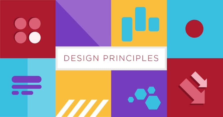
Design is the part of both web and graphic page creation that covers a range of skills. Designers draft with precision, illustrate their ideas and then make them available for implementation.
There are several principles or theories to take into account when designing graphics and they are cited below in detail.
What Is Design?
Design is all around us, in everything we see and use. Good design is functional, appealing, and makes a lasting impression. It’s important to understand the basic principles of design in order to create products that are both effective and visually appealing.
The 7 Principles Of Good Design
These are,
1. Balance
2. Proportion
3. Emphasis
4. Rhythm
5. Unity
6. Variety
7. Movement
Balance
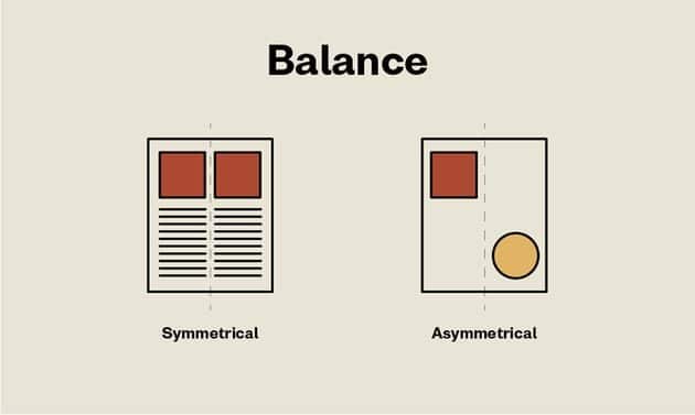
Design is all about creating a balance between various elements to achieve the desired look and feel. Different designers use different techniques to create Balance in their designs. Some of the most common methods are using symmetry, scale, and proportion.
Symmetry is creating a sense of balance by evenly distributing elements on either side of an imaginary line. This can be achieved by using identical elements or by simply mirroring the design.
Scale is creating a sense of balance by using different-sized elements. The most common way to achieve this is through the use of typography, where the size of the text can be used to create hierarchy and emphasis.
Proportion is creating a sense of balance by using different-sized elements in relation to each other. This can be achieved by using grid systems or by simply ensuring that the various elements are in proportion to one another.
Variation
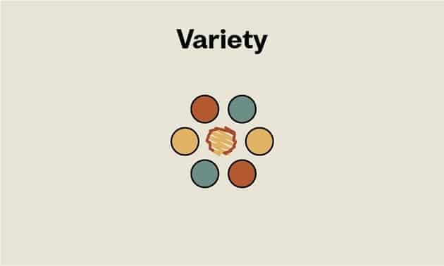
In design, variation is the intentional change of an element within a composition. The changes can be made to the size, shape, colour, or position of an element, and usually result in a more visually interesting composition.
When used effectively, variation can add visual interest, contrast, and depth to a design. It can also help to create a sense of movement or rhythm within a composition. However, too much variation can be chaotic and confusing, so it is important to use it sparingly and with purpose.
Repetition
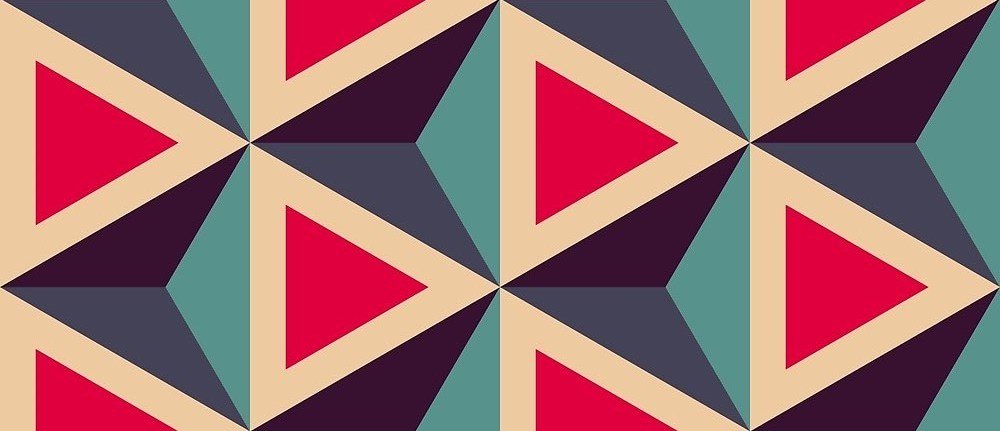
In design, repetition is used to create a sense of structure and order. By repeating elements such as shapes, colours, or patterns, you can create a cohesive design that is visually pleasing and easy to follow. Repeating elements can also help to draw attention to important areas of your design.
When using repetition in your design, it is important to vary the elements that you are repeating. Otherwise, your design will appear boring and uninspired. Try using different colours, sizes, or textures for the elements you are repeating. You can also change up the spacing between repeated elements to create interest.
Too much repetition can make a design appear busy and cluttered. Use repetition sparingly to avoid overwhelming your viewers.
Alignment
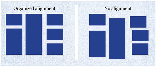
Design isn’t just about making things look good. Good design is about making things work well. That means taking into account the user’s needs and desires and making sure that the design meets those needs.
One of the most important principles of design is alignment. Alignment is all about making sure that elements are lined up correctly, both horizontally and vertically. This creates a sense of order and helps to guide the eye around the page.
Badly aligned elements can be distracting and make a page look messy. But when everything is aligned correctly, it creates a feeling of calm and ease. So next time you’re looking at a design, take a moment to check the alignment of the elements. Is everything lined up correctly? If not, it could be affecting how easy it is to use the design.
Proximity
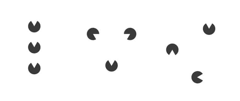
When considering proximity in design, think about how close elements are to one another both physically and psychologically. nearby elements tend to be perceived as related, while those that are further away are seen as more separate.
You can use proximity to create relationships between elements and suggest hierarchy. For example, positioning items closer together suggests they are more related than items further apart. This is why conventions like the periodic table or subway map place items that belong together side by side.
Closeness can also be used to create a sense of orderliness or chaos. arranging things in a neat and tidy grid suggests organization and control, while a more random scattering of items implies creativity and freedom.
Finally, keep in mind that people often scan documents and webpages in an F-shaped pattern, so placing important information near the top left corner where it’s likely to be noticed first is usually a good idea.
Contrast
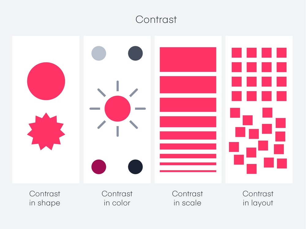
In any design, it is important to create a visual hierarchy in order to communicate the importance of different elements. Contrast is one of the most effective ways to create a visual hierarchy. By using contrasting colours, sizes, and/or textures, you can draw attention to the most important elements of your design.
When using contrast in your designs, it is important to consider the overall colour scheme and tone of your project. A high-contrast design may be appropriate for a website or app that is meant to be exciting and energizing. However, a low-contrast design may be more appropriate for a website or app that is meant to be calming and soothing.
Contrast can also be used within individual elements, such as buttons or call-to-action components. By making these elements stand out from the rest of the design, you can ensure that users will notice them and know what actions they need to take.
Unity
In design, the concept of unity is all about bringing all the elements of a design together to create a cohesive whole. It’s about making sure that each element works together to support the overall message or purpose of the design.
Creating unity in a design is not about making everything match perfectly, but rather about creating a sense of harmony between all the elements. This can be achieved through the use of colour, typography, imagery, and other design details.
When unity is successfully achieved in a design, it results in a design that is visually appealing and easy to understand. It’s important to note that unity does not necessarily mean boring or unimaginative. In fact, some of the most creative and innovative designs are also very unified.
So what are some tips for creating unity in your designs? Here are a few things to keep in mind:
• Use similar colours or tones throughout your design. This will help create a sense of cohesion between all the elements.
• Choose one or two main fonts and use them consistently throughout the design. This will help tie everything together visually.
• Use similar shapes and lines in your design. This will give your work a more unified look and feel.
• Be intentional with your placement of elements. Create purposeful groupings and arrangements to add structure and coherence to your work.
Conclusion
In conclusion, design is all around us and good design can make our lives better. Designers use the 7 principles of design to create effective designs that meet the needs of their clients and users.
Remembering and applying these principles will help you create designs that are both beautiful and functional.