


Color psychology is an intriguing and powerful part of branding and marketing that dives into people’s emotional and subconscious reactions to different colors. This practical tool uses color psychology to elicit particular customer sentiments, behaviors, and associations. Mastering how to use color psychology properly may have a big impact on the identity of a company, its instant messaging, and overall competitive performance.
In this color psychology investigation, we will look into the subtle interaction between colors and human feelings, as well as how businesses, particularly package design companies, can utilize this information to develop engaging advertising tactics and lasting customer experiences. Every color decision may affect client perceptions and behaviors, from logo layout to goods packaging, and website appearances to marketing efforts. Companies and package design firms may paint their road toward achievement more brightly and deliberately by understanding the mysteries of color psychology.
Know More About Colour Psychology
Various colors, tints, and tones evoke different associations, which influence human psychology and decision-making. One’s tastes and society can influence color psychology.
Color may influence how customers view various brands and items in marketing, so it’s critical to choose tones that correspond with your company’s aims and target demographic.
Introduction to the Importance of Colors in Branding
A variety of environmental factors influence our emotions or mental health. Colors play a significant role in packaging design in India. However, the influence of colors on humanistic sentiments varies from person to person based on a variety of factors including age, sex, individual experiences, individual tastes, upbringing, social conditions, and neurological variations.
Color can elicit emotions, boost sales conversions, and even encourage confidence in the company when used correctly, so don’t leave it till the last moment. By giving your web page, logo, or company papers a brand identification color, you unintentionally create psychological connections with those who visit them. The only thing that matters is that you evoke the proper emotions.
Provides a visually appealing solution to the intended audience
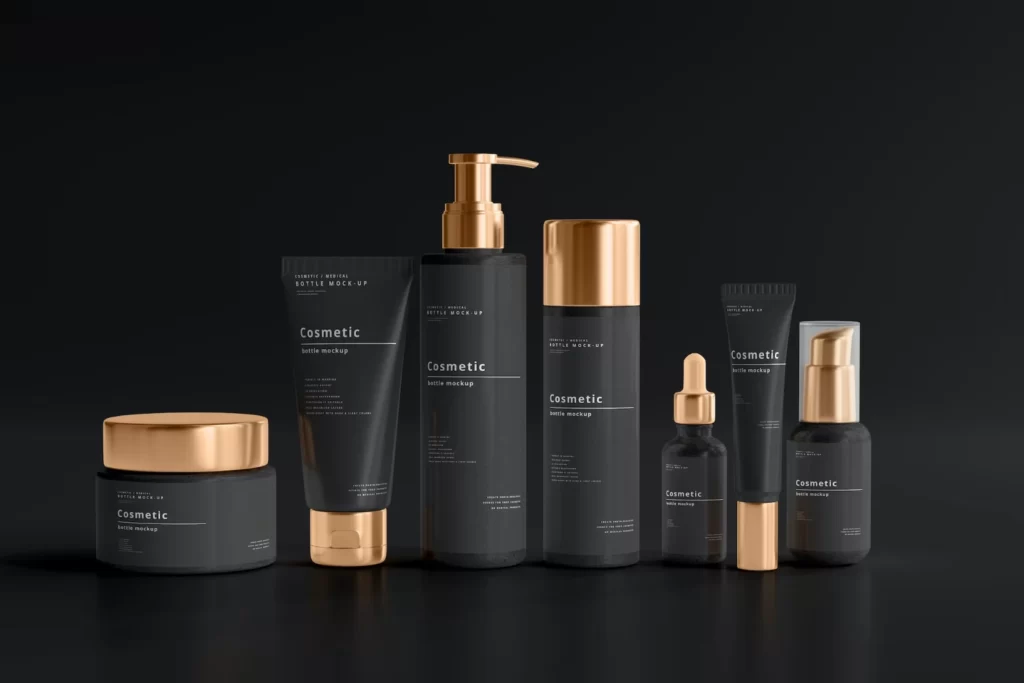
Your package design color is your way of providing a rich visual feast to your intended consumers while also conveying your personality. The right color scheme not only enhances the appearance of your advertising collateral, web page, and various branded content, nevertheless, it also changes how people interact with your business.
Assists Customers Keep Your Brand in Mind
Examine the companies that you encounter daily. Let’s use LinkedIn as an example. Could you please give us the color of the LinkedIn logo? the color blue. Visa, perhaps? Orange & red represent the card. Netflix, for example? The colors are black and red. That was a remembrance experiment to show how brand colors might affect your thinking.
It aids in differentiation
Clients are more likely to remember a brand based on its color. Color may impact consumers’ views of a packaging design agency. This is not the only thing. By using the right colors, a brand can stand apart and obtain an edge in the competitive marketplace.
Get Customers’ Emotional Reactions
Color is appealing because of its ability to elicit emotional reactions and impact people’s moods. Color may be used to create a certain atmosphere or to reinforce the worth of your company.
Keep in mind that the long-term achievement of the company is decided by the interactions you build, and a sense of connection is at the center of all interactions.
Color enhances and characterizes an organization, and every hue provokes a particular psychological reaction; so, selecting the proper color for the company is critical. Companies spend a significant amount of money on creative efforts to produce a suitable brand color that has the right implications for those who purchase from them.
Color Psychology: Influencing Consumer Behavior
Color has the ability to influence human conduct, with research indicating that blue and green tones might play a hidden role in promoting or hindering sleep. In daily life, we employ colors to represent our feelings, like “tickled pink,” “blue,” or “seeing red.” Shade associations may be subjective since numerous individuals can associate various hues with different sensations depending on their prior experiences.
A color chart provides a broad overview of the importance of colors to customers that could assist you in discovering which hues may be helpful to utilize in your package design.
Aside from the feelings that certain hues might evoke, the saturation and intensity of colors also influence customer responses.
Aside from the feelings that certain hues might evoke, the tone or intensity of colors also influences customer reactions. Colors that are cheerful like yellow, pink, or red elicit enthusiasm, but cold colors like blue or white depict calm and tranquility.
Impact of Color on Brand Recognition
Color psychology in branding not only aids in the expression of emotions or subjective states of consideration, such as connecting melancholy with the color, but their mental influence in marketing extends beyond basic connections.
For instance, according to Pantone research, companies that use consistent colors receive a 23% increase in customer awareness. This uniformity creates an authoritative aesthetic for the business, which makes it simpler for people to recognize and recall it. It emphasizes the importance of color in establishing a lasting impression on the subconscious of clients, hence increasing brand devotion and confidence.
Choosing the Right Colors for Your Brand
There are several factors to take into account when selecting your brand colors. First and foremost, consider your intended audience. What attracts your intended consumer’s interest, and what mindset do they require to have to connect with your goods and organization? What color best fixes the significance of the value you offer in the minds of those who are your audience and differentiates you from the opponents?
The origins of the color wheel may be dated back to 1666 when English scientist & mathematician Isaac Newton found that clean white light consists of seven discernible colors—otherwise referred to as rainbow colors. The color wheel’s fundamental components include:
- Red, blue, and yellow are the primary colors. These colors cannot be blended with others.
- Green, orange, & purple are examples of secondary colors. When primary colors are blended together, these colors result.
Colors may trigger distinct emotions and impact us in a variety of ways because they can produce particular moods. The atmosphere of brand manifestation is determined by color. What people believe of a brand has less clout than the way they think about it. Additionally, because we understand that various hues elicit particular reactions, your company’s colors possess the potential to influence both revenue and profitability.
Example: Dunkin’ Donuts
To demonstrate choosing a successful brand color strategy, consider Dunkin’ Donuts’ brand color palette.
The primary color of the company’s logo is a vibrant orange that conveys excitement, energy, and enjoyment. The dominant color is a bright magenta that is both lively and engaging.
These colors signify the brand’s colorful scattered donuts & fun-loving spirit when combined. Its major neutral color is cocoa brown, which complements the two brighter colors and communicates the brand’s sweetness and genuine attitude.
Tips for Selecting Colors that Align with Brand Values
Your color palette is an important component of your packaging design company in India, so selecting the proper logo colors requires far more than just picking your favorite colors. Colors express a wide range of emotions and thoughts, and they have the power to impact our behavior and decision-making. Here are some practical tips for selecting colors that align with brand values and target audience.
- Determine how many colors to include in your brand’s color palette.
- Use the color wheel to locate complementary colors.
- Recognize the relationship between the company’s personality & color palette.
- Learn about the optimal brand colors for your sector.
- Understand your brand’s color codes.
Color psychology influences how customers make decisions and assess brands: Colour may account for as much as 90% of a first impression. Color may improve brand familiarity and exposure by 80%. 93% of people rely on their purchase decisions solely on aesthetics.
Case Studies on Branding Success through Color
Stories of heroic regeneration are as intriguing as they’re informative in the ever-changing world of branding and marketing. Organizations that have used the psychology of colors to overhaul their company identities and storylines distinguish out as real pioneers in an ever-changing customer marketplace. We begin on a trip through the before-and-after histories of organizations that ventured to rebuild their visual characteristics with a special focus on color in this investigation of branding success stories.
Redesign of PepsiCo
In the past, PepsiCo’s logo & packaging were largely red, white, and blue in color. Although it aroused a sense of nation it managed to convey a young and vibrant picture.
Following: In 2008, PepsiCo revealed a radical overhaul. The logo & packaging were changed to a colorful, multi-colored worldwide on a dramatic, all-blue backdrop. The update was intended to express a more modern, cosmopolitan, and young image.
Marketing Impact: Although initial reactions to PepsiCo’s rebranding were mixed, the corporation continued. By 2011, it had increased its share of the market by an astounding 5.5%, illustrating the significant shift in consumer opinion and identification with the brand.
Instagram’s Exciting Evolution
Initially, Instagram had a brown & cream camera emblem, that was inconsistent with its concept of a lively, visual network.
Following: In 2016, Instagram received a significant makeover, replacing its classic camera emblem with a streamlined, colorful spectrum that reflected the range of its content created by users.
Industry Reaction: Instagram’s makeover was rapid and well-received. The platform’s audience swiftly expanded, and by the year 2018, it had more than one billion active users every month. Marketers and individuals rushed to the site, driving up sales and advertising expenditure.
Starbucks
Starbucks conducted a substantial makeover campaign in 2011. Having changed their old green logo featuring a black outline to a new all-green mark with the famous Siren image but no text or surrounding rings.
The redesign symbolized Starbucks’ transition to an increasingly international and diverse image. Green was kept as the predominant color because it represents development, youthfulness, and an attachment to the environment.
Industry Influence and Customer Reaction: Starbucks’ makeover was a risky decision that jeopardized brand awareness. The recurrent use of the green color, on the other hand, helps to minimize this. Starbucks’ sales increased by roughly 12% in the first year after the restructuring, hitting $13.3 billion, Reuters estimates.
Final thoughts
Now that you’ve learned how to select the ideal colors for your package branding, it’s time to finalize the color scheme and successfully employ it to promote your company’s operations.
Your corporate color palette helps you to express the essence of your company’s identity while also creating a psychological link with your consumers. Because most brand purchase choices are based on sentiments, there is no doubting the importance of color in determining your company’s success.