%201.webp)
02
AI Snaps
.svg)
.svg)
01
Our Work

03
About Us
05
Contact Us
06
Client Success

07
Blogs
08
Careers
Book A Call


Dairy Don has been making ice cream in Nashik since 1981. That's over four decades of the same family & the same dedication to 100% pure milk. What started as a single parlour has since grown into a genuine Maharashtra institution, with a range spanning fresh softy, family tubs & packs, ice cream bars, cassata, ice cream cones, and sundae boxes, served across their own parlours and stocked in homes across the region.
By the time they came to Confetti, Dairy Don had something most brands spend years trying to build such as genuine loyalty, a product people grew up on, and a family that had poured thirty years of their lives into getting it right. However what they didn't have was a brand that could carry all of that forward. Expanding across Maharashtra and eventually pan India meant building something new, without losing what made Dairy Don, an original worth keeping.
Rebranding a family business that has been running since before most of their customers were born is a different ball game altogether. There's real history involved, real opinions, and real stakes. The Dairy Don family brought all of that into the room. Five or six members across every meeting, each with their own perspective on what the brand should look like and what it should say. But that meant that every decision had to earn its place, and revisions weren't just rounds of feedback, they were genuine conversations about what the brand stood for.
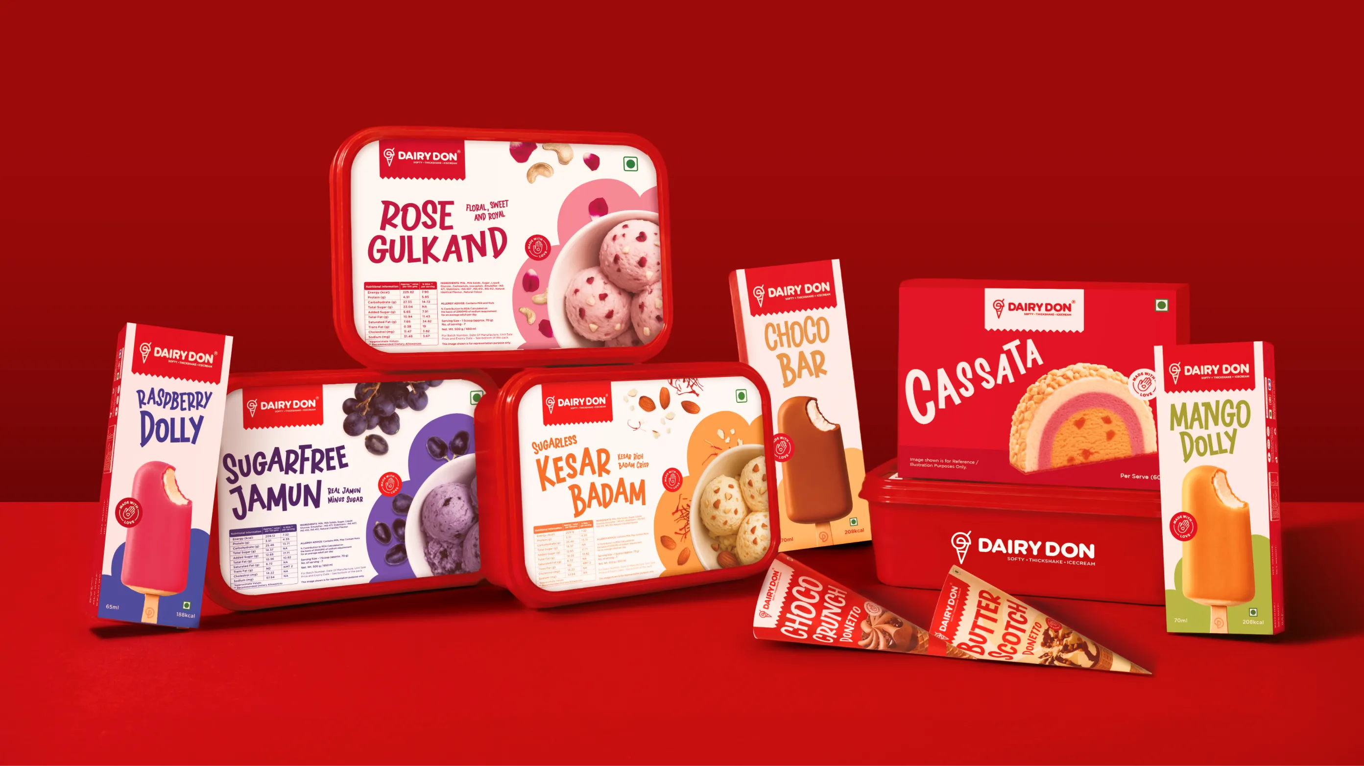
The product range added its own complexity. Dairy Don doesn't make one type of ice cream. They make softy, thick shakes, family tubs & packs, ice cream bars, cassata, ice cream cones, and sundae boxes all across their ice cream parlours and retail. The old identity couldn't hold all of that together coherently, and the new one needed to.
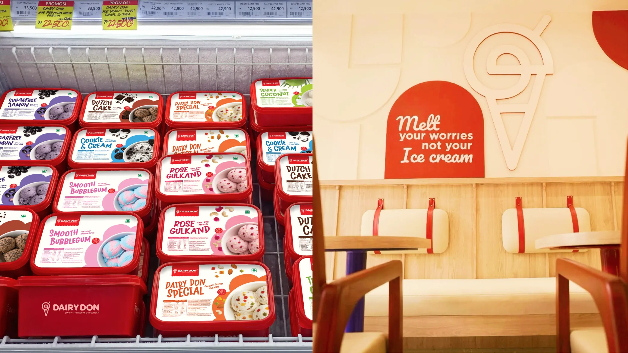
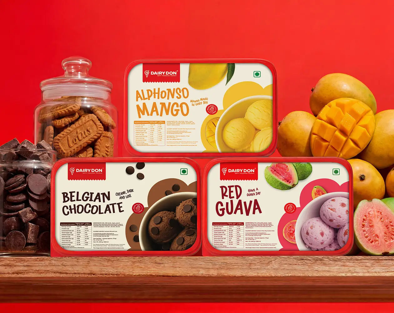
Packaging for over thirty flavours of ice cream sounds manageable until you realise that ten of those flavours are variations of chocolate, and several more share the brown end and even yellow of the spectrum between mango, butterscotch, and vanilla. Differentiating them visually without the range looking inconsistent took our designers extensive amounts of research, and it was one of the more painstaking parts of the project to get right.
This is the part of the project that everything else grew from, and it's worth explaining properly because what the designers arrived at is genuinely very clever & memorable.
Dairy Don had a specific ask from the commencement of our project. They wanted their logo to represent all of their products, not just one. A softy brand with a softy logo made sense to them in theory but felt too narrow for what the business actually was. The brief was to find something that could speak to the full range without becoming a cluttered diagram of every product they sell.
What Confetti's designers landed on, after multiple rounds of exploration and iteration, was a monogram built from the two Ds of Dairy Don. The initials are drawn so that when they come together, they form the shape of an inverted scoop. Turn it slightly and it becomes an ice cream scoop. Put it in a cup and it becomes a sundae. Add a cone and it turns into an ice cream cone. Add a straw and it becomes a thick shake. One mark, one continuous line, four product expressions, each adapting by context rather than requiring a separate icon for every category.
It took a long time to get there. That's worth saying clearly, because the simplicity of the final result can make it look like an obvious solution in hindsight. But honestly, it wasn't. It came from sustained work, in depth research, real back and forth with the family, and designers who kept pushing until the idea genuinely felt like we had nailed it.
The identity is built around Vanilla Peach, Strawberry Burst Red and Frozen Blue, a combination that's warm and energetic without tipping into the generic ice cream palette of pastels and cartoon colours. The cream gives the subtleness to the brand. The red carries confidence and appetite appeal. The blue grounds it and gives the brand a premium quality that the previous identity didn't have.
A cloud-like effect runs through the brand's patterns and backgrounds, bringing in a lightness and playfulness that fits a dessert brand without making it feel like it's aimed only at children. The typography is bold and rounded & fun in the right way. Brand patterns use the monogram and the ice cream cone icon tiled across backgrounds, giving the brand texture and a visual language that extends well beyond the logo itself.
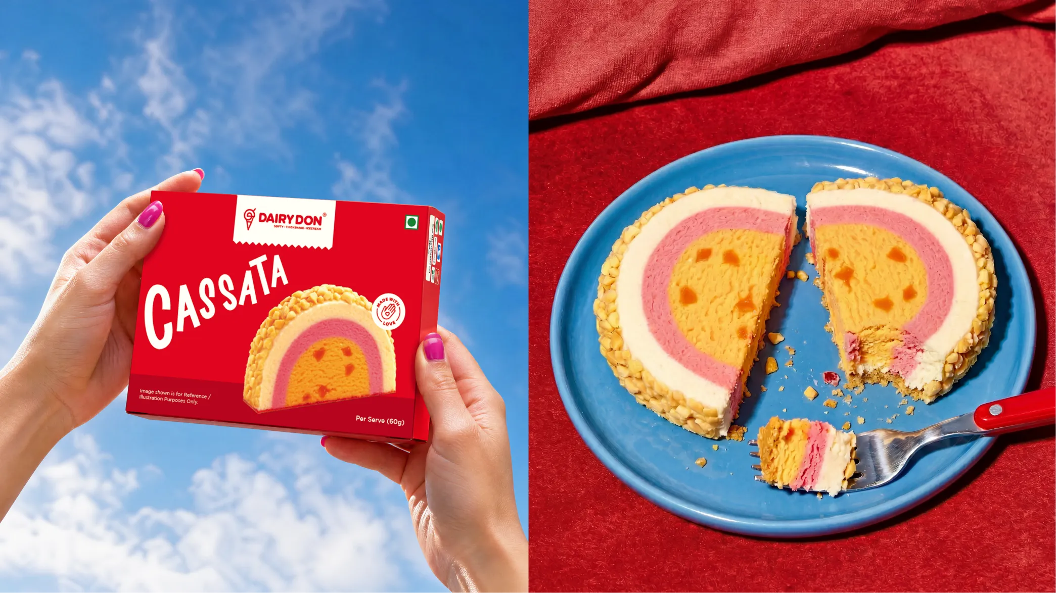
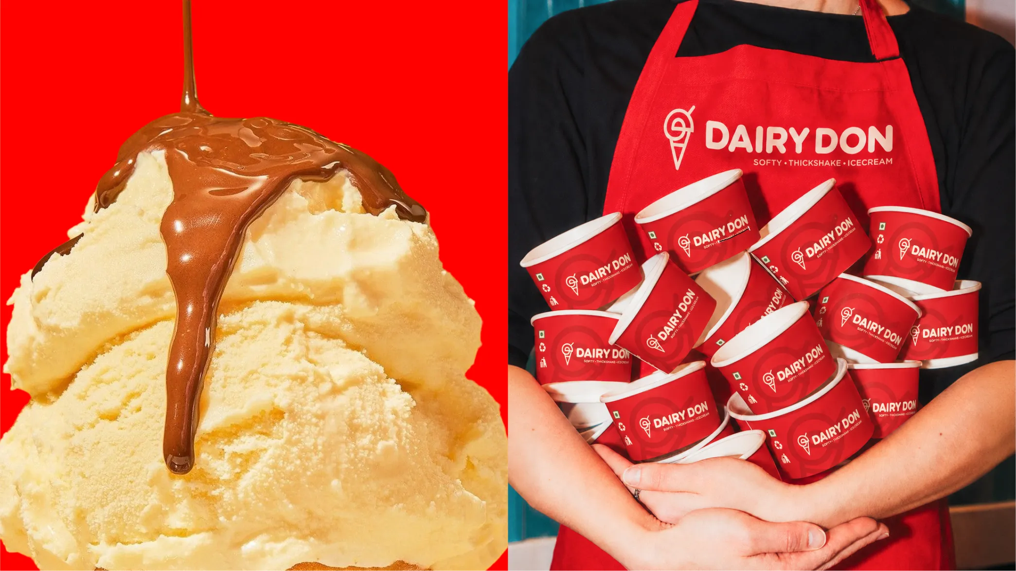
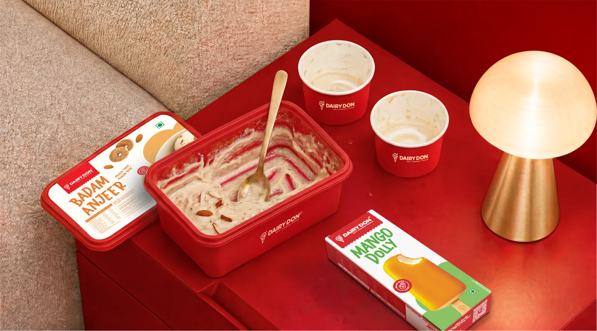
The packaging scope was pretty significant. Softy, family tubs & packs, ice cream bars, cassata, ice cream cones, and sundae boxes, and the full parlour suite including paper cups, disposable glasses, spoons, aprons, caps, t-shirts & more.
For the family pack tubs specifically, the challenge was colour. With more than thirty flavours and multiple products sharing similar colour territory, every shade had to be deliberate. The research that went into differentiating ten chocolate variants from each other, or separating mango, butterscotch, and vanilla within the yellow family. That was the kind of detail that doesn't announce itself on the shelf but is felt immediately when the customer sees the range sitting together in a freezer. Each flavour has its own colour story and the family as a whole still reads as one brand only.
The menu was designed in both vertical and horizontal versions to work across the different formats and contexts Dairy Don needed it in.
The visual identity extends into the parlour environment, and the family invested seriously in their interiors to match. Their ice cream parlours now feel very consistent and on brand. The red & cream, the patterns, the typography, all of it lands the same way in person as it does on packaging.


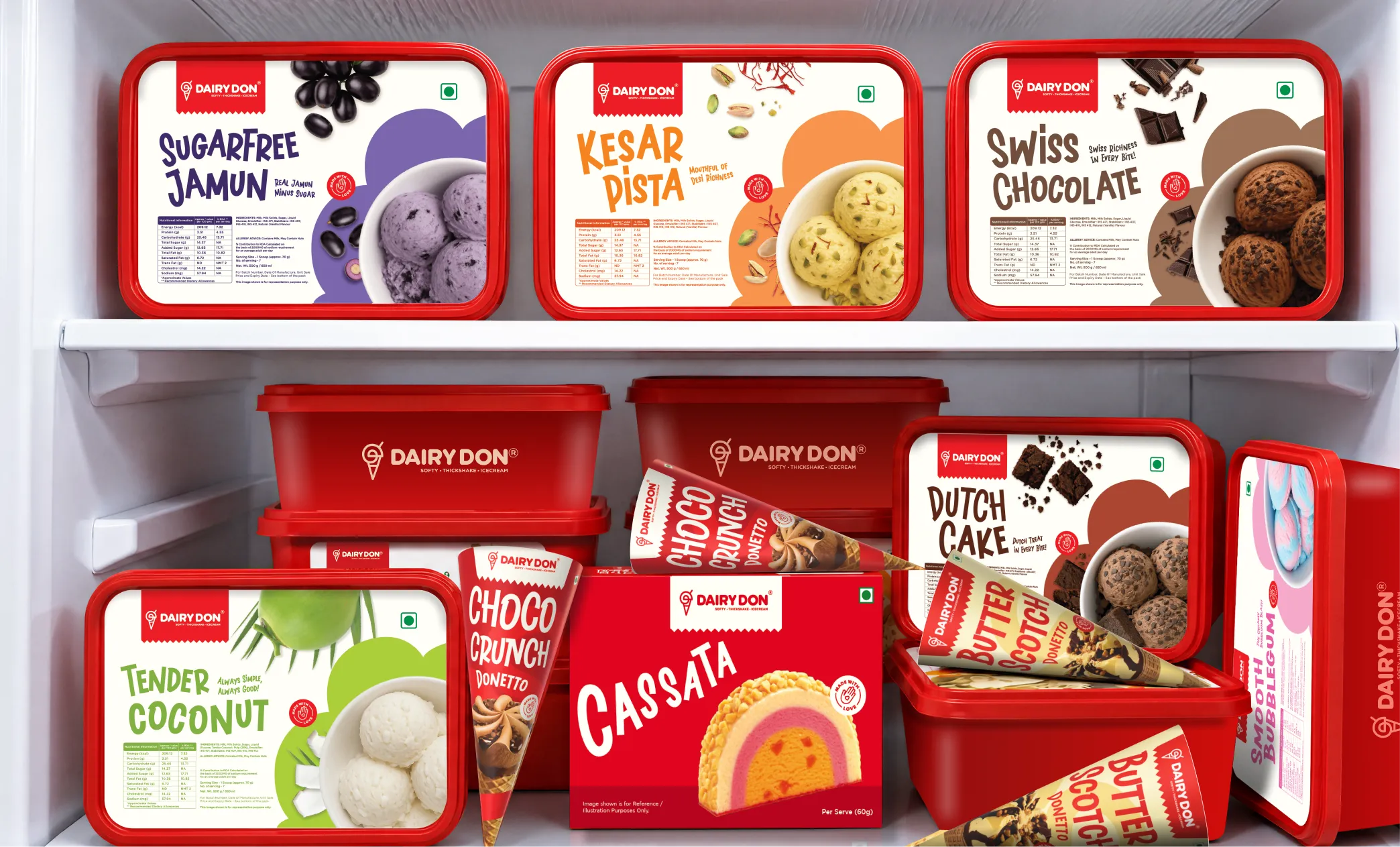
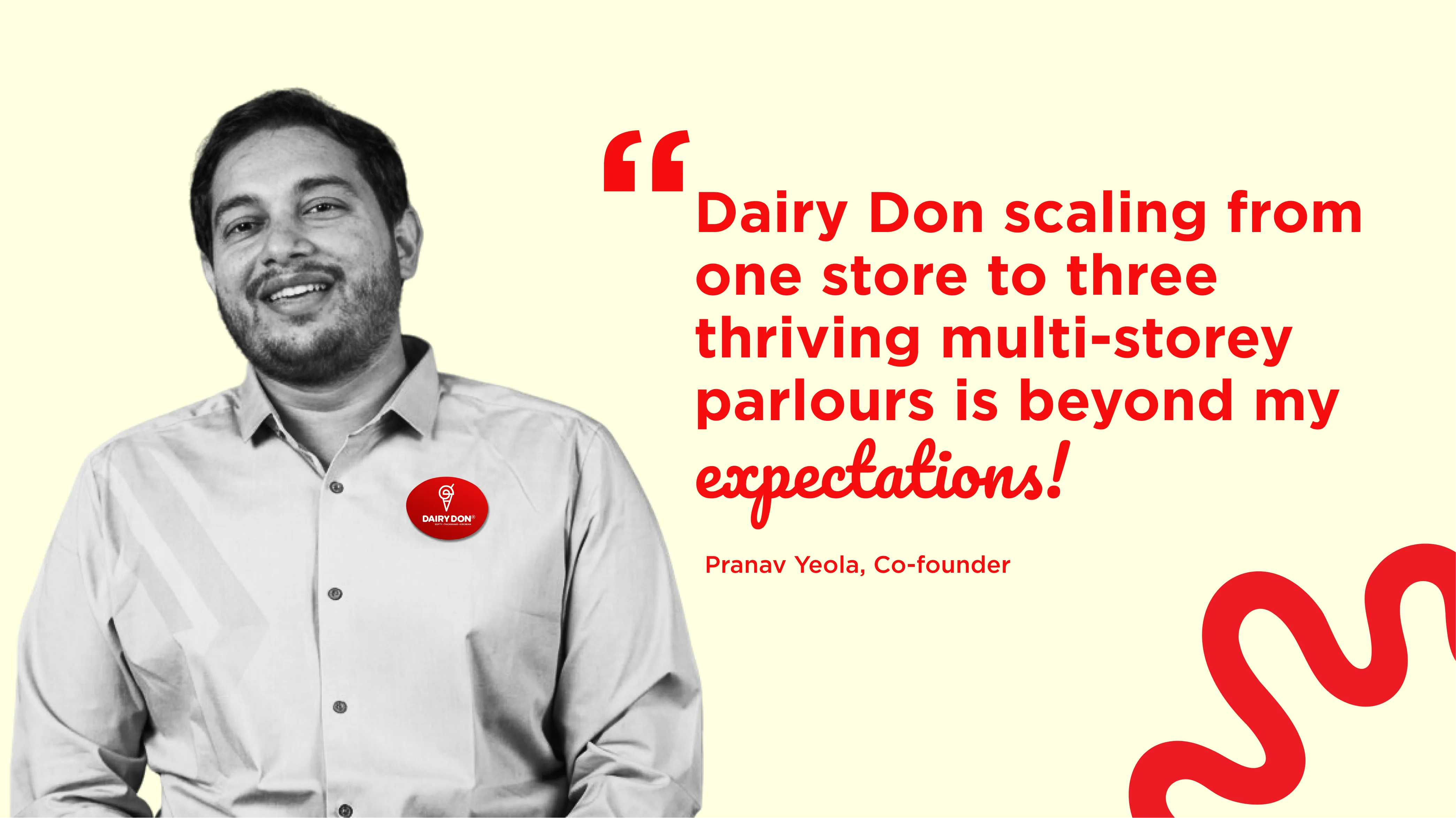
Dairy Don now has a brand that can grow with the business as it expands across the country. The logo works across every product they make and every format they need it in. The packaging range holds together across thirty plus flavours without looking like a different brand designed each one. The parlour experience is consistent all throughout. And the visual identity, red, cream, bold, and playful, is distinctive enough to be recognised and remembered in a category that tends to blur together very quickly in India.
For a family that has spent over forty years building a legacy brand in Nashik and across Maharashtra, Dairy Don now reflects the quality they've always delivered. It just finally looks like it.
If you are a family business with a genuine product and an identity that has not kept pace with your ambitions, reach out to Confetti for a fresh new look for your beloved brand.


.svg)
.webp)


.svg)
.svg)
.webp)
.webp)

.webp)
.svg)