%201.webp)
02
AI Snaps
.svg)
.svg)
01
Our Work

03
About Us
05
Contact Us
06
Client Success

07
Blogs
08
Careers
Book A Call


Northeast India's bakery shelves have been telling the same story for a long time. A handful of names with old packaging, no real ingredient story, and a distribution network strong enough to make the absence of quality feel normal. Novis was set up to make a change in that area. A new bakery brand straight out of Guwahati, standing on the belief that people in Assam deserve bread that's actually worth buying.
Confetti came on board at the very beginning, before a single label had been designed or a brand name decided. The scope involved everything from strategy, naming, identity, to a full packaging system across three product categories.
Walking into an established food category without a legacy is genuinely difficult. The brands that already occupied the Guwahati bakery shelf had something Novis didn't, years of familiarity, distribution reach, and the inertia that comes from being the only option people have ever known. And to be honest, none of that is easy to displace.
What the other players in the same market didn't have was any real quality story. No ingredient transparency, design investment, or reason for a thoughtful buyer to feel good about choosing them. Research showed that more than 90 per cent of consumers would switch to a better brand if one showed up. We found the white space in there itself, but now the question was how to walk through it strategically and smoothly.
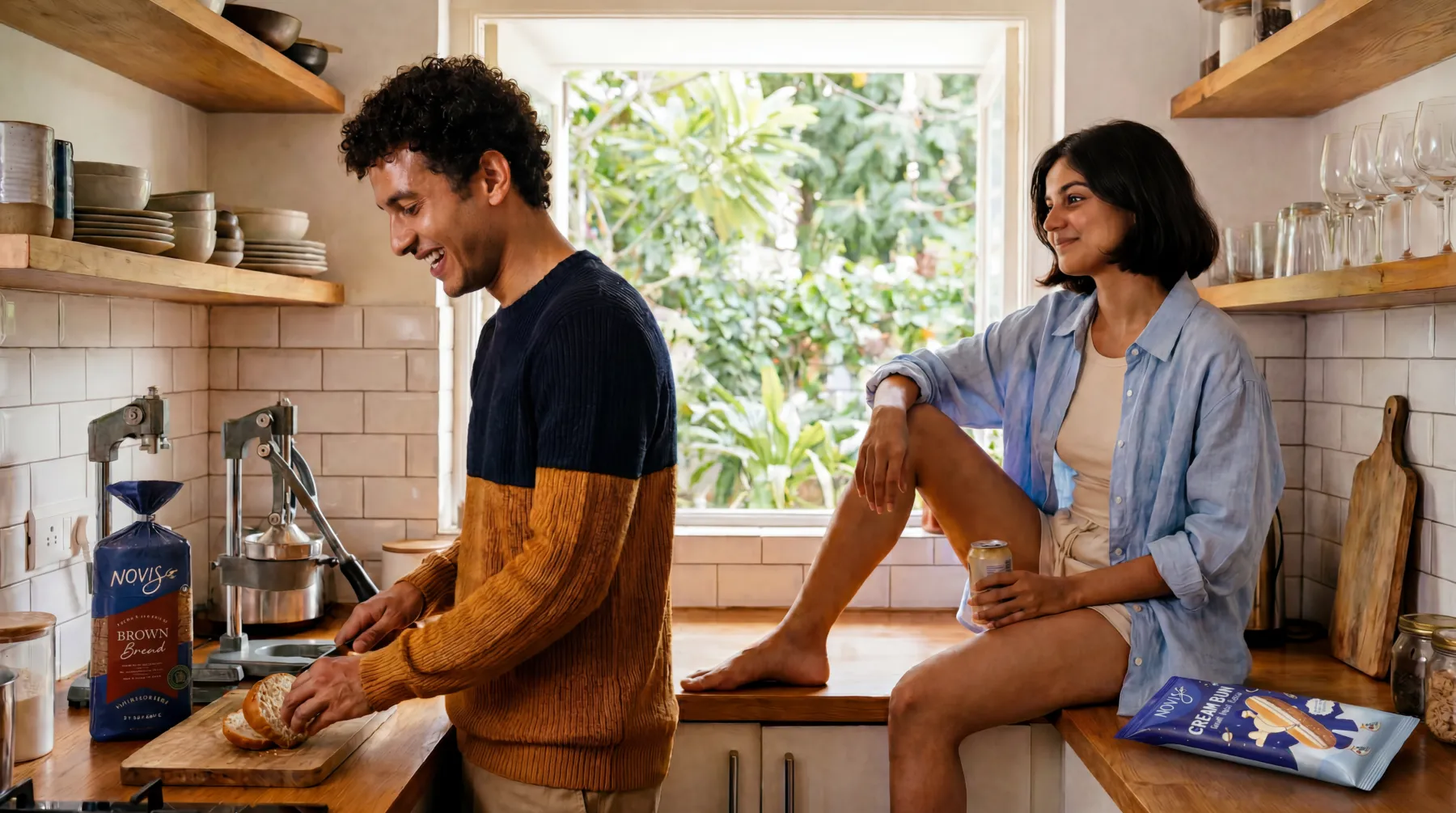
The woman making the purchasing decision in most Guwahati households is someone Confetti spent real time understanding. She's in her mid-thirties, shops at her local kirana store every couple of days, and pays more attention to what's on the label than most brands give her credit for. She's switched brands before when she felt let down, and she'll do it again. She's not looking for a premium product. She's looking for one that's honest about what it is.
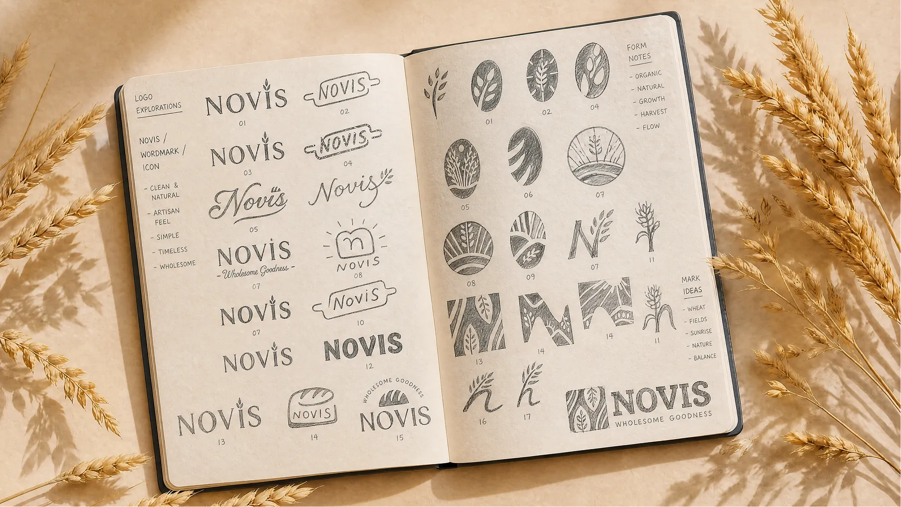
Novis is rooted in the Latin word for new. It doesn't over-explain and it doesn't try to sound regional or global. It just lands cleanly, easy to say, easy to remember, and completely open in the local market. The right name for a brand that was positioning itself as a fresh start.
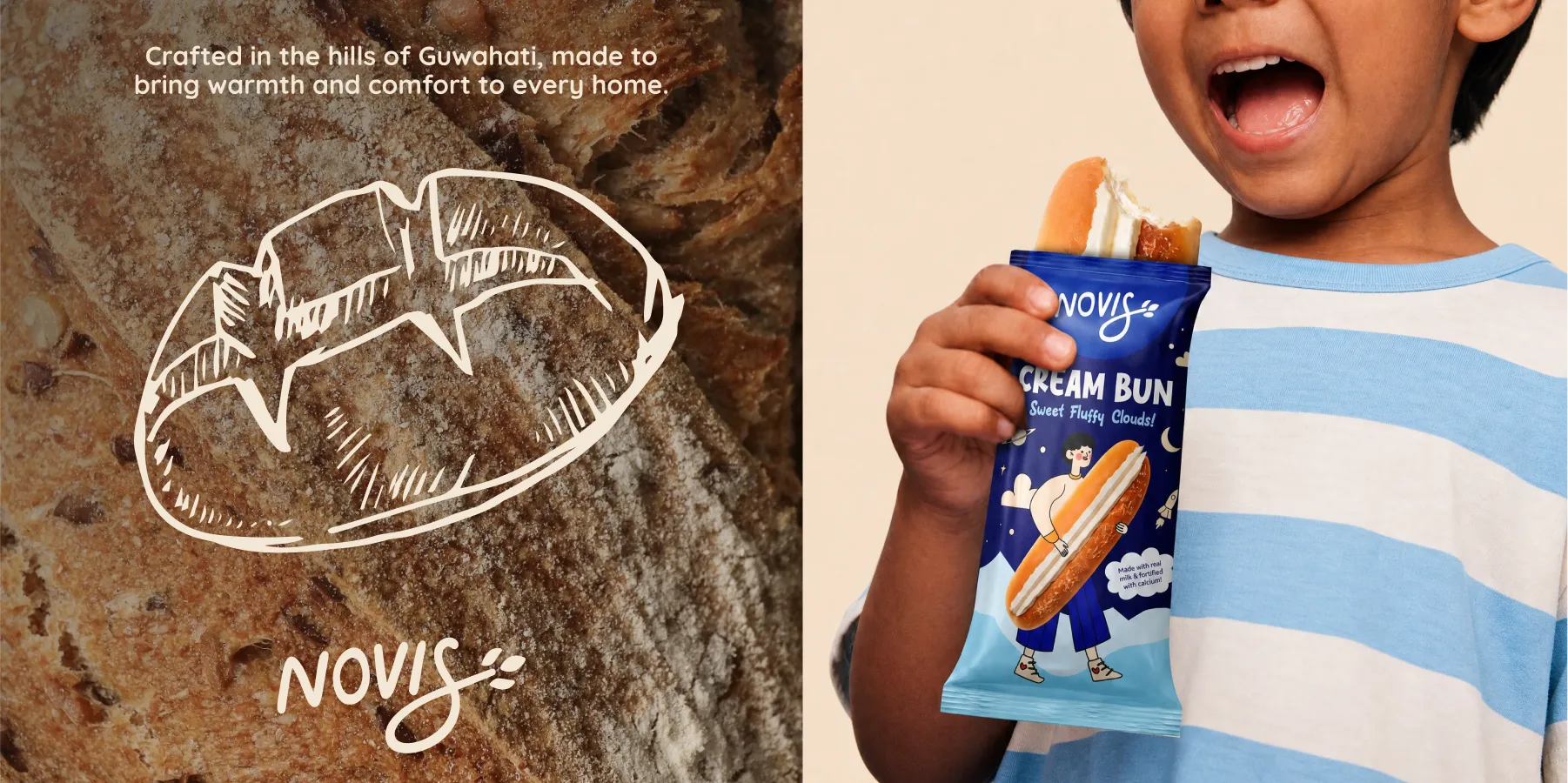
The wordmark is built in custom script, with letterforms that feel warm and considered. The S has a slight elongation and carries a wheat grain detail at its tip, a detail that earns its place because it connects the mark to what Novis actually makes without spelling it out. Alongside the wordmark, a standalone icon built around the same wheat motif works independently across smaller applications, favicons, stickers, embossed pack details.
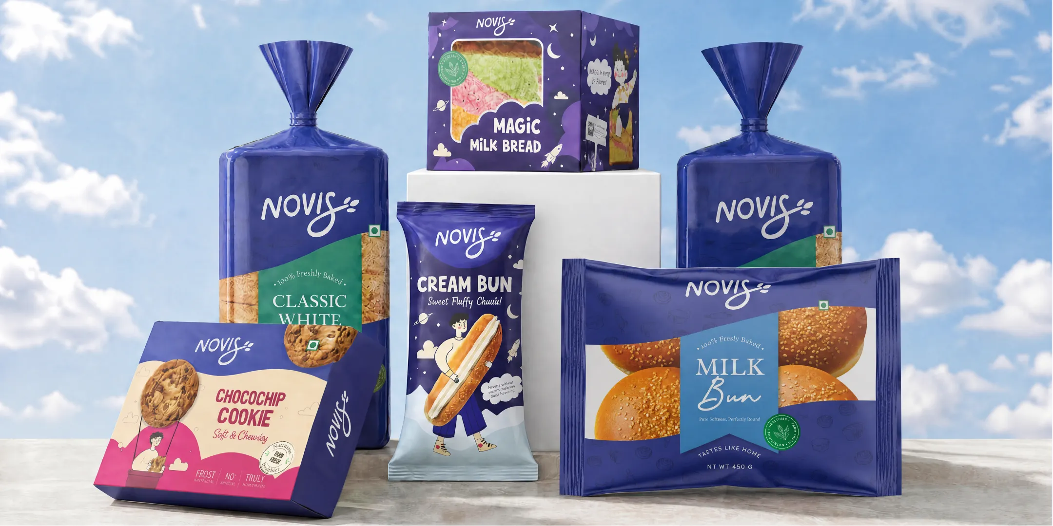
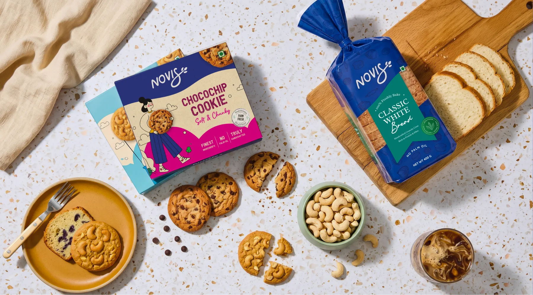
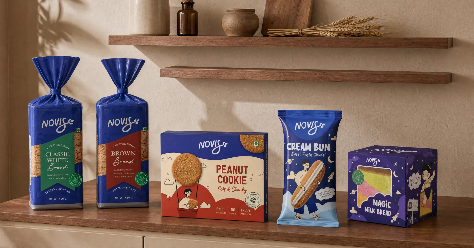
The primary colour is a deep, confident blue that Confetti named Blueberry. In a kirana aisle where most bakery packaging runs to faded primaries and generic yellows, it reads as fresh and trustworthy before a shopper has consciously registered why. Cream sits alongside it, bringing enough warmth to keep the palette from feeling distant. Rose Frosting and Golden Crust come in at the product level, giving the cookie and rusk ranges their own character without breaking away from the broader family.
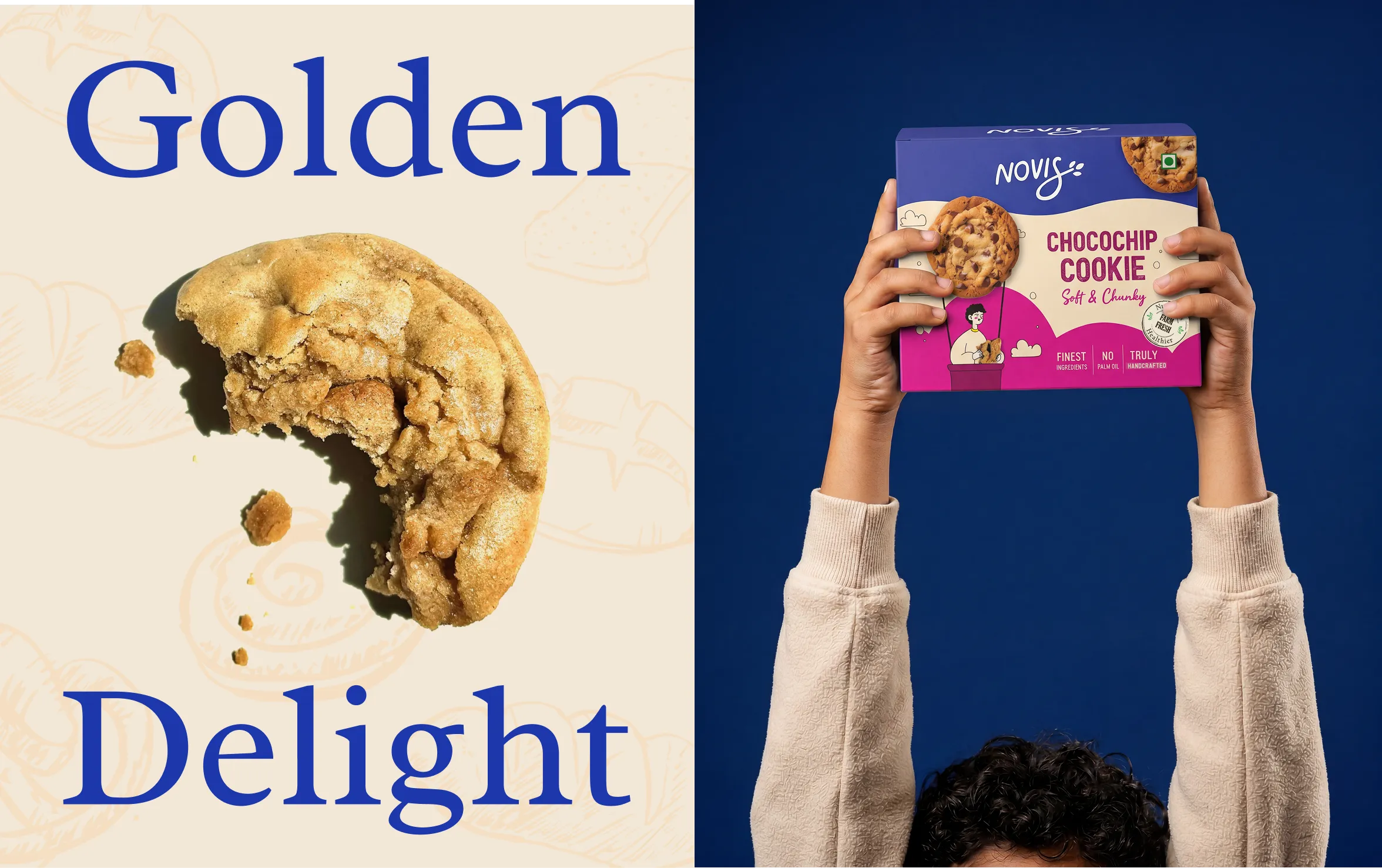
Three typefaces carry the identity. Radley, a serif with genuine warmth, handles headlines and the logo. Quicksand takes care of body copy and anything that needs to be read carefully. Claytonia, a handwritten accent face, appears sparingly on pack, used only in the moments that call for something that feels made by hand.
The architecture across all twelve SKUs follows the same logic. Novis wordmark anchored to the top left, product name large and central, illustrated character specific to each flavour, colour accent tied to product category. The system means the range reads as a family on shelf and each individual pack still feels like it was designed for that specific product.
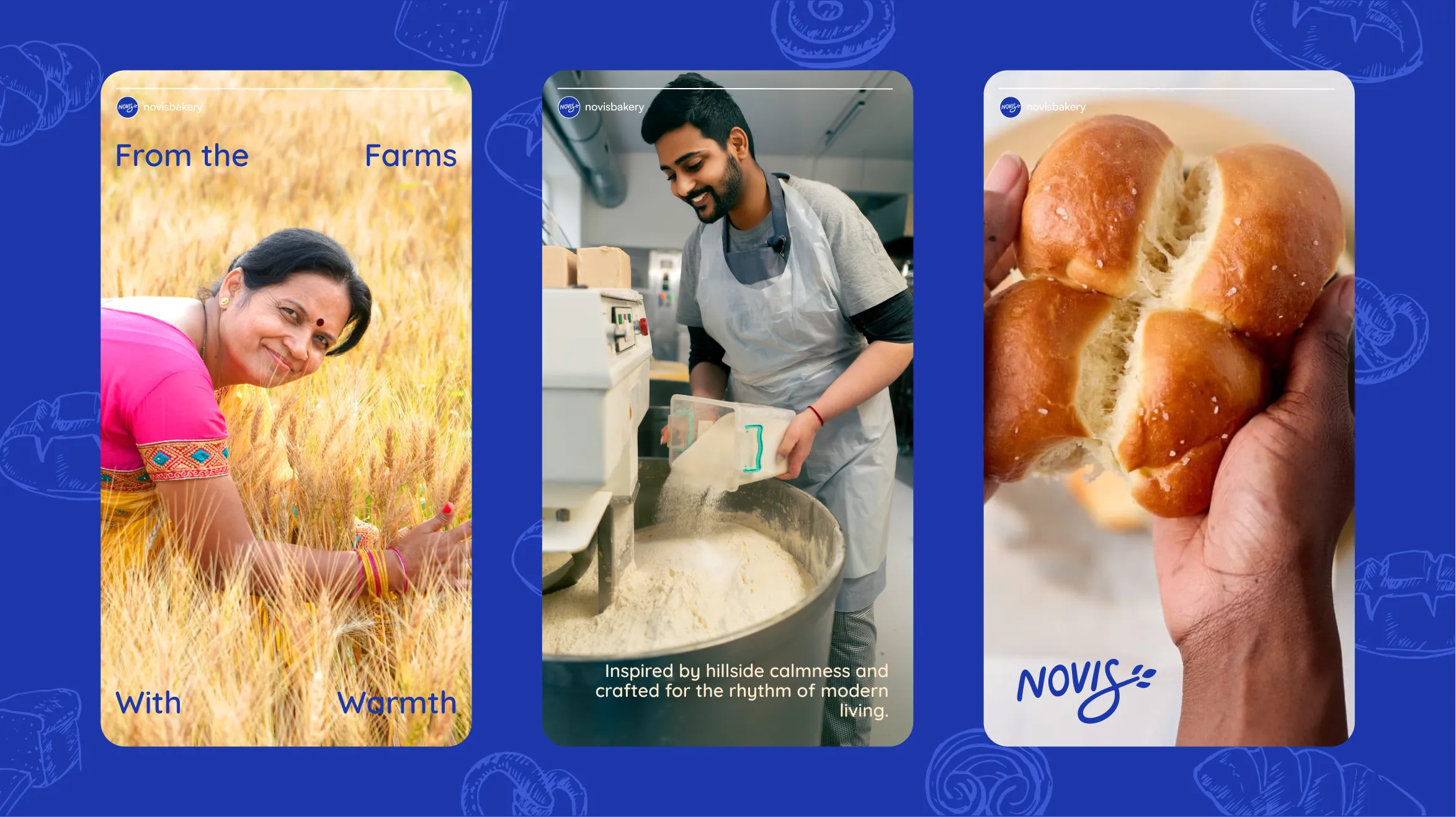
The illustrated characters are the detail that genuinely separates Novis from every competitor in the aisle. Each one is tied to a specific flavour, warm enough to invite attention, specific enough to be remembered. In a category where the competition either uses generic stock imagery or nothing at all, a character that belongs to the product is the thing that sticks.
Bread came in three SKUs such as Classic White, Brown, and Multigrain. Cookies across five flavours, each with its own colour treatment and illustrated character. Rusk went through three full colour directions before the final was chosen, not because the process was slow but because colour on a snack pack changes appetite appeal and shelf presence in ways that only become clear when you see the options against each other.
The Back of Pack was given the same care as the front. The Story of Novis panel, clean nutrition information, ingredient transparency, and a QR code. Designed to actually be read.
Novis launched with a brand built to last in a market that hadn't seen a serious challenger in years. The identity holds across twelve SKUs and three product categories without losing coherence. The packaging system is structured well enough to absorb new products and new markets as the brand grows. And the brand guidelines give the team a foundation that doesn't need to be rebuilt every time something new comes along. The gap in the market was always there. Confetti built the brand that was worth stepping into it.
So if you're launching a food brand somewhere the competition has been coasting for years, that's exactly the kind of project Confetti is built for.


.svg)
.webp)


.svg)
.svg)
.webp)
.webp)

.webp)
.svg)