02
AI Snaps


01
Our Work
03
About Us
04
Brand Audit
05
Contact Us
06
Client Success
12
07
Blogs
08
Careers
Book A Call




Need Help In Building Your Brand?
Click the button below & book a call with our founder directly.

Rishabh Jain
Managing Director
A global ready brand identity is one designed from the start to work in more than one market without a rebrand. Most brands are created for one market and only later reworked to fit the world.
This breakdown covers what global readiness actually means, why it is cheaper to build early, how we stress-test an identity before it travels, and what the work looks like across naming, typography, colour, packaging, digital, and governance.
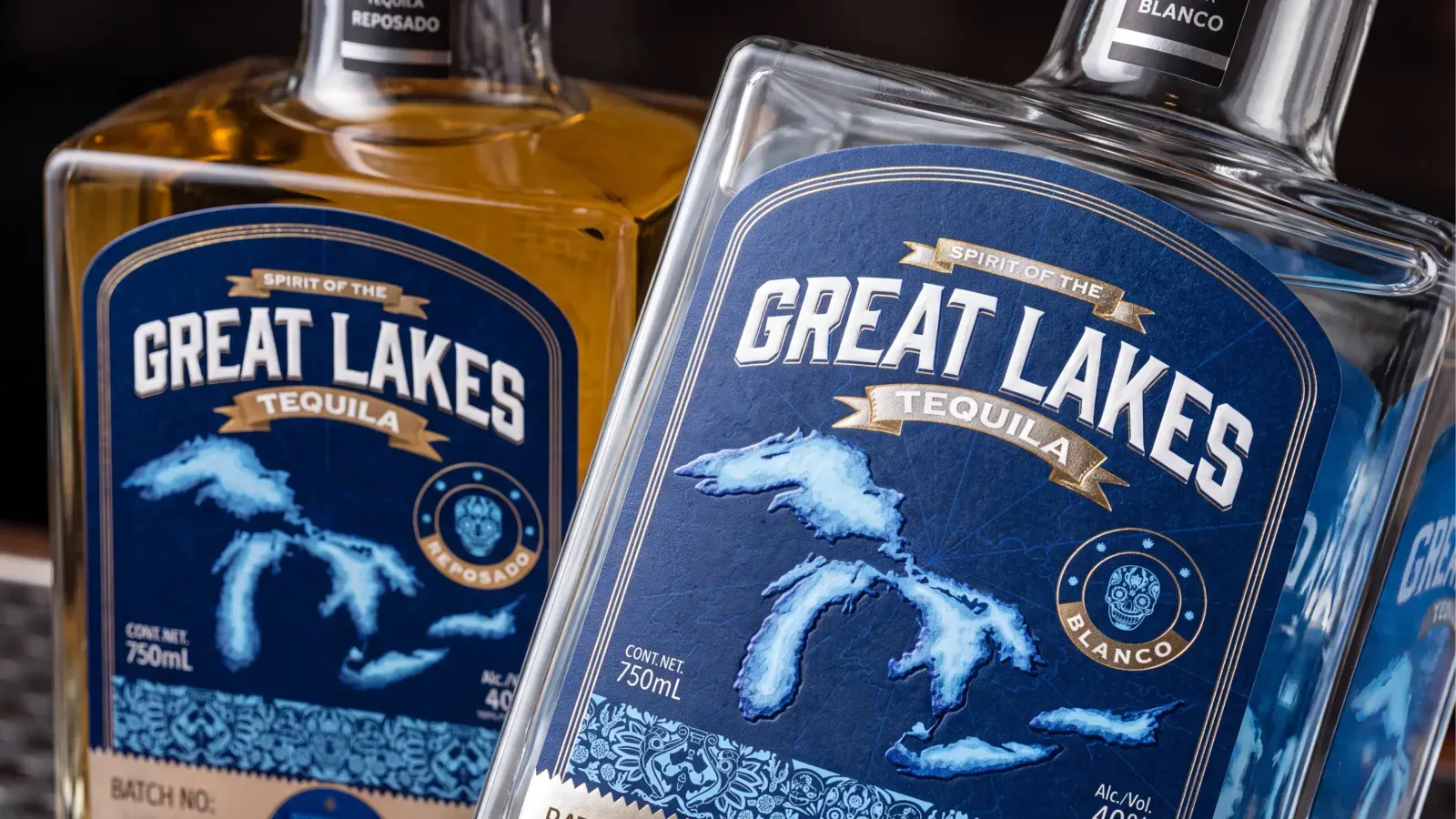
A global-ready brand identity is a system with a consistent core and a flexible expression, designed to adapt without losing recognition.
Focus on what must stay consistent and what can change before entering a new market.
Some brands strip away distinctive elements to avoid cultural risks, ending up with a neutral name, a simple logo and little personality. An identity can work across markets without becoming forgettable.
Build recognition around elements that travel well, such as a distinctive symbol, a recognisable colour, a consistent packaging structure or a clear brand idea.
Keep wordplay, idioms and culturally specific references in local campaigns rather than making them central to the identity.
A global-ready identity plans for adaptation from the very fist day.
Its brand guidelines should explain how the wordmark works in Arabic or Devanagari, how bilingual packaging accommodates additional text, which colours local teams can use and how imagery changes by market.
This reduces the need for redesigns when distributors, retailers or new customers require changes.
Translation alone is not enough. Names, visual associations, layouts and product information also need to work in each market.
Global readiness is also an operating model,.
Teams need clear rules for local adaptations so that every market can respond to its audience without creating a disconnected identity.
A global rebrand across multiple markets can run from $50,000 to well over $1,000,000, depending on the number of markets, the regulatory complexity, and the level of transformation required.
But the bigger cost is not the branding agency fee.
90–95% of total cost that is in application replacement: the packaging reprints, the signage, the website rebuilds, the distributor materials, and the operational disruption that follows a late change.
Building readiness in from day one front-loads a small amount of thinking and avoids that back-end cost.
A late change affects more than design fees.
These costs come up when the business is already managing distribution, inventory and growth. The disruption can be as significant as the redesign itself.
Planning for expansion at the start usually requires a few targeted additions to the branding brief:
These steps add some work to the initial project, but they preserve options without requiring you to finalise every future market in advance.
Global readiness does not mean predicting every future requirement. It means making decisions that keep expansion manageable.
An identity with clear rules and flexible components can be adapted as new markets, channels and products emerge. A rigid brand identity can hold you back because often it requires workarounds, inconsistent local versions or a larger redesign.
▶️Plan for likely expansion while changes are still easy to make. You do not need to build everything today. You need an identity that will not have to be rebuilt tomorrow.
At Confetti, we test a brand identity against four practical challenges before adapting it for new markets.
These checks reveal whether the system can flex without losing recognition.
We render the name in the scripts of the target markets: Arabic, Devanagari, Chinese, Cyrillic, Thai and assess whether the wordmark survives.
A wordmark built on a Latin letterform that has no visual equivalent in another script is a wordmark that will be redesigned, not translated. We check for pronunciation, unintended meanings, and visual coherence across scripts before the identity is locked.
We map the primary and secondary colours against the target markets' symbolic systems.
For example in Western markets it often signals urgency or error, while in China it is the foundational colour of prosperity and luck.
Green carries religious significance in some markets and health associations in others. Black signals premium in some contexts and mourning in others.
The test is not whether the colour is "safe" everywhere but if the brand knows what the colour is doing in each market and has decided whether that is acceptable.
We test the layout at different information densities. Western digital design favours negative space as a signal of premium and reduced cognitive load.
In many Asian markets, high-density layouts with maximum information are perceived as a signal of value, transparency, and popularity.
An identity that only works at one density is an identity that will feel wrong in half its markets. The test is whether the layout system has a density range, not just a density preference.
We map the mandatory information requirements of each target market before the artwork is finalised. Ingredients, allergens, warnings, net quantity, country of origin, importer details, language requirements, and conformity marks differ by market.
A packaging system that has no designated space for the market-specific information is a system that will be redesigned for every market.
The test is whether the pack can absorb a second language, a different conformity mark, and a market-specific warning without breaking.
▶️These four tests act as a filter. An identity that fails them is an identity that will cost more later. An identity that passes them has earned the right to enter the next market without being rebuilt.

Your brand name and wordmark are among the hardest identity elements to change after launch.
A name that works at home may have an unintended meaning abroad, while a wordmark designed for one script may lose its character in another.
Examples: Clairol's Mist Stick flopped in Germany because "mist" translates to manure.
Chevrolet's Nova was read as "no va", "it doesn't go", in Spanish. Pepsi's "Come alive with the Pepsi Generation" was interpreted in Chinese as "Pepsi will bring your ancestors back from the dead".
Before committing to a name:
These checks are easier to complete before packaging, marketing materials and retailer listings depend on the name.
Most brands have three options:
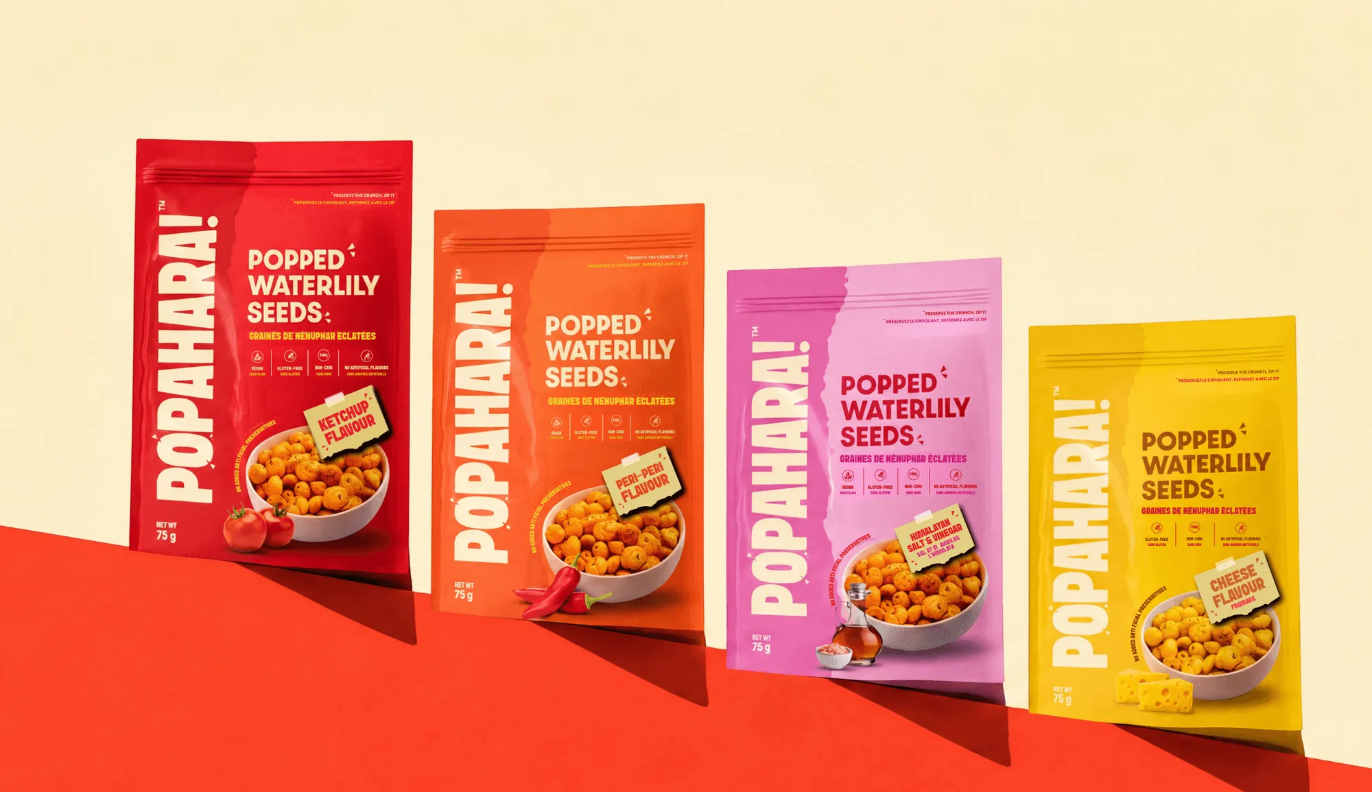
Example: For Popahara, we combined “Pop”, suggesting crunch, with “Ahaar”, the Sanskrit word for food or nourishment. The goal was to create one that connected the product's Indian roots with its intended market.
Wordmarks rarely transfer cleanly between writing systems.
Arabic, for example, reads right to left and has different letterforms and proportions from Latin script. Simply typing a Latin name in an Arabic font will rarely preserve its visual character.
Plan script-specific versions that maintain a consistent visual identity.
For bilingual packaging and signage, establish the language hierarchy, alignment and relative sizing early. Where the name changes by market, a distinctive symbol can help maintain recognition across versions.

Typography, colour, imagery and icons must adapt to local languages and cultural expectations without making the brand feel like a different business.
A typeface that works in Latin script may not support Arabic, Devanagari or Chinese.
Choose a type family that covers your target scripts, or select companion fonts that match the primary typeface in weight, proportions and personality.
Test real content before approval. Longer product names, accents, different writing directions and expanded translations can change how a layout looks.
Specify approved fonts and hierarchy rules in your brand guidelines so local teams do not choose substitutes independently.
Colour carries different meanings across cultures and categories. Red, for instance, can signal urgency in some contexts and prosperity in others.
That does not mean a global brand must avoid it. It means the brand should understand local associations and decide whether they support its intended positioning.
Define the core palette that builds recognition, then specify where secondary colours can flex. Local teams should have clear limits on what they can change without weakening the identity.
Models, clothing, settings, food, gestures and family scenes can carry different cultural meanings. A single image library may not suit every market.
Instead of relying only on approved photographs, define the principles behind them: lighting, composition, colour treatment, setting and mood.
This gives local photographers room to use relevant people and places while maintaining a recognisable visual style.
Icons and gestures are not universally understood.
A symbol may be friendly in one market but carry an unintended meaning in another.
Review icons, hand gestures, animals and warning symbols with local knowledge before using them across markets.
▶️Specify the system, not just the assets. A font, colour or photograph can be replaced for a local audience.
A well-defined system explains how to make that change while keeping the brand recognisable. Without those rules, each market makes independent choices, and the identity gradually fragments.
Packaging is where a global-ready identity comes face to face with compliance, and where unplanned identities usually break first.
Divide packaging into fixed brand elements and adaptable information zones. The brand elements include the logo, core colours and product hierarchy.
Flexible zones accommodate translations, ingredients, allergens, warnings, net quantity, importer details and market-specific marks.
Plan these zones before artwork is finalised. Translated copy can take up more space, and some markets require multiple languages on the same pack.
Requirements also vary by product category and country, so verify them with the relevant regulatory specialists before approving artwork.
Packaging must work physically as well as visually. Heat, humidity, shipping conditions, materials and adhesives can affect performance.
A pack designed for supermarket shelves may also need changes to withstand e-commerce transit.
A multi-market pack can reduce stock complexity when sales volumes are low across several countries.
Separate market-specific packs offer more room for local languages, claims and design choices but increase artwork, inventory and production requirements.
The right approach depends on sales volumes, regulations, retailers and supply chains. Build a packaging template that supports both options, so the business can introduce dedicated versions as demand grows.
A translated website with a currency switch is not enough.
Customers also need familiar payment methods, relevant delivery information, appropriate customer support and locally compliant product information.
Plan for how people discover and buy products in each market.
Marketplace listings need product images and copy that work within platform formats. Quick-commerce listings need assets that remain legible at thumbnail size.
D2C websites need a complete local shopping experience.
Languages that read right to left, including Arabic, require specific layout decisions. Navigation, image placement, product information and calls to action may all need adjustment.
At Confetti, packaging and digital are treated as parts of one brand system.
The identity should remain recognisable on a physical pack, a marketplace thumbnail and a localised website.
▶️Fixed brand elements provide consistency; flexible templates let each market meet its own requirements without fragmenting the brand.
A global-ready identity can still fragment if brand guidelines do not explain what must stay consistent, what local teams can adapt and who approves changes.
Guidelines need to function as an operating system, not just a PDF.
The core brand idea, logo, primary colour, typographic hierarchy and defining principles of the brand's voice build recognition and should remain consistent across markets.
Rules must explain how to adapt the identity. They cover local imagery, translated copy, secondary colours, campaign formats and market-specific packaging.
Keeping the core rules clear while allowing controlled flexibility helps local teams stay relevant without making the brand unrecognisable.
Effective governance needs three practical components:
Use one master guideline for the global identity, supported by a short annex for each market. The master defines the core and adaptation rules.
Each annex records the relevant scripts, approved wordmark versions, local imagery guidance, packaging requirements and agreed exceptions.
When a new market opens, extend the system with another annex instead of creating a separate identity or rewriting the guidelines.
Local partners and teams understand their audiences, cultural context and market conditions. Involve them before launch, explain which elements are fixed and invite feedback on what may not work locally.
Assign one clear owner to approve adaptations and document decisions so other markets can reuse them.
The goal is not to centralise every decision. It is to give local teams the freedom to adapt the brand within a framework that protects recognition and consistency.
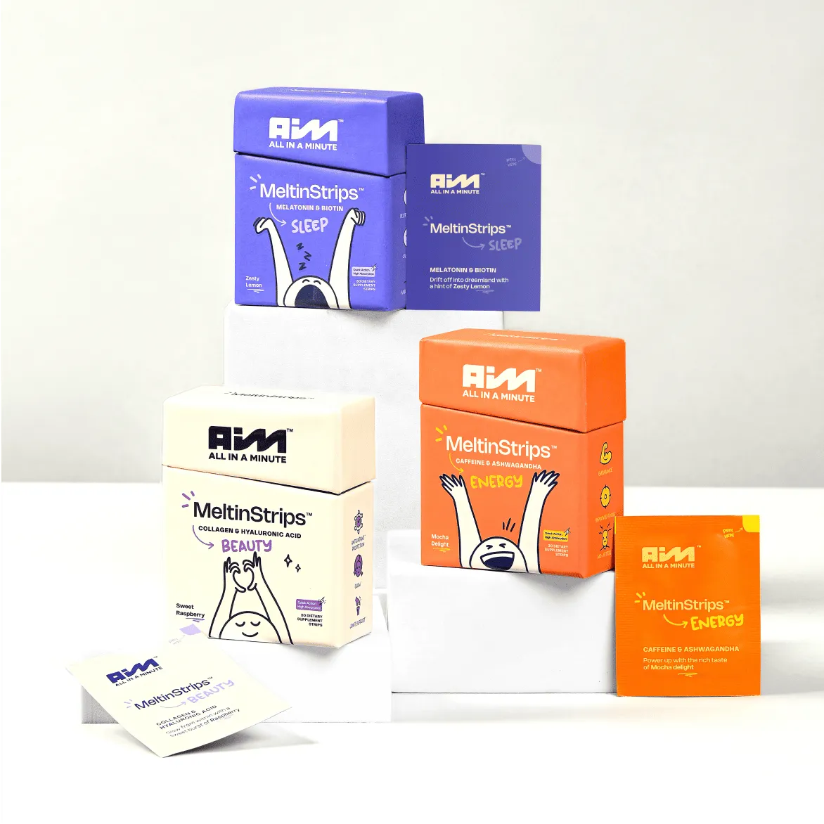
Use this checklist when briefing a new identity or reviewing an existing one before international expansion.
☐ The name has been screened across the scripts and languages of the target markets. Not just translated. Screened for unintended meaning, pronunciation, and cultural association.
☐ The wordmark has a companion system for non-Latin scripts. Or a documented plan for how it will be adapted.
☐ The typographic system specifies companion typefaces for each script. Not left to local designers.
☐ The colour system has been mapped against the cultural associations of each target market. And the brand has decided what it will do about the differences.
☐ The layout system has a density range, not a single density preference.
☐ The imagery system is specified at the level of principle, not just approved examples.
☐ The icon system has been tested for unintended meaning in each target market.
☐ The packaging system has modular compliance zones. It can absorb a second language, a different conformity mark, and a market-specific warning without a redesign.
☐ The digital system is localised, not just translated. Language, currency, payment, shipping, and service are built for the market.
☐ The governance model distinguishes big laws from little rules. And the little rules are usable by the people who have to execute them.
☐ The brand has a central asset system that local teams can access.
☐ The brand has a named owner for adaptation decisions. Not a committee. A person.
A brand that will never sell outside one market does not need global readiness.
A brand that is pre-revenue and needs a placeholder identity to launch a minimum viable product does not need it.
A brand whose only international exposure is a marketplace listing that it does not control does not need it.
The checklist is for brands that intend to enter a second market, or a third, and want the second entry to cost less than the first.
Building a brand for more than one market? Schedule a consultation and we will stress-test the identity before you commit to the second market.
What is a global-ready brand identity?
A global-ready brand identity is one designed from the start to work in more than one market without a rebrand. Its name clears trademarks and pronunciation checks abroad, its logo and typefaces work in the scripts it will need, its colours and imagery have been checked locally, and its packaging and guidelines leave room for languages and local rules.
How do you make a logo work in different languages?
Design the logo so the symbol can carry recognition on its own, then create wordmark versions in each script you need, drawn to match rather than typed in a default font. Check direction, since Arabic reads right to left, and letterforms, since some sounds don't exist in every script. Native-speaker and type-designer review before launch prevents expensive mistakes.
Should a brand name be the same in every country?
Ideally yes, because one name concentrates recognition and lowers cost. But it has to be available as a trademark in each market, easy to pronounce, free of unwanted meanings, and appropriate to the category. Where a name fails in one market, brands use a local name under a shared symbol or a transliterated version rather than abandoning the name everywhere.
When should a startup think about global branding?
As soon as international expansion is a realistic plan, even if it is two or three years away. Building a name check, script support and a flexible pack system into the first identity costs far less than renaming, redrawing or reprinting later. If the business will stay in one market for the foreseeable future, a simpler single-market identity is a reasonable choice.
What is the difference between global and local branding?
Global branding keeps one identity and core message across markets, which builds recognition and lowers cost. Local branding adapts or replaces elements for each market to fit language, culture and rules. A global-ready identity sits in between: it fixes the core elements that carry recognition and builds in flexibility for the elements that need to change by market.
Want strategic branding and packaging like this for your business?