%201.webp)
02
AI Snaps
.svg)
.svg)
01
Our Work
03
About Us
04
Brand Audit
05
Contact Us
06
Client Success
12
07
Blogs
08
Careers
Book A Call
.svg)



.svg)
Need Help In Building Your Brand?
Click the button below & book a call with our founder directly.

Rishabh Jain
Managing Director
Signs your brand identity is holding back growth can be easy to miss. When growth slows, and brand identity “feels” like where the problem lies, you need to investigate deeper.
Here are 11 concrete signs, and for each one, what it actually indicates you should do about it.

Lucidpress shows that 81% of companies struggle with off-brand content despite having documented brand standards. The main reason behind this is that the guidelines do not give the team enough information to make everyday decisions consistently.
Your website uses one version of the logo, packaging uses another colour, the sales deck has a logo nobody remembers approving, and social media sounds like a completely different business. Each piece may look fine on its own. Together, they weaken recognition.
This usually points to an identity system problem.
▶️Walk through your own touchpoints
Look at the full customer journey rather than reviewing the logo in isolation. Compare the website, packaging, social profiles, ecommerce listings, sales presentations, advertising, signage and email templates.
Pay attention to small deviations:
Repeated inconsistencies across important touchpoints make the brand harder to recognise.
▶️Find out whether the problem is the brand guidelines
Brand guidelines explain how to use it: logo spacing, colour codes, typography, imagery, layouts, applications and examples.
A company can have a strong brand book and still produce inconsistent work because the operational rules are missing.
▶️Test whether the system works without the original designer
Give the identity to a new employee, freelancer or packaging supplier and ask them to create a new asset without additional instruction. If they need to ask which logo to use, what colour value to select, how much clear space to leave, or how the brand should sound, the system has gaps.
The fix may be much smaller than a rebrand. Audit what is currently documented against what the team actually produces, identify the specific points where people are improvising, and add rules and examples for those situations.
Before changing the identity itself, make sure the problem is not simply that the brand identity was never documented well enough to scale.
When customers compare you on cost, it's because nothing else in their mind distinguishes you from the alternative. The product might be better, ingredients might be superior, service might be faster.
But if the brand hasn't encoded those differences into something the buyer recognises and trusts without being told, the only remaining differentiator is price.
This shows up commercially as: Margins become harder to protect, discounts become part of the sales process, customers delay purchases until promotions, sales teams start negotiating instead of explaining why the offer is worth choosing.
▶️Separate perception from positioning
A weak identity is not always the cause.
If competitors offer essentially the same product at similar quality and service levels, changing the visual identity will not create meaningful differentiation. Likewise, an aggressive discount strategy can train customers to focus on price even when the brand itself is well positioned.
Look at the underlying offer first:
What can your customer get from you that is meaningfully different, and does the brand make that difference easy to understand?
If the answer is unclear, the problem may lie in positioning, product or pricing rather than visual identity.
▶️Examine what the identity is communicating
A brand can be consistent and still be difficult to differentiate. Your logo may be applied correctly everywhere, while the overall identity uses the same colours, typography, imagery and messaging as every other business in the category.
That is different from Sign 1 which is about inconsistency. This sign is about lack of differentiation.
A refresh or rebrand may be appropriate when the underlying positioning is clear but the identity does not communicate it. The work should focus on the specific gap: visual territory, messaging, hierarchy, packaging, digital presentation or another customer-facing expression.
Check: Remove the price from your sales message and look at what remains. If the brand still gives customers a clear reason to choose you, perception may not be the problem. If the value becomes difficult to explain, the identity and positioning may need closer review.
Getting a buyer meeting is not the same as getting listed. If retailers or distributors repeatedly show interest but do not move forward, the problem may be that the brand is not presenting a clear commercial proposition.
Retail buyers need to understand the product range quickly: what category it belongs to, where it sits on price and quality, how the SKUs work together, and whether the packaging is ready for the intended retail environment.
Carrefour UAE, for example, accepts seller applications through its marketplace and states that its team reviews the submitted catalogue before contacting the seller.
That means your packaging and product presentation have to communicate more than consumer appeal.
▶️Look at the range, not one pack
A single SKU may look polished while the overall range feels inconsistent. Different logo sizes, changing colour logic, weak variant differentiation or unclear category architecture make the portfolio harder to assess.
A buyer should be able to see immediately:
▶️Separate consumer appeal from trade readiness
If key product information is difficult to find, the hierarchy is unclear, or the packaging does not appear ready for the intended channel, the buyer has more work to do before approving the range.
Consider how the product will appear across physical stores, retailer websites, marketplace listings and quick-commerce platforms. The same identity needs to remain recognisable in each environment.
▶️Find the actual reason for rejection
Do not assume a failed listing means the brand needs a complete redesign. Ask what stopped the conversation.
Was the issue price, margin, category fit, range size, packaging, documentation, product readiness or differentiation?
If the commercial offer is strong but the packaging fails to communicate it, an identity or packaging refresh may solve the specific problem. If the buyer's objection is fundamentally about pricing, distribution or product performance, design is unlikely to fix it.
Check: can a buyer understand why this range deserves shelf or digital space without you having to explain every SKU? If not, the brand presentation may be creating friction at the listing stage.
Paid advertising can bring people to the business, but it does not automatically create a reason to remember it. A customer who sees your brand for the first time through an ad still needs to understand what makes you different and why they should return.
If customer acquisition costs keep rising while organic demand remains flat, look beyond your media strategy. Your brand may not be creating enough recognition, preference or repeat demand to reduce dependence on paid acquisition.
Retention also matters because acquiring new customers generally costs more than retaining existing ones.
▶️Check whether the brand is building recognition
Review where customers come from and what they search for. Are people searching specifically for your brand? Are returning customers increasing? Do customers mention your brand without needing to be reminded where they bought from?
If most demand disappears as soon as paid campaigns stop, the issue may be broader than marketing efficiency.
▶️Separate brand problems from offer problems
Weak organic demand does not automatically mean you need a rebrand. An undifferentiated product, poor pricing, weak distribution or low customer satisfaction can produce the same symptoms.
Start with the offer, then assess whether the brand identity clearly communicates its differentiation and remains recognisable across the channels where customers encounter it.
Consistent presentation can support lead generation and existing customer relationships.
Check: when paid traffic stops, what part of your demand continues? If branded search, direct visits, referrals and repeat purchases remain weak, examine whether the brand is building enough recognition to compound the money you are already spending on acquisition.
A newer competitor enters the market with less history, fewer customers and a smaller team, yet their website, packaging and sales materials make them look like the more established business.
That does not necessarily mean their product or service is better. It can mean your visual identity has fallen behind the category standard.
▶️Check whether the market has moved
Brand identities often reflect the market conditions in which they were created. Five years later, customer expectations for typography, photography, digital interfaces, packaging and overall presentation may have changed.
Compare your current identity with recently launched competitors across the same touchpoints. Look for practical gaps:
Find out whether your identity still communicates the level of quality, relevance and professionalism your business wants customers to perceive.
▶️Decide between a refresh and a rebrand
This sign does not automatically call for a complete rebrand.
If your brand positioning, audience, offer and brand strategy are still valid, a visual refresh may be enough. The work can focus on modernising typography, colour, imagery, layout, logo execution or key applications while preserving the strategic foundation and existing recognition.
A rebrand becomes more relevant when the business itself has changed: a new market, audience, category, positioning or business model.
▶️Test the change against real touchpoints
Do not judge the refresh from a logo presentation alone. Apply the proposed direction to the website, packaging, social media, sales materials and other important customer-facing assets.
Check: does the identity still represent where the business is going, or is it mainly preserving how the business looked when it started? If the strategy is still right but the expression feels dated, the problem may require an identity refresh rather than a full reset.
Ask five people in the company what makes the business different from its competitors. If you get five different answers, the problem is deeper than inconsistent messaging.
Teams often fall back on the same claims: quality, service, innovation, experience. These may be true, but they rarely explain why a customer should choose one business over another.
▶️This is usually a positioning problem
When leadership, sales and marketing cannot agree on what the brand stands for, each team starts emphasising a different feature. The website talks about expertise, sales about service, marketing about innovation.
The customer receives several messages without a clear reason to remember any of them. The identity can look perfectly polished while this problem continues underneath it.
A useful positioning statement should be specific enough to exclude alternatives. If it could describe three competitors with only minor changes, it is probably describing the category rather than defining the brand.
Start by identifying:
▶️Do not redesign before resolving the strategy
This sign often appears before the identity itself starts showing visible problems. That makes it easy to misdiagnose.
A visual refresh built on vague positioning may produce a more polished identity without making the business easier to understand. The strategic decision needs to come first: what space should the brand own, for whom, and why should that customer choose it over a named alternative?
Once that is clear, the identity has something specific to communicate.
Check: Can everyone who represents the business give the same answer to “Why should I choose you instead of X?” If the answer changes depending on who you ask, the next project should begin with positioning, not design.

Talk to our experts to find out what's really going on
Book A Call
Your business has changed, but the brand still communicates the version that existed when you launched.
This can happen when a brand moves into a higher price tier, expands its product range, enters new markets or starts selling to a different audience. The original identity may have been right for that earlier stage, but the signals it sends no longer match the business customers encounter today.
A skincare brand, for example, might launch with bright, accessible packaging aimed at an affordable market. A few years later, its formulations improve, prices increase and the products move into premium retail. If the packaging and website still communicate budget positioning, customers may struggle to understand the higher price.
The same issue can affect B2B businesses. A software company that started by serving small teams may initially use an informal, playful identity. As it moves into enterprise sales, procurement teams and larger organisations, that identity may no longer communicate the level of maturity, reliability or sophistication the business now needs to convey.
▶️Look for a strategic mismatch
The warning signs usually appear across several touchpoints:
This is different from having an outdated logo or inconsistent applications. The identity may still be well executed. The problem is that it represents a business that no longer exists.
▶️Know when a refresh is not enough
A visual refresh can update execution while preserving an underlying strategy. This sign points to a deeper issue when the positioning itself has changed.
If your audience, price architecture, category position, offer or growth direction has materially shifted, the identity needs to be rebuilt around those decisions. That may mean revisiting positioning, messaging, visual identity and brand architecture together.
Check: Does the brand accurately represent the business customers are buying from today, and the business you are building next?
When the answer is no, polishing the existing identity may only preserve the mismatch.
Your business has plans for new products, channels or markets, but every expansion creates a new branding problem. The identity works for what you sell today and struggles with what you plan to sell next.
This is usually an identity architecture problem, not simply a visual one.
A brand created around one product may not have a clear way to organise a broader range. A D2C identity may work beautifully online but become difficult to adapt for retail.
An English-first identity may require substantial reworking when Arabic becomes part of the customer experience. The issue is not that the original design was wrong. It was built for a narrower job.
▶️Look at what breaks when you expand
The warning signs usually appear during planning:
When every new business direction requires starting from scratch, the identity is functioning as a collection of individual assets rather than a system.
▶️Decide whether you need an extension or a rebrand
Not every stretch problem requires a complete rebrand.
If the core positioning remains relevant, a structured identity extension may be enough. This can involve developing variant rules, flexible layouts, responsive logo formats, sub-brand architecture and market adaptation guidelines.
A full rebrand becomes more relevant when the business itself is changing significantly, such as entering a different category, targeting a substantially different audience or adopting a new market position.
Check: Can your current identity accommodate the next stage of the business without creating a new design problem every time you add something?
If the answer is no, the next project should focus on building the missing architecture, not simply producing another version of the existing logo.
You want to launch a premium line, raise prices or compete with brands positioned significantly above you, but the existing identity keeps pulling the business back toward its current price tier.
This is a price-positioning problem. The brand may work across products and channels, but its visual signals have become associated with accessible or mainstream pricing.
▶️Look at what the identity currently signals
Typography, colour, photography, packaging materials and overall presentation all contribute to perceived positioning. If these consistently communicate value and accessibility, simply increasing the price will not necessarily change how customers evaluate the product.
The result is a common mismatch: the product improves, the price increases, but the brand still looks like the lower-priced option.
▶️Check whether the strategy supports the move
Moving upmarket should not begin with gold foil or a more expensive logo. First establish what the premium offer actually represents and why customers should pay more.
Then assess whether the identity communicates those decisions through:
The commercial team's statement that “the brand won't hold the price” can be a useful signal, but it does not prove the problem is visual. Product quality, distribution, pricing strategy and customer perception all matter.
A rebrand or identity refresh becomes relevant when the strategic position has changed but the existing visual identity still anchors the brand to its previous tier.
Check: If the product and price moved up tomorrow, would the brand look credible at that new level? If not, the identity may be limiting the range's ability to move upmarket.
Every new market creates a new branding project.
You enter the UAE and discover the need for Arabic packaging and market-specific requirements. You enter the EU and encounter the Packaging and Packaging Waste Regulation, which began applying from 12 August 2026.
You launch a new category and need a different product architecture. You move into retail and find that the existing identity does not work across shelf, ecommerce and other formats.
The problem is not that every market needs identical packaging. It is that your identity has no adaptation system.
▶️Look at what has to be rebuilt
A scalable identity should allow certain elements to remain fixed while others change by market, channel or product.
For example:
Without those rules, every expansion starts with a blank page. That creates design cost, but the bigger commercial problem is delay. Packaging has to be redesigned before products can be approved, produced or launched.
▶️Adaptation is different from translation
A brand entering the UAE may need Arabic versions of packaging and communications, but simply translating existing artwork does not guarantee that the identity works in the new market. Arabic and Latin scripts have different reading directions and visual characteristics, while local regulatory information can also change the available design space.
The same principle applies beyond the UAE. Packaging for UK and EU's PPWR now creates a harmonised packaging framework, with additional requirements applying on different timelines through 2030 and beyond.
▶️Decide whether the architecture needs fixing
You do not automatically need a rebrand.
If the core positioning and identity are still appropriate, the better solution may be to build the missing brand architecture, responsive logo rules, bilingual system, packaging templates and market adaptation guidelines.
A full rebrand becomes more relevant when the expansion also changes the business's positioning, audience or category.
Check: when entering a new market, are you adapting an existing system or rebuilding the brand? If every expansion requires starting again, the identity was designed for one context rather than for growth.
Your sales team creates its own presentations. Marketing designs new social templates instead of using the approved assets. People recreate logos, colours or layouts because the official brand files are nowhere near as convenient as starting from scratch.
That is a useful internal warning sign, but it does not automatically mean the identity needs to change.
▶️Find out why people are avoiding the assets
There are two very different problems.
If the team cannot find the right files, the folder is badly organised, templates are missing, or the available assets do not work for common tasks, you have an asset-management problem.
The identity itself may be completely usable. The fix could be a better asset library, clearer naming, accessible templates and a practical set of formats for everyday use.
The second problem is more fundamental. If the correct assets are easy to find and simple to use, but the team still avoids them because they look outdated, restrictive or less credible than what competitors are using, the issue is likely with the identity itself.
Ask: “Did you create your own version because you couldn't find ours, or because ours wasn't good enough?”
The answer points to a very different project.
▶️Make the brand easier to use
Before commissioning a redesign, review how the identity works for the people using it every day.
A usable brand system should provide the formats and templates teams actually need, including presentation layouts, social assets, document templates, packaging files and approved logo variations.
It should also be clear enough that employees and external suppliers can make routine decisions without repeatedly asking the design team.
If the problem is usability, fix the system first. If the team has access to a well-organised, practical toolkit and still chooses to work around it, that is stronger evidence that the identity itself may need to be reassessed.
Check: is your team ignoring the brand because it is difficult to use, or because they do not want to use it?
In our experience at Confetti we have observed most brand problems aren't design problems. They're system problems that show up as design symptoms.
Our starting point in any brand conversation is figuring out which of these situations is actually in play. That diagnostic step shapes brand strategy and identity work before any design decisions get made.
We've built brand identity systems for businesses across different markets and stages from early-stage brands establishing a first identity to more established businesses expanding into new categories or geographies, reflected in our work across India, the UK, Dubai, Australia, and the US.
That range means we've seen most versions of the signs above play out, which shapes how we ask questions at the start of a project rather than assuming every "the brand feels off" conversation ends in the same recommendation.
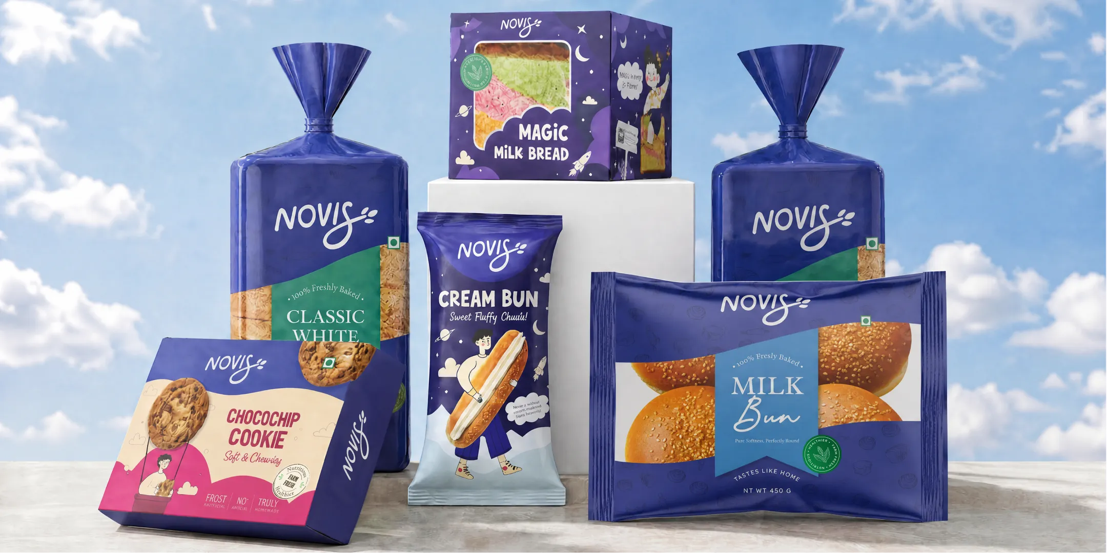
For Novis, a bakery brand launching in Guwahati, we built a complete identity and packaging system across twelve SKUs and three product categories. The identity holds without losing coherence, and the packaging system is structured to absorb new products as the brand grows. That outcome required the strategy, identity, and packaging to be designed as one system, from the beginning.
If you're trying to work out which of these situations actually applies to your business, we're glad to talk it through before either of us commits to a scope of work.
How do I know if my brand identity is actually holding back growth?
Look for commercial symptoms first: rising acquisition costs, price-based competition, failed listing conversations, and competitors with weaker products winning on perception. If two or more of those patterns are present, the brand is likely underperforming as an asset. Internal symptoms—team avoidance, inconsistent channels, unclear differentiation—usually confirm what the commercial data already suggests.
Can a brand identity be fixed without a full rebrand?
Often, yes. If the positioning is sound and the visual system is coherent, the fix may be documentation, governance, and adaptation rules rather than a redesign. A refresh that adds system flexibility can solve stretch and consistency problems at a fraction of the cost of a full rebrand. The diagnostic is whether the underlying strategy is still valid. If it is, build on it. If it isn't, rebuild.
How long does it take to fix a brand that's holding back growth?
A focused identity or positioning project typically runs four to eight weeks. A full rebrand with strategy, architecture, and multi-market adaptation takes longer. The critical path is usually the strategic work, not the design work. Rushing strategy to get to visuals faster is the most common cause of a second rebrand eighteen months later.
Can I fix brand inconsistency without hiring an agency?
If the inconsistency is caused by a lack of documented guidelines rather than a weak strategy, yes. A competent in-house designer can build a system document that covers logo usage, colour hierarchy, typography, and application rules across your core touchpoints. If the inconsistency is caused by a strategic gap, the brand doesn't have a clear position to be consistent about, documentation won't fix it.
Want strategic branding and packaging like this for your business?





.webp)
.webp)


.webp)
.webp)
.webp)
.webp)
.webp)







.svg)
.webp)