%201.webp)
02
AI Snaps
.svg)
.svg)
01
Our Work
03
About Us
04
Brand Audit
05
Contact Us
06
Client Success
12
07
Blogs
08
Careers
Book A Call
.svg)


Makhana has been sitting in Indian homes for generations. Fox nuts, popped lotus seeds, whatever you want to call them, they've always been there, in temple offerings, in late night snacking, in the food that your grandmother always made for you without calling it a superfood.
Popahara was begun as an initiative to take that ingredient somewhere new.
Based in Canada,Popahara launched as a makhana snack brand with a belief that something this good, this nutritious, and this genuinely Indian deserved to be on shelves far beyond where it had always lived.
The name says it all. Pop, for the crunch the product delivers. Ahaar, the Sanskrit word for wholesome nourishment. Two ideas became one name, and a brand that needed to carry them into a Canadian market that had never really encountered makhana before.
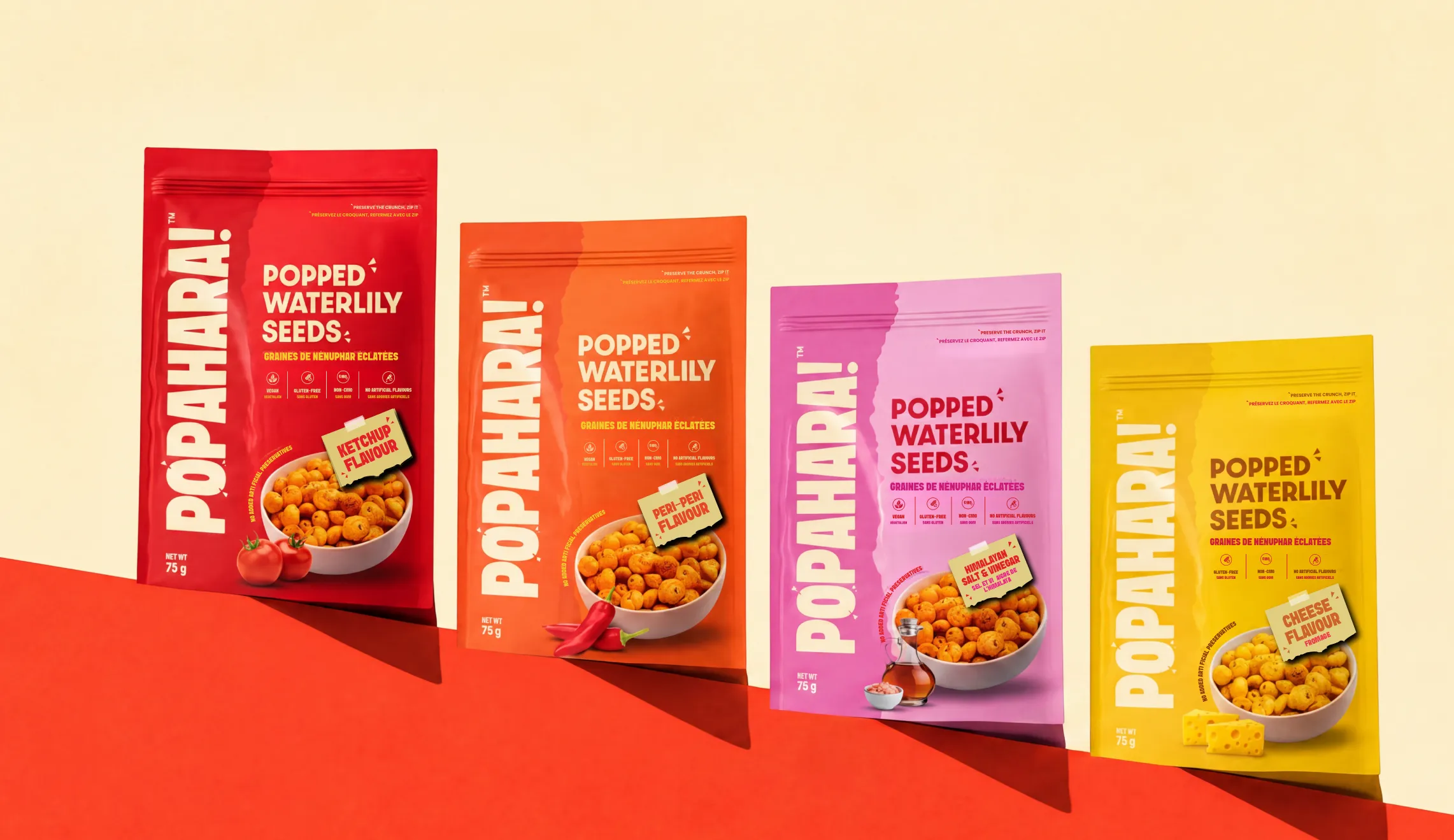
Confetti worked on the naming, brand identity, and complete packaging system across four flavours, with everything built to work in both English and French for the Canadian market.
Launching a snack brand in Canada built around an ingredient most of the market has never heard of is a specific kind of challenge. The product needed to be explained without being made to sound like a health food lecture. The Indian origin needed to be present without the brand feeling like it was only speaking to the diaspora. And the audience was genuinely broad, college students drawn to the quirkier flavours, corporate professionals, and older buyers looking for something that tasted good and happened to be good for them.
The packaging added its own layer of complexity. Canadian regulations require bilingual packaging, so every decision made for the English version had to work equally well in French.

Popahara came from a genuine creative process. Pop for the crunch and the energy the product delivers. Ahaar because this was never just a snack, it was nourishment that comes from a wholesome meal with Indian roots and a Sanskrit vocabulary behind it. The name had to resonate with a Canadian audience who might not know what “ahaar” meant while feeling immediately right to anyone who did. It does both.
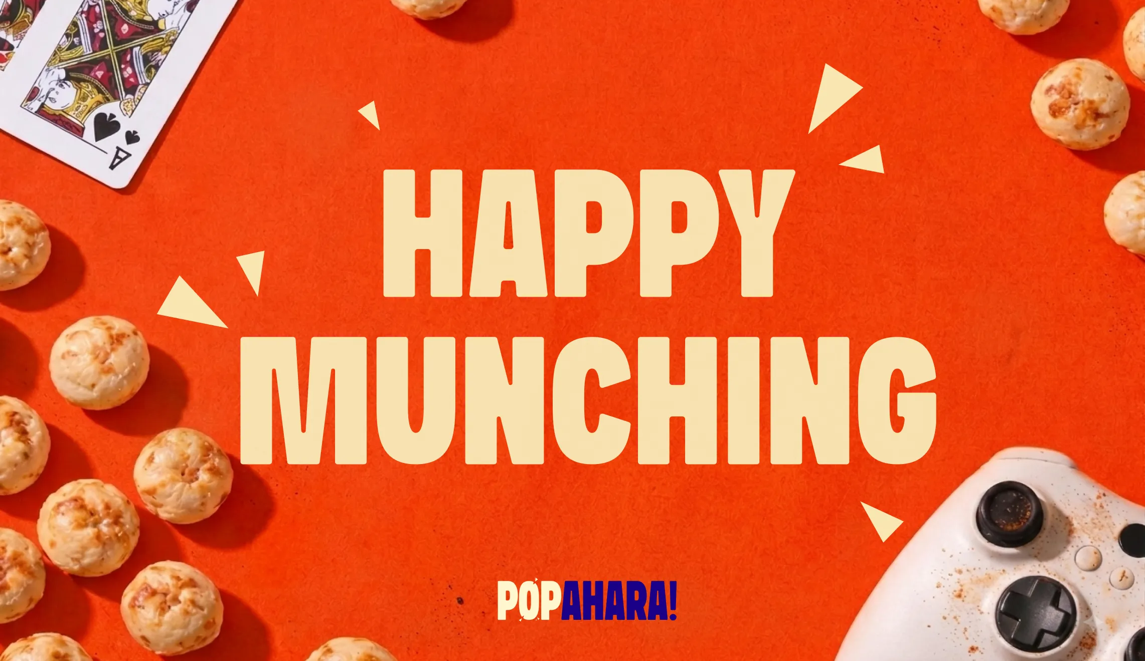
The direction was minimal, poppy, and high energy without tipping into the kind of chaos that makes a brand feel exhausting. The logo uses a dual colour treatment as its priority, chosen specifically so the pop element within the wordmark has enough contrast to visually stand out at every size and on every surface. Single colour versions exist but the dual treatment was always the lead.
A makhana pattern was developed from the original logo concept, giving the brand a texture it could use across packaging, social media, and any surface that needed to feel distinctly Popahara without relying solely on the wordmark.
Cracking doodle elements, those small inverted comma shapes that suggest something splitting open, run through the packaging to communicate crunch and that specific pop feeling without spelling it out. It's that kind of detailing that works subconsciously, you feel the energy of the product before you've read a word.
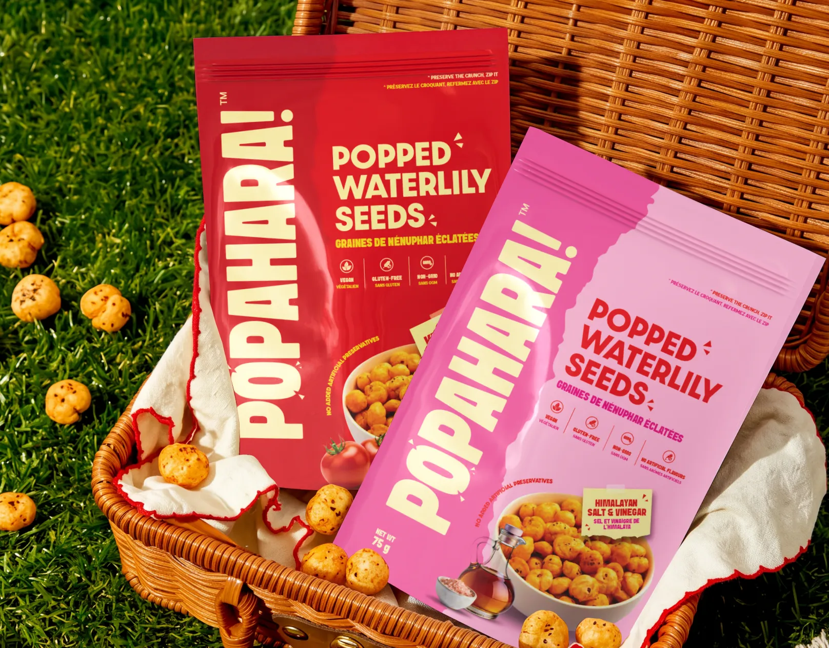
Four flavours across stand-up pouches, one master design and three variants covering Ketchup, Peri Peri, and Tomato. The aesthetic direction was raw and desi, a paper tearing texture that gave the packaging a handmade quality that felt honest about where the product came from. It was a deliberate departure from the cleaner brand guidelines and it was the right call for the format and the retail context.
The back of pack carries a founder story with a photograph. In a category full of snack brands that say nothing personal about who made them or why, that's a meaningful differentiator. It makes the product feel like it came from real people with a real reason for making it, which it did.
Everything on the pack appears in both English and French, meeting Canadian bilingual requirements without either language feeling like an afterthought.
The flavour segmentation was thought through from an audience perspective. Quirky, bolder flavours for younger buyers. Classic options like Tomato for the broader demographic that wanted something familiar. The range was designed to speak to everyone Popahara was trying to reach without any single product feeling misplaced.
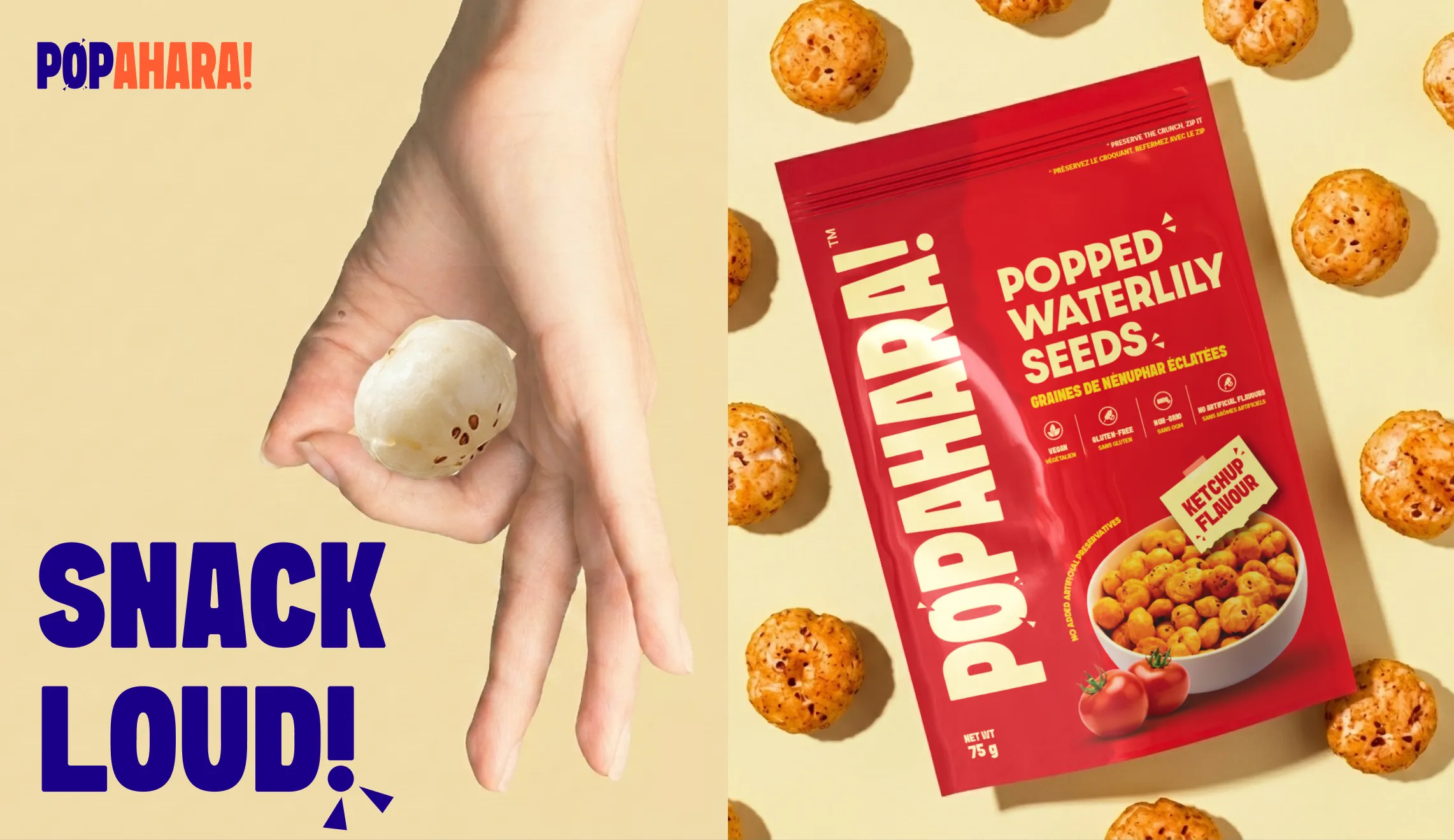
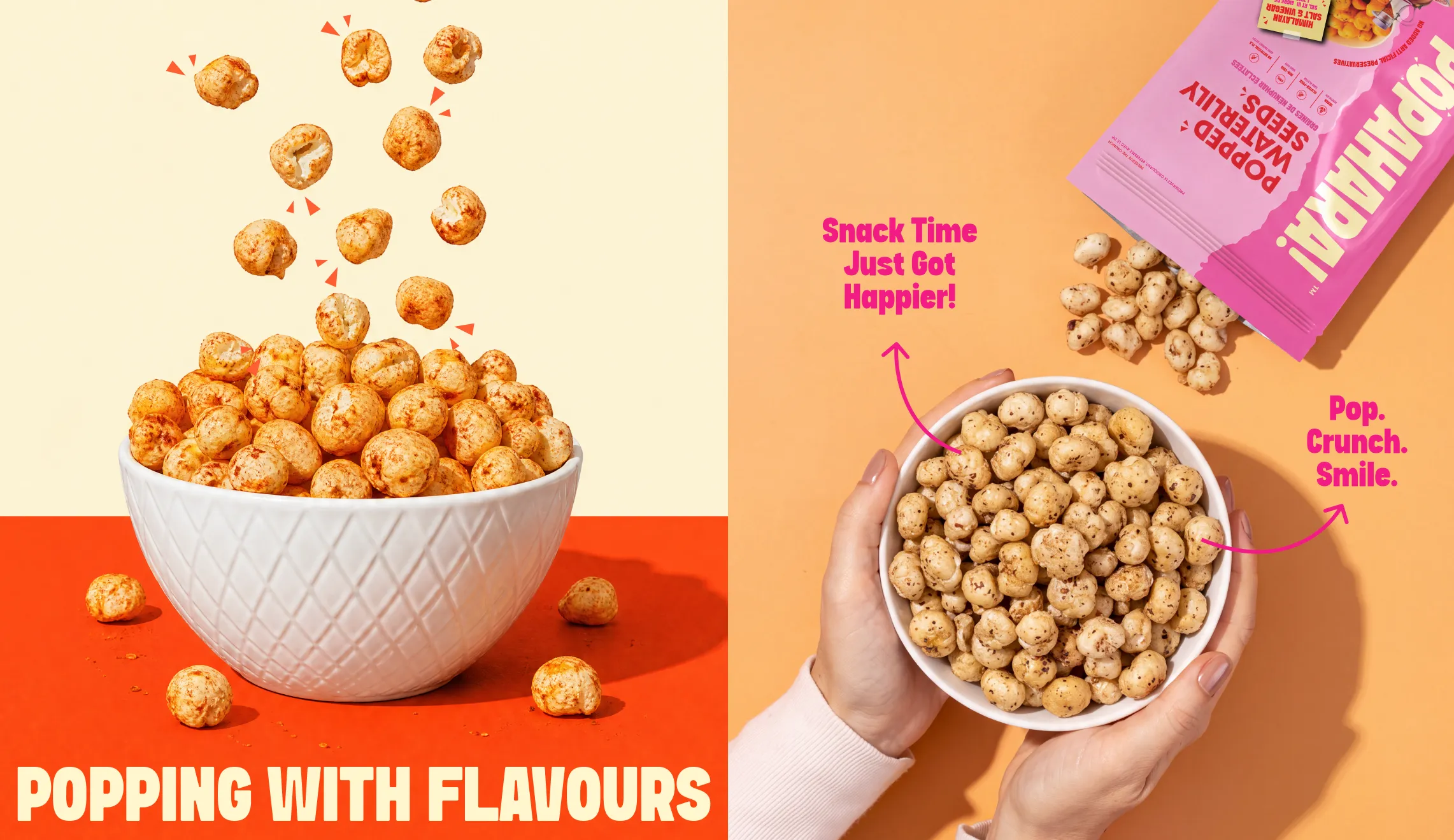
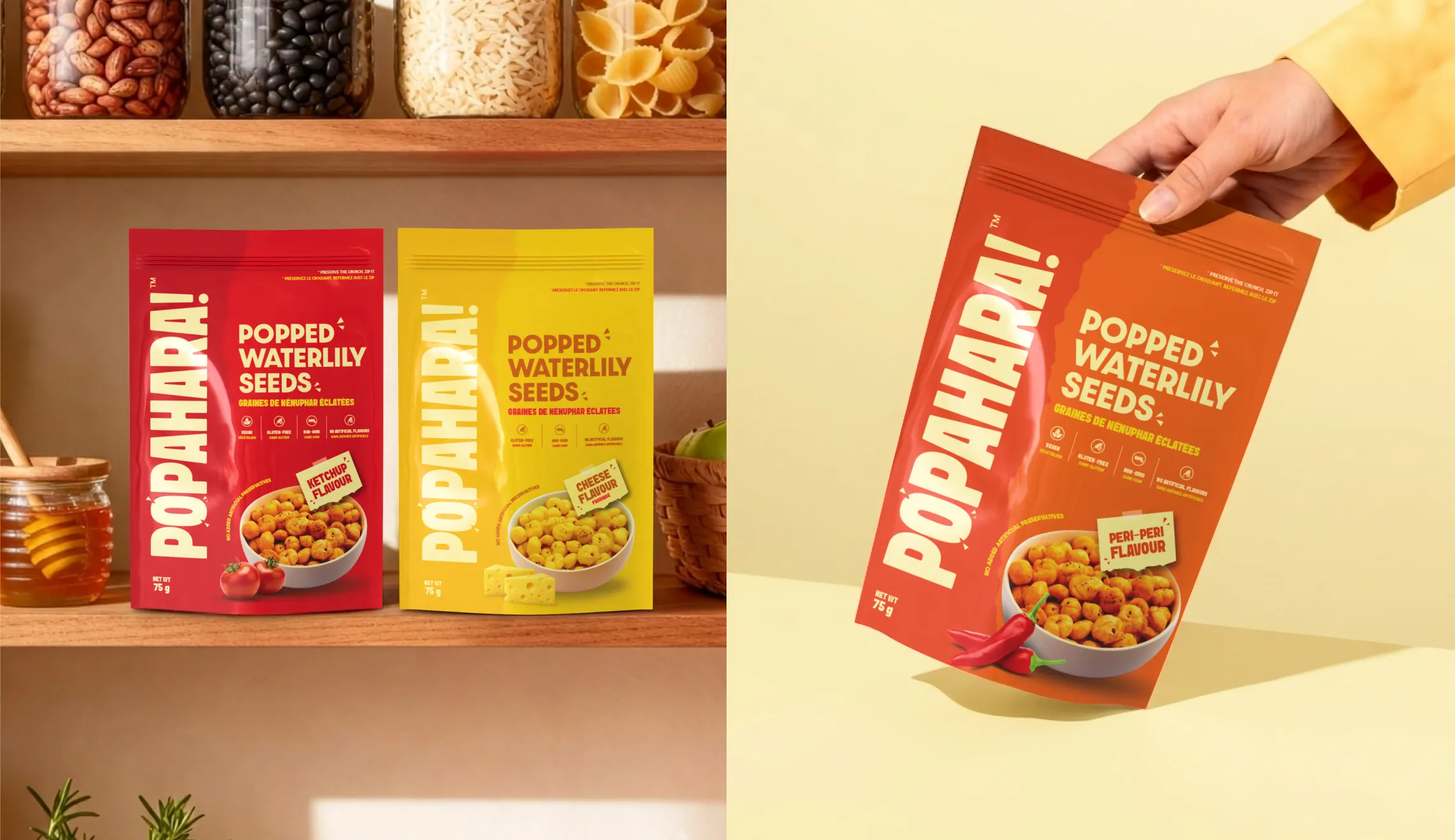
Popahara launched online in Canada with a brand that could carry an unfamiliar ingredient into a new market without over-explaining it or underselling it. The name is memorable and rooted in something real. The visual identity has enough energy to compete with established snack brands without losing the Indian warmth that makes Popahara genuinely different from anything else in its category in Canada. The packaging feels catchy, and considered in a way that a founder-led brand launching for the first time should.
For a brand taking makhana somewhere it had never really been before, Confetti built the identity that gave it the best possible start.











.svg)
.svg)
.webp)
.webp)


.svg)