%201.webp)
02
AI Snaps
.svg)
.svg)
01
Our Work

03
About Us
05
Contact Us
06
Client Success

07
Blogs
08
Careers
Book A Call


.svg)
Need Help In Building Your Brand?
Click the button below & book a call with our founder directly.

Rishabh Jain
Managing Director
Understanding what to include in brand guidelines helps you create a useful framework instead of a rulebook that becomes ineffective and counterproductive.
This Confetti guide covers a checklist of strategic, visual core, and often ignored execution layer of brand guidelines. We look at what makes guidelines usable with real examples from global and Indian brands.
Brand guidelines are a documented set of rules that define how your brand looks, speaks, and behaves across every surface it appears on.
The purpose of brand guidelines is to make consistency possible at scale.
Consistency, in turn, is what builds recognition, and recognition is what builds trust. Research indicates that brands presenting themselves consistently across all touchpoints can see up to a 33% increase in revenue
When a customer encounters your brand across a website, a product package, a social media post, and a store shelf, and every encounter feels like the same brand, that coherence signals reliability.
Inconsistent brands signal chaos. Customers do not trust chaotic brands.
These terms are used interchangeably but they mean very different things:
📌A brand style guide covers visual identity elements only: logo, colour, typography, imagery. It's the entry-level document useful for a new brand briefing its first designer.
📌Brand guidelines are broader. They include the strategic foundation (who you are, why you exist, who you serve) alongside the visual system, the voice, and the rules for how everything applies across channels.
📌A brand book is the most comprehensive version used by organisations with multiple sub-brands, licensing partners, or large internal teams. It includes brand history, architecture diagrams, and application examples across every medium the brand operates in.
At Confetti, we develop brand guidelines alongside the identity, not as a separate document delivered later. The same decisions that shape the identity, from colour and typography to logo usage, form the foundation of the guidelines.
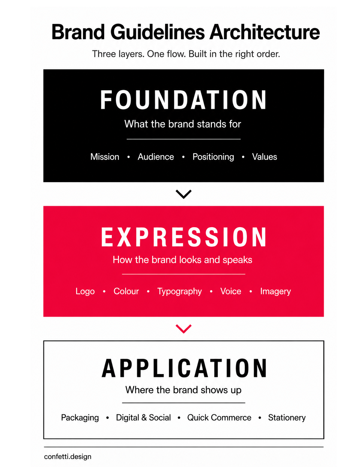
Before we list out what goes into brand guidelines, you need to understand the structure that makes them actually usable.
At Confetti, we organise guidelines across three layers:
Here's what each layer contains.
This strategic layer is the reference point for every design decision that follows.
This section should be concise: a few paragraphs. It gives context to everyone who works on the brand, from designers to copywriters to social media managers.
Example: The story Paper Boat tells is about reclaiming the flavours of an Indian childhood that mass FMCG had forgotten. That specific conviction is what makes every design and copy decision legible.
Your guidelines should document the positioning clearly enough that anyone can articulate it.
Many Indian D2C brands target “urban millennials aged 25–35,” but that’s demographics, not positioning. Real positioning defines behaviours and beliefs: like buyers who read labels, distrust health claims, and pay more for trusted brands. That clarity guides better design decisions.
It is about defining a consistent character that informs everything from visual style to customer service interactions.
Example: Rage Coffee’s character is clear and can be inferred from the output. High-energy, confrontational, and no filler. It knows what it isn’t: smooth, safe, or for everyone. That counter-character creates a consistent identity across formats.
Tone of voice is how your brand speaks. Brand tone is how that personality adjusts by context.
The same brand voice that sounds warm and direct on packaging copy should sound equally warm and direct, but more formal, in a legal notice. The voice doesn't change. The tone does.
Example: The Whole Truth documents its voice all the way to the ingredient panel. It writes what's actually in the product and why. That's a voice decision, applied at label level.
Not the values you put on a website because they sound good. The values that actually guide decisions.
If a value is not visible in how the brand operates, it does not belong in the guidelines.
A value that costs nothing is just a preference. “Quality” is easy to claim; “we delay launches until products pass blind testing” is a real value. Strong values create constraints that guide design, copy, and packaging decisions.

This is what most people associate with "brand guidelines" when it is only a part of it. The visual layer is a system designed to be applied across every touchpoint a brand occupies.
This is the most frequently referenced section of any brand guideline. It needs to be thorough.
Example: On a kirana shelf, a logo may be squeezed onto a 4×5 cm front panel. If your guidelines don’t define minimum print sizes or rules for tight spaces, vendors will decide. often poorly.
Colour is the fastest signal a shopper processes. Faster than logo and product name. It's also the element most likely to drift without precise documentation.
What looks like your brand red in HEX or RGB can print orange, brown, or muddy depending on the material. Without Pantone references and substrate-specific CMYK values, you're leaving colour accuracy to the printer.
Typography is one of the most misunderstood elements of brand guidelines. Most documents just list a font name. That's not a system.
Nutritional information, ingredient lists, and legal text on FMCG packs must remain legible at small sizes. If the guidelines don't specify minimum type sizes for this content, they're incomplete for any brand that sells physical products.
Our guide on typography in branding goes deeper on how typeface choices signal brand personality, useful if you're choosing or reviewing your type system.
Imagery guidelines tell your creative team, your photographer, and your social media vendor what "on-brand" looks like visually beyond the logo and colour.
Brands within the same category can feel vastly different based on how they approach imagery alone
Product photography rules matter because consistency builds recognition. Your pack shots, lifestyle images, social content, and quick commerce visuals should feel like one system, not separate executions.
If your brand uses icons or illustrations, their style needs to be documented with enough specificity that a new designer can produce an on-brand icon without seeing your previous work.
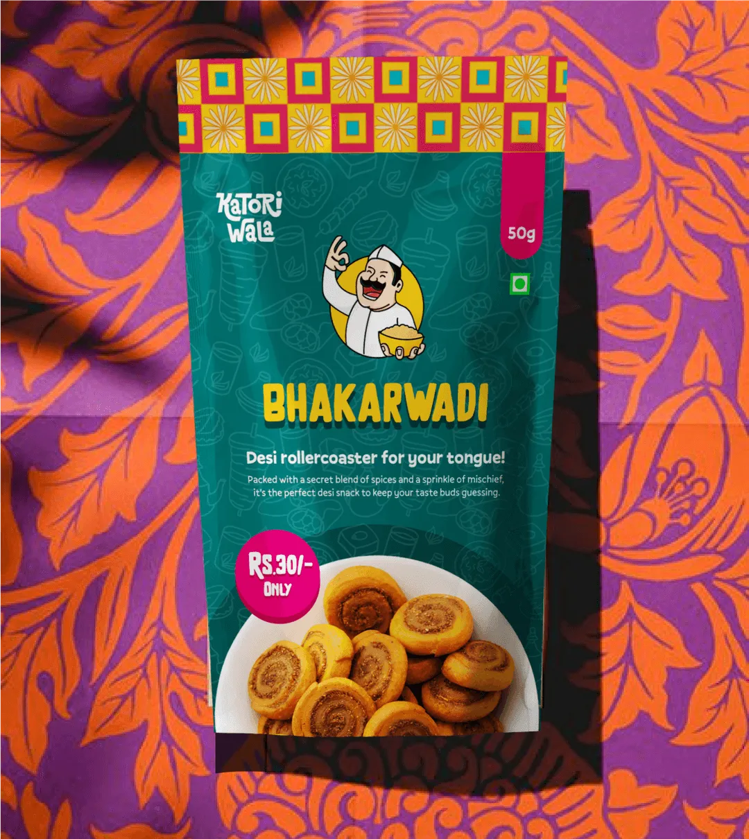
This is the most commonly omitted section in brand guidelines, and the one that causes the most visible inconsistency across a growing brand's touchpoints.
Logo and colour can be consistent. If the layout logic is undocumented, two pieces of collateral from the same brand will still feel like they came from different companies.
Multi-SKU FMCG brands expose layout weaknesses quickly. As products are designed over time by different vendors, inconsistencies appear in hierarchy, spacing, and alignment—even when logo and colour stay consistent. A documented grid system from the first SKU prevents these issues instead of fixing them later.
What separates a usable brand guideline from one that sits in a shared folder and collects digital dust is the application layer — the rules that tell your team and vendors how the system works across actual formats.
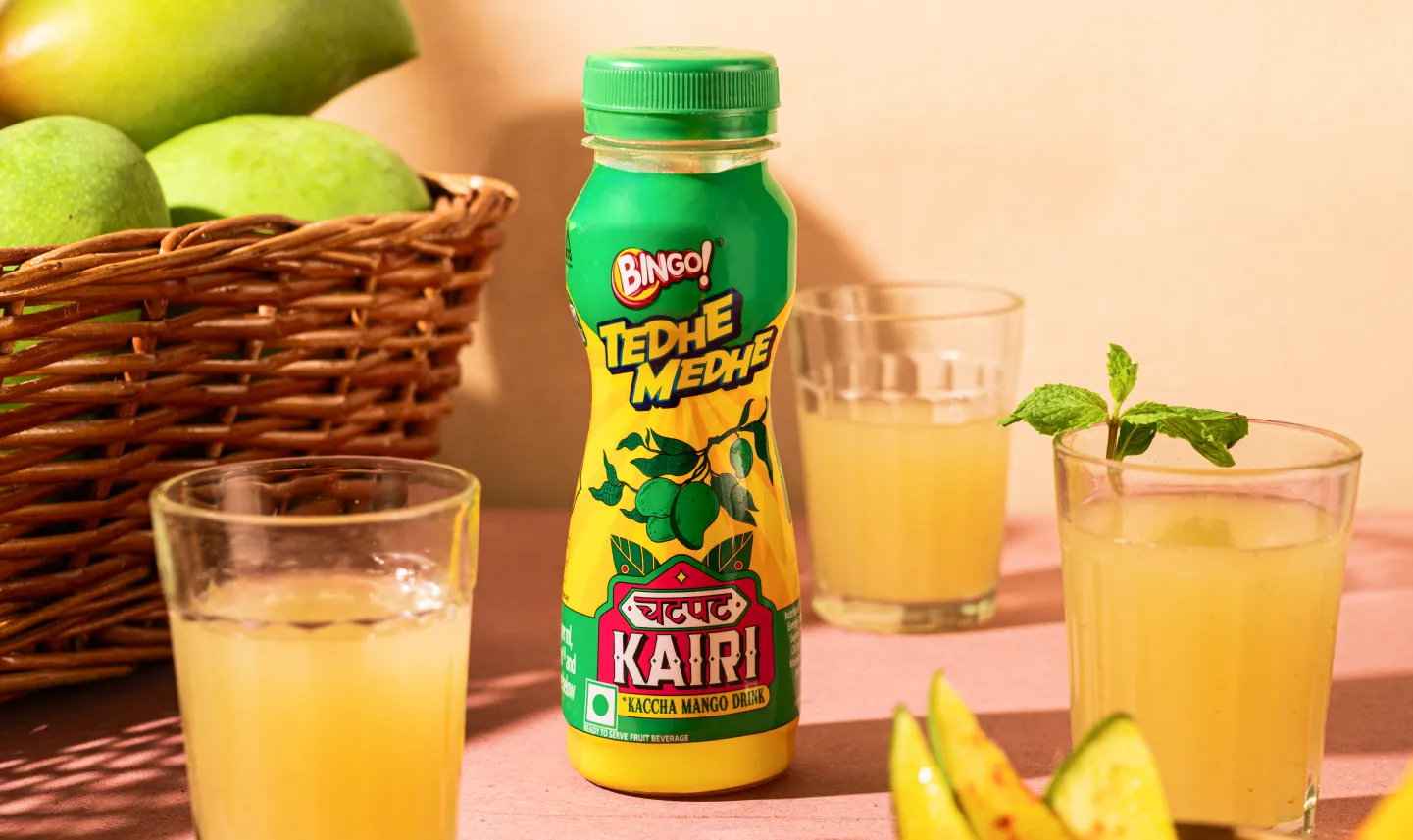
Packaging specifications are critical for FMCG and D2C brands scaling across SKUs. Without documented rules, different vendors make inconsistent decisions turning one brand into many.
A packaging expression guide ensures every SKU stays part of the same system.
For brands working through the FSSAI-compliant packaging design requirements, this section also prevents costly reprints by documenting mandatory elements before print, not after.
Many brands skip it, but at Confetti, we strongly insist on having these included in the brand guidelines to strengthen your consistency.
For D2C brands, packaging inserts and unboxing experience are key brand touchpoints often missed in guidelines. Without clear rules, they become inconsistent.

Talk to Confetti experts and build a brand playbook your team will actually use.
Book A Call
Most brand guidelines fail because they are built like reference manuals rather than decision-making tools.
Here’s what makes and breaks them:
❌ Static documents in a dynamic world
PDF guidelines quickly become outdated. Without clear versioning, dates, and update notes, teams miss new assets, colours, and changes, leading to inconsistent use of logos and brand elements.
❌ Hard to access when needed
Large documents are hard to search and reference, so teams often rely on assumptions instead of the right rules. Most work happens in decks, templates, social tools, and operational systems, not long PDFs in shared folders. Without linked approved logos, fonts, and templates, vendors often use outdated or incorrect files.
❌ Solve symptoms, not root causes
Brand inconsistency often comes from broken systems, outdated templates, missing tools, or unclear workflows, not just missing guidelines.
❌ Create bottlenecks and dependency
When every piece of content needs designer approval, teams slow down and create workarounds. Good guidelines enable independent decisions. Guidelines focused only on rules and restrictions feel limiting, reducing adoption.
❌Not format-specific
A website rule does not solve packaging, quick commerce thumbnails, or trade show assets. Each format needs rules for size, layout, colour, and constraints.
❌ Too abstract to apply
Guidelines often describe intent instead of actions. “Use confident typography” is unclear, while specific rules on font, size, spacing, and usage create consistent execution.
✅Accessible at the point of creation
Guidelines should be built into everyday tools and workflows, so teams can access the right assets without searching through folders or PDFs.
✅Updated in real time
A brand changes constantly. Guidelines should evolve with new products, campaigns, markets, and visual updates.
✅Explain the why, not just the what
Rules become easier to follow when teams understand the purpose behind decisions like typography, colour, tone, and layout.
✅ Built around real workflows
Effective guidelines consider how teams actually work, including templates, software access, production limits, and operational needs.
✅Flexible within clear boundaries
The best systems create consistency without blocking creativity, giving teams freedom within defined brand parameters.
✅Taught, not just distributed
A guideline document alone does not create adoption. Teams need onboarding, examples, training, and regular reinforcement.
✅Include governance, not just rules
Strong guidelines define ownership, approvals, permissions, and review processes so brand consistency is maintained at scale.
💡The Guideline Usability Test: Before finalising any brand guideline document, run this check.
Could a print vendor in a city you've never visited produce correct packaging using only this document and the linked assets? Could a social media executive in a different time zone create three on-brand posts without calling you? If the answer to either question is no, the document isn't finished.
Across 200+ branding and packaging projects, the pattern we've seen most consistently is this: brands don't lack a document. They lack a system.
The document exists: often beautifully designed, sometimes extensive. But when we conduct our PIPES brand audit before beginning a project, we consistently find the same set of gaps.
These are documentation and implementation failures.
Our approach to building guidelines for FMCG and D2C brands differs from a standard design agency process in one key way: we build for omnichannel execution from the start, not as a retrofit.
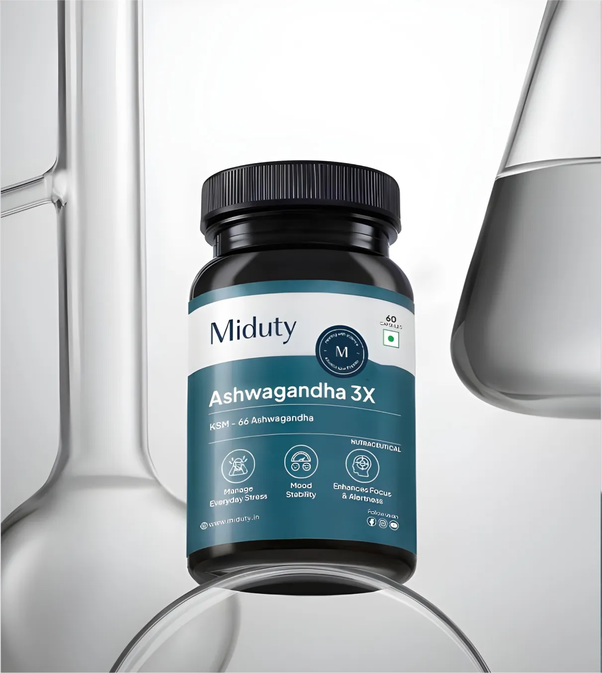
Today's retail environment is not a single channel. A brand like Miduty operates across its own D2C store, Amazon, a growing modern trade presence, and quick commerce.
Its guidelines need to work for a health supplement bottle label and a Zepto product thumbnail and a trade marketing standee and a digital ad, simultaneously, often produced by different vendors. A guideline built only for digital will collapse in print. A guideline built only for one pack size will fail when the brand extends to a new format.
Also, the guidelines are delivered as part of the identity system, not as a separate document months after the logo is approved.
This unified approach strengthens consistency and communication across every touchpoint. The result is a set of guidelines that is practical, detailed, and straightforward to execute, designed to be used, not just admired.
Examples are more useful when you understand why something works, not just that it does.
Spotify
Spotify's brand guidelines are a masterclass in scalable expression. The system is built around a logic: The Duotone treatment (a two-colour overlay on photography) and the Circular typeface.
They create a visual system that generates thousands of unique playlist covers and campaign visuals while remaining immediately, unmistakably Spotify. The guidelines teach the logic, not just the rules. This is the difference between a brand system and a brand template.
Nike
Nike's brand guidelines teach you about consistency at scale. Every element, logo placement, colour application, typography, tone, reinforces a single identity: the spirit of performance and inspiration.
The Swoosh is never altered, never stretched, never placed without clear space. The typography is athletic, confident, unmistakable. The photography is dynamic, human, and aspirational.
The result is a brand that feels the same whether you encounter it on a product, a billboard, a website, or a store environment. That coherence is the product of rigorously enforced guidelines applied across thousands of touchpoints, in dozens of countries, for decades.
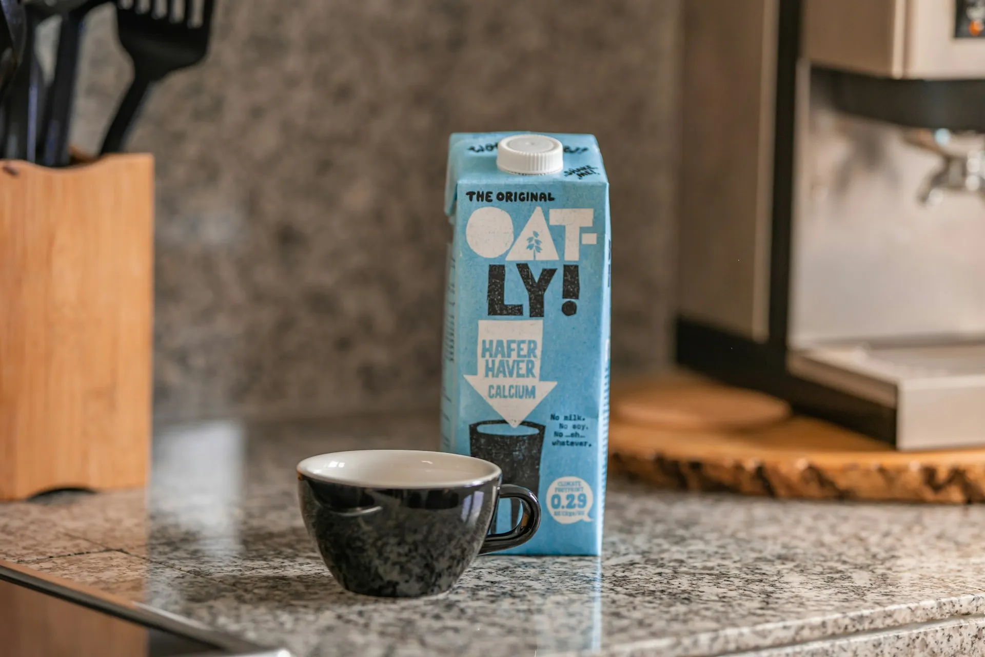
Oatly
Oatly's guidelines are unusual because they start with personality, not logo. The brand's irreverent, conversational, self-aware tone is so thoroughly documented that it shapes everything: carton copy, social posts, even legal text.
The result: a brand that feels coherent across every surface even when the visual design is deliberately inconsistent. This is what voice-led guidelines look like in practice.
NASA's Graphics Standards Manual
Public domain and freely available. Worth studying not for the aesthetic (it's 1970s aerospace) but for the structural rigor.
Clear do/don't documentation, application examples across dozens of formats, and version-controlled specifications. It's the template for how a guideline should be organised.
Bombay Shaving Company
Bombay Shaving Company demonstrates how guidelines enable category extension. The brand started in men's grooming and has expanded across multiple product lines without losing its premium, sophisticated positioning.
Each new SKU category looks clearly like part of the same family. A well-documented brand system lets you extend without diluting.
Plum
Plum, the beauty and personal care brand, offers a particularly sharp example of colour-coded branding. Their design philosophy is summed up as "foxes over pandas" vibrant, distinctive colour systems rather than minimalist sameness.
Every product range is colour-coded with one or two leading colours and a lot of white. Light green signals the Green Tea range for oil control. Bright orange/yellow signals Vitamin C for brightening. Light blue identifies the Niacinamide range.
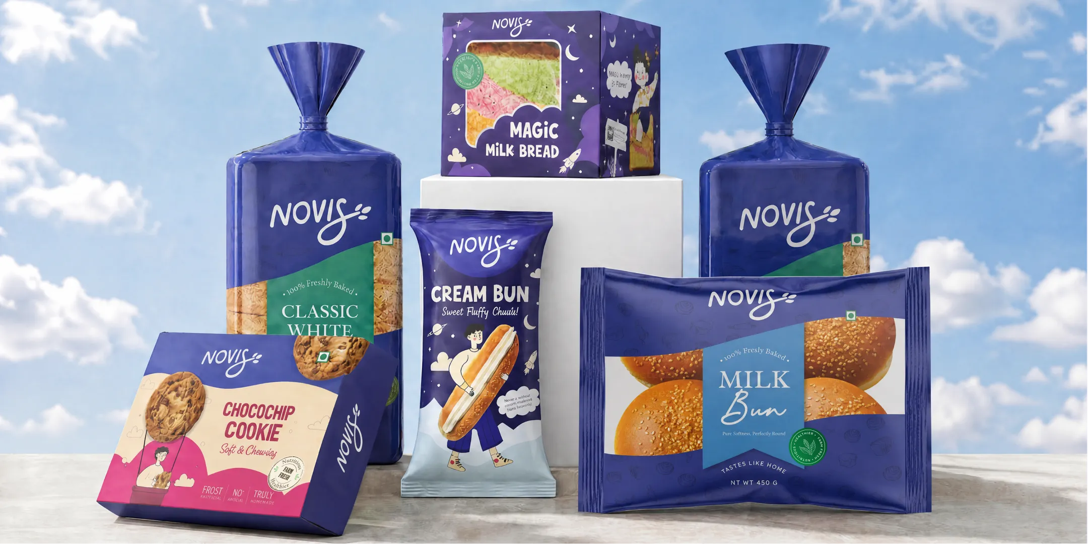
Novis Bakery
Novis entered a category led by legacy brands with outdated packaging and little ingredient storytelling. The goal was to create a system that felt fresh from day one.
The brand identity Confetti designed includes a custom script wordmark with a wheat detail in the “S,” a standalone icon, and a colour system built around Blueberry (fresh, trustworthy), Cream (warmth), Rose Frosting, and Golden Crust (product differentiation).
Typography uses Radley, Quicksand, and Claytonia to balance premium, friendly, and handmade cues.
Across all 12 SKUs, the packaging follows one clear structure: wordmark top-left, product name central, flavour-specific illustrations, and category-linked colours. The result is a cohesive shelf presence that positions Novis as the better choice.
What are the essential elements of brand guidelines?
Brand guidelines must include: brand mission and positioning, logo usage rules (sizes, clear space, and colour variations), colour palette with HEX, RGB, CMYK, and Pantone values, a typography hierarchy, brand voice and tone documentation, and imagery style direction. For product brands, packaging specifications including substrate-specific colour callouts and label hierarchy are a required addition that most generic frameworks omit entirely.
How long should brand guidelines be?
There is no fixed length. A lean style guide for a single-product D2C brand may run 10–15 pages. Comprehensive brand guidelines for a multi-SKU FMCG brand with retail and digital presence usually run 40–80 pages, with a separate packaging expression guide. What matters is completeness and usability, a 100-page document that no vendor reads serves no purpose.
Do brand guidelines need to include packaging specifications?
Yes, especially for FMCG and D2C brands. Standard brand guidelines often miss critical packaging details like CMYK-to-Pantone conversions by substrate, label hierarchy, dieline references, and FSSAI-required placements.Without these specifications, vendors and printers make their own decisions across SKUs leading to inconsistent packaging that can make a growing range look like different brands.
How often should brand guidelines be updated?
Update guidelines whenever major brand elements change: logo, colours, packaging, product range, or new channels. Most growing brands should review them annually. For new channels like quick commerce, exports, or modern trade, add specific usage rules before launch. Outdated guidelines can create more confusion than having none.
What happens if a brand doesn't have brand guidelines?
Without guidelines, teams and vendors make inconsistent choices. Logos change, colours drift, and brand voice becomes unclear. In an omnichannel market, inconsistency weakens recognition, reduces recall, and makes marketing less effective. Documentation is a small investment compared to the cost of fixing mistakes later.
Can a small brand or startup have brand guidelines?
Yes and we recommend this. Start early with a simple guide covering logo usage, colours, fonts, and tone. As the brand grows, the system can expand. Clear guidelines from the beginning help avoid costly errors and keep every touchpoint consistent.
Want strategic branding and packaging like this for your business?


.webp)
.webp)

.webp)
.webp)
.webp)
.webp)
.webp)


.svg)
.webp)
.svg)
.webp)