02
AI Snaps


01
Our Work
03
About Us
04
Brand Audit
05
Contact Us
06
Client Success
12
07
Blogs
08
Careers
Book A Call




Need Help In Building Your Brand?
Click the button below & book a call with our founder directly.

Rishabh Jain
Managing Director
As the demand for better for you food grows, health food branding faces a growing challenge: standing out in a market saturated with overused claims like “natural,” “clean,” and “wholesome.”
Drawing on our experience in branding healthy snacks and food products, this post breaks down how your brand can rise above the noise through credible claims.
We cover distinctive positioning, and packaging that balances health with pleasure.
Healthy food branding has to make three things work together: credible health benefits, desirable taste and a clear reason to choose the brand.
Looking healthy is not enough with
Green packaging, kraft textures, leaf icons and claims such as “wholesome” or “guilt-free” have become familiar category signals.
When brands you compete against use the same visual language, shoppers have little reason to remember one over another.
Build a distinct brand identity around your product, audience and positioning rather than relying on generic health cues.
Your packaging design should communicate what makes the product different at a glance.
Shoppers increasingly look beyond the front of the pack.
Brands such as The Whole Truth have made ingredient transparency part of their positioning, showing customers what goes into their products rather than relying only on broad promises.
Use specific, verifiable information to support your claims.
Explain ingredients and relevant nutritional benefits clearly, and make sure packaging, website copy and advertising tell the same story.
Regulatory scrutiny makes this essential.
In India, FSSAI has warned that “100%” claims can be ambiguous and misleading. In the US, the FDA's updated criteria for using “healthy” on food labels include food-group requirements and limits on added sugars, saturated fat and sodium, with compliance required by 25 February 2028.
Check the rules that apply to each market before approving claims.
Consumers should not have to choose between feeling good about what they eat and enjoying it.
Messaging built around pleasure, flavour and everyday wellbeing can make a healthy product more appealing than language focused on restriction or guilt. This is something SuperYou has done well.
Show what makes the product enjoyable through flavour-led naming, appetising imagery, texture cues and clear product benefits.
📌The strongest healthy food brands connect proof with pleasure. They make health believable, taste appealing and their difference easy to recognise.

Healthy food brands often lean too heavily on either health benefits or taste appeal. The proof–pleasure grid helps identify the gap and shows what your branding needs to communicate.
Proof means giving customers specific reasons to believe the product delivers on its health positioning, such as protein content, named ingredients or a clearly defined production process.
Vague words like “wholesome” and “natural goodness” are not proof on their own.
Pleasure means making the product look and sound enjoyable.
This can be done through appetising photography, flavour-led naming, colour, texture cues and appealing eating occasions.
The goal is to combine credible proof with the desire to eat the product. Neither can compensate fully for the absence of the other.
High-proof, high-pleasure health snack branding
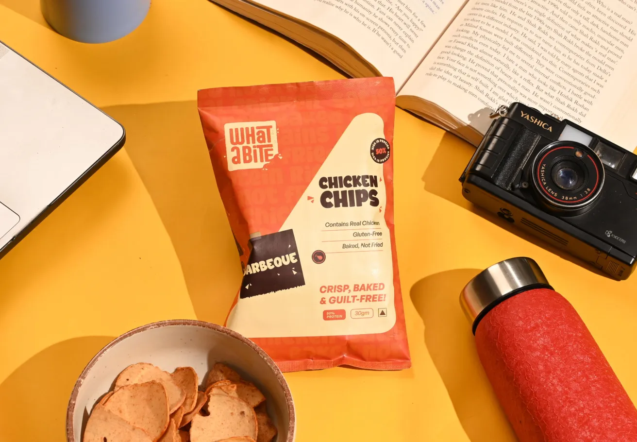
For What A Bite branding and packaging design project, our challenge at Confetti was to make protein-rich snacks feel as appealing as they were nutritious.
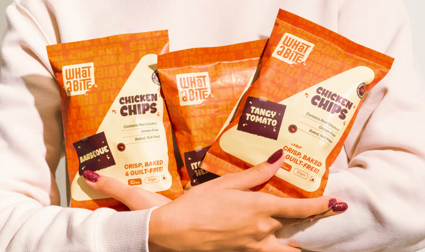
The packaging communicates benefits through claims such as “Contains Real Chicken”, “Gluten-Free” and “Baked, Not Fried”, alongside a prominent “50% protein” badge.
An energetic orange-and-white palette, mouth-watering product imagery and playful flavour labels keep the packs lively rather than clinical.
The design makes the product's nutritional proposition visible without letting it overwhelm taste appeal.
📌Key Takeaway for your brand
Look at your front-of-pack design. Separate specific, verifiable claims from broad adjectives, then assess whether the product looks genuinely appetising from a shopper's viewing distance.
If the pack communicates health but not enjoyment, strengthen the sensory cues. If it looks delicious but relies on vague promises, make the product's real differentiators clearer. The aim is a brand customers can believe in and want to eat again.
Many healthy food brands try to lead with every benefit at once: high protein, low sugar, gluten-free, plant-based and preservative-free.
What they get is a crowded message that makes it hard for shoppers to remember what sets the brand apart.
Choose instead one primary reason to buy. Other benefits can support the positioning, but one should lead the brand story and front-of-pack communication.
Most healthy food brands lead with one of four approaches:
Choose the territory that matters most to your target customer and can be supported with credible evidence.
Different customers buy for different reasons. A parent choosing a school snack may prioritise ingredients, while a gym-goer may look for protein content. Someone buying an afternoon snack may care about feeling satisfied without sacrificing taste.
Define your primary customer and the occasion when they buy. Then make that need the centre of your positioning.
What A Bite leads with protein, addressing the gap between enjoyable snacking and protein-rich options. Claims such as “Baked, Not Fried”, “Gluten-Free” and “Contains Real Chicken” support that central promise rather than competing with it.
SuperYou built its protein wafer proposition around a familiar snack format. The product's core appeal is easy to understand: protein in a wafer. The lesson is not that every healthy food brand should lead with protein, but that a clear benefit, repeated consistently across packaging and marketing, is easier to remember.
Complete this sentence: “This is the brand for people who want ______.”
If you cannot fill the gap without saying “healthy”, you need to work on your positioning further as it's too broad.
Also ask whether customers would choose the product over alternatives for its taste and eating occasion alone.
If Yes, lead with taste and let health reinforce the decision. If the health benefit is the main reason to buy, make it prominent and substantiate it.
We have worked on better-for-you products in very different categories, and each needed its own answer to one question: how do you show health without losing appetite appeal?
Here are three of those:
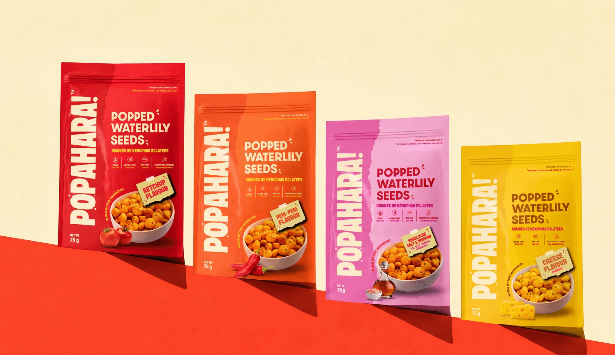
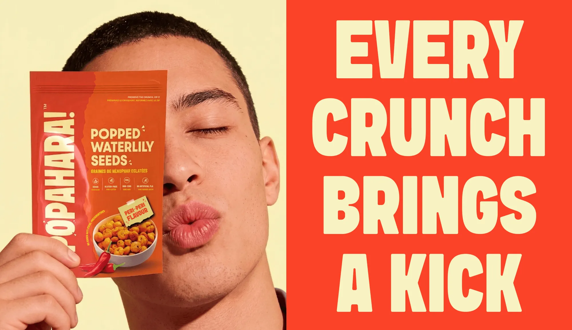
The brief was to launch a makhana snack in Canada, where the ingredient was unfamiliar and the brand needed to explain the product without turning it into a health lecture.
The strategy led with the name, the texture, and the origin story rather than the nutritional panel.
The packaging design uses a raw, "desi" paper-tearing texture and a founder story on the back to make the product feel honest and human, while the bilingual English–French system meets Canadian regulatory requirements without either language feeling like an afterthought.
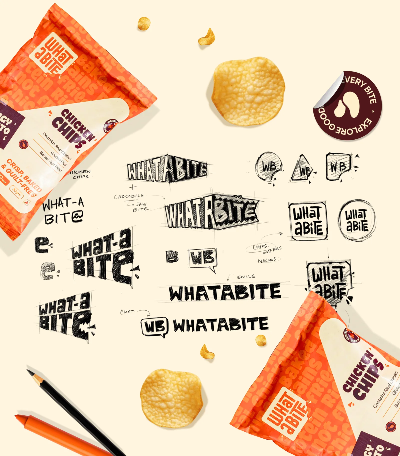
The brief was to build a brand for India's first non-vegetarian chip, in a market where vegetarianism dominates the snacking conversation.
The strategy had to make protein the hero without making the product feel like a gym supplement. The pack leads with the protein badge, supports it with "real chicken" and "baked, not fried," and wraps the whole thing in a palette and typographic system designed for maximum engagement across touchpoints.
The tone is bold, modern, and approachable, proof that does not take itself too seriously.
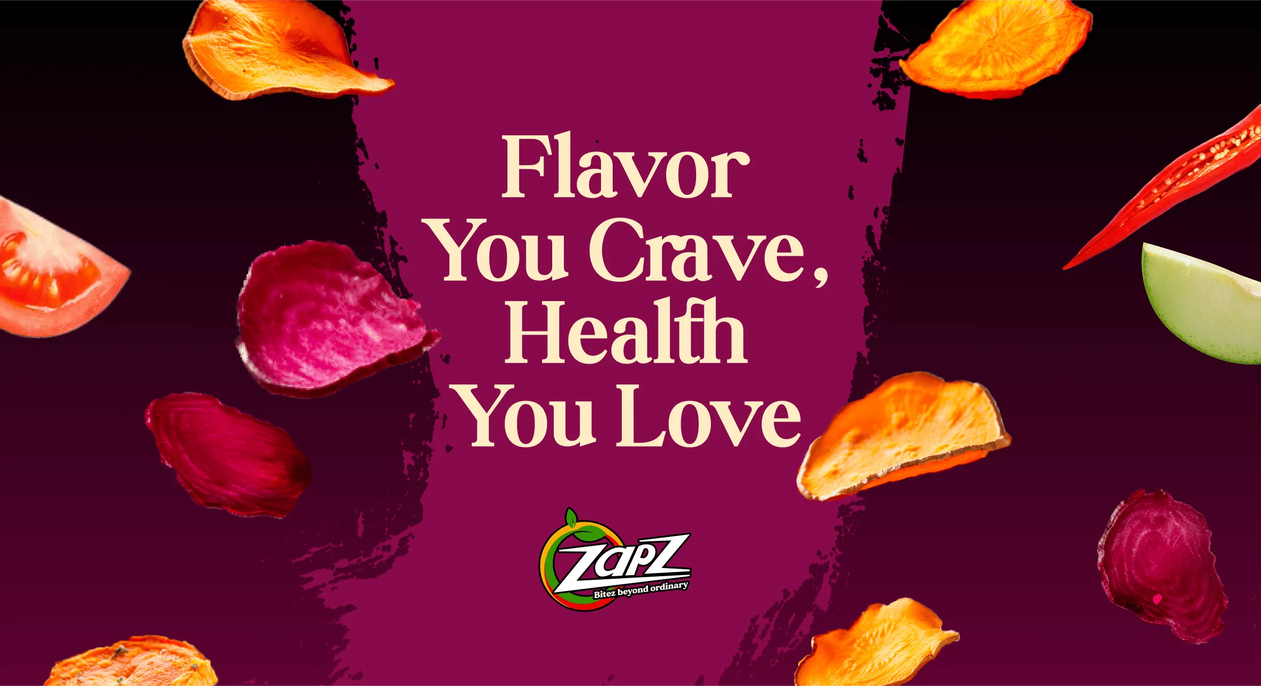
The brief was to build a distinctive brand for flavoured beetroot chips in a crowded healthy-snacking market, where standing out and earning consumer trust were equally important.
The strategy had to make nutrition appealing without letting the product feel like a conventional health food.
A vibrant colour palette, bold typography, and clear communication of product benefits create a visual identity that balances flavour appeal with nutritional credibility.
Photography adds appetite appeal, bringing the product’s texture and flavours to the forefront.
The tone is energetic, playful, and approachable, making healthy snacking feel less like a compromise and more like a craving worth giving in to.
📌What we'd tell any healthy food founder
Choose the one proof point you could defend in any regulatory review, and build the brand around it.
Then make sure the pack looks like something people want to eat/ drink. The three projects above found that balance in different ways: a number, a place, and a clear picture of the buyer.

“Healthy”, “natural” and “clean” are the most widely used words in food branding, which makes them less useful for differentiation.
They can also attract regulatory scrutiny.
An experienced food branding agency like Confetti will start with specific claims that tell customers what the product offers and provide evidence to support it.
Use the most meaningful claims your product can substantiate.
Specific wording is usually more informative than broad promises, but it is not automatically compliant.
Choose wording that describes the actual product.
“Sweetened with monk fruit” tells customers more than “clean”.
“15g protein per serving” is more useful than “protein-rich” when supported by accurate nutritional data.
“Baked, Not Fried” describes a process rather than making a broad health promise.
For What A Bite, claims such as “Contains Real Chicken”, “Gluten-Free” and “Baked, Not Fried”, alongside its protein claim, communicate tangible product attributes.
Rules differ by country.
India's FSSAI issued an advisory in May 2025 against using “100%” on food labels and promotional materials because the term is undefined under existing regulations and can mislead consumers.
In the US, the FDA's updated definition of “healthy” has a compliance date of 25 February 2028. In the EU, nutrition and health claims must meet the requirements of Regulation (EC) No 1924/2006.
Before approving artwork, document every claim, its supporting evidence, the rules in each target market and an alternative wording if needed. This protects both compliance and the brand's credibility.
Healthy food packaging must communicate: why customers should trust the product and why they would enjoy eating it.
The hierarchy, colours, photography and label design should work together to deliver both.
A shopper should understand what the product is, what makes it different and how it might taste within a few seconds.
A practical hierarchy is:
Too many badges compete for attention and make the design harder to scan.
Keep the front focused on the few details that matter most to the purchase decision.
Green and kraft textures are familiar signals of natural or better-for-you products, but they can make brands look interchangeable when competitors use the same approach.
Choose colours based on your positioning and the competitive shelf. Bright orange or yellow can communicate energy and flavour, while deeper tones may support a premium direction.
The palette should distinguish your brand and variants without weakening recognition across the range.
For Zapz, vibrant colours and bold typography give veggie chips a playful, contemporary identity, balancing flavour appeal with clear communication of nutritional benefits.
The design helps the brand stand out in the competitive healthy-snacking category without compromising on taste or approachability.
Product photography should create appetite, not simply document the product.
Close-up texture shots, visible ingredients, pouring scenes and images showing how food is eaten can make taste and texture more tangible.
For Zapz photography we used vibrant, appetising visuals to highlight the texture and flavours of the beetroot chips, making healthy snacking feel exciting, playful, and indulgent.
Use real product and ingredient imagery wherever appropriate. It helps customers understand what they are buying and gives the brand a more specific visual identity than generic wellness symbols.
Treat mandatory information as part of the design system. Reserve clear areas for ingredients, allergens, nutrition information, claims and required market-specific details.
Maintain legibility without letting compliance information overwhelm the front of the pack.
For Popahara, Confetti created a packaging system covering four flavours across stand-up pouches, using a master design with adaptable variants.
A paper-tearing texture provides a distinctive, handmade feel, while the English–French layout accommodates Canada's bilingual requirements.
Also consider how the pack will be used and sold. Resealable pouches suit products consumed over several occasions, while single-serve formats may suit on-the-go snacking.
For marketplaces and quick-commerce platforms, ensure the brand, flavour and primary benefit remain legible in thumbnail images
A healthy food brand's identity must make the product feel credible and desirable at the same time.
The name, logo and tone of voice should communicate what makes the product worth choosing without making it look clinical, generic or indulgent without substance.
Names built around words such as “Nutri”, “Vital” or “Wellness” can sound functional but are often difficult to distinguish from competitors.
Names focused only on taste or texture may be appealing but leave the product's purpose unclear.
Look for a name that connects with the product's sensory appeal, ingredients, origin or the role it plays in everyday life.
Also make sure you check trademark availability, pronunciation and meanings in your target markets.
Avoid names that depend on health claims you may struggle to substantiate or that restrict future product expansion.
For Popahara, a Canadian makhana snack brand, we combined two words: “Pop”, meaning crunch and energy, and “Ahaar”, the Sanskrit word for food or nourishment.
The name connects the snack's sensory appeal with its Indian roots without sounding like a nutritional supplement.
Healthy food brands often use familiar symbols like leaves, hearts, and check marks to show that their products are good for you.
While these symbols help your audience understand what the brand stands for, they don’t do much to make it stand out from the competition.
Build recognition through a well-crafted wordmark, an ownable colour palette and graphic elements that can extend across packaging, digital content and advertising.
The visual identity should balance credibility with appetite appeal rather than leaning entirely towards clinical simplicity or playful indulgence.
Confetti made the logo for Zapz, a veggie based chips brand more desirable with a bold, playful identity that makes healthy snacking feel fun, fresh, and appealing.
Healthy food brands often sound either clinical, listing nutritional figures without warmth, or restrictive, relying on phrases such as “guilt-free” and “no bad stuff”.
Both approaches can limit appeal.
Instead, use clear, specific language that combines credible benefits with sensory detail.
Explain what the product contains, how it tastes and when customers might enjoy it. Avoid moralising about food choices or making broad claims without supporting evidence.
Popahara also uses a founder story and photograph on the back of its packaging, giving customers a personal reason to connect with the brand.
Keep the voice consistent across packaging, social media, websites and customer support.
A short guide to preferred language, words to avoid and examples of on-brand copy helps every team communicate the same promise.
Healthy food branding involves more than designing a pack around a health claim.
Your brief needs to connect product benefits, supporting evidence, taste appeal, packaging and regulatory requirements before design begins.
Give your branding partner the information needed to make sound decisions:
If the formulation or nutritional information is still changing, flag it early. These changes can affect claims, packaging layouts and approval timelines.
The cost depends on the decisions the project needs to resolve.
A single-SKU launch with established positioning is usually simpler than a multi-flavour range requiring new naming, several packaging formats and bilingual artwork across markets.
Factor in strategy, naming, claims review, the number of variants, regulatory complexity, packaging production requirements and digital assets.
Scope the budget around the work needed to launch successfully, not just the number of deliverables.
Look for a team with food or FMCG experience that can challenge your positioning, work with substantiated claims and build a packaging system that balances credibility with appetite appeal.
Ask how the team handles claims review, tests packaging on shelves and at thumbnail size, and adapts designs across SKUs.
Review case studies that show the process from positioning to final packaging, including how changes were managed.
At Confetti, projects such as What A Bite , Zapz and Popahara demonstrate how positioning and packaging can work together to communicate product benefits while keeping taste appeal central.
The right sequence is positioning, claims review, identity, packaging and digital. This helps prevent expensive artwork changes and ensures the final design reflects what your product can credibly promise.
Mistake 1: Assuming the product's healthiness will do the branding
The founder believes the formulation is so superior that the brand will sell itself. It does not. The customer cannot taste the difference through a screen or a shelf.
Confetti Fix: invest in the identity and the pack as the mechanism that makes the health benefit visible, credible, and desirable
Mistake 2: Choosing proof over pleasure
The pack looks like a supplement, the photography is clinical, and the flavour is buried in small print.
The customer buys once for the benefit and does not return for the taste.
Confetti Fix: design the pack to signal indulgence as strongly as it signals health.
Mistake 3: Choosing pleasure over proof
The pack looks delicious but the health claim is vague or absent. The customer enjoys the product but does not trust the brand.
Confetti Fix: build the claim hierarchy and the evidence base before the design, and make the proof visible on the pack.
Mistake 4: Trying to own too many health reasons
The brand is high protein, low sugar, gluten-free, plant-based, and functional, and the customer cannot remember any of it.
Confetti Fix: choose one primary health reason and let the other benefits support it rather than compete with it.
Mistake 5: Designing the identity before the claim
The logo and palette are chosen for aesthetic reasons, and the claim is added later. The result is a pack where the health message feels bolted on.
Confetti Fix: start with the claim the brand can defend, then build the identity around it. Confetti's work begins with the positioning and the proof system, not the mood board.
Mistake 6: Ignoring the regulatory surface until the end
The claims are designed for one market, and the packaging cannot accommodate the labelling requirements of another.
Confetti Fix: map the claims and the mandatory information requirements of every target market before the artwork is finalised, and build the pack with modular compliance zones that can absorb different regimes.
Mistake 7: Building a brand for the health shopper only
The identity speaks to the converted and repels the mainstream customer who simply wants a snack that tastes good and happens to be better for them.
Confetti Fix: design for the mainstream customer who is health-curious but pleasure-driven, not the health obsessive.
Mistake 8: Treating the founder story as optional
The brand says nothing about who made it or why, and the customer has no reason to trust it beyond the claims.
Confetti Fix: use the founder story as a form of proof that no certification can replicate.
Building a better-for-you brand?
Talk to us and we will help you choose the one health reason you can defend, build the proof system around it, and design a pack that makes the product taste as good as it is.
What is healthy food branding?
Healthy food branding is the strategy, identity and packaging that tell shoppers a food is better for them, and give them reasons to believe it. It covers positioning, name, visual identity, claims, ingredient and nutrition communication, and tone of voice. The best healthy food brands balance proof of health with clear signals of taste, so the product feels worth buying again.
What can I say instead of "healthy" on packaging?
Instead of the word "healthy", describe what makes the product better: the ingredient ("sweetened with dates"), the benefit ("12g protein"), the process ("baked, not fried") or what is left out ("no palm oil"). Specific words are more believable than general ones, and in many markets "healthy" itself is a regulated claim that the product must qualify for.
Can I use words like "healthy" or "natural" on my food label?
t depends on the market. In the US, the FDA's updated "healthy" claim requires foods to meet food-group and nutrient limits, with compliance required by February 2028. In India, FSSAI's claims rules restrict words such as "natural", "fresh" and "pure", and regulators have been questioning front-of-pack claims. Check every claim with a regulatory adviser before printing.
What colours work best for healthy food brands?
Green, beige and kraft brown are common because they signal nature, but they are now so widespread that they rarely help a brand stand out. Choose colour by positioning and competitor set instead: bright colours can signal taste and energy, dark tones can signal premium. Use colour to separate variants and keep the core brand colour consistent.
How do healthy food brands build trust?
Trust comes from proof that shoppers can check: short ingredient lists shown clearly, specific nutrition numbers, honest claims, and consistency between the pack, website and advertising. Brands lose trust fastest when a front-of-pack claim is challenged, so avoid vague or absolute words. Showing what the product contains often works better than saying it is healthy.
Want strategic branding and packaging like this for your business?