%201.webp)
02
AI Snaps
.svg)
.svg)
01
Our Work

03
About Us
05
Contact Us
06
Client Success

07
Blogs
08
Careers
Book A Call


Need Help In Building Your Brand?
Click the button below & book a call with our founder directly.

Rishabh Jain
Managing Director
Conducting a brand identity refresh is how you make an established brand feel current without making it feel unrecognisable.
This Confetti guide walks you through how to do it right. Know what a refresh actually covers, steps involved, mistakes to avoid, a brand identity refresh checklist and the best global and Indian examples.
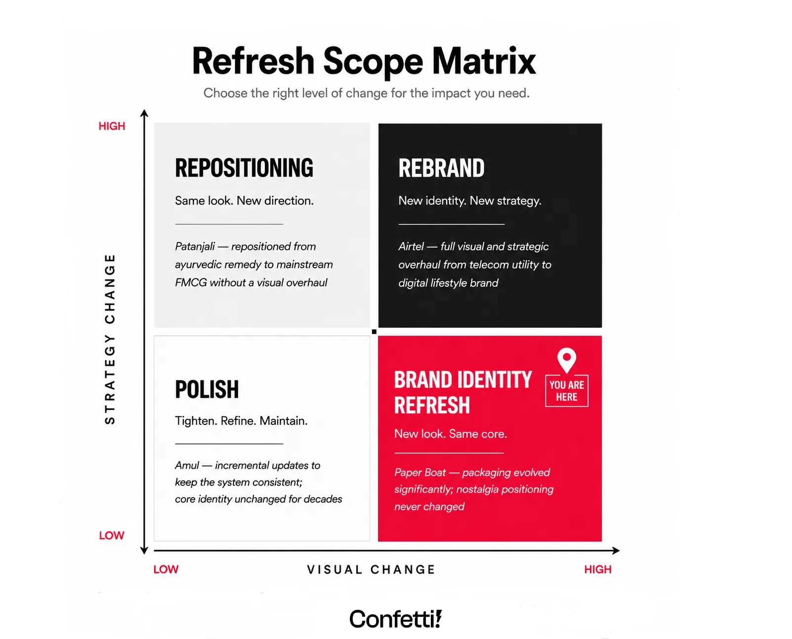
A brand identity refresh is a targeted update to a brand's visual and verbal expression, made to keep the brand relevant, competitive, and aligned with its current business reality, without abandoning the equity built over years.
You keep the structural integrity which is the brand's core purpose, values, and audience recognition, while updating the surfaces, finishes, and details that signal modernity.
A brand identity refresh usually includes:
What a brand identity refresh does not include:
The moment you're changing any of those, the project has crossed into rebrand territory: with a different strategic brief, a different budget, and a different risk profile.
At Confetti, we treat a brand identity refresh as a commercial decision first and a creative exercise second. The question we start with isn't "What would look better?" It's "What needs to change for this brand to win where it currently isn't?"
These three terms often get confused and sometimes used interchangeably, which is a huge mistake.
Here’s a quick look at what they imply:
✨Brand Identity Refresh focuses specifically on visual and verbal expression: logo, colours, typography, packaging, tone of voice. The brand's name, core positioning, and fundamental promise stay intact.
A brand identity refresh is what you do when your product still works, your strategy still holds, but your expression has aged or become inconsistent.
This is the scope most FMCG and D2C brands actually need when they say they want to "look better."
✨Brand Refresh is a slightly broader term. It can include updates to positioning, messaging, or even slight shifts in target audience, alongside visual changes.
A brand refresh may touch what you say and who you say it to; a brand identity refresh stays firmly in how you show up.
✨Rebrand is a different category entirely. A rebrand is a fundamental change in how an organisation positions itself. It can include a new name, a completely revised brand strategy, a new identity system, and often a new target audience or market focus.
Rebranding involves a complete overhaul of a brand's positioning, mission, and audience focus. It's what you do when the core of the business has changed.
Still unsure whether your brand needs a refresh or a rebrand? Let's talk.
The trigger for a refresh is usually 3-4 small signals accumulating. This can be: new channel, a competitor's visual upgrade, declining shelf off-take, inconsistency across print materials, etc. Together make the case undeniable.
These are the some of the clearest signals that a brand identity refresh is needed:
1. Your category has upgraded and you haven't.
Your visuals feel dated, not just "not trendy," but actively working against your brand. If your logo, colour palette, or typography look like they belong to a different era, customers will subconsciously associate that datedness with your product quality.
2. Your brand looks inconsistent across touchpoints
Your website, packaging, social media, feel like three different brands. This inconsistency across touchpoints, creates customer confusion about who you are and what problem you solve. Result, trust erodes and recognition doesn’t build the way it should.
3. You've entered a new channel/ market and the identity doesn't translate.
A visual system designed for general retail shelves is different from what’s needed on quick commerce. Similarly what works in the Indian market may not work in the UAE. If you've expanded distribution in the last 12–18 months, getting an expert brand identity review is a must.
4. Your brand awareness is strong but purchase conversion is falling.
This is one of the clearest diagnostic signals. If brand recall is high but sales growth has slowed, the issue is perception. Customers know who you are. They're just not choosing you. A refresh addresses the gap between how customers perceive the brand and how they need to perceive it to feel confident buying.
5. Your brand guidelines don't exist or aren't being followed
If you have six vendors producing six slightly different versions of the logo, if your social templates don't match your packaging, if your website typography has drifted away from your printed materials: this is a refresh signal. The strategy is fine. The system has lost discipline.
6. You've recently raised capital or are preparing to scale
A fundraise or a significant retail expansion is the right moment to audit and refresh the brand identity. Investors, modern trade buyers, and channel partners all form first impressions from visual signals. A brand that looks like it's ready to scale attracts different conversations than one that looks like it's still figuring itself out.
💡The best time to refresh is before you need to. Brands that refresh while they're still winning have the resources, customer trust, and clarity to do it right. A refresh is maintenance, not rescue and keeping your identity as sharp as your business is what helps brands endure.
A brand identity refresh happens in clear and distinct phases. Here's the process we use at Confetti.
It's built on the principle that a refresh should be driven by diagnosis, not decoration:
Before any design work begins, you need to conduct a brand perception audit that examines your brand from three angles:
At the end of this stage, you should be able to answer: What specific problems is this refresh solving? If you can't answer that with data, you're not ready to design.
Every brand has 2–3 visual or verbal anchors that carry disproportionate recognition value.
These are the elements customers have been trained to associate with the brand over repeated purchase cycles. Change them and you've eroded something that took years to build. Protect them and everything else can evolve freely.
What usually stays in a brand identity refresh:
For example, for The Whole Truth, it's the ingredient-first, zero-claim packaging language, for Rage Coffee, it's the bold typography and the performance-first personality.
At Confetti, we always start a refresh engagement by identifying the brand's equity anchors: the distinctive assets customers already associate with the brand. These are locked before design begins, ensuring evolution without losing recognition.
❌Common mistake: agencies start with a blank brief and "explore" freely. The work may impress internal teams, but if key recognition assets are changed, customers no longer recognize the brand and the problem often isn't discovered until launch.
Your brand identity refresh brief should clearly separate:
A strong refresh brief looks like this:
"We need the packaging to read as premium on D2C but accessible on kirana. Our current red is ownable, protect it. We're expanding to modern trade in Q3: the label hierarchy needs to communicate variant differentiation clearly from 1.5 metres. Our logo is well-recognised: refine, don't replace. Quick commerce thumbnail performance is a hard requirement: test at 80px before final sign-off."
Your brief should specify:
Design decisions in a refresh should be driven by how people actually encounter and process your brand. We call this "retail physics"
✔️For a brand with physical packaging: how colours perform under different lighting, how logos read at different sizes, and how design elements hold up on shelf next to competitors.
✔️For a digital-first brand: how your identity performs as a favicon, a social media avatar, a mobile website header, and an email signature.
The design phase should also stress-test options against your brand's distinctive assets. If you have a colour that customers associate with you, changing it requires a compelling reason.
If you have a typographic style that's become recognisable, evolving it requires strategic intent, not aesthetic whim.
At Confetti, we evaluate design directions against three criteria: distinctiveness (does it stand out from competitors?), flexibility (does it work across all touchpoints?), and longevity (will it still feel relevant in five years?). A refresh shouldn't need another refresh in eighteen months.
A phased rollout protects your brand equity while allowing for course correction. It also gives your audience time to adjust.
The rollout should follow a logical sequence:
Phase 1: Digital
Social media templates, website visual language, D2C digital assets. Fastest to update. Zero print cost. Use this phase to seed the new visual system in the market and gauge response.
Phase 2: D2C packaging
Hero SKU packaging first. The D2C audience is your most brand-aware, most engaged segment. They'll notice, respond, and often amplify the refresh if it lands well.
Phase 3: Modern trade
New pack artwork for modern trade channels. Category buyers at modern trade chains often react positively to a refreshed visual system, it signals brand investment.
Phase 4: General trade
The most complex rollout because of print run timing, distributor pipelines, and the reality that old and new packs will co-exist on kirana shelves for months. Brief your sales team and distributors before new packs hit the market. They need to know what's changing and why.
Communicate the refresh proactively. For D2C brands especially, a refresh announcement done well builds excitement rather than confusion. It signals that the brand is growing, not struggling.
Set measurable KPIs before launch: sell-through rate comparison pre and post, social engagement on new visual assets, distributor and buyer feedback, customer perception survey at 60 days. Our guide on measuring packaging design ROI covers this in detail.

Talk to Confetti about a strategic brand identity refresh that drives recognition and trust
Book A Discovery Call
A brand identity refresh is defined as much by what stays as by what changes.
Change too much and you erode recognition. Change too little and you waste the opportunity.
The sweet spot sits between these two risks.
💡The table works in both directions. If you find yourself changing something in the right-hand column, you're doing a rebrand, whether you intended to or not.
A refresh updates and injects fresh energy into an identity without abandoning everything that came before.
Every change in a refresh should be weighed against the question "Does this preserve or strengthen our recognisable core?" If the answer is no, the change belongs in a rebrand, not a refresh.
Most agencies treat a brand refresh as a visual update. We treat it as a commercial intervention.
The question guiding every project isn't "Does this look better?" It's "Will this help the brand win where it currently isn't?"
We Start with Diagnosis, Not Design
Before any creative work begins, we conduct a comprehensive brand audit. We assess packaging, identity systems, digital presence, and customer touchpoints to identify:
A refresh built on assumptions creates short-term fixes. A refresh built on evidence creates lasting impact.
We Design Systems, Not Just Logos
A logo is one asset, a brand is an ecosystem. Our work includes:
Every element is designed to work together across digital, retail, and packaging environments.
We Design for Real-World Behaviour
Packaging is a physical experience. So, when designing, we consider:
The goal is simple: ensure the brand performs where customers actually encounter it.
Built for Long-Term Consistency
A refresh succeeds only when it's executed consistently. That's why we create practical brand guidelines covering:
What Makes Us Different
A brand refresh isn't a creative project with a commercial outcome. It's a commercial project that happens to involve creativity. We approach it that way from the first conversation to the final handoff. The design is the output. The commercial result is the objective.
☑️ Audit every identity touchpoint: logo, packaging, social, ads, POSM, distributor materials
☑️ Lay all assets side by side and document every inconsistency
☑️ Identify your Position Lock, the 2–3 visual anchors that must not change
☑️ Run customer perception research: photo A/B tests, 8–10 buyer interviews
☑️ Get distributor and sales rep feedback on current packaging
☑️ Map every retail channel the new identity must work across
☑️ Benchmark competitor visual systems: what's changed, what's ownable
☑️ Review existing brand guidelines: what's working, what's being ignored
☑️ Set measurable identity KPIs before any design work begins
☑️ Write a channel-specific design brief, not a generic "look more premium" direction
☑️ Define Position Lock in writing before briefing the design team
☑️ Refine the logo: adjust proportion, weight, spacing; do not replace it
☑️ Lock exact colour specs: Pantone, CMYK, RGB, and hex; no vendor approximations
☑️ Update the full typography system: headline, subhead, and body type
☑️ Refresh photography and illustration style guidelines
☑️ Refresh tone of voice, ensuring verbal identity matches the visual update
☑️ Redesign packaging label: hierarchy, variant navigation, claims architecture
☑️ Update digital asset templates: social, D2C, e-commerce listings
☑️ Test logo legibility at 16px and 200px
☑️ Test quick commerce tile at 80×80px: brand, variant, and logo must all read
☑️ Test typography legibility at shelf scale, 2-second read at arm's length
☑️ Test colour reproduction across substrates: flexo, CMYK offset, screen
☑️ Test with actual customers, distributors, and category buyers, not the internal team
☑️ Confirm all print production specs before final sign-off
☑️ Build a complete, vendor-ready brand guidelines document
☑️ Roll out digital first: social templates, website, D2C
☑️ Update D2C packaging next, the most brand-aware audience with the fastest feedback loop
☑️ Roll out to modern trade packaging
☑️ Roll out to general trade last, managing old and new pack co-existence on shelf
☑️ Brief GT distributors and sales teams before new packs reach the market
☑️ Publish a refresh announcement for D2C and social: build excitement, not confusion
☑️ Share updated brand guidelines with every vendor, printer, and agency
☑️ Update all in-store POSM and display materials
☑️ Track sell-through and category buyer response in first 60 days
☑️ Monitor social engagement on new identity assets
☑️ Collect customer feedback on the refreshed packaging
☑️ Review guideline compliance across all touchpoints at 6 months
☑️ Check for drift: are vendors and internal teams still following the system?
1. Treating a Refresh Like a Rebrand
Cracker Barrel’s 2025 logo backlash is a cautionary tale. The company replaced its heritage-driven identity with a generic wordmark, triggering customer outrage and a rapid reversal. The mistake? Calling a rebrand a refresh.
📌 Confetti Fix: A refresh evolves what exists. Preserve distinctive brand assets and refine them rather than replacing them. If you're changing core identity elements, it's a rebrand.
2. Removing What Customers Recognise
When Tropicana dropped its iconic orange-with-a-straw packaging in 2009, shoppers struggled to find the product. Sales fell sharply, and the design was quickly reversed.
📌 Confetti Fix: Identify and protect your brand’s memory codes—colours, shapes, symbols, or patterns that drive recognition. Update them thoughtfully; don’t erase them.
3. Starting with Design Instead of Strategy
Many refreshes begin with “We need a new logo” rather than a business objective. Without a strategic reason, design changes rarely create meaningful results.
📌 Confetti Fix: Define the problem first. Whether it's declining visibility, inconsistent experiences, or outdated perception, strategy should guide every creative decision.
4. Forgetting It’s a Cultural Change
A refresh affects more than visuals. It influences employee behaviour, customer perception, and how the organisation communicates.
📌 Confetti Fix: Treat the refresh as a change-management initiative. Align teams internally before launching externally.
5. Ignoring Packaging
For FMCG and D2C brands, packaging is often the most important customer touchpoint. Updating digital assets while leaving packaging unchanged creates a disconnected experience.
📌 Confetti Fix: Extend the refresh across packaging, SKU architecture, materials, and in-store assets to ensure a consistent brand experience.
6. Testing with the Wrong Audience
Internal teams and agency creatives aren’t representative customers. Feedback from a small internal bubble can lead to errors that prove costly later..
📌 Confetti Fix: Test concepts with real customers, sales teams, distributors, and retail partners. They evaluate brands through a commercial lens, not just an aesthetic one.
7. Over-Refreshing
Changing the logo, colours, typography, packaging, tone, and positioning at once often destroys brand equity. The more established the brand, the more carefully changes should be made.
📌 Confetti Fix: Limit changes to what’s necessary. A refresh should evolve roughly 20–30% of the identity system while preserving recognisable assets.
8. Neglecting Brand Guidelines
Without updated guidelines, inconsistencies quickly return and undermine the refresh.
📌 Confetti Fix: Complete every refresh with practical, production-ready brand guidelines that ensure consistency across teams, vendors, packaging, and retail execution.
Homegrown beauty and wellness brand Nat Habit has unveiled a new identity and philosophy, "Breathe Life," evolving beyond its earlier "Fresh Ayurveda" positioning.
The refresh features a chakra-inspired flower logo, modern packaging, and a vibrant orange colour palette, replacing traditional Ayurvedic green-brown tones. Rolling out across digital, retail, and quick-commerce channels, the rebrand supports the company’s next growth phase.
Why it worked: Nat Habit refresh was a strategic shift to signal a more modern, ambitious brand while staying true to its natural roots. By moving beyond traditional Ayurvedic design cues, it differentiated itself and strengthened its market presence.
American hypermarket chain Walmart unveiled one of 2025's most subtle redesigns, with a largely unchanged brand identity and logo. Walmart updated its "spark" motif to be slightly fuller, reflecting the chain's current state as a "people-led, tech-powered omnichannel retailer".
Why it worked: Walmart understood that its brand recognition was its greatest asset. The refresh. barely noticeable signalled evolution without risking customer confusion.
British squash brand Ribena worked with design consultancy Elmwood and typographer Luke Ritchie to refresh its identity.
The goal was to preserve nostalgic familiarity while dialling up the brand's most recognisable qualities. The wordmark is now rendered in attention-grabbing red rather than blackcurrant purple.
Why it worked: Ribena understood that its equity was in its recognisability. The refresh amplified what already worked rather than replacing it.
British automaker Bentley made the "biggest change" to its familiar Winged B emblem in its 100-year history.
The brand simplified the emblem's wings and stylised them with a diamond pattern, removing the feathers below the central B for the first time since the logo was designed in 1919. The project marked only the fourth rebrand since Bentley was founded.
Why it worked: Bentley understood that even heritage brands need to evolve. The refresh was conservative, only the fourth change in a century, but meaningful. It signalled a shift towards sustainability and decarbonisation without abandoning the brand's luxury positioning.
Amazon unveiled a new logo for the first time in 20 years, with an understated tweak to its recognisable smile logo. The update expanded the shaft and point of the arrow and rendered it in a more vibrant orange hue.
Design agency Koto explained: "Our update puts greater emphasis not on the arrow, but on a deeper and more emphatic smile, reflecting Amazon's mission to delight customers and make their lives easier".
Why it worked: The smile is one of the most recognised brand symbols globally. The refresh was about refinement, not reinvention.
Lay's identity was updated by the in-house design team of parent company PepsiCo.
The team sought to honour "real, farm-grown potatoes" with a new logo featuring a sun-like circle emblazoned with a red ribbon and the word Lay's, finished in flatter shapes than its predecessor.
Why it worked: The refresh rooted the brand in its product truth while modernising the visual system. The design felt contemporary without losing the brand's familiar cues.
The challenges Indian D2C and FMCG brands face in brand identity refresh are different from other markets.
A brand identity refresh in India isn't one design problem. It's five simultaneous display contexts that need to align. Getting this wrong means your refresh performs beautifully in one environment and completely fails in another.
👉General trade / kirana: 2–3 seconds of shopper attention. Packed shelves. Fluorescent lighting. Your brand wins or loses on colour blocking, logo legibility, and pack architecture.
👉Quick commerce (Blinkit, Zepto, Swiggy Instamart): The product image is often displayed as a 1:1 thumbnail: sometimes as small as 80×80 pixels. Your brand name, logo, product variant, and key claim all need to be read clearly at that size. Most packaging systems designed even 3 years ago were never built for this.
👉Modern trade (DMart, Reliance Smart, Big Bazaar): Gondola-end visibility, structured category blocking, and consistent facings. Brands with cleaner visual systems get better placement and easier visual navigation for shoppers.
👉D2C (own website, app): Immersive brand storytelling, unboxing experience, and a full brand world. Customers are spending more time with the brand here than anywhere else.
👉Amazon and Flipkart: A+ content, storefront design, hero imagery on white backgrounds, a completely separate visual grammar from physical retail. Our guide on Amazon packaging design for e-commerce covers this in detail.
Indian consumers in mass FMCG categories are highly price-sensitive and they've been trained over years to associate certain visual cues with value, trust, and reliability.
A visual change that reads as "premium" to an urban design team can read as "same product, now more expensive" to a buyer in Tier 2 or Tier 3 markets.
The visual system carries price signals that are invisible to most designers but highly legible to experienced shoppers.
This makes the refresh brief in India more delicate than in most other markets. You're not just updating aesthetics. You're managing price perception, category familiarity, and shelf recognition simultaneously.
At Confetti, we help brands steer through these challenges. If you are facing something similar, let’s connect.
How often should a brand refresh its identity?
We recommend reviewing your visual system every 2–5 years, or whenever you enter a significant new retail channel, expand into a new audience segment, or notice that competitors have upgraded their visual language and yours looks dated. In fast-moving categories like FMCG and D2C, the refresh cycle can be shorter.
What does a brand identity refresh include?
It covers logo refinement, colour palette evolution, typography updates, updated photography and illustration guidelines, revised tone of voice, and packaging label redesign. It should also include digital asset templates for social media, e-commerce listing images, and quick commerce tile optimisation. It does not include changing the brand name, core positioning, or target audience.
How long does a brand identity refresh take?
A focused brand identity refresh, covering visual identity, packaging design, and brand guidelines, usually takes 6–16 weeks depending on the number of SKUs, channels, and approval layers involved. Brands with extensive GT distribution or complex packaging ranges may take longer due to production lead times.
How do I know if my brand needs a refresh or a rebrand?
If your brand's positioning is still commercially valid: right audience, right category, right value proposition, but the visual and verbal expression feels dated, inconsistent, or misaligned with where you're now selling, you likely need a refresh. If the business itself has changed direction, new category, new audience, fundamentally new competitive positioning, that's when a rebrand becomes the right call.
Can I refresh my brand's packaging without changing the logo?
Yes, and for many established FMCG brands, this is the recommended approach. Packaging can be refreshed through updated label architecture, revised colour application, improved information hierarchy, new photography or illustration styles, and material upgrades, while keeping the logo and its recognition equity entirely intact. The logo doesn't need to change for the brand to look significantly more current.
Want strategic branding and packaging like this for your business?


.webp)
.webp)


.webp)
.webp)
.webp)
.webp)
.webp)


.svg)
.webp)
.svg)
.webp)