%201.webp)
02
AI Snaps
.svg)
.svg)
01
Our Work

03
About Us
05
Contact Us
06
Client Success

07
Blogs
08
Careers
Book A Call


Need Help In Building Your Brand?
Click the button below & book a call with our founder directly.

Rishabh Jain
Managing Director
Rage Coffee | Confetti's Verdict ⭐⭐⭐½
Confetti Design Studio has analysed Rage Coffee to understand how a brand founded in 2018 reached cumulative sales of Rs 100 crore by December 2023, reported a turnover of Rs 24.95 crore in FY24, raised USD 11.4 million across six rounds from investors including Sixth Sense Ventures and Virat Kohli, and attracted a 44% strategic stake from GRM Overseas at a valuation of approximately Rs 180 crore in August 2024. With over 5,000 retail touchpoints and 1,000-plus HoReCa outlets across India.
The Indian coffee market in 2018 was dominated by calm, considered, artisanal positioning. Blue Tokai offered origin. Third Wave offered education, Sleepy Owl offered comfort and every premium player was competing in the same relaxed, thoughtful register, but none of them owned the energy end of the spectrum.
Rage Coffee walked into this gap with a single word that communicated everything its competitors were deliberately avoiding intensity. Before a consumer reads a flavour description, sees a product image, or understands the ingredient stack, the name alone sets a physical expectation. Rage is not a coffee you sip thoughtfully at a Bengaluru café on a Sunday morning. Rage is a coffee you reach for at 6 AM before a workout, at 11 PM before a deadline, at 4 PM when the afternoon slump hits hard.
In a crowded category, the ability to set a distinct emotional expectation through the brand name alone is one of the most valuable things a brand can achieve. Rage Coffee did this, and the name has continued to work as a differentiator even as the brand has scaled. It is genuinely difficult to forget, and it creates an immediate mental position that no competitor has claimed.
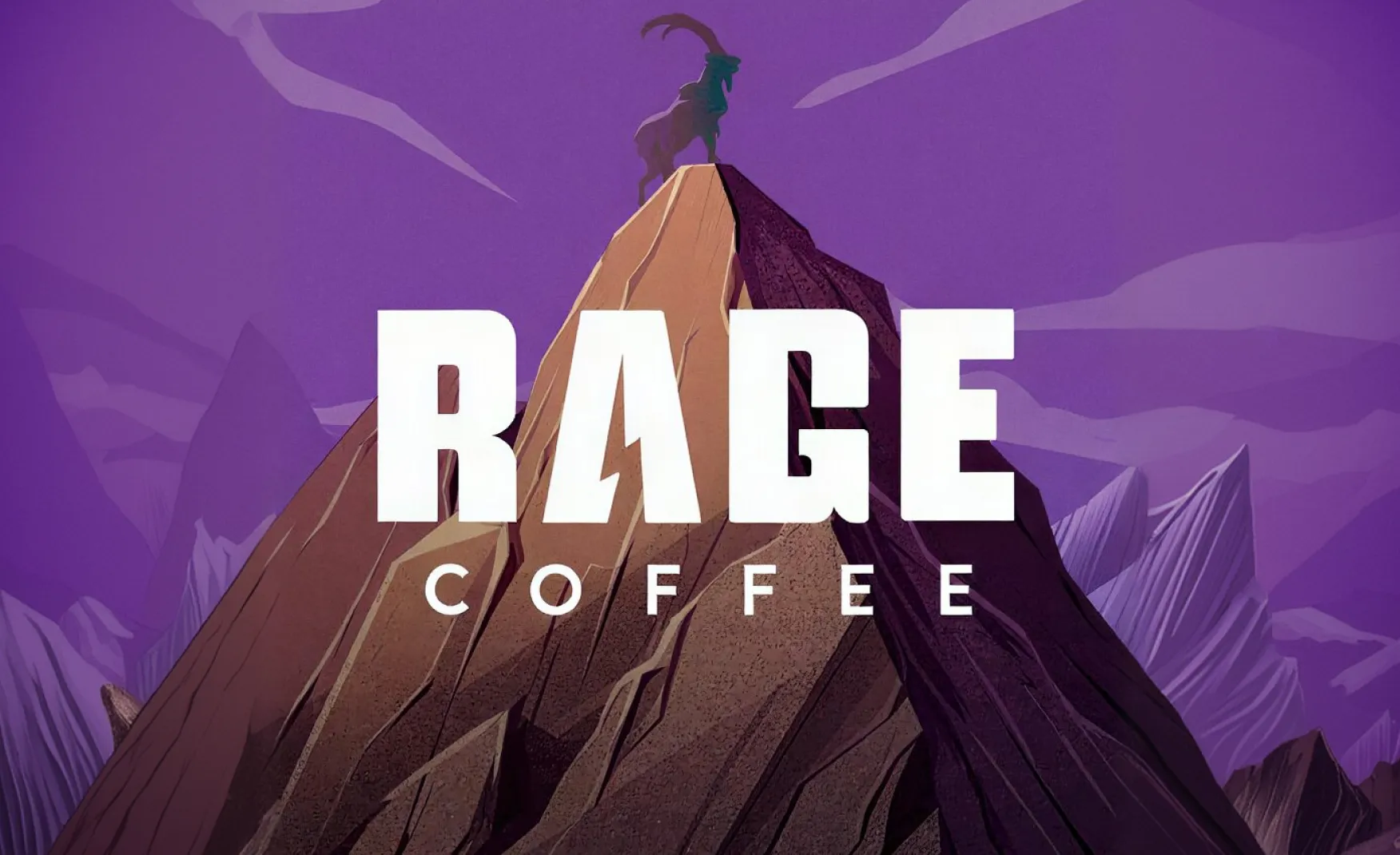
Brand symbols that work on two levels simultaneously are rare. Most logos communicate one thing: the brand name, an abstract visual mark, or an industry reference. Rage Coffee's goat icon communicates at least two things, and the second is significantly more interesting than the first.
On the surface, the goat atop a mountain communicates energy, dominance, and the act of reaching peaks. These are the right associations for a brand named Rage. For the general consumer, this reading is sufficient and effective. For the consumer who knows coffee history, the symbol talks about how coffee was discovered when an Ethiopian goat herder noticed his goats becoming unusually energised after consuming coffee berries. The Rage Coffee goat is a direct visual reference to this origin story.
This layered symbolism is the mark of a brand that has thought seriously about its identity. It rewards curiosity. It communicates coffee expertise to those who carry it, and brand confidence to those who do not. A symbol that can speak to multiple audience segments simultaneously without losing coherence for either of them is a genuinely sophisticated design decision.
Most packaged coffee brands differentiate on origin, roast profile, or flavour. Rage Coffee chose a different axis entirely like the cognitive function. The addition of plant-based nootropic ingredients including L-theanine, Panax ginseng, Bacopa monnieri, Rhodiola rosea, Ginkgo biloba, and L-glutamine positions the product not just as a coffee but as a performance beverage.
This ingredient stack has real scientific grounding. L-theanine, in particular, is well-documented in research for its ability to moderate the stimulant effects of caffeine, producing alertness without jitteriness. The combination of caffeine and L-theanine is one of the most studied nootropic combinations in cognitive science. Rage Coffee is not manufacturing a wellness claim, it is in fact actually building on an evidence-based product formulation.
In a market where most premium coffee brands compete on taste and provenance, a brand that competes on cognitive performance occupies genuinely differentiated territory. The consumer who is already taking supplements for focus and mental energy is a consumer who understands this positioning and is willing to pay for it. The brand's Rs 100 crore in cumulative sales confirms that this audience exists and is growing.
For a brand of Rage Coffee's revenue scale, the distribution footprint is disproportionately strong. Over 5,000 general trade and modern retail touchpoints, 1,000-plus HoReCa outlets, and a presence across D2C, e-commerce, and quick commerce platforms represents an omnichannel infrastructure that most comparable D2C brands have not built.
The GRM Overseas acquisition in August 2024 significantly strengthens this position. GRM has established distribution networks across basmati rice export markets globally and deep domestic retail relationships. Their stated intent to leverage these networks for Rage Coffee's international expansion and domestic scale gives the brand a distribution partner that most D2C coffee brands would need years and several funding rounds to build independently.
The 30,000 sq ft production facility at IMT Manesar in Haryana, producing freeze-dried, spray-dried, and agglomerated instant coffee formats as well as whole beans and ground coffee, also reflects a brand that has invested seriously in manufacturing capability rather than relying entirely on third-party production. This vertical integration at the production level is a commercial and quality assurance advantage that most competitors in the same segment do not have.
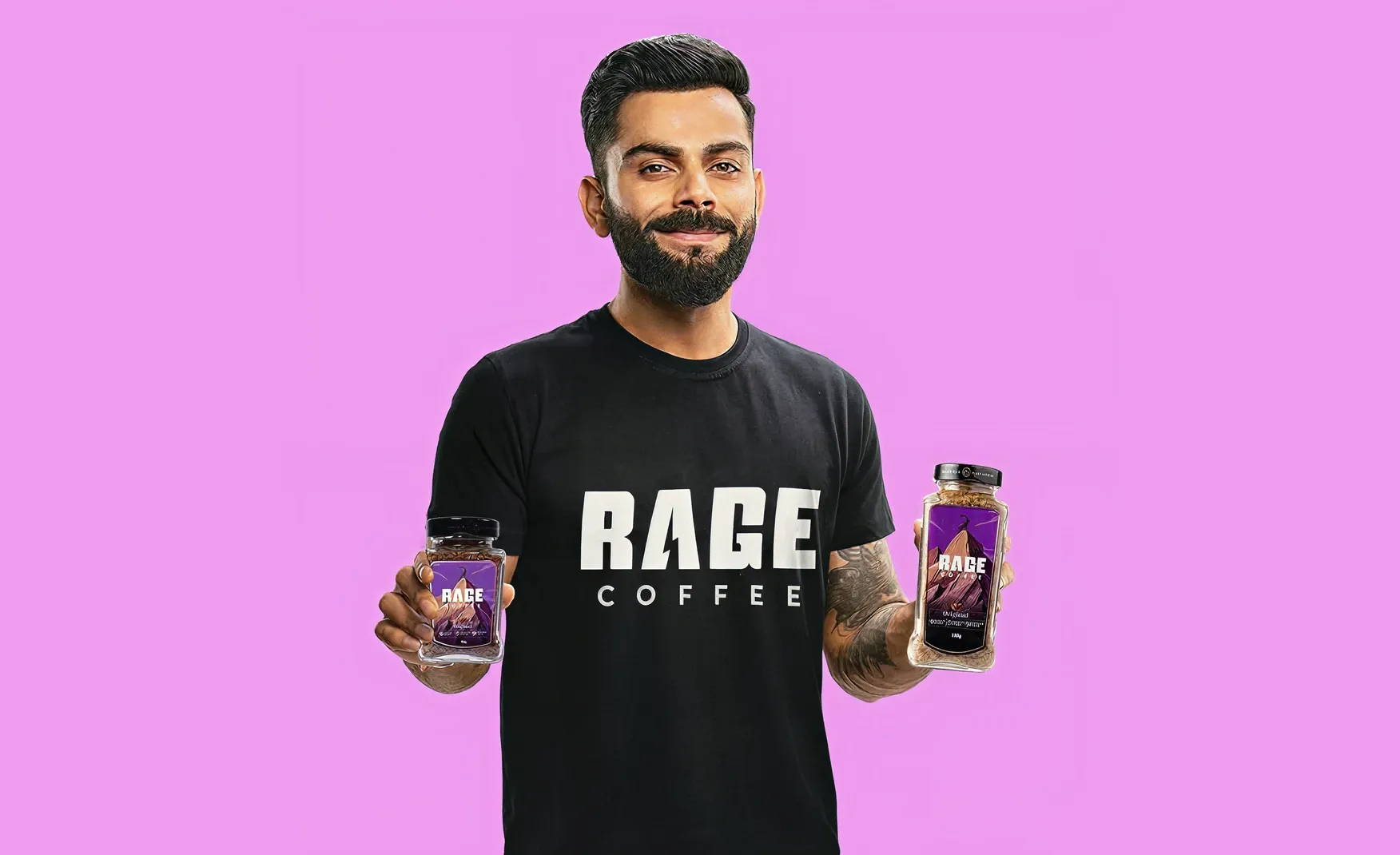
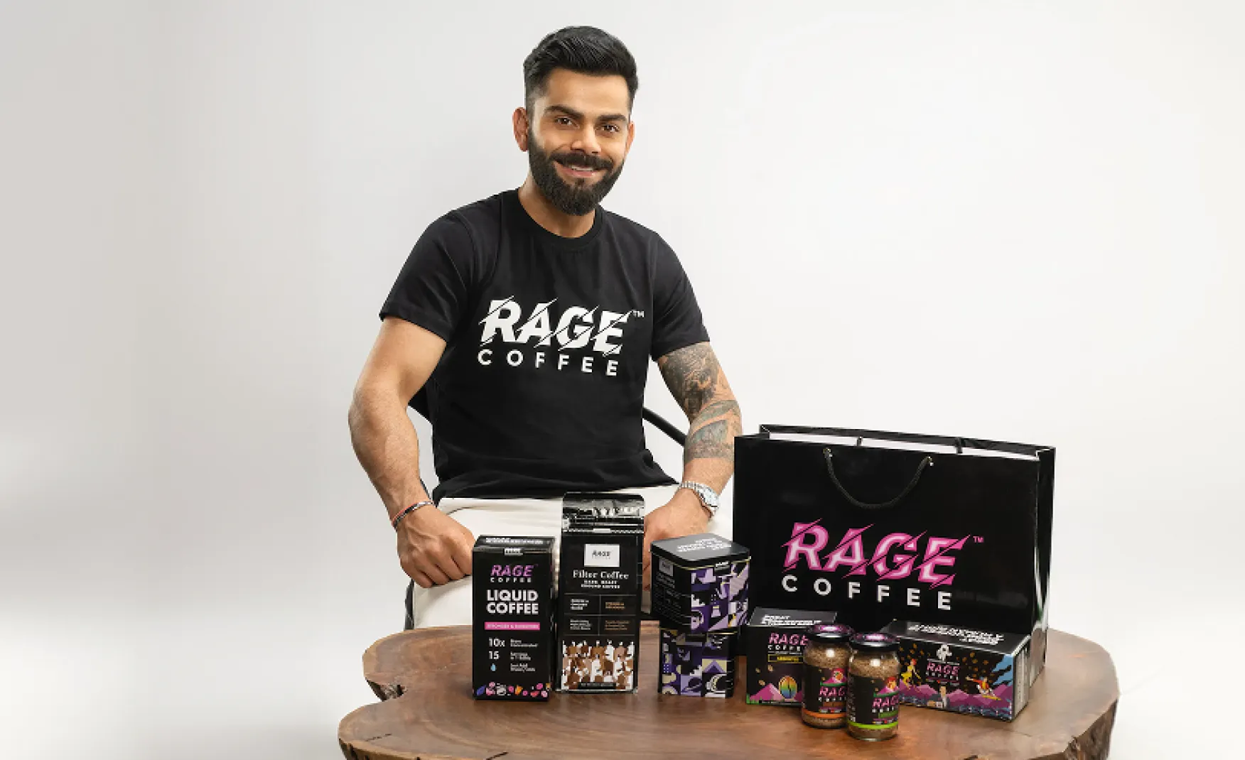
Celebrity association in FMCG is common. What is less common is a celebrity association that is genuinely coherent with the brand's core positioning rather than simply attached to it for reach.
Virat Kohli is, in the Indian cultural imagination, synonymous with intensity, discipline, and peak physical performance. His public persona, built over two decades of elite cricket, is entirely consistent with the emotional territory that the name Rage Coffee claims. A fitness-focused, high-performance athlete who has been public about his clean lifestyle choices and personal wellness routines is the ideal human expression of a coffee brand that positions itself around cognitive energy and physical performance.
This is not a brand deal that requires consumers to stretch their imagination. The fit is natural enough that it reinforces the brand's positioning rather than simply adding a famous face to it. When Kohli says he uses Rage Coffee, the consumer's first instinct is to believe him, because the brand and the person occupy the same emotional territory.
This is the central brand contradiction in Rage Coffee, and it is the most important problem for the brand to solve before any other design investment will have its full effect.
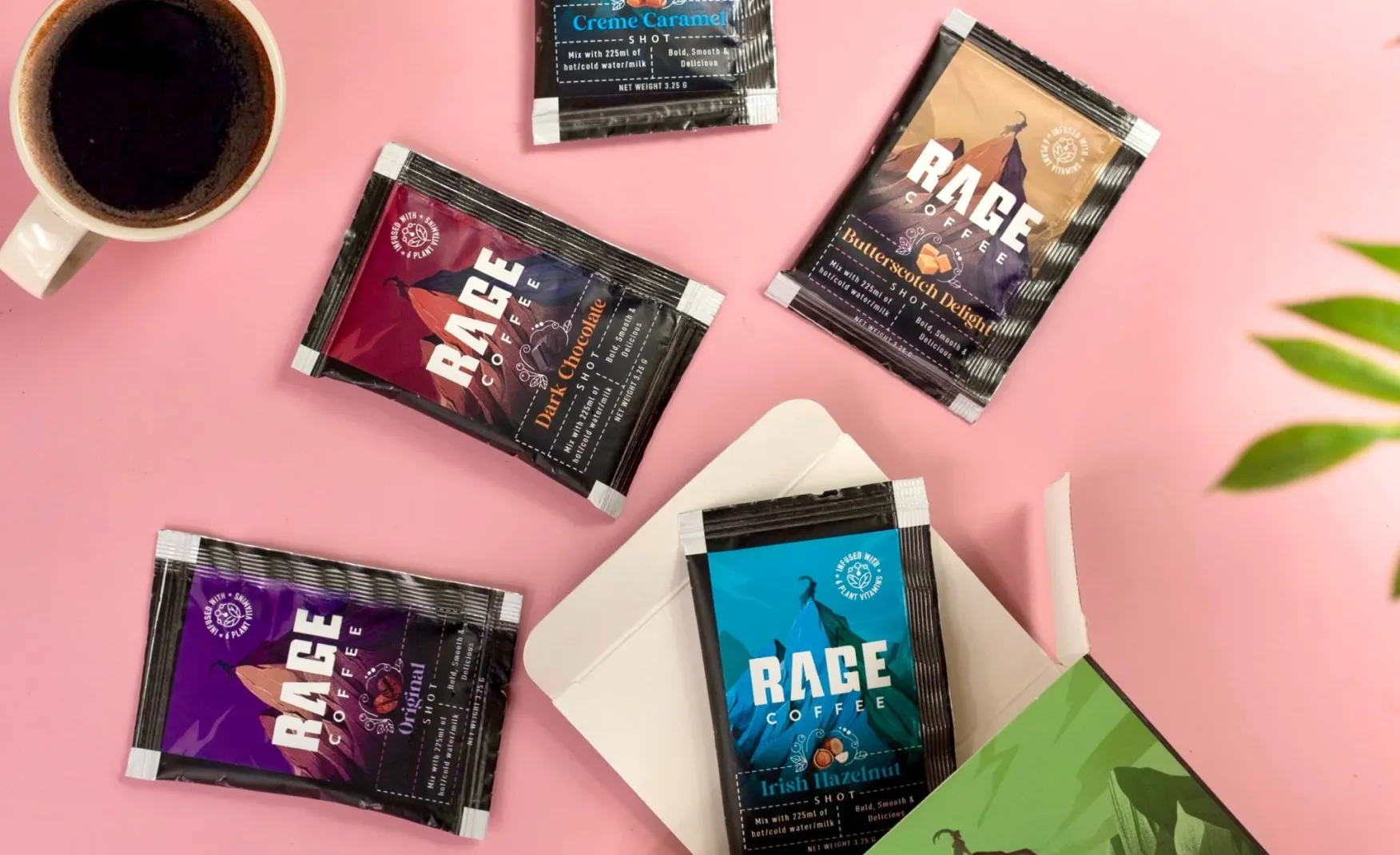
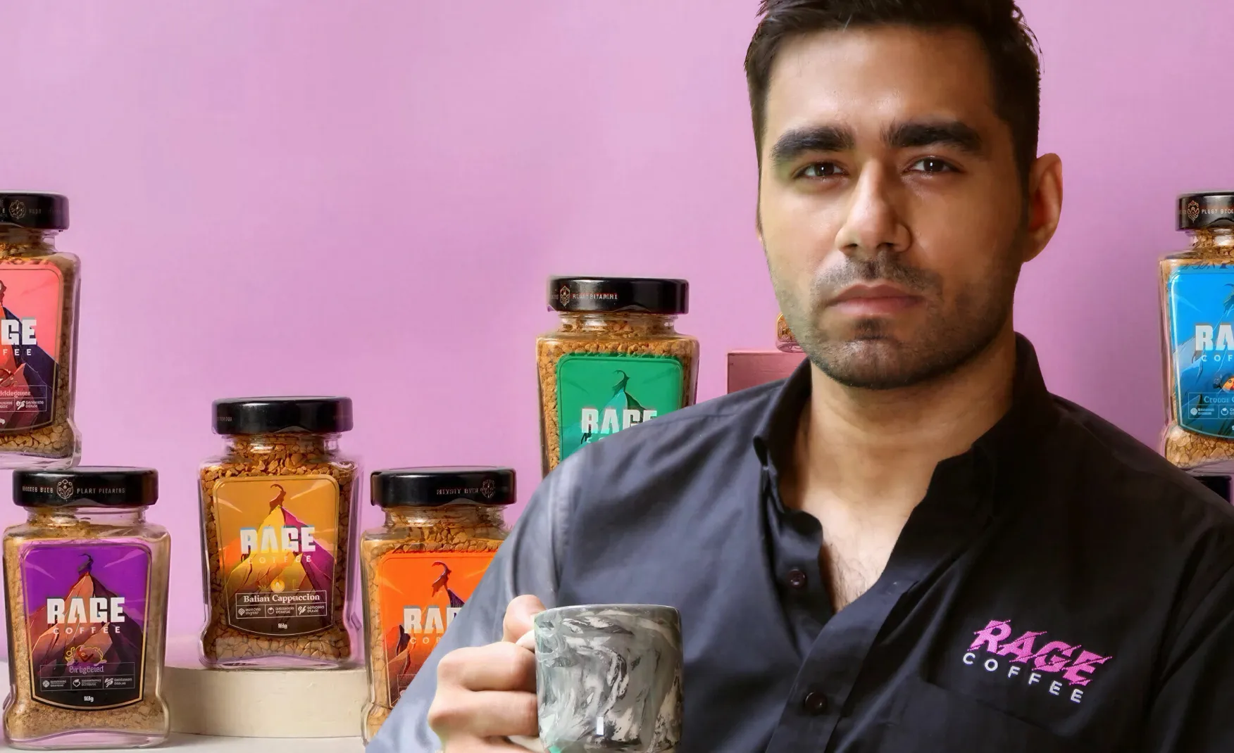
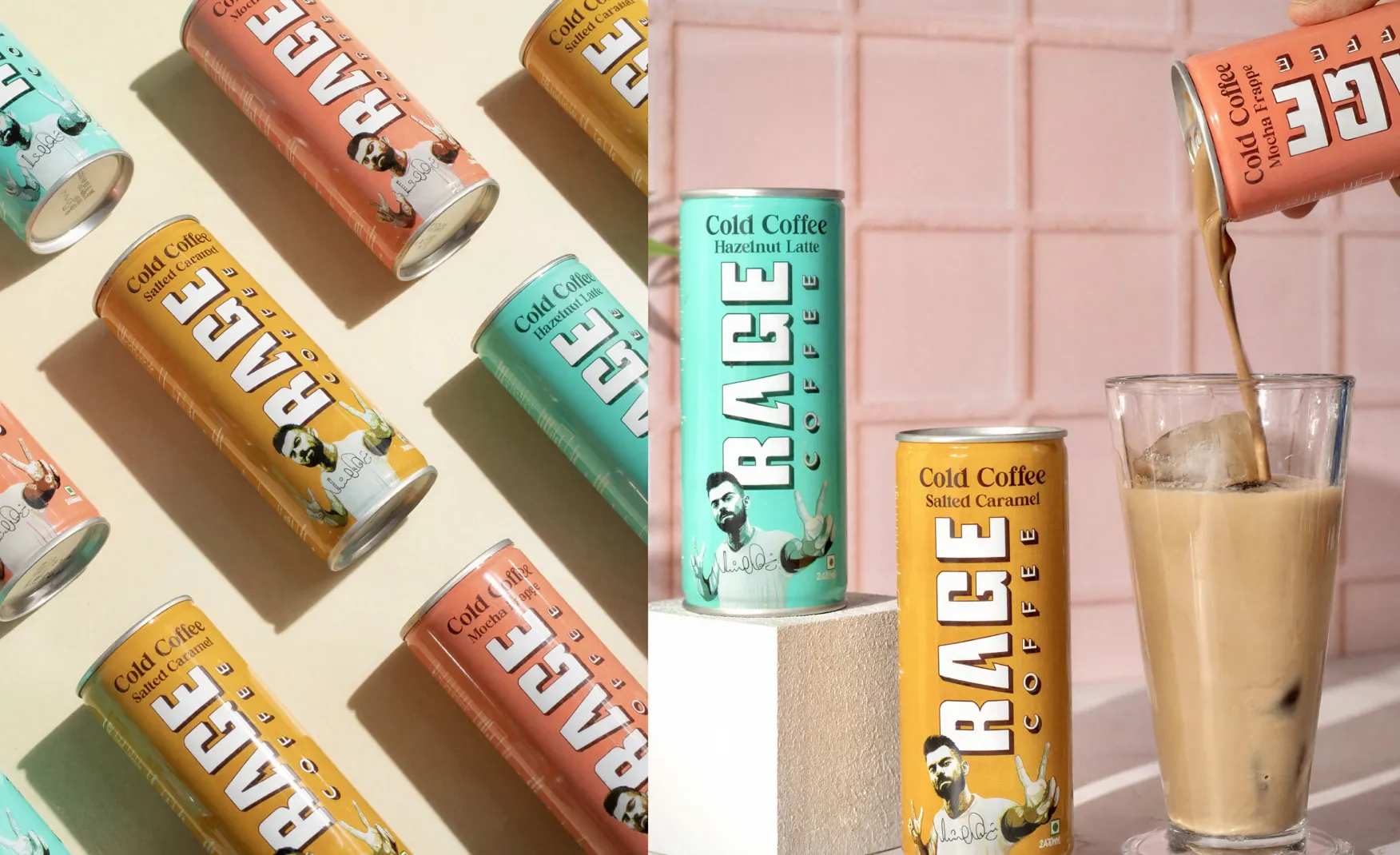
The product range includes flavours named Creamy Hazelnut, Vanilla Velvet, and Belgian Chocolate. These names are sophisticated, smooth, and indulgent. They belong to a premium café menu or a luxury grocery aisle. They do not belong to a brand called Rage. A consumer who is drawn to the brand by the name expects something that matches that intensity. This is not a minor tonal inconsistency. It is a direct contradiction between the brand's most prominent asset, its name, and the language it uses to describe its products. Every naming decision in the range should either amplify the Rage energy or create a tension with it that is deliberate and interesting. Creamy Hazelnut does neither. It simply ignores the name and applies a generic premium flavour descriptor that any competitor in the category could use.
The visual contradiction mirrors the naming contradiction. Floral patterns and decorative elements appear across Rage Coffee's packaging in a way that reads as elegant and refined rather than energetic and intense. For a brand whose name carries physical force, the packaging communicates the opposite.
This is not an argument for aggressive, maximalist design. Restraint can communicate intensity, like think of Indri's clean white label or Sleepy Owl's disciplined colour system. The issue is not that Rage's packaging is too quiet. It is that the visual language it has chosen, decorative florals and soft gradients, belongs to an entirely different brand archetype. A wellness tea brand or an artisanal café concept would be served by this aesthetic. A brand called Rage, positioning itself around cognitive performance and caffeine intensity, is not.
The result is packaging that does not confirm what the name promises. A consumer who picks up the product based on the name and then reads the packaging feels a discontinuity that undermines confidence in the brand's coherence. Coherence is the single most important quality in building consumer trust at the point of purchase.
The plant-based nootropic ingredient stack is one of Rage Coffee's most genuinely distinctive product features. It is also currently communicated in a way that sits awkwardly between two different brand registers.
The ingredient information, L-theanine, Panax ginseng, Bacopa monnieri, Rhodiola rosea, Ginkgo biloba, reads as a wellness and supplementation language. It belongs to a brand archetype built around holistic health, calm energy, and evidence-based wellness. That is not the Rage archetype. The Rage archetype is performance, intensity, and competitive drive. The ingredients are genuinely relevant to that archetype, but they need a narrative bridge that translates their science into the brand's emotional language
The most urgent brand work Rage Coffee needs to do is the decision itself. The brand is currently sitting between two archetypes, one the performance-led aggressor that the name suggests, and the other one is the premium artisanal wellness brand that the packaging and product naming suggest. Both are legitimate brand positions in the Indian coffee market. Neither can be held simultaneously without confusing the consumer.
Our recommendation is to commit to the performance archetype because it is the one the name already owns. No other Indian coffee brand holds that territory. Third Wave owns education. Sleepy Owl owns comfort. Blue Tokai owns origin. Rage can own intensity, and that position is worth more than the premium-artisanal space where it would be competing with better-established names. Once the archetype decision is made, every subsequent design decision, from product naming to packaging to content, becomes straightforward. The brand just needs to build towards the same direction that its name is already pointing.
The flavour names need to be rebuilt from scratch in the brand's actual language. This does not mean making them aggressive for the sake of aggression. It means finding names that carry energy and purpose rather than comfort and luxury.
At Confetti, we worked on ITC Bingo Chatpat Kairi, a project where every element from the brand name to the flavour descriptor to the pack visual had to speak the same cultural and emotional language without contradiction. The discipline of that alignment is what makes a product feel like a coherent brand rather than a collection of design elements. For Rage Coffee, the equivalent means product names that feel like they belong to a brand called Rage: names that communicate speed, sharpness, and drive rather than creaminess and velvet. The ingredient stack gives the brand plenty of raw material to work with. L-theanine Focus. Peak Blend. Pre-Game Black. These are just directions. The point is that the naming should amplify the identity rather than contradict it.
The packaging needs to be redesigned around the same performance archetype that the name already occupies. This means a visual language built on sharpness, precision, and controlled energy rather than decorative softness. Dark backgrounds, typographic confidence, minimal ornamentation, and a colour system that communicates edge rather than warmth.
The goat logo is a strong asset and should be retained. The layered symbolism works. What needs to change is everything around it: the colour palette, the layout logic, the secondary typography, and the way the functional ingredients are presented on pack. A packaging system that looks as intense as the name sounds would be one of the most distinctive shelves in the Indian coffee category, because no one currently owns that visual space. The performance-first packaging position is available, and Rage Coffee's name has already earned the right to claim it.
Rage Coffee has the hardest part of brand building already done: a name that owns distinct emotional territory in a crowded category, a symbol that rewards knowledge, a product formulation that is genuinely differentiated, and a distribution infrastructure that most comparable brands have not built. The commercial momentum, Rs 100 crore in cumulative sales and a strategic investor willing to deploy significant capital and distribution muscle, confirms that the market has responded.
The work ahead is alignment. The gap between what the name promises and what the packaging and product naming deliver is real enough to create consumer confusion at the moment of first encounter, which is the most consequential moment in any brand relationship. Closing that gap does not require starting over. It requires the courage to commit fully to the intensity positioning that the name already occupies and the discipline to rebuild every other brand element around it. A brand that does that would have no meaningful competitor in the Indian coffee category for the position it would own.
If you are building a coffee, beverage, or energy brand and want to create a design system and brand identity where every element, name, packaging, product language, and content, confirms the same promise, Confetti can help you build that.
Want strategic branding and packaging like this for your business?


Lorem ipsum dolor sit amet, consectetur adipiscing elit. Suspendisse varius enim in eros
Lorem ipsum dolor sit amet, consectetur adipiscing elit. Suspendisse varius enim in eros
Lorem ipsum dolor sit amet, consectetur adipiscing elit. Suspendisse varius enim in eros
.svg)
.svg)


.webp)
.webp)


.webp)
.webp)
.webp)
.webp)
.webp)


.svg)
.webp)
.svg)
.webp)


.webp)


.webp)


.svg)