%201.webp)
02
AI Snaps
.svg)
.svg)
01
Our Work
03
About Us
04
Brand Audit
05
Contact Us
06
Client Success
12
07
Blogs
08
Careers
Book A Call
.svg)



.svg)
Need Help In Building Your Brand?
Click the button below & book a call with our founder directly.

Rishabh Jain
Managing Director
Hyperlocal branding operates across several layers at once, from design and language to product adaptation and community engagement, which is why it takes more than swapping a color palette to get right.
In this blog, we cover what actually goes into hyperlocal adaptation, where most brands get it wrong, and what it looks like in practice across global markets.
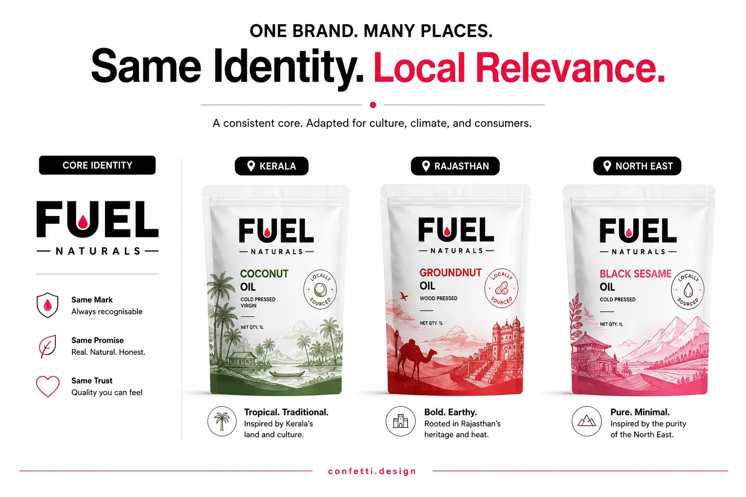
Hyperlocal branding adapts a brand's visual and verbal identity, messaging, and physical presence to resonate with consumers in a precisely defined geographic area, sometimes as small as a neighbourhood, a single ZIP code, or even a city block.
It makes use of region-relevant colour, symbols, language, and cultural references, without breaking the brand's core recognizability.
It moves beyond regionalisation, which might involve translating a campaign into a local language or inserting a festival reference.
Also, hyperlocal branding is different from standard branding.
Hyperlocal branding operates at a deeper and a more precise level.
It embeds the brand within the cultural operating system of a place: its pace, its rituals, its humour, its anxieties, its food logic, and its domestic codes.
Hyperlocal branding helps brands feel like they belong. By reflecting local language, culture, values, and buying habits, brands build familiarity and trust faster than generic, one-size-fits-all marketing.
This is especially effective in trust-driven categories such as food, FMCG, healthcare, beauty, personal care, and retail, where consumers prefer brands that understand their everyday lives.
Key benefits:
☑️Builds trust faster: Local relevance creates stronger emotional connections.
☑️Increases engagement: Locally relevant content can drive up to 30% higher engagement, while businesses using local signals and optimized content have reported up to 20% higher conversions.
☑️Competes beyond price: Brands that feel culturally relevant are harder to replace because customers value familiarity and trust, not just cost.
☑️Supports growth at any scale: Regional brands can dominate niche markets, while larger brands can stay consistent while adapting to diverse audiences.
In markets like India, where preferences vary by region, language, and culture, hyperlocal branding becomes a significant competitive advantage.
Brands like McDonald's adapt menus and messaging to local tastes, Coca-Cola personalizes campaigns around regional festivals and languages, and Amul combines a consistent national identity with locally relevant communication.
However, effective hyperlocal branding goes beyond translation or adding local symbols.
You must maintain a consistent positioning while adapting elements such as messaging, packaging, visuals, product variants, and customer experience to local expectations. This balance creates recognition without sacrificing relevance.
At Confetti, we help brands build scalable brand identity systems that remain consistent across markets while adapting where it matters most, creating brands that are recognizable everywhere but feel local wherever they appear.
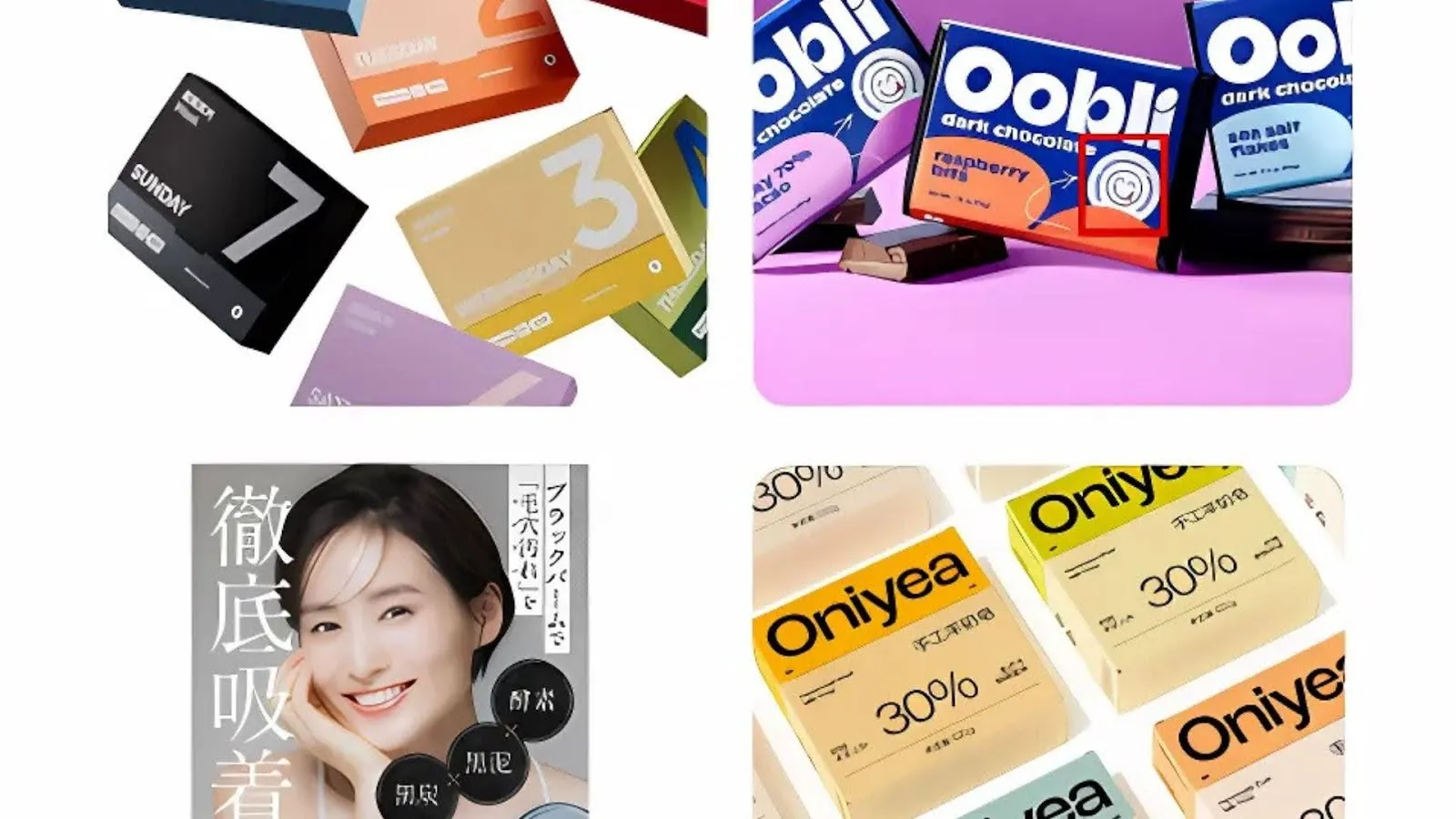
We think about hyperlocal adaptation across three layers: Signal, Language, and Form.
Signal includes every visual element that shapes first impressions, from colours and imagery to motifs, symbols, and graphic styles. It is also where brands often fail by relying on stereotypes instead of genuine cultural understanding.
Visual meanings are rarely universal. A colour linked to celebration in one market may signal mourning or politics in another, while imagery that appeals to urban audiences may feel irrelevant elsewhere.
Rather than adding local motifs as decoration, successful brands adapt their visual systems while preserving core brand assets.
Example: Pepsi's Culture Can Series, featured region-specific packaging inspired by local music, architecture, food, and cultural icons, yet every design remained instantly recognisable as Pepsi.
Hyperlocal branding goes beyond translation. It requires transcreation, adapting meaning, tone, humour, and cultural context so communication feels natural to local audiences.
This applies across every touchpoint, from product names and packaging copy to advertising and customer support. Even the right level of formality varies by region.
Example: TataTea Premium created state-specific packaging and campaigns under “Desh ki Chai, Apne Pradesh ka Swad,” celebrating local traditions, festivals, and cultural pride while maintaining a consistent national identity.
Brands that sound local build trust far faster than brands that simply translate global messaging.
Form is the physical experience of a product, including pack size, structure, materials, and usability. While often overlooked, it shows whether a brand truly understands local buying habits.
Consumer preferences vary widely. Some markets favour affordable sachets, while others prefer family packs, refill formats, or premium gifting options. Retail channels, from kirana stores and quick commerce to supermarkets, also require different packaging solutions.
Example: Many FMCG brands in India use sachets and small-value packs where affordability drives purchases, while premium urban markets increasingly favour larger refill packs and reusable packaging.
Designing for local behaviour often has a greater commercial impact than changing graphics alone.
Core assets such as the logo, typography, colour palette, positioning, and brand promise remain consistent to build recognition and long-term brand equity.
Elements like imagery, packaging graphics, messaging, regional languages, product variants, and pack formats can then be adapted where research shows they improve local relevance.
This balance separates thoughtful hyperlocal branding from superficial localisation. A flexible brand system keeps a brand instantly recognisable while allowing meaningful regional adaptation.
At Confetti, we build scalable brand and packaging systems that preserve consistency while giving businesses the flexibility to connect authentically with local markets.
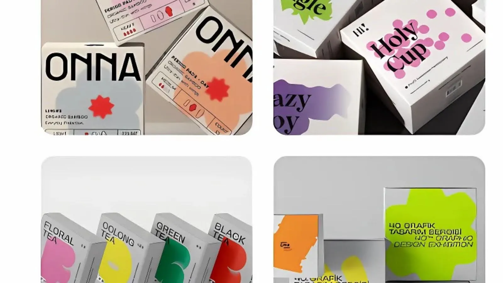
Hyperlocal branding involves building a consistent brand that can adapt intelligently to local cultures, languages, buying habits, and retail environments without losing its core identity.
Here’s a step by step process:
Many brands believe their identity is "universal" when it is simply generic. An identity can be consistent across markets yet fail to connect with any of them because it was designed around assumptions rather than local realities.
Review every customer touchpoint, including your logo usage, packaging, colours, imagery, messaging, website, retail presence, and advertising.
Ask a simple question: Was this designed intentionally for this market, or was it carried over from another market by default?
This exercise often reveals hidden opportunities to improve relevance without changing the brand's strategic foundation.
Before adapting anything, establish your brand's non-negotiables.
Core assets such as your logo, primary colour palette, typography, positioning, and brand promise should remain consistent across every market. These create recognition and strengthen long-term brand equity.
Everything else, including supporting colours, imagery, messaging, illustrations, packaging graphics, regional languages, product variants, and pack formats, can be adapted where research demonstrates it will improve customer relevance.
This balance between consistency and flexibility is one of the foundations of effective brand positioning. Without clear guardrails, local adaptations gradually become inconsistent identities.
Successful hyperlocal branding starts with understanding how people actually live, shop, and make decisions. That means looking beyond demographics to understand:
Desk research alone is not enough. Spend time with retailers, distributors, sales teams, and customers.
Observe products in stores, visit neighbourhood markets, and conduct interviews where possible. The cost of good research is significantly lower than the cost of launching a regional strategy built on incorrect assumptions.
Research should lead to a clear local positioning rather than superficial localisation.
As we discuss in our articles on creating a brand positioning statement and standing out in competitive markets, strong differentiation comes from occupying a position that competitors cannot easily replicate.
Identify where three factors overlap:
Example: Mother's Recipe increased cultural relevance by introducing regional-language packaging across its product portfolio while maintaining a consistent master brand.
Once the positioning is defined, adapt the brand expression across the three pillars of hyperlocal branding as discussed above:
Example: Smaller sachets may perform better in price-sensitive markets, while premium refill packs may better suit urban consumers. Likewise, packaging designed for quick commerce may require different priorities than products primarily sold through neighbourhood retailers.
Every adaptation should improve relevance while keeping the overall brand immediately recognisable.
One of the biggest mistakes brands make is assuming their local adaptations are culturally appropriate without testing them.
Before launch, validate packaging, messaging, imagery, and campaigns with people who actually belong to the target market.
Ask questions such as:
This final review helps identify unintended cultural mistakes before they reach customers.
Hyperlocal branding cannot succeed if operations remain generic.
Customer service, fulfillment, retail execution, influencer partnerships, community engagement, and regional content should reinforce the same local understanding reflected in the brand identity.
Many successful brands increasingly collaborate with regional creators, local retailers, and community organisations because local credibility often generates stronger trust than national advertising alone.
Hyperlocal branding is an ongoing process rather than a one-time rollout.
Track both quantitative and qualitative performance, including:
Use these insights to refine messaging, packaging, product formats, and customer experience over time. Consumer preferences evolve, and the most successful brands continuously adapt while protecting their core identity.
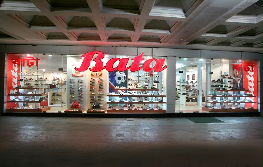
Leading global and regional brands are using hyperlocal branding to create stronger cultural relevance while maintaining a consistent brand identity.
Bata: The Brand That Feels Local Everywhere
Although founded in the Czech Republic and headquartered in Switzerland, Bata is perceived as a local brand in many countries.
It adapts product ranges to regional needs, displays its name in local languages across India, and has invested deeply in communities by developing factory townships such as Batanagar and Batawa.
💡Bata embeds localization into products, identity, and community investment, making the brand feel native rather than imported.
Adidas: Partnering with Local Cultural Landmarks
Adidas has collaborated with iconic local institutions such as Dubai's Ravi Restaurant and Dream Girls Tailor.
Its Loomhood Collection drew inspiration from Al Fahidi, Diriyah, and Cairo's El-Khayamiya, incorporating traditional craftsmanship like Emirati talli weaving while working directly with local artisans.
💡Adidas built authenticity by collaborating with local creators instead of simply borrowing cultural symbols, allowing regional stories to shape the products.
IKEA's "Globally Local" Campaign
Across the UAE, Qatar, and Oman, IKEA invited local artists to reinterpret its products through regional craftsmanship and storytelling.
The campaign included artist collaborations, customer workshops, and the Your Local Story social initiative, blending Scandinavian design with Arab cultural identity.
💡IKEA empowered local artists to shape the brand, creating culturally authentic experiences instead of imposing a global design perspective.
H&M's Middle East Makeover
H&M has redesigned its GCC retail experience with interactive stores, customization stations, expanded beauty offerings featuring regional brands, and localized seasonal collections such as Ramadan capsules.
The strategy extends beyond products to include store design and digital engagement.
💡H&M adapts the entire customer experience, from merchandising to retail design, to reflect local lifestyles and preferences.
Sprite: Hyperlocal Through Climate, Culture, and Consumption
Sprite adapts its global refreshment platform to local markets by tailoring products, partnerships, and campaigns to regional tastes and lifestyles.
Across Southeast Asia, the brand has paired Sprite with local spicy foods, launched flavours such as Sprite Chill Lemon Mint and Sprite + Tea, and created market-specific activations ranging from beach festivals in the Philippines to cooling experiences in Vietnam.
Sprite also uses real-time data, including temperature-triggered advertising, to deliver relevant messaging when demand is highest.
💡Sprite embeds localisation into product development, partnerships, and marketing while maintaining a consistent global identity. The result is a brand that feels locally relevant without losing global recognition.
Uniqlo: Hyperlocal Through Community Collaboration
Uniqlo brings its global LifeWear philosophy to life through collaborations with local brands and cultural institutions.
In Melbourne, it partnered with Hector's Deli to create custom apparel inspired by a neighbourhood favourite, while in Singapore it worked with Ya Kun Kaya Toast and Old Chang Kee on locally inspired collections and in-store experiences.
Rather than relying on generic city symbols, Uniqlo celebrates the places and brands that already hold meaning for local communities.
💡By collaborating with trusted local institutions, Uniqlo creates authentic cultural relevance. The brand stays true to its minimalist identity while making customers feel it genuinely belongs in each market.
Sprite, Uniqlo, and IKEA, each execute hyperlocal branding differently, but the principles are consistent:
🔎Brand understands the local consumer deeply: not through demographics, but through cultural insight.
🔎Strategy is executed through multiple levers not just advertising: Bata adapted products, communities, and visual identity. H&M redesigned stores and digital experience. IKEA partnered with local artists.
🔎Hyperlocal is embedded in the operating model: Sprite develops region-specific flavours. Uniqlo builds in-store customisation experiences.
🔎Core brand remains intact: H&M remained H&M. IKEA remained IKEA. Hyperlocal branding is not about abandoning identity. It is about expressing identity in a way that resonates locally.
🔎Local partners and voices are central: IKEA worked with local artists. HThe brands that succeed at hyperlocal branding are the ones that collaborate rather than dictate.
At Confetti, we build brand identities and packaging systems that travel, that maintain their strategic foundation while flexing to meet the cultural and behavioural expectations of each market.
Because in hyperlocal branding, the goal is not to be everything to everyone. It is to be exactly what each local audience needs you to be, while remaining unmistakably yourself.
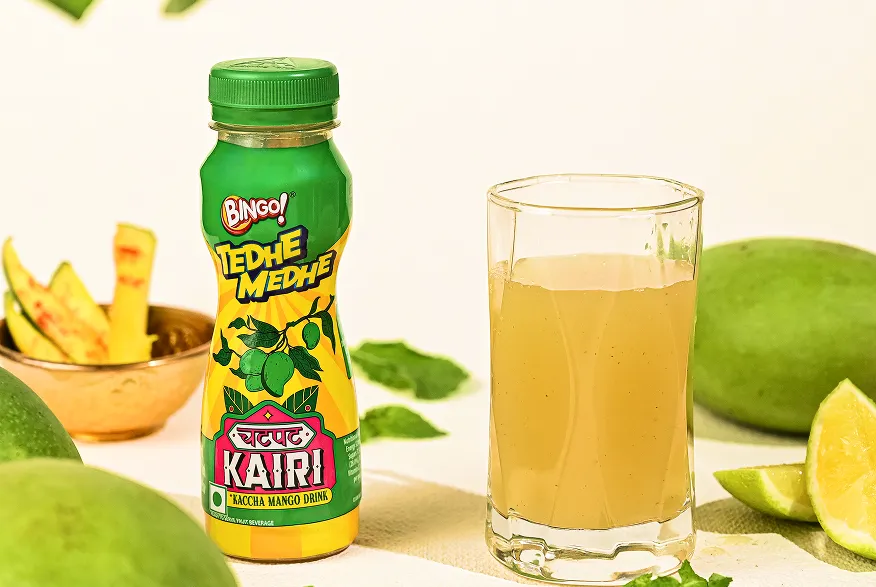
We do not treat hyperlocal branding as a checklist of regional symbols. We treat it as a strategic discipline that requires research, precision, and a clear understanding of what must stay fixed and what can flex.
✅ We research each market before we design for it
We do not work from mood boards of "regional inspiration." We conduct on-ground research into local values, consumer behaviour, cultural cues, and competitive dynamics.
For Aoba, this meant comprehensive market research and brand strategy development to ensure the new name and identity resonated with the target audience.
✅ We build systems that flex without breaking
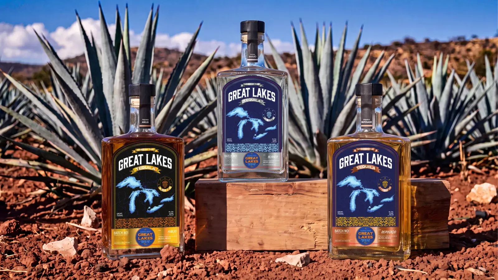
We design core brand assets including primary logo, colour palette, and foundational mission, to remain consistent across all markets. Secondary elements such as messaging, campaign themes, and packaging details are designed to adapt.
For Kooji, we built a single packaging structure across three product lines, then let each scent define its own visual universe inside it. The structural logic never changes, but the world inside it changes completely.
✅ We adapt visual language to local aesthetics without losing brand recognition
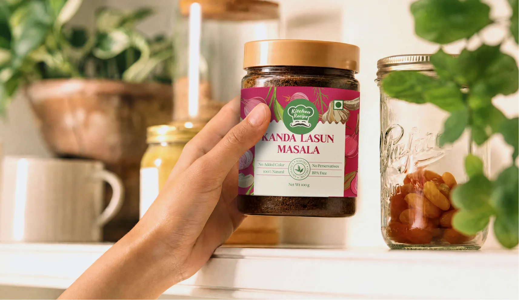
For Slosh & Co, we leaned into hyper-saturated neons layered with desi motifs, rooted in local flavour but unmistakably the brand.
✅ We treat language as transcreation, not translation
Location-specific messaging is more than swapping words. It is reshaping taglines, copy, and visuals for cultural meaning. We adapt messaging to reflect local priorities and concerns whether that means sustainability in one market or tradition in another, while keeping the brand voice consistent.
✅ We design packaging that performs in local retail environments
Packaging must hold its own against national and global competitors in the specific retail context of each market.
For Novis Bakery, we built a brand identity and packaging system for a brand rooted in the belief that people in Assam deserve bread worth buying.
✅ We maintain brand recognition across digital and physical touchpoints
Your brand identity shows up in packaging, web content, store signage, and social feeds. We ensure that every touchpoint reinforces your local roots while staying, you.
✅ We bring global perspective with local precision
We are an international studio working with brands across the UK, Australia, the GCC, and India. We understand that what works in one market will not automatically work in another.
We adapt colour, copy, and structure to meet the cultural and behavioural expectations of each market without losing the thread of what makes your brand distinct.
We build identities that travel. That hold together across markets. That feel local everywhere they go.
⚠️Tokenism
Using a regional symbol, colour, or phrase without understanding what it actually signals to people from that region.
This is usually the result of a design team working from a mood board of "regional inspiration" images rather than direct research or input from people who live in the market.
⚠️Fragmenting brand recognition
Adapting so heavily per market that the parent brand becomes unrecognisable across its own regions.
This usually happens gradually, one reasonable-seeming regional request at a time, without anyone tracking the cumulative drift against the brand's fixed elements.
⚠️Treating language adaptation as translation
A literally translated tagline usually loses the meaning it was built to carry, and can occasionally land as confusing or unintentionally funny in the new language. Budgeting for transcreation as a separate creative task, rather than a translation line item, avoids this.
⚠️Stereotyping instead of researching
Relying on assumed regional preferences rather than real category and consumer behaviour research specific to that market. Assumptions here tend to come from whatever regional reference is most visible globally, which is rarely the most accurate one.
⚠️Adapting the message but not the product
Regional messaging without matching format, size, or price adaptation reads as surface-level rather than genuine, and customers notice the gap between what a brand says about understanding their market and what it actually offers them.
⚠️Copying what worked in one hyperlocal market to another
A strategy that drove engagement in London will not automatically work in Riyadh. Each market has its own cultural logic, consumer behaviour, and competitive dynamics. Lifting and dropping without fresh research is not scaling, it is repeating someone else's homework.
⚠️Ignoring local distribution and retail realities
Hyperlocal branding fails when it is not backed by operational understanding. If your packaging does not fit local shelf configurations, or your pricing does not align with local purchasing power, the cultural relevance on the pack becomes irrelevant.
⚠️Overlooking local regulatory and cultural sensitivities
What is acceptable in one market may be offensive or illegal in another. Imagery, claims, and even colours can carry different meanings across borders. A brand that does not vet its hyperlocal execution against local norms risks reputational damage that regional relevance cannot repair.
What is hyperlocal branding?
Hyperlocal branding is the practice of adapting a brand's visual and verbal identity, color, language, symbols, and product presentation, to resonate with a specific city, region, or cultural context, while keeping the core brand recognizable across every market it operates in.
How is hyperlocal branding different from hyperlocal marketing?
Hyperlocal branding is a design and identity discipline: what a brand looks and sounds like in a specific region. Hyperlocal marketing is a media and promotion discipline: how a brand reaches nearby customers through geo-targeted ads and local search. They often work together but solve different problems.
What’s the difference between localization and hyper-local branding?
Localization adapts your brand’s messaging, visuals, and offers to suit a specific region or language. Hyper-local branding goes a step further, tailoring your brand identity to deeply connect with a small, specific community or neighborhood—reflecting its culture, values, and everyday life.
Does hyperlocal branding weaken brand consistency?
No, if it's done with clear boundaries. Consistency requires a small set of fixed elements, logo, core color, primary typography, that stay the same everywhere. Hyperlocal branding adapts everything outside that boundary. Problems only arise when there's no defined boundary at all, and adaptation is left to individual regional teams without a shared reference point.
How do global brands adapt identity for different cities or regions?
The strongest examples adapt with real specificity, referencing actual local architecture, materials, or symbols with understood meaning, rather than generic "local flavor" clichés like flag colors or landmark silhouettes. Weak adaptation relies on assumption; strong adaptation is grounded in real research into what a symbol or color actually signals in that specific place, and usually touches the product itself, not just its packaging.
Is hyperlocal branding relevant for D2C brands, or only large retailers?
It's relevant for any brand expanding beyond its home market or serving culturally distinct regions within one country, which includes most growing D2C brands in India. The scale of adaptation differs, a large portfolio brand might build multiple regional packaging variants, while a smaller D2C brand might start with transcreated messaging and regionally relevant color choices before investing in structural packaging changes.
How do I stay consistent while localizing my brand?
Define and stick to core brand elements such as your mission, tone of voice, and key visual motifs while allowing flexibility in details like imagery, language nuances, and campaign themes to suit local markets.
Can I change my logo for different regions?
Yes, but cautiously. Subtle variations like color adjustments, cultural symbols, or seasonal adaptations can help local relevance without diluting brand recognition.
Want strategic branding and packaging like this for your business?





.webp)
.webp)


.webp)
.webp)
.webp)
.webp)
.webp)







.svg)
.webp)