02
AI Snaps


01
Our Work
03
About Us
04
Brand Audit
05
Contact Us
06
Client Success
12
07
Blogs
08
Careers
Book A Call




Need Help In Building Your Brand?
Click the button below & book a call with our founder directly.

Rishabh Jain
Managing Director
Rebranding across borders involves making it resonate in new markets without losing what makes it distinctive. From naming and packaging to brand positioning and labelling, your brand success depends on knowing what to keep, adapt or replace.
As a branding and packaging design agency that serves clients across the globe, here’s what you need to know about adapting to new markets and preserving brand equity.
Rebranding across borders means changing how an existing brand is named, designed, labelled or positioned so that it works in one or more new countries.
But international expansion does not really require a complete rebrand.
The real task is identifying what needs to change, what should stay consistent and what the market requires.
The scope can vary from minor adjustments to creating an entirely new brand. Choosing the right level helps control costs, timelines and the risk of losing existing brand equity.
1. Regulatory and label adaptation
The identity stays the same, only required information changes, such as language, importer details, ingredient declarations, nutrition formats or mandatory symbols.
This is often the smallest intervention when the brand already fits the market.
2. Localisation
The brand retains its name and core identity but adapts its language, imagery, tone, pack sizes, variants or price architecture to local preferences.
This works when the brand proposition travels well but its expression needs adjustment.
3. Partial rebrand
One or two elements change because they create a specific problem in the new market.
This might mean changing a name that carries an unintended meaning, adjusting colours or redesigning packaging for local retail requirements.
4. Market-specific brand
The business creates a distinct name or identity for a particular market while retaining selected visual assets or a parent-brand endorsement.
This can help when the existing brand has limited relevance locally but the company wants to preserve some connection.
5. Global rebrand or new brand creation
The most extensive option changes the identity across markets or introduces a separate brand with no visible parent connection.
Toyota's creation of Lexus shows how a company can establish a distinct brand to serve a different market position. Such decisions require a clear strategic reason because they involve greater investment and can sacrifice existing recognition.
A simple label adaptation may be enough for a brand with strong international recognition. A new brand may be justified when the existing name or positioning actively limits its appeal.
A global rebrand can affect every SKU, product listing and market where the business already operates.
Unnecessary changes can also confuse existing customers, including travellers and diaspora shoppers who recognise the brand abroad.
This is different from building a global-ready brand identity from the start.
Here, the business already has a brand and needs to adapt it without losing the equity it has earned. The scope should match the gap between what the brand brings and what the new market requires.

Cross-border branding requires a clear distinction between what must stay consistent and what should change for local markets.
The right branding agency will help you preserve recognition while making the brand relevant to new customers.
Standardisation creates a consistent brand identity across markets, building recognition while reducing costs and simplifying brand management.
Core elements such as the name, logo, colours and visual identity remain consistent.
This approach works well when a brand has strong international recognition and its positioning resonates with local audiences.
However, consistency alone cannot overcome differences in local messaging, products or packaging expectations.
Adaptation allows brands to respond to local languages, cultures, buying habits and regulations.
Messages and packaging may need to change to suit local perceptions and expectations.
This balances both approaches by maintaining the core brand identity while adapting selected elements.
McDonald’s, for example, retains its recognisable global identity while adapting its menu to local markets.
💡 At Confetti, cross-border branding projects start first with deciding the core. Once that is written down, changes to it are treated as exceptions that need a reason.
Then we give each market room to adapt the flex layer within clear rules. That balance is easier to manage than either extreme, and it scales as markets are added.
Before changing anything, audit what the brand actually owns in the new market. The audit separates equity that travels from habit that should be retired.
Keep elements that customers recognise and that communicate the right meaning in the target market.
These may include the brand name, logo, signature colours and core promise, provided they pass linguistic, cultural and legal checks.
Adapt elements that remain useful but need local adjustments.
These might include packaging formats, typography for a different script, photography, tone of voice, product variants and promotional mechanics. The goal is to preserve recognition while improving local relevance.
Replace elements that create a clear problem.
A name with an unintended local meaning, a tagline that loses its meaning in translation, culturally inappropriate imagery or packaging that cannot meet local requirements may need to change.
Create a grid with brand elements in rows and target markets in columns. For each market, record the decision and the evidence behind it.
Review:
Use trademark searches, native-speaker reviews, regulatory checks, local shelf and marketplace audits, and feedback from distributors or target customers.
A distributor’s recommendation can be useful, but test it against other evidence before changing a recognised asset.
Confetti’s work for Kitchen Recipe, a spice and dry fruit brand from Sangli, Maharashtra, illustrates the principle. The family’s logo had decades of recognition, so it stayed. Devanagari was added to the back of every pack to serve local shoppers better. The recognised asset remained; the local layer adapted.
The same approach applies across borders. If most elements can stay or be adapted, localisation may be enough.
If one element, such as the name, fails in a particular market, a partial rebrand may be justified. If several core elements fail across markets, a broader rebrand may deserve consideration.
▶️For every asset check: Is it recognised, relevant and usable in this market? Keep it when all three hold, adapt it when a targeted change can fix the gap, and replace it when the risk or mismatch cannot be resolved.

The name is the highest-stakes decision in cross-border rebranding.
A brand name carries recognition, meaning and legal risk.
Changing it across borders can weaken existing equity, but keeping it without checking how it works locally can create problems after launch.
1. Keep the name
Retaining the original name preserves recognition and consistency across markets.
It works when the name is legally available, easy enough for local customers to pronounce and free from unintended cultural meanings.
Nike and Apple are the best examples of how a consistent name can support a global brand.
2. Transliterate the name
Transliteration represents the name’s sound in another writing system. This is useful when entering markets that use Arabic, Chinese, Cyrillic or other scripts.
Coca-Cola's Chinese transliteration, Ke Kou Ke Le, is the classic success. It sounds like Coca-Cola and means “tasty and joyful”. But transliteration is not risk-free. It must be tested for unintended meanings in the local language.
However, the result must be checked for pronunciation and unintended meanings.
3. Translate or adapt the meaning
This works when the name has conceptual meaning and the translation respects local idioms.
But direct translation often fails. Coca-Cola originally used a transliteration that meant “bite the wax tadpole”.
Mitsubishi had to rename the Pajero to Montero in Spanish-speaking markets because of the term's slang meaning.
KFC's “finger-lickin' good” became an invitation to “eat your own fingers” in Chinese.
4. Rename for the market
A new name may be necessary when the original conflicts with an existing trademark, carries unacceptable cultural associations or cannot support the intended positioning.
This creates additional costs and requires the brand to build recognition under a new name.
Burger King’s Australian franchise opened as Hungry Jack’s in Perth in 1971 following a trademark issue.
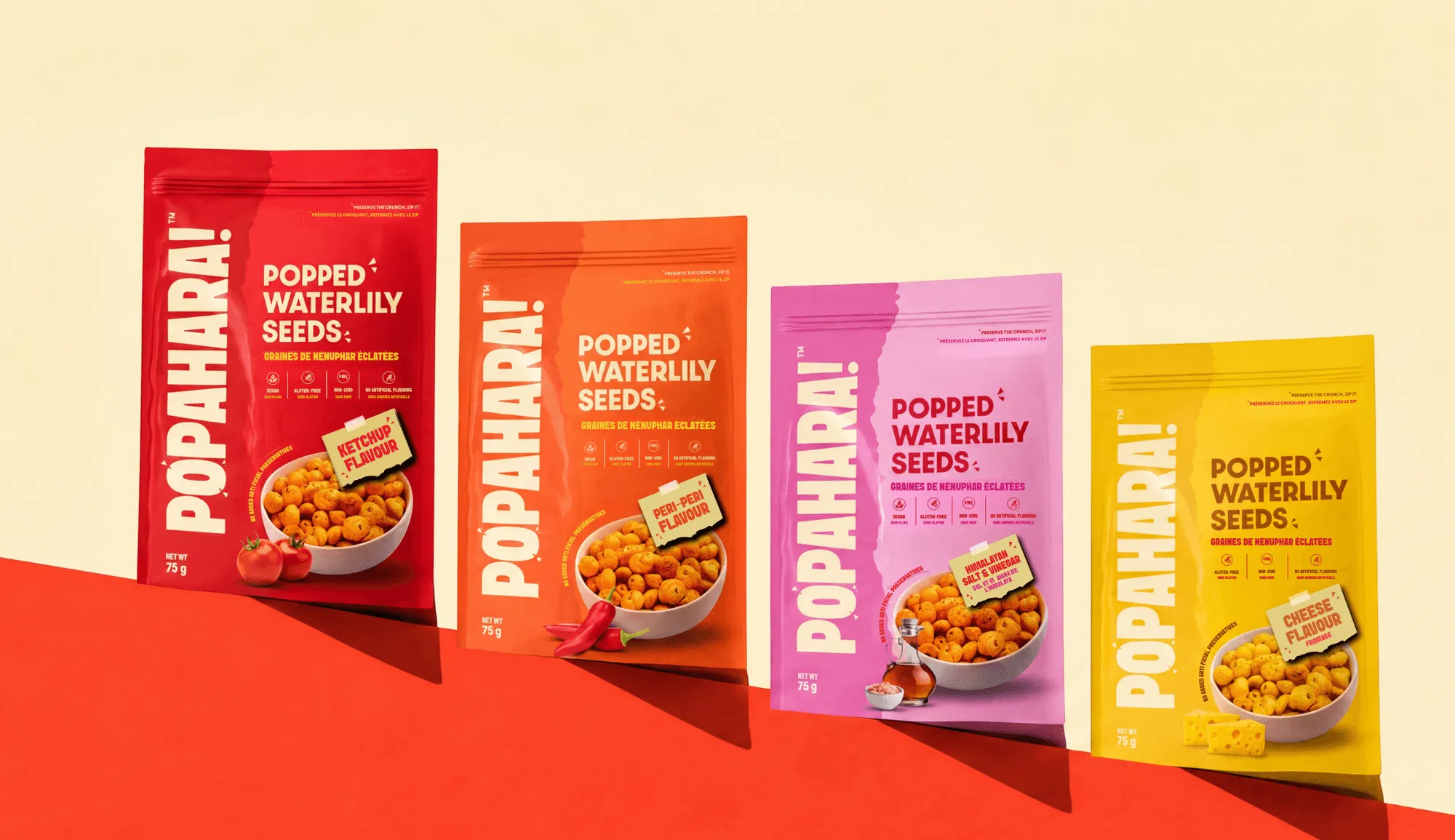
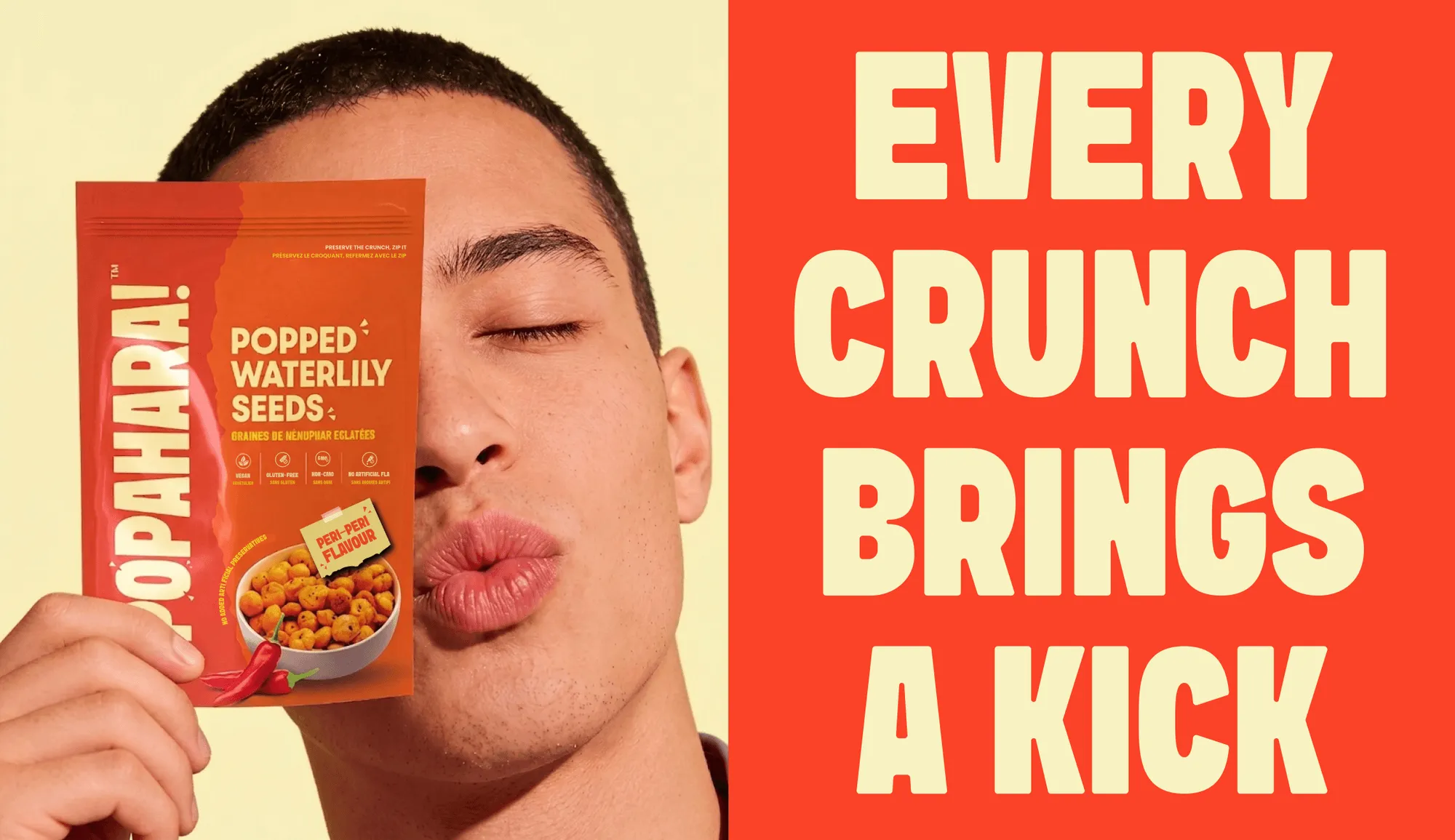
For Popahara, a Canadian makhana snack brand, Confetti created a name combining “Pop”, which signals crunch, with “Ahaar”, the Sanskrit word for nourishment.
The name made the product’s appeal accessible to Canadian consumers while retaining a connection to its Indian roots.
Before approving a name, complete trademark searches in each target market and relevant class.
Ask native speakers to assess pronunciation, meaning and cultural associations. Check how the name reads in local scripts, along with domain and social handle availability. Where possible, test shortlisted names with target customers.
▶️The decision should be evidence-led. Finding a naming problem before launch is far less disruptive than changing a printed identity, product listings and packaging after entering the market.
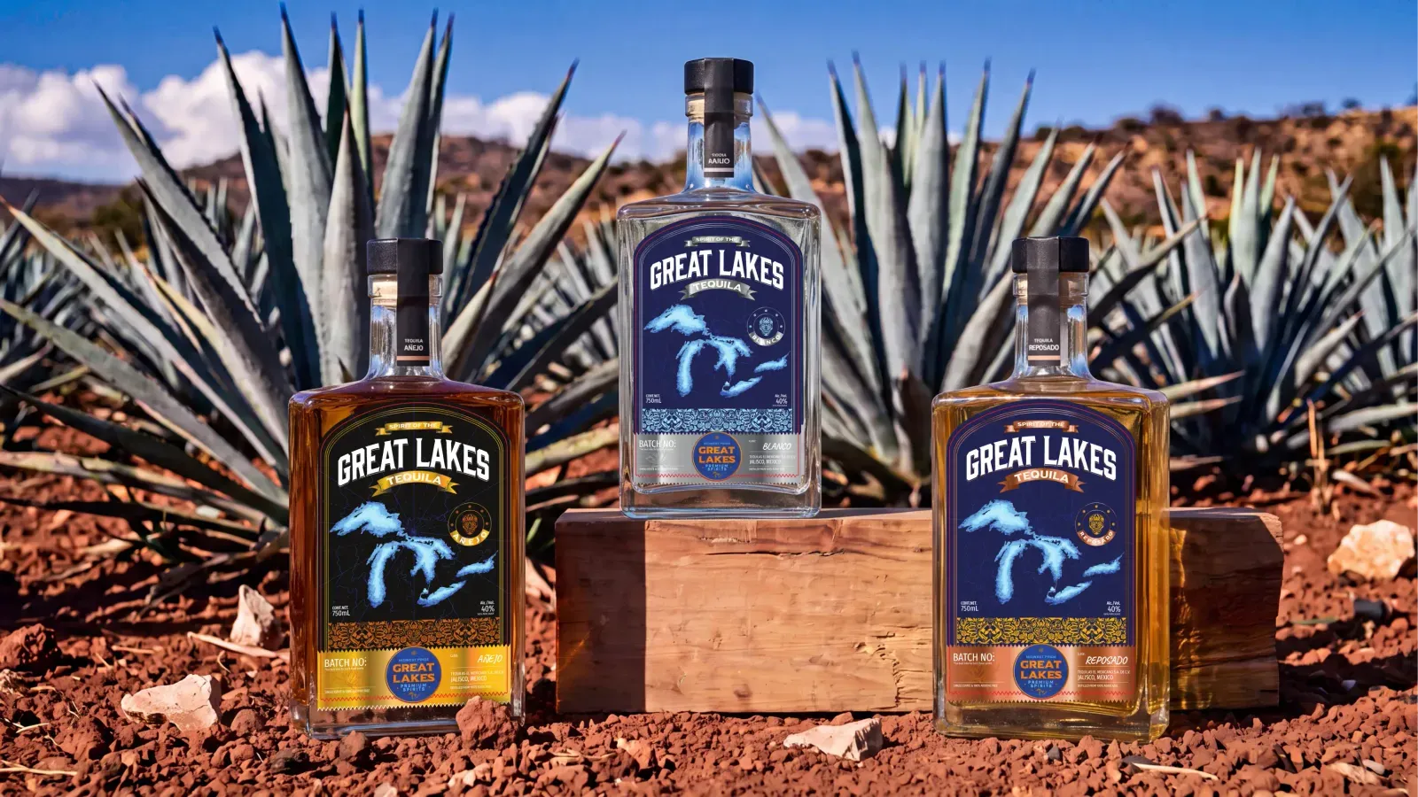
Packaging is where cross-border brand strategy meets compliance needs. The challenge is to preserve a consistent identity while adapting labels, formats and materials to each market's requirements.
There is no single global labelling and packgaing design standard. Requirements vary by product category and country.
Apart from these, the EU's Packaging and Packaging Waste Regulation (PPWR) began applying on 12 August 2026, introducing a wider framework for packaging composition, recyclability and waste reduction, with some requirements taking effect later.
Brands exporting to Europe need to assess how these rules affect their packaging choices.
Avoid finalising the home-market artwork before considering export requirements.
Instead, define fixed brand elements, such as the logo, primary colours and typography, alongside flexible zones for translations, ingredients, warnings, certification marks and importer details.
Plan multilingual panels from the start, allowing enough space for the longest text while maintaining legibility.
Then decide whether one multi-market pack or separate market-specific versions make more sense.
The decision depends on sales volumes, storage complexity, regulatory requirements and retailer needs.
Local requirements extend beyond labels. Pack sizes, price points, retail conventions, climate and distribution methods can affect whether a format works.
A pack designed for a supermarket shelf may need additional protection for e-commerce transit, while heat and humidity can affect materials, adhesives and product integrity.
▶️Map regulatory requirements before artwork is finalised, confirm them with a qualified adviser or local importer, and build flexibility into the packaging system. This reduces avoidable redesigns while protecting brand consistency.
A cross-border rebrand needs a phased rollout. Even the right brand decisions can lose value if markets launch without coordination.
Phase 1: Pilot the rebrand in the most demanding market
Launching everywhere at once multiplies risk. Pick a lead market, learn from it, then roll out in waves.
The market with the tightest regulatory requirements, the most competitive shelf, or the most culturally distinct customer is the best pilot.
If the brand works there, it will work in easier markets. If it fails there, the failure is contained.
Phase 2: Build the central asset system before local rollout
A central hub for approved assets, templates, and brand guidelines allows local teams to execute without reinventing the brand in each market.
The infrastructure is not a nice-to-have; it is what prevents the brand from fragmenting across markets.
The brands that get this right treat brand strategy as infrastructure: a system that has to hold together across dozens of markets and teams,not as a campaign or a single rebrand.
Phase 3: Empower local teams within guardrails
Local teams need the flexibility to adapt tone, imagery, and channel execution to their market. But the flexibility must be bounded by the core.
The most effective systems provide templates as starting points, not straitjackets, and a clear approval path for use cases that fall outside the templates.
Phase 4: Monitor and adjust
Cross-border rebranding is not a one-time event. Customer response, competitive reaction, and regulatory change will require adjustments.
The brand system must be built to evolve without being rebuilt.
The timeline
A full cross-border rebrand usually runs 12 to 24 months from strategy to full rollout, depending on the number of markets, the regulatory complexity, and the number of SKUs.
A single-market adaptation can be delivered in 8 to 16 weeks. The timeline is determined by regulatory approvals, production lead times, and the speed of local decision-making.
Sometimes, the audit reveals that the problem extends beyond the new market. The existing brand may need to change at home, too.
A global rebrand creates brandconsistency across markets, but it can weaken existing recognition and costs more than local adaptation.
A phased approach may be safer: refresh the home identity first, making it suitable for international use, then extend it as new markets open.
This spreads costs over time and gives existing customers a chance to adjust. A simultaneous global rebrand avoids running two identities in parallel but concentrates the investment and risk.
Compare both options against your expansion timeline, number of target markets and the equity your current brand holds at home.
Not every market needs the same brand name. You can use the parent brand everywhere, create locally named brands endorsed by the parent, or operate separate local brands.
Unilever's ice cream portfolio, for example, uses different regional names under its shared Heartbrand identity.
The right choice depends on how much recognition the parent brand carries abroad and how different the target markets are. A global rebrand is only one option, not the default.
✅ Our team works across three time zones.
With 40+ people spread across three time zones, we have built the internal rhythm for cross-border work, overlapping hours with GCC, India, and Western markets
There will be no lag that slows a rebrand down when every decision has to wait for a single timezone to wake up.
✅ We have delivered across the US, UK, Australia, Canada, UAE and India
Our client base is not domestic with an international footnote. We have taken brands into English-and-French Canada, into UAE retail, and into markets across Europe and North America.
This means we have already made the keep/adapt/replace decisions that a first-time cross-border rebrand gets wrong.
✅ We work on the compliance layer, not just the design layer
Cross-border rebrands fail at the labelling, language and regulatory surface before they fail aesthetically.
We map mandatory information, bilingual requirements, and market-specific conformity marks before artwork is finalised, so the system can absorb a second market without a redesign.
✅ We design the system, then the market entry
Modular packaging, adaptable compliance panels, and identity frameworks that can be extended to the next market, not a single fixed artwork that has to be rebuilt every time the brand crosses a border.
The second market should cost less than the first, and we build for that.
✅ We have done this across categories where the stakes are real
FMCG, food and beverage, beauty, fashion, lifestyle, brands sold on shelves in Dubai, in Canadian grocery, and through export channels.
Different categories, same discipline: the core holds, the expression flexes, and the pack works in every market it enters.
Taking a brand across borders? Schedule a consultation and we will map the keep, adapt, and replace decisions before you commit to the first market launch.
The brands that cross borders successfully decide what is core and what is expression, and they build a system that holds both.
McDonald's: fix the system, flex the menu
McDonald's keeps the Golden Arches, the service model, and the brand promise consistent, while adapting the menu to local tastes.
Spicy Paneer burgers in India, rice menus in Asia, and festival-linked campaigns in local markets.
Lesson: the core is the operating system; the menu is the application layer.
Airbnb: fixed purpose, localised experience
Airbnb's “Belong Anywhere” positioning stayed fixed while the platform localised listings, UI/UX, and language for each market.
The rebrand itself was a repositioning from a listings marketplace to a global community, with the visual system built to carry that reframed positioning, not the other way around.
Lesson: the strategy comes before the symbol, and the symbol must be built to travel.
IKEA: same aesthetic, local relevance
IKEA keeps its blue and yellow identity and flat-pack model consistent, while adapting store experiences and product ranges to local homes and habits.
Lesson: the brand codes travel; the retail experience is where local relevance is built.
Danone → Dannon: adapt the name to the market's mouth
The French group entered the US in 1942 and changed Danone to Dannon to suit American pronunciation. The product, the packaging, and the promise stayed.
Lesson: when the name is the barrier, change the name, not the brand.
Bimbo: keep the parent, protect the consumer brand
Grupo Bimbo's name carries an unfortunate meaning in English, so its US arm operates as Bimbo Bakeries USA while shoppers buy Entenmann's, Thomas', Sara Lee, and Oroweat.
Lesson: a corporate name can survive a market where a consumer name cannot.
Axe → Lynx: rename where trademark blocks you
Unilever launched Axe in France in 1983 but sold it as Lynx in the UK, Ireland, Australia, New Zealand and China because the Axe name was already taken. The brand system stayed; the name did not.
Lesson: trademark clearance is a market-entry decision, not a legal afterthought.
What does rebranding across borders mean?
Rebranding across borders means changing how an existing brand is named, designed, labelled or positioned so it works in one or more new countries. It ranges from adapting labels and packs for local rules, to renaming the brand in a market, to rebuilding the identity for all markets at once. The right scope depends on what actually fails to travel.
Should a brand change its name when entering a new country?
Only if the current name fails a specific test in that market: it is already trademarked there, it is hard to pronounce, it carries an unwanted meaning, or it reads as the wrong category. Burger King trades as Hungry Jack's in Australia because the name was already registered there. If the name passes those checks, keeping it is usually cheaper and safer.
What is the difference between localization and standardization in branding?
Standardization keeps the brand the same everywhere, which saves cost and builds one consistent identity. Localization adapts it to each market's language, culture, rules and buying habits. Most brands do both: they fix the core, such as the name, logo and promise, and adapt the expression, such as packaging copy, imagery, product range and pack sizes.
How do you adapt packaging for international markets?
Start with the rules: mandatory languages, ingredient and nutrition formats, importer details and claims. Then check the retail environment, pack sizes and price points buyers expect. Keep the brand's recognisable assets, adapt copy and imagery where needed, and redesign the back panel for the longest bilingual version of the text rather than squeezing a translation into leftover space.
Do I need a full rebrand to expand internationally?
Usually not. Most brands entering a new country need label and packaging adaptation, some localised copy and imagery, and a checked name, not a new identity. A full rebrand makes sense when the home identity already limits growth, when the brand will run as one global identity across many markets, or when the name cannot be used in key markets.
Want strategic branding and packaging like this for your business?