%201.webp)
02
AI Snaps
.svg)
.svg)
01
Our Work
03
About Us
04
Brand Audit
05
Contact Us
06
Client Success
12
07
Blogs
08
Careers
Book A Call
.svg)


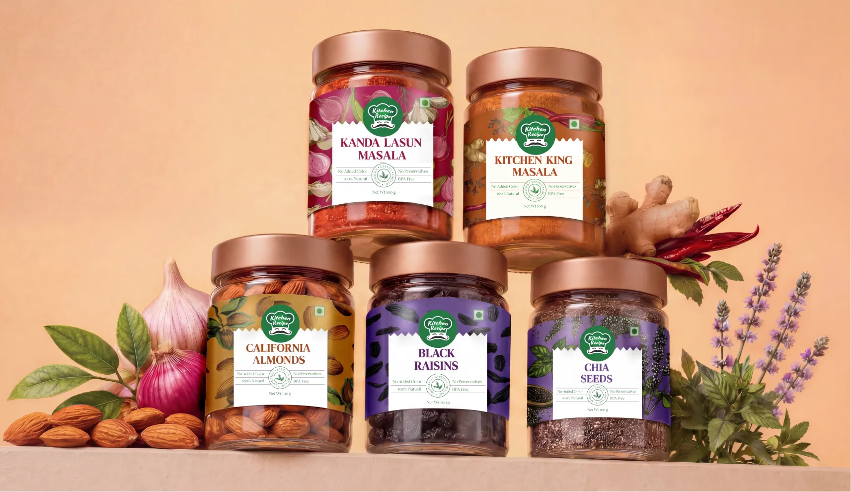
Kitchen Recipe is based in Sangli, a city in Maharashtra that sits along the Krishna river and carries the title of India's Turmeric Capital. The land around it has been growing turmeric for generations, and Kitchen Recipe has been part of that story since 1972, when they began large-scale production of turmeric powder, an ingredient that sits at the centre of Indian cooking and increasingly the world's.
What started as a turmeric business has grown into a full spice and dry fruit range: haldi, jeera, red chilli, coriander, kanda lahsun masala, alongside almonds, raisins, pistachios, cashews & more. The business runs on a farm-to-packet model, selling organic spices and dry fruits with no added colours, and is built on relationships with farmers and suppliers across the state. It remains a family-led business with an ambition to become the largest-selling masala brand in India by 2026.
Confetti was brought in to build the visual identity and packaging system that could carry that ambition forward.
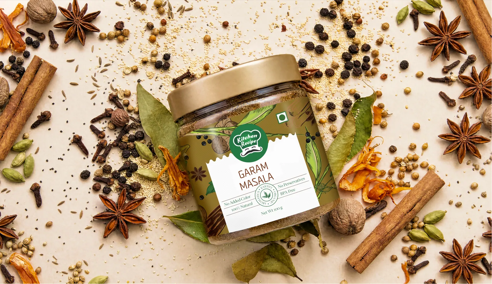
Kitchen Recipe's logo was not on the table. The family had built genuine recognition around it over decades, and changing it would have meant asking customers to relearn something they already trusted. That's a reasonable position for a brand with this much history, but it created a real design problem. How do you build a modern visual identity across an entire product range when the one fixed element in the system is a logo that was never designed with a system in mind.
The product range itself added scale to the challenge. Multiple spice categories, dry fruits, jars, and sachets, all needing to feel like they belonged to the same brand while staying clearly differentiated from each other on a shelf where a homemaker is making a purchase decision. Kitchen Recipe is genuinely very affordable compared to their competitor brand. And hence their packaging needed to read as trustworthy and well-made without drifting into a premium positioning the brand wasn't trying to claim.
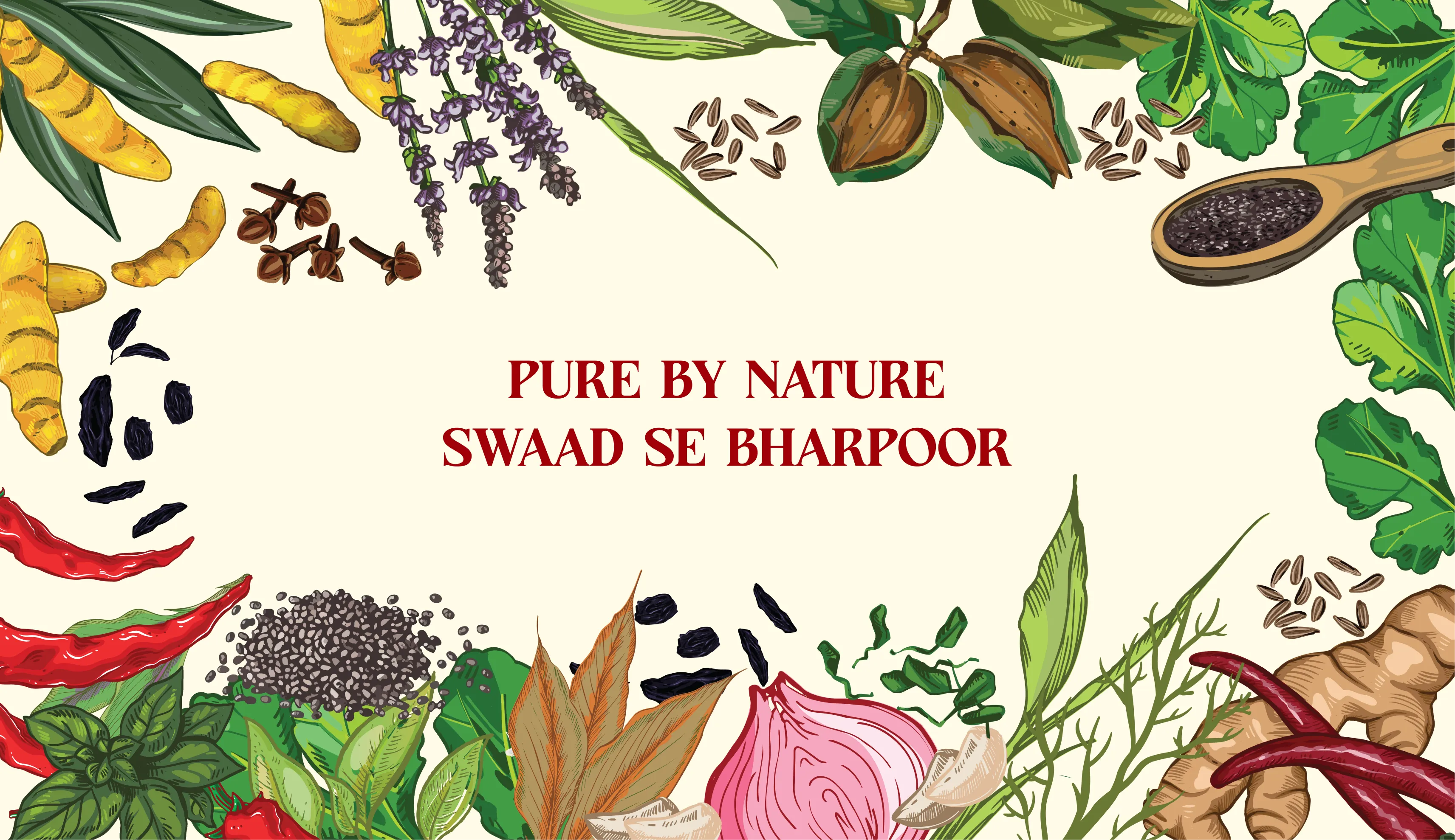
The starting point for every decision was the existing logo. Confetti's work was to build a complete visual identity, typography, colour, layout and packaging structure, that could sit around it cohesively, so that the logo people already recognised felt like the anchor of something prominent rather than an old asset merely bolted onto new packaging.
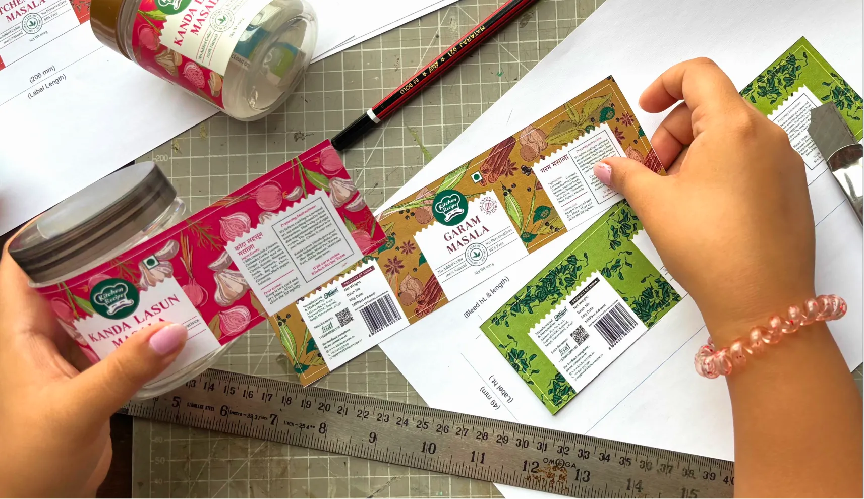
The client's instinct for the packaging direction was illustrative, and Confetti built a full visual language around it. Each product has illustrations specific to what's inside. Kanda lahsun masala features garlic and onion artwork. Turmeric powder carries imagery built around the root itself. Black raisins sit against a purple backdrop with raisin illustrations that make the product instantly identifiable even from a distance on a crowded shelf.
This kind of specificity matters more in a spice aisle than almost anywhere else in a grocery store, because the products often look similar in form and the packaging is doing all the work of differentiation. A homemaker scanning a shelf for kanda lasoon masala should be able to find it by colour and illustration alone, without needing to read the label closely.
Devanagari script was introduced across the back of the pack for every product, written for the local audience Kitchen Recipe actually serves. It's a detail that does real work. A brand rooted in Maharashtra, speaking to homemakers in Maharashtra in a script they read comfortably, builds a kind of trust that English-only packaging can't replicate.
For products like red chilli powder, coriander powder, and turmeric, Kitchen Recipe wanted to introduce ten-rupee sachets aimed at travellers and smaller households. Rather than following the standard square sachet format that dominates the category, Confetti designed them in a vertical shape, a small but deliberate decision that makes Kitchen Recipe's sachets recognisable at a glance against a wall of identical-looking competitors.
For the jar range, Confetti suggested adding a gold cap, a simple addition that lifted the perceived quality of the product without changing the pricing strategy behind it. It's the kind of detail that makes a jar feel prominent on a shelf even when it's sitting at an accessible price point, which mattered for a brand that wanted to feel premium in craft without becoming premium in cost.

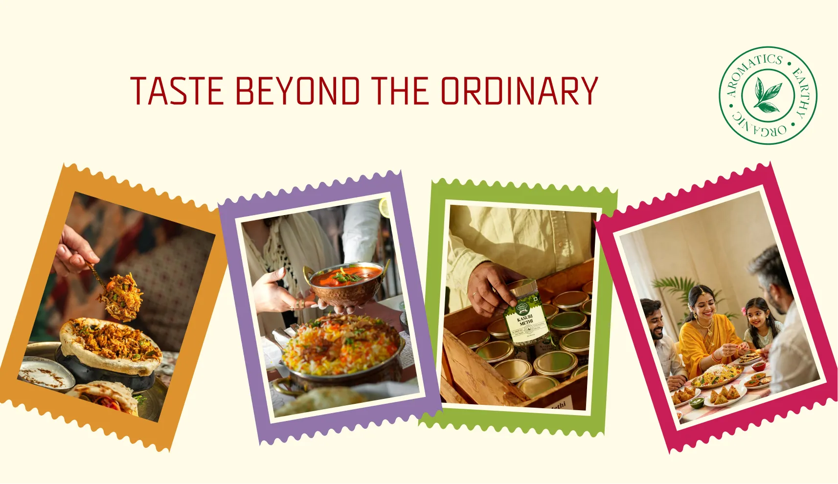
Kitchen Recipe now has a packaging and brand system that holds together across a genuinely wide product range, multiple spices, dry fruits, jars, and sachets, while keeping the logo the family had built their reputation on fully intact. The illustrations make every product identifiable at speed, which matters enormously for a homemaker shopping quickly. The Devanagari script connects the brand to the audience it has always served. And small details, the vertical sachets, the gold caps, give the range a sense of care that a 50 year old spice brand competing on value had not had before.
For a business built on farm to packet integrity and decades of trust in Sangli, the new system gives Kitchen Recipe a visual identity that finally matches the quality of what's inside the packet, without asking customers to let go of the one thing they already knew.
If you have a legacy brand that needs a modern system built around what already works rather than against it, that's exactly the kind of project Confetti is built for.











.svg)
.svg)
.webp)
.webp)

.svg)