%201.webp)
02
AI Snaps
.svg)
.svg)
01
Our Work
03
About Us
04
Brand Audit
05
Contact Us
06
Client Success
12
07
Blogs
08
Careers
Book A Call
.svg)


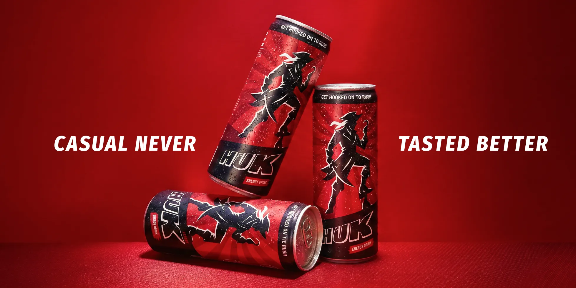
Elixir 9 is a new energy drink company with a straightforward premise that the market has options, but none of them were built for the young Indian who is managing a degree, a side income, and a fitness routine on a budget that doesn't stretch to premium imports. Huk is their answer to that gap. Confetti was brought in before the brand had a name the market had heard, before it had a can on a shelf or a follower on Instagram. The brief was to build everything, and to build it in a way that could compete with giants that had been in the room for decades.

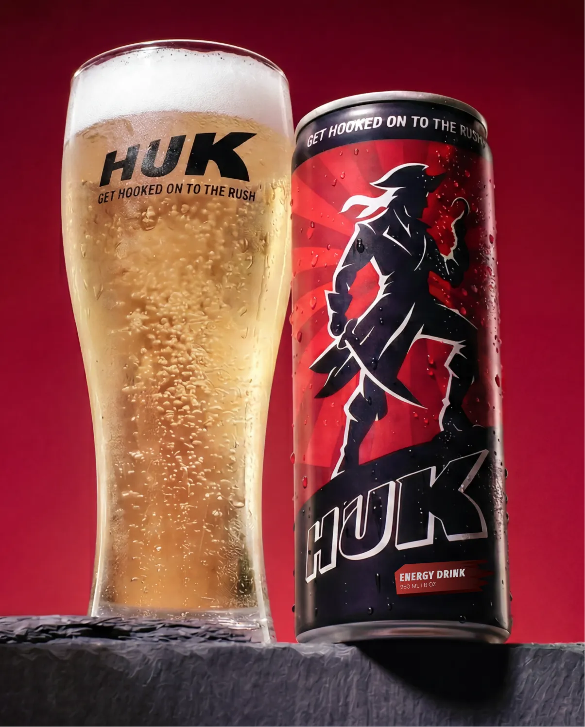
When it comes to energy drinks, Red Bull, Monster, Bang, and V Energy have the shelf space, the distribution, the cultural presence, and the marketing history. A new entrant has a narrow window to say something different before the customer reaches for the familiar option. The specific challenge with Huk was positioning affordability and authenticity together without either one undermining the other.

No existing brand presence, visual identity, or customer base to build from
A category defined by established global players with significant recognition advantages
A product that needed to feel premium in character while staying accessible in price
A need for a system that could extend into merchandise, digital, retail, and community without fracturing
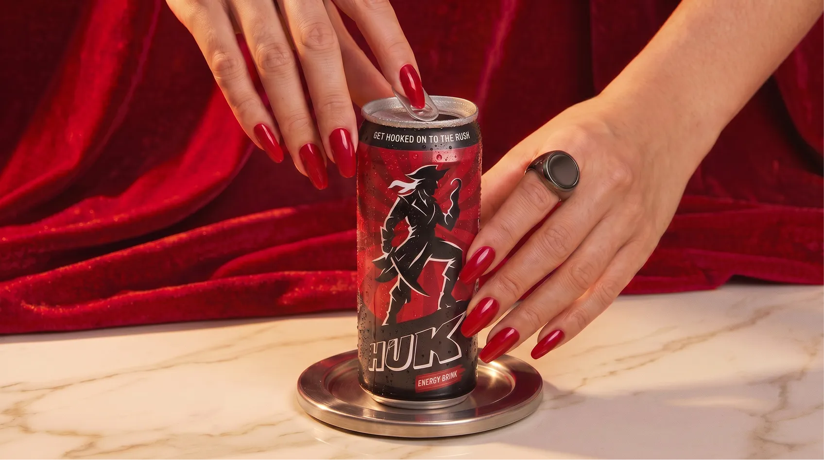
The brand’s name “Huk" comes from wordplay around the word “hook” which stands for sharp, sudden, the kind of thing that catches you before you've even decided to be caught. The wordmark carries that through the block-style, forward-leaning, thick black outline, a jagged K that pushes the whole word into motion. Then came the mascot inspired by the idea of having a pirate with a hook, sitting on the can, full of attitude and a little bit of menace. It gave the brand something rare in this category, a character. Not a symbol nor an icon, but an actual personality that lives across packaging, merchandise, and campaigns and makes people look twice every single time.
Some of the most important creative decisions Confetti made for Huk were subtractive. The identity was built from those refusals as much as from what Huk wanted to be, because in a category full of noise, the clearest way to stand out was to be the brand that didn't shout.
The audience work Confetti did, two detailed personas became the filter for every design decision. Would this feel real to someone managing Rs 40,000 a month across rent, gym, and ambition? Would this feel worth picking up for a student running four things at once? If the answer was no, the decision changed.
Huk launched with three flavours. The plan includes functional variants, sustainable packaging, retail partnerships, and a community programme. The brand system Confetti delivered was built to absorb all of it.
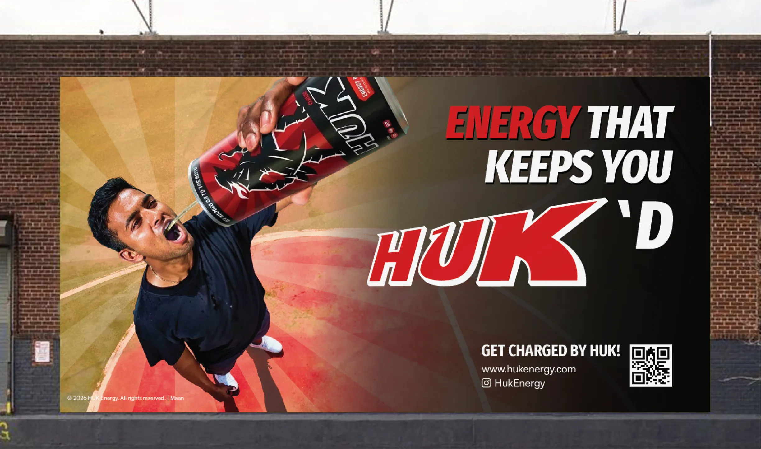
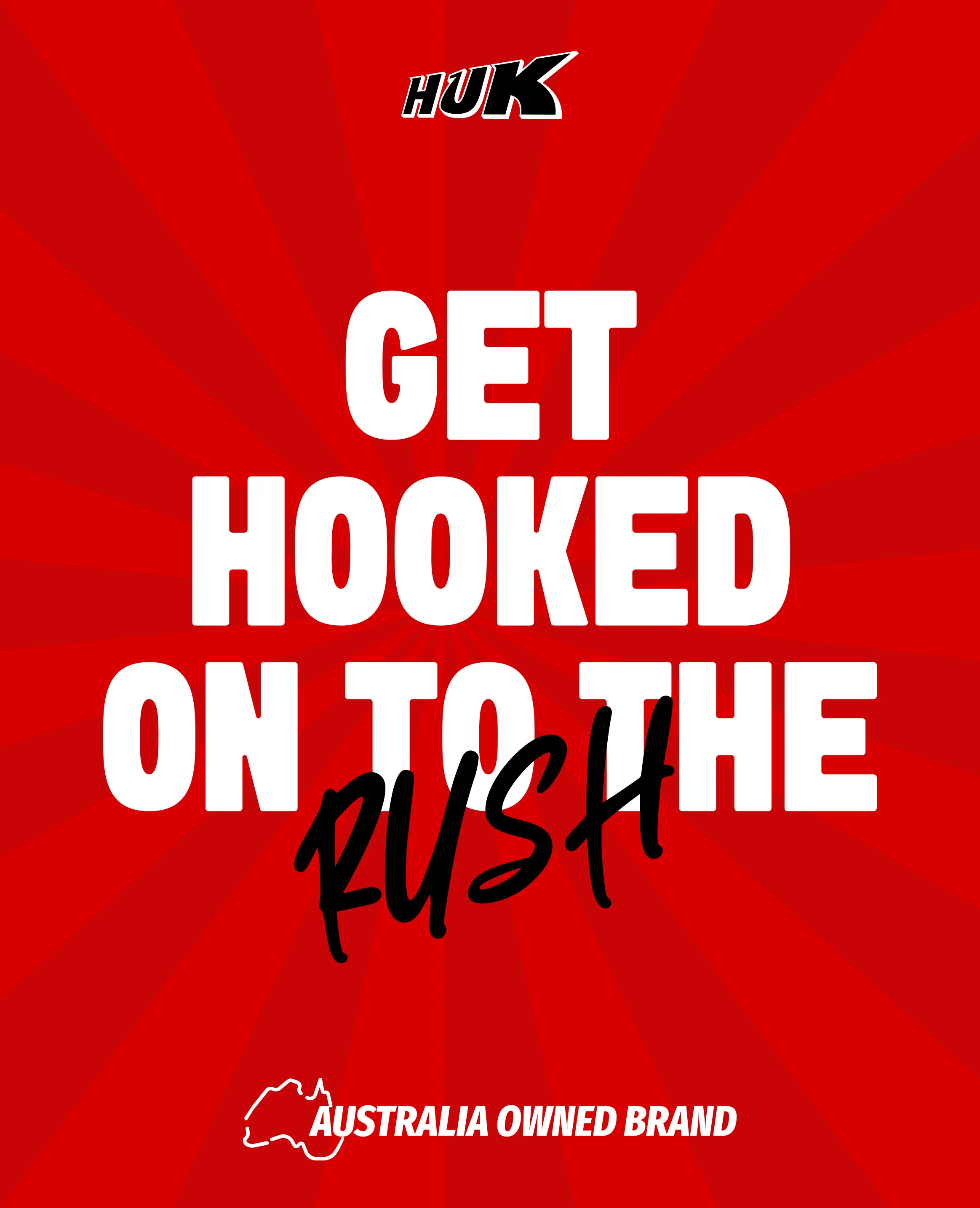
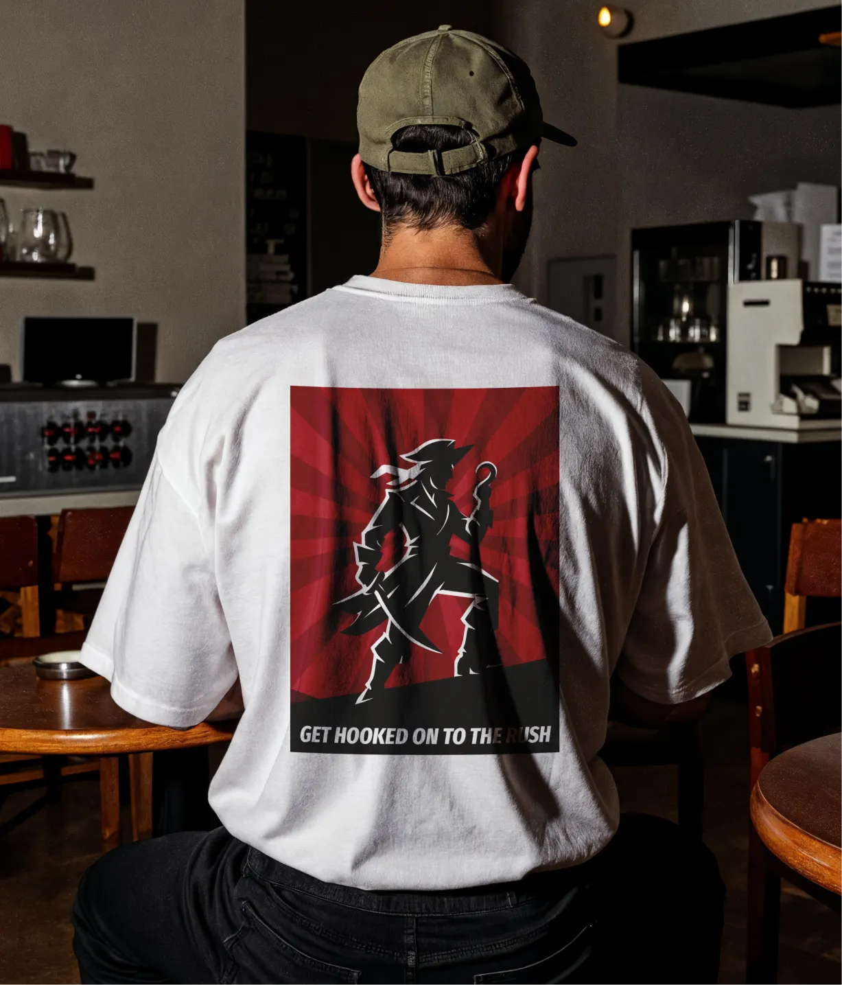
Huk went from a brief to a complete brand identity ready to compete in one of India's most crowded consumer categories. The logo holds across every format. The mascot gives it a face that's genuinely hard to forget. The voice holds across every platform. And the system has room to grow into everything Elixir 9 has planned. For a brand entering a category this established, the goal was never to out-spend the existing ones. It was to out-think them and that's what Confetti has exactly built.
If you're launching in a competitive consumer category and need a brand that can go the distance from day one, Confetti knows how to build it.
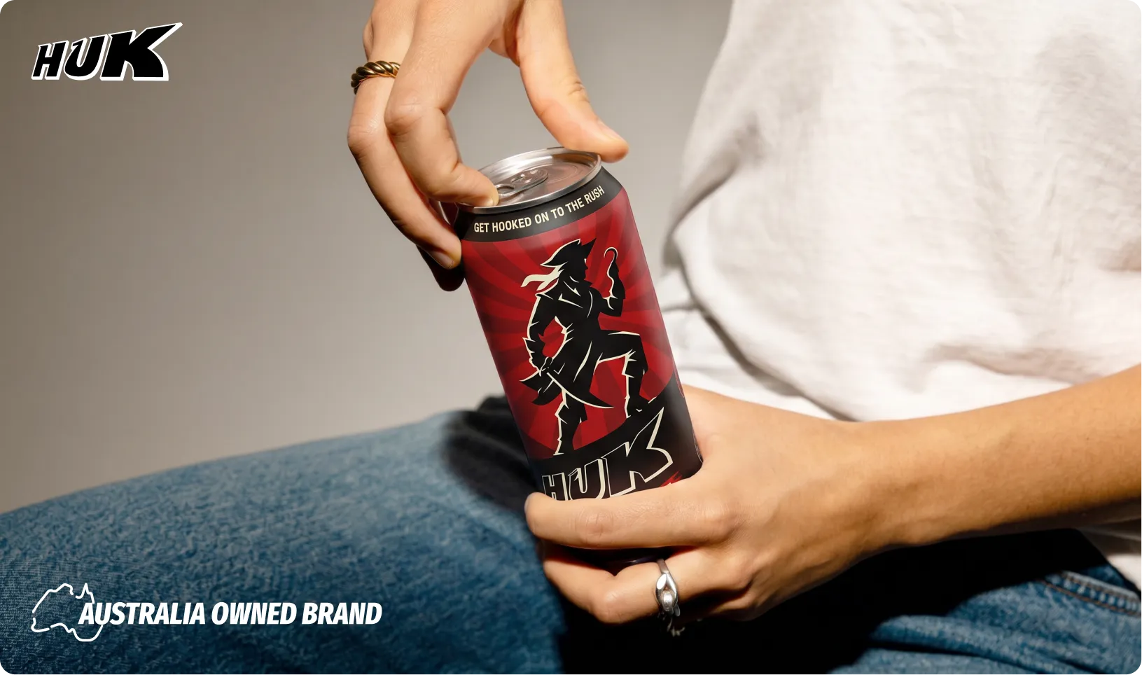
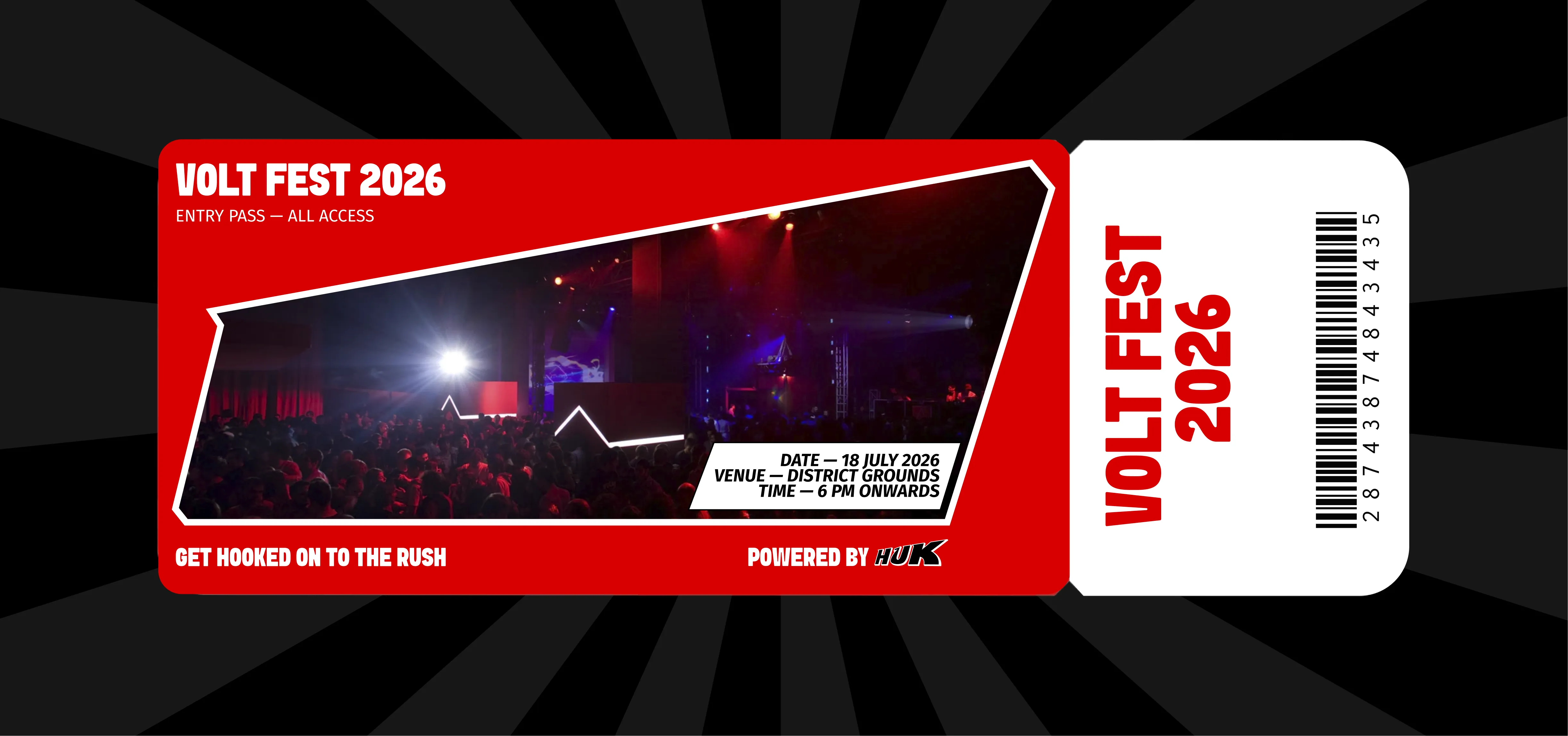











.svg)
.svg)
.webp)
.webp)
.svg)