02
AI Snaps


01
Our Work
03
About Us
04
Brand Audit
05
Contact Us
06
Client Success
12
07
Blogs
08
Careers
Book A Call




Need Help In Building Your Brand?
Click the button below & book a call with our founder directly.

Rishabh Jain
Managing Director
The task for heritage branding is to make that trust earned through years legible to a generation that has no memory of why it was earned. That requires a specific discipline: knowing what to keep, what to evolve, and what to retire.
This Confetti post covers how to tell real heritage from age, how to audit what to keep, what research says about updating heritage products, how to modernise the identity, and when a refresh is enough.
Heritage branding is the strategic use of a brand’s history, craftsmanship, provenance and accumulated trust to stay relevant to today’s customers. It turns what a brand has earned over time into a reason to choose it now.
Heritage is valuable when it offers something competitors cannot easily reproduce: a founder’s story, a longstanding relationship with customers, specialist expertise or a meaningful cultural connection.
The challenge is to make that history important to new and existing audiences without becoming trapped by it.
Retro design for its own sake: Vintage typography, traditional colours and nostalgic packaging design do not automatically communicate authenticity or quality. Without a meaningful connection to the brand’s history, they can make the business look outdated rather than established.
Refusal to change: A long history does not guarantee future relevance. Customer expectations, shopping habits, product categories and competitors evolve. Legacy brands must adapt their identity and experience while preserving what customers value about them. Reinvention can be part of protecting a brand’s heritage, not abandoning it.
A complete rebrand. When a brand has strong recognition and customer trust, replacing its identity entirely may put valuable equity at risk. A considered refresh can update its visual identity, packaging, messaging and digital presence while retaining familiar cues that customers recognise.
👉Heritage is an asset, not a design style. The work lies in identifying what deserves to be protected, what needs to evolve and how to make the brand’s history matter to the next generation of customers.
Heritage is a collection of elements that together create the brand's accumulated meaning. Understanding each element is the first step to deciding what to keep, evolve, or retire:
Brand History and Origins
The founding story, year, place of origin, and circumstances that shaped a brand form the raw material of heritage. But history becomes heritage only when made relevant. A brand founded in 1946 has a history; whether it resonates with a 25-year-old in 2026 depends on how that history is framed.
Founder Story
The people behind a brand, their values, motivations, and struggles, form a powerful part of its heritage. Founder stories are distinctive and human, but their true value lies not in chronology, but in the principles that continue to guide the business today.
Cultural and Regional Identity
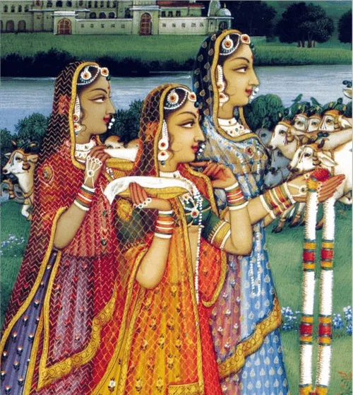
A brand’s place of origin, cultural roots, and regional traditions are powerful heritage assets. In India, Kooji a brand from Kannauj evokes the perfume capital, while Forest Essential draws on royal craftsmanship. Such cultural identities are difficult to replicate and increasingly valuable to consumers seeking authenticity.
Craftsmanship and Expertise
The skills, techniques, and processes a brand has refined over time form its craftsmanship heritage. These distinctive methods signal quality, longevity, and human expertise, qualities increasingly rare in a market dominated by mass production.
Established Brand Values
The principles a brand consistently upholds such as trust, purity, quality, fairness, and innovation become heritage when demonstrated over decades, not merely stated in a mission statement. Dabur, for instance, has built its brand identity around heritage, purity, and health across product categories and generations.
Signature Products
The products that made the brand famous. The ones customers associate with the name. Amul means butter. Parle-G means biscuits. These signature products are heritage assets because they carry memory and association. The challenge is extending that association without diluting it.
Visual Brand Assets
The logo, the typography, the colours, the packaging format, the tagline. These are the visible markers of heritage. Some are worth preserving because they trigger recognition. Others are worth evolving because they signal outdatedness. The skill is telling the difference.
Brand Traditions and Rituals
The recurring behaviours, campaigns, or seasonal moments that customers associate with the brand. Traditions create continuity and emotional connection. But they must remain relevant, not become ceremonial.
Before redesigning a legacy brand, identify which parts of its identity carry genuine value and which survive mainly through habit. A heritage audit helps separate customer recognition from internal attachment to the past.
Preserve elements customers recognise, associate with quality and still find relevant. These may include a distinctive logo, signature colour, familiar packaging, a product tradition or a name with a strong reputation.
Examples include the Amul Girl and the Parle-G wrapper. Their value comes from the recognition and associations they have built over time, not simply their age.
Some assets remain valuable but no longer work well across modern channels. A detailed logo may lose clarity on mobile screens, typography may become difficult to read on small packaging, or an established pack format may not suit e-commerce.
Refine these elements without removing the cues customers rely on. In Confetti’s work with Cookwell, the logo was refined rather than replaced, retaining its connection to the original identity while giving it a cleaner, more contemporary appearance.
Remove elements that customers barely recognise, no longer find relevant or associate with an outdated position. These might include an unused tagline, an ineffective colour scheme or packaging that adds cost without improving the customer experience.
An asset should not be retained simply because it has been part of the brand for decades.
Internal teams often overvalue familiar elements and underestimate the cues customers actually use to identify a brand. Ask customers and retailers what they recognise, and test packaging or identity variations with key elements removed or updated.
For every asset, ask three questions:
Keep assets that perform well across all three.
👉 Evolve those with strong recognition but weaker relevance or usability. Retire those that no longer contribute meaningful value.
This evidence-based approach also helps resolve disagreements between family members, long-serving employees and new leadership. The decision becomes less about personal preference and more about what the brand needs to preserve its equity while moving forward.
A flagship product carries years of customer memories, habits and expectations.
Changing it can feel risky, but leaving it untouched can limit growth.
For heritage brands, the challenge is to improve the product without making loyal customers feel they have lost the original.
The “curse of the original” research found that customers rated an upgraded product less favourably when it came from a heritage brand than when it came from a newer brand.
In a follow-up experiment involving tomato sauce, presenting the new version as a “bold departure” widened the gap. Framing it as a return to the brand’s origins nearly eliminated it.
The findings suggest that customers judge heritage brands partly on whether they remain true to their beginnings.
The lesson is to connect product improvements to the values customers already trust, rather than presenting every change as a departure from the original.
Amul offers a useful example of modernising packaging while reinforcing established associations.
Its cheese spread redesign emphasised the brand’s reputation for purity, while its butter bread packaging made the butter more visible, strengthening the connection with Amul Butter.
Before a full rollout, test the actual product and packaging with loyal customers.
Observe whether they recognise the brand, understand the reason for the change and respond positively to the new experience. Surveys can help, but product trials reveal reactions that stated preferences may miss.
You must protect the experience and values customers care about while improving how the product meets their needs today.
Modernising a heritage brand is about making it relevant to today’s customers without losing the recognition and trust it has built.
For most legacy brands, evolving the identity is safer than replacing it entirely.
A full rebrand may be justified when the business is moving into a new market or repositioning for a different audience, but it also risks alienating loyal customers.
A legacy logo may have decades of recognition but was never designed to work across mobile screens, e-commerce listings and an expanding product range. Rather than replacing it, build a consistent system around it using typography, colour, layout, information hierarchy and clear product differentiation.
Kitchen Recipe, a family-led spice and dry fruit brand from Sangli, Maharashtra, illustrates this approach. The brand began large-scale turmeric production in 1972, and its established logo was central to its identity. Confetti retained the logo and developed a contemporary packaging system around it.
The product range included multiple spices and dry fruits in jars and sachets. Product-specific illustrations, such as garlic and onion artwork for kanda lahsun masala, helped shoppers identify products quickly on crowded shelves.
Gold jar caps added a sense of quality while keeping the brand within its existing price positioning.
The result was an updated packaging system that respected the brand’s history while making the range easier to navigate and more cohesive.
Small changes to familiar design elements can improve usability without making a legacy brand feel unfamiliar.
Visual identity is only one part of modernisation. Legacy brands may also need to update their tone of voice, digital presence, collaborations or product experience to connect with new audiences.
Make these changes consistent with the brand’s established values and promise. A contemporary visual system cannot compensate for a product that no longer meets customer expectations, just as a familiar logo cannot make an outdated experience relevant.
Before approving a redesign, check three things:
Modernisation succeeds when the brand feels current without losing what made it trusted in the first place.
A heritage identity designed for traditional retail now needs to work across quick commerce, direct-to-consumer (D2C) channels and international markets.
Each creates a different challenge:
Quick commerce packaging must work as a small product image alongside competing brands. Fine details, ornate lettering and subtle colour differences can disappear at thumbnail size.
Prioritise the elements shoppers need to recognise immediately: the logo shape, dominant brand colour and product name.
Before approving a redesign, place your packaging into an actual category-page screenshot at its displayed size. Check whether the brand name and product remain legible beside competitors.
A simplified logo variation may help at smaller sizes, provided it retains the distinctive features customers associate with the brand.
D2C gives heritage brands more control over how they explain their origins, craftsmanship and values. Packaging can introduce the story, while product pages and the wider digital experience provide more detail.
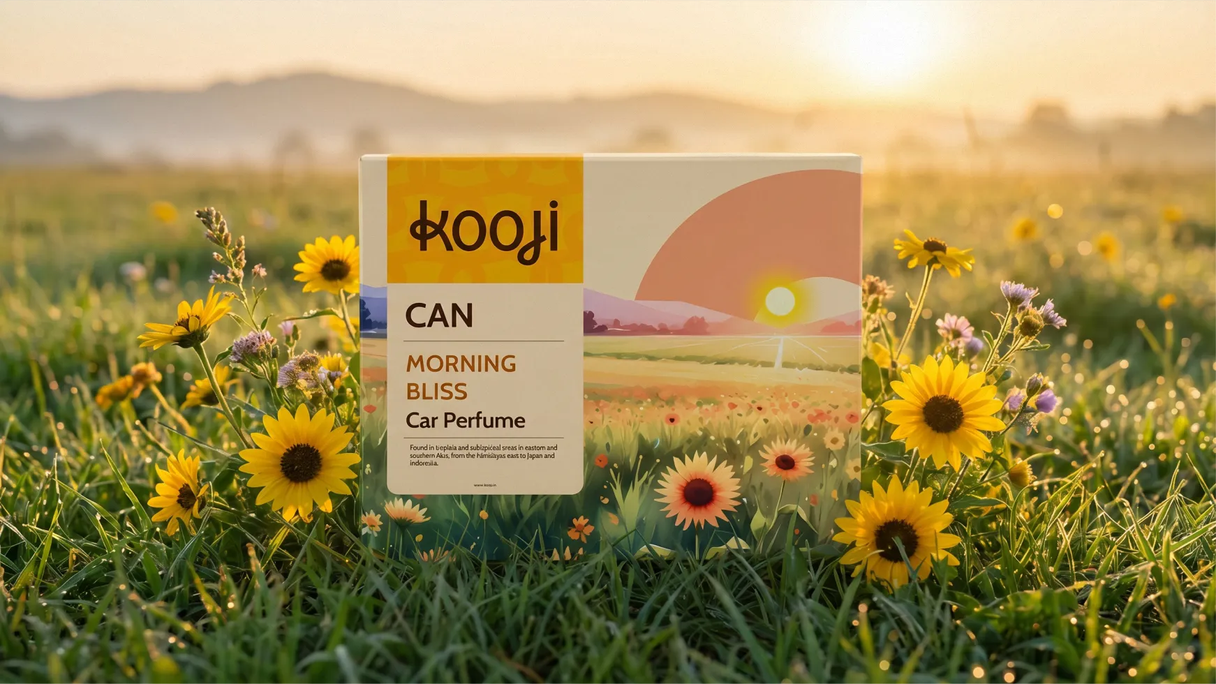
Confetti’s rebrand of Kooji for Vedashree, a heritage perfume house from Kannauj, addressed this opportunity. The identity needed to help a traditional perfume business compete on digital shelves and introduce its heritage to customers unfamiliar with the category.
The key is to make provenance relevant to the buying decision. Explain what the brand’s origins mean for the product rather than relying on a founding date or heritage claim alone.
A heritage identity must remain recognisable across different pack sizes, materials and product formats. A system designed around one jar may not translate well to sachets, multipacks or gift boxes.
Kitchen Recipe illustrates how this can work in practice. Confetti added Devanagari to the back of its packaging to connect with local Maharashtra shoppers while keeping the front panel clear for shelf recognition. The brand also introduced ₹10 vertical sachets for travellers and smaller households, extending the identity to a different format and use case.
Test the system on the smallest and largest packs before approving it for production. Check that the logo, product information and key visual cues remain clear at every size.
A product’s origins may be meaningful at home but unfamiliar in another market. For example, “Sangli turmeric” may resonate with shoppers in Maharashtra but need context for customers in Dubai or elsewhere.
Decide which details belong on the packaging and which can be explained through product pages, retail displays or other marketing.
Translate the brand’s history into benefits customers can understand, such as regional expertise, traditional production methods or distinctive ingredients. Avoid reducing cultural heritage to decorative motifs or stereotypes.
💡Target flexible identity, not a different brand for every channel. Preserve the core recognition cues while adapting the format, information hierarchy and storytelling to how customers encounter the product.
Not every brand has a long history to draw on. New brands can still build a sense of authenticity through regional crafts, traditional recipes, art forms and cultural references.
⭐You must use these cues honestly without presenting borrowed heritage as a history the brand has earned itself.
A brand launched in 2023 cannot claim decades of customer trust. It can, however, draw on a genuine connection to a region, culture or craft tradition. The distinction matters: cultural heritage can inform a new brand’s identity, but it does not give the brand a history of its own.
Confetti’s Katoriwala branding and packaging design project illustrates this approach. In a market dominated by established heritage brands and mass-market competitors, the challenge was to feel rooted in traditional Indian snacking while giving the brand a modern, playful personality.
Traditional Indian colour influences and hand-drawn typography were paired with a witty, conversational voice, creating a contemporary identity without pretending the brand was decades old.
Cultural references become a liability when brands use them as decoration without understanding or acknowledging their source.
Prada faced criticism over a sandal design associated with Kolhapuri footwear, raising questions about credit and recognition for a living craft tradition.
Such controversies show how quickly a design choice can become a reputational issue when its cultural context is overlooked.
To use cultural references responsibly:
Before using a cultural reference, ask whether the connection is genuine, whether its source is represented accurately and whether the people associated with the tradition would recognise it as respectful.
Borrow cultural inspiration transparently; do not manufacture brand heritage.
A new brand can build credibility through the traditions it supports and the choices it makes today. It does not need to pretend to have a past to create a meaningful identity.
For heritage brands, packaging carries a dual obligation: reassure the customer who already trusts the brand, and persuade the customer who has no memory of why that trust was earned.
The continuity obligation
Heritage packaging carries recognition. The logo, typography, colour, and format are the anchors that tell an existing customer this is still the brand they know. Removing them is displacement.
A customer who has bought the same product for twenty years is looking for confirmation, not novelty. When the pack changes too far, confirmation becomes a question: Is this still the product I trust?
Changing nothing makes a heritage brand invisible to a generation that has never heard of it. The risk of continuity is obsolescence. The risk of change is alienation. Heritage packaging must balance the tension between the two.
The relevance obligation
The customer of 2026 discovers the brand on a 60-pixel quick commerce tile, in an Instagram reel, on an Amazon listing where five competitors are visible in the same scroll.
The packaging must earn attention at each distance, not just at arm's reach.
Heritage brands struggle as newer brands design at thumbnail size first and scale up. Heritage brands often do the opposite. Elements that carried meaning on a physical shelf: texture, finish, subtle colour shifts, fine typography, disappear on screen.
A brand that relies on "you have to hold it to understand it" loses on every digital touchpoint. The challenge is not aesthetic but structural: which elements carry the brand's meaning, and do they survive at every distance?
Material as a heritage signal
Glass instead of plastic, uncoated stock instead of gloss, letterpress instead of digital. These materials signal craft and permanence, and customers increasingly value them. But they carry cost and logistics implications.
See whether the material is doing strategic work or signalling heritage for its own sake. Kraft paper on a heritage food brand reinforces authenticity. On a skincare brand, it may signal cheapness.
The structural implication
Heritage brands carry legacy formats designed before e-commerce, quick commerce, and current logistics. A bottle that worked on shelf may be too heavy for D2C shipping.
A label compliant in 2010 may not meet current regulation. Heritage packaging projects are structural reviews: the visual identity, structural design, material specification, and channel requirements must all hold together.
The heritage audit should help clarify how much change the brand needs. The decision between a refresh and a rebrand depends on whether the existing identity still supports the business, not simply on how dated it looks.
A refresh is usually the right choice when the brand has strong recognition and its core values remain relevant, but its identity or packaging needs to work better across current channels.
This may involve refining typography, improving packaging hierarchy, standardising colours or building a consistent system across a growing product range. The recognisable assets stay, while their expression becomes more useful and contemporary.
A rebrand may be necessary when the business has fundamentally changed, is entering a new category or audience, or carries associations that actively undermine its intended position.
For heritage brands, the decision deserves particular care. Replacing familiar assets can weaken recognition built over decades. Before committing, identify what the business needs to leave behind, what customers may lose in the transition and how the new identity will retain trust.
A useful brief explains the business problem rather than asking an agency to make the brand look modern. Include:
Be specific about the audience you need to reach. For example, the brief might ask the agency to make the brand relevant to a 28-year-old first-time buyer without alienating the 55-year-old who purchases it every month.
Family members, founders and long-serving employees may have strong personal attachments to familiar assets. Acknowledge that history, but agree on decision criteria before reviewing designs.
Use customer recognition, strategic relevance and practical performance to guide decisions. Establish who has final approval and share the audit findings with key stakeholders before presenting concepts. This reduces the risk of feedback becoming a debate about personal taste.
Before appointing an agency or designer, ask:
A smaller heritage brand with a limited range and clear direction may only need a skilled freelance designer. A broader project involving multiple SKUs, family stakeholders, new channels or international expansion may benefit from a branding partner with strategic and packaging expertise.
The right brief defines what success must preserve as clearly as what it must change. That gives the design team room to modernise the brand without sacrificing the recognition and trust that make its heritage valuable.
✅ Audit your brand before designing to identify what to preserve, evolve, or retire.
✅ Distinguish meaningful brand equity from outdated conventions to keep what is truly important.
✅ Design for every channel, ensuring your heritage remains relevant across shelves, quick commerce, D2C, and export markets.
✅ Preserve recognition while refreshing relevance, as we did by refining Cookwell’s logo without losing its original identity.
✅ Translate authentic provenance into contemporary visual identities, as we did for Kooji’s Kannauj craft heritage.
✅ Build scalable brand systems that maintain consistency across your multiple SKUs and product ranges.
✅ Validate our design decisions with real customers to ensure changes strengthen recognition and relevance.
✅ Respect cultural authenticity by grounding every heritage cue in the brand’s genuine origins and story.
✅ Balance creative ambition with manufacturing feasibility, packaging constraints, and cost realities.
✅ Equip your teams and partners with clear brand guidelines to ensure consistency as your business grows.
✅ Bring cross-category expertise across perfume, skincare, cookware, and FMCG to every heritage branding challenge.
✅ Build heritage identities designed to remain relevant for years, not just the next campaign.
Schweppes
Schweppes revived its relevance in the craft-soda market with “With Time Comes Taste,” combining 18th-century-inspired typography, its original 1851 fountain symbol, and vibrant saffron yellow. Heritage is the foundation for a distinctive, contemporary identity.
Raymond
A 100-year-old brand that moved from fabric to fashion, demerged its businesses, and placed reinvention at the core of its strategy. Heritage is an anchor. The legacy of craftsmanship is leveraged; the operating model is modernised.
Tiger Balm
The heritage pain-relief brand modernised its logo and packaging while retaining its iconic metal tin, a symbol of product strength and authenticity. Modernise what feels dated, but preserve what makes the brand distinctive.
Jameson
The Irish whiskey refreshed its packaging while retaining its iconic green bottle, refining the shoulders, neck, embossing, and wordmark placement. Small structural and typographic changes can modernise shelf presence while preserving brand recognition.
Ajmal Dubai
Ajmal rebranded as Ajmal Dubai with the platform “Scent of a City,” connecting its oriental perfumery heritage to Dubai’s global identity. Heritage can evolve through a new cultural context without losing its roots.
Modernising a heritage brand? Schedule a consultation, we will audit what you own before we change anything.
What is heritage branding?
Heritage branding is positioning a brand on its past: its track record, longevity, core values and the symbols customers have known for years. Researchers Urde, Greyser and Balmer describe a heritage brand as one whose positioning and value proposition are based on that heritage. Age alone does not qualify; the history has to mean something to customers today.
What is the difference between heritage branding and nostalgia branding?
Heritage branding uses a brand's own history and values as its positioning. Nostalgia branding borrows the feel of a past era, such as retro typography or vintage colours, and any brand can use it, including a brand launched last year. Heritage is earned and specific to one brand; nostalgia is a style. Mixing them up leads to fake "since" dates.
How do you modernise a heritage brand without losing customers?
Separate what customers recognise from what has simply always been there. Keep the assets that carry trust, such as the logo, a colour or the name, and modernise the system around them: hierarchy, typography, variant coding and formats. Change in steps rather than all at once, and frame product updates as consistent with the brand's original values.
Can a new brand use heritage branding?
Yes, but carefully. A new brand can draw on cultural heritage, such as regional crafts, recipes or scripts, provided the link is genuine and specific. It cannot claim a brand history it does not have. Invented founding dates or fake family stories are easy to expose and undermine the trust that heritage branding is meant to build.
Should a heritage brand change its logo?
Usually not entirely. A logo customers have recognised for decades is often the strongest asset a heritage brand owns. The safer route is to refine it for modern use, such as small sizes and digital screens, or keep it as is and build a more modern system around it. A full replacement is justified only when the brand is deliberately repositioning.
Want strategic branding and packaging like this for your business?