%201.webp)
02
AI Snaps
.svg)
.svg)
01
Our Work
03
About Us
04
Brand Audit
05
Contact Us
06
Client Success
12
07
Blogs
08
Careers
Book A Call
.svg)


Cookwell has been in Indian kitchens since 1995. Kettles, hand mixers, air fryers, slow juicers, and a range of non-stick cookware, built for the kind of everyday cooking that holds a household together. Over nearly three decades, the brand had earned genuine loyalty from the homes it had been part of, and that loyalty was not something to be discarded lightly.
By the time they came to Confetti, Cookwell was ready to grow. The audience they wanted to reach next was younger, setting up homes for the first time, shopping on Amazon and Flipkart, and making purchase decisions based on how a product looked on a screen as much as what it actually did. The brand needed to speak to that buyer without alienating the one it had always had.
Rebranding a thirty year old kitchen brand is a particular kind of problem. The trust that Cookwell had accumulated since 1995 lived partly in how the brand looked, and a dramatic visual overhaul risked breaking that connection before the new identity had time to build one of its own. The logo needed to evolve without becoming unrecognisable. The colours and tone needed to feel modern without losing the warmth that had made the brand feel at home in Indian kitchens for a generation.
The product range added its own complexity. Every SKU needed its own packaging, each one communicating the product's specific USPs and how it would fit into a consumer's life, while the whole range still read as a coherent family. And as Cookwell's primary growth channel was online, the packaging and A plus creatives on Amazon and other platforms needed to carry the same elevated feel.
The visual direction Confetti explored for Cookwell was etched to the feeling of a kitchen that is the warmest room in the house. Not high-tech, not sleek in the way that appliance brands often reach for, but genuinely homely. Inviting typography, warm and nurturing colours that felt like natural light on a Sunday morning, a palette that communicated comfort.
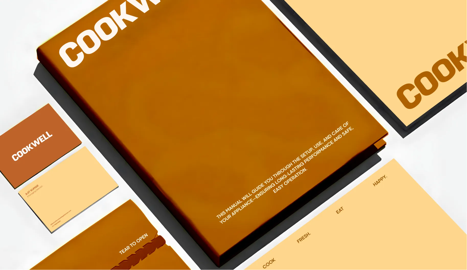
The logo was evolved rather than replaced, keeping enough of the original that the people who already trusted Cookwell would still recognise it, while giving it the refinement the brand needed to sit credibly in a modern home. The association to what came before was deliberate and carefully maintained throughout.
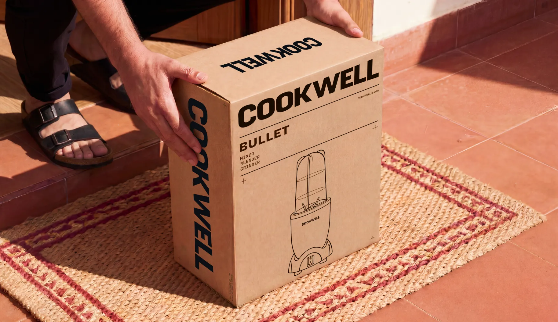
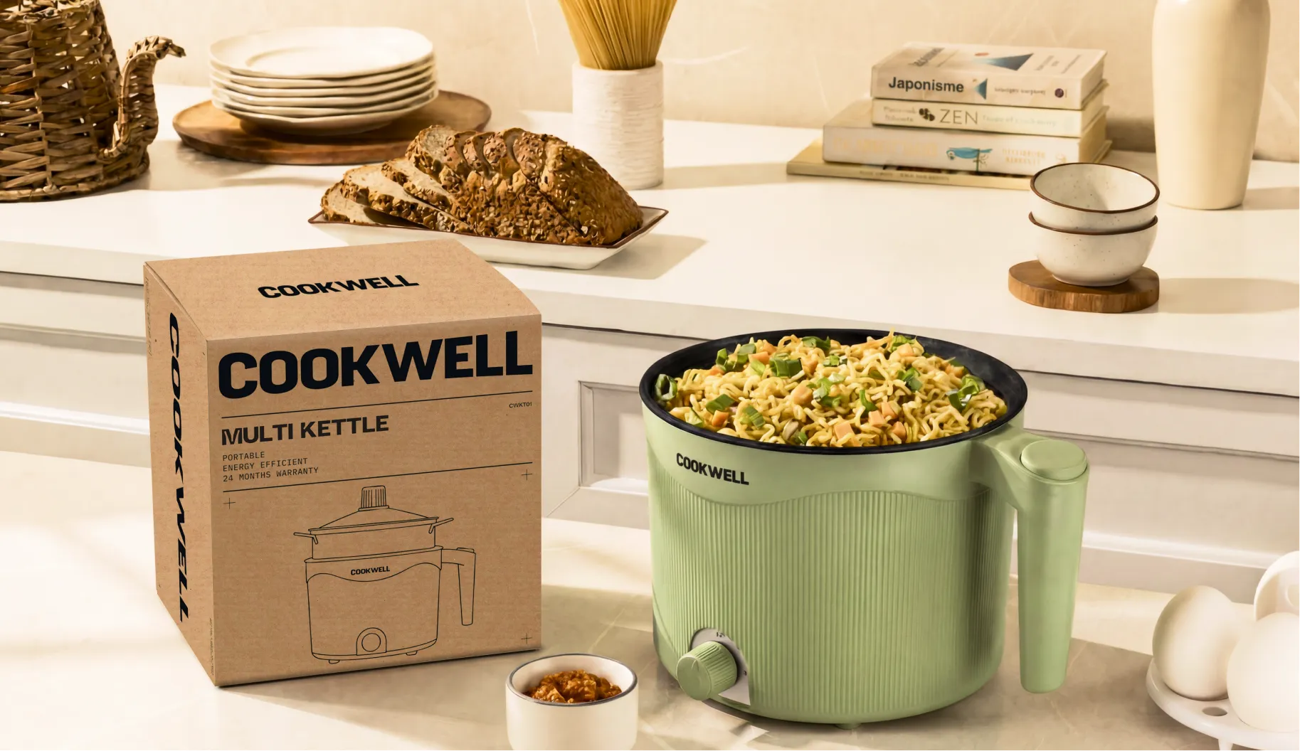
The packaging for Cookwell's kettle, hand mixer, air fryer, slow juicer, and non-stick range used corrugated boxes with line art of each product on the exterior. The line art itself came from Cookwell, and Confetti's work was in building a packaging design system around it that felt considered and elevated while remaining warm and approachable. Every SKU had its own box, each designed to communicate how that specific product would fit into a consumer's everyday life, not just what it was.
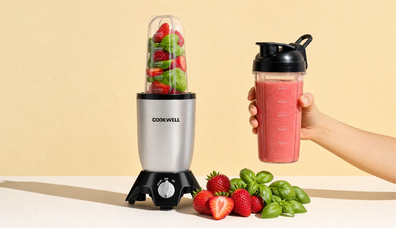
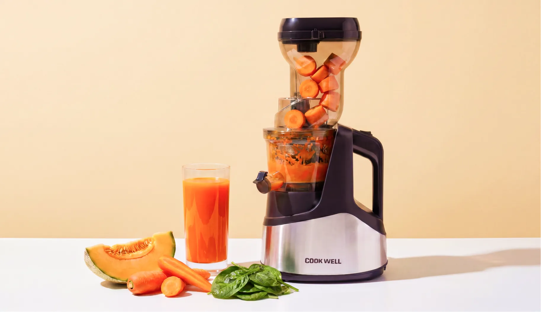
A significant part of the project was Cookwell's A plus creatives for Amazon and other platforms, where the brand's design language was extended into the listings that would do the actual selling. A copper gradient was developed as the premium design element throughout, rich and warm, shiny enough to communicate quality on screen whether printed in gloss or matte. Shades of gold, bronze, and copper worked together to give the product imagery a finish that felt genuinely elevated.
For each product, the creatives moved between zoomed in and zoomed out photography, showing the product in detail and in context. The air fryer, the slow juicer, the non-stick kettle, each one presented with its USPs woven into the design rather than listed separately, so the page told a story about the product rather than just describing it.
To ensure that everything Cookwell produced after the rebrand stayed consistent with the visual world Confetti had built, a detailed photography guide was developed alongside the creative work. The direction was bright, warm, and domestic: broad natural light, copper and wood surfaces, colours that popped without feeling clinical. A home that felt lived in and loved, which was exactly the feeling Cookwell's products were meant to be part of.
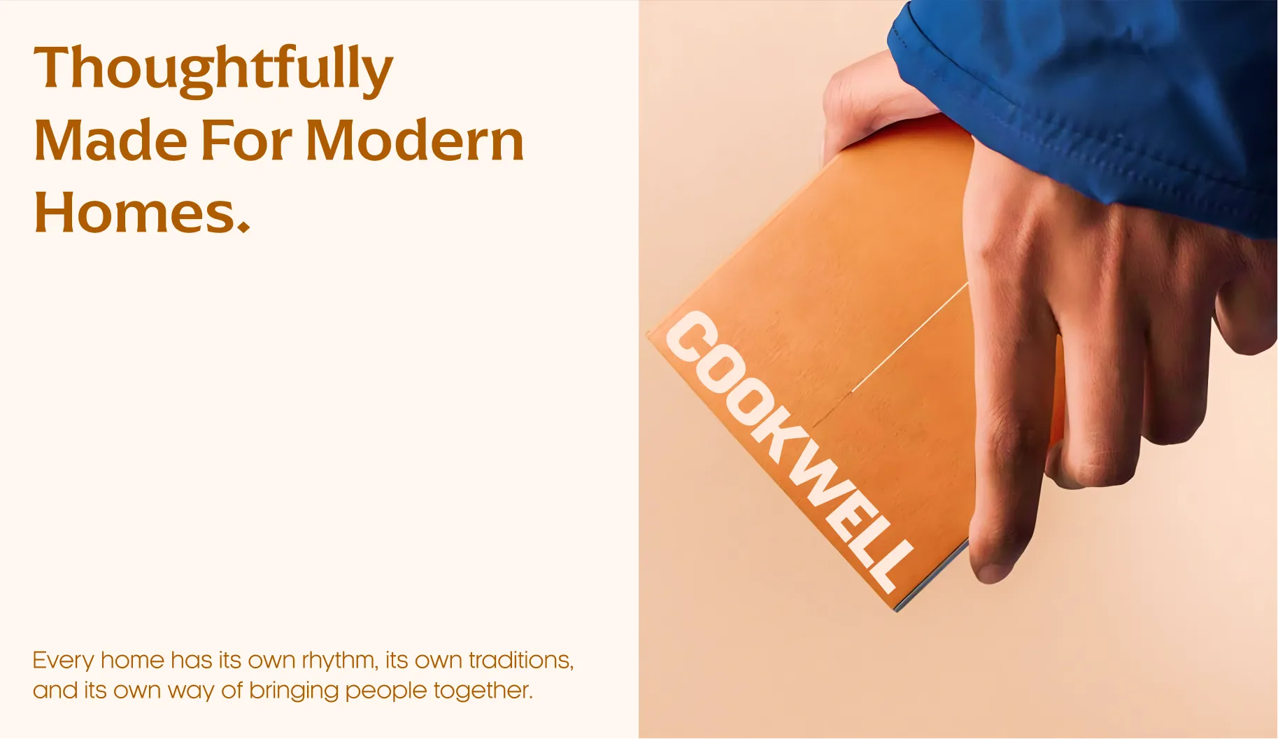
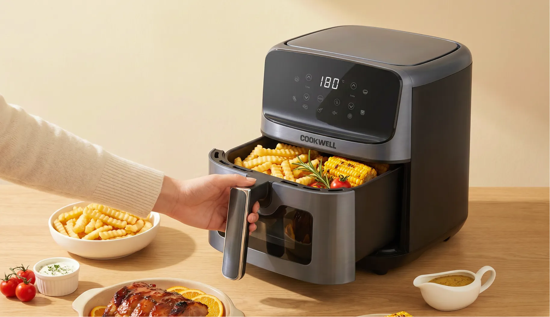
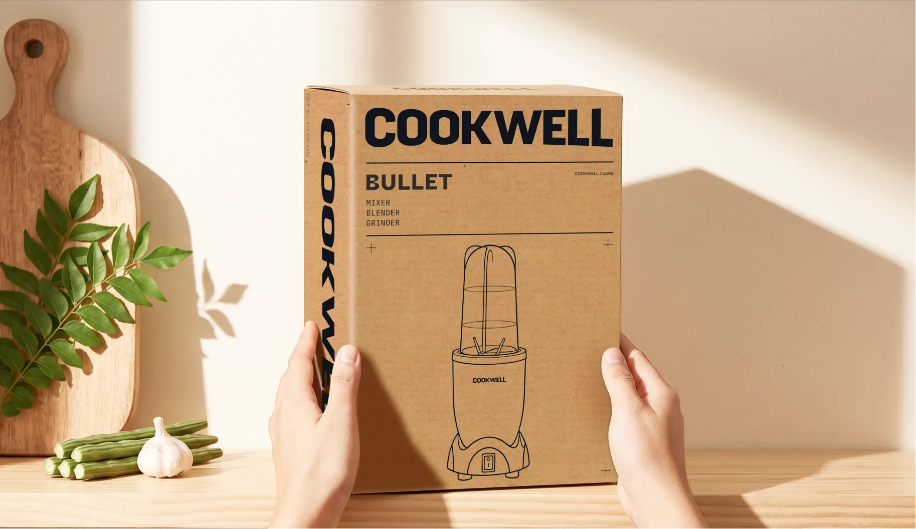
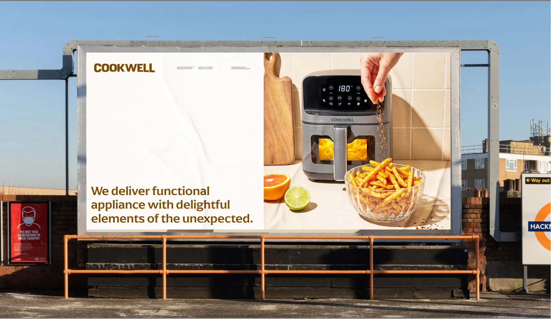
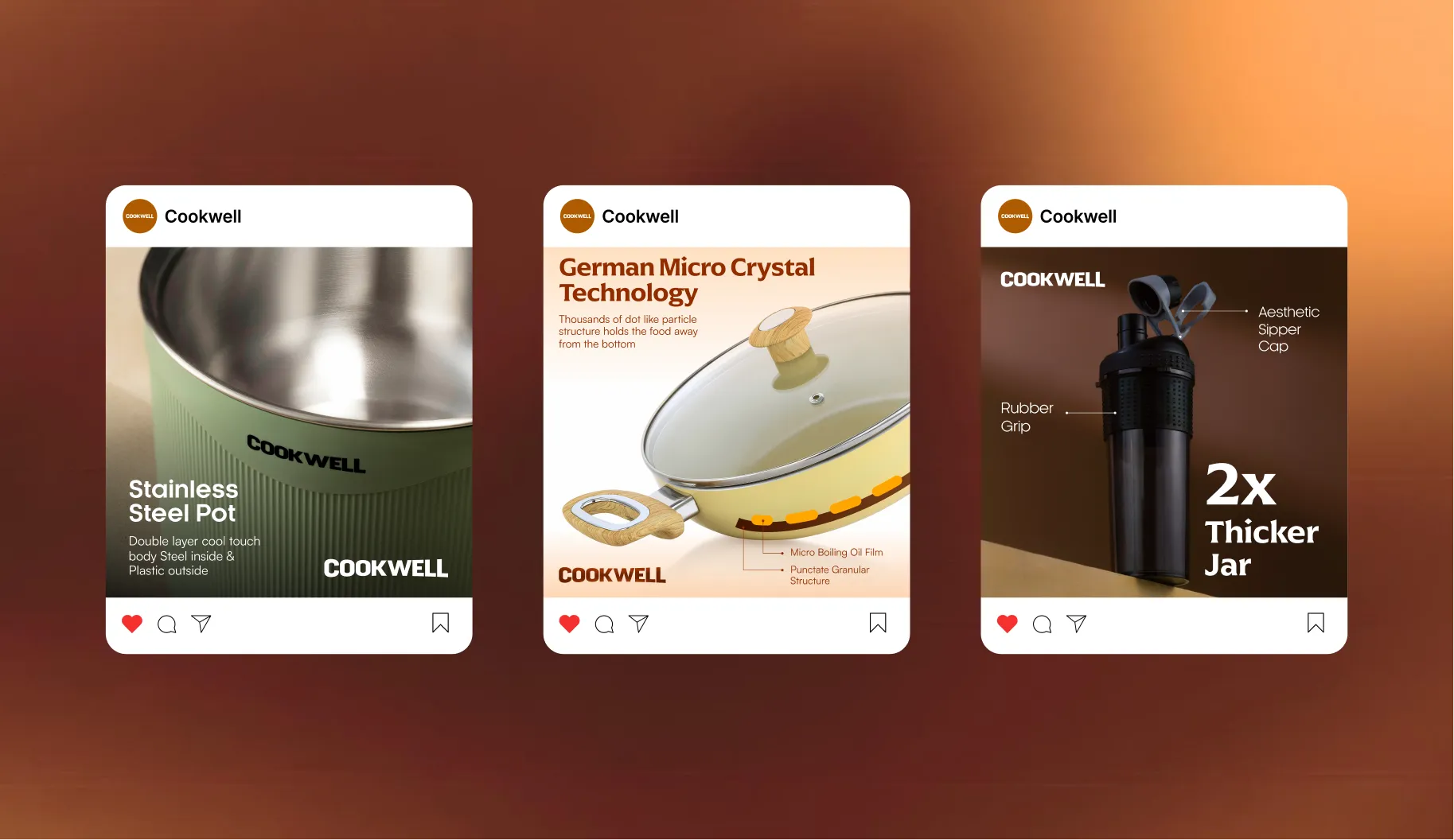
Cookwell now has a brand identity that carries thirty years of household trust into a visual language that modern buyers can respond to. The logo retained its connection to what people already knew. The packaging range is coherent across every SKU while staying specific to each product. The A plus creatives give Cookwell a premium online presence that competes seriously with brands that have spent far more building theirs.
Most importantly, nothing about the rebrand asks existing customers to reconsider a brand they've had in their kitchen for decades. It just gives new ones a reason to put it there.
If you have a legacy brand that needs to reach a new generation without losing the one it already has, Confetti knows how to walk that line.











.svg)
.svg)
.webp)
.webp)


.svg)