%201.webp)
02
AI Snaps
.svg)
.svg)
01
Our Work
03
About Us
04
Brand Audit
05
Contact Us
06
Client Success
12
07
Blogs
08
Careers
Book A Call
.svg)



.svg)
Need Help In Building Your Brand?
Click the button below & book a call with our founder directly.

Rishabh Jain
Managing Director
Most brands that underperform on Blinkit or Zepto think about and in most cases benefit from rebranding for Quick commerce, when done correctly.
This guide gives you a 3-level diagnostic to identify whether you need a full rebrand, a brand refresh, or a Q-commerce-specific packaging adaptation with examples.
Quick commerce in India has transformed product discovery and purchase, creating a retail channel with unique dynamics and new challenges for brands:
A brand identity built for quick commerce has to work at 200x200 pixels, on a mobile screen, in under 3 seconds, with zero physical interaction. It also has to compete against 15–20 other thumbnails on the same category page.
Fine-line typography and intricate illustration that look premium on a shelf often turn into visual noise at thumbnail scale.
🚫Gold foil, pastel palettes, and subtle tonal gradients, all classic cues for "premium" in print, frequently lose almost all contrast against the flat white background of a Blinkit or Zepto category page.
What looks elegant in hand can be invisible on a screen.
It shows up directly in performance data. Click-through rate (CTR) is a ranking signal on all Q-commerce platforms such as Blinkit, Zepto and Instamart.
Listings with weak thumbnail readability:
Successful brands account for this before their first (New Product Information) NPI submission adapting to packaging upfront.
Brands that don't, usually find out the hard way, 3-6 months into being live, with listings that aren't converting, and no clear diagnosis of why.
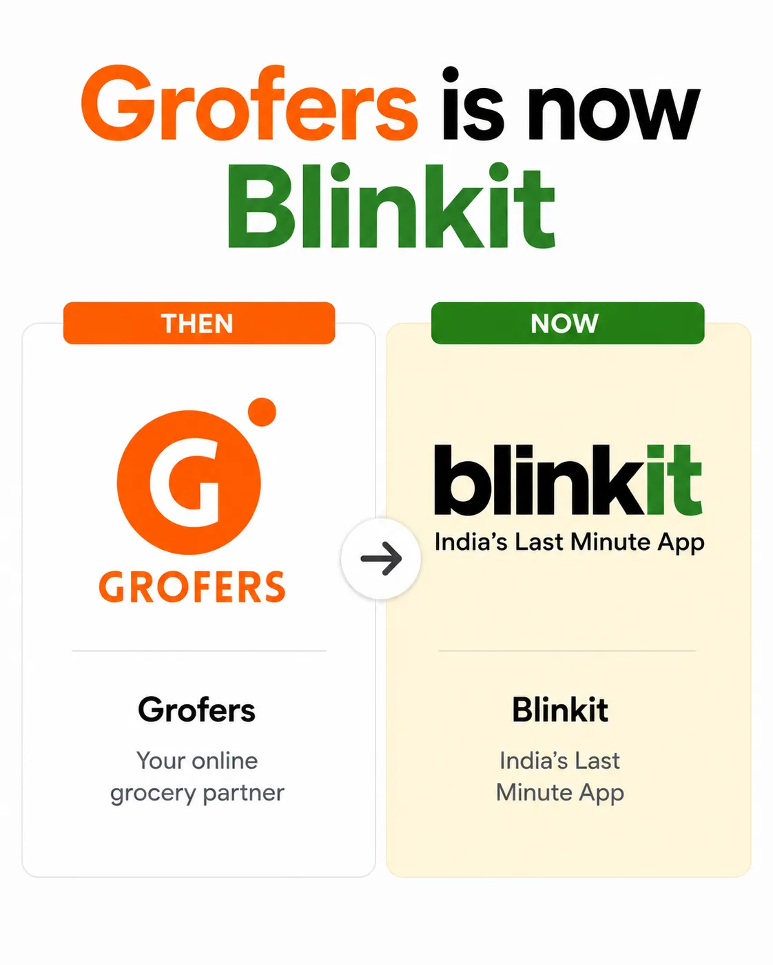
Grofers' own 2021 rebrand into Blinkit is the clearest domestic example of this shift being taken seriously at the platform level itself.
Grofers had built a large grocery delivery business, but the company rebuilt its entire identity around a 10-minute delivery model as quick commerce reshaped the market.
The new visual identity used a high-visibility colour palette,built to signal boldness and urgency.
Any FMCG brand selling on Blinkit today is dealing with a smaller version of the exact problem Blinkit solved for itself.
Dark store inward inspection teams check every consignment against a fixed list:
None of this was necessarily a design consideration when the packaging was first created before quick commerce existed as a channel.
A brand that placed its FSSAI number for general regulatory compliance might have it on the carton base, fine for a warehouse audit. But invisible during a dark store inspection of the consumer unit.
A barcode positioned for shelf aesthetics might sit on a panel that can't be scanned once the product is stacked the way dark stores stack it.
These gaps rarely show up until the consignment reaches the dark store gate, usually 4-8 weeks into onboarding. At that point, the consignment gets returned, at the brand's cost, and the listing is delayed until packaging is corrected and resubmitted.
For established FMCG brands, it's a packaging adaptation gap, decisions that made sense in a retail-first context but don't carry over to dark store operations.
And critically, it's fixable without touching the brand identity at all.
📌That’s where our team at Confetti works with D2C and FMCG brands in packaging and rebranding for Q-commerce readiness.
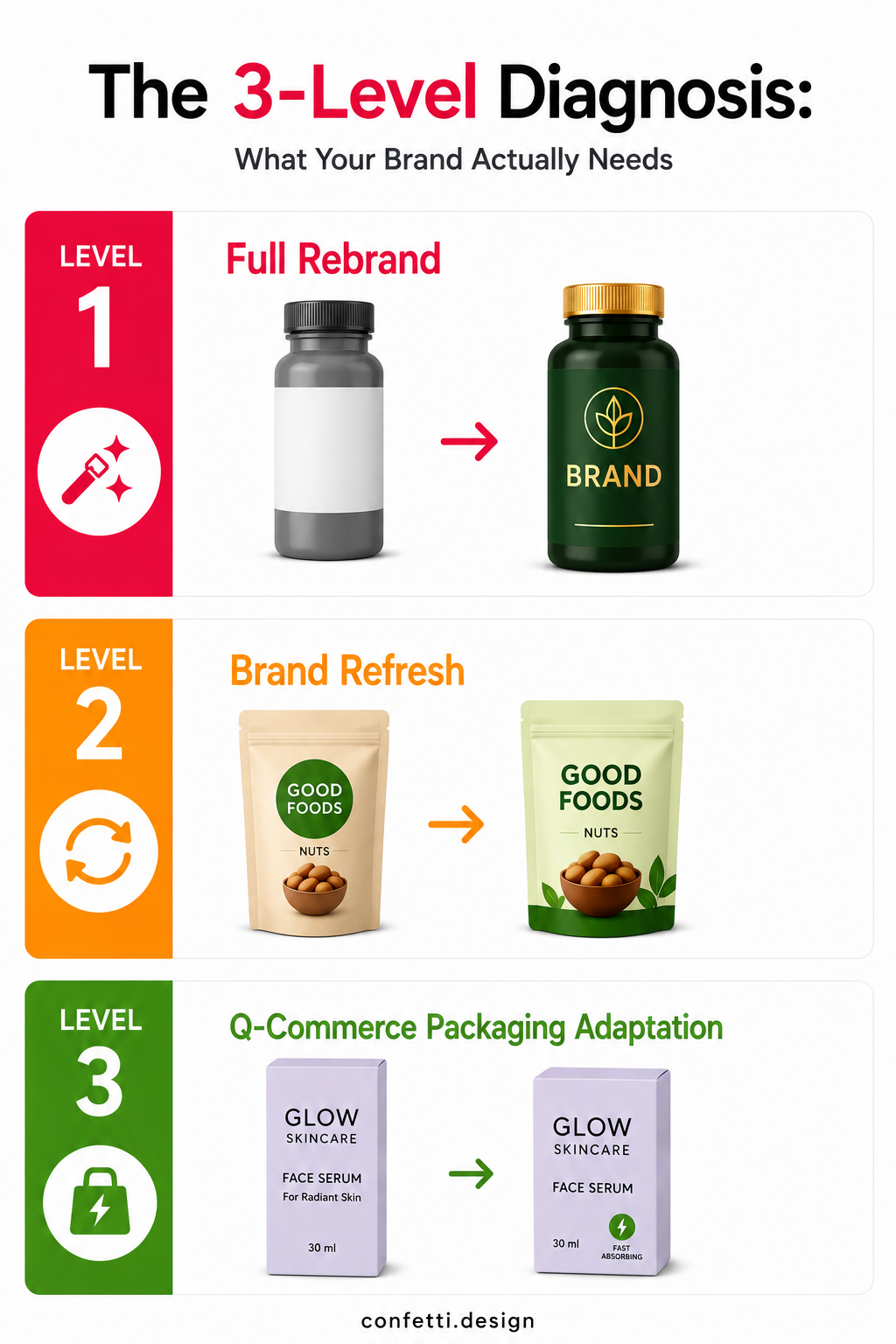
Before you brief your designer, you need to know which of the three interventions your brand actually requires:
A full rebrand changes your brand's name, core visual identity, logo, colour system, typography, positioning, and sometimes packaging architecture.
It's the highest-risk, highest-cost, longest-timeline option.
You need full rebrand before Q-commerce entry if:
🕐Timeline: 14–24 weeks
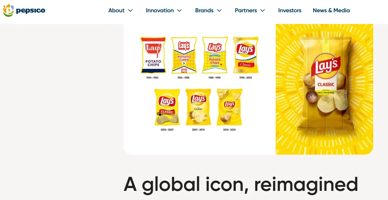
A brand refresh is all about updating specific elements such as logo simplification, palette evolution, type modernisation, photography direction, while keeping your name, positioning, and core equity intact.
You need a brand refresh if:
🕐Timeline: 6–12 weeks
📌For example, Lay's global 2025 packaging overhaul. PepsiCo gave the brand its largest refresh in nearly a century, warming up the sun device into what it calls "Lay's Rays," shifting to an ingredient-derived colour palette, and updating photography and typography.
The design team kept Lay's signature cues intact. That's the discipline a Level 2 refresh requires: evolve the elements that need updating, protect the ones that are already doing the recognition work.
It's a systematic redesign of the front face and label, using your existing brand system, built specifically for mobile thumbnail performance and dark store compliance.
What it involves:
Your name, logo, colour system, typeface family, and positioning stay exactly as they are.
Existing customers recognise the product across every channel. What changes is how the brand system is applied to this one context, which is standard brand system management.
🕐Timeline: 3–6 weeks (across 3–5 hero SKUs)
These warning signs apply whether the brand has already entered Q-commerce and is underperforming, or is preparing to enter and wants to identify what to fix before NPI submission.
⚠️1. Your logo has thin lines, fine detail, or a complex multi-element mark
Shrink your logo to 40x40 pixels on a white background. Can you still read it? Can you still recognise it without squinting?
Logos built for print, where colour separation and fine linework do the work of communicating craft, often collapse into a grey smudge at app-icon scale. If yours does, it needs adaptation for screen environments before anything else gets fixed.
⚠️2. Your front-of-pack carries six or more competing elements
Retail packaging convention rewards putting everything on the front: brand, product name, variant, certifications, ingredient callouts, lifestyle photography, a brand story line.
That convention works against you at 200x200 pixels. If you put more than 3 dominant visual elements on the front face, you're almost certainly losing the 3-second scan to a competitor running a simpler label.
⚠️3. Your primary colour blends into your category's palette
Snacks cluster around orange and red. Personal care leans white and pastel. Dairy sits in blue and white. Beverages split between red and green.
If your brand colour doesn't break from that pattern, you're not differentiating.
⚠️4. Your product photography was shot for retail or e-commerce, not for a thumbnail.
Natural lighting, lifestyle staging, detailed backgrounds, overhead catalogue angles, all standard for retail and marketplace photography. And all counterproductive on a Q-commerce grid, where a clean white background and front-facing product-led composition win the click.
If your images have never been tested at actual thumbnail size, assume they're underperforming.
⚠️5. Your NPI submission has bounced back for corrections more than once
Wrong resolution, incorrect background colour, an off-centre product, cropped label elements, these rejections are a direct signal that your photography wasn't built to platform spec in the first place.
Each correction round adds another 5–7 working days before you're live.
⚠️6. Your CTR is below category average on Seller Hub or Jarvis
Impressions with a weak CTR almost never point to a pricing or keyword problem. It's a label or photography problem, your product isn't earning the click once it's shown.
⚠️7. Your barcode has been flagged at dark store inward inspection
A barcode on the base panel, hidden under a label overlay, or unreadable in the shelf-stacked orientation is a print specification issue. It needs a production fix.
⚠️8. Your FSSAI number or MRP isn't visible on the primary consumer unit
If either is on the outer carton instead of the individual pack, or gets covered during shelving, your consignment gets rejected at the gate.
This has to be corrected in the next production run, not patched after the fact.
If you count more than 2 or 3 warnings, you're looking at a structural gap between how your brand was designed and how it's actually being consumed today.
Once you know which level of intervention you need, the next question is sequence.
Here's the sequence that works:
The single most common mistake in any rebranding project is starting creative work before the commercial groundwork. For Q-commerce, that groundwork means 2 audits, run in parallel.
🟣Brand Equity Audit
Which elements of your current identity are actually driving recognition and purchase in your existing channels?
Show a sample of your current customers your brand mark, packaging, colour system, and product photography in isolation. Note what they recognise as "yours" without the complete picture.
Those elements are your equity assets. They get preserved or evolved. They never get discarded just because a Q-commerce thumbnail test flags them.
🟣Q-commerce Performance Audit
If you're already live on Blinkit or Zepto, pull Seller Hub or Jarvis data: impressions versus CTR by SKU, organic-to-paid impression share, inward rejection history, and how many correction rounds your NPI submissions have needed.
If you're not live yet, do it manually.
Open Blinkit and Zepto category pages for your sub-category and compare your product images against the top five organic listings, at actual thumbnail size, on an actual phone.
Together, these 2 audits tell you exactly what needs to change without you accidentally destroying what's already working.
Once the audit points to a level, full rebrand, refresh, or packaging adaptation, write down precisely what's fixed and what's changing. This document is your protection against scope creep.
🟣For a packaging adaptation: brand name, logo mark, core palette, typeface family, and positioning stay fixed. Label layout, front-face hierarchy, element sizing and contrast, photography direction, barcode placement, and compliance element positioning are what change.
🟣For a brand refresh: name, core positioning, brand voice, and established equity signals stay fixed. Logo refinement, palette contrast adjustments, typeface adaptation, photography style, and the packaging system itself are open for change.
🟣For a full rebrand: everything is on the table, and the equity audit determines what if anything survives from the existing identity.
Every piece of Q-commerce packaging has to pass a thumbnail test before it goes anywhere near production or catalogue upload.
The test:
Then ask 3 questions:
❓Is the brand name readable at a glance
❓Is the variant distinguishable from the rest of your range
❓Does the label actually stand out against the competitor thumbnails sitting next to it
A "no" to any of these means the design goes back for revision before it touches production print or catalogue submission.
This is the phase where most Q-commerce packaging projects create damage they didn't intend.
A brand updating packaging for Q-commerce is usually still selling through modern trade, Amazon, D2C, and sometimes export. Each has its own packaging formats, image specs, and regulatory requirements.
If you push a Q-commerce packaging update live without a sequencing plan, and you end up with old and new packaging circulating simultaneously. This will lead to confused customers, retailer complaints, and a brand that looks inconsistent across channels.
The fix is a 2-stage rollout.
Update your Q-commerce catalogue assets, the product photography and NPI images first, without touching physical packaging at all.
Submit new, Q-commerce-optimised images, measure the CTR lift, and only then fold the design changes into your next physical production print run.
This decouples catalogue performance from packaging changeover. You get faster Q-commerce results without forcing an emergency reprint, and your physical packaging updates on its normal production cycle instead of a rushed one.
Not every Q-commerce underperformance problem is a brand identity problem. And rebranding to fix a problem that isn't a brand problem is one of the more expensive mistakes.
Three specific errors to watch out for:
🔴Error 1: Destroying Recognition Equity in Pursuit of Thumbnail Clarity
Your brand is already recognised through offline distribution, Amazon reviews, or social presence that recognition is doing real work on a Q-commerce category page.
A shopper who already knows your brand, clicks faster. That fraction-of-a-second advantage is worth more than most brand managers give it credit for.
Strip that recognition away by swapping a familiar logo or distinctive colour for a "cleaner," Q-commerce-optimised design, and you're trading a proven advantage for an unproven one.
You may end up with a label that tests beautifully at mobile screen size 200x200px and converts worse in the market, because the thing that was actually earning the click was familiarity, which is gone.
🔴Error 2: Rebranding the Wrong Layer
Many brands that receive poor Q-commerce NPI feedback or low CTR data conclude they need a rebrand when they actually need a photography update.
The label design may be adequate. The specific photograph submitted to the catalogue, the angle, the lighting, the background, the composition, is what's creating the CTR problem.
Before committing to a packaging redesign, test whether updated product photography with the existing label can improve CTR. Take new front-facing photographs with a clean white background, a larger product in frame, and the most legible face of the existing pack centred prominently.
Submit these as updated catalogue images. Measure CTR change over 3–4 weeks. If CTR improves materially, the label itself is not the problem.
🔴Error 3: Rebranding for Q-Commerce in Isolation from Other Channels
A brand may update its packaging specifically for Q-commerce, with a simplified, high-contrast label designed for mobile thumbnails. But if the new design doesn't also work on Amazon listing images, modern trade shelves, and D2C website product pages, it creates a fragmented brand experience.
The Q-commerce-optimised label, if reduced to a very simplified system, may feel generic. A label that performs brilliantly at thumbnail scale may look visually thin or design-sparse at full shelf size.
Design for both environments simultaneously. Test at mobile thumbnail and at actual shelf presentation dimensions. The strongest Q-commerce-ready brand systems that we also strive to create at Confetti, work in both contexts.
The following cases demonstrate different approaches to Q-commerce brand adaptation across platforms and product categories.
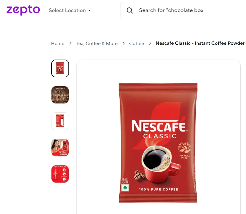
Nestlé redesigned Nescafé's sachet packaging specifically to improve handling and shelf life inside quick commerce micro-warehouses, rather than to chase a visual refresh.
The change let dark stores rotate inventory faster and hold better fill rates, turning a packaging decision into a direct lever on availability and margin.
Not every quick-commerce-driven packaging change is about thumbnail clarity. Sometimes the constraint is physical. How a pack behaves in a 1,500–3,000 sq ft dark store built for rapid picking.
The brand name, the red-and-white system, and the core identity stayed untouched. What changed was format engineering aimed at operational fit.
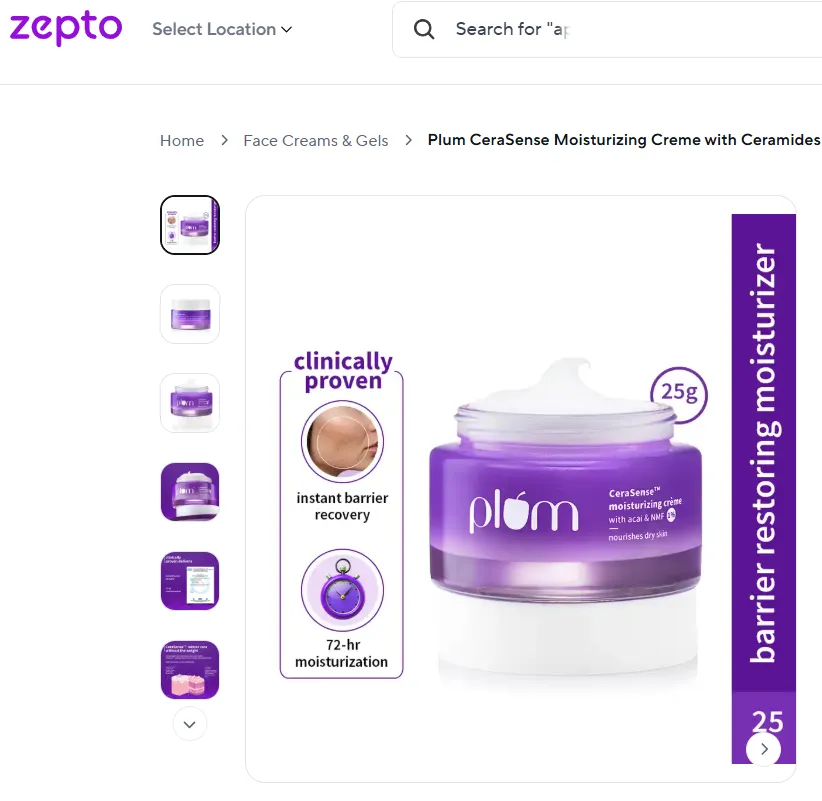
In a beauty category where competitors on Nykaa, Blinkit, and Zepto use soft pastels and subtle typography, Plum took the opposite approach: bold, saturated colors that stay clear and eye-catching even at 100–200px thumbnail size.
The result is a range where a shopper scrolling a crowded category page can identify a Plum product before reading a single word on the pack, purely from the colour block and layout pattern.
That's the exact outcome of Level 3 packaging adaptation.
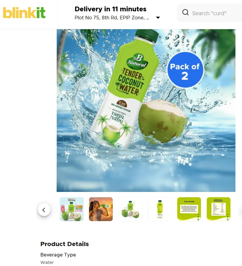
ITC B Natural's packaging was designed by Confetti and adapted for the Q-commerce environment. We ensured that the beverage brand's product image communicated clearly at Blinkit and Zepto thumbnail scale.
B Natural's name, positioning, colour system, and established equity across modern trade stayed exactly where they were.
What changed was the application of that identity to the Q-commerce catalogue context:
The result is a brand that reads clearly at 200x200 pixels on Blinkit and Zepto without looking like a different brand to a shopper who already knows it from a supermarket shelf.
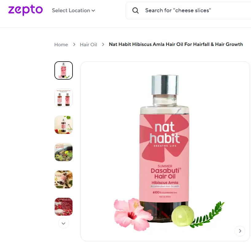
Nat Habit refreshed its identity with a chakra-inspired flower logo, modern packaging, and a vibrant orange palette, replacing the green-brown colours typical of Ayurvedic brands.
The rebrand launched across digital, retail, and quick commerce as part of its next growth phase, not as a response to poor performance.
In a category dominated by similar natural, earthy colours, those traditional cues often blend together, especially in quick commerce, where products are viewed as tiny thumbnails.
By switching to a distinctive orange and a bolder logo, Nat Habit became easier to spot in mobile grids while still clearly communicating its natural, wellness-focused positioning.
The first thing we do when a brand comes to us for Q-commerce readiness is its diagnosis.
🛍️We run the brand equity audit and the Q-commerce performance audit at the same time. On one side, we're looking at what your existing customers actually recognise and trust about your brand.
🛍️On the other, we're looking at what your product images are communicating or failing to communicate on Blinkit and Zepto at actual thumbnail scale.
The gap between those two pictures tells us what level of intervention you genuinely need. Most of the time, that's a Q-commerce packaging adaptation. The core identity is sound.
The specific label application has a hierarchy problem, a contrast problem, or a compliance placement problem that's specific to how the product shows up in this one channel.
We redesign the application. We leave the underlying brand system alone.
🟢Sometimes the diagnosis points to a refresh:
We evolve the specific elements that are underperforming and protect the ones that are carrying equity.
🟢Occasionally, it's a full rebrand. That happens when:
In those cases, we do the complete work, positioning, identity system, packaging architecture, NPI assets with the thumbnail test built in as a mandatory checkpoint at every stage.
Use this to work out exactly what your brand needs before you enter or try to fix performance on Blinkit, Zepto, or Swiggy Instamart.
Answer each question honestly, the scoring at the end tells you where to start.
📋Brand Identity Audit
📋Packaging Design Audit
📋Catalogue Asset Audit
📌Scoring:
1–3 fixes needed → catalogue or print specification updates only.
4–6 fixes needed → comprehensive packaging adaptation.
7–9 fixes needed → brand refresh alongside packaging redesign.
10+ fixes needed → full diagnostic before any investment.
Does a brand always need to rebrand before entering Blinkit or Zepto?
No. Most established brands entering Q-commerce need a packaging adaptation or brand refresh. Rebrand changes the brand's name, positioning, and core visual identity (logo, colour, typeface).
A packaging adaptation redesigns how the existing identity is applied to product labels and catalogue images for Q-commerce screen environments. The majority of Q-commerce listing failures trace to packaging adaptation problems.
What specifically needs to change in packaging for quick commerce?
The front-face label hierarchy is the primary change. For Q-commerce, the front face needs 3 dominant visual elements: brand mark (readable at thumbnail scale), product name and variant (immediately distinguishable), and one key claim.
Secondary elements move to back and side panels. Barcode placement must be specified for dark store scanning accessibility. FSSAI number and MRP must be visible on the primary consumer unit. Product images must be tested at 200x200px on a mobile screen.
How long does a Q-commerce packaging adaptation take?
A focused Q-commerce packaging adaptation for 3–5 hero SKUs usually takes 3–6 weeks, including brand equity audit, label redesign, thumbnail testing, NPI-ready image production, and formatting to each platform's technical specifications.
A brand refresh adds 4–6 weeks. A full rebrand usually runs 14–24 weeks depending on scope.
Will rebranding for quick commerce hurt performance on other channels?
Only if the rebrand is executed without considering those channels simultaneously. The strongest Q-commerce-ready brand systems are designed to work at mobile thumbnail scale and at retail shelf scale and in e-commerce listing contexts.
This is achievable. It requires designing against all 3 environments simultaneously rather than optimising for one. Brands that rebrand specifically for Q-commerce without testing the result in modern trade contexts risk gaining Q-commerce performance at the cost of shelf presence.
Should a new D2C brand build its brand identity for quick commerce from the start?
Yes. A D2C brand building its visual identity from scratch in 2026 should treat Q-commerce as a primary design environment.
That means designing the brand mark to work at 40x40px, specifying colour palettes for contrast performance on white mobile backgrounds, establishing front-face label hierarchy principles in the original brand guidelines, and including a thumbnail test as a mandatory step in the packaging design approval process.
Want strategic branding and packaging like this for your business?





.webp)
.webp)


.webp)
.webp)
.webp)
.webp)
.webp)







.svg)
.webp)