


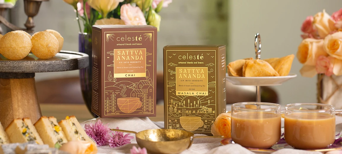
Problem
To develop a branding and packaging strategy for House of Anasha that resonates with their target audience and sets them apart from competitors.
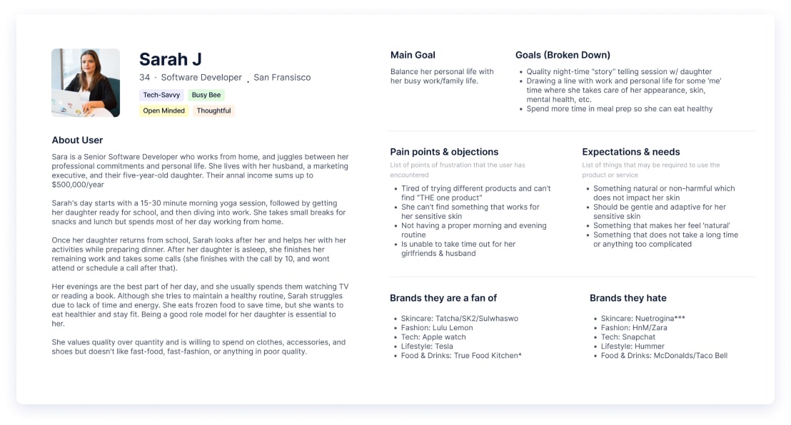
User Persona
The target Users for House of Anasha is made up of people between the ages of 30 and 50 who are keen on having a skincare routine that is easy to maintain, natural and is suitable for all skin types.

Positioning Statement
House of Anasha is a luxury skincare brand that empowers its customers to experience the transformative power of nature’s purest botanicals.
With a focus on simple, precious ingredients grown mostly in India and drawing on the wisdom of our ancestors, we craft luxurious skincare products that embody the healing power of nature.
We are committed to providing the purest, most effective natural skincare solutions that elevate beauty, health, and wellness in a holistic way, empowering our customers to feel confident and radiant in their own skin.
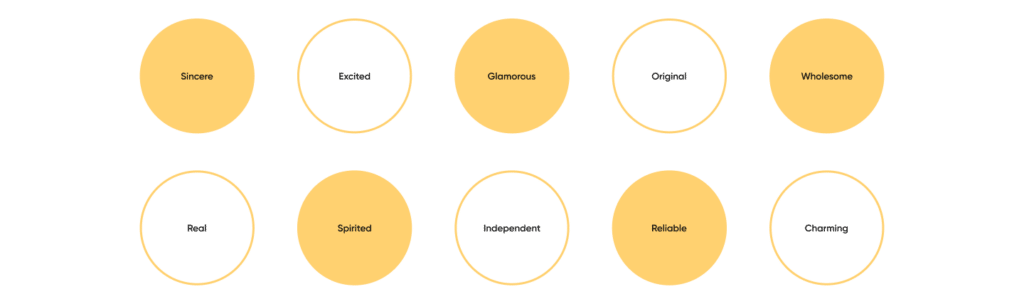
Brand Personality
Brand Persona: The Magician
“This brand concept centers around conveying a sense of transformation and wonder that comes from using high-quality skincare products. The visuals are intended to be communicate the idea that their products have the ability to transform, renew, and rejuvenate the skin, helping customers feel confident, beautiful, and magical. transporting the user to a different world.
Ideal for : Brands that want to appeal to customers who are looking for a transformative and magical skincare experiences. These customers are likely to be interested in innovative and unique skincare products that can provide a sense of wonder and awe.
Brand look and feel :
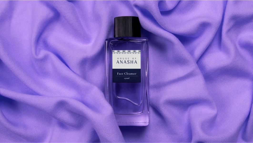
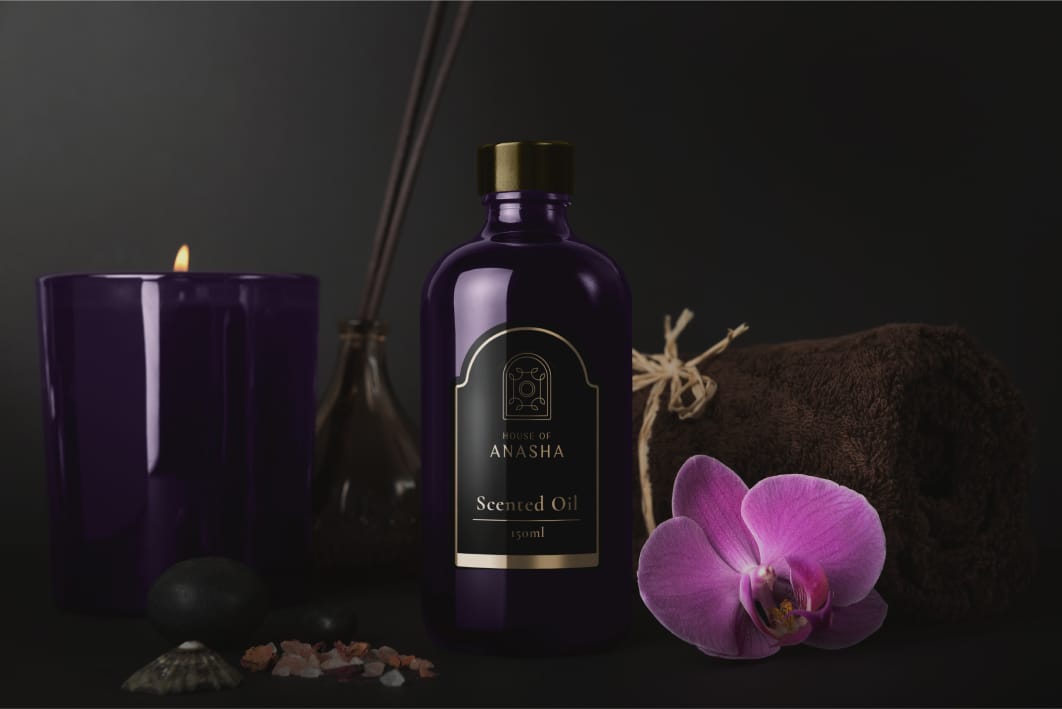
With its luxurious skincare products that embody the transformative power of nature’s purest botanicals. House of Anasha’s commitment to originality is reflected in the unique formulations that they create. As a brand they are dedicated to their efforts in providing solutions that are not only real and original, but also wholesome for the customers.

Brand Values
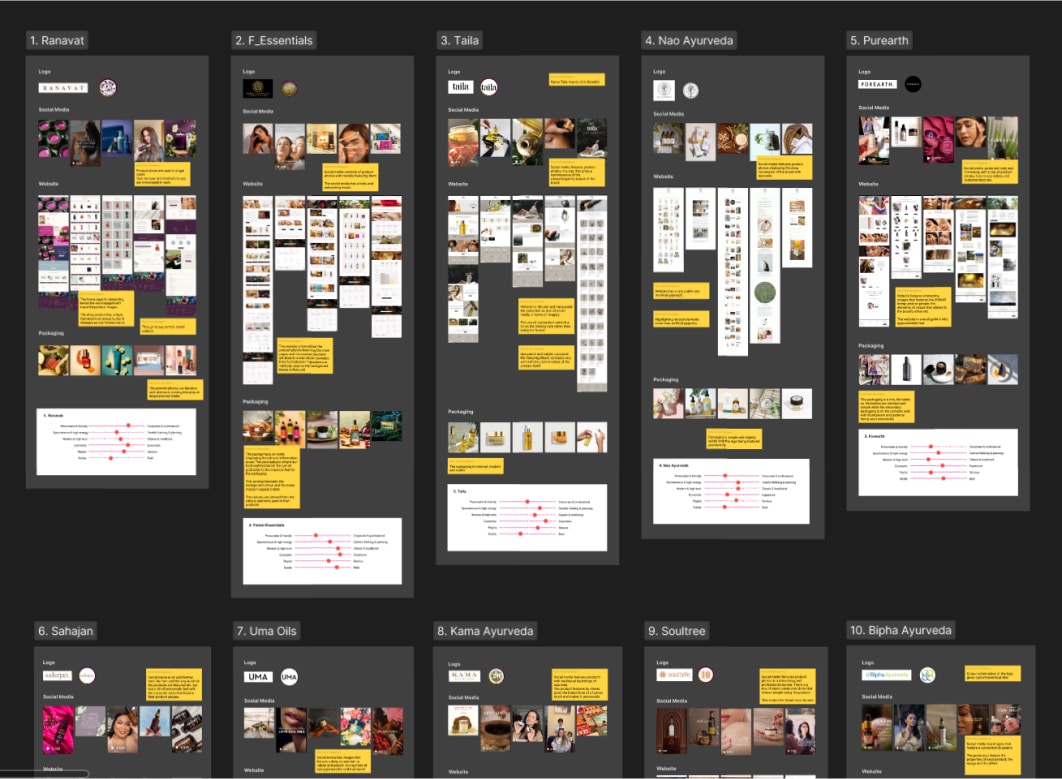
Competitive Analysis
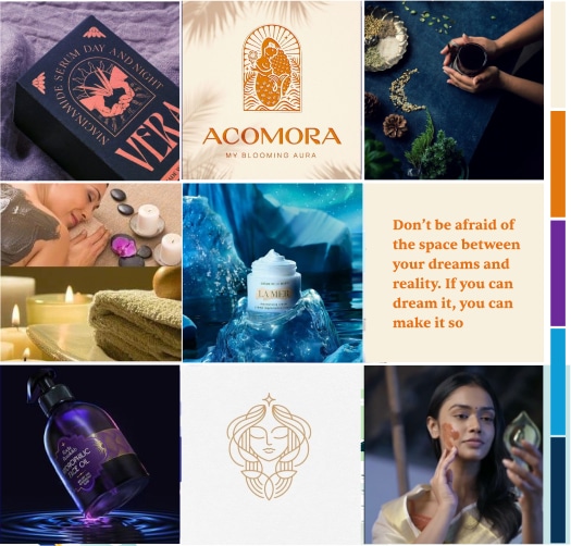
By analyzing the competition in the market, we were able to have a deeper understanding of the industry and the style in which these competitors appealed to the customers. This allowed us to come to an understanding to visualize how the brand should appeal.


Ideation
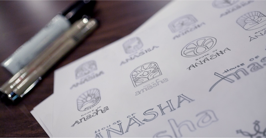
After competitor research was done, the ideas were conceptualized as sketches from which the ones that fits better with the brand was selected and discussed to come to a final concept.
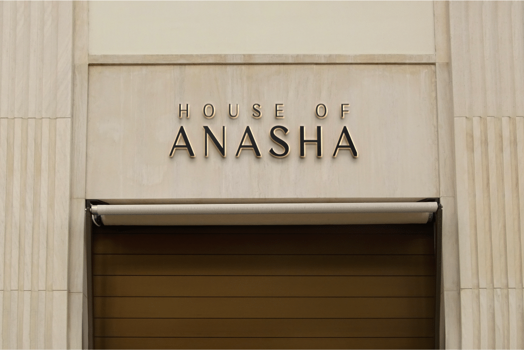
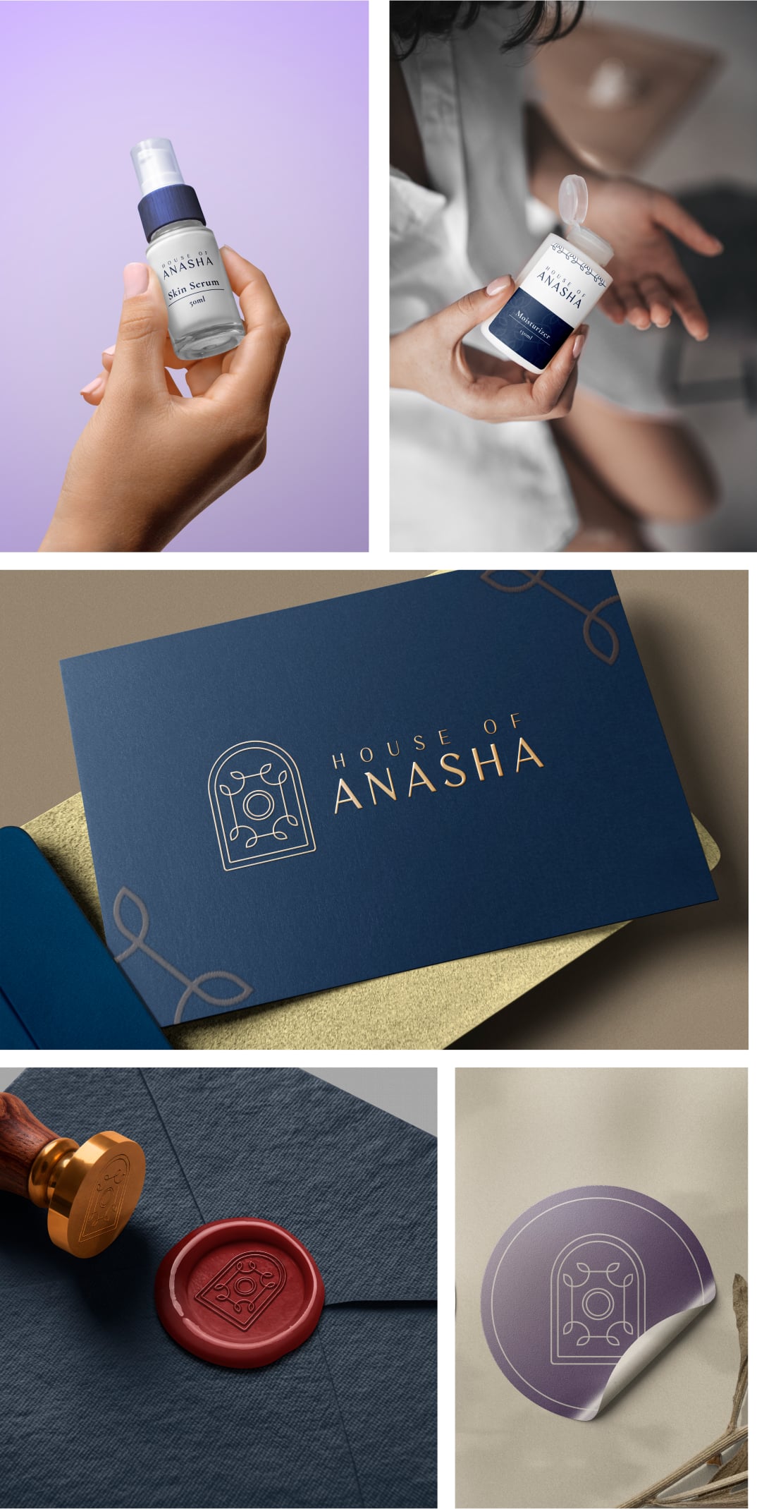
The Logo

Different Lockups
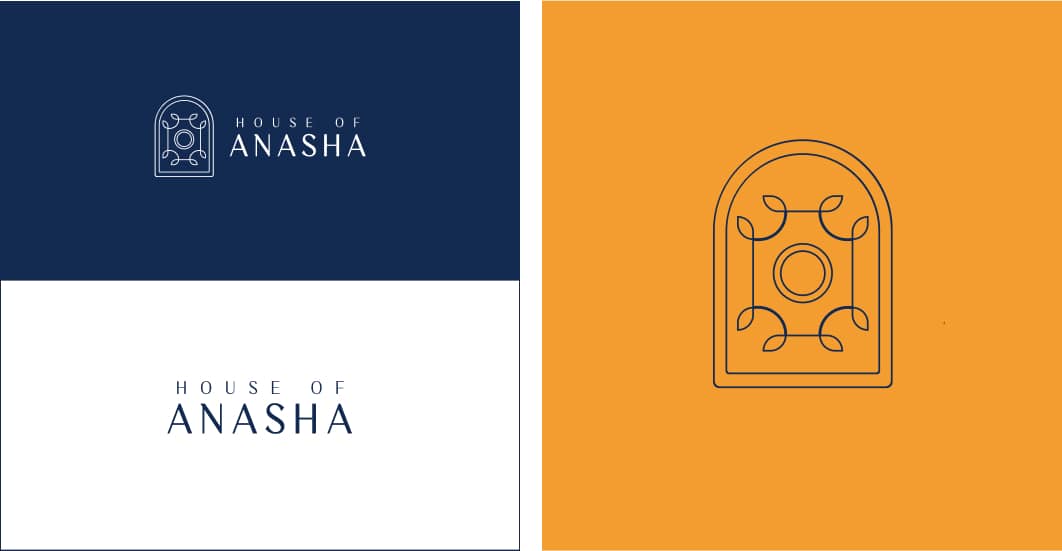
Colour combinations
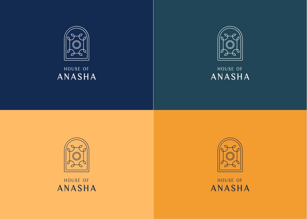
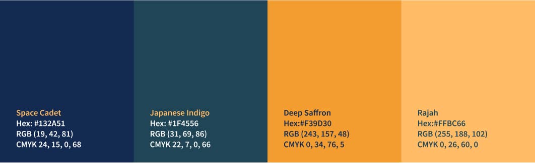
Primary colour pallete
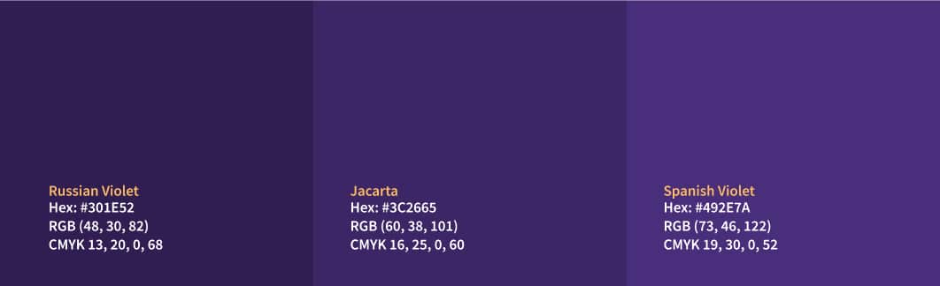
Secondary colour pallete
Typeface

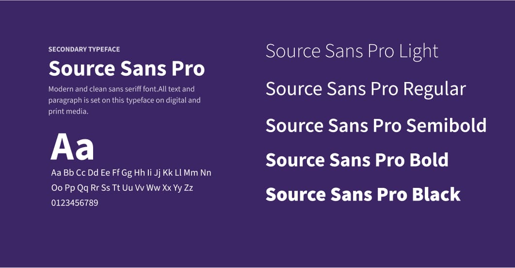
The primary typeface is Cormorant, it is used for the main headings and the secondary typeface is Source Sans Pro, it is used for the body text.
Brand in use