%201.webp)
02
AI Snaps
.svg)
.svg)
01
Our Work
03
About Us
04
Brand Audit
05
Contact Us
06
Client Success
12
07
Blogs
08
Careers
Book A Call
.svg)


Anomaly Bio is a Singapore-based biotechnology company working on a problem most people don't even know exists yet. The natural ingredients that go into nutrition products, crop protection, and personal care, the ones extracted from plants and animals and finite natural sources, are increasingly difficult to produce at the scale the world needs. Anomaly is a brand that is engineering microbes into micro-factories capable of producing those same functional ingredients through advanced fermentation. Same ingredients without having any dependency on any sort of fragile supply chains or limitations of geography or season.
It is genuinely some groundbreaking work that they are doing & it surely needed a brand that could carry that essence further.
Confetti was brought in to build the complete visual identity, from the logo and colour system to patterns, iconography, and the verbal foundations the brand would communicate from.
Biotechnology brands tend to go in one of two directions. Either they lean so hard into the science that the identity feels cold and inaccessible, or they reach for sustainability clichés, the predictable greens, the leaf motifs, the language of wellness that has been used so many times it has stopped meaning anything. Neither of those worked for Anomaly Bio, because what Anomaly does sits in a genuinely unusual place. It is deeply scientific and deeply rooted in the natural world simultaneously, and the brand needed to hold both of those things together.
The audience made it harder as Anomaly's partners and buyers are R&D teams, pet food manufacturers, agricultural innovators, nutrition brand founders, and corporate sustainability leads. Technically minded, globally oriented, and not easily impressed by surface level design decisions. The identity had to communicate credibility and confidence to people who would look past anything that felt like it was performing intelligence than actually possessing it.
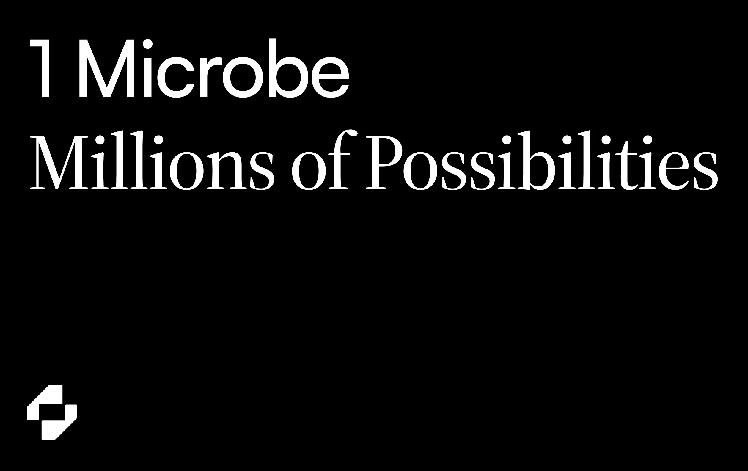
The strategic foundation Confetti built the identity around was a single idea which was “nature reimagined through technology”. Anomaly isn't replacing the natural world, in fact it's actually finding a way to work with it more intelligently, to produce what nature produces but without the fragility and limitation that comes with depending entirely on it. This was the underlying phenomenon that shaped everything, from the logo to the photography direction to the tone of every line of copy for our design team at Confetti.
The icon mark at the centre of the identity is built around the letter O, drawn as an abstract form inspired by molecular chain structures. It is scientific without being literal, recognisable without being obvious, and carries enough visual complexity that it rewards closer inspection without needing to be explained.
The colour palette was chosen to reflect the natural world Anomaly works with and the technological precision it brings to it. Tones that feel grounded and alive rather than clinical or artificially fresh. Nothing in the palette reaches for the predictable sustainability greens that have become shorthand for brands that want to seem environmentally conscious without saying anything specific about it.
Photography and texture were built around natural recurring elements like grass, rock, mineral, terrain, flowers. Rich 3D landscapes that feel like the natural world being looked at differently rather than romanticised.
A custom pattern system and iconography set were developed alongside the core identity, giving the brand a visual language it could use consistently across digital surfaces, presentations, and brand materials without relying on the logo alone to carry the whole identity.
Typography combines Source Sans Serif 4 with Satoshi and IBM Plex Mono, a pairing that brings structure and modernity together without tipping into the kind of typographic choices that make a technology brand feel like every other technology brand.
The tone Confetti established for Anomaly is direct and precise. It speaks to a technically minded global audience that doesn't need jargon to feel respected and doesn't respond well to language that oversimplifies what the company actually does. The voice is an amalgamation of scientific depth and future facing confidence, the kind of communication that builds trust with people who will fact-check what you say.
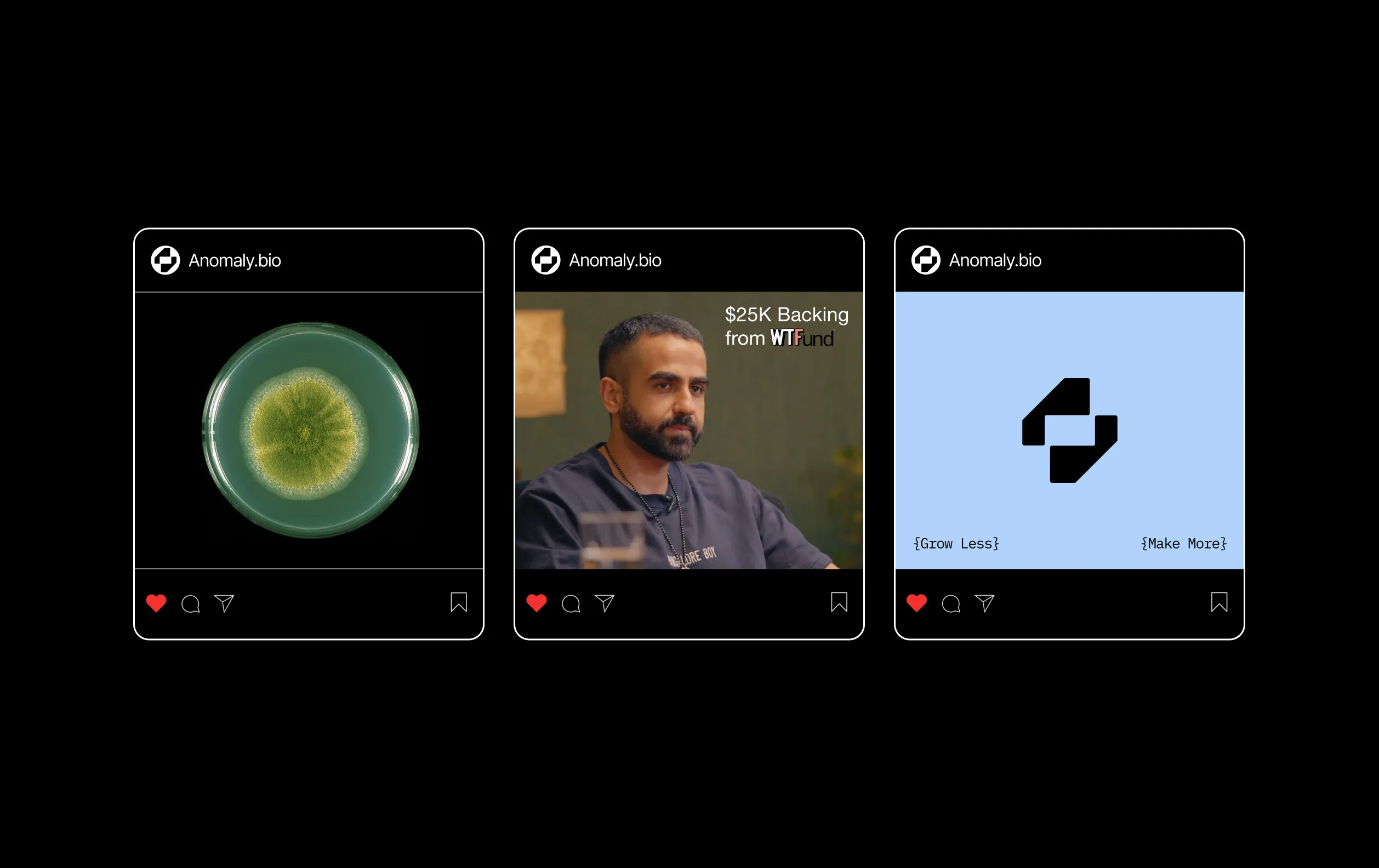
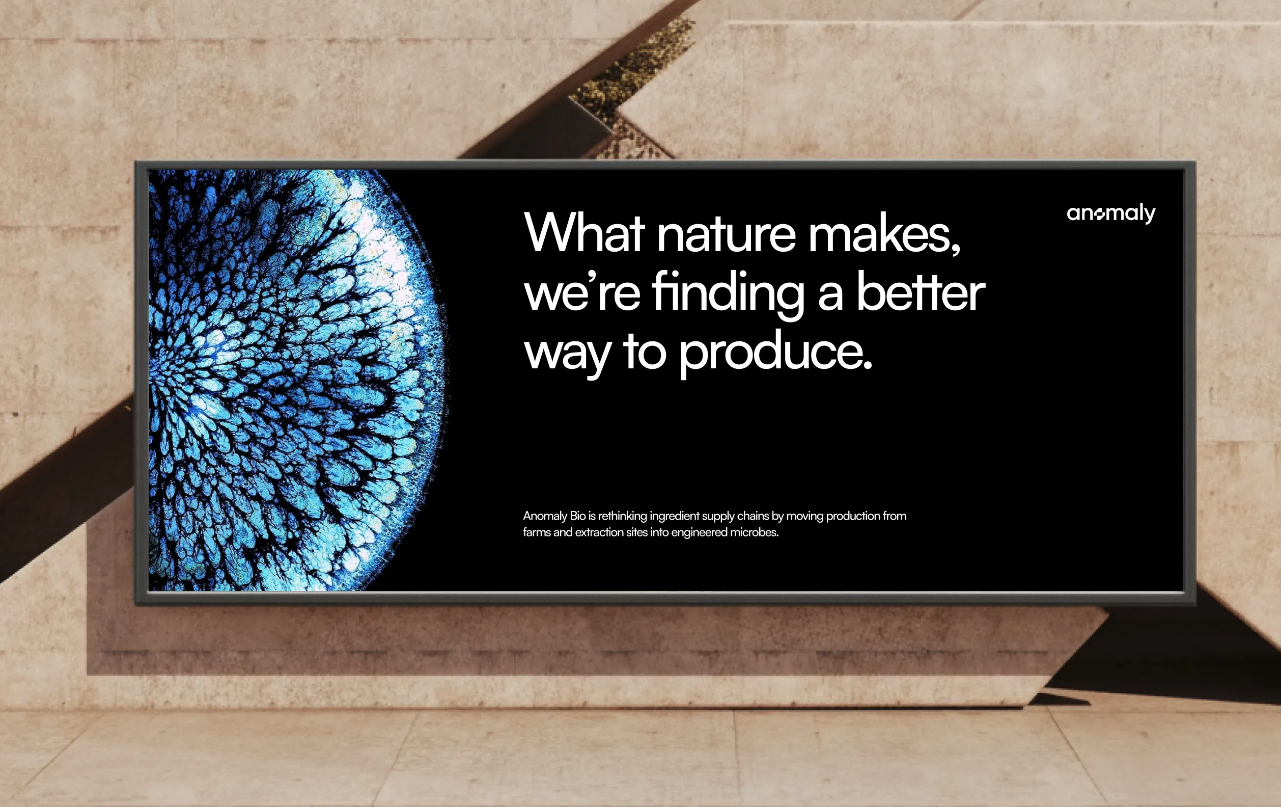
Anomaly Bio launched with a brand identity that sits in a genuinely unusual place in its category. It doesn't look like a sustainability brand or a typical biotech company. It looks like something new and unique in its own niche, which is exactly what a company doing something new should look like.
The visual system holds together across a complex range of applications and communicates to a technically sophisticated audience without losing the warmth that comes from a brand genuinely rooted in the natural world. The iconography and patterns give the brand room to breathe and grow across surfaces without the identity feeling stretched.
For a company building the future of how the world produces natural ingredients, the brand Confetti built reflects the ambition behind the work.












.svg)
.svg)
.webp)
.webp)






.svg)