%201.webp)
02
AI Snaps
.svg)
.svg)
01
Our Work
03
About Us
04
Brand Audit
05
Contact Us
06
Client Success
12
07
Blogs
08
Careers
Book A Call
.svg)


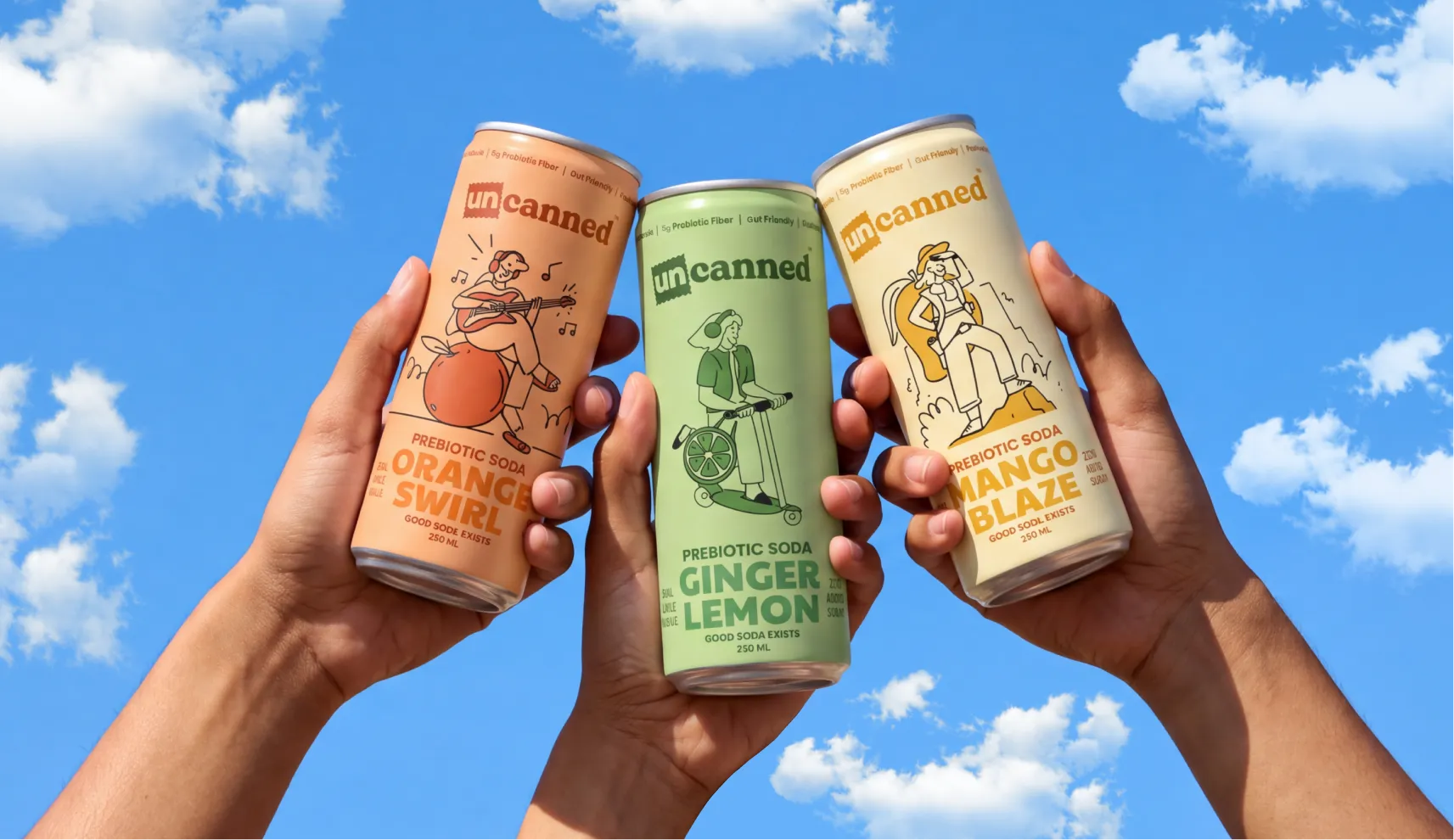
Prebiotic soda has already made its case abroad, brands like OLIPOP and Poppi turned "good for your gut" into something people actually want to be seen drinking. India hadn't seen its own version of that yet, Gen Z drinkers who scroll past anything that sounds like a wellness lecture. Uncanned set out to be that brand, a functional soda with none of the self-seriousness the category usually comes with. Unbothered, unfazed, unapologetic, a drink that could sit with any mood and still sound exactly like itself.
Confetti was brought on for the naming, the complete brand identity, and packaging across the range, along with the wider brand world that would carry it, from apparel to stickers to the little details that make a brand feel like something you belong to than something you merely just buy.
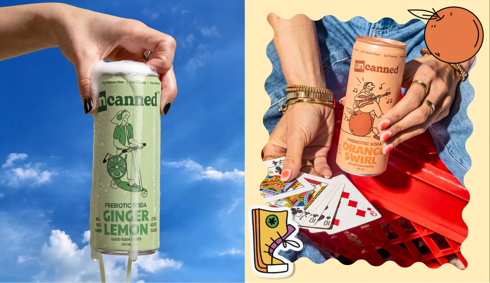
Drinks aimed at Gen Z tend to go one of two ways. Either they lean into the wellness angle so hard that the can feels like a lecture, or they chase "fun" so visibly that it reads as a brand trying too hard to be liked. Uncanned's audience can smell both from a distance. They don't want to be marketed at, they want to feel like the brand already gets them, and that only works if the brand actually behaves like one of them.
The brief was to build something that felt like a community before it felt like a product. Unbothered, a little rebellious, entirely unconcerned with being conventional, and confident enough not to explain the joke. Unfazed, unfiltered, unwavering, the kind of brand that could sit with any mood and still sound exactly like itself.
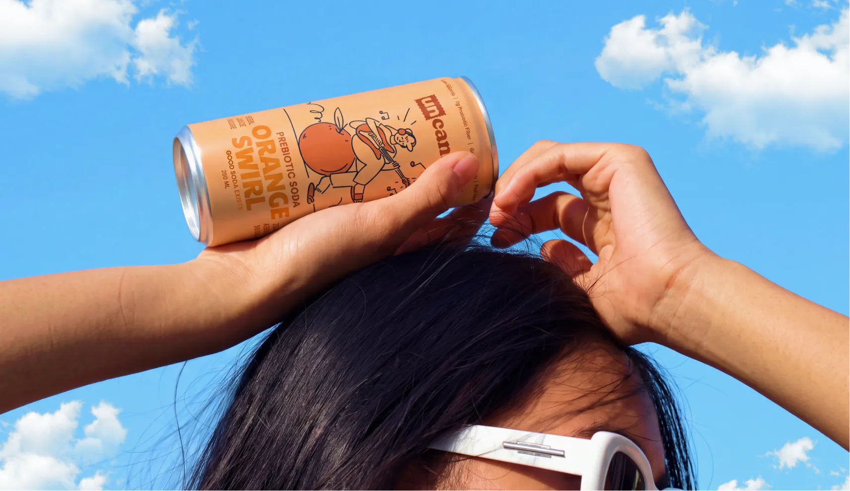
Confetti named the brand Uncanned, around the idea of everything a can usually isn't allowed to be. Unconventional. Unbothered. Unfiltered. Unfazed. Unwind.
The name works as wordplay on the format itself while carrying the actual attitude the brand is built on, the belief that the best memories are unplanned, the best stories are unfiltered, and the best people are the ones who never got put in a box to begin with.
The brand was built around the Creator archetype, as a way of moving through the world, someone who makes their own rules rather than borrowing everyone else's. That idea, the refusal to be conventional, ran underneath every decision that followed, from the logo to the packaging to the merchandise that extended the brand beyond the can.
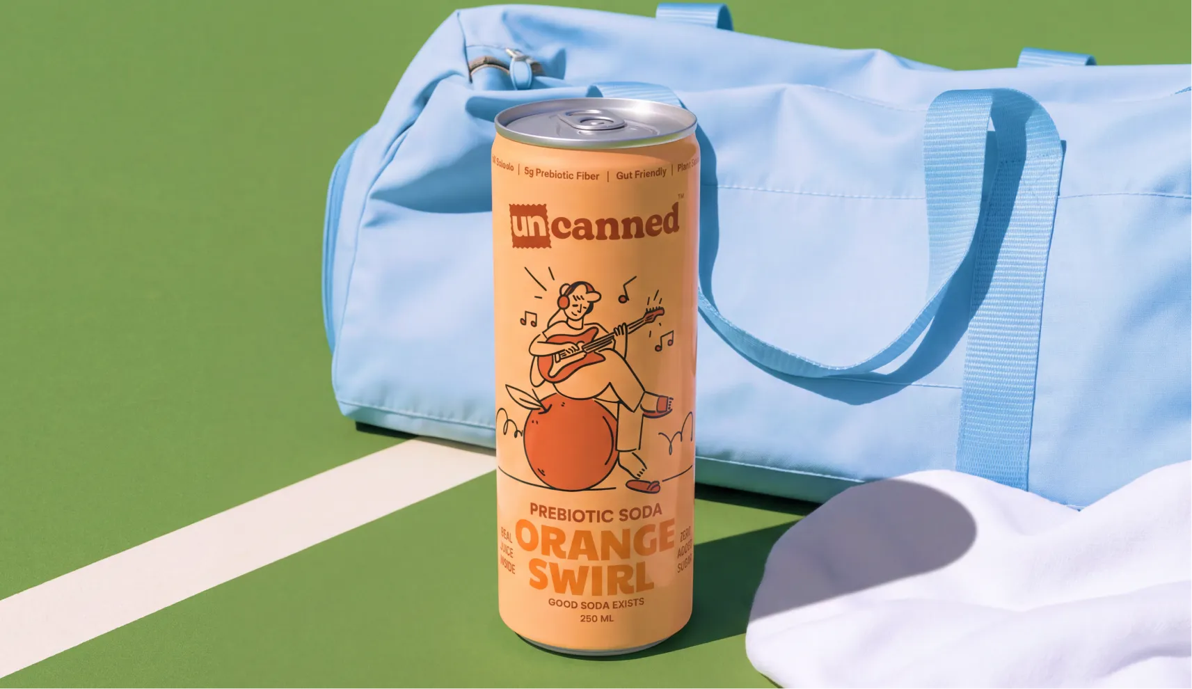
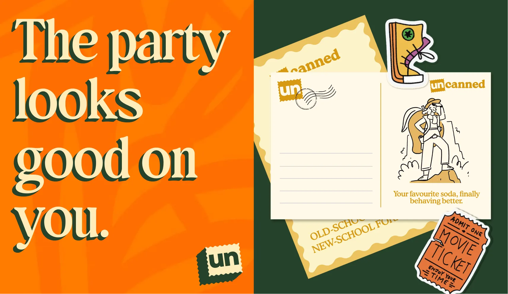
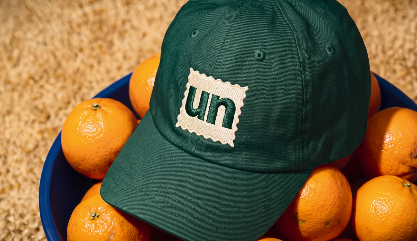
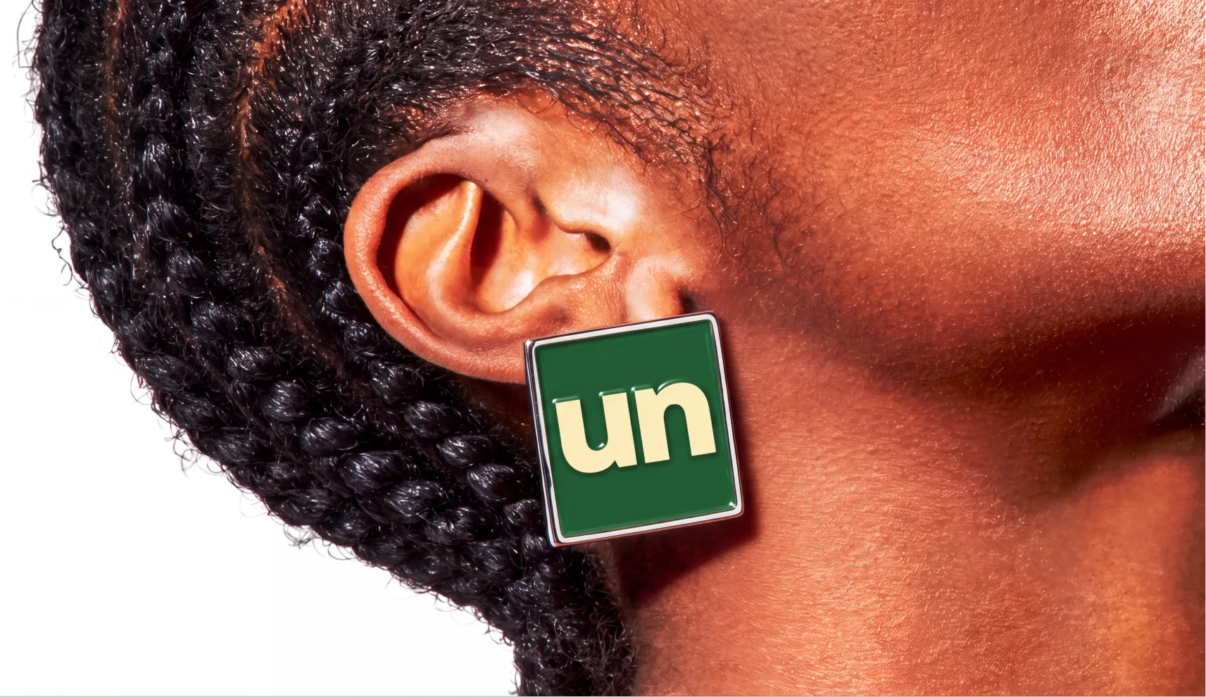
The wordmark went through dozens of concepts before landing on its final form, the word Uncanned with the "UN" framed inside a postcard stamp mark, a small nod to something sent out into the world rather than sealed shut. It reads as playful without losing legibility, and it gives the brand a mark distinctive enough to live on merchandise as comfortably as it does on a can.
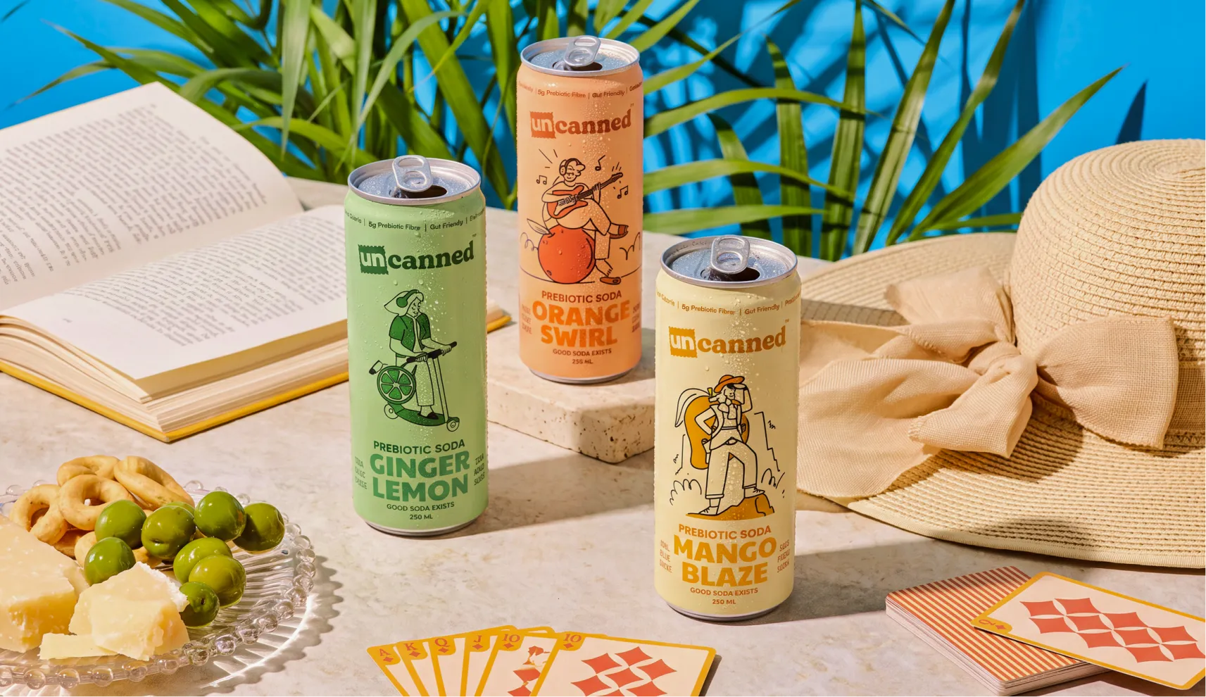
The palette moves away from the bright, saturated colours most Gen Z drink brands reach for, choosing warm beige, burnt orange, dusty teal, and olive grey instead. Muted colours over peppy & loud ones, the kind of palette that reads as confident rather than desperate to be noticed, which fits a brand built around not needing anyone's approval.
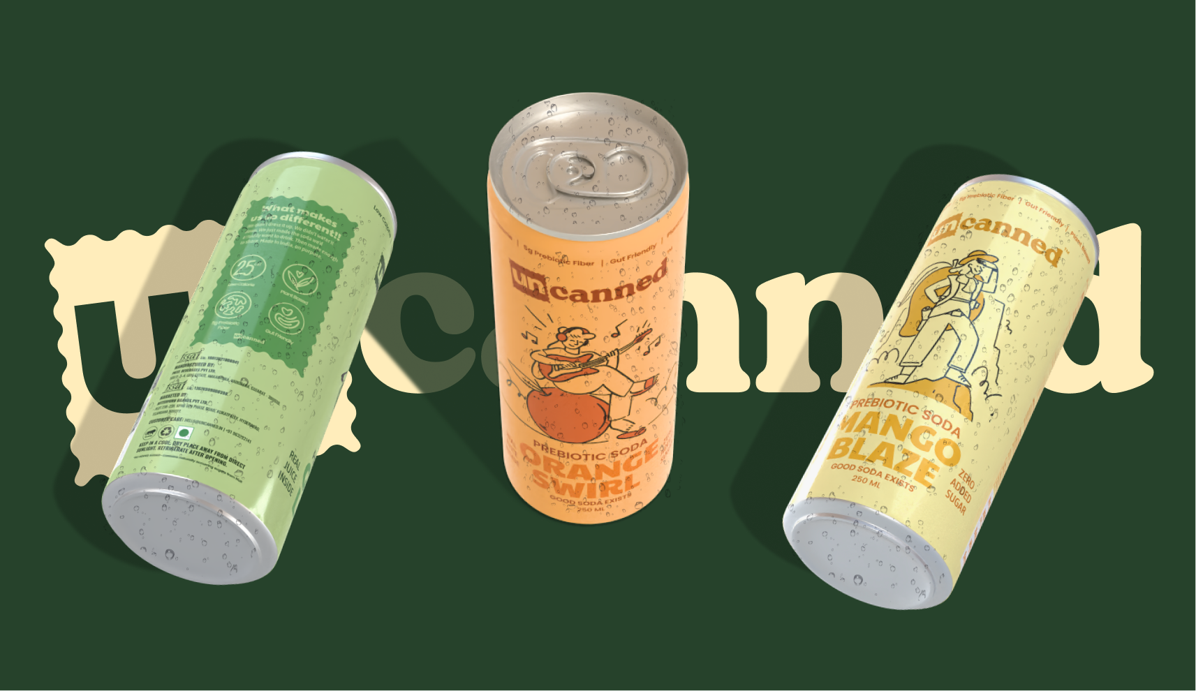
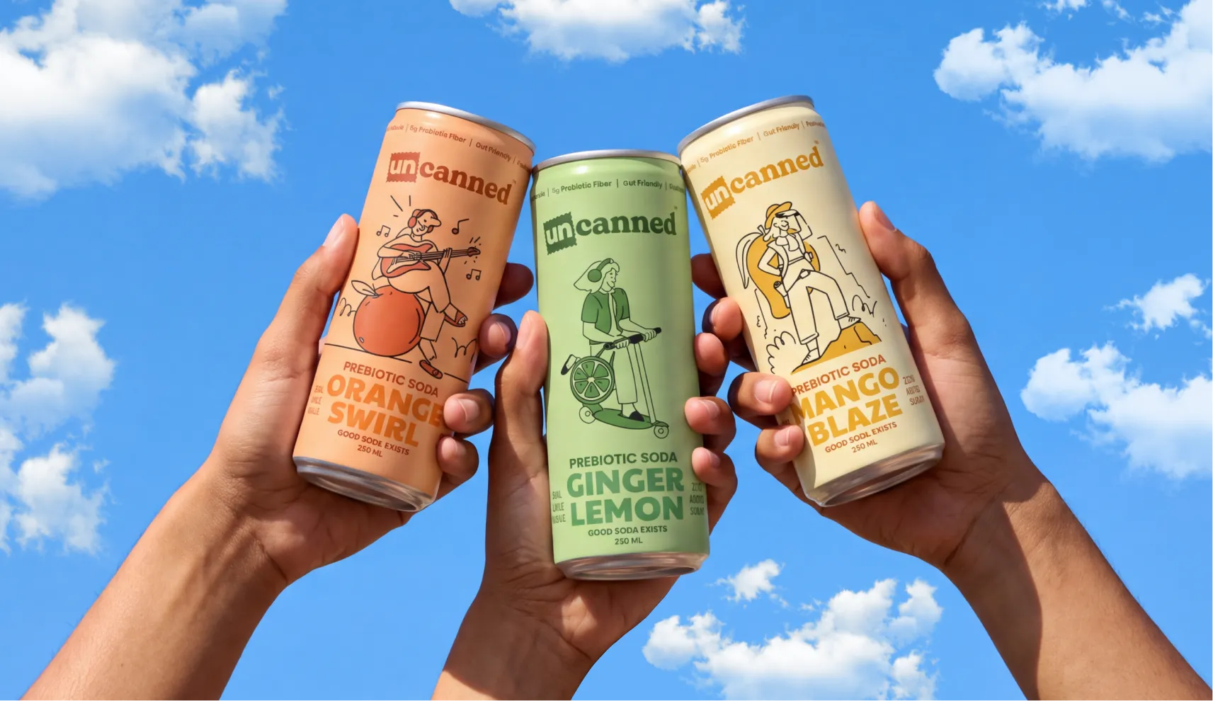
The packaging went through more than fifty concepts before the team landed on a character-led illustration system, each can carrying a figure that reflects the flavour inside without spelling it out literally. The team iterated and explored close to fifty different directions before finalizing on the one that made the cut.
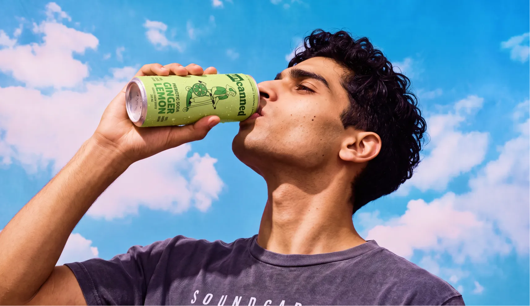
The orange can shows a girl sitting on a giant orange, playing music. The ginger lemon can, in green, shows a girl riding a motorbike with a lemon-shaped bag slung over her shoulder. The mango glaze can, in a soft pastel yellow, shows a girl hiking up a mountain with a mango-shaped backpack. Each illustration carries the same underlying idea, people who move through the world exactly as they are, never fitting into a single box.
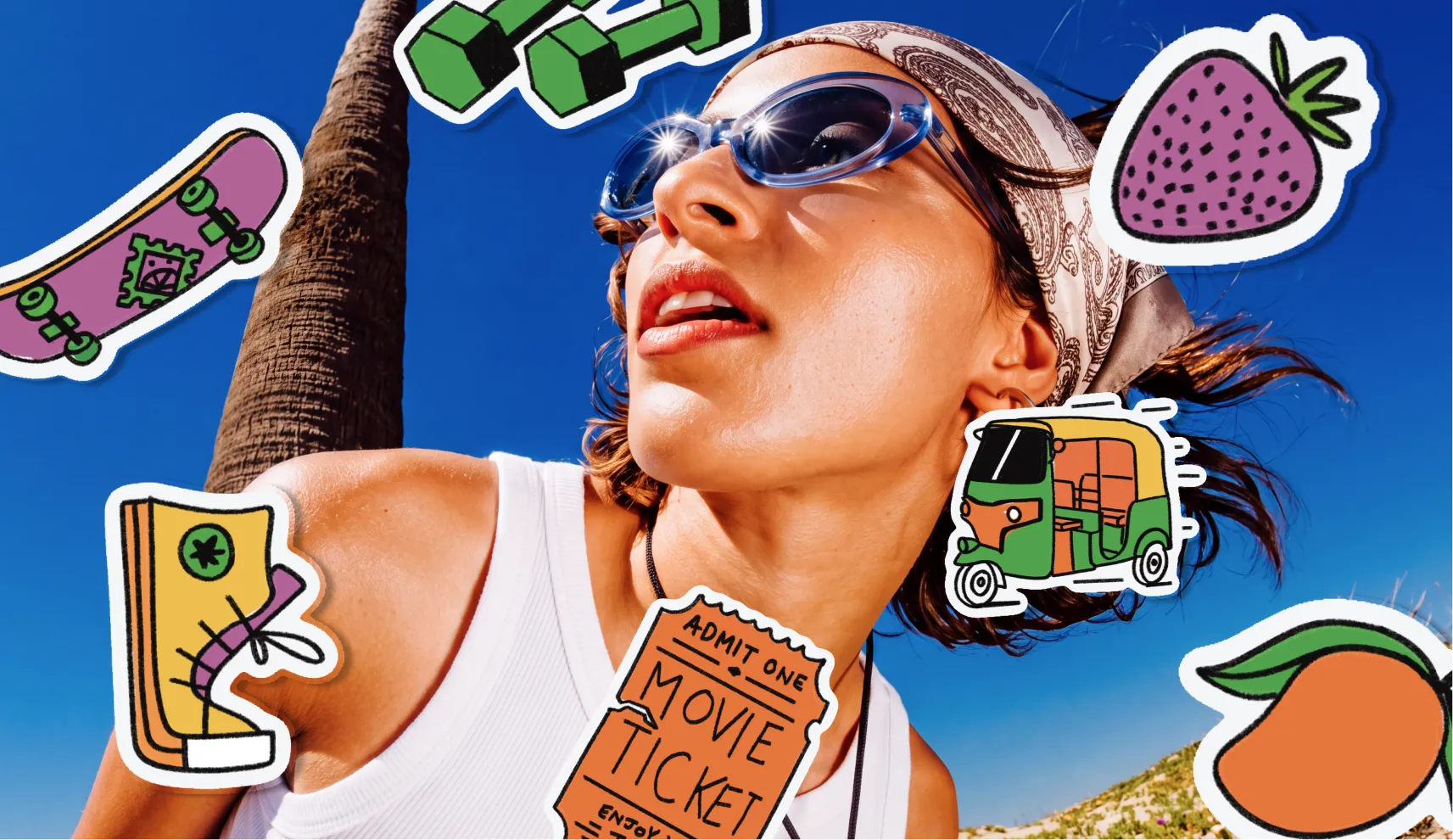
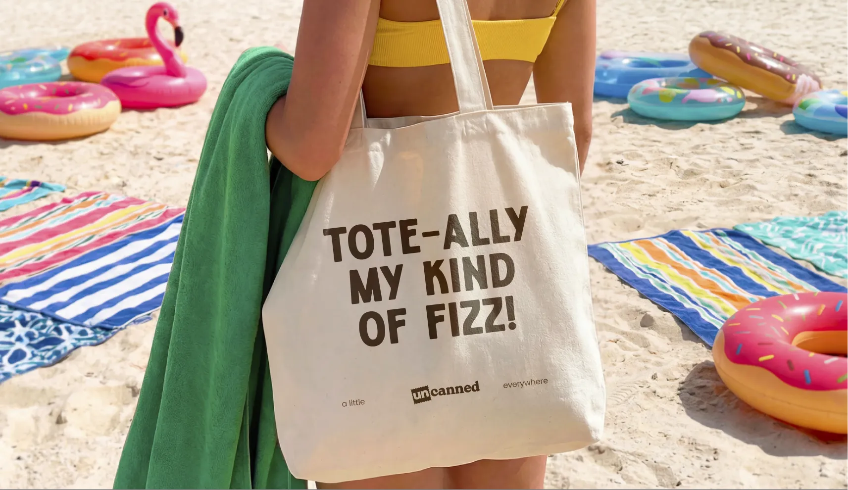
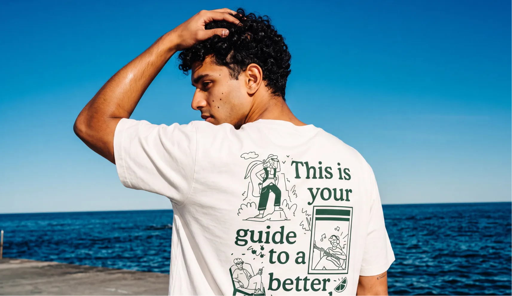
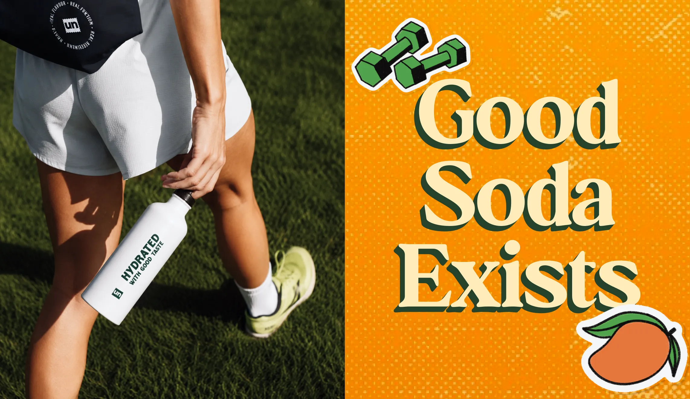
Confetti extended the identity beyond the can into the merchandise that gives a brand like this room to live outside the fridge, t-shirts, tote bags, caps, a wide range of quirky and colourful stickers, thank you notes, and bottles.
Every piece carries the same unbothered, creator-led energy as the core identity, giving Uncanned's audience things they'd actually want to be seen wearing and carrying, not just drinking.
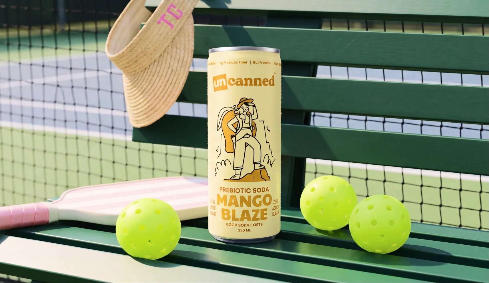
Uncanned launched into India's soda category with an identity that doesn't ask its audience to explain themselves, and it turned out to be exactly the brand the category needed. The name carries the attitude before a single can is opened.
The packaging turns a shelf into a lineup of characters rather than flavours. And the wider brand world, from the stickers to the stamp mark on the logo, gives the community around Uncanned something to actually hold onto beyond the drink itself. For a category that keeps assuming Gen Z wants to be sold to carefully, Uncanned is proof that the better move is to just be unbothered right alongside them.











.svg)
.svg)
.webp)
.webp)
.svg)