


Trendsetters in Type
Top 10 Indian FMCG Websites with Striking Typography Choices
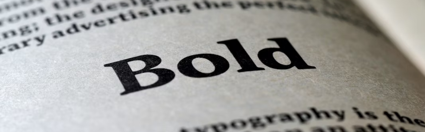
In the ever-evolving world of branding and marketing, the importance of visual elements cannot be overstated. Typography is one such element that works as a powerful tool that can significantly enhance a brand’s identity and create a memorable user experience. This is especially evident in the realm of Fast-Moving Consumer Goods (FMCG) where there’s a constant fierce competition to stand out and be memorable. Let’s explore how unique and striking typography has played a pivotal role in elevating the brand identity and websites of some notable Indian FMCG brands.
Wlth.in
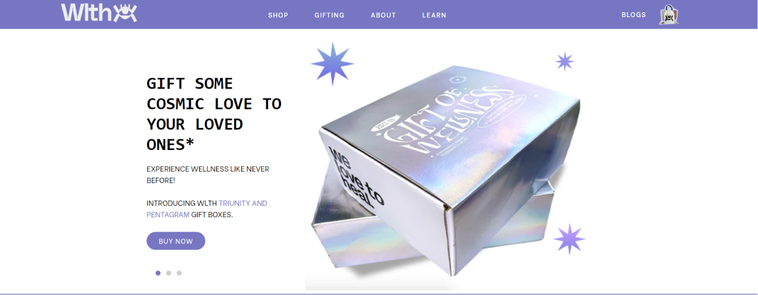
Wlth is a plant-based wellness brand that uses striking iridescent style in their identity to focus on their “cosmic” theme. This already makes it stand out from the crowd, but to put cherry on the top, they also use a very unique inktrap typeface which gives it a bold and modern look, making it memorable, while speaking directly to their target audience.
Soulfull
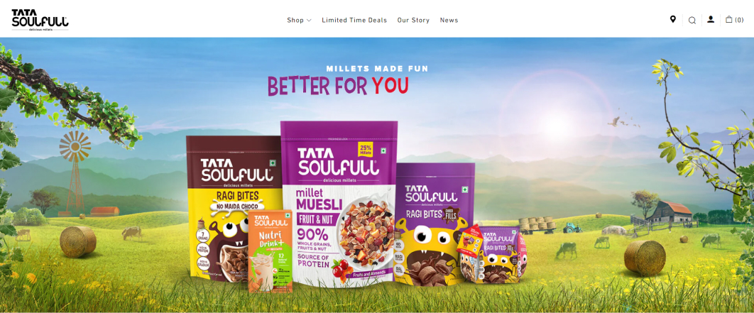
“Soulfull,” a brand that offers traditional Indian breakfast options, has embraced typography that resonates with authenticity and warmth. They use rounded and fun typefaces to mirror their “fun and approachable” vibe. These typefaces go extremely well with their colorful palette and their unique brand mascot as well.
Too Yumm!
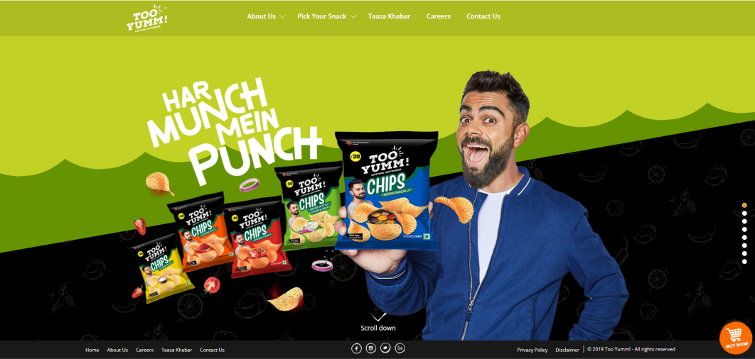
“Too Yumm!” is all about healthier snacking options without sacrificing flavor. Their branding employs bold and lively typography that reflects the playful spirit of their products. The website employs a similar strategy, using dynamic typography to showcase their range of snacks and engage visitors in a visually exciting manner. This approach not only enhances brand recall but also reinforces the idea that healthier choices can be enjoyable and indulgent.
Paper Boat
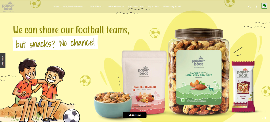
Paper Boat’s branding is a masterclass in creating an emotional connection through typography. Their packaging and marketing all focus on the aspects of “nostalgia and authenticity”, and that gets reflected really well with their choice of hand-drawn typeface. This distinctive typography is consistently applied across their website, creating a consistent brand narrative. The typography, combined with vibrant visuals, transports visitors to a world of cherished memories and delightful flavors.
Chumbak
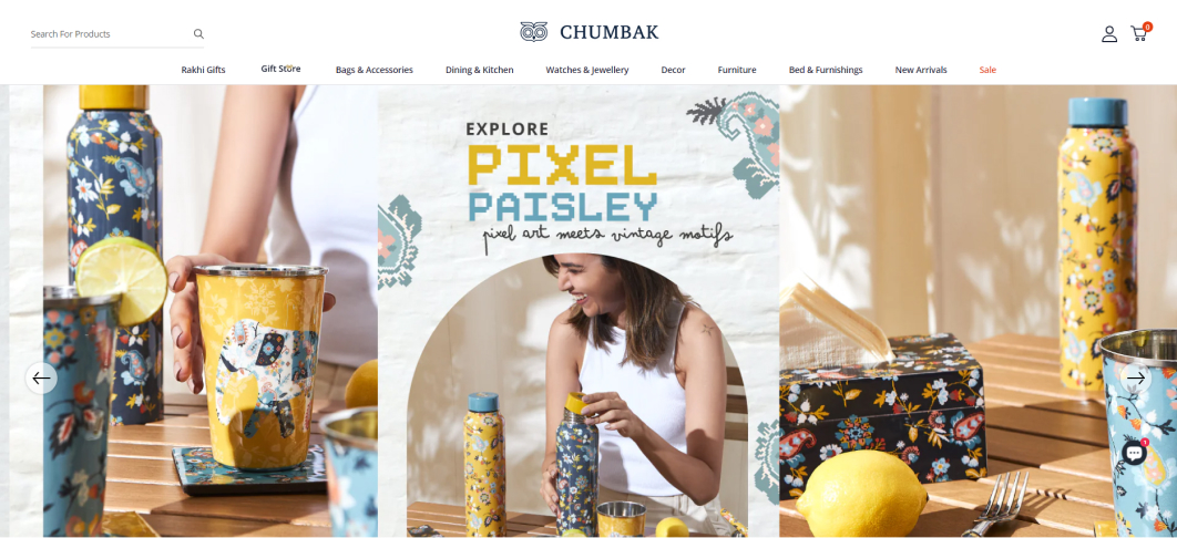
Chumbak is synonymous with vibrant and quirky designs, and their typography is no exception. They use bold, colorful, and whimsical fonts on both packaging and website. This sets the stage for a playful and imaginative brand experience. The typography effortlessly communicates the brand’s vibrant personality and stands as a testament to how typography can be a crucial part of the overall visual language.
Juicy Chemistry
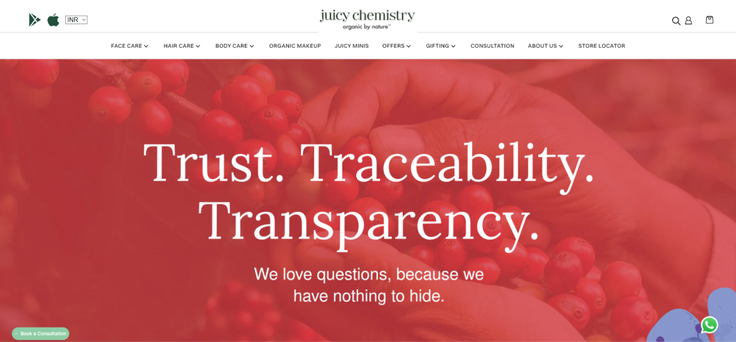
Juicy Chemistry, a brand focused on organic skincare, has opted for typography that exudes luxury and purity. The elegant typography on their packaging and website mirrors the handcrafted and delicate nature of their products. The choice of typography aligns with their commitment to natural ingredients and quality, creating an immersive and premium brand experience.
Minimalist
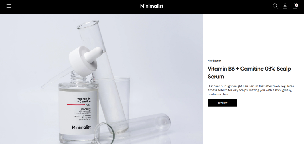
Minimalist has quickly grown to be a brand that everyone knows of. As the name suggests, Minimalist embraces simplicity, and their typography is a testament to that. Clean, bold, sans-serif typography is a cornerstone of their brand identity, reflecting their commitment to straightforward and effective skincare. The typography and packaging mirror the clutter-free approach they take to skincare, making information easily accessible and products enticing.
Jade Forest

Jade Forest is a brand that focuses on improving the drinking experience in India. Their catalog includes delicious and low-calorie beverages. Their branding takes an interesting approach, using very bright and playful colors. But what stands out the most is their memorable typography. They use a custom serif typeface that gives a premium vibe while also maintaining a friendly persona. This unique style gives them a chance to stand out against the competition, while also increasing their brand recall value.
Licious
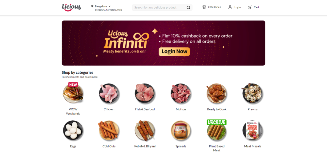
Licious, a brand that provides high-quality meat and seafood, employs typography that exudes sophistication and premium quality. The refined and modern typography reflects the brand’s commitment to excellence. On their website, this typography adds an air of elegance and trustworthiness, reassuring visitors of the quality and authenticity of their offerings.
The Moms Co.

The Moms Co. specializes in safe and natural products for mothers and babies. Their typography is characterized by a friendly and approachable script-like style, reflecting the care and gentleness associated with motherhood. This typography is thoughtfully extended to their website, creating an environment that resonates with parents seeking the best for their children.


Want to grow your FMCG brand?
Fill the form below and let’s get on a quick call to see how we can help you!