02
AI Snaps


01
Our Work
03
About Us
04
Brand Audit
05
Contact Us
06
Client Success
07
07
Blogs
08
Careers
Book A Call




Need Help In Building Your Brand?
Click the button below & book a call with our founder directly.

Rishabh Jain
Managing Director
Your distribution has expanded, but sell-through remains flat, discounts are rising, and new variants lack brand consistency. These are some of the first signs to change your packaging or branding or both.
This guide helps you identify 13 signs that change is needed, understand where the problem lies, decide how much to change, assess the cost of waiting, retain existing customers, and choose the right partner for the job.
Branding and packaging solve different problems. You must understand which one is failing to invest in the right fix instead of redesigning parts of the business that are already working.
Consider these three layers:
Branding problems start with meaning and positioning. The positioning no longer matches who you sell to. The name boxes you into one category when you now sell three.
The story that won your first customers doesn't explain why a new customer should pay more than the alternative. When the brand is the issue, customers misread you: they think you're cheaper than you are, or meant for someone else, or they can't say what makes you different.
Brand identity includes your logo, colours, typography, imagery and the visual rules connecting them. Even with clear positioning, a weak identity system can make the business look different across products, websites, campaigns and retail channels.
This often happens when new products and marketing materials are created without shared brand guidelines resulting in an inconsistent brand that gets harder to recognise as it grows.
Packaging problems are problems of performance. It disappears beside competitors, and variant names are too small to read from a metre away.
Flavour coding is inconsistent, so a shopper looking for mango picks up lemon. The front panel lists eleven claims and none of them registers.
In these cases, the packaging needs improvement, not necessarily the entire brand.
As a trusted D2C branding and packaging design agency, the most common mistake we see is fixing the wrong layer.
You commission a new logo when the real issue is poor packaging hierarchy, or redesigns its entire range when its positioning is no longer relevant.
Start with three questions:
A structured brand audit can help identify which layer needs attention. For instance, our audit of Gisou, traces how a single family honey story holds the brand together across packaging, Instagram, and creator partnerships, and asks whether that story can stay believable as the brand scales.
Reviewing the positioning, identity, packaging and digital presence together makes it easier to separate the symptoms from the underlying problem.
The signs can be grouped under 4 categories: commercial, shelf and system, strategic, and competitive or regulatory.
We’ve added a check with each one that you can run internally before you speak to anyone outside the business.
More distribution with flat sales is one of the clearest signals that the pack is not converting at the point of purchase.
The product is getting more chances to be seen, and the same number of people are buying. That gap usually means the pack is not earning attention, not justifying the price, or not communicating a reason to switch.
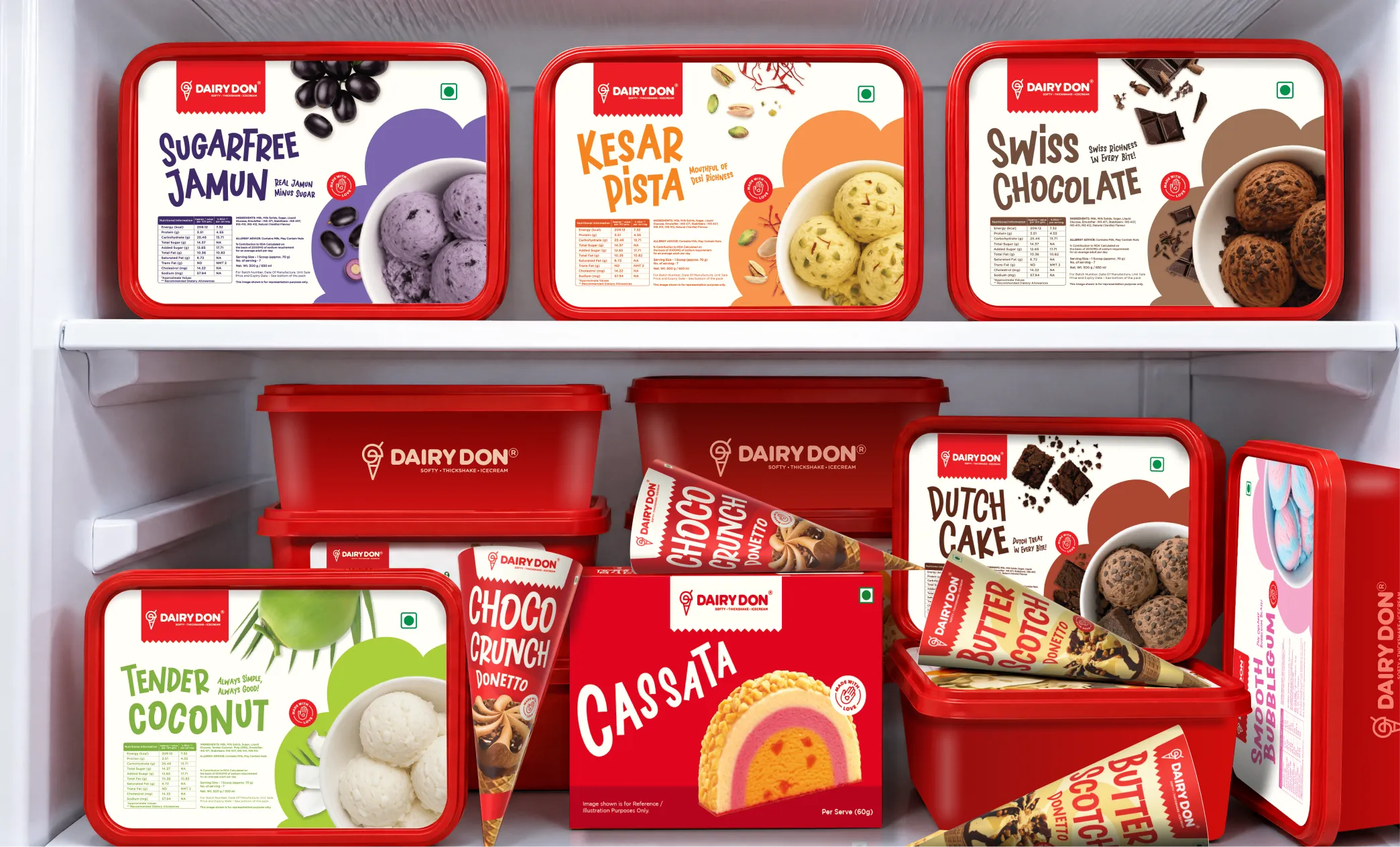
Dairy Don had over four decades of family craftsmanship and loyal customers, but its brand identity hadn’t kept pace. We rebuilt its identity and packaging around a versatile DD monogram, creating a cohesive system across 30+ flavours, multiple product formats and parlour interiors, giving a legacy brand the foundation to scale nationally
✅Check: Compare monthly units per active outlet, or per marketplace listing, against the same period last year.
When a brand discounts because the pack does not communicate value, the discount becomes a permanent correction for a perception gap.
Discount-led selling trains the buyer to wait, erodes margin, and makes the brand harder to sell at full price in every channel. A pack that carries material quality, provenance, or a functional benefit clearly can hold price without a promotional crutch.
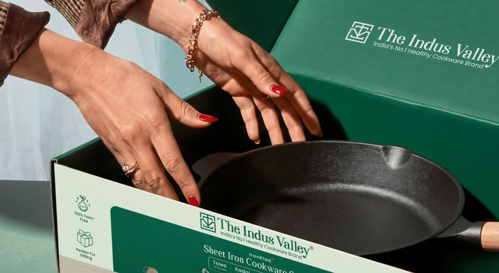
When The Indus Valley approached us, its cookware packaging was cluttered with competing information. We rebuilt the hierarchy around product, brand, features, and technical details, using deep green to subtly reinforce health positioning and create a more premium, elevated feel.
✅Check: Compare the full-price conversion rate against the discounted conversion rate. If the gap is wide and persistent, the pack is not doing its job at full price.
For a brand selling on a marketplace, a quick-commerce app, or a D2C store, the primary touchpoint is often a product image at roughly 160 pixels wide. A pack designed only for a 3D shelf frequently fails at that size: the hierarchy collapses, the brand name becomes illegible, and the differentiating idea disappears.
Your pack must have a thumbnail-first hierarchy: one recognisable asset, one clear colour field, and one legible brand cue that survives compression. A pack that works on shelf and fails at thumbnail is a pack built for one channel in a multi-channel market.
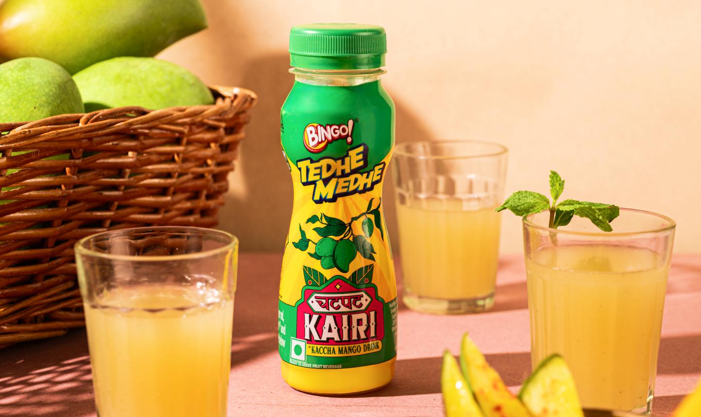
ITC Bingo’s Chatpat Kairi packaging was built around three core design choices: tropical green and yellow colours, a bilingual logo fusing Devanagari and English, and truck-art-inspired illustration. That restraint is what allows the pack to read at speed, on shelf and in a listing.
✅Check: screenshot the results for your main category search, shrink it to phone size and convert it to greyscale. Can you find your product in 2 seconds and tell which variant it is?
Ranges that grow organically often look like a series of unrelated products sharing a logo. The buyer cannot tell that the variants belong together, and the brand loses the compounding recognition that a coherent system produces.
This can look, something like different typographic scales, inconsistent colour logic, and hierarchy that changes from pack to pack. The fix is a portfolio system, a set of rules that holds across every SKU and every format.
At Confetti we take special care of this. For example, for Novis bakery, we built an identity system across 12 SKUs and 3 product categories without losing coherence.
✅Check: line up every SKU. Can someone who has never seen the brand group them and find the variant they want?
Your pack carries every claim, every certification, every ingredient callout, and every promotional message at equal volume. The buyer’s eye has no entry point, and your single most important idea is buried under the secondary ones.
Decide what the pack is for, and let everything else support it. A pack that says one thing clearly will outperform a pack that says twelve things at 80% volume.
✅Check: Show five people the front of the pack for three seconds and ask what they remember. If the answers differ, or they only remember the colour, the hierarchy is broken.
When the brand system lives in a folder of PDFs and a set of verbal instructions, every reprint is an interpretation. A new printer, a new packaging supplier, or a new marketing hire introduces a small drift, and the drift compounds until the range no longer looks like one brand.
Design system with documented rules and production-ready assets: colour values, typographic scales, logo clear space, hierarchy rules, and print specifications.
✅Check: compare three print runs of your best seller from the last year side by side.
A snack brand built for college students now sells mostly to working parents. A skincare brand wants to move from mass pharmacy to premium D2C. What appealed to the first audience may put off the second.
When the audience shifts, the brand’s visual and verbal language has to shift with it or the brand will keep attracting the old buyer while trying to appeal to the new one.
✅Check: compare current customer data with the persona you designed for at launch. If they've drifted, revisit strategy before any design work.
A line extension or category entry is the moment when a brand’s architecture is tested. Check whether the new product can carry the parent brand’s equity without confusing the buyer about what the brand is for.
Bingo’s extension from snacks into beverages with Chatpat Kairi required design choices that carried the parent brand’s boldness into a new format while giving the new product its own visual world. The extension worked because the design honoured both the parent brand and the new category, rather than forcing one to imitate the other.
✅Check: mock up the new product on a shelf with category leaders. Does it belong there, and still look like you?
Moving from offline to marketplaces, from D2C to modern trade, or from India to the UAE changes what the brand has to do.
Kooji's founders had a strong offline reputation, but none of it was visible on a digital shelf already dominated by three or four better-funded brands, so the rebrand was built for that environment.
✅Check: for each new market or channel, list the brands you'll sit next to and the rules (language, labelling, image formats) you'll have to meet.
Many brands have a genuine story: a founder history, a material provenance, a craft process that never reaches the buyer because the brand has not translated it into a visual or verbal language. The story exists in the about page and the founder’s interviews, but not on the pack or the listing.
The work is to make the true story legible at the point of decision. That means finding the one asset, phrase, or image that carries the story and building the pack’s hierarchy around it.
✅Check: read your pack and listing as a stranger would. Does anything explain why you, rather than the cheaper option?
A pack that uses excessive plastic, unrecyclable materials, or a format that contradicts the brand’s stated values creates a credibility gap that buyers increasingly notice.
This is often a factor inside a packaging change: when the pack is being reworked anyway, the material and format decisions should be re-examined alongside the visual ones.
A brand that claims environmental responsibility and ships in a format that undermines it is sending two messages, and the buyer will believe the pack, not the copy.
✅Check: you are using recyclable, reusable, or responsibly sourced packaging materials that align with your brand’s sustainability claims and minimise unnecessary plastic and waste.
Category codes shift, new entrants establish a different visual language, legacy competitors refresh, and the shelf’s centre of gravity moves. A brand that was once distinctive can become the thing it originally disrupted.
When category leaders redesign, the shelf shifts around them. In January 2021 Burger King launched its first full rebrand in 20 years, designed by Jones Knowles Ritchie, replacing its 1999 logo with a flatter mark based on its earlier designs and rolling it out across packaging, uniforms and digital. Brands that stood still beside resets like this start to look a generation older.
✅Check: compare a photo of your category shelf today with one from three years ago.
Labeling regulations, ingredient disclosure requirements, health claims rules, and packaging waste directives change on a cycle that brands do not control. A regulatory change is often the moment when a packaging system is forced open and it is better to use that moment to fix the system than to treat it as a compliance patch.
A pack that is non-compliant cannot be sold in the affected market, and a hasty reprint introduces inconsistency across the range. A regulatory trigger is an opportunity to re-examine the whole pack system.
📌Ticking one or two of these is normal for a growing brand. Three or more, especially across different groups, usually means it's time to act.

Once you identify what is failing, the next decision is how much to change. A refresh, packaging redesign and full rebrand may be the right choice.
A packaging refresh keeps the brand and identity and fixes how the pack performs. It suits signs 5, 6 and 13: weak hierarchy, inconsistent reprints, regulatory change.
The work usually covers restructuring the front panel, tightening colour coding, updating mandatory information, and producing proper master files and print specs. It's the smallest and fastest change, and for many brands it's enough.
A packaging system redesign rebuilds the architecture of the range. It suits signs 2, 3 and 4: a pack that undersells the price, a listing that fails at thumbnail size, SKUs that don't read as a family.
The output is a template every current and future SKU follows, with rules for how variants, sizes and sub-ranges differ. It pays off most for brands planning to add SKUs, because each new one becomes an application of the system rather than a fresh design project.
A brand-led rebrand starts with strategy and works outward. It suits signs 7, 9 and 10, often alongside sign 1.
Positioning, personality and sometimes the name are reconsidered first, then the identity, then the packaging. It takes the longest and involves the most stakeholders, so choose it only when the brand's meaning needs to change, not only its appearance.
Here’s a look at what changes, what says the same and scope for the three options:
Before changing anything, identify the elements customers associate with your brand: colours, logo, typography, packaging shapes, characters or distinctive product cues.
Keep them where they still support recognition. Our Ben & Jerry's brand audit examines how its hand-drawn lettering, Vermont imagery and distinctive flavour names have become recognisable parts of its packaging.
Internal design fatigue, a change in marketing leadership or one poor sales quarter are not, by themselves, reasons to rebrand. Pricing, distribution and product quality problems will not disappear with a new identity.
👉Start with the problem, protect what works and choose the smallest scope that can solve it.

Delaying a brand or packaging update may seem like the safer financial decision. A redesign requires investment, time and planning. But keeping an underperforming brand also has costs.
Confetti's Bombay Shaving Company brand audit illustrates how early branding and architecture decisions can become limitations as a business grows, even when the brand has strong recognition.
Calculate the cost of waiting
Review the previous 12 months and estimate your discount costs, packaging reprints, obsolete stock, delayed launches and repeated design expenses. Compare these figures with the investment required for a brand refresh, packaging redesign or full rebrand.
A redesign is not always the right answer. But the financial decision should compare the cost of making a change with the cost of keeping a system that no longer works, rather than assuming that doing nothing costs nothing.

A brand refresh or packaging redesign can improve how customers perceive your products, but changing too much at once can weaken recognition.
The goal is to fix what is not working while protecting the elements customers already know.
1. Start with an audit
Review your brand strategy, visual identity, packaging and digital presence together. Identify which elements are underperforming and which ones customers still recognise. A brand audit helps establish the scope before design begins.
2. Protect distinctive brand assets
Identify the elements that help customers recognise your products: logo, colours, typography, illustrations, pack shape or other distinctive cues. Decide what should stay before exploring new concepts.
Avoid changing every element at once. Retaining familiar assets gives existing customers a visual reference as the brand evolves.
3. Finalise strategy before design
If your audience, positioning or brand architecture needs to change, agree on those decisions first. Otherwise, design reviews can become discussions about colours and layouts when the real disagreement is about the brand's direction.
4. Design for the complete product range
Gather your SKU list, sizes, variants, claims and regulatory requirements before developing packaging concepts. A design that works for one hero product may fail across the wider range.
For Forest Essentials, Confetti created an SKU database and content inventory before developing eight packaging concepts, which were narrowed to three for review. This helped ground the design process in the actual product range.
5. Test before committing
Evaluate the new designs in realistic buying environments:
Testing helps identify problems before they affect the entire range.
6. Plan the rollout carefully
Decide whether to update all products at once or phase in the new designs. Plan old-stock clearance, printer handoffs, retailer communication and updated marketplace listings. Where useful, add a temporary “new look” message to help customers recognise the updated packaging.
A small packaging refresh may take weeks, while a full rebrand across multiple products and markets can take several months.
A successful brand change requires identifying what customers value, fixing what no longer works and introducing the changes in a controlled way.
👉A well-executed change can still produce a short-term dip. So, it is important to scope the change to what the diagnosis actually requires, and for protecting the assets that make the dip shorter.
When it comes to modifying the design, the tussle is between going in-house or outsourcing digital branding services. A wise decision here would be to hire a professional agency because of the following brownie points.
Better Experience And Expertise
Redesigning with outside professional design agencies will bring a wealth of expertise, creativity, and resources to the table. Such specialists have a deep understanding of design principles, market trends, and consumer psychology which they will use to revamp your package and brand design miraculously. They will craft designs that not only look appealing but also communicate your brand’s message effectively
Advanced Tools And Software
Innovative designs and digital branding are possible with the help of advanced technologies which might not be available in-house. Contrarily, professional agencies have access to cutting-edge design tools and technologies using which they ensure that your packaging design is not just visually striking but also technically sound. Such expertise becomes significant if your packaging involves intricate details or special printing.
Cost-Effective And More Productive
Some people misperceive that outsourcing will be an expensive affair and fall into the trap of getting designing services from in-house amateurs to save costs. Doing this might seem tempting but will be a risky approach as naive designers may not drive desired results. Such mistakes can impact your brand’s image and potentially cost you more in the long run. Opting for professional outsiders will get you quality results.
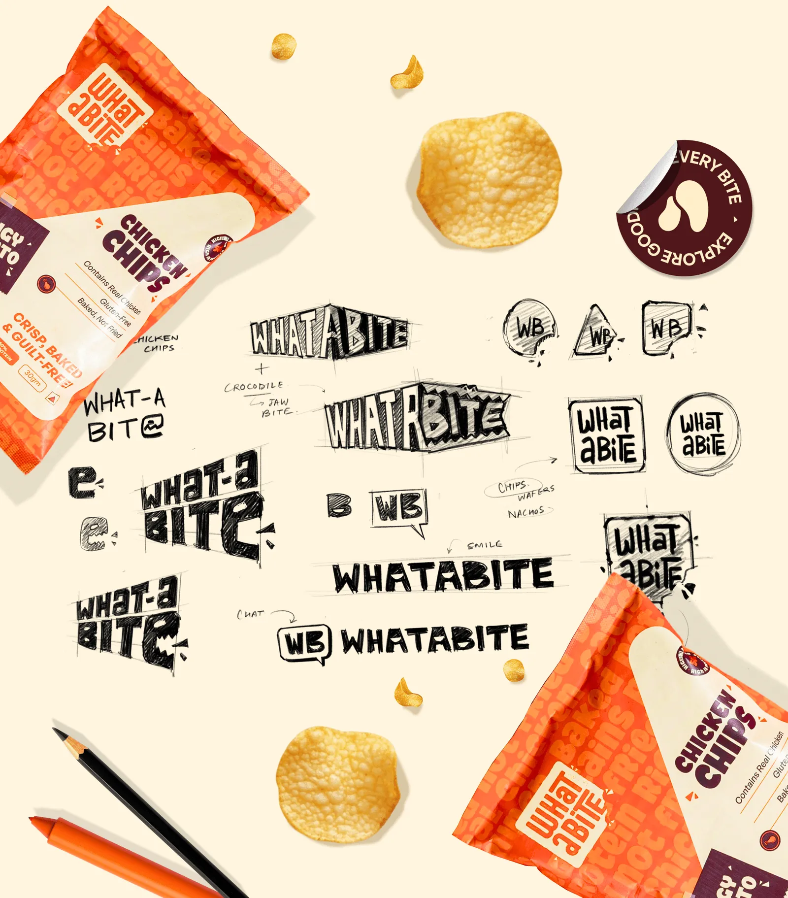
Redesigning an established brand is different from creating a new one.
Your agency needs to understand what customers already recognise, identify what is underperforming and manage the change across packaging, retail and digital channels.
1. Experience with brand and packaging redesigns
Ask for before-and-after case studies. Look for evidence of how the agency protected existing brand recognition while improving the identity or packaging system.
2. A diagnostic approach
Ask how they determine whether you need a refresh, packaging redesign or full rebrand. A good agency should audit your existing brand before recommending the scope. Be cautious of proposals that jump straight to visual concepts.
3. Category and channel experience
Check whether the agency understands your product category and sales channels, including retail shelves, e-commerce marketplaces and quick-commerce platforms. Ask how it balances shelf visibility with thumbnail readability.
4. Packaging and production expertise
Confirm who handles structural design, dielines, material specifications, artwork preparation and print-ready files. A design that looks good on screen must also work in production.
5. System thinking
Ask to see complete product ranges, not just individual hero packs. The agency should demonstrate how it manages variants, new SKUs, brand guidelines and consistency across channels.
6. Clear accountability and measurement
Establish who manages approvals, printer coordination and rollout. Agree on success measures such as sell-through, price realisation, marketplace click-through rates and reprint frequency.
Share an existing product page or shelf photograph and ask the agency to identify three specific improvements. Its ability to explain the problems, prioritise changes and connect design decisions to business outcomes will tell you more than a portfolio of attractive mockups.
A good partner should recommend the right amount of change, even when that means a smaller project.
Confetti Design is a retail-focused branding and packaging design studio working with FMCG, F&B, beauty, wellness, fashion, and D2C brands.
With more than 200 projects delivered, our approach starts with identifying what is holding a brand back before recommending a redesign or rebrand.
Our process focuses on five steps:
For Kooji, the challenge called for a full rebrand. We developed a new name, identity and packaging system across 24 SKUs, creating a foundation that could support future product categories.
For The Indus Valley, the brand remained, but its packaging system needed to evolve to support stronger shelf presence and new product launches. This is an example of packaging-led change rather than starting the brand again.
For Dairy Don, Confetti rebuilt the identity around a single monogram that became a scoop, a cone, a sundae, and a shake, giving more than thirty flavours a shared system without losing individual shelf presence. This is a redesign case.
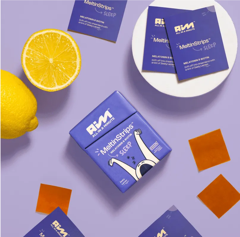
For AIM, a wellness brand Confetti’s work began with positioning, personas, and a strategic framework, then moved to identity and packaging built around “one minute at a time”. This is a branding-led case: the audience problem had to be solved before the pack could solve it.
A branding and packaging change is a commercial intervention, and it should be judged on commercial measures.
What to measure before and after:
Set the baseline before launch. A change that is judged only on post-launch intuition cannot distinguish a temporary transition dip from a genuine miss. The brands that get the most from a change are the ones that decide what they will measure before the first design concept is presented.
What this means for the agency relationship. A partner who is willing to be measured after launch is a partner treating the project as a commercial intervention. That is the difference between buying design and buying a change that earns its cost.
How do I know if I need a rebrand or just a packaging refresh?
Look at where the problem shows up. If customers misunderstand who you are or who you serve, the issue is brand strategy and identity. If they understand you but don't pick you up, compare you or recognise your range, it's usually packaging. An audit separates the two before you commit budget to either.
How often should a brand change its packaging design?
There's no fixed cycle. The trigger should be evidence: falling sell-through, weak shelf or thumbnail visibility, range expansion, or a regulatory change. Brands with strong distinctive assets can go decades with only small updates, as Ben & Jerry's has, provided the pack keeps doing its job at the shelf.
Will changing my branding and packaging confuse existing customers?
It can, if you remove the cues they use to find you, such as colour, pack shape, characters or logo position. Keep those assets, change what isn't working, test with current buyers before rollout, and use on-pack and online signals during the switch. Untested changes carry the most risk.
How much does it cost to change branding and packaging?
It depends on scope. A packaging refresh within an existing system costs far less than a rebrand covering strategy, naming, identity and a multi-SKU packaging system. SKU count, number of markets and print or compliance requirements also drive cost. An audit first usually narrows the scope, and the budget with it.
Should I change my branding before entering a new market?
Not always, but test it first. Check whether your name, colours, claims and language work in the new market, and whether labelling rules require changes, such as Arabic text or halal marks in the UAE. An adaptation of the existing system is often enough; a full rebrand is needed only if positioning changes.
Want strategic branding and packaging like this for your business?