%201.webp)
02
AI Snaps
.svg)
.svg)
01
Our Work

03
About Us
05
Contact Us
06
Client Success

07
Blogs
08
Careers
Book A Call


Need Help In Building Your Brand?
Click the button below & book a call with our founder directly.

Rishabh Jain
Managing Director
Bombay Shaving Company | Confetti's Verdict ⭐⭐⭐½
Confetti Design Studio has analysed Bombay Shaving Company to understand how a men's grooming brand launched in 2015 reached Rs 271 crore in revenue in FY25, raised USD 69.8 million across multiple rounds from investors including Sixth Sense Ventures, Colgate Palmolive, and Malabar Investments, closed a Rs 136 crore round in November 2025 with Rahul Dravid as an investor, and reported a run-rate of Rs 550 crore-plus as it prepares for a potential IPO.
When Bombay Shaving Company entered the Indian grooming market in 2015, the category was dominated by either international brands with foreign-sounding names or Indian brands that had borrowed Western aesthetic codes to signal aspiration. The name Bombay Shaving Company did neither. It was unambiguously Indian, historically rooted, and deliberately serious in its intent.
The choice of Bombay rather than Mumbai is itself a considered branding decision. Bombay carries a register of cosmopolitan heritage and commercial seriousness that Mumbai, as a contemporary name, does not fully replicate. It evokes a trading city, a port of ambition, a place where craft businesses once had names that conveyed reliability over flair. Paired with "Shaving Company", the name signals a founder who is serious about the category, not merely trend-adjacent.
In the early D2C era in India, when consumers were making the psychological shift from buying personal care at pharmacies and supermarkets to buying from a website or app, a name that communicated heritage and purpose helped lower that trust barrier faster than any marketing campaign could. The name earned the brand its first customers before the product had proven itself at scale.
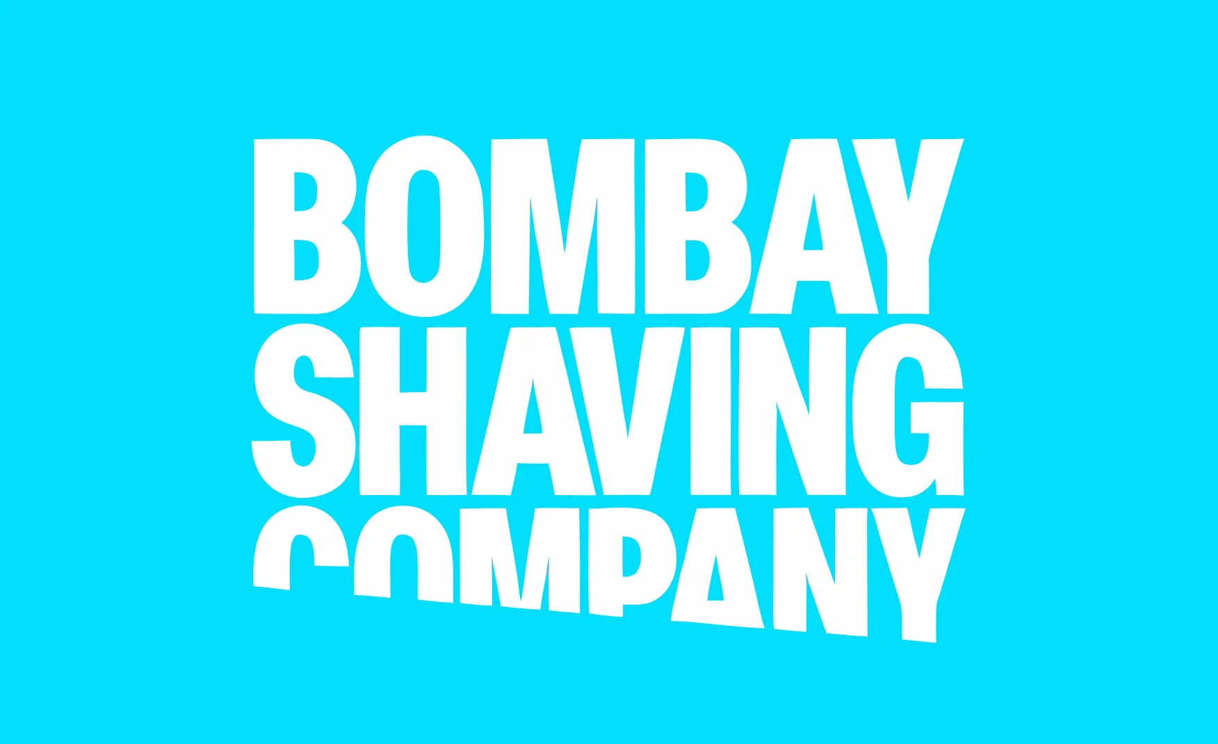
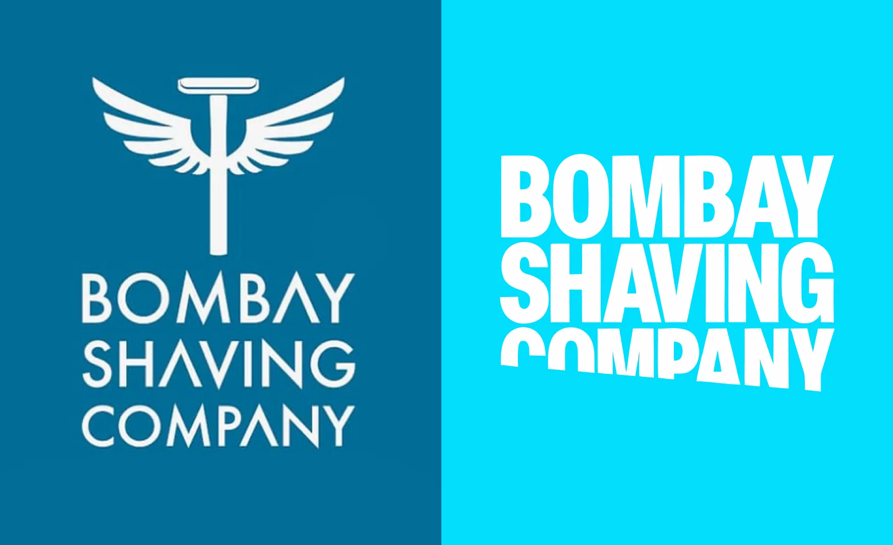
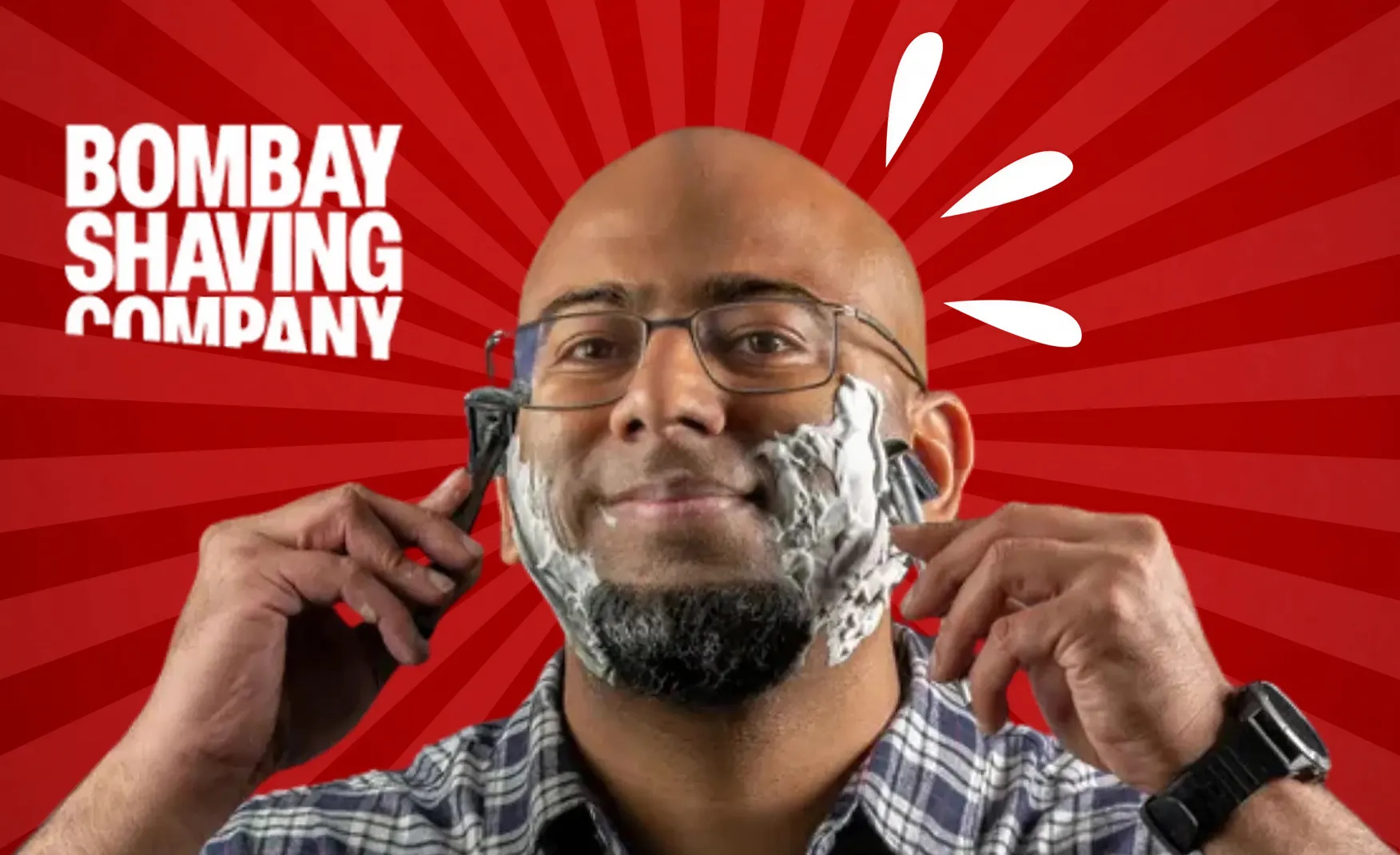
The original Bombay Shaving Company logo, featuring a razor-and-wings motif, was appropriate for a startup signalling that it was entering a category with energy and a point of view. It served its purpose in the early years. As the brand scaled into a Rs 270 crore business preparing for public markets, retaining that startup-era mark would have sent the wrong signal to investors, retail partners, and consumers evaluating the brand for the first time.
The rebranded identity is a meaningful upgrade in confidence and authority. The new mark is bolder, more typographic, and less illustrative. It communicates a brand that has arrived rather than one that is still arriving. For a company in the pre-IPO phase, that distinction matters commercially. Investors read brand identity as a proxy for management maturity. A logo that looks like a serious consumer brand rather than a startup makes the IPO narrative easier to tell.
The intent behind the rebrand is correct and the execution is a clear improvement on what it replaced. The challenge, which is addressed in the Challenges section, is that the transition has not been clean. Old and new identities are still coexisting across platforms and products in a way that dilutes the impact of the upgrade.
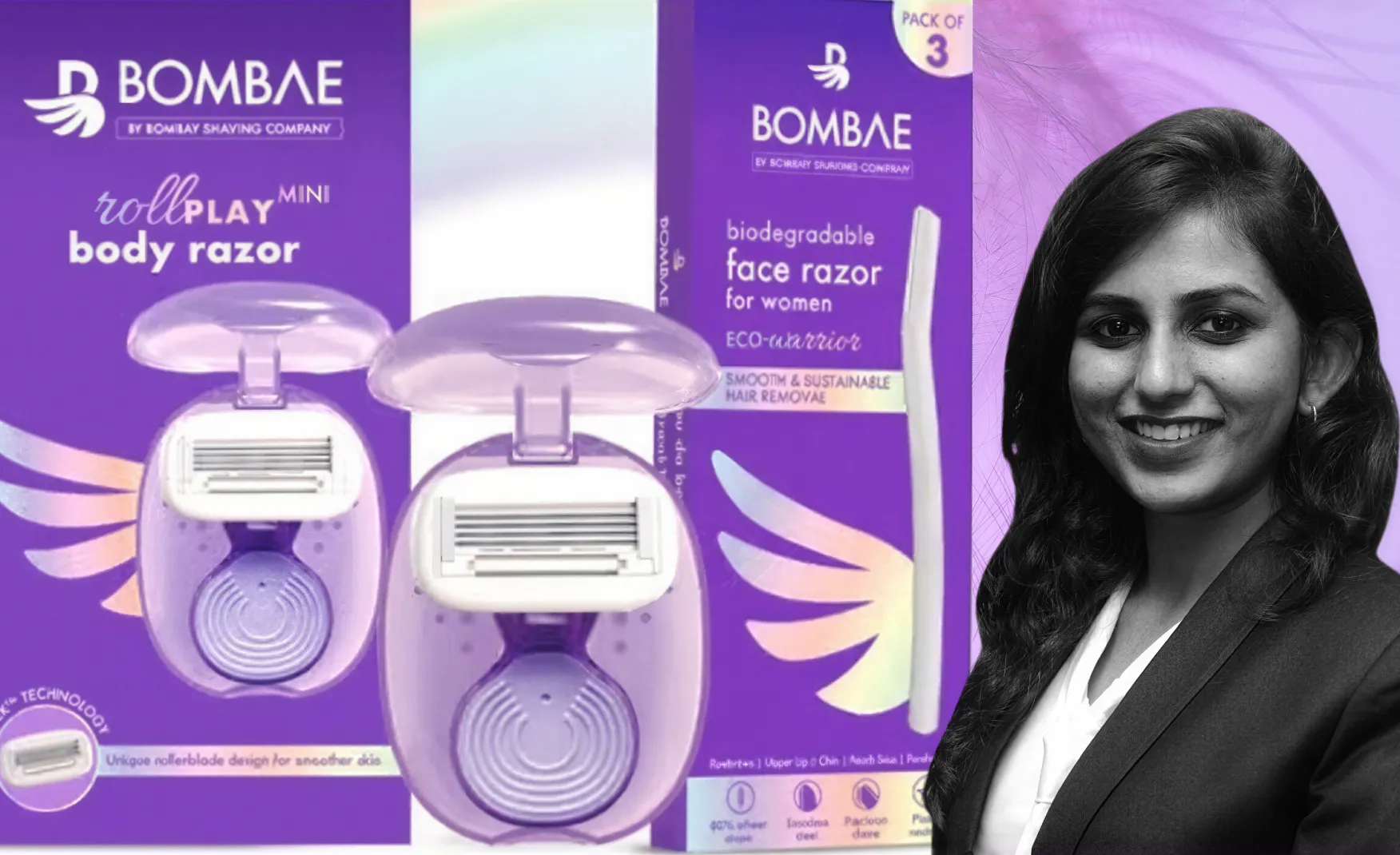
When the brand decided to enter women's personal care, the instinctive choice for many D2C founders would have been to simply extend the parent brand. Bombay Shaving Company Women, or some variant of it, would have been faster to market and cheaper to build. The decision to launch Bombae as a separate brand was structurally more expensive and operationally more complex. It was also the right call.
Grooming is a deeply gendered category at the level of consumer psychology, not just product formulation. The purchasing behaviours, the aesthetic expectations, and the trust signals that drive conversion differ materially between male and female buyers. A brand named Bombay Shaving Company carries masculine associations that are not incidental. They are definitional. Extending that name into women's hair removal, waxing, or skincare would require the consumer to consciously override what the name implies. Bombae sidesteps that cognitive friction entirely and this decision also demonstrates a level of brand architecture maturity that most D2C brands at the same stage do not exhibit. Recognising that a single parent identity cannot credibly stretch into every adjacent category, and building a separate brand to address a different audience rather than forcing the parent brand to stretch, is exactly the discipline that allows a portfolio of brands to grow coherently rather than incoherently.
Shantanu Deshpande is one of the most consistently visible D2C founders in India. His public presence through podcasts, LinkedIn posts, media interviews, and candid commentary on the business of building a consumer brand has created a layer of emotional equity around Bombay Shaving Company that its advertising spend alone could not purchase.
Founder visibility is one of the highest-return brand-building investments a consumer company can make when it is authentic. Consumers who follow Deshpande's content develop a relationship with the business through him that is qualitatively different from a relationship built through product advertising. They become invested in the brand's journey rather than merely aware of its products. This translates into higher brand loyalty, more charitable interpretation of product shortcomings, and the kind of organic word-of-mouth that is structurally impossible to manufacture.
In the context of a pre-IPO brand building its public narrative, founder visibility is particularly valuable. The retail investor who encounters Bombay Shaving Company for the first time in an IPO prospectus is more likely to invest in a brand whose founder they have already encountered and developed a view on. Deshpande's public brand is an asset on the company's balance sheet that does not appear in any financial statement.
Building an omnichannel distribution infrastructure, covering the brand's own website, major e-commerce and quick commerce platforms, and physical retail across multiple cities, is operationally demanding for any D2C brand. Most D2C grooming brands at Bombay Shaving Company's stage remain primarily online because offline retail requires capital, logistics capability, and trade relationships that are expensive to build.
The November 2025 Rs 136 crore funding round included explicit plans to expand the offline retail footprint, and the brand has already extended its physical presence across assisted retail and modern trade. For a brand approaching an IPO, omnichannel distribution is not just a commercial decision. It is a valuation one. The brands that command the highest multiples in consumer goods IPOs are those with diversified revenue channels. A brand that earns 70% of its revenue from a single digital platform carries channel concentration risk that institutional investors price into their valuation. Bombay Shaving Company's push into offline retail, accelerated by the latest funding round, is a structurally important move for the IPO ambition even if it compresses near-term margins.
This is the brand's most structurally significant challenge, and it is one that cannot be resolved by a packaging refresh or a social media rebrand. The name Bombay Shaving Company is category-specific in a way that most successful personal care company names are not.
Dabur is not a chyawanprash company.
ITC is not a cigarette company.
Philips is not a shaving company.
Each of these names is category-agnostic enough to credibly extend across product portfolios that bear no obvious connection to the founding product.
Bombay Shaving Company is defined by its name as a shaving company.
A consumer encountering a Bombay Shaving Company fragrance, face serum, or women's wax strip for the first time carries a subconscious expectation set by the name that the product must work against rather than with.
This is not a problem that surfaces dramatically in a single moment. It accumulates as a long-term drag on the brand's ability to command premium pricing and consumer confidence in non-shaving categories. The further the product range moves from shaving, the harder the name works against the category extension. As the brand moves toward IPO and continued portfolio diversification, this structural tension will become more visible, not less.
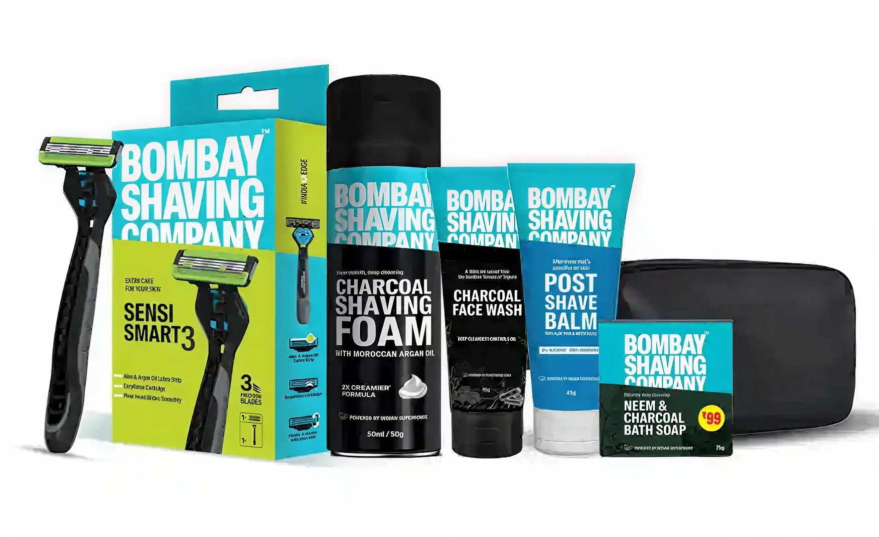
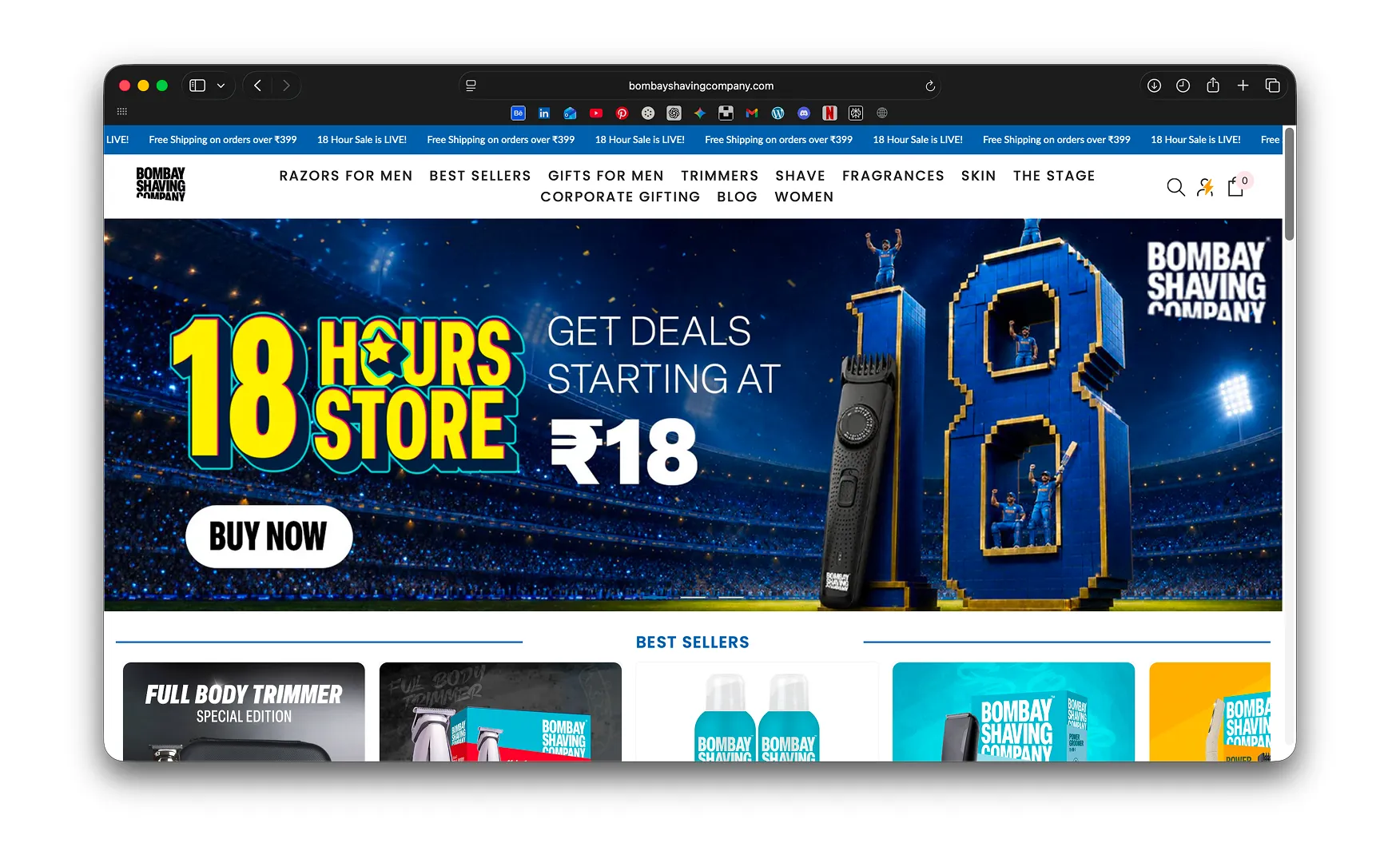
Walk through the Bombay Shaving Company product range and the visual inconsistency is immediate. Face washes, charcoal scrubs, fragrances, trimmers, beard oils, acne products, and hair removal sprays do not cohere into a single brand family. They look like products sourced from different design briefs, different creative agencies, and different strategic moments in the brand's history.
For a brand spending Rs 101 crore on advertising in FY25, this visual fragmentation is a significant waste of media investment. Every ad that drives a consumer to the website or the offline shelf is building brand awareness for a product they may not connect to the brand they just saw advertised. Visual inconsistency breaks the recognition loop that advertising spend is trying to build.
In premium personal care, packaging is a trust signal. A consumer who is spending Rs 500 to Rs 2,000 on a grooming product is making a judgment about quality based partly on what the product looks and feels like before they have used it. A fragmented visual identity raises subconscious doubts about the brand's quality control and design intelligence that the product formulation must then overcome. That is an unnecessary burden to place on any product, however good it is.
Bombay Shaving Company is currently running three visual identities in parallel: the original logo, the rebranded mark, and the Bombae identity. On any given platform, a consumer can encounter all three without a clear signal of which represents the current brand. This is the most commercially damaging aspect of the rebrand process as it currently stands.
Rebrands are not events. They are transitions, and transitions require absolute clarity about which identity is active and which is being retired. The longer a partial transition persists, the more the new identity is undermined by the continued presence of the old one. A consumer who sees the new bold logo in an Instagram ad and then encounters the old razor-and-wings mark on a product they purchased six months ago is not receiving a coherent brand signal. For a brand approaching an IPO, where investor confidence is built on consistency, unresolved brand identity transitions are a specific type of risk.
At Confetti, this is exactly the design problem we addressed with Miduty, a nutraceutical brand with a wide product range spanning serums, capsules, tablets, and skincare, each with different functional claims, different consumer needs, and different shelf contexts. The packaging system we built created unmistakable coherence across the entire range: every product looked distinct enough to communicate its specific function, and unmistakably part of the same brand. The consumer could encounter a Miduty product they had never seen before and immediately know it was Miduty.
Bombay Shaving Company needs the same intervention at greater scale. A modular design system with defined rules for typography, colour application, label architecture, and category signalling would allow every product in the range, from precision razors to face serums to fragrances, to feel like it belongs to the same brand while still clearly communicating what it does. This is not about making everything look identical. It is about making everything look related. There is a significant design difference between the two, and the commercial consequences of that difference are visible every time a consumer sees Bombay Shaving Company on shelf.
The new identity is stronger than the one it replaces. The work now is to complete the transition without compromise. This means a formal audit of every digital and physical touchpoint where the old identity appears: social media profiles, website banners, product packaging, retail displays, email templates, and any co-branded or partnership material. Every instance of the old mark needs a retirement timeline and a replacement execution.
It is the operational discipline that makes a rebrand actually land rather than simply being announced. The brands that benefit most from rebrands are the ones that execute the transition with the same thoroughness that they designed the new identity. A half-executed rebrand is commercially worse than no rebrand, because it creates a split signal that neither the old audience nor the new one can fully read.
The IPO narrative for Bombay Shaving Company will require a clear answer to a question that the brand has not yet publicly resolved: is this a shaving company that also makes other things, or is it a personal care company that started with shaving? The answer to that question determines the brand architecture, the valuation multiple the market will assign, and the investor confidence that the prospectus needs to establish.
At Confetti, brand architecture work is one of the most commercially consequential design projects we undertake for scaling brands. The decisions made at this stage, about which categories sit under the master brand, which get sub-brands, and what the parent company's brand identity should communicate to make all of those decisions coherent, compound over years into either a portfolio that builds equity or one that dilutes it. For Bombay Shaving Company, the IPO preparation is the best possible forcing function for making those decisions deliberately rather than reactively.
Bombay Shaving Company has built genuine scale. Rs 271 crore in FY25 revenue, a Rs 550 crore-plus run-rate by November 2025, over a decade of brand recall in Indian men's grooming, and a founder whose public presence has earned the brand trust that advertising alone cannot build: these are real achievements in a competitive category.
The rating reflects something specific: the brand has scaled faster than its identity system could support. The name works for shaving and is a structural tax on everything else. The packaging is visually fragmented across a range that continues to grow. The rebrand is incomplete in its execution. Each of these is a solvable problem, and the Rs 136 crore raised in November 2025 gives the brand the resources to solve them before the IPO makes them visible to public markets. The brands that go public with coherent identities earn better multiples than those that go public with coherent financials and inconsistent brand systems. Both matter.
If you are building a grooming, personal care, or lifestyle brand and want to create the kind of modular packaging system and brand architecture that holds coherently as the product range expands, Confetti can help you build that.
Want strategic branding and packaging like this for your business?


Lorem ipsum dolor sit amet, consectetur adipiscing elit. Suspendisse varius enim in eros
Lorem ipsum dolor sit amet, consectetur adipiscing elit. Suspendisse varius enim in eros
Lorem ipsum dolor sit amet, consectetur adipiscing elit. Suspendisse varius enim in eros
.svg)
.svg)


.webp)
.webp)


.webp)
.webp)
.webp)
.webp)
.webp)


.svg)
.webp)
.svg)
.webp)


.webp)


.webp)


.svg)