%201.webp)
02
AI Snaps
.svg)
.svg)
01
Our Work

03
About Us
05
Contact Us
06
Client Success

07
Blogs
08
Careers
Book A Call


Need Help In Building Your Brand?
Click the button below & book a call with our founder directly.

Rishabh Jain
Managing Director
Done right, brand repositioning recovers lost relevance, opens new audiences, and gives your entire marketing and packaging effort a clearer direction.
Done wrong or mistimed, it confuses your existing customers and produces expensive design with no solid foundation under it.
This Confetti guide covers what brand repositioning actually is, how to know when you need it, the types that exist, and a step-by-step process of getting it done the right way.
Brand repositioning is the process of changing how a target market perceives your brand. It refreshes the image, message, and market position to meet new customer needs, adapt to changing market conditions, or achieve new business goals.
Repositioning influence perception by adjusting elements like:
According to Harvard Business School, effective repositioning transforms brand equity, unlocks new markets, and creates the conditions for brand extensions.
Now, many brands confuse repositioning with rebranding and brand refresh. Here’s a quick distinction you need to understand.
☑️Repositioning changes what your brand means. Repositioning is an inner move. It rewires consumer associations, redefines your target audience, sharpens your competitive territory.
☑️Rebranding changes what your brand looks like. It is an outer move. It changes the name, logo, visual identity system, and packaging language.
The two are distinct, but be performed together or separately.
You can reposition without rebranding. For example: Tata Tea repositioned itself from a commodity tea brand to a socially engaged premium brand through the "Jaago Re" campaign. The visual identity barely changed, but consumer perception shifted entirely.
You can also rebrand without repositioning. But a new logo with no change underneath leaves the same unclear brand in a new outfit, leaving the customer dissatisfied.
❌The most expensive mistake you can do as a brand: rebrand when repositioning was the actual need. You have a new logo, new packaging, but the same confused message.
A brand refresh updates the visual language such as fonts, colours, photography style, tone of voice, without touching the underlying brand positioning.
If your positioning is still accurate but your identity feels dated, that's a refresh.
Confusing the two leads to either:
This is why at Confetti Design Studio, when brands reach out to us, we don’t jump to an assignment. We understand your end goals, and work backwards from there to assess what you actually need: a repositioning, rebranding or a brand refresh.
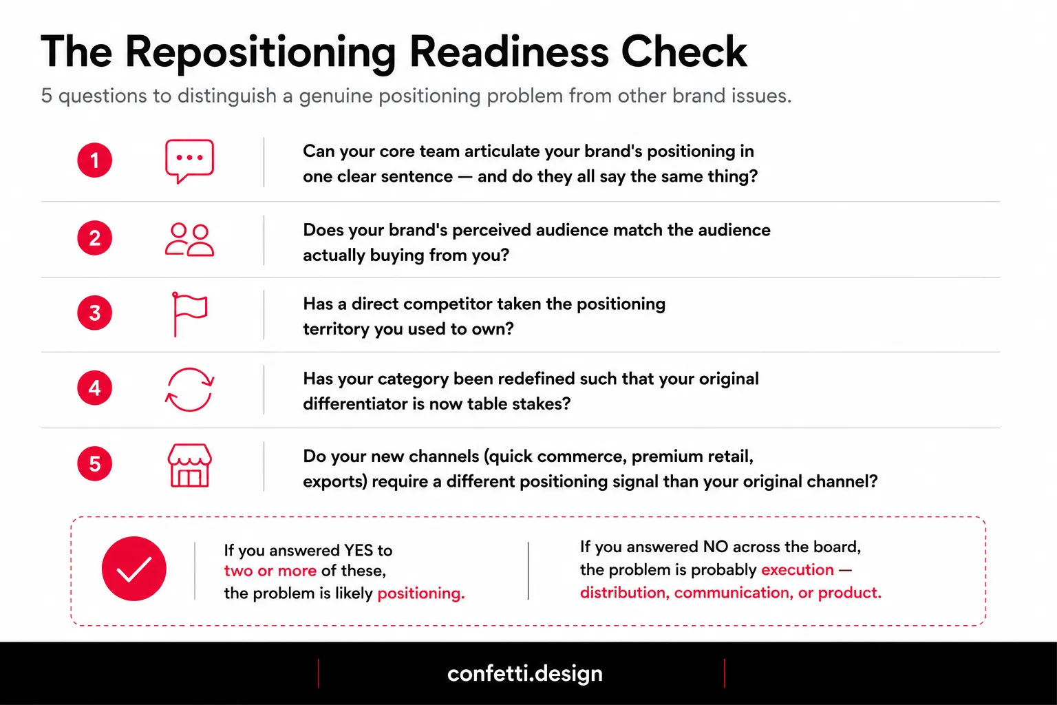
Not every brand problem is a positioning problem.
🔍A product quality problem looks like poor repurchase rates but isn't solved by redesigning your brand story.
🔍 What looks like a repurchase problem maybe about product quality, it won't be fixed by changing your brand story.
🔍 What looks like a value perception issue may actually be a pricing and packaging design problem.
Repositioning only fixes a problem when the problem is this:
Consumers understand your brand accurately and have stopped finding it relevant or your brand has evolved so far beyond its original positioning that it no longer reflects what you actually are.
1. You've moved from D2C-only to retail or quick commerce, but your brand still looks "online-only"
A brand built for Instagram aesthetics and D2C email flows will not automatically do well in a retail store or a Blinkit thumbnail. The visual hierarchy, claim priority, and shelf-recognition logic are different.
If your packaging was designed for a white-background product photo and is now sitting next to 40 competitors at a retail rack, you have a positioning expression problem.
2. A new entrant has occupied the exact space you held and is executing it better
In FMCG and D2C categories, competitive displacement happens fast.
If a new player has entered your category with cleaner positioning, stronger packaging, and more targeted communication, and you're seeing shelf share shift toward them, your position has effectively been taken.
Spending more on the same form of marketing won't recover it.
3. Your category differentiator is becoming a category norm
"No palm oil" was differentiation in 2018. In 2026, it's a baseline claim on almost every snack packaging design.
Health, wellness, and snacking categories have evolved rapidly. Brands that repositioned early captured new points of differentiation, while those that didn’t are now competing with similar claims in increasingly crowded markets.
4. Your original target customer has moved on and a different buyer has replaced them
Sometimes repositioning is triggered by success in an unexpected direction.
If your brand was designed for urban millennial women and your actual purchase data shows you're being bought by 35–50 year-old health-conscious men in tier 2 cities, you have a positioning mismatch and an opportunity.
5. Your brand fails the one-sentence test
If your founder, your sales team, and your packaging designer would each describe your brand differently in one sentence, your positioning is undefined.
This is a strategy problem that expresses itself as a communication problem, a packaging problem, and eventually a sales problem.
6. Your message attracts the wrong customers
If your marketing attracts leads who churn quickly, push back on pricing, or don't fit your ideal customer profile, your positioning is misaligned.
You're promising one thing but delivering another, or you're speaking to the wrong set of needs entirely.
7. Your brand feels outdated or irrelevant
If your brand feels like it belongs to a previous era, what some call "uncle energy,"you have a repositioning problem.
HUL's CEO Priya Nair has explicitly stated the company is working to make its brands modern and youthful to combat competition from online brands. They're changing packaging, marketing, and introducing new products.

For D2C Brands
D2C success often comes from serving a niche that larger brands ignore. But niches evolve. What was once a differentiated position can become crowded. D2C brands need to watch for:
By 2030, Gen Z and Gen Alpha will dominate India’s beauty market, prioritizing transparency, creator-led education, and community trust. D2C brands that fail to adapt risk losing relevance.
For FMCG Brands
Legacy firms are seeing their traditional business moats weaken. The signals for FMCG repositioning include:
Large FMCG firms are turning to D2C acquisitions to enter premium, niche, and fast-growing categories. When internal innovation can't keep pace, repositioning or acquiring brands with stronger market fit becomes essential.

Talk to Confetti experts about a brand repositioning strategy that works
Book A Call
Not all repositioning is the same. The type you choose determines the research you conduct, the assets you change, the timeline you set, and the investment you make.
Choosing the wrong type wastes time and erodes brand equity. Choosing the right type gives you a clear roadmap.
👥Audience Repositioning
It means you've identified a better-fit customer than the one you originally targeted or your product has drifted into a new demographic that you now need to design your brand around.
This is often the lowest-risk type because the product doesn't change. The visual identity updates to speak to a new consumer, and communication channels shift accordingly.
Example: Mamaearth's repositioning is the clearest example of Audience + Value repositioning in Indian D2C.
It began with toxin-free baby care products and later expanded into adult skincare, broadening both its target audience and value proposition.
✨Value Repositioning
Involves redefining the core promise. That can be moving from functional to emotional, from affordable to premium, from ingredient-led to outcome-led.
This is more disruptive because it changes what consumers expect from you. It requires changes at the packaging level, at the communication level, and sometimes at the product level to make the promise credible.
Example: Burberry repositioned from high-luxury exclusivity to culturally relevant heritage. It shifted focus from competing with ultra-luxury houses to making its British heritage more relevant and accessible to modern consumers.
Burberry retained its luxury status while making the brand more culturally resonant, helping reconnect with Gen Z and Millennial shoppers and reignite demand..
🏷️Category Repositioning
This is the highest-risk move: you're changing the competitive frame entirely. You're no longer competing where you used to compete.
A snack brand that repositions from "afternoon snacking" to "protein-forward lifestyle food" is now in a different category with different shelf placement, different consumer expectations, and different competitive benchmarks.
The entire brand architecture needs to follow.
Example: Gü repositioned itself from a premium dessert brand to a symbol of guilt-free indulgence. Through its “When You’re Done Being Good, Be Gü” platform and a bold redesign, it reframed indulgence from a guilty pleasure to a shame-free joy.
💭Perception Repositioning
This type of brand repositioning is the most nuanced. The product, the audience, and the category stay roughly the same but the consumer association attached to the brand needs to change.
A heritage brand that feels outdated, or a brand that was perceived as low quality despite decent product performance, is a perception repositioning candidate. This type often has the highest design intensity relative to strategic change.
Example: Bata was seen as comfortable but outdated by Gen Z. Through campaigns like Surprisingly Bata and partnerships with Kriti Sanon and Kartik Aaryan, it showcased its stylish side while staying true to its comfort-first identity.
Bata refreshed its perception among younger consumers without losing its heritage.
Repositioning is a process with distinct phases. Skipping or rushing phases leads to wasted investment or worse failure.
Here's how we at Confetti, as a leading branding agency actually run repositioning engagements:
Before any repositioning work starts, you need a structured brand audit.
When brands jump to execution without understanding their starting point, they create solutions for problems they haven't properly diagnosed.
A brand audit answers five questions:
1. Where are we now? Assess brand health across awareness, consideration, preference, and loyalty. Compare how consumers perceive the brand today versus its intended positioning.
2. Who are we for? Identify the *actual* customer base versus assumed personas—often core buyers differ by income, age, or geography.
3. What do we stand for? Map brand associations, emotions, and attributes. This reveals the gap between intended positioning and real consumer perception.
4. Where do we fit? Analyze competitive positioning using perceptual mapping to understand occupied vs open spaces in the category.
5. What’s working and what isn’t? Use performance data (sales, repeat rate, CLV, churn) to identify strengths and weaknesses in brand effectiveness.
At Confetti, our brand immersion process begins with in-depth discussions with the leadership team. We seek to understand the brand's vision, target audience, and unique challenges.
This rigorous diagnostic that lays the foundation for everything that follows.
Define the positioning territory with these four elements:
1. Target audience: Who are you repositioning for? Be specific. "Urban millennials" isn't specific enough. "Health-conscious urban professionals aged 28-40 with disposable income and limited time" is better.
2. Frame of reference: What category are you in? What are the alternatives consumers consider? Your new positioning must define a clear frame of reference because that's how consumers understand what you offer.
3. Point of difference: What makes you meaningfully different from the alternatives? Not different for the sake of different. Different in a way that matters to your target audience.
4. Reasons to believe: Why should consumers believe your point of difference? What proof do you have? What evidence can you offer?
We call this document the Positioning Territory Map. It's a one-page brief that must be locked before design decisions are made.
This process is central to what we cover in our brand strategy services, because strategy is the prerequisite to design, not a post-rationalisation of it.
Once the Positioning Territory Map is locked, the execution sequence matters as much as the design quality.
The correct order:
Most brands start with packaging ("let's make it look more premium"), then try to build strategy around the design decisions already made.
This produces brand identity systems that look directionally right but don't communicate a coherent position.
Also, repositioning that doesn't address packaging is incomplete. Your packaging is your single highest-reach touchpoint. It's present at the shelf, in the Blinkit thumbnail, in the unboxing video, in the influencer post, on your website product page.
This is the hardest part of repositioning. You're changing the brand. But you still need to keep the customers who loved the old brand.
Repositioning too fast, or too loudly, breaks the continuity they relied on. The best transition strategies:
✨The gradual shift
Change elements of the brand over time rather than all at once. This gives existing customers time to adjust. It also allows you to test market response before committing fully.
✨The clear break
Make the change decisive and communicate it clearly. This works when the old positioning is so outdated that gradual change would be confusing.
Old Spice used this approach. The brand changed dramatically, but the communication was clear enough that consumers understood the new direction.
✨The dual approach
Keep elements of the old brand while introducing the new. This works when you're repositioning to a broader audience but still need to serve your existing niche.
Some D2C brands use this approach, maintaining a core product line for existing customers while introducing new lines for the repositioned audience.
A few principles for managing the transition:
✅ Don’t announce repositioning as a relaunch. Let packaging, product, and communication show the change naturally.
✅Roll out in phases: packaging first, then communication, then full brand platform if needed.
✅Give loyal customers continuity, expand the brand instead of replacing its existing audience.
✅Track perception metrics (recall, sentiment, customer mix), not just sales, since revenue lags perception change.
Repositioning is an investment, and like any investment, it should deliver a clear return. Define what success looks like before you spend anything.
Clarity upfront forces focus. It defines your goal and how you’ll measure progress, guiding every decision in the process.
At Confetti, when we work on branding and packaging design projects, we set success metrics before execution to ensure alignment. When success is clear, everyone moves in the same direction.
Here are some of the success metrics for repositioning:
When should you measure success?
Not immediately. Repositioning takes time to work. Consumers need to see the new brand multiple times before they update their mental model. The timeline varies by category and channel.
For FMCG brands:
In-store changes are visible quickly. But changes in consumer perception take months. Measure early indicators, shelf presence, distribution, trade acceptance, in the first quarter. Measure consumer perception and sales after 6-12 months.
For D2C brands:
Digital changes are immediate. Website traffic, engagement, and conversion rates change quickly. But brand perception takes longer. Measure early indicators in the first month. Measure brand perception after three to six months.
Here are some of the best repositioning cases, analysed by type, trigger, and execution — with a focus on what the design work had to do to support the strategic shift.
LG moved from being primarily seen as a consumer electronics manufacturer to positioning itself as a “Smart Life Solution Company.”
This shift was supported by a refreshed mission“Innovation for a better life”and a clearer strategic focus on user-centric innovation and experience-led design.
The brand also modernised its identity and ran a large-scale internal activation, engaging t thousands of employees globally as brand ambassadors to ensure alignment before external rollout.
Why it worked: LG treated repositioning as an organisational transformation. Strong internal alignment made the external story credible and consistent.
Snitch began as a digital-first menswear brand and quickly scaled through rapid online drops and viral growth. Its repositioning came through a bold move into premium offline retail, opening stores in high-footfall, aspirational locations like Colaba and key metro cities.
This physical expansion translated digital hype into tangible brand presence and higher-value shopping experiences, with offline customers reportedly spending significantly more than online ones.
Why it worked: The brand physically followed its target audience and used store locations as a signal of aspiration and credibility, strengthening trust and perceived value.
Lacto Calamine: From General Skincare to Oily Skin Expert
Lacto Calamine refreshed its positioning by narrowing its focus from general skincare to becoming the “oily skin expert.” Instead of competing broadly in a crowded beauty market, it chose to own a specific, high-prevalence skin concern in India.
The brand retained its familiar identity while modernising packaging and communication to appeal to younger, ingredient-conscious consumers, and expanded into a more complete skincare offering.
Why it worked: By focusing on one clearly defined consumer problem, the brand built authority and differentiation without losing existing trust.
Duroflex shifted from marketing mattresses through technical specifications to framing its offering around a universal insight: stress.
The brand expanded its narrative beyond sleep to include sofas, recliners, and holistic comfort solutions, positioning rest as a lifestyle need rather than a product feature. This simplification helped make the category more emotionally resonant and easier for consumers to understand.
Why it worked: It reframed a technical purchase into an emotional benefit, widening relevance and opening up new product categories.
Paper Boat originally built its identity on nostalgia-driven beverages inspired by childhood memories. As the category became crowded, it shifted to emphasising “real ingredients and honest recipes.”
The brand now highlights authenticity in what goes into its drinks such as traditional Indian recipes and natural ingredients moving the focus from emotional memory to product truth.
Why it worked: It replaced a highly replicable emotional narrative with a stronger, more defensible product-based positioning.
Gap revitalised its brand by leaning into its heritage while reinterpreting it for a digital-first, Gen Z audience. Campaigns like “Better in Denim” used Y2K nostalgia, music, and social-media-friendly choreography to reintroduce core products like denim in a culturally relevant way.
The brand also strengthened its fashion credibility through creative leadership and retail refreshes in key global cities.
Why it worked: Gap didn’t abandon its identity, it modernised its cultural expression, making heritage feel current again.
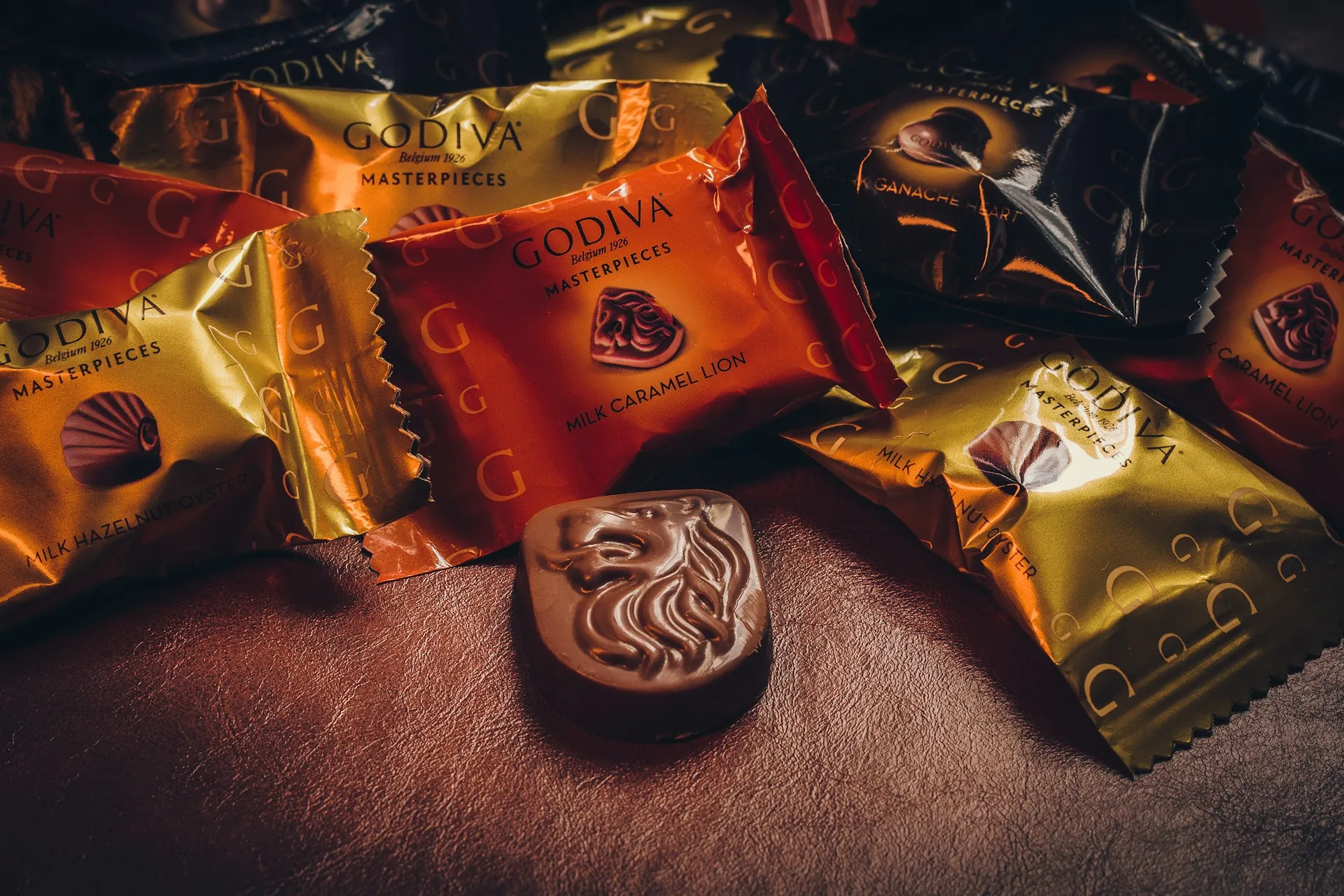
Godiva shifted from being positioned as an exclusive premium chocolate brand to a more accessible form of "everyday self-care indulgence."
As part of its 100-year reboot ahead of the 2026 centenary, campaigns reframed chocolate as a simple, guilt-free moment of pleasure rather than a rare luxury.
This was supported by storytelling emphasizing art, craft, and emotional ease, along with a refreshed visual identity, new packaging, and the Masterpiece Collection campaign.
Why it worked: It reduced emotional and psychological barriers to consumption, making chocolate feel like an accessible self-care ritual, while maintaining premium quality cues through craftsmanship storytelling and elevated design.
📌Successful repositioning examples reveal a consistent pattern: the most effective repositionings preserve core equity while shifting meaning, audience, or category frame.
The question for your brand isn't whether to reposition, it's what type of repositioning you actually need. Choosing the right type creates defensible differentiation.
Repositioning always has a design consequence. But the consequence isn't always the same. What needs to change in your packaging depends entirely on the type of repositioning you're executing.
❌The most common and costly mistake: brands lock a repositioning strategy brief and then commission packaging design that doesn't reference it.
The design team works from category inspiration boards and aesthetic references rather than from the positioning territory map. The output looks good but doesn't communicate the new position.
Consumers receive the old signal from the pack and the new signal from the advertising and the contradiction produces confusion.
We work with FMCG and D2C brands at different points in the repositioning arc:
Each stage requires a different entry point. But the underlying approach is consistent.
🧩Every repositioning engagement starts with diagnosis, not design: We've seen too many brands invest in repositioning design only to discover the problem was something the design couldn't fix: a distribution gap, a pricing mismatch, a category claim that needed regulatory support before it could go on pack.
🧩Repositioning engagements at Confetti always include packaging as a core workstream: For the brands we work with, packaging is the primary consumer touchpoint: it's present at retail, on quick commerce platforms, in post-purchase unboxing, and in social content. A brand repositioning that leaves the packaging untouched hasn't been executed. It's been planned.
Some examples of how this has played out in our work:
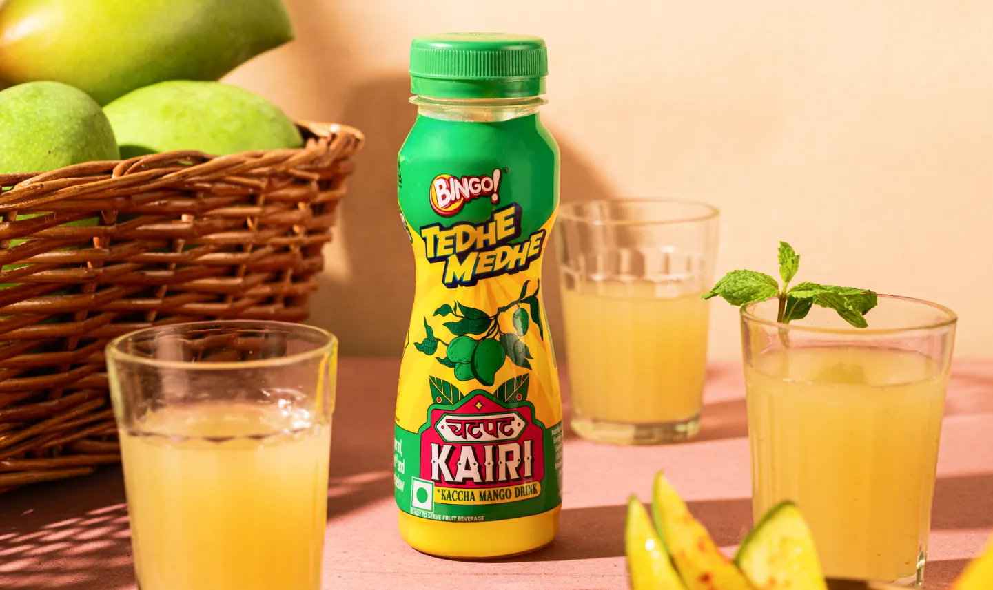
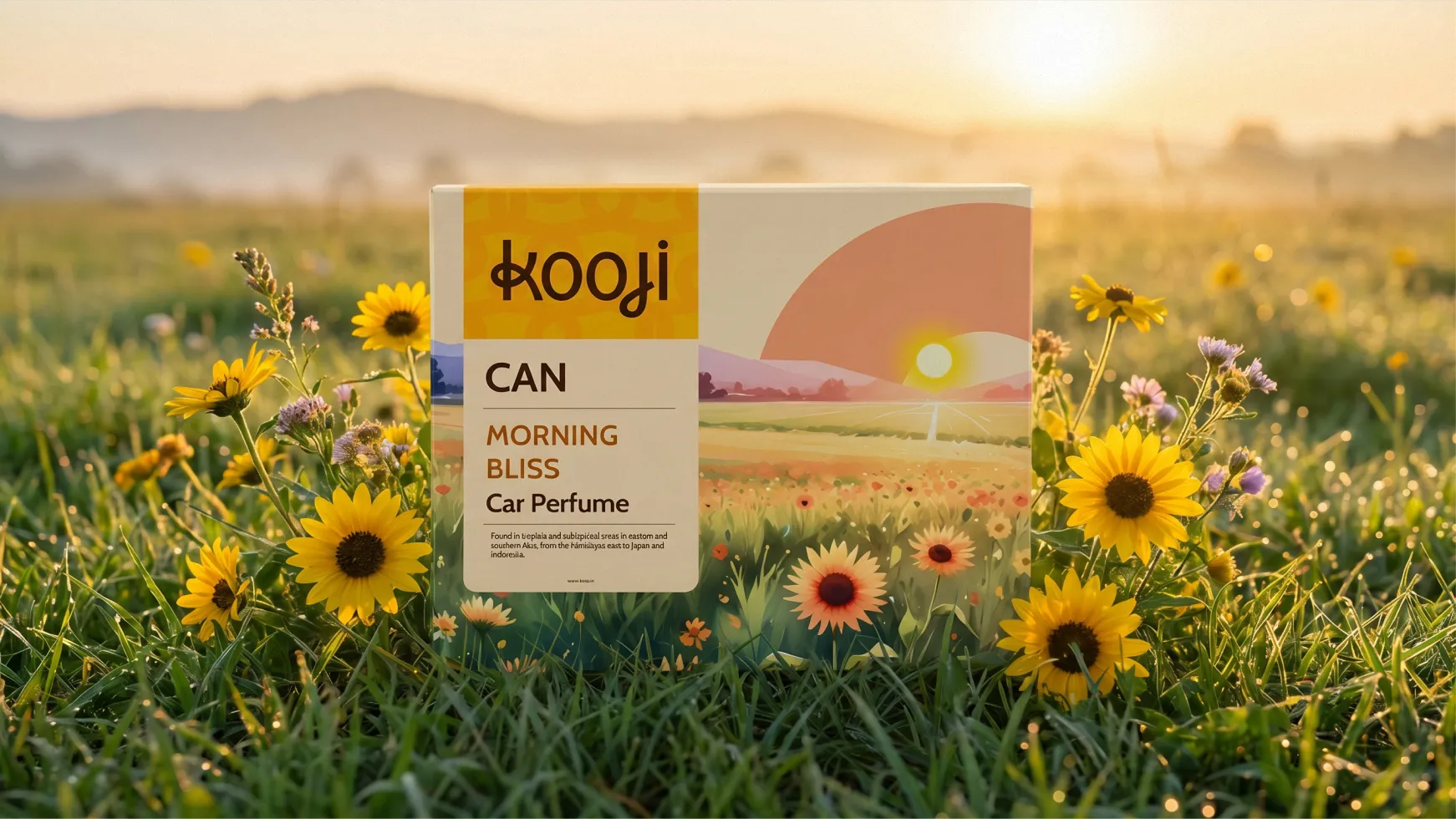
For Kooji, we approached the engagement as a full premium lifestyle repositioning: rebuilding the brand's visual language to justify a significantly higher price point in a category where most competitors compete on value.
For Swizzle, the challenge was differentiation in a crowded non-alcoholic beverage market. We used brand storytelling and mascot design as the primary repositioning tools — building recall and personality in a category where most competitors compete on ingredients alone.
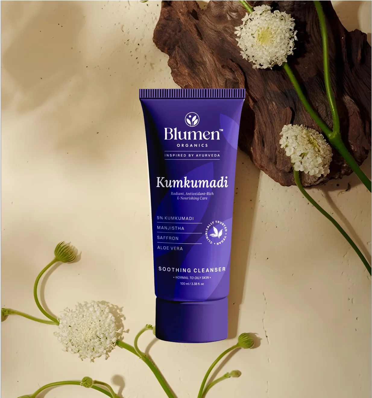
For Miduty, it involved moving a nutraceutical brand from a functional supplement identity to a credibility-led, science-forward positioning. A move that required redesigning the packaging language at the claim, typography, and material level simultaneously.
If you're evaluating whether your brand needs to reposition, the most productive first step is a structured brand audit.
📞Book a call with us to start with a diagnosis before committing to a direction
What is brand repositioning?
Brand repositioning is the strategic process of changing how a target audience perceives your brand: shifting who the brand is for, what it promises, or which category it competes in. It operates at the level of meaning, not just appearance. It doesn't require changing your product or your logo, but it does require changing the strategic foundation that every design, communication, and distribution decision is built on.
What are the signs a brand needs to reposition?
Key signals: your brand's perceived audience no longer matches who's actually buying; a competitor has taken the positioning territory you held; your core differentiator has become a category norm; your brand fails the one-sentence test (no one can describe it consistently); or your new channels require a positioning signal that your current identity can't deliver.
What is an example of successful brand repositioning in India?
Mamaearth repositioned from a baby-safe personal care brand to India's leading toxin-free skincare brand for adults. This required audience repositioning (from parents to adult consumers), value repositioning (from safe-for-infants to efficacy-for-skin), and a packaging redesign that communicated clinical credibility rather than nurturing softness. It was executed gradually, without announcing a pivot, and the underlying "toxin-free" proof point transferred credibly to the new category.
How long does brand repositioning take for FMCG or D2C brands?
A full repositioning: audit, strategy brief, identity and packaging redesign, and communication rollout, usually takes 4–9 months depending on scale, number of SKUs, and whether the brand is making a category or audience shift. A packaging-level repositioning with an existing strategy brief can be completed in 6–10 weeks.
Can brand repositioning fail? What causes it?
Common repositioning failures include skipping the audit and misdiagnosing the problem, changing design without changing strategy, moving too fast and losing loyal customers before new ones are secured, positioning the brand in a space the product can’t credibly support, and failing to carry the strategy through to packaging and key touchpoints. Design-led repositioning without a clear strategic brief is often the costliest mistake.
Want strategic branding and packaging like this for your business?


.webp)
.webp)


.webp)
.webp)
.webp)
.webp)
.webp)


.svg)
.webp)
.svg)
.webp)