02
AI Snaps


01
Our Work
03
About Us
04
Brand Audit
05
Contact Us
06
Client Success
12
07
Blogs
08
Careers
Book A Call




Need Help In Building Your Brand?
Click the button below & book a call with our founder directly.

Rishabh Jain
Managing Director
Most clothing brands build from the outside in: logo first, then packaging and content. But lasting recognition starts from the inside out, with a clear point of view and distinctive product details.
This Confetti guide takes you through the Clothing Brand Stack: five layers, from brand positioning and product signatures to logos, labels, packaging and content.
Learn how to build each layer in the right order, approach clothing and textile branding, and plan the work and budget behind it.
For a clothing brand, branding is not just a logo, colour palette or label.
It's the combination of product, design and experience that makes a label recognisable before someone reads its name.
A clothing brand is built through the signals customers see and feel: fit, silhouette, fabric, colour, distinctive details, garment labels, packaging, photography and tone of voice. These elements need to communicate the same positioning.
A premium label, for example, can undermine its image with inconsistent product photography or poorly finished garment labels.
A minimalist brand can lose its identity if every collection introduces a new visual style. Customers may not identify the exact problem, but they notice when the product and its presentation do not match.
Clothing is unusual among products. It is worn in public, photographed by customers and seen by people who never visited the store or website.
The product carries the brand more than in almost any other category.
At the same time, logos often sit on fabric at very small sizes, and collections change every season while the brand needs to stay recognisable.
The brand is the constant; collections are variations on it. A common mistake among young labels is letting each drop redefine the brand, with a new aesthetic, a new tone and sometimes a new logo treatment every few months.
Customers then have nothing stable to remember.
Strong labels change the clothes every season while keeping the voice, the marks, the signatures and the photography style recognisably the same.
▶️A clothing brand's identity lives in the product, the point of view, and the consistency of the world around it. The logo is the signature at the bottom of the page, not the page itself.
A recognisable clothing brand needs a clear point of view, distinctive product details and a consistent identity across garments, packaging, content and customer experience.
At Confetti, we approach clothing branding as five connected layers. Each builds on the one before it.
Who is the brand for, what does it stand for, and what does it refuse to be?
The foundation is a clear position that defines the audience, the brand's beliefs and the space it wants to own.
Without this clarity, decisions about design, pricing, photography and communication become disconnected.
For Desi Minimals, Confetti built the identity around “Less noise. More you.”
The idea of understated essentials shaped the brand's visual language and communication. Every element had a reason to exist because it supported the same point of view.
Fits, fabrics, trims and details that repeat across collections.
A brand's point of view must become visible in the clothes themselves.
This means developing recognisable fits, silhouettes, fabric choices, trims, construction details or recurring design elements.
Comet Sneakers, for example, uses a distinctive comet-star motif across its footwear. Such a signature can help customers recognise the product before they notice the name.
The same principle applies across clothing categories.
Whether it is a characteristic cut, a recurring stitch detail or a recognisable approach to prints, product signatures give customers something consistent to associate with the brand across collections.
Name, wordmark, monogram and placement rules.
Once the positioning and product signatures are clear, build the name, wordmark, monogram and placement rules.
A clothing logo must work at the actual sizes and in the materials used for production: woven labels, embroidery, buttons, leather patches, care labels and digital thumbnails.
It must also remain legible after stitching, washing and repeated wear.
Define where the marks appear, how large they can be and when the garment should deliberately carry no visible logo.
These rules prevent every collection or merchandiser from making unrelated decisions.
Woven labels, care labels, hang tags, packaging and inserts
These extend the identity beyond the garment's main design. Each should reinforce the same positioning through typography, material, finish and tone.
For a D2C brand, packaging also connects the online purchase to the physical product. Thoughtful unboxing experience reinforces confidence; poor packing or damaged packaging can undermine it.
Every touchpoint should have a clear purpose.
Photography, voice, drops, website, social and collection launches
They determine how customers experience the brand over time.
Bluorng illustrates the value of treating campaign direction, motion graphics, website experience and retail as one visual system.
A customer encountering the brand on social media should recognise the same point of view when visiting its website or store.
Collections can change, but the brand's underlying visual language should remain recognisable.
They skip layers 1 and 2 and spend most of their effort on layer 3. A logo can't carry a brand with no point of view and no recognisable product.
Many young labels invest heavily in logos and hang tags before defining their positioning or establishing distinctive product signatures.
They expect the logo to create recognition that the product has not yet earned.
✅Check: Cover the logo on your last ten social posts. Could customers still recognise your brand through the styling, product details, colours or photography?
If not, the answer may not be another logo redesign. It may be to strengthen the layers beneath it.

A clothing brand's positioning is a clear point of view that shapes what the brand makes, who it serves and why customers should choose it over alternatives.
Start with a specific customer and occasion, not “everyone who loves fashion”.
An essentials label for people who want effortless weekday dressing is different from a streetwear brand for people who want to stand out.
Define the customer, what they need from clothing and the role your brand will play in their lives.
This gives the team a practical filter for decisions about products, pricing, design and communication.
Streetwear, essentials, occasion wear, activewear, ethnic wear and kidswear each have different customer expectations.
Your price position adds another layer. A premium label needs product quality, fit, fabric, finishing and presentation that justify its price. The visual identity must reinforce that value rather than promise more than the product delivers.
This means having a deliberate choice about what not to do.
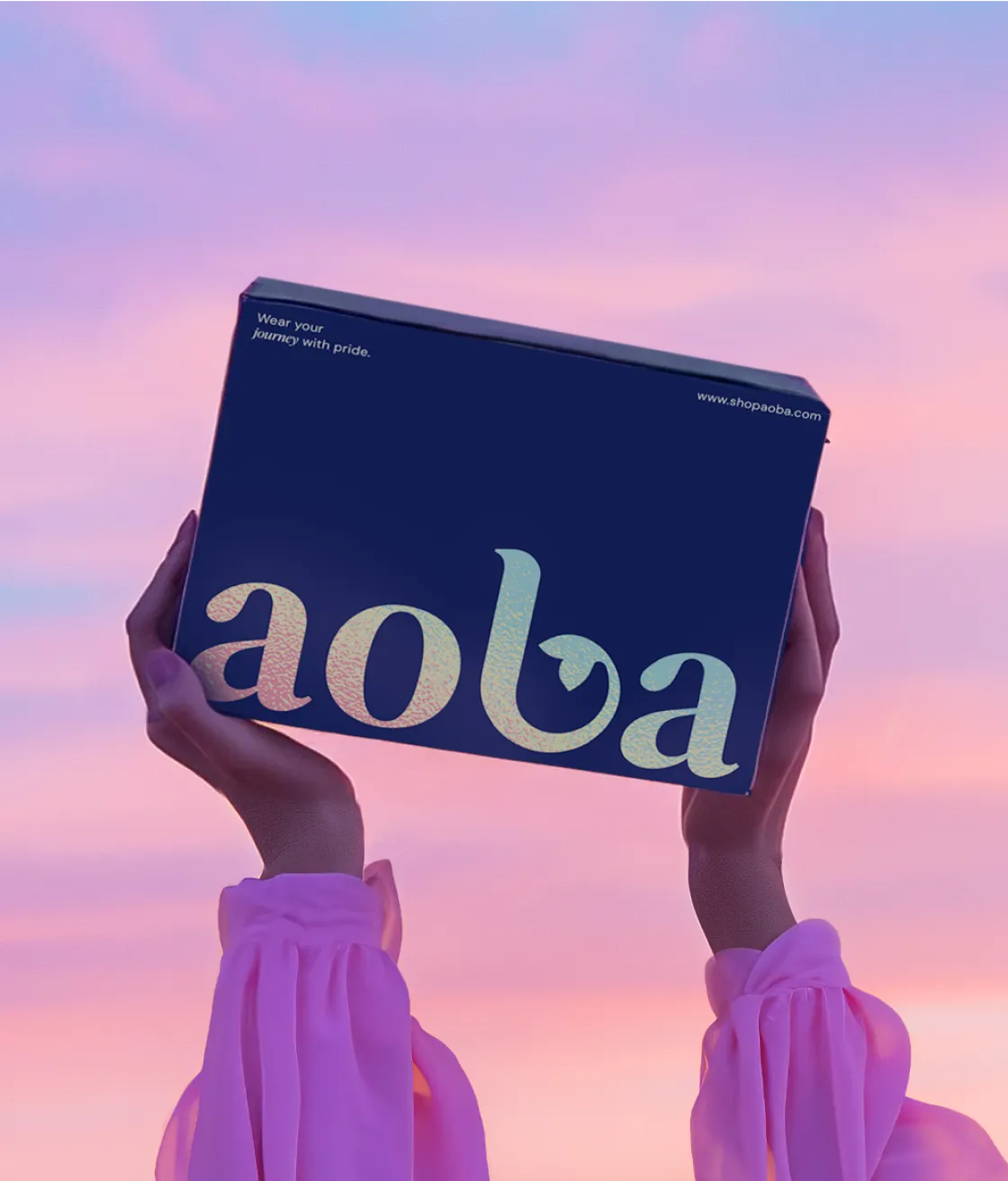
For AOBA, we built the identity around tropical escapes and vibrant self-expression, positioning resort wear as a premium lifestyle choice that brings the freedom, adventure, and joy of island living into everyday life
Rare Rabbit established a premium menswear position through product and brand consistency rather than relying solely on celebrity endorsements or borrowed international credibility.
These brands show us a recognisable point of view comes from choices customers can see, not just words in a brand statement.
Generic claims about passion, quality and craftsmanship cannot differentiate a clothing label.
An effective story comes from something real: the founder's motivation, a distinctive approach to fit, a particular craft tradition or the problem the first collection was designed to solve.
Most importantly, the positioning must hold up.
A brand promising craftsmanship must deliver through construction and finishing. One claiming sustainability must consider materials, production and packaging. A product-first brand must make the product distinctive enough to support that promise.
✅Check: Can you explain who the brand is for, what it stands for and what makes it different without relying on words such as “premium”, “quality” or “unique”?
If not, you need to work more on positioning before starting with the visual identity.
A product signature could be a distinctive fit, a fabric, a stitch pattern, a trim or a construction detail.
Over time, customers learn to associate that feature with your brand, even when the logo is not visible.
Levi's Red Tab shows how a small detail can become a lasting brand asset.
Introduced in 1936, the red tab on the back pocket helped distinguish Levi's denim from competing products when viewed at a distance.
The detail became recognisable in its own right, without relying on a large logo.
The same principle applies to emerging clothing labels. Nicobar builds recognition through its product-first approach to fabric, form and print.
A signature does not have to be a single graphic. It can also be a consistent approach to how products are designed.
Choose one or two signatures that express the brand's positioning and work across multiple products.
A detail that suits only one collection may be interesting, but it will not necessarily build long-term recognition.
A signature only works when customers encounter it consistently.
Document its specifications in technical packs, including dimensions, materials, placement, colour and finishing.
Check that manufacturers can reproduce it reliably across sizes, fabrics and production runs.
If a feature becomes central to the brand, investigate whether it can be legally protected rather than assuming it is exclusive.
For a new clothing brand, one or two well-chosen details repeated over several seasons can build stronger recognition than introducing a new visual idea with every drop.
Make the product identifiable before the customer reads the label. The garment should carry the brand, not just display it.

Clothing brands often come to us. with plenty of visual references, an early logo and a collection in development.
The challenge is turning those ideas into a recognisable brand that can grow across products, collections and markets.
At Confetti, we build the identity around the brand's point of view and the product, not the logo alone.
For Desi Minimals, we developed the positioning “Less noise. More you.” around simplicity, comfort and intentional living.
This gave the brand a clear foundation for its visual identity, verbal identity and packaging. The tone of voice was warm, calm and quietly confident, reflecting the experience the clothes were designed to offer.
For AOBA, a resortwear brand, the challenge was to make resortwear feel like a relatable, aspirational lifestyle rather than a niche category.
The work began with brand immersion and repositioning before moving into the visual identity.
Both projects show why strategy matters: it gives every later design decision a clear purpose.
A clothing brand needs recognisable product signatures, whether through fit, fabric, silhouette, prints or construction details.
These should be considered alongside the identity so the garments and the brand reinforce each other.
The aim is to help customers recognise the label through its products, even when the logo is not visible.
Garment labels, hang tags, care labels, packaging, websites and campaign imagery should all express the same positioning.
Their design must also suit the way customers discover, buy and wear the clothes.
For D2C brands, packaging needs to protect the garment during shipping and create a consistent unboxing experience.
Retail brands need touchpoints that work on shelves and in stores. Across both, product photography should show the details customers cannot assess in person, including fabric, fit and drape.
We sequence the work from positioning and product signatures to identity, labels, packaging and content.
The result is a system that stays recognisable as collections change, rather than an identity that needs to be reinvented with every launch.
We aim to build a clothing brand people recognise through its products, point of view and consistent experience, not just its logo.
A clothing brand's identity must work beyond a website or presentation.
It has to survive embroidery, stitching, washing and printing while remaining recognisable on everything from a woven collar label to a shipping box.
A strong clothing brand name should be easy to pronounce, spell and remember. It should also be practical to use on garment labels, digital storefronts and social media.
Before committing, check trademark availability in relevant markets and product classes, along with domains and social handles.
Avoid names tied too closely to one garment or trend if you plan to expand into other categories. A name that works for a T-shirt label today should not limit the brand when it launches outerwear, accessories or footwear.
Different applications need different versions of the identity.
Most clothing brands benefit from a wordmark, a compact monogram or symbol, and a simplified mark for small applications such as tabs, buttons and labels.
Each asset has a different job. The wordmark identifies the brand, while the monogram can provide recognition where space is limited.
A monogram should be deliberately designed rather than simply cropped from the full logo.
A logo that looks sharp on a large screen can lose detail when embroidered on a chest or woven into a collar label.
Different production methods also handle fine lines, small spaces and colour differently.
Test real samples at the sizes and on the materials you plan to use. Check embroidery, woven labels, screen printing, heat transfers and patches as relevant to the product range. Review the physical result before approving the final artwork.
The quality of the label matters, too. Scratchy materials, poor cutting or inconsistent printing can undermine the impression created by the garment itself.
Decide where branding appears: on the chest, sleeve, hem, inside neck, back yoke or nowhere visible at all.
Define acceptable sizes, colours and placements, and specify when the product signature should take priority over the logo.
Restrained branding can be a deliberate choice, particularly for premium and minimalist labels. The aim is not to put the logo everywhere, but to make every use feel intentional.
A flexible identity system that works in production and builds recognition over time. When the name, marks and placement rules are designed together, each garment reinforces the same brand without requiring a prominent logo on every piece.
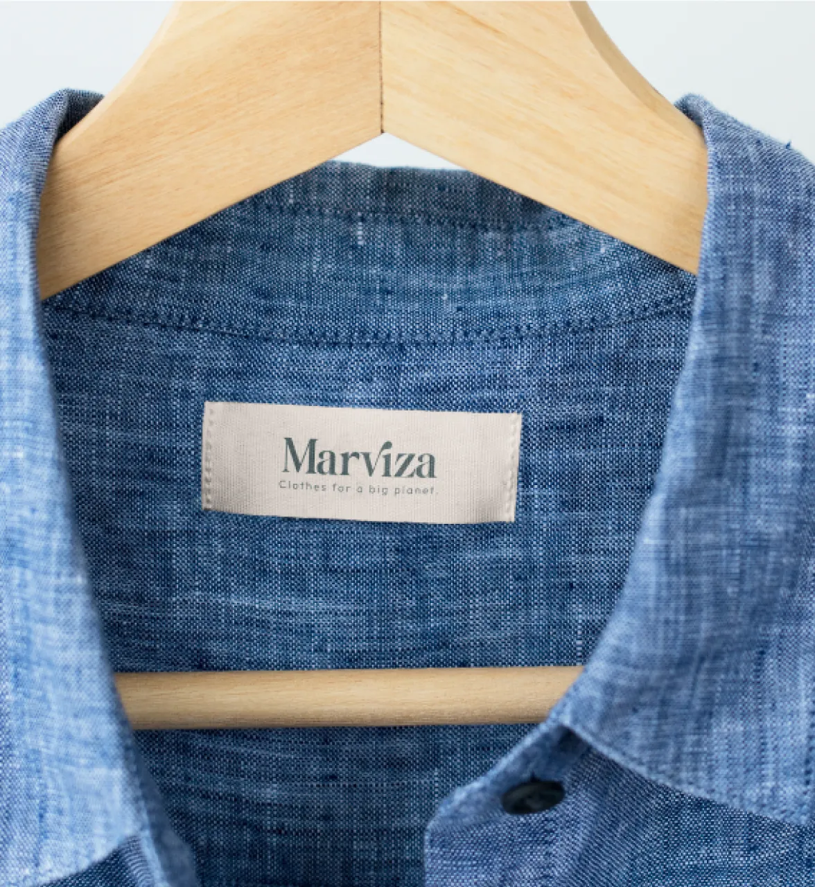
Labels, tags and packaging turn a clothing brand's identity into a physical experience.
They may be smaller than the garment itself, but each one helps confirm the quality and positioning promised by the brand.
Different labels serve different purposes. The neck label identifies the brand, the size label helps customers find the right fit, and the care label explains how to maintain the garment. Materials, comfort, durability and legibility matter, especially for labels that remain against the skin.
Legal requirements also vary by market. In the US, most textile products must disclose fibre content, country of origin and the identity of the responsible business.
Care instructions must also meet applicable FTC requirements. Check the rules for every market you sell in before approving label artwork.
Design the mandatory information alongside the brand elements so compliance does not become an awkward addition at the end.
A hang tag is a useful place to introduce the brand's story, explain a product detail or direct customers to more information.
Establish a clear hierarchy for the brand name, product information and any supporting message.
Choose paper, printing and finishes that suit the price point rather than adding embellishments without a purpose.
A QR code can link to fabric details, care guidance or the story behind a collection without overcrowding the design.
For direct-to-consumer clothing brands, packaging is often the customer's first physical interaction with the business.
Mailers, tissue, inserts and garment presentation should feel consistent with the online experience.
Premium labels may use a carefully designed reveal or reusable packaging, while an everyday essentials brand may be better served by simple, well-made recyclable materials.
The priority is to protect the product, present it well and avoid unnecessary packaging.
Every touchpoint should reinforce the garment's quality and the brand's positioning. The aim is not to add more branded elements, but to make each one work harder.
A clothing brand builds recognition through repeated exposure to the same point of view.
Photography, collection launches, social content and the website should feel connected, even as products and campaigns change.
Define consistent rules for models, styling, settings, lighting, composition and colour treatment.
Show the details customers cannot assess online, including fabric texture, stitching, fit and drape.
A recognisable visual style across regular product shoots can build stronger recall than an occasional polished campaign followed by inconsistent content.
Document the rules with reference images so photographers, stylists and creators can follow them.
Each collection or drop is an opportunity to reinforce the brand's identity. Keep the core elements consistent while allowing new colours, silhouettes, themes and graphics to introduce variety.
A drop creates attention, but consistency gives customers a reason to return.
A release schedule should reflect the product strategy and brand positioning, not simply follow social media trends.
Product pages should communicate fit, fabric, sizing, care and styling clearly. Accurate size guides and honest descriptions help customers make informed decisions and can reduce avoidable returns.
On marketplaces and social commerce platforms, product images must work at thumbnail size.
Consistent backgrounds, cropping, styling and colour treatment help shoppers recognise your products before reading the brand name.
As a clothing label grows, more people shape its identity, from photographers and creators to manufacturers and retail partners.
A practical brand guide should document the visual style, tone of voice, logo placement, product signatures and packaging rules.
The objective is not to make every campaign look identical. It is to give every collection enough freedom to feel new while preserving the details customers associate with the brand.

Whether you're launching a new label or repositioning an existing one, a clear brief helps you build a recognisable brand rather than simply commissioning a logo.
The logo is only one part of the investment.
Account for strategy, naming, identity design, labels and tags, packaging production, photography, website design and brand guidelines.
Costs depend on the number of product categories and SKUs, the complexity of the identity, the markets you serve and the number of touchpoints required.
Scope the work around your launch priorities and future growth plans, rather than spending most of the budget on a logo.
What to look for in a partner. A clothing branding partner should be able to interrogate the point of view before designing the logo.
They should understand the product signature: the fit, fabric, and construction decisions that carry recognition. They should be able to build the trims and touchpoints as one system. And they should be able to show work where the brand is recognisable without the logo, because that is the test that matters.
How do you brand a clothing brand?
Start with a clear point of view: who the clothes are for, what they believe and what makes the product different. Then build signature product details, a name and logo system that works on fabric, labels, tags and packaging, and a consistent voice and photography style. Branding a clothing brand is as much about the garment itself as the logo.
What does clothing branding include?
Clothing branding usually includes positioning and brand story, the name, a logo system with wordmark and monogram, colour and typography, photography and content style, tone of voice, woven labels, hang tags and care labels, packaging and unboxing, and a website and social presence. Signature product details, such as a trim or stitch, are part of it too.
How much does branding a clothing brand cost?
Costs vary widely with scope and who does the work. A freelancer may deliver a logo and basic identity, while a studio usually covers positioning, naming, the identity system, labels, tags, packaging and guidelines that may cost USD 3000+. Budget separately for label and packaging production, photography and the website, which often cost as much as the identity design.
What is a signature detail in clothing branding?
A signature detail is a recognisable product feature that identifies the brand even without the logo, such as a coloured tab, a stitch pattern, a lining or a distinctive trim. Levi's introduced its Red Tab in 1936 because managers found it hard to tell Levi's jeans from competitors' at a distance, and registered it as a trademark in 1938.
What information must go on clothing labels?
It depends on the market. In the US, the FTC requires labels to show fibre content by percentage, country of origin and the company name or RN number, with care instructions on a permanent label under a separate rule. Other countries set their own requirements, so plan label space early and check the rules wherever you sell.
Want strategic branding and packaging like this for your business?