%201.webp)
02
AI Snaps
.svg)
.svg)
01
Our Work

03
About Us
05
Contact Us
06
Client Success

07
Blogs
08
Careers
Book A Call


Need Help In Building Your Brand?
Click the button below & book a call with our founder directly.

Rishabh Jain
Managing Director
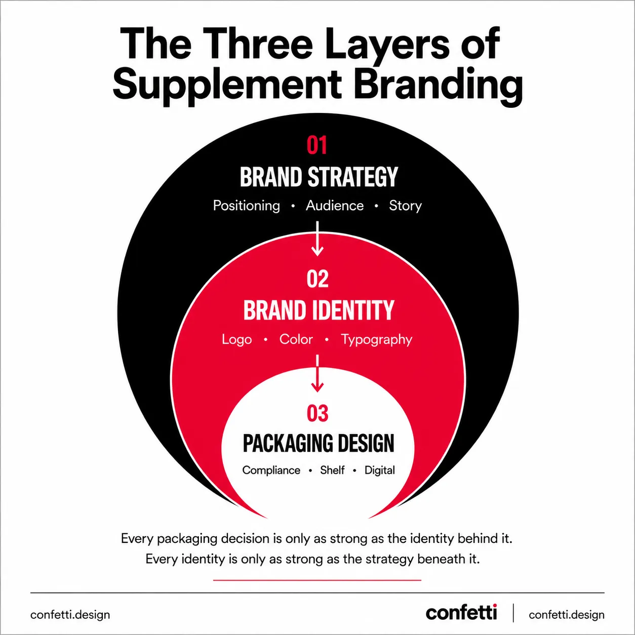
Health supplement branding has become critical in a rapidly expanding dietary supplements market where most products look identical and lose on brand before they lose on formulation.
This Confetti guide covers everything a founder or brand builder needs: positioning strategy, visual identity, packaging design, real-world examples from D2C brands, and what a specialist supplement branding agency actually delivers.
.png)
Health supplement branding is the process of building a distinct, trustworthy identity for your supplement brand.
It includes defining positioning, visual identity, packaging design, and communication that impacts how a buyer perceives, trusts, and repeatedly purchases your supplement.
Supplement branding is fundamentally different from other products for the following reasons:
1. High Trust Barrier & Deficit
A buyer choosing a protein powder, a sleep supplement, or a women's wellness capsule is making a decision about something they will put into their body.
The scrutiny level is much higher than any other consumer product. The branding must communicate safety, efficacy, and credibility from the very first glance.
Also, decades of adulterated products, inflated efficacy claims, and enforcement gaps have made supplement buyers skeptical by default. In a low-trust category, brand design has to do the trust-building work that consumer products in other categories can often leave to reputation and familiarity.
2. Regulatory Constraints Limit
In India, the Food Safety and Standards Authority of India (FSSAI) regulates health claims tightly. Terms like "immunity booster," "heart healthy," and "100% natural" are increasingly scrutinised.
In the US, the FDA prohibits structure-function claims that cross into drug territory. This means you cannot simply shout the benefit you want to shout.
Your branding must work within a framework of permissible claims, which makes differentiation through visual and emotional cues even more critical. When everyone says roughly the same thing, the brand that looks different and feels different wins.
3. Category is Visually Homogeneous
Walk down the supplement aisle of any modern retail store or scroll through the nutraceutical section of an e-commerce platform. You will see a sea of white, green, and blue with stock imagery of capsules, leaves, etc.
You will see the same sans-serif typefaces, the same layout structures, the same visual language of "clean" and "natural". This visual sameness is the result of brands playing it safe, assuming that looking like a supplement is the same as looking trustworthy. It is not. In fact, it is the fastest route to invisibility.
4. Ingredient Parity
Every supplement category is crowded. Protein, collagen, probiotics, adaptogens, nootropics, women's wellness, sports recovery, every subcategory has dozens of brands making nearly identical claims.
Any competitor can source the same ingredient: KSM-66® Ashwagandha, Vitamin D3+K2, creatine monohydrate, from the same supplier. Product differentiation at the formulation level is rarely durable.
5. Claim Saturation
"Boosts immunity." "Supports gut health." "Clinically proven." Every brand says it. None of it stands out.
The regulatory environment in most countries also restricts what can be claimed, which means the words available to all brands are nearly identical.
6. Fragmented Audience
A cognitive health supplement positioned for Baby Boomers concerned about memory decline requires a completely different brand language than the same functional ingredient positioned for Gen Z gamers seeking focus and reaction time.
The product may be similar. The brand cannot be. Understanding the target audience: demographics, specific health goals, lifestyle preferences, and emotional pain points, is foundational. Get this wrong, and every subsequent branding decision is misaligned
The result: Most supplement brands are competing on packaging aesthetics within a narrow band of category conventions. Clinical white for science-forward brands. Green and earthy for natural or Ayurvedic brands. Black and bold for sports and performance. Within each lane, the visual differentiation is minimal.
The brands that break out are the ones that approach the category differently both visually and strategically.

Positioning determines who you speak to, what you say, how you look, and ultimately, whether you command a premium or compete on price.
In the supplement category, positioning focuses on occupying a distinct, defensible territory in the consumer's mind.
Here are the core positioning territories that work in health supplement branding:
This positioning stakes everything on clinical validation, research-backed formulations, and transparent ingredient sourcing. The brand does not make vague wellness promises.
It points to studies, third-party certifications, and measurable outcomes. It speaks the language of bioavailability, dosage precision, and ingredient synergy.
Who it attracts: Research-driven, educated buyers who read ingredient labels and cross-reference claims. Often 28–45, urban, skeptical of marketing.
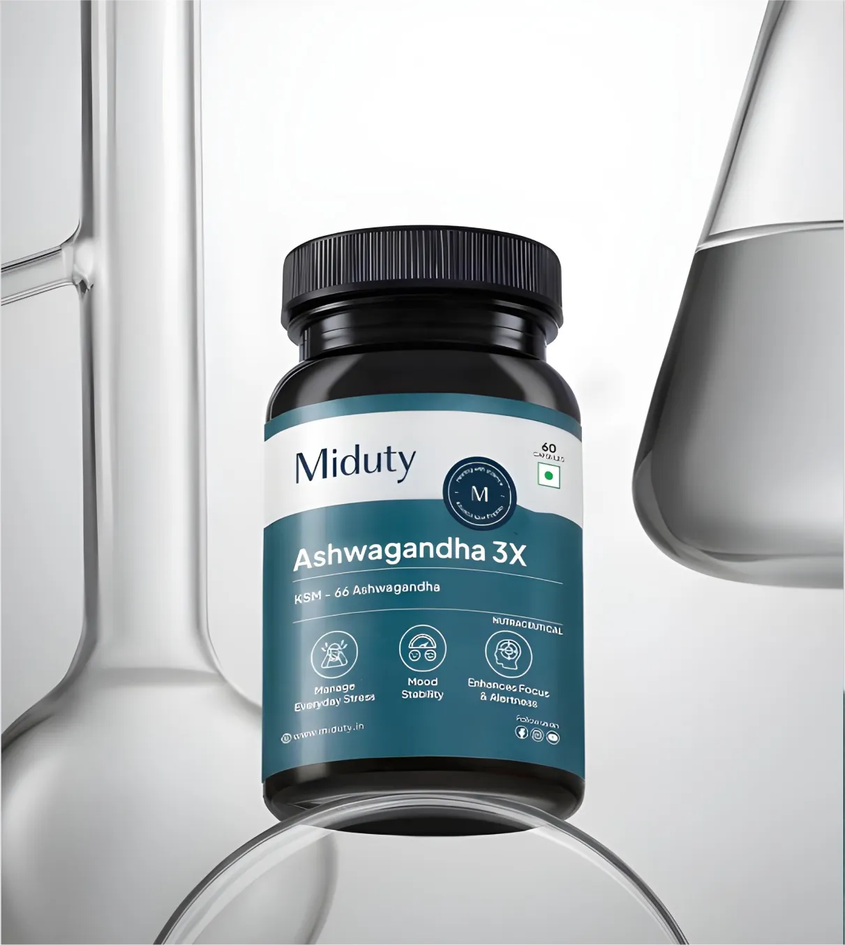
Example: For Miduty branding and packaging, we built its positioning around root-cause health science. Every formulation decision, from ingredient selection to bioavailability prioritisation, is explained in clinical terms that treat the buyer as an intelligent adult, not a wellness consumer.
Design implication: Clean information hierarchies, structured layouts, muted or monochromatic palettes, certification marks treated as brand assets not compliance stamps. Typography must be functional and legible at small print sizes.
This positioning leverages traditional ingredient credibility (herbs, botanicals, adaptogens) combined with modern bioavailability science.
The brand projects authenticity, time-tested wisdom, and natural origins.
Who it attracts: Health-conscious buyers who trust traditional wisdom but also want scientific validation. Broad demographic reach, from urban wellness buyers to consumers with deep cultural roots in herbal medicine.
Example: Kapiva bridges Ayurvedic ingredient heritage with modern nutritional science- its product range uses traditional botanicals like Shilajit, Shatavari, and Giloy, but frames them through dosage precision, bioavailability research, and condition-specific stacking logic that a contemporary urban buyer can evaluate and trust.
Design implication: Earthy palette grounded in positioning, warm neutrals, botanicals referenced without becoming decorative, heritage typography balanced with a clean label structure. The pack should feel trustworthy, not archaic.
The supplement is an extension of who the consumer aspires to be: a high-performer, a serious athlete, a biohacker, a wellness-first professional. The brand belongs to a cultural identity, not a health category.
Who it attracts: 22–38, fitness-embedded consumers who make purchasing decisions based on aspiration and tribal affiliation. The brand choice signals something about them to others.
Example: Our SuperYou brand audit reveals how this positioned itself as a convenient, enjoyable way to get protein. This was lifestyle integration, not clinical supplementation.
Design implication: Bold, high-contrast, confident visual systems. Strong iconography or wordmark. Pack as a status signal, something the consumer is comfortable having visible on their counter or gym bag.
One problem, solved with depth. Not a broad wellness brand that addresses everything — a targeted intervention for a specific, defined consumer health challenge.
Who it attracts: Buyers dealing with a specific health concern who have already tried generic wellness brands and want something more precisely relevant.
Examples: Our brand audit of The Good Bug, shows how the brand positioned itself as a leading gut health supplement brand. We examine how condition-specific positioning creates durable category authority and what it requires to hold that position as the brand scales.
Design implication: Clear problem-solution hierarchy on pack. Condition language leads, not ingredient language. Color-coded SKU systems for multi-condition ranges. Trust markers specific to the condition (e.g., clinical references for a hormone health brand look different from those for a sports recovery brand).
📌Most common positioning failure: Trying to occupy all four territories simultaneously. "Science-backed, nature-inspired, lifestyle-ready wellness for everyone" is a product description, not a brand position.
No single territory is universally correct.
Choose your territory depending on your product's actual differentiation, your target audience's psychology, and the competitive landscape.
At Confetti, we help brands identify their defensible territory through a structured discovery process. We analyse the product, the category, the competition, and the consumer. We test positioning hypotheses. We pressure-test the brand's right to win in that space. Only then do we build the visual identity and packaging system.

Trust is the currency of the supplement category. But trust is not built through claims. It is built through visual cues that trigger subconscious associations of verification, authenticity, and credibility.
Here is what trust actually looks like when translated into design:
Color is the fastest communicator on any shelf or digital surface. In supplements, the risks are category-specific:
🎨The clinical trap: White and blue communicate science, but the category is saturated. Product blends in rather than standing out.
🎨The natural default: Green and earthy tones communicate organic or herbal origin. Also saturated across the category. Most Ayurvedic and plant-based brands occupy the same visual space.
🎨Category color camouflage: Choosing a color because you've seen it in the category is designing to blend in. That is the opposite of what branding should do.
The brands that break through make deliberate color choices anchored in positioning, not category convention.
Three principles drive effective supplement typography:
🔠Wordmarks over symbol logos: Product names need to be legible instantly, at multiple sizes simultaneously.
Wordmark-led logos outperform symbol-first systems in supplement categories because the brand name is the primary recognition asset.
🔠Legibility at print scale: Most supplement packs carry significant required information: ingredient panels, dosage tables, certifications, disclaimer language.
The typeface must be readable at 7–8pt on the smallest pack in the range. Decorative typography that works in full-size renders does on work on a 30g sachet.
🔠Consistent information hierarchy: Brand name, product type, key claim, and supporting information must be distinguishable at first glance.
If a buyer has to search for what the product is, the hierarchy has failed.
NSF Certified for Sport, FSSAI (in India), USDA Organic, GMP-certified, third-party tested, are all trust signals that belong in the visual design hierarchy.
In a category where buyers are making health decisions and the history of the industry includes enforcement failures, visible compliance signals do active selling work.
A prominently placed certification badge communicates: "We're regulated and proud to prove it." A certification buried in fine print communicates the opposite, even when the product is fully compliant.

Talk to Confetti experts about creating a stronger, more differentiated brand .
Book A Call
In any modern supplement brand's channel mix, the product appears: on retail shelves, as an e-commerce listing thumbnail, in D2C unboxing, at point-of-sale in modern trade, and on quick-delivery platforms.
Retail Shelf (Pharmacy, Health Store, Supermarket):
In retail, health supplement packaging competes directly with nearby alternatives, so shelf visibility and immediate attention are critical.
Clean layouts, readable fonts, and simple icons support fast decisions, while the back label must clearly present serving sizes, ingredients, health warnings, certifications, and all required regulatory information to maintain trust and compliance.
E-Commerce Listing (Amazon, Flipkart):
For e-commerce, packaging is first seen as a small mobile thumbnail, where only key elements such as the brand name, product type, benefit, and quantity remain visible.
Clear hierarchy and legibility are essential, while the design must also balance product protection with cost-efficient shipping to minimize damage and returns.
Quick-Delivery Platforms (Blinkit, Zepto, Instamart):
In quick commerce, packaging faces the same thumbnail constraints as e-commerce but with even faster purchase decisions. The brand, product type, and key benefits must be instantly recognizable to drive impulse purchases.
As packaging often serves as the primary shipping container, it must withstand rapid handling and delivery while maintaining product protection, visual appeal, and clear brand communication.
D2C Unboxing:
The first physical brand touchpoint for a customer who bought online. This moment carries disproportionate weight in building long-term trust and driving advocacy.
A premium unboxing experience converts a transactional purchase into a brand relationship. A plain brown box with a printed invoice signals that the brand stopped caring once the payment was processed.
Here’s more information on nutraceutical packaging design.
Every regulated market: FDA in the US, FSSAI in India, FSA in the UK, mandates specific label information for supplements. Ingredient panels, dosage instructions, warnings, certifications, net quantity, country of origin, disclaimer language.
Make sure to treat regulatory and informational requirements as a priority when designing.
An effective approach we follow at Confetti is to design the information architecture first, mapping mandatory content, establishing a clear reading hierarchy, and building the visual system around it.
In this way, compliance becomes the foundation of the label rather than a constraint added later.
Supplements are one of the strongest categories in consumer goods for retention. The product is consumable, repurchase is predictable, and health outcomes often take weeks or months to become noticeable.
This can create an inherently long-term relationship between brand and customer.
Most supplement brands concentrate their investment on acquisition: paid social, influencer campaigns, affiliate partnerships, and marketplace optimization.
Far less attention is given to the retention levers that determine whether a first-time buyer becomes a multi-year customer.
The role of a brand evolves across the customer journey, from driving initial trust to reinforcing outcomes and ultimately creating advocates.
Unlike fashion or entertainment, supplements are outcome-driven purchases. If the product delivers the promised benefit, customers return. If it does not, no amount of branding or advertising can sustain long-term retention.
This does not make branding irrelevant. It makes branding more important.
The role of brand strategy is to create alignment between expectation and reality.
Overpromising through packaging, messaging, or advertising creates a gap between what customers anticipate and what they experience. That gap destroys trust, weakens retention, and increases churn.
Many supplement brands assume subscriptions automatically solve retention. They do not.
Subscription is a billing mechanism, not a loyalty engine.
Supplement brands that pair subscriptions with routines, education, and ongoing engagement stand out. They help customers build habits.
The subscription is the container. The routine is the value.
The strongest brands design for retention from day one.
What's Up Wellness recognised the importance of retention early, resulting in a significant increase in revenue driven by strong six-month customer retention.
Traya has taken an even more retention-focused approach, publicly stating that the majority of its revenue comes from existing customers rather than ongoing acquisition efforts.
These companies tell us: sustainable growth in supplements comes from extending customer lifetime value, not endlessly increasing advertising spend.
Retention is often treated as a marketing KPI, but it is better viewed as a measure of strategic alignment.
These are not just marketing challenges. They are brand strategy challenges.
When the brand promise, product experience, and customer reality align, retention becomes a natural outcome.
Brand voice determines whether a supplement brand sounds like a medical authority, a knowledgeable peer, or a wellness lifestyle company. The wrong voice can erode trust even when positioning and design are strong.
None of these approaches is inherently better. Each succeeds because it aligns with a distinct positioning strategy.
The mistake is borrowing a voice because it sounds appealing rather than because it reinforces a clearly defined market position.
Ultimately, supplement brands win when branding and product performance work together. Acquisition may create the first purchase, but retention, advocacy, and lifetime value are built through a combination of efficacy, experience, and trust.
Most supplement founders understand they need branding help but only a few understand what a branding agency should actually do versus what they're sometimes sold.
✅ Positioning before design: We start with strategy: competitive audit, white space, and defining brand territory.
✅ Scalable identity system: A full system including logos, typography, color, visual language, and usage rules across all surfaces.
✅ Channel-ready packaging: Design for real contexts like Amazon, retail shelves, and mobile thumbnails, not just mockups.
✅ Compliance integrated early: In regulated categories, compliance shapes structure from the very first say.
✅ Built for SKU expansion: Ensure the system holds up as the product range grows, without losing coherence.
At Confetti, we built our personal wellness and supplement brand portfolio on exactly this approach: positioning-first, channel-tested, compliance-integrated, and built to scale across SKUs.
✨Our work with Miduty brand identity, packaging, and e-commerce redesign for one of India's fastest-growing nutraceutical brands is featured in Packaging of the World and demonstrates what strategy-led supplement branding actually produces in practice.
✨Our AIM Nutrition packaging project shows how visual differentiation within category conventions works when the brief is built around a clear positioning.
What sets us apart: we take ownership, we obsess over what actually works, and we build for retention, not just acquisition.
Brands like ITC, Dabur, Miduty, and AIM Nutrition have achieved measurable commercial success through our strategic branding and packaging design.
Want to know more? Get in touch with our Supplement Branding experts

The most powerful branding ideas in this category operate at the level of format, communication architecture, and business model and not just logos and colours.
Here are some supplement branding ideas that have produced the most durable differentiation:
1. Make the Format the Brand
Wellbeing Nutrition's Melts oral strips are a strong example of format-led branding. The no-pill, no-water experience made the product stand out and reshaped the supplement ritual into something simpler and more modern.
When a product has an unusual format, packaging must quickly explain it while staying visually clean, balancing education with restraint instead of overloading on copy.
2. Build a Transparency System, Not a Product
The Whole Truth Foods built their entire visual identity around complete ingredient disclosure: every ingredient, listed with its exact quantity, on the front of the pack. This was both a compliance philosophy and a brand position.
Similarly, Ritual differentiated in a commoditized multivitamin market through radical transparency rather than formulation. Clear capsules, visible ingredients, and traceable sourcing maps turn trust into the product.
Transparency became the product, and the packaging design enforced it so consistently that it became instantly recognizable across a crowded supplement shelf.
3. Create a New Category Instead of Entering an Existing One
SuperYou did not enter an existing category. It created one by using fermented yeast protein technology rather than standard whey or soy protein.
Similarly AG1 repositioned from a greens powder into “foundational nutrition,” turning it into a daily health ritual and a category of one.
Through creator partnerships (e.g., Andrew Huberman and Tim Ferriss), subscription, and premium branding, it separated itself from commodity supplement competitors.
Category creators do not compete on price and it is the ultimate form of differentiation. If you cannot create a new category, find a sub-category where you can be first. The brand that defines the category owns the consumer's mental reference point.
4. Use Ritual as a Brand Anchor
Daily supplement habits are powerful retention mechanisms. Brands that make the ritual feel intentional, through packaging, naming, and subscription design, convert single purchasers into long-term subscribers faster than brands that treat the product as a transaction.
AG1's pouch and travel packet system, Ritual's subscription-only model, Hum Nutrition's daily ritual branding, each makes the act of taking supplements feel like a meaningful daily choice, not just a health obligation.
5. Build a Visual System That Actively Resists Category Convention.
Tonic Health’s rebrand took a contrarian approach. Instead of following the category’s muted pastels and soft greens, it went bold.
High-impact gradients were designed to stand out on shelves and in feeds. Typography also broke from the norm, scaling up a strong sans-serif to give it more presence and voice.
6. Color-Code for Condition at Scale
For supplement brands with multiple SKUs across different health conditions, a deliberate color-coding system is the navigation system for the brand. Buyers who trust the brand for sleep support should be able to find the sleep SKU instantly.
Color systems that differentiate by condition without losing brand coherence are one of the most technically demanding and commercially valuable design problems in supplement packaging.
7. Let the Science Show, Don't Just Claim It
Brands like Momentous and Thorne use clean, structured label design that makes ingredient science visible: dosage precision, form specificity (magnesium glycinate rather than just magnesium), bioavailability notes.
This is a design choice as much as a content choice: making the label feel like a specification sheet, not a marketing brochure, communicates confidence in the science.
Idea 6: Use Restraint as a Competitive Advantage
In a category defined by exaggerated promises and visual noise, restraint signals confidence. The Good Bug demonstrates this: clean, deliberate identity without unnecessary embellishment.
Calm branding stands out amidst cluttered shelves. Auditing every design element and removing what does not serve the consumer's decision-making builds trust. The brands that shout are compensating. The brands that speak calmly have nothing to hide.
Idea 7: Frame Wellness as Cumulative, Not Corrective
Most brands sell corrections, fixing what is broken. The more effective frame is cumulative: building wellness over time through consistency.
AIM exemplifies this, positioning wellness as accessible and sustainable, not urgent and reactive. The brand becomes a partner in daily practice, not a crisis solution. This narrative builds lasting relationships, not one-off transactions.
8. A Differentiated Philosophy Must Be Visually Legible
When your product philosophy is genuinely differentiated, packaging must make that philosophy immediately legible, not just signal it vaguely through design style.
We built Miduty's complete brand identity and packaging redesign, featured in Packaging of the World, communicating clinical precision and health philosophy simultaneously. The coherence drove a 70% customer retention rate and export expansion to the US, UK, and UAE.
9. Balance Category Legibility with Visual Differentiation
Category legibility and visual differentiation are not opposites. The best supplement packaging occupies both, looking unmistakably like a supplement and unmistakably like itself.
AIM Nutrition required a packaging system that communicated premium supplement credibility while standing out in a rigid, predictable category. The challenge was differentiation within category legibility, being immediately recognizable as a nutrition brand while looking nothing like the competition.
What is health supplement branding?
Health supplement branding is the system shaping perception, trust, and repeat purchase: positioning, identity, packaging, and communication.
It defines what you stand for, who you serve, and why you’re chosen, expressed through visuals and packaging that work on shelf and screen.
How is supplement branding different from other consumer goods branding?
Supplements carry a higher trust burden because they’re consumed for health outcomes. Buyers scrutinize ingredients, certifications, compliance, and expertise before trying.
Credibility must be established quickly and clearly, making every design and message a tool for trust-building, not just awareness.
What should supplement packaging design include?
Supplement packaging must meet regulatory requirements (FDA, FSSAI, FSA), including ingredients, nutrition facts, dosage, net quantity, dates, manufacturer details, origin, and disclaimers.
Apart from compliance, it must clearly communicate positioning, make benefits instantly legible, and work effectively across retail, e-commerce, and quick-commerce platforms.
What does a supplement branding agency actually do?
A specialist supplement branding agency like Confetti Design Studio delivers positioning strategy before design, a scalable identity system, channel-tested packaging, early compliance integration, and production-ready assets.
Generalist studios may create attractive packaging, but category-experienced agencies build systems that perform commercially within the specific regulatory and competitive demands of supplements.
How do you measure the ROI of supplement branding investment?
The primary returns from supplement branding investment show up in conversion rate (browser to buyer), perceived value uplift (price premium over generic alternatives), retail placement quality (buyer decisions at listing stage), and subscription retention (churn reduction driven by post-purchase brand experience). Our guide on packaging design ROI measurement outlines a framework for evaluating each.
Want strategic branding and packaging like this for your business?


.webp)
.webp)


.webp)
.webp)
.webp)
.webp)
.webp)


.svg)
.webp)
.svg)
.webp)