%201.webp)
02
AI Snaps
.svg)
.svg)
01
Our Work

03
About Us
05
Contact Us
06
Client Success

07
Blogs
08
Careers
Book A Call


Need Help In Building Your Brand?
Click the button below & book a call with our founder directly.

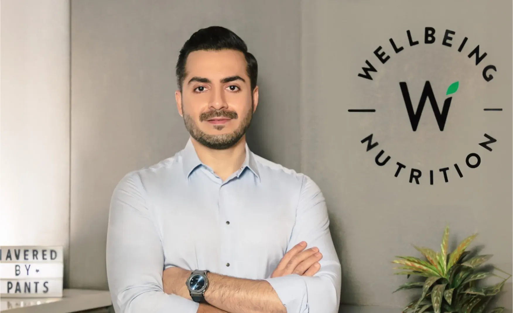
Rishabh Jain
Managing Director
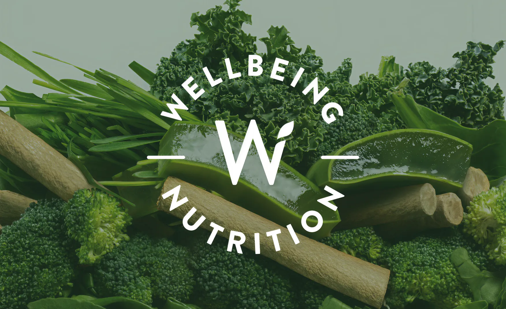
Wellbeing Nutrition | Confetti's Verdict ⭐⭐⭐⭐½
Confetti Design Studio has analysed Wellbeing Nutrition to understand how a clean-label nutraceutical brand grew revenue 95% to approximately Rs 170 crore in FY25, raised USD 16.7 million across seven rounds backed by HUL and Fireside Ventures, and was acquired by pharmaceutical major USV in February 2026 at a valuation of Rs 1,583 crore.
The most strategically loaded element in Wellbeing Nutrition's visual identity is not the packaging structure or the colour system, it is their logo format.
The brand's logo is rendered in a stamped format, and that choice does a great deal of work. Culturally and psychologically, a stamp communicates verification, authenticity, and approval. It is the visual shorthand for "this has been checked and certified." In a nutraceuticals category where consumers are increasingly sceptical of ingredient claims and quality standards, a logo that looks like a seal of approval builds unconscious trust before a single word of copy has been read.
This is not accidental typography, but a brand signal that reinforces the core promise of every product in the range: that what is inside has been rigorously validated. For a brand that competes on scientific credibility and clean-label positioning, the stamp logo is one of the smartest single design decisions in the category.
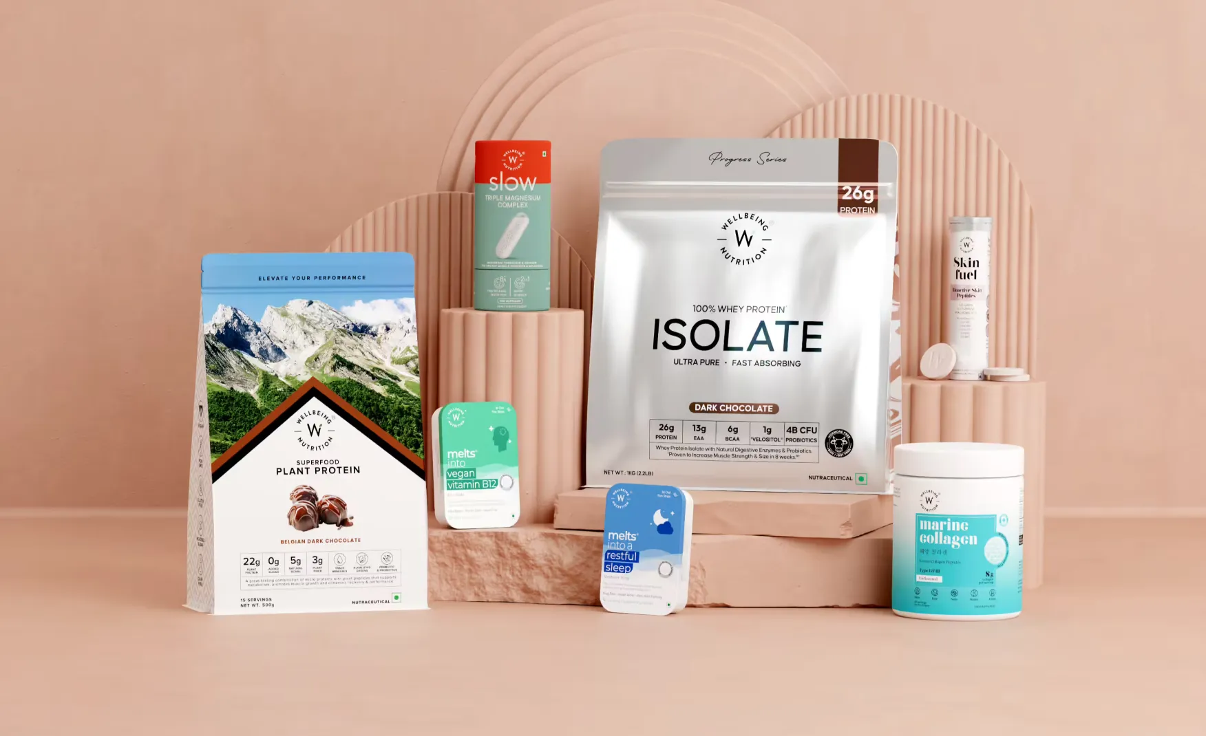
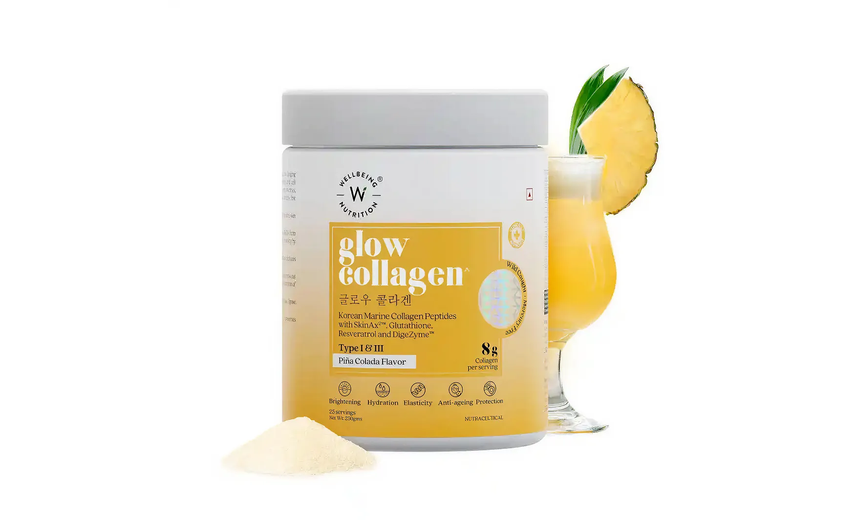
Most nutraceutical brands default to the same format playbook: brown glass bottles for premium, white plastic for everyday, tubs for protein. Wellbeing Nutrition chose a fundamentally different approach.
The packaging architecture is unusually diverse and each format choice is tied to a specific product experience:
This willingness to experiment with packaging structure signals a brand that thinks about the product experience holistically, not just the label on a standard container. In a category where most competitors are mostly indistinguishable on shelf, these format choices create the much needed immediate differentiation and genuine product recall in the consumers’ minds.
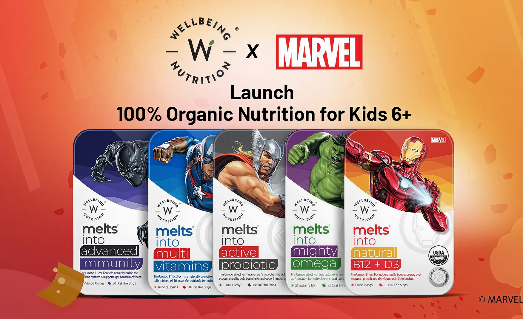
Building a single brand that credibly serves children, beauty-conscious women, fitness-focused adults, and health-aware seniors simultaneously is one of the most difficult design challenges in consumer goods. Wellbeing Nutrition has executed this more successfully than almost any other Indian nutraceutical brand.
Each category within the range has its own visual world and emotional tone:
Yet across all of this, the parent identity holds its value. The stamp logo, the consistent typographic approach, and the quality of finish create a unifying thread that tells the consumer these products all belong to the same trusted source. This mirrors how conglomerates like ITC manage master brands and sub-brands simultaneously. For a D2C startup, this level of brand architecture thinking is genuinely impressive.
The most telling sign of a brand's design maturity is what it does with the small details that most consumers will barely notice consciously but will feel.
Wellbeing Nutrition's Korean Marine Collagen packaging includes copy written in both English and Korean. The Matcha Collagen range incorporates Japanese script. These are not decorative choices. They are precision-targeted credibility signals for a consumer base that is deeply influenced by K-beauty and Japanese wellness trends and knows that the most authentic products from those traditions carry those scripts. It communicates "this product is genuinely rooted in the tradition it claims to draw from" without a single marketing claim. These micro-gestures demonstrate a level of consumer insight that goes well beyond surface-level design. The brand understands not just what its audience buys, but what makes them believe.
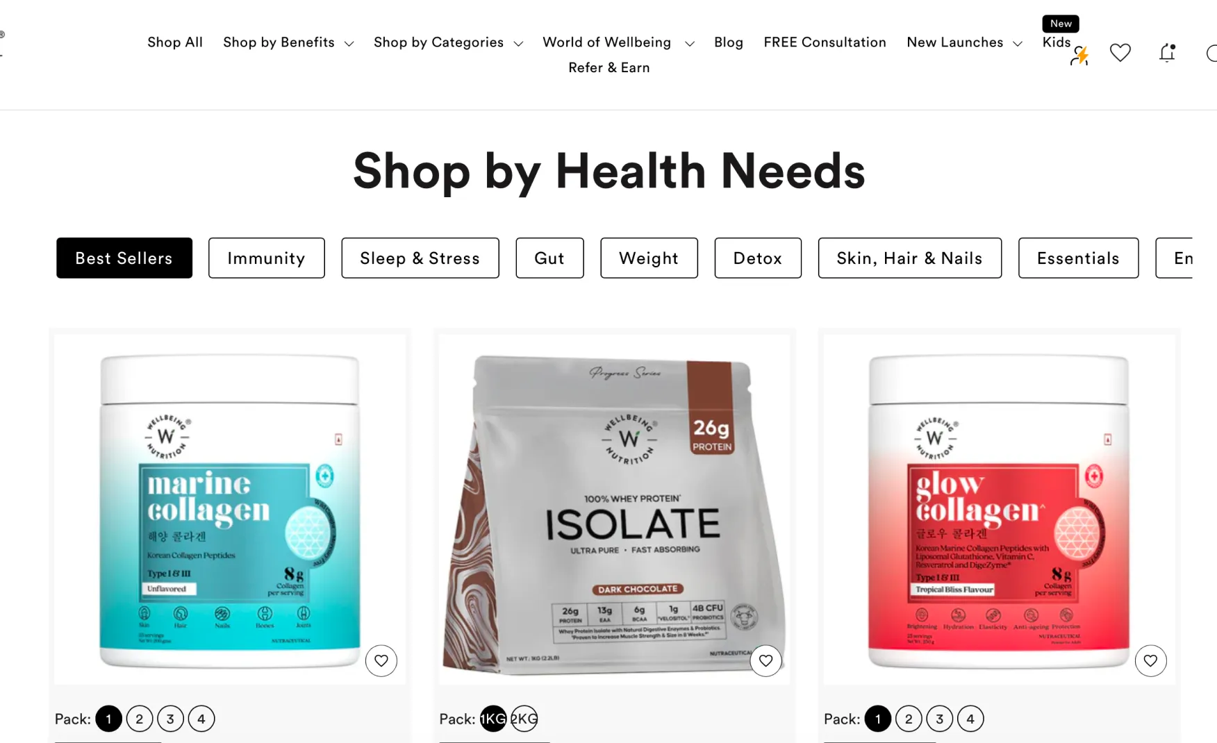
Wellbeing Nutrition's e-commerce website is structured around one of the most consumer-intelligent navigation choices in Indian D2C health: shop by benefit rather than shop by product.
Rather than presenting the range as a product catalogue, the website leads with outcomes: sleep, gut health, immunity, beauty, energy. A consumer who knows they have a sleep problem but does not know which supplement to take can immediately identify the relevant category. This reduces the cognitive load of purchase and removes a key drop-off point in the conversion funnel.
The website also uses video-led sales content alongside the product listings, which builds the kind of trust that static imagery cannot. Seeing a product explained and demonstrated reduces hesitation, particularly in a category where consumers may be purchasing a supplement format they have never tried before. The free consultation feature, which connects customers with nutrition experts, extends the trust-building further. It positions the brand as a partner in the customer's health journey rather than a retailer of supplements. For a premium-priced range, this level of service architecture is what justifies the price point.
The same design flexibility that allows Wellbeing Nutrition to serve multiple audiences simultaneously carries a structural risk: as the range continues to expand into new categories and age groups, the visual distance between sub-ranges may grow to a point where the master brand identity is no longer strong enough to hold everything together.
A consumer comparing the Daily Greens packaging, the Slow Collagen tube, and the Shilajit range may struggle to connect them to a single brand without the logo as the only visual anchor. In branding terms, this is the line between strategic flexibility and identity fragmentation. The logo stays consistent, but if the visual systems diverge sharply enough, the perceived authority of the parent brand begins to diffuse.
This does not undermine the brand today. But as the product count grows and the category breadth widens, a stronger set of connective design elements, whether through a consistent structural grid, a typographic system, or a recurring visual motif, will become essential for maintaining master brand coherence.
The voice and personality notes from Confetti's analysis highlight an interesting tension in the brand's archetype. Wellbeing Nutrition's base archetype is grounded in education and the Sage: authoritative, science-backed, trustworthy. This works exceptionally well for the adult wellness, senior care, and clinical nutrition categories.
But when the brand leans into categories like protein and fitness, recently collaborating with comedian Biswa Kalyan Rath, it shifts towards the Jester archetype: fun, irreverent, light. And when it positions Shilajit as a performance enhancer sourced from the Himalayas, it takes on the tone of the Hero archetype: adventure, liberation, mastery.
Multiple archetypes can coexist within a brand architecture, but they require clear delineation. Without that, the brand risks feeling tonally inconsistent to a consumer who encounters it across different categories. Building clearer archetype guardrails for each sub-range would add a layer of strategic coherence to the already strong visual system.
The February 2026 acquisition of a 79% stake by pharmaceutical major USV at a valuation of Rs 1,583 crore is a significant validation of Wellbeing Nutrition's brand equity. Fireside Ventures achieved approximately a 15-fold return and HUL achieved a 5-fold return on their investments.
The integration challenge ahead is real. Wellbeing Nutrition's brand equity is built on a D2C-first, design-forward, consumer-intimate identity. USV's DNA is rooted in pharmaceutical distribution, clinical credibility, and prescription-led sales. Merging these two identities without diluting the consumer-facing brand requires deliberate management of how the USV association is communicated, if at all, at the brand level.
At Confetti, we navigated exactly this challenge when working with Miduty, a holistic wellness and skincare brand in the nutraceutical space with a similarly diverse product portfolio spanning serums, night creams, ashwagandha tablets, and blood sugar supplements. When Miduty approached us, they faced inconsistent packaging across categories, weak visual cohesion, and unclear messaging for a quality-conscious audience. We built a cohesive design system that balanced elegance with scientific clarity so that every product looked unique but unmistakably part of the same brand. This structural discipline is precisely what Wellbeing Nutrition needs as it scales its range further: a master brand grid, a typographic system, and visual motifs that create recognition at the range level, not just at the logo level.
The brand's tonal flexibility is a creative asset. The risk is that it becomes somewhat of a creative inconsistency. Building explicit archetype frameworks for each sub-range, whether that is the Sage voice for clinical nutrition, the Jester for fitness and protein, or the Hero for performance supplements, would allow the brand to flex across personalities without feeling tonally fragmented. These guardrails do not constrain creativity, instead, they channel it.
The USV acquisition creates a structural opportunity that few D2C brands ever achieve: access to a pharmaceutical-grade distribution network, clinical credibility, and manufacturing scale. The brand's role in this partnership is to ensure that the consumer-facing identity, the warmth, the design sophistication, the direct relationship with the customer, is protected and does not become subordinated to USV's institutional brand language. Confetti works with brands at precisely these inflection points, where the design system needs to evolve to absorb new scale without losing the identity that made the brand valuable.
Wellbeing Nutrition is one of the most design-sophisticated nutraceutical brands to have emerged from India. Its packaging format innovation, its multi-audience sub-brand architecture, and its consumer-intelligent e-commerce experience all reflect a brand that thinks about design as a business tool, not just an aesthetic choice.
The USV acquisition at Rs 1,583 crore is the ultimate commercial validation of that philosophy. The 120% revenue growth over two years and the brand's trajectory towards Rs 450 crore by FY27 confirm that design-led brand building in the nutraceutical category is not just aesthetically superior. It is commercially superior too.
If you are building a nutraceutical, wellness, or multi-category health brand and want to create the kind of bold design, sharp positioning, and scalable brand architecture that can hold together across dozens of SKUs and multiple audience segments, Confetti can help you build that.
Want strategic branding and packaging like this for your business?


Lorem ipsum dolor sit amet, consectetur adipiscing elit. Suspendisse varius enim in eros
Lorem ipsum dolor sit amet, consectetur adipiscing elit. Suspendisse varius enim in eros
Lorem ipsum dolor sit amet, consectetur adipiscing elit. Suspendisse varius enim in eros
.svg)
.svg)


.webp)
.webp)


.webp)
.webp)
.webp)
.webp)
.webp)


.svg)
.webp)
.svg)
.webp)


.webp)


.webp)


.svg)