02
AI Snaps
.svg)
.svg)
01
Our Work

.svg)
03
About Us
.svg)
05
Contact Us
.svg)
06
Client Success

.svg)
07
Blogs
.svg)
08
Careers
.svg)
Book A Call
Need Help In Building Your Brand?
Click the button below & book a call with our founder directly.

Rishabh Jain
Managing Director
What if gut health did not feel like medicine at all?
What if it sounded friendly, looked lifestyle-led, and felt like something you could actually build a daily habit around?
That is the problem The Good Bug set out to solve. In a category traditionally dominated by clinical language, prescription aesthetics, and pharmaceutical cues, The Good Bug entered the Indian market with a very deliberate shift in tone. The brand operates in the fast-growing gut health and prebiotic space, alongside names like Yakult, Oziva, Wellbeing Nutrition, Kapiva, and Fast&Up.

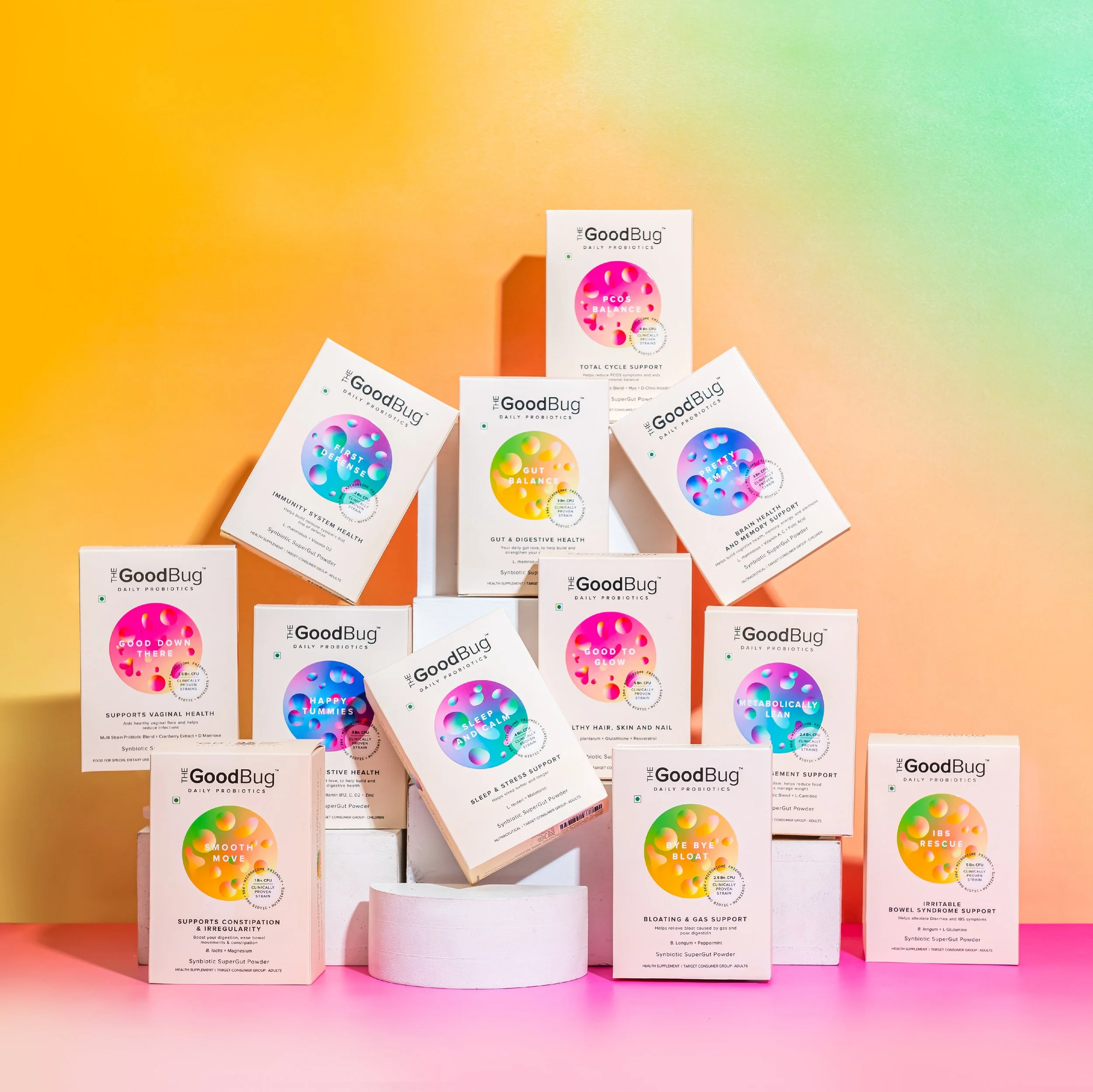

The difference is in their positioning, while many players in this space lean heavily into either medical authority or ayurvedic tradition, The Good Bug chose a third path. One that makes gut health feel approachable, modern, and part of everyday life rather than merely being more of just a reactionary fix. At Confetti, our branding and packaging experts analysed how effectively that intent translates across naming, visual identity, packaging, and brand communication. The result is a brand that gets several fundamentals right, with one clear area holding it back from becoming truly category-defining.
The name “The Good Bug” is one of the brand’s strongest assets. In a market like India, where prebiotics and gut bacteria still carry a strong association with illness or medication, this naming choice immediately shifts perception. Instead of sounding corrective or clinical, the brand feels friendly and familiar. By leaning into the word “bug” and reframing it positively, the brand simplifies a complex scientific concept into something people can intuitively understand. This is crucial for a category that still requires education. The name alone reduces hesitation and makes the product feel lifestyle-led rather than medicinal. That is not accidental. It is a smart category design.
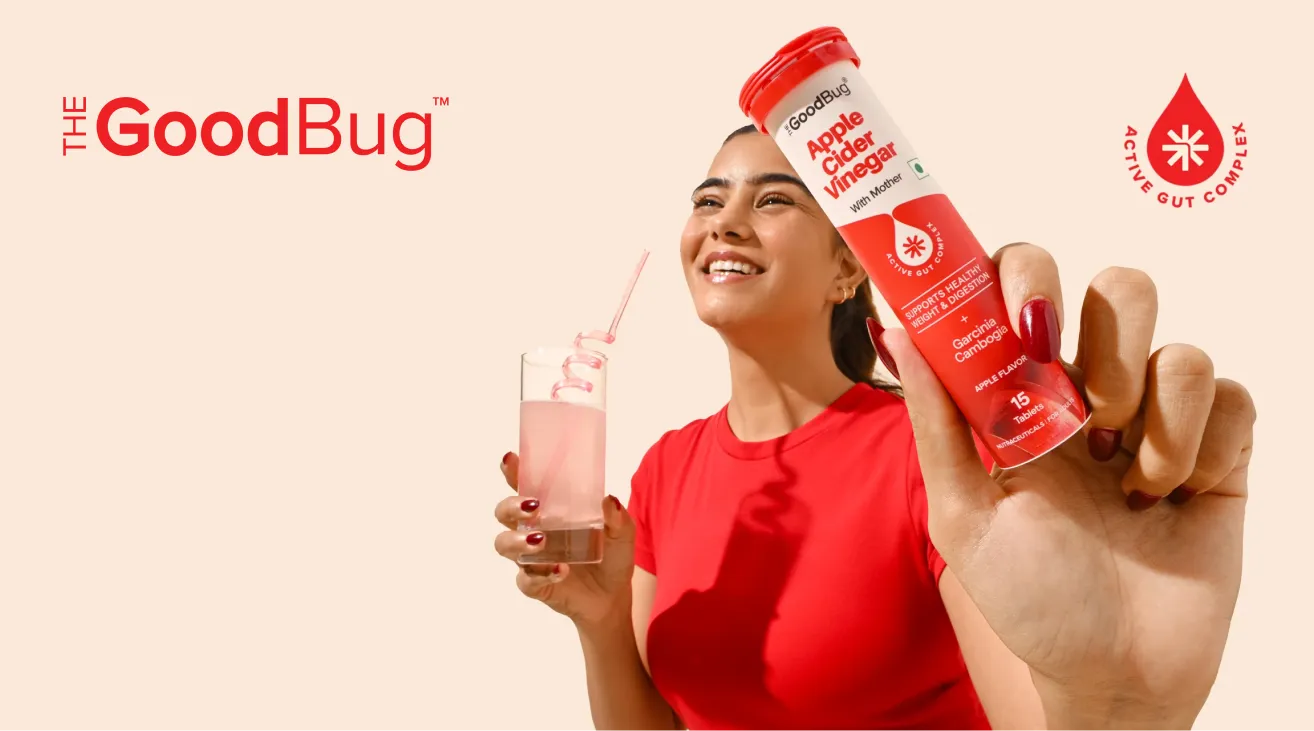
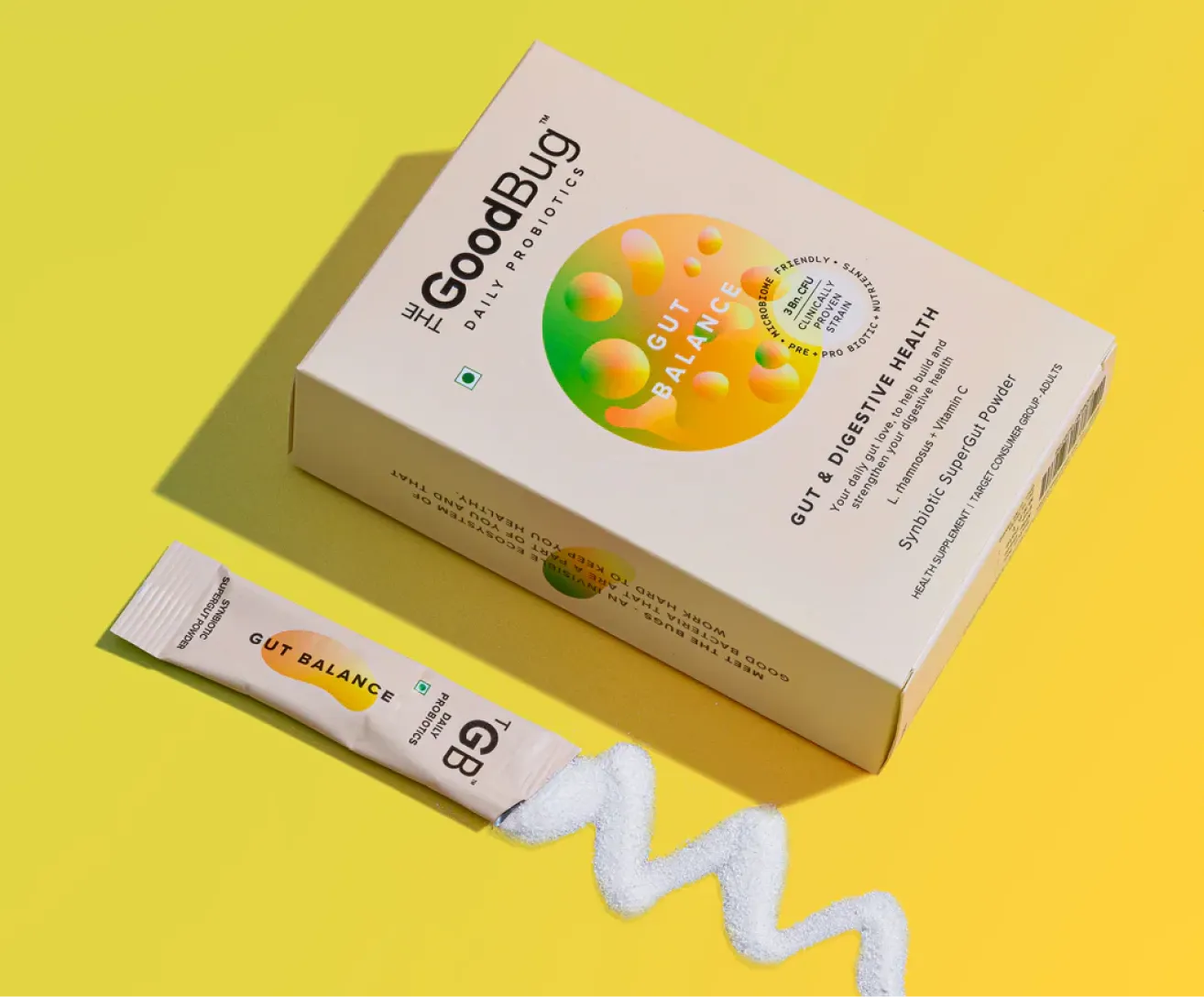
The Good Bug’s visual identity is restrained, clean, and deliberate. From the logo to the packaging to the website, the brand maintains a consistent minimal aesthetic that signals modernity and reliability. There are no unnecessary embellishments, loud claims, or visual clutter trying to overcompensate for the science behind the product. This restraint works in the brand’s favour and in a shelf and feed filled with noisy wellness brands making exaggerated promises, The Good Bug’s calm confidence helps it stand out. The visual system supports the idea that this is a brand built on understanding, not urgency.
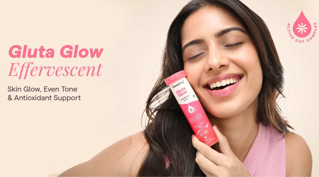
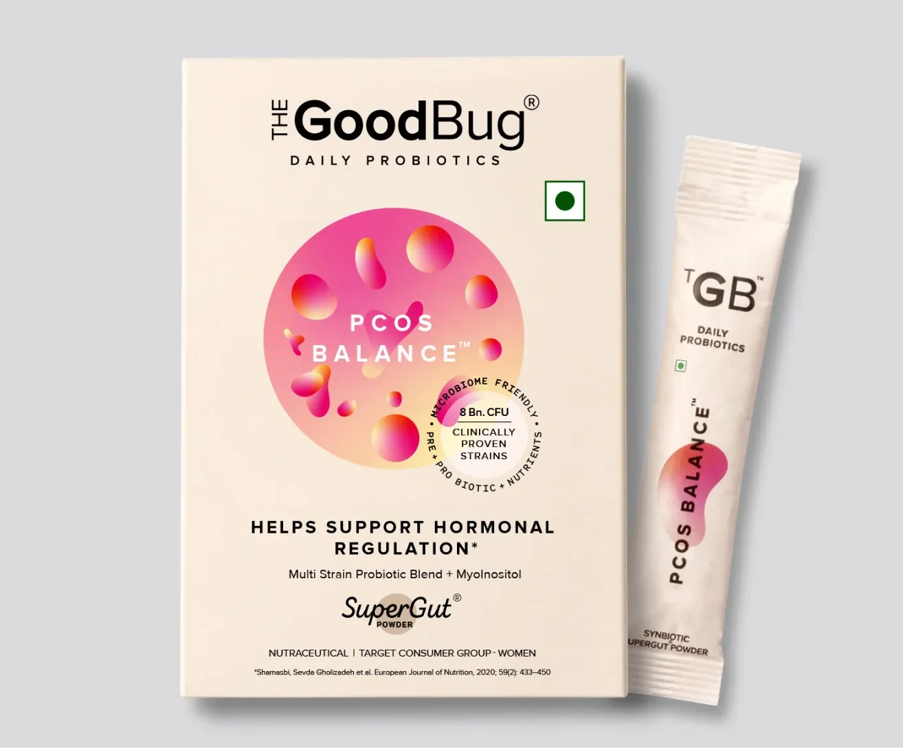
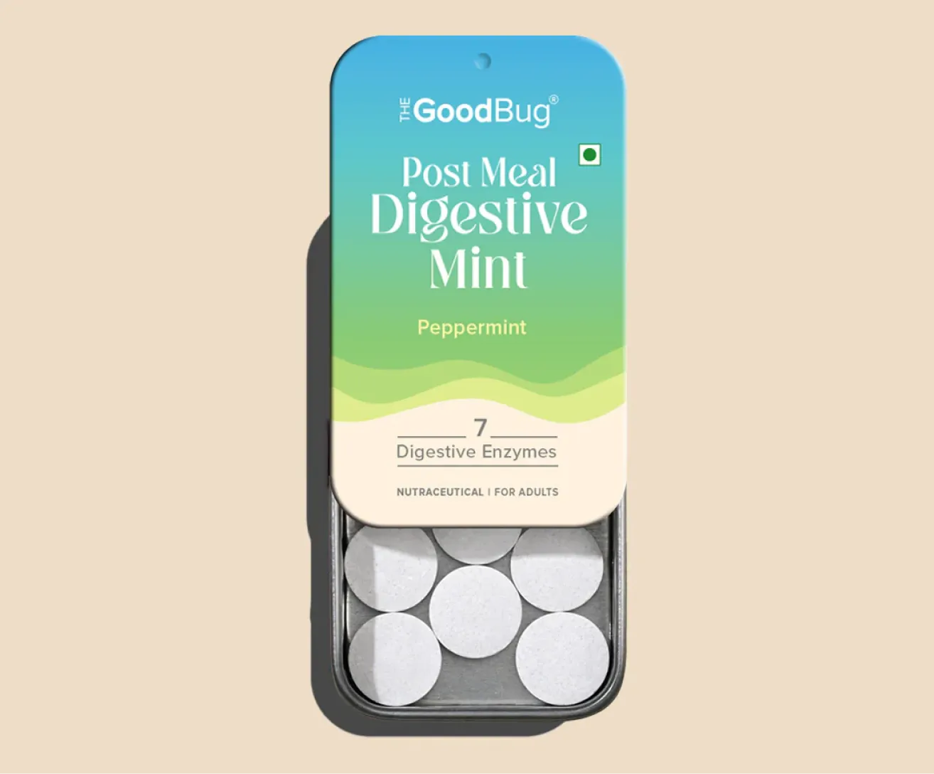
One detail worth calling out is the way The Good Bug uses abstract, organic shapes across its branding. These blob-like, irregular forms appear in packaging details and especially in their social media, Instagram highlights section. They subtly refer to the gut bacteria and internal systems without being literal or instructional. This is good brand thinking and it communicates function without needing diagrams or jargon. The shapes feel intentional and on-brand, reinforcing the product’s purpose while staying visually friendly. It is a small detail, but one that shows thoughtfulness in their visual identity design.
If there is one area where The Good Bug’s branding begins to unravel, it is social media, particularly Instagram. While the core brand identity is strong, its application across social content feels scattered and uncoordinated. The feed swings between multiple visual and tonal directions. Some posts feel playful and meme-led, others try to be scientific and clinical, while some rely heavily on influencer-style content. The result is a feed that lacks a clear visual system or brand voice. Over time, this inconsistency chips away at trust.
For a product category that requires education, reassurance, and credibility, this matters. When communication feels fragmented, it subconsciously raises questions about reliability, even if the product itself is sound. Interestingly, the highlight covers do a much better job of staying on-brand, using the same abstract forms and visual language seen elsewhere. This only reinforces the point that the issue is not the brand system, but how loosely it is being executed across day-to-day marketing.

At Confetti, we have seen this exact challenge play out with emerging categories. One example is our work with What A Bite, a meat-based chips brand operating in a space that also required heavy consumer education. The breakthrough was not louder marketing but focusing on ensuring that the visual and verbal consistency is maintained at all touch points of the brand.
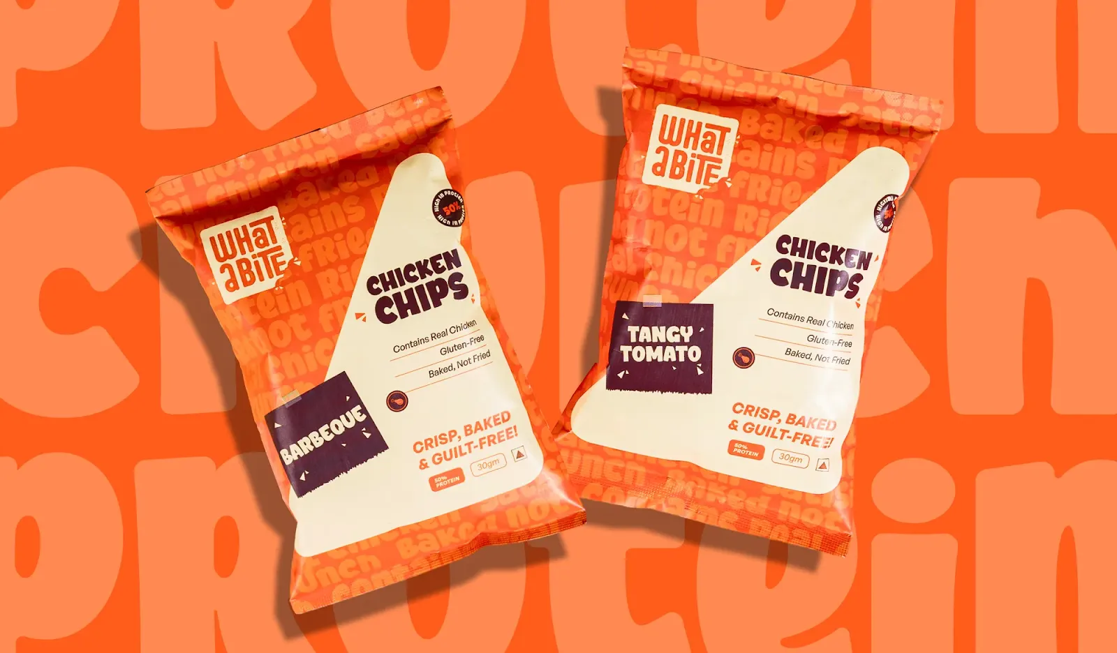

For What a Bite, we ensured that the brand’s visual language, tone of voice, and personality remained consistent across packaging, website, social media, and campaigns. Whether a customer encountered the brand on Instagram, on shelf, or on the website, the experience felt unmistakably cohesive.
The Good Bug already has the foundations to do the same. The brand system is strong and the intent is clear. The opportunity here totally lies in discipline. A more controlled social media design system, a tighter content tone, and clearer brand guardrails would allow The Good Bug to build long-term trust in a category where trust is everything.
At Confetti, we rate The Good Bug 4 out of 5.
It is a thoughtfully positioned brand with a strong name, a clean and modern identity, and a clear understanding of how to make gut health feel accessible in the Indian market. The missing point is not strategy, but consistency. Tightening how the brand shows up on social media and marketing communication would elevate The Good Bug from a well-designed brand to a truly authoritative one in the prebiotic space.
Confetti is a branding and packaging design studio that helps emerging and established brands build identities that stand the test of time. We work across food, beverage, wellness, and lifestyle categories, helping brands stand out without shouting and scale without losing their core. If you are building a brand in a complex or education-heavy category, you can connect with us through the link beside this article.


.svg)