Do customers ignore your products?
Analyse your packaging performance for free
# Packaging Audit

Introducing the green tea series of Mamaearth: A Packaging Design Inspired by Nature

Mamaearth Green Tea range of skincare products is made with natural and organic ingredients that are gentle on the skin. The range includes a face wash, face serum, face toner, and face mask that are enriched with the goodness of green tea.

Green tea has been used for centuries for its numerous health benefits, including its positive effects on the skin. It is rich in antioxidants and anti-inflammatory properties that help in reducing the appearance of fine lines, wrinkles, and other signs of aging. Green tea also contains a high concentration of polyphenols, which are known to protect the skin from harmful UV rays and prevent skin damage.

Green tea also helps in unclogging pores, reducing inflammation, and keeping the skin hydrated, making it a great addition to any skincare routine. Overall, incorporating green tea into your skincare regimen can help in achieving healthy and glowing skin.

In-depth review

Beauty in a bottle (or jar, we won't judge) (“Packaging Jokes”).

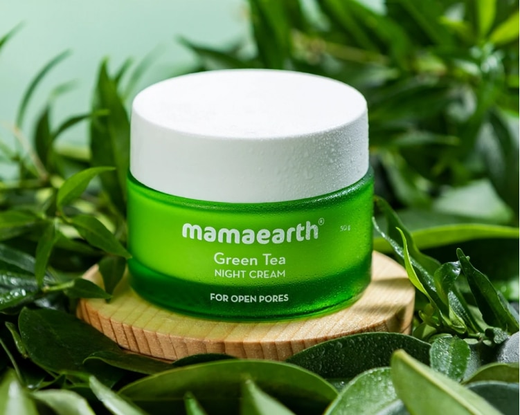
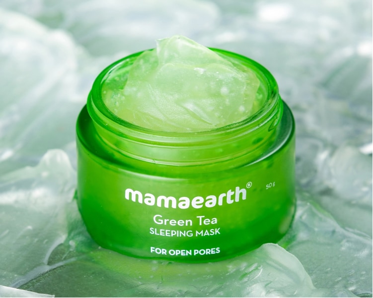
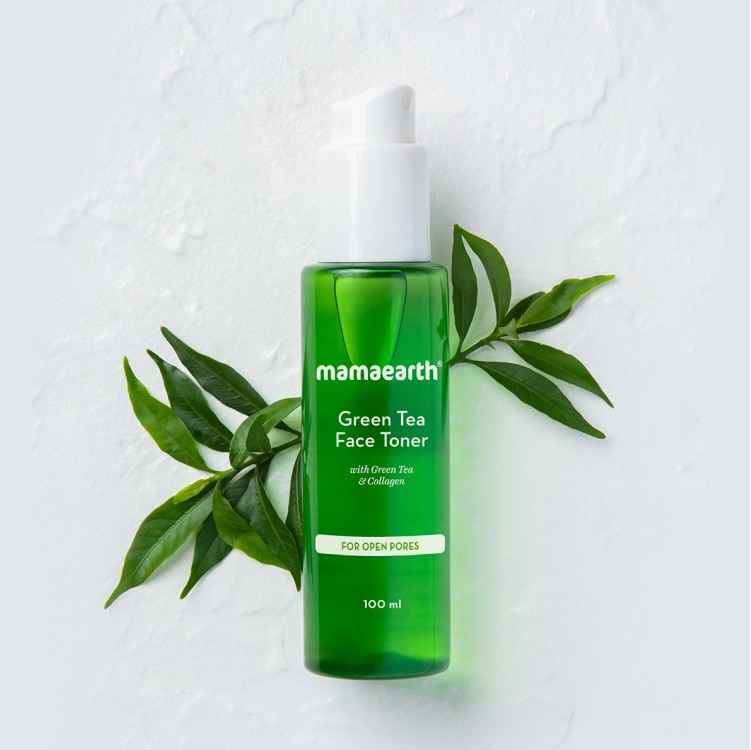
Mamaearth offers a range of green tea-infused skincare products, including face washes, toners, face masks, and serums. Most of the packaging design in this series follows a minimalist approach by portraying the green color of the green tea giving it a calming and refreshing look.
Value Proposition

Packaging so good, you won't even need the product but we will!!

Mamaearth has kept the consistency the same throughout the series and with their actual product white and close to transparent it gives a cooling feeling and the texture reminds us of aloe vera which further instigates the user that the design brings him/her closer to nature.

Mamaearth has kept the design pattern and elements simple with the color here acting as the main hero and with no extra graphic element a user would spot the product from a mile as to what the product features and what it achieves which is a sign of a great packaging design.
“The only way to do great work is to love what you do” - Steve Jobs
The branding of the entire segment is consistent thereby enhancing the brand and user’s experience.
Detrimental factors

The things they could have improved, green is cool but blue is better.

Mamaearth has kept the consistency same through out the series which might be their bane as well as it might be difficult for user to differentiate between certain products.

Although in no aspect, the design/branding is any lesser than its competitors but there could have been a contrasting colour to the packaging signifying the difference in the products as in the image you can see that the colour palette of blue and white has been used, similar design protocols could have been used for example in differentiating between day and night cream.

“Packaging lacks information and yes there is thing called too much white space”.

Conclusion

Our Rating is 4/5.

I would rate Mamaearth’s packaging 4 out of 5 because the designs are minimalist yet visually appealing, making it easy to distinguish from other brands.

The vibrant colors used on the packaging, such as green and blue, are inspired by nature and symbolize purity of the brand.

Got An Idea?

Let’s build It Together!

Our Clients Love Us!

Unlisted
Truefan
Gelatin
Miduty
StockPe

Want to grow your FMCG brand?

Fill the form below and let’s get on a quick call to see how we can help you!

Type of project