%201.webp)
02
AI Snaps
.svg)
.svg)
01
Our Work

03
About Us
05
Contact Us
06
Client Success

07
Blogs
08
Careers
Book A Call


Need Help In Building Your Brand?
Click the button below & book a call with our founder directly.

Rishabh Jain
Managing Director
Beverage packaging design is your brand's most public-facing sales asset. It competes in real time, at point of purchase, without a salesperson, and without a pitch. So, getting it right is a must.
As an award winning food and beverage packaging design expert, let us help. We take you through drink packaging design strategy, elements to consider, sustainability concerns, and mistakes to avoid.
The difference between beverage packaging design and other food packaging design lies in its form, packaging material needs, and consumer psychology.
Here’s what you need to consider:
The Container-First Design Problem
Beverages are primarily container-forward products. The container IS the product experience in many cases like a wine bottle, a spirits label, an energy drink can.
This means the brand's choice of container is a positioning decision. Choosing the wrong container format can actively undermine an otherwise strong visual identity.
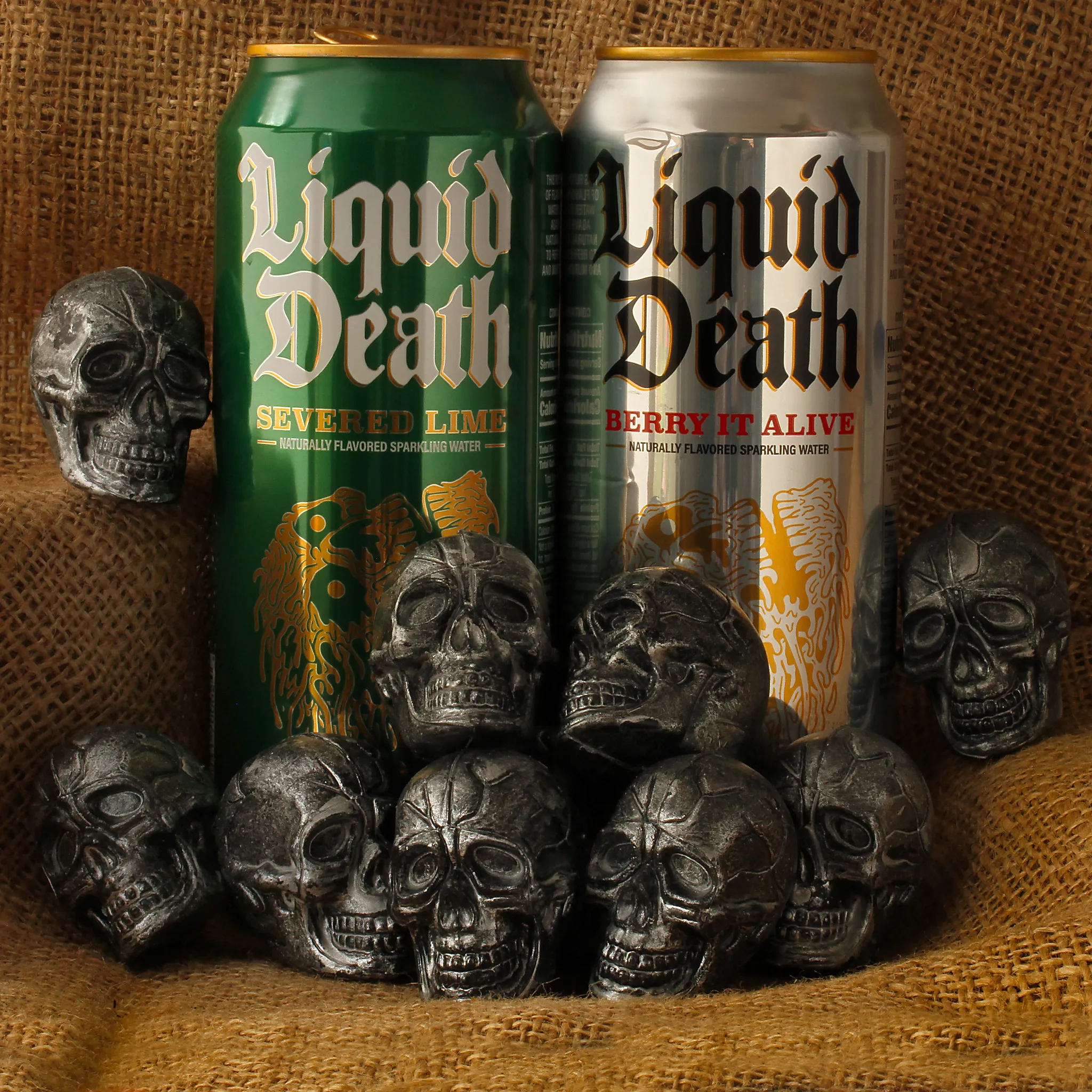
Example: Liquid Death chose a tall aluminium can, traditionally the format of energy drinks and lager to sell premium mountain water.
That choice communicates irreverence, accessibility, and anti-premium posturing followed by the skull imagery or the gothic typography which stands out.
Consumer Interaction & Encounter
In a retail store, a brand's pack competes against 12 to 20 adjacent products within the same segment, all fighting for the same square footage and the same 3 seconds of attention.
Also, consumers interact with beverage packaging more often than food packaging.
People carry bottles, reseal them, and keep them visible throughout the day. Because of this, beverage packaging must be comfortable to hold, easy to use, and visually appealing even after purchase.
Material Barrier Requirements
Liquids spoil much faster than solid foods when exposed to oxygen, light, or moisture. Because of this, beverage packaging needs stronger protective barriers.
For example, beer can quickly lose flavor if oxygen enters the bottle, while juice can lose nutrients when exposed to sunlight.
Special materials like aluminum layers and advanced plastics are often used to keep beverages fresh for longer.
Structural Design for Liquids
Beverage packaging must handle pressure and temperature changes. Carbonated drinks need strong bottles that can hold internal pressure without bursting.
Hot-filled drinks need containers that will not collapse while cooling. Glass protects flavor very well, but it is heavier, more expensive to transport, and easier to break than plastic.
Labels in Tough Conditions
Beverage labels must stay readable even when exposed to water, cold temperatures, and condensation.
Waterproof materials and strong adhesives are often used for beer, wine, and refrigerated drinks.
Designers also need to make sure the liquid inside does not cover important text on transparent bottles.
Logistics and Shipping
Liquids are much heavier to transport than solid foods, which increases shipping costs.
Beverage packaging must also stay stable during stacking and transport to avoid damage or leaks. Glass bottles are especially heavy and require extra protection during shipping.
Regulations and Compliance
Beverage packaging usually follows stricter labeling rules than food packaging.
Alcoholic drinks have additional legal requirements, and brands must carefully follow rules for nutrition labels, serving sizes, and text placement. Mistakes in labeling can lead to compliance problems.
At Confetti, we regularly see brands reference competitors from adjacent categories as design inspiration.
This is one of the most persistent mistakes in beverage packaging: applying the same design conventions across categories.
If you apply energy drink aesthetics to a wellness brand, it will read as aggressive and synthetic.
Similarly if you apply minimalist craft water design to an energy drink it will feel soft and under-energised.
The design brief for each of these categories is commercially and emotionally different:
Understanding where your product sits in this spectrum and designing to those specific commercial expectations is the starting point of effective beverage packaging strategy.
Strong beverage packaging is not measured by how it looks in a Behance mockup.
High-performing beverage packaging is engineered to convert, contain, and communicate across five distinct layers:
For the retail environment, packaging design has roughly 3-5 seconds to earn a glance, then another three to trigger a grab. It also needs to be identified from 3 feet away by one visual element alone.
That’s the shelf reality, but there’s another one you can’t ignore: the D2C, quick-commerce and e-commerce reality.
High-performing designs now need to work at a physical store and as a thumbnail on a phone screen.
The solution is contrast-driven hierarchy. Not busy layering, but one dominant visual anchor. You need a bold color field, a striking illustration, or a typographic lockup that reads instantly.
We apply this in our packaging work by testing designs at both scales before approving final assets. A kombucha label that looks distinctive in a store but becomes a blur on Zepto is a failure.
Beverage packs are picked up, rotated, placed back, and picked up again. They are viewed at oblique angles in dark convenience stores. They appear as 300×300px thumbnails on food delivery apps.
The legibility hierarchy for beverages should follow the order:
brand name → flavour or variant → key claim → supporting information
Each element must be able to exist independently at a reduced scale, in challenging light conditions, and in the presence of competing visual noise.
The most common legibility failure in craft and D2C beverage packaging is using display typefaces at sizes that look elegant in print proofs but dissolve into visual noise at actual product scale.
If your brand name cannot be read on a 100ml thumbnail on Swiggy, you have a legibility problem.
If your beverage brand has multiple SKUs like flavours, formats, or strengths, you must also address the design challenge of navigating the range without losing the brand.
Many brands have a strong hero product and then fail to build a coherent system around it.
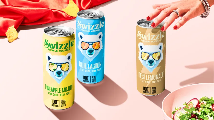
Colour-coding works well when each variant has a genuinely distinct hue that can be tied to a clear flavour expectation: orange for citrus, green for mint, red for berry. This is something we did for Swizzle Premium Mocktail
However, that fails when variants cluster in similar hues, when the category already owns those colours, or when new variants push the system beyond its original logic.
Also, flavour cues do not always have to be literal. Scent-referencing colour combinations, ingredient photography, and illustrative cues all function as strong flavour signals, if they are culturally calibrated and category-appropriate.
Material and finish choices are brand strategy decisions.
All of these are brand signals that consumers interpret and respond to in measurable ways.
Assume a premium craft gin in a standard cylindrical bottle with a plain paper label, versus the same gin in a hand-finished frosted glass bottle with embossed letterforms and a tactile seal.
The product is identical. The perceived value, and the price the consumer is willing to pay, is not. Material and finish do not add to cost. They add to the margin.
Regulatory requirements for beverage packaging are mandatory, category-specific, and frequently more complex than brands anticipate. This is especially true for alcohol, health beverages, and nutritional drinks.
The common mistake is designing a front face without factoring in what must appear on the back and side panels.
The result is a heavily designed front panel surrounded by a disordered back-of-pack crammed with mandatory declarations, nutritional tables, allergen statements, and legal copy in inconsistent fonts and weights.
Smart brands treat mandatory labelling compliance elements as a secondary design system. This is designed in parallel with the front face.
Beverage packaging designed exclusively for retail shelf will underperform online. Packaging designed exclusively for e-commerce may fail to hold its own in a physical retail set.
If you are selling on both platforms, the brief needs to account for both channels.
Shelf-based beverage packaging is your brand’s only advocate in a physical space.
Here, your packaging exists in three dimensions: can be rotated, touched, and evaluated from multiple angles.
Your packaging must:
🛒Block from 3-6 feet away: Shoppers scan aisles at walking speed. Your color field and typography need to register at a distance. Test for this by evaluating designs both at full scale and from across a room.
🛒Signal category instantly: A juice packaging design needs to look like juice at a glance, not water, not a sports drink. Consumers sort by visual shorthand. Deviate too far from category cues and you lose them before they pick up the bottle.
🛒Communicate hierarchy: Flavor, variant, key benefit, price signal. All must be legible without sequential reading. We see this fail constantly when brands treat their packaging like a poster rather than a piece of rapid-fire communication.
🛒Get picked among dozens: Competitors sit 12 inches away and provide the contrast against which your pack is judged. Your packaging design needs to stand out.
🛒Survive physical handling: Labels need to withstand condensation, repeated gripping, and being put back on the shelf. Texture and finish matter like soft-touch coatings can signal premium, but they also need to resist scuffing.
🛒Include retail-specific logistics: Pallet stacking, case packing, shelf-facing dimensions. A beautiful bottle that doesn’t fit category shelf standards won’t get listed. You also need to think about store lighting, the shelf positioning, and the retailer's planogram.
Online, that same pack appears as a flat image on a white or grey background, compressed to a thumbnail. There are no competitors in frame. No tactile experience. No ambient branding.
Your D2C or e-commerce beverage packaging brief requires engineering for:
📱Front Face: There is only the front face, the product title in text, and the star rating. Your pack must work as a standalone visual asset, an image that communicates brand identity, flavour, and desirability in a single glance.
📱Colour and Contrast: Must survive digital compression and white-background photography. Highly detailed illustrations, subtle gradient work, and fine typography can collapse at reduced sizes in ways that are not visible in pre-press proofs.
📱Zero-context brand communication: The consumer isn’t seeing competitive alternatives during unboxing. Your drinks brand is fighting for “retention”. Your packaging needs to deliver the brand story that existed during the purchase decision, remind them why they bought you in the first place.
📱Unboxing Experience: Over 90,000 people search “unboxing” on YouTube every month, with 62% doing so while researching a specific product. Your packaging becomes part of their purchase research. The sensory sequence, sound of tearing, texture of materials, visual reveal, each element gets evaluated on camera.
D2C packaging is about earning loyalty after the sale. It’s experiential, shareable, and engineered for a completely different set of stressors.
Quick commerce (10–15 minute delivery) has created a third channel that borrows from both briefs.
The consumer sees a thumbnail on an app, clicks based on convenience, and receives the product within half an hour in a branded or unbranded delivery bag.
The result: the unboxing experience has compressed to roughly five seconds before the packaging gets discarded. That’s your entire brand moment.
Packaging needs to work in that compressed window, memorable enough to survive the speed of the transaction.
The packaging’s shareability matters more than its shelf-blocking because the shelf never existed.
Colour is the fastest communication tool a beverage brand owns. The human brain processes colour before it recognizes shapes or reads text.
Research shows that a significant portion of first impressions are driven by colour alone, and that impression hits before the shopper has registered your logo, your flavor name, or your brand claim.
There are two distinct colour decisions in beverage packaging:
Both must be designed. The second one especially is where most brands improvise, with mounting consequences as the SKU count grows.
Different beverage categories have established visual codes that consumers have learned over decades of exposure.
Ignoring them entirely can create confusion. Adopting them without differentiation makes you invisible.
Example: A health beverage that positions itself in bold black and neon packaging is making a category-contrast claim: we are the anti-wellness wellness brand. That works, if the brand strategy supports it. It fails if it is done accidentally, or because the brand team found the aesthetic appealing without considering the commercial implication.
Here’s how colour functions across core beverage categories:
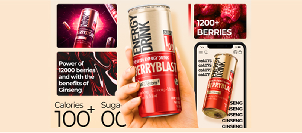
⚡Energy drinks
Standard Colour Cues: Black, neon green, electric blue, red gradients
Strategic Risk: Blending into the “extreme” visual noise; alienating casual consumers
Differentiation Opportunity: Pastel neons, phosphorescent inks for night-use occasions, or approachable palettes that signal “everyday energy” rather than elite athletics
🧃Juice
Standard Colour Cues: Vibrant fruit-matching hues (orange, red, yellow, green), often paired with whitespace
Strategic Risk: Looking generic if the palette mirrors every other juice brand on shelf
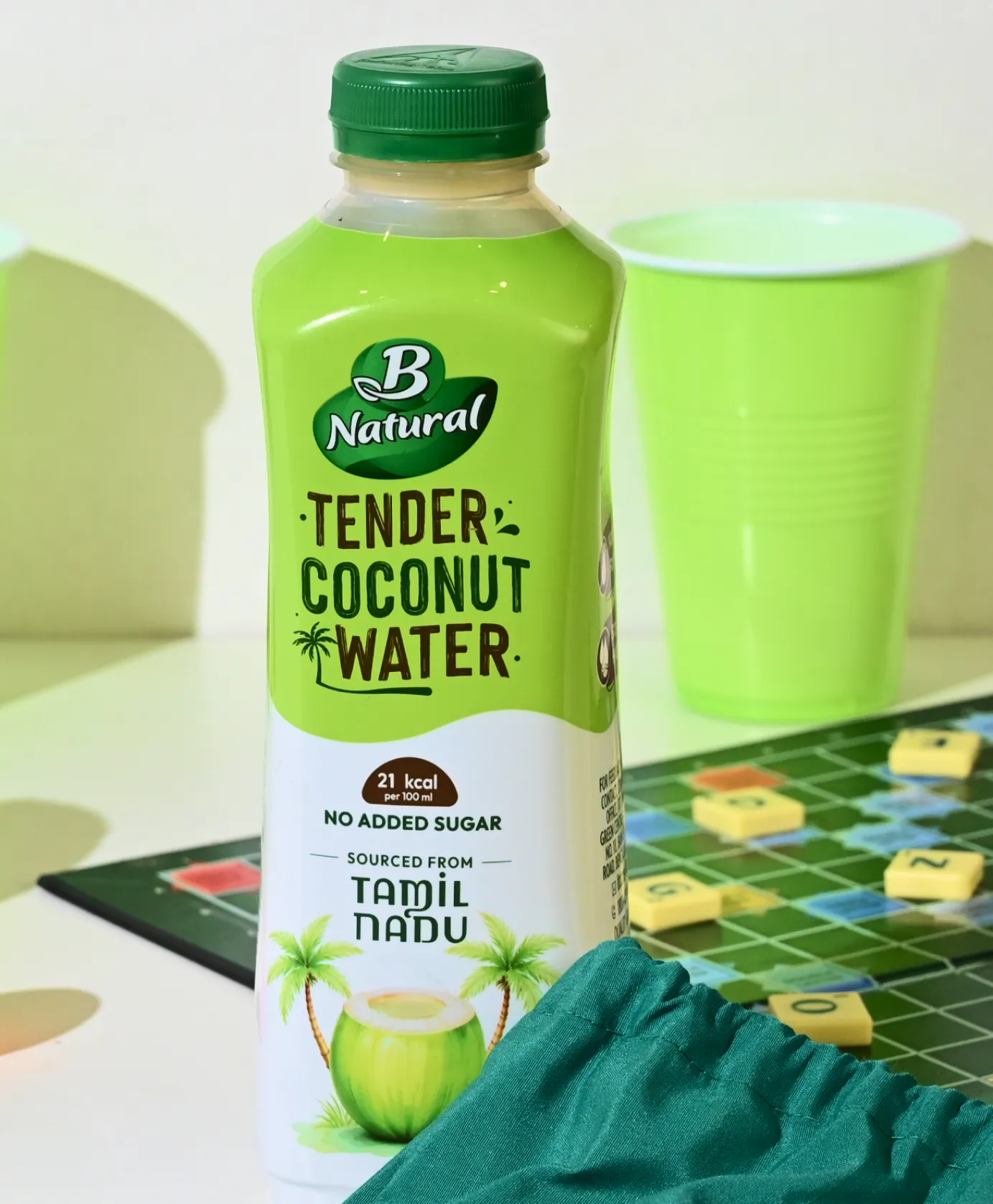
Differentiation Opportunity: Unexpected base colors with strategic fruit accents; regional color stories linked to provenance (e.g., coastal-inspired palettes for coconut water)
🍺Beer
Standard Colour Cues: Gold, amber, deep brown for traditional brands; pastels and metallics for craft
Strategic Risk: Gold/brown palettes signal tradition but risk feeling dated
Differentiation Opportunity: High-saturation gradients, glow-in-the-dark specialty inks, or tactile matte finishes that create perceived value
💧Water
Standard Colour Cues: Blue gradients, white, transparent labels with light blue accents
Strategic Risk: Blue has become so universal it’s almost invisible
Differentiation Opportunity: Sky blue with lemon accents for flavored variants; stark white and cyan combinations to signal purity
🥛Premium Craft Beverages
Standard Colour Cues: Deep jewel tones, metallics, muted naturals
Strategic Risk: Expensive palettes can read as serious and inaccessible
Differentiation Opportunity: Unexpected bright accents within sophisticated palettes; texture and finish variations that signal craft without cliché
Our audits of Paper Boat's brand and packaging approach and Rage Coffee's visual identity shows how these brands use and occasionally break category conventions as competitive positioning tools.
For brands with multiple flavours or variants, the colour system must help consumers navigate the range efficiently at the shelf.
A functional variant colour architecture works on three levels:
The failure mode is colour fatigue, where a range expands to 12 or 14 SKUs and the variant colours start to blur into near-identical hues that confuse rather than navigate.
At this point, the colour system is actively hurting sales by making it harder for consumers to find their preferred variant.
💡We often see brands over-index on brand colour consistency and under-invest in the variant colour logic.
The pack range looks coherent in a brand guidelines document, but falls apart at the point of purchase where consumers need to distinguish between flavours quickly. The fix is architectural
💡Brands selling across all three channels need a primary palette optimized for retail contrast, secondary palettes or finishes optimized for D2C photography, and strict color-blocking rules that survive thumbnail compression. That’s the level of strategic detail that your brand needs.
In our packaging design process, we evaluate colour strategy across four measurable criteria before production.
You can apply this framework to your own packaging:
✅Distinction:
Does your primary packaging colour differ from at least 70% of direct competitors on shelf? A quick audit at a local retail store answers this.
✅Readability:
Does your colour palette allow flavor, brand name, and product category to be discerned from eight feet, under cool retail LED lighting, and as a thumbnail on a quick-commerce app?
✅Association:
Does your primary colour trigger the correct emotional response for your positioning? Green on a natural juice brand signals health; green on an energy drink without flavor justification creates confusion.
We mapped association gaps for Slosh & Co by stress-testing hyper-saturated neons against consumer expectation, the lime greens and rani pinks didn’t just look distinct; they felt right for a bold, desi cocktail mixer.
✅Consistency:
Does the palette hold across all sub-brands and flavor variants without breaking? Strong color systems make brands instantly identifiable across platforms.
For ITC’s coconut water packaging, we built a coastal palette of palm grove green, lime leaf, pale sunshine, coconut husk brown, cloud white, and sunset pink for the lychee variant, colors that create a natural, fresh shelf presence while remaining consistent across the range.
The packaging strategy for a new beverage brand is different from that of an established one.
▶️New brands need visibility, recognition, and trial.
▶️Established brands need consistency, retention, and controlled evolution.
A new beverage brand starts with zero recognition. Consumers don’t know the logo, trust the product, or understand the positioning yet.
Packaging becomes the brand’s primary sales tool during those first moments on shelf.
🎯Break category conventions:
New brands cannot afford to blend in. Packaging that looks too similar to category leaders, mostly gets ignored.
The strongest launches (example above Liquid Death) use unexpected colors, typography, or bottle silhouettes that intentionally disrupt category norms and create instant visual separation.
🎯Prioritize one unmistakable asset:
Strong new brands are built around a single memorable element. This can be a custom bottle shape, a bold color block, or a distinctive illustration style.
This creates faster recognition in crowded retail environments where shoppers make split-second decisions.
🎯Front-load key messages:
New brands only get a few seconds of attention. The brand name, flavor, and product benefit need to appear immediately and clearly on the front pack.
Subtle hierarchy or hidden claims reduce clarity and hurt trial.
🎯Signal quality through materials:
Without brand heritage, packaging itself must communicate trust.
Premium materials, textured labels, embossing, or thicker packaging can help consumers perceive higher quality before ever trying the product.
Established beverages must stay relevant without losing recognition. Existing customers already associate certain colors, shapes, and visual cues with the brand.
Sudden change can create confusion, while no change at all can make the brand feel outdated.
🎯Maintain recognizable brand anchors:
Established brands should preserve the visual elements customers already associate with them.
These can be logos, bottle shapes, or signature colors. Modernize surrounding design systems, finishes, or materials.
🎯Create stronger range architecture:
As product lines expand, packaging systems need to help shoppers navigate variants quickly.
Clear color coding and consistent SKU organization improve purchase speed and reduce confusion across large portfolios.
🎯Transition materials strategically:
Sustainable packaging updates are important, but abrupt changes can affect consumer perception and product experience.
Gradual rollouts across select SKUs help brands test reactions before full implementation.
🎯Protect against private label competition:
As private labels improve in quality, established brands need harder-to-copy packaging assets such as proprietary bottle molds, specialty finishes, or complex structures that reinforce differentiation.
Sustainability in beverage packaging is increasingly important. It is impacted by regulation, logistics, consumer perception, and brand positioning.
For beverage brands, now the challenge is balancing environmental impact with shelf appeal, cost efficiency, and operational practicality.
Different packaging materials create different environmental and brand outcomes:
One of the biggest misconceptions in sustainable packaging is assuming glass is always the best environmental choice.
While glass feels premium and recyclable, lifecycle assessments often show that aluminum and recycled PET can produce lower carbon footprints due to lower manufacturing and transport emissions.
The right choice depends on:
✅Distribution radius
✅Product category
✅Shelf life requirements
✅Consumer expectations
✅Retail and D2C logistics
Packaging sustainability is increasingly driven by regulation, not just consumer preference.
Key shifts shaping beverage packaging:
This means sustainability must be addressed during packaging development itself.
The highest-impact sustainability improvements are often the simplest. Common packaging optimization strategies:
The challenge is maintaining perceived quality while reducing material use. Consumers often associate heavier packaging with premium value, especially in beverages.
Consumers increasingly recognize the visual language of sustainability:
But sustainable aesthetics alone are not enough. Strong sustainability communication requires:
Terms like “eco-friendly” or “100% sustainable” without proof create both reputational and regulatory risk.
Several beverage brands have successfully embraced sustainable packaging practices, showcasing their commitment to environmental responsibility:
1. FIJI Water: FIJI Water introduced a new bottle design that uses 20% less plastic while maintaining its iconic square shape. This initiative reduced the brand’s carbon emissions associated with transportation and production.
2. Boxed Water is Better: This brand gained recognition for its commitment to sustainability by packaging its water in cartons made from renewable resources. Their “Boxed Water is Better” campaign resonated with eco-conscious consumers.
3. Starbucks: Starbucks implemented sustainable practices by offering reusable cups and encouraging customers to bring their own tumblers. Additionally, they launched a “Greener Apron” initiative to reduce waste and promote sustainability in stores.
Most beverage packaging projects that produce weak outcomes can be traced back to the brief.
A brief that reliably produces strong packaging work covers:
Following the trends in packaging design is helpful only when applied through the lens of your brand and category context.
The following trends have structural staying power because they emerge from real shifts in consumer behaviour, material science, or regulatory pressure:
1. Substantiated Sustainability
Packaging regulations like the EU’s PPWR and Green Claims Directive are pushing brands to replace vague messaging with verifiable data.
Instead of broad claims like “eco-friendly” or “100% sustainable,” beverage packaging now needs measurable proof:
As EPR regulations expand, packaging decisions are increasingly shaped by compliance requirements, not just marketing preferences.
2. Human Design as Opposed to AI Homogenisation
As AI-generated visuals become more common, consumers are increasingly drawn to packaging that feels human and handcrafted.
In beverage packaging, that appears through:
Slight imperfections now function as trust signals, helping brands feel more authentic and collectible in an increasingly automated visual landscape.
3. Collectible and Limited Edition Packaging
A May 2026 Forbes report identified limited-edition beverage packaging as a major commercial growth area, with brands using scarcity, sports collaborations, and Gen Z targeting to turn bottles and cans into social objects.
The commercial mechanics are well established: limited edition releases drive social sharing, accelerate trial, and create pricing headroom that standard packs cannot achieve.
The strategy is especially effective for brands that already have strong visual equity.
The limited edition variation amplifies an existing distinctive identity rather than creating a new one from scratch.
4. Maximalist Illustration as Brand Storytelling
Minimalism hasn't disappeared, but it's no longer sufficient to earn attention.
The strongest prediction for 2026 is a shift toward colour-maxxing: bold palettes, expressive typography, and packaging that feels visually alive
In craft beer especially, intricate illustrations, folk-art references, and dense visual storytelling have become primary shelf differentiation tools precisely because the category is saturated with clean, minimal labels.
💡Maximalism must serve your brand narrative. Our analysis of minimalism vs maximalism in branding explores when each approach is commercially appropriate.
5. Transparency Packaging, Quite Literally
In health beverages, functional drinks, and wellness RTDs, ingredient transparency has become a primary design driver.
Consumers want to see what is in the product and brands that surface ingredient information clearly, legibly, and prominently build trust faster.
The design implication is a front panel hierarchy that elevates key ingredients alongside the brand name, rather than relegating them to the back.
6. Tactile Finishes as Premiumisation
Soft-touch laminates, textured stocks, embossing, and debossing are being deployed increasingly across the full beverage category as brands look for differentiation that cannot be replicated digitally.
A competitor can copy your colour. They cannot copy the way your label feels in someone's hand.
The commercial value of tactile finishes is most clearly evident in the spirits category, where material finish decisions contribute to premium positioning like in the case of Indri Whisky.
7. Truly Connected Packaging
AI-enabled QR codes can now embed into label artwork subtly and help unlock interactive content like cocktail recipes, ingredient traceability, usage tutorials.
A code that accurately detects which SKU they scanned and delivers specific utility (how to serve this mixer, pair this beer, refrigerate this kombucha) boosts loyalty.
For beverage brands launching or refreshing a range, connected packaging also protects from packaging redesign cycles.
Digital content can be updated without reprinting materials, allowing regional promotions, seasonal updates, and A/B testing that physical packaging alone cannot provide.
1. Trend adoption without brand rationale
The most commercially damaging packaging design mistake in beverages today is adopting design trends that fit the category but not the brand.
Examples:
When a heritage spirits brand switches to maximalist neon, it risks alienating loyal consumers without gaining new ones.
Similarly, a minimalist wellness water brand introducing collectible packaging for a short campaign can disrupt shelf consistency without the systems needed to make collectibles work commercially.
Every trend should pass one test: does this suit the brand, category, and stage of growth? If not, it’s not worth following.
2. Generic minimalism
Minimalism isn’t the problem, generic minimalism is.
The widespread use of white space, sparse layouts, black sans-serif type, and subtle accents has made many beverage brands visually indistinguishable.
Premium waters, juices, and craft drinks increasingly look alike, weakening shelf impact and recognition.
Minimalism only works when backed by strong brand equity, category ownership, or exceptional execution. Otherwise, it risks becoming invisible.
For categories already dominated by minimalism, differentiation may require moving away from restraint, not into chaos, but into clearer emotional and visual distinctiveness.
Most packaging failures are a result of the following mistakes:
❌ Mistake 1: Designing for the Mood Board, Not the Shelf
Packaging designed only from Pinterest or Behance inspiration often ignores the real retail environment.
A shelf is crowded with competing products, not curated visuals. Without studying category norms, your design risks blending in unintentionally.
Fix: Before creating concepts, conduct a shelf audit to understand competitor colours, typography, pack structures, and visual patterns. Strong packaging is designed against the market context, not in isolation.
❌ Mistake 2: Overloading the Front Panel with Messages
Many beverage brands try to communicate everything at once: claims, certifications, ingredients, awards, flavour notes, and health benefits.
The result is visual clutter that weakens the primary goal: getting noticed and picked up.
Fix: The front panel should focus on only three things: the brand name, one key message, and flavour identification.
Additional information belongs on secondary panels where consumers can explore after engagement.
❌ Mistake 3: Ignoring Production Constraints Too Late
Designs created before confirming print and production specifications often require expensive revisions later.
Print methods, substrates, ink limitations, and packaging structures all affect what is practically achievable.
Discovering these restrictions after concept approval delays timelines and increases costs.
Fix: Confirm print technology, material specs, and structural formats before the design process begins to avoid preventable redesigns and production issues.
❌ Mistake 4: Treating Packaging as a One-Time Project
Many beverage brands design packaging only for current SKUs without considering future expansion.
What works for three flavours can collapse when the range grows to 8-10 products. This leads to inconsistency and eventual redesign costs.
Fix: Instead, build a modular packaging system with clear design rules for colours, typography, hierarchy, and flavour differentiation so future SKUs can scale smoothly within the same visual family.
❌ Mistake 5: Approving Designs Without Shelf Testing
Packaging is frequently approved as PDFs or flat mock-ups without evaluating how it performs in a real retail environment.
A design that looks impressive in a presentation may disappear under shelf lighting or beside competitors.
Fix: Before final approval, test physical mock-ups in simulated shelf conditions, photograph them in retail environments, and evaluate visibility from different distances.
Shelf context reveals weaknesses digital reviews often miss.
❌ Mistake 6: Choosing the Wrong Adhesive for Cold Storage
Beverage labels often fail in refrigerators because standard adhesives lose bond strength at low temperatures.
Condensation causes labels to peel, curl, or slide off entirely, making the product appear low quality.
The issue usually begins when teams specify label materials but ignore adhesive temperature ratings.
Fix: Always request cold-chain or freezer-grade adhesive certification from suppliers and test labels under actual refrigeration conditions before full-scale production.
❌ Mistake 7: Ignoring Fill Levels on Transparent Labels
Transparent labels may look elegant on empty bottle mock-ups but behave differently once filled. Dark beverages can obscure text, while lighter liquids can make white or pale graphics disappear. Critical information such as regulatory copy or branding may become unreadable.
Fix: Always test transparent label artwork on filled bottle prototypes using the actual liquid colour, clarity, and carbonation. For important text, consider opaque panels or back-printing techniques.
❌ Mistake 8: Overlooking Closure and Opening Experience
Packaging design often prioritises the bottle and label while treating the cap or closure as a standard component. Poor opening mechanics like difficult caps, weak reseals, or inconvenient closures create friction that affects repeat purchases.
Fix: Beverage brands should evaluate closures based on real usage situations such as gyms, cars, offices, or travel.
Features like grip texture, one-handed operation, reseal feedback, and leak resistance significantly influence user experience and product perception.
❌ Mistake 9: Launching Limited Editions Without an Exit Plan
Limited-edition packaging can generate excitement, but many brands fail to plan how those products leave the market.
Unsold seasonal inventory often lingers on shelves long after relevance fades, hurting retailer relationships and brand freshness.
Fix: Brands should create a clear phase-out strategy before launch, including visible expiry cues, retailer return policies, and planned markdown timelines.
Limited editions should feel temporary while still remaining visually connected to the core product range.
What is beverage packaging design?
Beverage packaging design is the process of creating the container, label, and structural format for a drink product.
It covers material selection, structural design, label layout, typography, colour, imagery, and print finish, all working together to communicate the brand's identity and drive purchase decisions on shelf and online.
What makes good beverage packaging design?
Good beverage packaging must be instantly visible on shelf (strong shelf presence), communicate brand and flavour clearly at a glance, perform across retail and digital channels, comply with regulatory requirements, and be faithfully reproducible within print production constraints.
The best packs balance distinctiveness against the competitive category with clarity that converts at the point of purchase.
What are the current trends in beverage packaging design?
The most commercially significant trends include making sustainable choices, collectible and limited-edition packaging formats, maximalist illustration as a brand storytelling tool in craft categories, transparent ingredient communication for health beverages, and tactile finishes as premiumisation signals.
How do I choose the right packaging format for my beverage?
Start with your category conventions and brand positioning. Glass signals premium and craft. Aluminium cans signal energy, portability, or sustainability.
PET is mainstream and functional. Cartons and pouches suggest health and convenience. Match format to consumer occasion, channel context, and the price positioning your brand intends to own.
How is beverage packaging design different for D2C vs retail?
Retail packaging competes on a 3D shelf against 12 to 20 adjacent products in real time. D2C packaging must work as a flat 2D thumbnail on a white background at compressed sizes on e-commerce and quick commerce platforms.
D2C brands must also design for shipping integrity, unboxing experience, and social shareability. The most effective approach is designing for both contexts from the start.
Want strategic branding and packaging like this for your business?


.webp)
.webp)


.webp)
.webp)
.webp)
.webp)
.webp)


.svg)
.webp)
.svg)
.webp)