%201.webp)
02
AI Snaps
.svg)
.svg)
01
Our Work

03
About Us
05
Contact Us
06
Client Success

07
Blogs
08
Careers
Book A Call


Need Help In Building Your Brand?
Click the button below & book a call with our founder directly.

Rishabh Jain
Managing Director
What if a coffee brand decided that the world did not need 5-page-long menus, bigger cups, or sugary seasonal drinks?
What if it bet on exactly the opposite? Like fewer items, more clarity, and a space so minimal that the coffee itself becomes the only thing you notice?
Strange idea for a global café chain, right? Yet this is exactly the bet % Arabica made.
Born from a Japanese design philosophy and built around the belief that great coffee should speak for itself, % Arabica has become one of the fastest growing speciality coffee brands across Dubai, Abu Dhabi and the wider UAE.
It roasts its beans fresh in-store, reduces every touchpoint to its purest form, and uses the percentage mark as a bold visual commitment to quality. The result is a brand that feels precise, intentional and unmistakably premium.
At Confetti, our branding and packaging experts studied % Arabica through the lenses of identity design, menu architecture and packaging behaviour. Below is our audit of how the brand has created one of the clearest, most disciplined coffee experiences in the world and the one strategic tension that will shape its next chapter.
Before we dive into it, let us understand why the name and idea matter here? As per our design experts at Confetti, we are sure of the fact that there is no accidental branding at % Arabica. The name signifies an explicit position, and reiterates the fact that Arabica is a speciality coffee, not mass coffee.
The percentage mark in the logo has become instantly recognisable and more often read as coffee cherries, a symbol of purity like the 100%, or simply a nod to precision. The tagline of Arabica coffee, “See the World Through Coffee” turns the beverage into perspective.
Every element here in Arabica’s branding is educational, not promotional. That clarity of intent is the brand’s first victory, and it plays very well in UAE markets where design literacy and premium retail expectations are high.
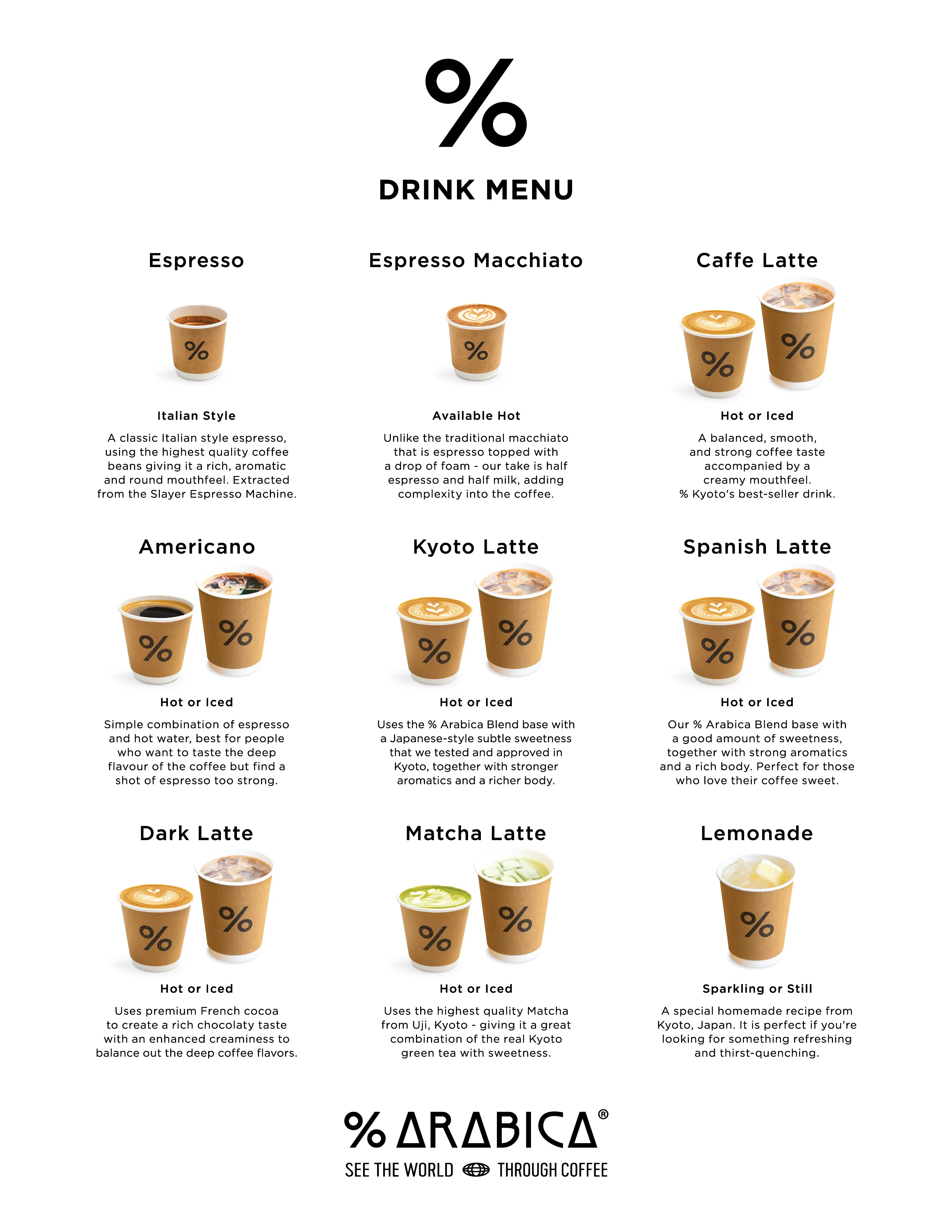
Walk into an Arabica in Dubai and the menu reads like a curated tasting list. The menu separates espresso-based drinks, single-origin pours and blends; it foregrounds origin, processing and roast.
This choice signals expertise and prices the experience appropriately. The simplicity tells customers immediately who the brand is for, coffee purists and curious, quality-minded drinkers, and that is exactly why Arabica coffee performs brilliantly in premium retail contexts in the UAE.
.webp)
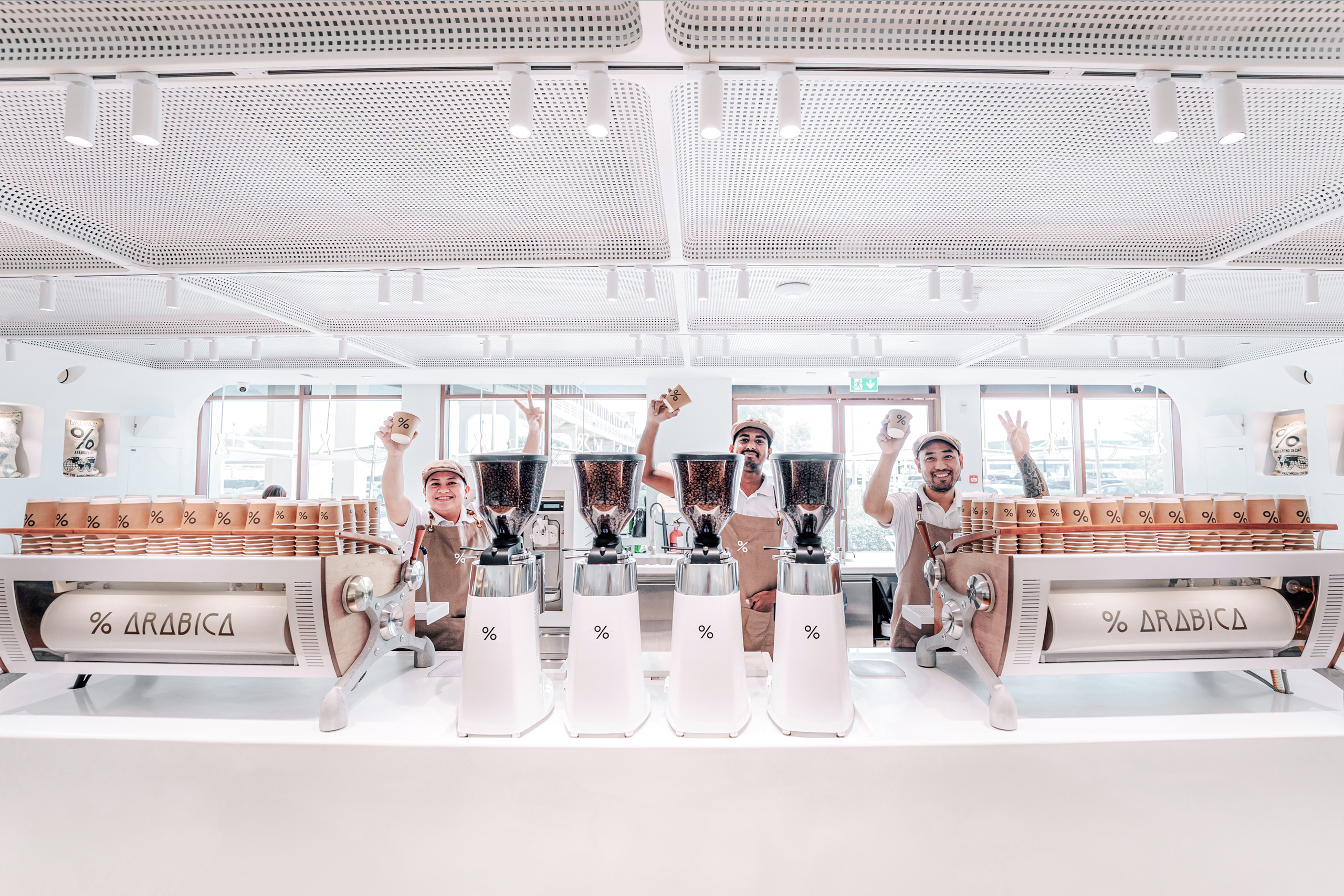
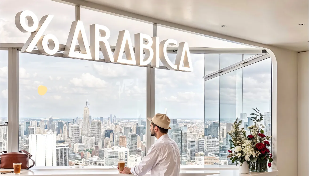
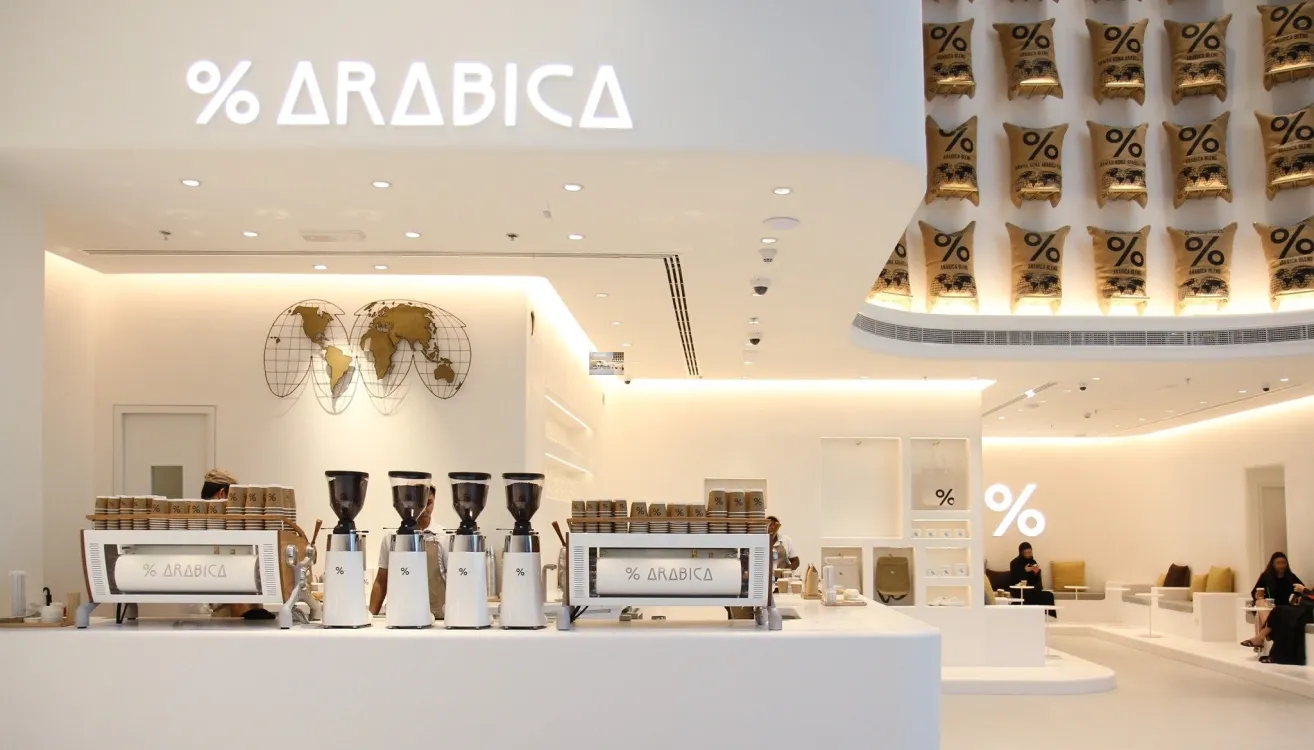
The white, minimalist interiors, the custom white espresso machines, and the soft, gallery-like lighting are not just for decoration. They are well-thought-out and functional brand signals.
The store reads like an Apple showroom for coffee: the product is centre stage. For a Dubai audience used to luxe retail environments, this approach truly translates into credibility and calm luxury.
.webp)
% Arabica does not chase seasonal gimmicks or maximalist marketing. There are no frappes, no syrup-first playbooks.
The brand’s restraint is strategic: it anchors trust and keeps the conversation on beans and brewing only. In cities like Dubai & Abu Dhabi, where customers know the difference between origin and origin story, that focus is a really important brand asset to have clarity upon.
The percentage sign functions as a compact brand device, instantly reproducible at scale, striking on facades, and legible across digital menus and packaging. It is distinctive in a category that often recycles the same coffee icons. The logo’s adaptability helps maintain a cohesive identity across regions.
.webp)
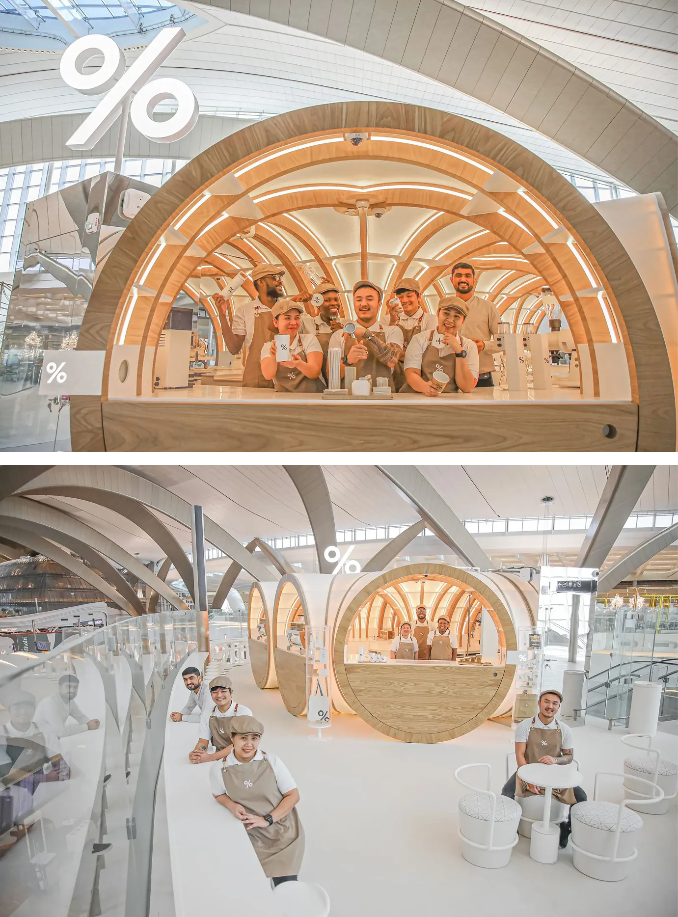
% Arabica has scaled quickly into the Middle East with multiple UAE locations (Dubai, Abu Dhabi, Sharjah, Ras Al Khaimah), and the brand’s local stores reflect consistent execution.
There is only one real strategic risk to watch. % Arabica’s identity is built on restraint.
That restraint is a strength in cosmopolitan markets that value craft. But it can become a constraint very easily when the brand enters markets where coffee culture is less specialist, or where local consumers expect more overt warmth, variety or cultural cues, like in countries like India.
Two outcomes are possible as % Arabica globalises further:
We do not expect % Arabica to chase trend collaborations; their track record shows deliberate restraint.
The real test is time: does their model scale across cultures while remaining unmistakably % Arabica? If the brand resists short-term commoditisation, it will remain iconic. If it chases mass appeal, identity will erode. This is a growth risk, not a design risk as per our branding and packaging experts at Confetti.
At Confetti, our creative team of designers and branding experts rates % Arabica 4.9 out of 5 for design discipline, brand clarity and global execution. The brand is a near-perfect example of how minimalism, when intentional and consistent, becomes a powerful strategic advantage in premium markets such as Dubai and Abu Dhabi.
The single variable to monitor is scale. Give % Arabica time to prove that its minimal system can flex across cultures without losing its core. If it does, the brand will stand as a rare global success in speciality coffee.
At Confetti, we design brand systems that hold up under growth. We focus on clarity, hierarchy and future-proof packaging strategies so a product not only looks premium today but stays recognisable as it scales.
If you are launching a speciality beverage or preparing to expand a premium retail concept across the Gulf, we can help you preserve what makes your brand distinct while building for tomorrow. Book a call with us; the link is right beside this article.
Want strategic branding and packaging like this for your business?


Lorem ipsum dolor sit amet, consectetur adipiscing elit. Suspendisse varius enim in eros
Lorem ipsum dolor sit amet, consectetur adipiscing elit. Suspendisse varius enim in eros
Lorem ipsum dolor sit amet, consectetur adipiscing elit. Suspendisse varius enim in eros
.svg)
.svg)


.webp)
.webp)


.webp)
.webp)
.webp)
.webp)
.webp)


.svg)
.webp)
.svg)
.webp)


.webp)


.webp)


.svg)