Brand Audit

Tipsy Tiger Branding & Packaging Audit

Rishabh Jain
February 16, 2026
5 Minutes
February 16, 2026
5 Minutes
No items found.
No items found.
This is some text inside of a div block.
Posted On
Estimated Reading Time
5 Minutes
Category
Brand Audit
Wrriten By
Nimisha Modi

Book a call and get unlimited revisions for your project!

Book A Call
A stylized pink thunderbolt or lightning icon
Get Instant Response

Need Help In Building Your Brand?

Click the button below & book a call with our founder directly.

Rishabh Jain

Managing Director

Book A Call

Tipsy Tiger | Confetti's Verdict ⭐⭐⭐⭐½ 

Attribute Details
Confetti Rating ⭐⭐⭐⭐½ (4.5 / 5)
Brand Tipsy Tiger
Year Founded 2020 (commercially launched 2022)
Industry Cocktail Mixers / Beverages / D2C
Co-Founders Sagar Sarin, Rushil Bhatia and Abhishek Chopra
Headquarters New Delhi, India

Confetti Design Studio has analysed Tipsy Tiger to understand how a bootstrapped cocktail mixer brand conceived in February 2020 and formally launched in 2022 by Sagar Sarin, Rushil Bhatia, and Abhishek Chopra built one of the most visually distinctive identities in the Indian beverage category, posting 82% revenue growth in its most recently reported financial year and reaching consumers through Zepto, Swiggy Instamart, Blinkit, Amazon, and modern retail partnerships across Delhi NCR. The Indian cocktail mixer category, which includes players like Jimmy's Cocktails and Bartisans, is projected to reach USD 800 million by 2030.
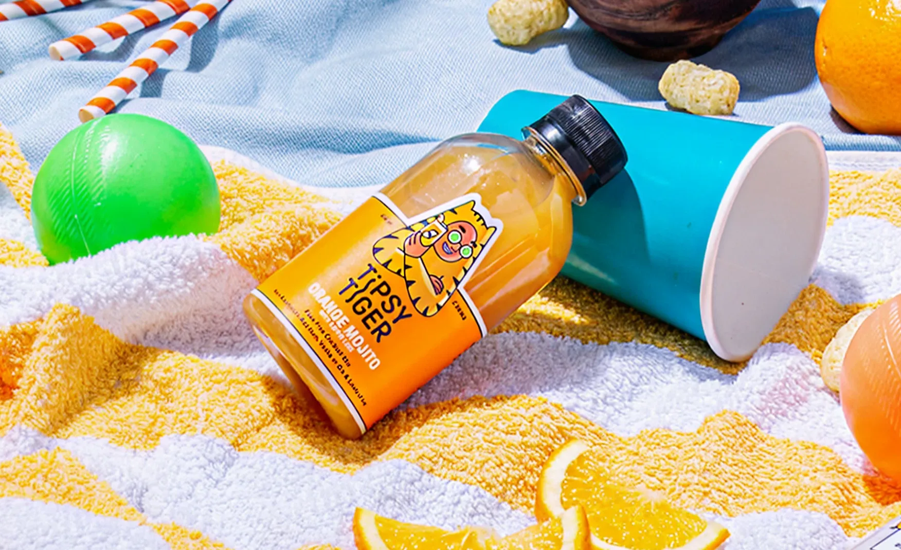
Tipsy Tiger Brand Audit By Confetti Design Studio

Tipsy Tiger Brand Strengths: What the Brand Gets Exceptionally Right 🍹

1. Tipsy Tiger's Name: Personality Before the Product, Category Without Saying It 🐯

Naming a cocktail mixer brand in India carries a specific set of constraints. The brand cannot show alcohol. It cannot make alcohol-adjacent health claims. It must communicate occasion and mood without leaning on the product it is designed to accompany. Most brands in the category resolve this by reaching for approachable, slightly playful names that do not particularly distinguish themselves: functional enough, forgettable in equal measure.

Tipsy Tiger is in a different category of name entirely. The alliteration creates immediate sonic distinctiveness. "Tipsy" communicates the desired emotional state without referencing alcohol directly, which is the precise positioning manoeuvre the category requires. "Tiger" adds confidence, boldness, and animal energy to what could otherwise be a soft, mood-led name. Together, the two words create a brand personality that is playful without being insubstantial and bold without being aggressive.

In a shelf context, the name does competitive work before the packaging is even read. A consumer scanning a beverage aisle for something to accompany a house party encounters Tipsy Tiger and registers mood, occasion, and personality simultaneously. No other cocktail mixer brand in India owns that specific combination of lightness and confidence in its name. That is a brand positioning advantage built into four syllables.

Tipsy Tiger Brand Audit By Confetti Design Studio

2. Tipsy Tiger's Mascot: A Human in a Tiger Suit Is More Interesting Than a Tiger 🦅

The easiest version of the Tipsy Tiger visual identity would have been a tiger illustration. Bold, category-appropriate, energetic. It would have been fine. What the brand chose instead is significantly more interesting, and significantly harder to copy.

The mascot is a human wearing a tiger suit. The distinction is not decorative. It is conceptual. A human who becomes the tiger is a metaphor for social transformatio, basically what happens to a person's personality when they loosen up, let go of composed professional behaviour, and allow the version of themselves that wants to dance, be loud, and stay up too late to surface. That is exactly the emotional moment a cocktail occasion represents. The mascot does not illustrate the drink. It illustrates the effect the drink enables.

This layered visual thinking is rare in an emerging brand with limited marketing spend. It is the kind of creative decision that costs the same as a straightforward illustration but builds significantly more brand memory because it rewards the consumer who thinks about it for a moment longer than they would a generic mascot. The mascot is a brand asset that can carry the identity across every touchpoint, from packaging to social media to event presence, without ever needing to be explained.
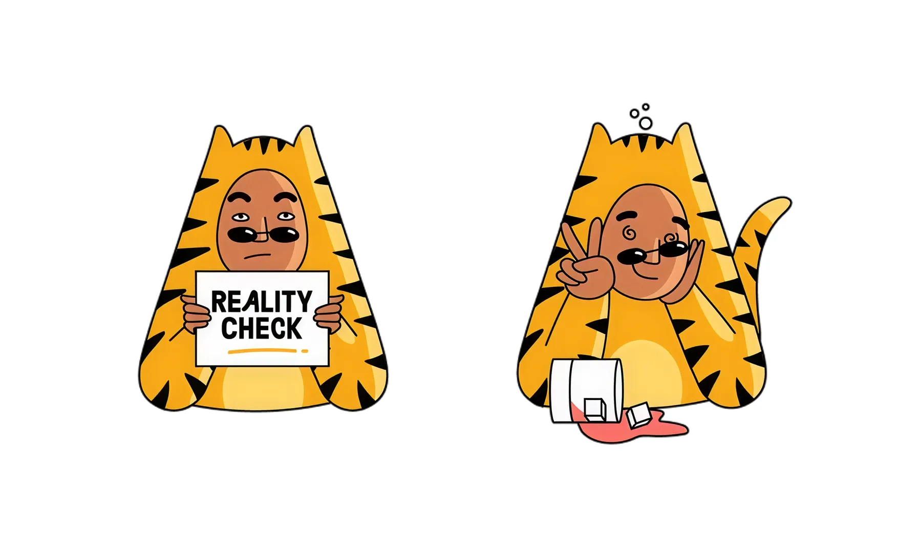
Tipsy Tiger Brand Audit By Confetti Design Studio

3. Tipsy Tiger's Packaging Coherence: Visual Consistency Across an Expanding Range 🍶

Building visual coherence across a product range is a challenge that defeats many brands with far larger design budgets and more experienced teams than a bootstrapped startup in its third year of commercial operation. The instinct under resource pressure is to solve each new SKU as a separate design problem and hope the master brand holds it together. Tipsy Tiger has not made this mistake.

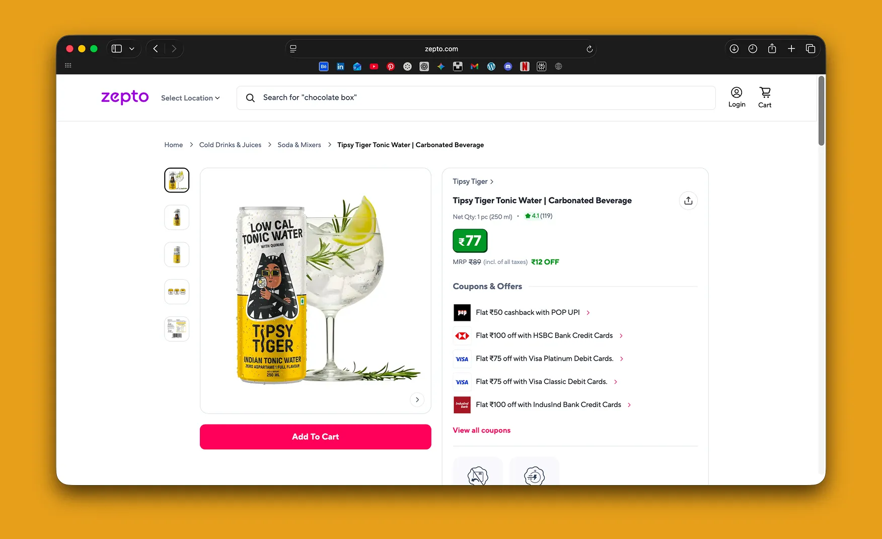
Across cocktail mixers, ginger ale, tonic water, lemonade, lime soda, and low-calorie variants, the brand maintains a consistent visual system with the mascot, bold colour blocking, and confident typography. Each product has its own colour identity within that system, which creates SKU differentiation without fragmenting the brand family. A consumer who picks up a Tipsy Tiger ginger ale and a Tipsy Tiger Whiskey Sour mixer encounters two clearly differentiated products that unmistakably belong to the same brand. That recognition work is happening at the design system level, not at the marketing spend level.

The extension into non-cocktail formats, ginger ale, tonic water, and lemonade, also reflects intelligent category thinking. These are products that work both as mixers and as standalone soft drinks, which means Tipsy Tiger is present at multiple consumption occasions rather than being locked into the specific moment of cocktail making. The consumer who discovers the brand through a gin and tonic is a potential buyer of the lemonade on a weekday. The packaging system makes both products feel like they came from the same confident creative world.
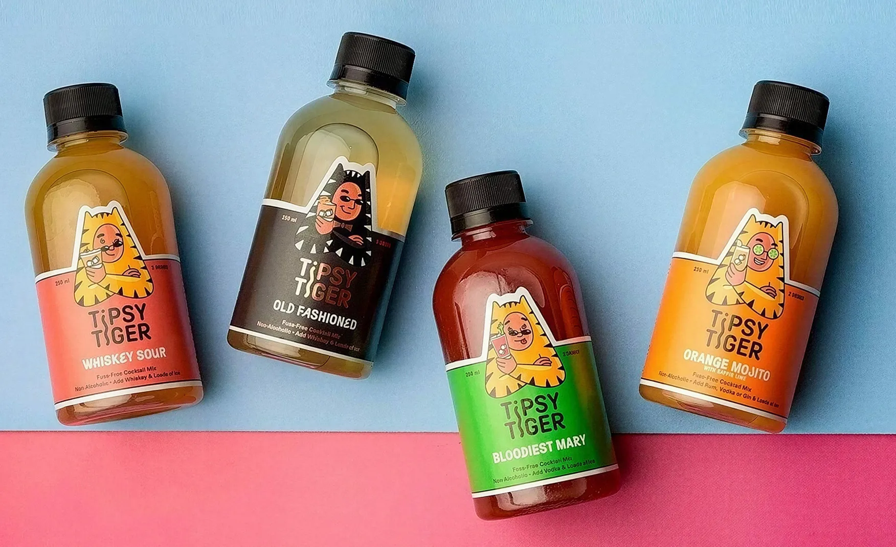
Tipsy Tiger Brand Audit By Confetti Design Studio

4. Tipsy Tiger's Product Formulation Discipline: Low Sugar as Brand Value, Not Trend Response 🍋

The decision to build Tipsy Tiger's entire range around less than 5 grams of added sugar, no artificial sweeteners, no artificial colours, and no shortcuts was not a trend response. It was a founding product philosophy established before the better-for-you beverage conversation had reached the mainstream in India.

Abhishek Chopra has written candidly about what this decision required technically: reducing sugar meant actually designing the flavour rather than letting sugar mask formulation shortcuts. Sourcing the right jalapeños for the Picante mixer, the right bitters, the right fruit juice ratios, this is a product development discipline that produces real differentiation from competitors who reach for flavour concentrate and sweetener combinations that are cheaper and faster to produce.

The consumer who is reaching for Tipsy Tiger on Blinkit at 11 PM before a party is not necessarily making a conscious better-for-you choice. But when they taste a product that delivers genuine flavour rather than sweet syrup, and when they read the label and find nothing that needs explaining away, the brand earns a trust that competitors built on artificial shortcuts will struggle to replicate. In a category that is still forming consumer loyalty, product integrity is one of the most durable long-term investments a brand can make.
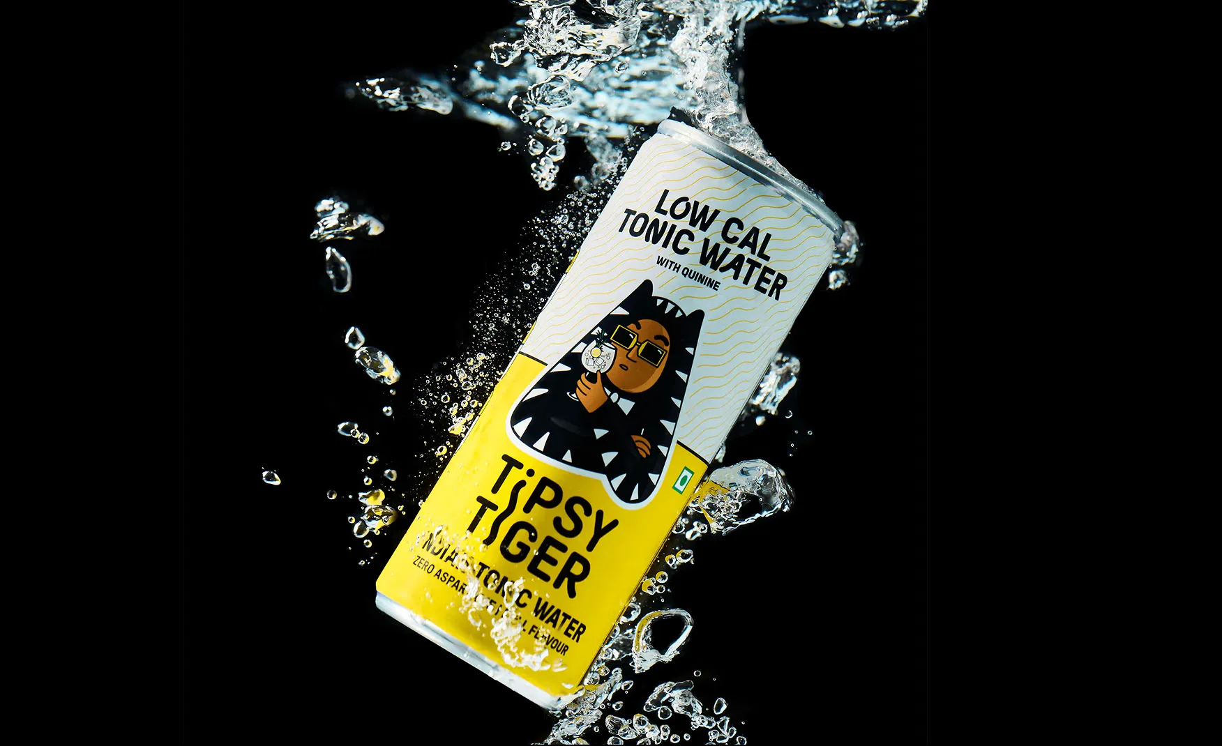
Tipsy Tiger Brand Audit By Confetti Design Studio

5. Tipsy Tiger's Quick Commerce Presence: Right Channel, Right Occasion, Right Timing 📱

The structural fit between cocktail mixers and quick commerce is one the brand identified early and built around deliberately. The core occasion for a cocktail mixer, the spontaneous house party, the last-minute hosting moment, the Friday evening that was not planned in advance, is definitionally a quick purchase. The consumer needs the product in 15 minutes, not in 48 hours.

Tipsy Tiger's presence on Zepto, Swiggy Instamart, and Blinkit means the brand is available at the exact moment of maximum purchase intent in its most important consumer occasion. A consumer who decides at 8 PM that friends are coming over and needs cocktail mixers is the Tipsy Tiger consumer. The brand is present at that moment in a way that offline retail, with its planned visit and browsing requirement, cannot replicate for an impulse-occasion product.

The exclusive Picante mixer launch on Blinkit for the festive season in 2024 demonstrated that the brand understands not just the channel but how to use it strategically. A channel-exclusive festive launch creates urgency, drives trial at a culturally loaded occasion, and generates the kind of social sharing that a generic retail launch does not. It is smart use of a channel relationship rather than simply maintaining shelf presence.
Tipsy Tiger Brand Audit By Confetti Design Studio

Tipsy Tiger's Growth Challenges and Areas to Watch 👀

The Brand Has More Personality Than Its Social Media Shows ⚡️

This is the most visible gap between what Tipsy Tiger has built at the brand identity level and what it is currently communicating through its most accessible consumer channel. The core brand system, the mascot, the name, the colour blocking, the packaging personality, is coherent and distinctive. The Instagram feed is not consistently reflective of that quality.

Content swings between recipe reels, UGC reposts, trend-led formats, street interviews, and festive content without a tonal anchor that makes every post feel unmistakably like Tipsy Tiger rather than a beverage brand with a fun name. A mascot as strong as the tiger-suited human character should be driving more of the content. Instead, the brand appears to be exploring multiple content directions simultaneously, which produces a feed that is active but not particularly memorable.

In a category where virality can do the commercial work of six months of paid media in a week, the gap between the brand's visual identity quality and its social execution quality is a meaningful missed opportunity. The foundations for a genuinely viral social media presence are already built into the brand. The discipline of applying them consistently is the work that remains.

Revenue Scale Needs to Catch Up With Brand Ambition 💰

Tipsy Tiger is a brand audit subject at an earlier commercial stage than most others in this series. The brand's most recently published revenue figure is approximately Rs 93.8 lakh in FY24, with the founder citing 82% year-on-year growth and a run rate of approximately Rs 4 crore in more recent statements. These are meaningful growth trajectories for a bootstrapped brand in a nascent category. They are also numbers that require significant acceleration to match the brand's creative ambitions and the commercial opportunity the cocktail mixer category represents.

The category is expected to reach USD 800 million by 2030. Tipsy Tiger is currently a small fraction of a small fraction of that number, however their brand identity is strong enough to carry a much larger commercial scale. The question is how the brand intends to bridge the gap between its current revenue stage and the scale at which the identity investment begins to deliver compounding returns. External capital, which the founders have so far resisted, is one path. Deeper quick commerce and modern trade penetration is another. Both require a clearer commercial strategy than a bootstrapped brand with a small team can typically execute simultaneously.

Category Competition Is Intensifying Faster Than the Brand Is Scaling 🏃

Jimmy's Cocktails, Tipsy Tiger's most direct comparator, has raised USD 6 million, operates across 20,000-plus retail outlets, and has a valuation of Rs 212 crore. Bartisans has introduced a bottle cap that doubles as a measuring tool, earning design innovation coverage across the category. International brands are beginning to appear on Indian quick commerce platforms as the category grows.

Tipsy Tiger's brand identity is strong enough to compete credibly with all of these players. Its distribution footprint and revenue scale currently are not. A brand with superior creative assets but inferior distribution reach will lose market share to a brand with adequate creative assets and superior distribution reach, because most consumers discover new brands through availability rather than through active search. The brand needs to close the distribution gap before the category's growth phase creates winners that are very difficult to displace.

How Confetti Would Strengthen Tipsy Tiger's Brand System 💡

Building a Social Media System That Puts the Mascot at the Centre of Every Touchpoint 🦅

The human-in-tiger-suit mascot is the brand's most powerful and underused asset. At Confetti, the principle we apply to brands with strong mascot identities is that the mascot should be the lens through which every piece of content is evaluated, does this communicate the mascot's personality, or does it communicate something else? Every post that does not feature or invoke the mascot's energy is a post that is building a different brand from the one the packaging is building.

A documented social media design system, with explicit templates for how the mascot appears in recipe content, how the tiger-suit character is used in trend-led formats, and what tonal guidelines govern the brand voice across every post type, would allow the team to produce consistent content at speed without negotiating the brand identity from scratch each time. The creative raw material is already exceptional. The system to deploy it consistently is what is missing.

Packaging Structural Innovation to Separate From a Crowded Shelf 🍶

At Confetti, we worked with AIM (All in a Minute), a supplement brand competing in a category of identical tubs and jars. The intervention that separated AIM from every competitor on shelf was a structural packaging decision rather than a label design decision. A distinctive container format creates recognition that no label design can achieve on a standard bottle.

Tipsy Tiger's current packaging is well-designed within a standard bottle format. The opportunity is to develop a proprietary structural element, a distinctive cap, a unique bottle silhouette for the premium cocktail mixer range, or a textural label treatment, that makes the product recognisable by form rather than only by colour and label. In a quick commerce thumbnail context where the product is viewed at small scale, structural distinctiveness translates directly into click-through rate. In a retail environment, it translates into the unprompted reach. For a brand at Tipsy Tiger's stage, where marketing budget is limited and every impression needs to work harder, structural packaging innovation is one of the highest-return brand investments available.

Defining the Commercial Roadmap That Matches the Brand's Creative Ambitions 📈

The brand's identity is ready for significantly more scale than its current distribution can deliver. The founders have intentionally resisted external funding, which has preserved creative control and brand coherence at the expense of distribution reach and marketing spend. As the cocktail mixer category accelerates toward its USD 800 million projected size, the window for a distinctive new entrant to claim meaningful market share will close.

The most important strategic decision ahead for Tipsy Tiger is not a design decision. It is a commercial one: what is the right combination of capital, distribution partnerships, and marketing investment that allows the brand's creative foundations to reach the consumer base they deserve? The brand is built. The distribution and capital strategy needs to catch up with it. Once those are aligned, Tipsy Tiger has the creative assets to become the cultural symbol of India's at-home cocktail occasion that it is currently positioned to be but not yet resourced to capture.

Tipsy Tiger Brand Verdict and Confetti Rating ⭐

Tipsy Tiger has done the hardest part of brand building with the fewest resources: it created a genuinely distinctive identity in a nascent category. The name is memorable. The mascot is conceptually intelligent. The packaging system is coherent across an expanding range. The product formulation is built on real discipline rather than category shortcuts. These are brand foundations that most funded competitors in the cocktail mixer space have not matched.

The rating holds the half star in reserve for the commercial distance still to be covered. The brand identity is 4.5-out-of-5 quality. The commercial scale is at an earlier stage. Closing that gap requires the same strategic discipline in distribution and capital deployment that the founding team has applied to its creative work. The cocktail mixer category is projected to reach USD 800 million by 2030. The brands that earn meaningful share of that number in the next three years will be those that combined creative distinctiveness with distribution reach. Tipsy Tiger has the former. The latter is the next design problem to solve.

Confetti Rating: ⭐⭐⭐⭐½ 4.5 / 5

If you are building a beverage, cocktail mixer, or consumer lifestyle brand and want to create the kind of brand identity and packaging system that earns consumer loyalty before the marketing budget is large enough to buy it, Confetti can help you build that.

Want strategic branding and packaging like this for your business?

Book A Call
Share:

Other Brand Audits

Lorem ipsum dolor sit amet, consectetur adipiscing elit. Suspendisse varius enim in eros

Author:
Nimisha Modi

Lorem ipsum dolor sit amet, consectetur adipiscing elit. Suspendisse varius enim in eros

Author:
Nimisha Modi

Lorem ipsum dolor sit amet, consectetur adipiscing elit. Suspendisse varius enim in eros

Author:
Nimisha Modi

WishCare's name splits neatly into a promise and a discipline, and the packaging on its shelf does not carry the same idea.

Author:
Rishabh Jain

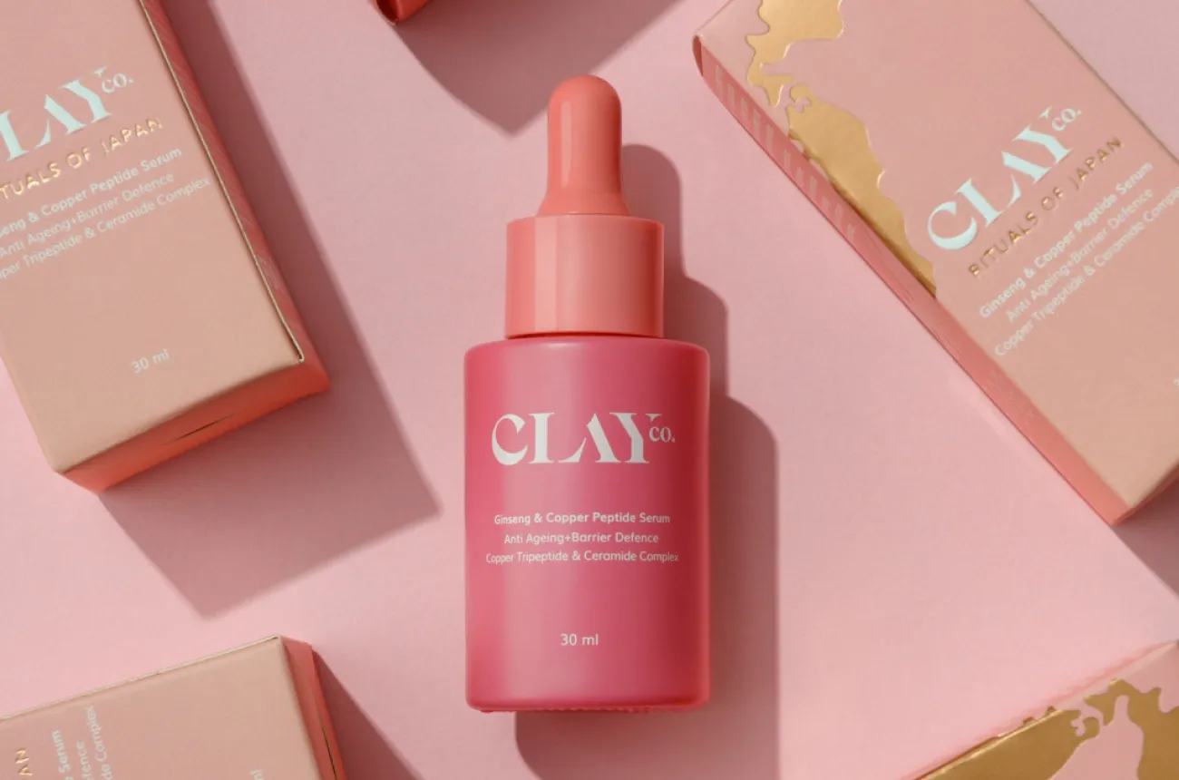
ClayCo designed a platform built to hold every beauty ritual on earth, and three years in, it still only tells Japan’s story, and even that one is slipping.

Author:
Rishabh Jain

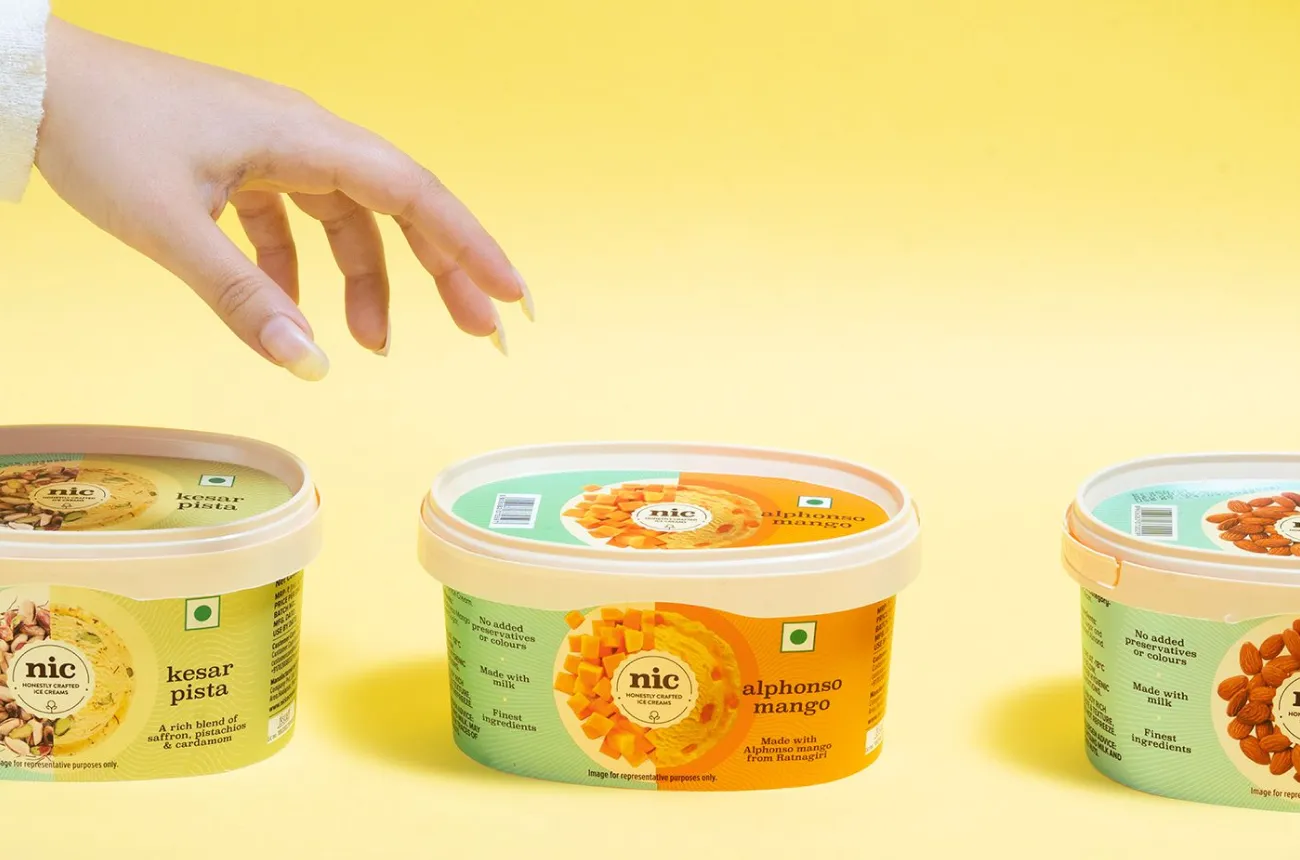
NIC built a well-run house of ice cream brands, and gave its flagship label a name that keeps doing marketing work for a rival called Naturals.

Author:
Rishabh Jain

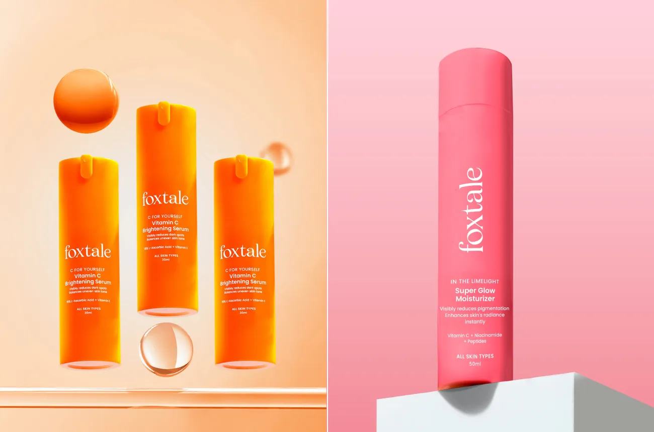
Foxtale is the upcoming skincare brand with colour coded packaging that customers can spot before reading the label, and now has to prove that colour can carry a brand once everyone else copies it.

Author:
Rishabh Jain

Rhode built a billion dollar exit on three products and one food led idea, and sold it for $10M in e.l.f Beauty in just 11 days.

Author:
Rishabh Jain

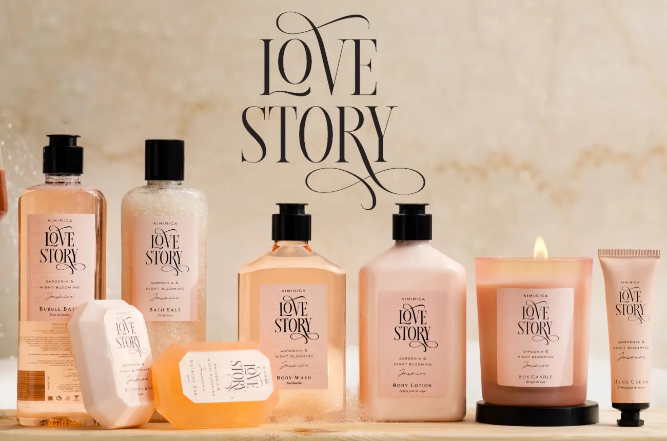
How Kimirica turned five-star hotel amenities into a bootstrapped Rs 300 crore vegan luxury bath and gifting brand.

Author:
Rishabh Jain

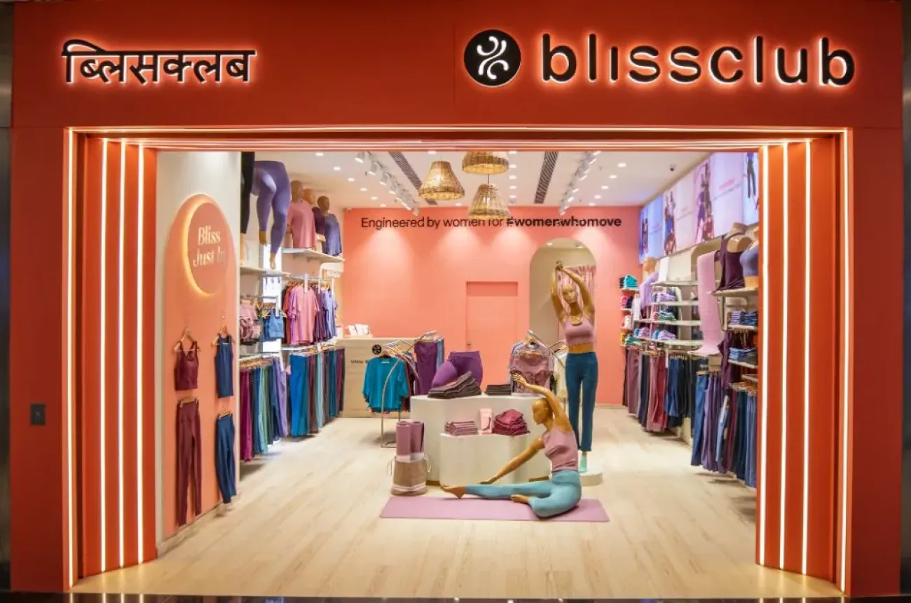
How BlissClub built India's most talked-about women's activewear brand from a WhatsApp community, and why profitability is now the harder game.

Author:
Rishabh Jain

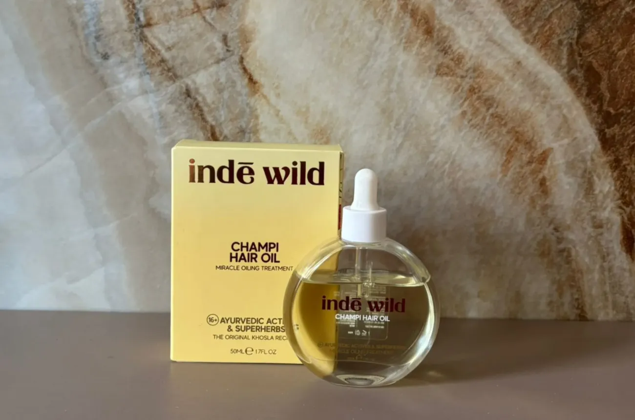
How Inde Wild became the first homegrown Indian brand to sell out at Sephora US through founder-led branding and a modern take on Ayurveda.

Author:
Rishabh Jain

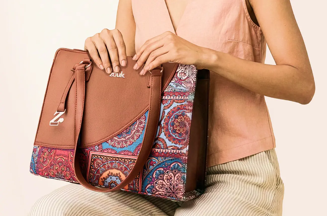
How Zouk built a Proudly Indian, PETA-approved bag brand by turning Indian handicraft into modern everyday carry, and why becoming iconic is the next design problem.

Author:
Rishabh Jain

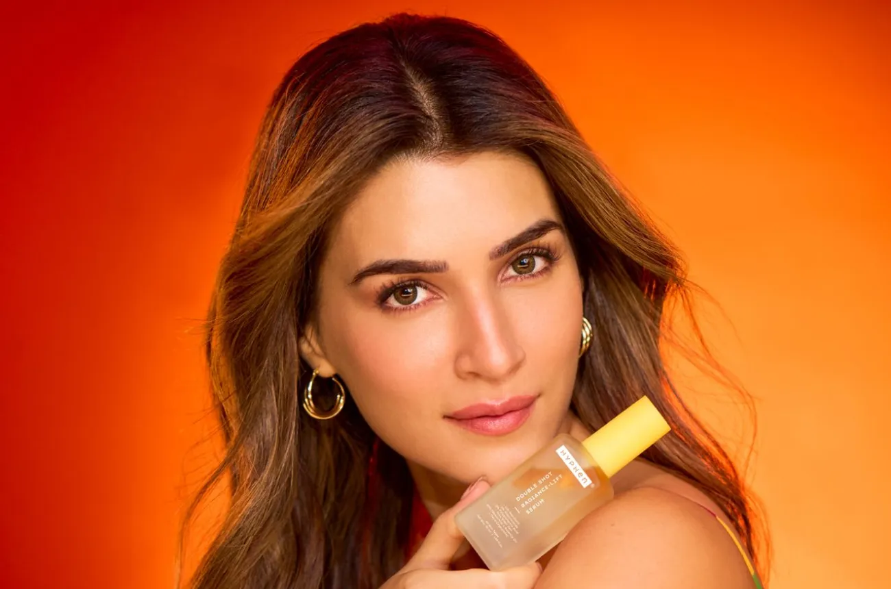
How Hyphen used Kriti Sanon as a co-founder rather than a mascot to build a skincare brand in two years, and why credibility is now its real battle.

Author:
Rishabh Jain

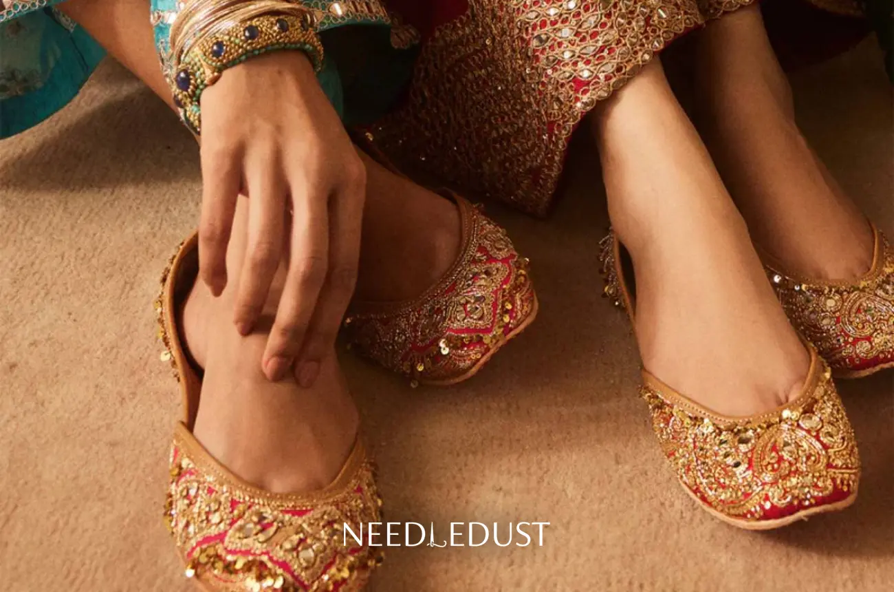
How Needledust turned the traditional jutti into a luxury, celebrity-worn shoe, and why growing beyond the occasion is its next design problem.

Author:
Rishabh Jain

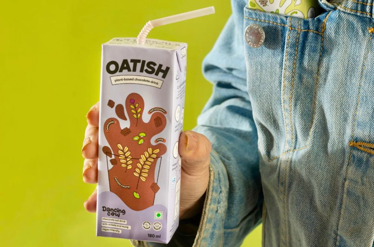
How Dancing Cow turned animal rescue into an alt-dairy brand, and why its two names now compete for the same shelf.

Author:
Rishabh Jain

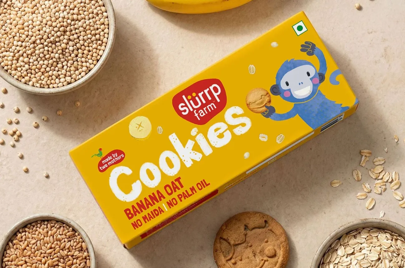
How Slurrp Farm made millets a children's food category through design-led packaging and a parent community it built itself.

Author:
Rishabh Jain

How Soulflower turned two decades of aromatherapy expertise into India's best-selling online hair oil, and why coherence is now its design challenge.

Author:
Rishabh Jain

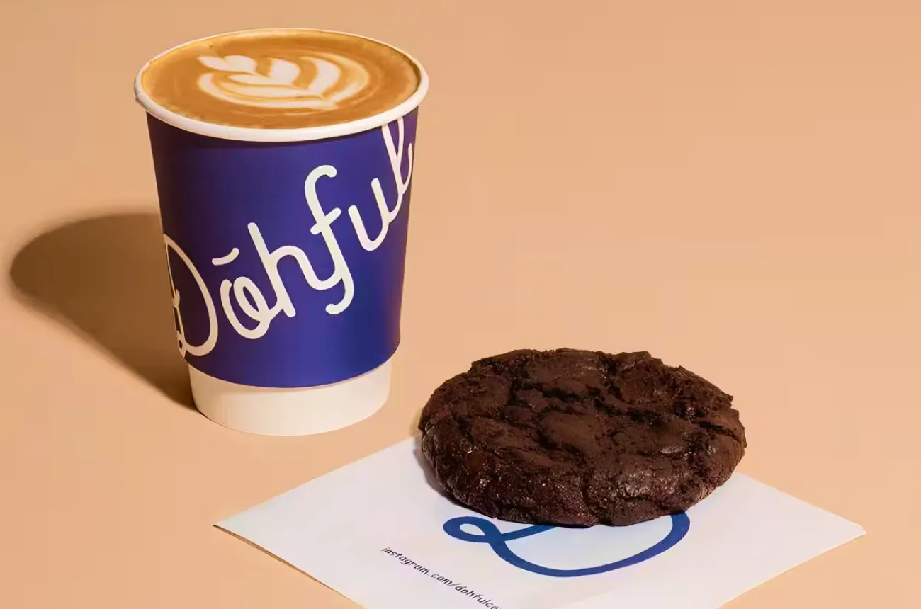
How Dohful turned soft-baked cookies and a candid founder newsletter into India's most intimate D2C brand, and why its offline pivot is the real test.

Author:
Rishabh Jain

How d'you turned a single 11-active serum into a bootstrapped, profitable cult skincare brand by making the formula the whole brand.

Author:
Rishabh Jain

Cosmix built one of India's cleanest supplement brands through root-cause formulation and founder-led education, and earned a Marico buyout doing it.

Author:
Rishabh Jain

XYXX has cracked distribution in a way almost no premium Indian menswear brand has, but that same reach is now the thing putting its premium identity at risk.

Author:
Rishabh Jain

Bombay Shirt Company built a genuine zero inventory business on the promise that a shirt made for you fits better than one made for everyone, and now it has to prove that promise still holds across 40 stores.

Author:
Rishabh Jain

Palmonas turned a Bollywood actor into an equity holding co-founder and rode that bet to 40x revenue growth, but the brand behind the face still looks like every other demi-fine label on the shelf.

Author:
Rishabh Jain

India built the luxury Ayurveda category around Kama, and the brand is now watching a rival it once matched get bought outright by a global beauty giant.

Author:
Rishabh Jain

How Plix grew to Rs 436 crore by solving a format problem before a formulation problem, built a browse-by-plant experience no competitor has matched.

Author:
Rishabh Jain

How Benne built a Rs 350 crore brand story from a 12-seater dosa café in Bandra by picking one product, doing it obsessively well, and letting the queues tell the rest of the story.

Author:
Rishabh Jain

How Bummer built the first genuine personality in Indian innerwear, survived Ashneer Grover's "doglapan" moment on national television, and still has the most important question in front of it: how does a brand this loved become a business this large?

Author:
Rishabh Jain

How Nicobar built India's most disciplined lifestyle brand by refusing to raise capital, discount, or borrow a design language from anywhere else, and why it has become the quiet reference point for an entire generation of Indian founders.

Author:
Rishabh Jain

How Moxie Beauty told Indian women with curly and wavy hair something the global haircare industry had never bothered to say: it was never your hair, it was always the product.

Author:
Rishabh Jain

How Forest Essentials turned ancient Indian Ayurveda into a Rs 585 crore global luxury brand, and why the full Estée Lauder acquisition announced in March 2026 is the most consequential moment in its 25-year history.

Author:
Rishabh Jain

How Sleepy Cat built India's most coherent sleep brand by doing the one thing its better-funded rivals forgot: staying obsessively focused on sleep, and nothing else.

Author:
Rishabh Jain

How Country Bean made flavoured coffee India's softest entry into specialty before anyone else thought the market was ready, and why the brand that opened the category needs a next act before the market moves fully past it.

Author:
Rishabh Jain

How Nuuk is filling the gap between Dyson and cheap imports with design-first home appliances built for modern Indian homes, and why the brand identity now needs to move as fast as the product has.

Author:
Rishabh Jain

How Poppi turned colour, a founding story, and a TikTok community into a USD 1.95B acquisition by PepsiCo and why its biggest design challenge now has nothing to do with the can.

Author:
Rishabh Jain

How ZYN used design precision and sport sponsorship to make nicotine feel like a premium lifestyle choice, and what that reveals about the power and limits of branding.

Author:
Rishabh Jain

How OLIPOP made gut health fun instead of clinical, built a USD 1.85B brand that turned down acquisitions from both Coke and Pepsi, and became the last serious independent in a category that consolidated around it.

Author:
Rishabh Jain

How Gully Labs made Indian streets the design brief, built a Noida factory before most investors believed in it, and raised Rs 35 crore to prove the category is real.

Author:
Rishabh Jain

How NOTO spotted India's guilt-free ice cream opportunity before anyone else, earned 87 investors across eight rounds, and why the packaging and portfolio focus need to catch up with the founding insight before the competition does.

Author:
Rishabh Jain

How Bluorng proved that Indian streetwear does not need a Western reference point to command Rs 20,000 for a sweatshirt, and what it means for every brand building in a category that did not exist before they arrived.

Author:
Rishabh Jain

How Cumin Co consolidated India's scattered cookware market with patented technology and design so good that people ask where to buy it, and why the brand building work is what comes next.

Author:
Rishabh Jain

How Arata built a 1.5 million customer haircare business on product quality and quick commerce reach alone, and why both Unilever and L'Oréal invested in it.

Author:
Rishabh Jain

How Bira91 created India's craft beer category, became the default drink of a generation, and why the brand's cultural achievement and the business's financial crisis are two entirely separate stories.

Author:
Rishabh Jain

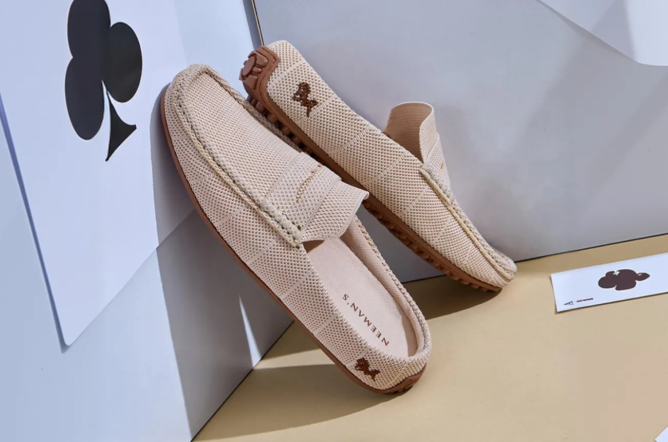
How Neeman's democratised sustainable footwear for India rather than premium-ising it, and why the brand identity has not yet caught up with the product's ambition.

Author:
Rishabh Jain
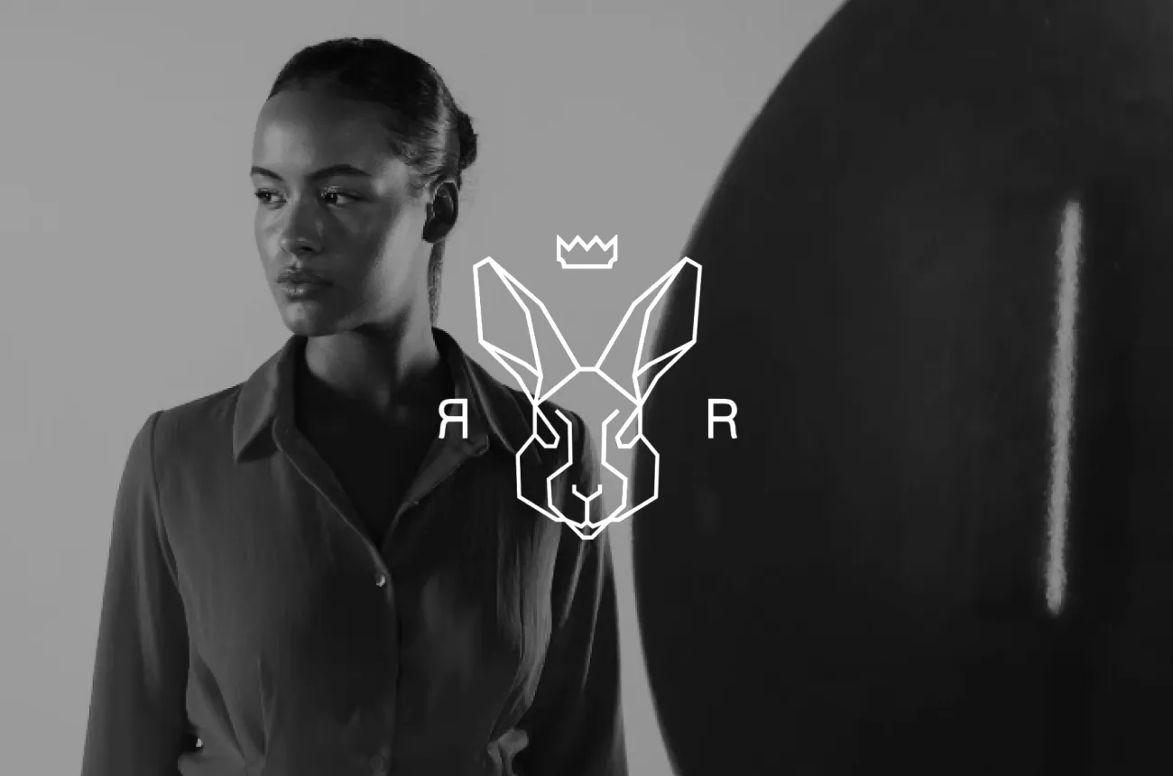
Rare Rabbit Brand Audit By Confetti Design Studio

How Rare Rabbit built India's most commercially serious premium fashion brand on product restraint, a tier 2-3 city strategy nobody talked about, and a monogram that does more brand work than any billboard could.

Author:
Rishabh Jain

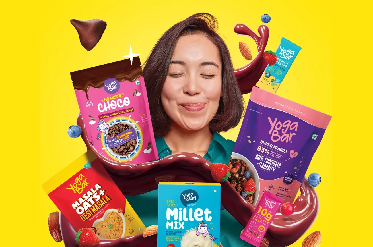
How Yogabar built a decade of consumer trust on ingredient honesty, scaled to Rs 201 crore through ITC's distribution reach, and now faces its most important brand question yet.

Author:
Rishabh Jain

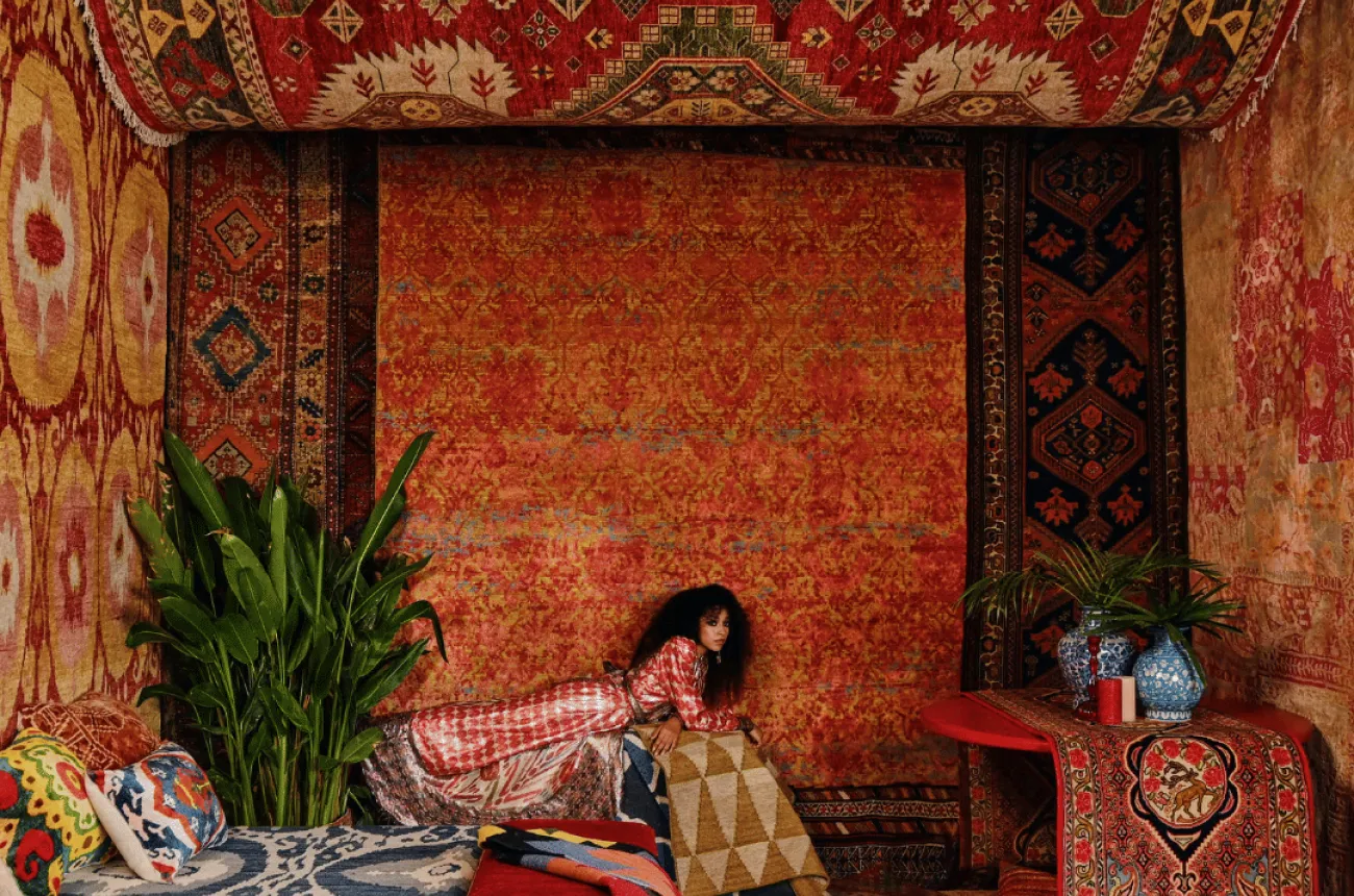
How Jaipur Rugs built the most powerful Indian luxury story in the world through 40,000 artisans, Paris Fashion Week, and a founder who started with a Rs 5,000 loan.

Author:
Rishabh Jain

How Snitch went from Rs 11 crore to Rs 900 crore in five years by building the fastest trend pipeline in Indian menswear, and why the next Rs 900 crore requires something the machine cannot produce by itself.

Author:
Rishabh Jain

Mokobara made Indian luggage worth wanting. Whether it can hold its ground as the scrutiny grows is the next design problem to solve.

Author:
Rishabh Jain

How the Comet sneakers brand is building hype in India through iconic design, limited drops and streetwear culture.

Author:
Rishabh Jain

How UnderNeat is normalising shapewear in India through influencer-led branding, real women, and category-first storytelling.

Author:
Rishabh Jain

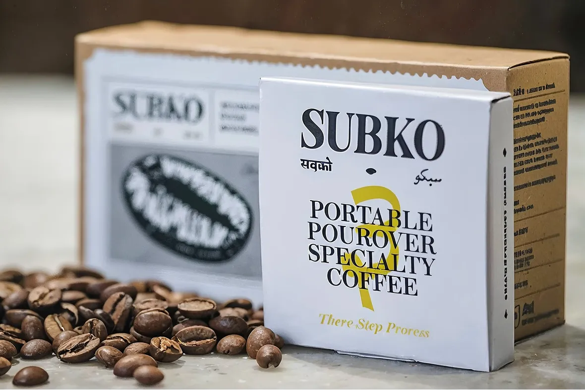
How Subko turned specialty coffee into a South Asian cultural movement: a Confetti brand audit.

Author:
Rishabh Jain

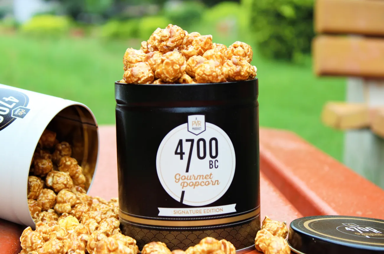
4700BC turned a commodity snack into a gourmet category, attracted PVR INOX and then Marico, and built the most disciplined brand identity in Indian premium snacking.

Author:
Rishabh Jain

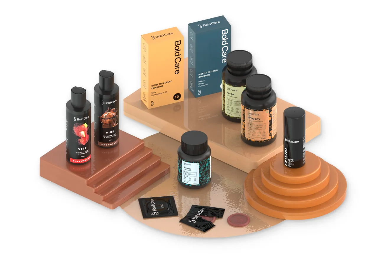
Bold Care turned one of India's most stigmatised categories into a Rs 100 crore conversation. The next chapter is about proving the brand can convert attention into sustainable profit.

Author:
Rishabh Jain

Bombay Shaving Company scaled faster than most Indian D2C brands ever will. The question now is whether the brand system can catch up with the ambition.

Author:
Rishabh Jain

How The Good Bug made gut health feel like a lifestyle choice rather than a medical prescription, and why brand consistency is now the most important product it needs to build.

Author:
Rishabh Jain

How Vahdam built a globally scaled Indian tea brand by controlling the supply chain from plantation to doorstep, without losing what makes it Indian.

Author:
Rishabh Jain

How Plum turns simplicity and functional design into a skincare staple, and what it takes to go from dependable to iconic.

Author:
Rishabh Jain

How Keventers blends a century of legacy with contemporary design to stay timelessly relevant in India's crowded indulgence category.

Author:
Rishabh Jain

A closer look at how bold naming and visual cues turn coffee into an adrenaline experience, and why Rage Coffee has not fully committed to the promise its name makes

Author:
Rishabh Jain

How Sleepy Owl made cold brew a habit for urban India, and why staying interesting is now the harder challenge.

Author:
Rishabh Jain

How MyMuse made sexual wellness feel safe, modern, and completely normal for India.

Author:
Rishabh Jain

What happens when cocktail culture is designed for real homes, real parties, and real drinkers.

Author:
Rishabh Jain

How Indri became India's most awarded single malt by designing for all five senses, not just the glass.

Author:
Rishabh Jain

A look at how focus, simplicity, minimalism and intention built an unmistakably premium coffee experience.

Author:
Rishabh Jain

Third Wave Coffee put specialty coffee on the Indian map. The harder question now is whether it can protect the philosophy that made the name mean something.

Author:
Rishabh Jain

How Wellbeing Nutrition built a design system flexible enough to serve every age group without losing the plot.

Author:
Rishabh Jain

How Hocco reimagined indulgence through playful design, bold naming, and a joyful brand language that India's frozen aisles had never seen before.

Author:
Rishabh Jain

A closer look at how Two Brothers translates farm-first values into a trusted, premium identity.

Author:
Rishabh Jain

How The Whole Truth turned honesty into a design system, a business model, and a transparency movement.

Author:
Rishabh Jain

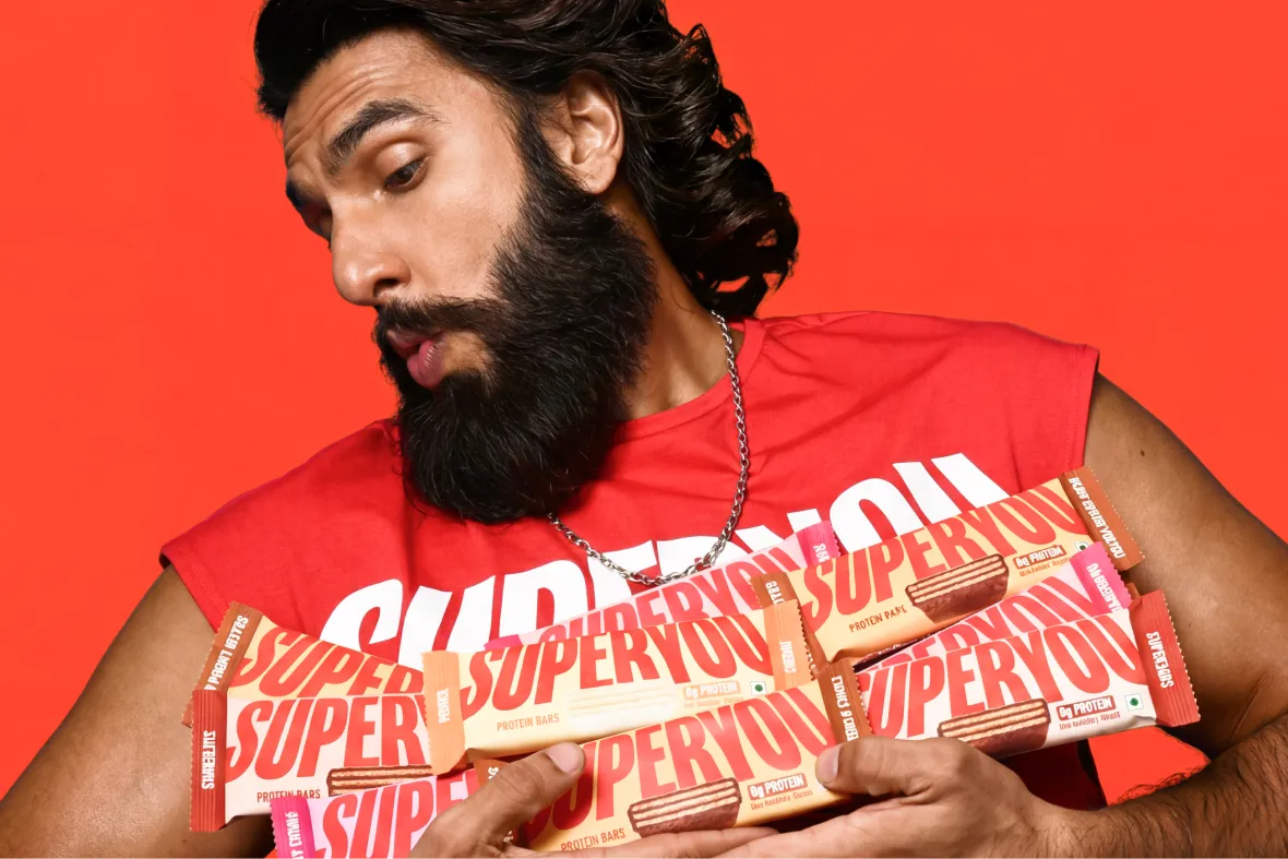
How SuperYou became India's fastest-growing celebrity D2C snack brand by making protein mainstream, not niche.

Author:
Rishabh Jain

Exploring how CRED turned credit card payments into a premium, habit-forming experience through design and rewards.

Author:
Rishabh Jain

How Sugar Cosmetics made bold makeup accessible through vibrant branding and digital-first storytelling.

Author:
Rishabh Jain

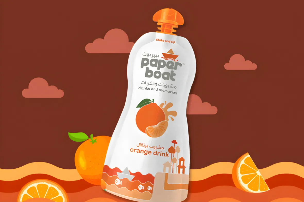
How Paper Boat bottled childhood and sold it back to a generation, and why the next decade demands something more than memory.

Author:
Rishabh Jain

Exploring how Snitch built a fast-moving menswear brand by translating global trends into accessible, digital-first fashion.

Author:
Rishabh Jain

How Jupiter approaches personal finance through thoughtful UX, simplicity, and a product-first digital experience.

Author:
Rishabh Jain

A closer look at how Phool reimagines a traditional ritual through sustainable design, storytelling, and modern luxury.

Author:
Rishabh Jain

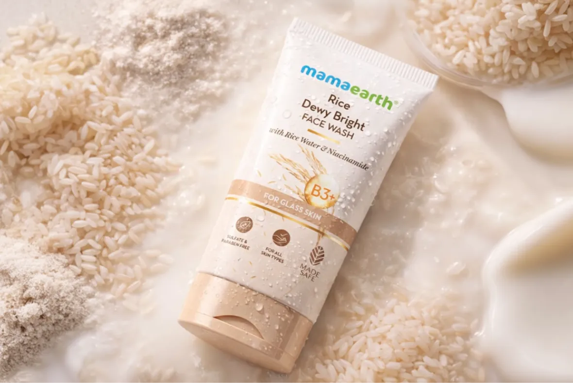
How Mamaearth found the sweet spot between Patanjali and the Western beauty giants, and why that middle ground is getting harder to hold.

Author:
Rishabh Jain

Let’s Build The Next Big Thing

Portrait photo of Rishabh Jain, Founder of Confetti, smiling and sitting down.
Rishabh Jain's signature
Rishabh Jain
Founder @Confetti
Get Started
A stylized pink thunderbolt or lightning icon
Get Instant Response
We’re looking forward to talk to you!
There was an error in form submission.
Please try to submit the form again.

Global Recognition

The logo for the publication PACKAGING OF THE WORLD, featuring the word 'PACKAGING' in bold black capital letters and 'OF THE WORLD' in a smaller font size.
ITC Bingo Chatpat Kairi is featured in ‘Packaging Of The World', 2025
A product photograph showing a green bottle of 'Bingo! Chatpat Kairi' drink, surrounded by glasses of mango juice, a woven basket filled with raw green mangoes, and slices of mango.
The logo for the World Brand Design Society, which includes a black geometric symbol, the Royal Coat of Arms of the United Kingdom, and the words 'WORLD BRAND DESIGN SOCIETY'.
WhatABite is featured in ‘World Brand Design Society’, 2025
Close-up of a bag of orange-red 'WhatABite Chicken Chips (Barbecue)' resting on a bright yellow surface, surrounded by a laptop, an open book, a black vintage-style camera, a red thermos, and a small white bowl holding some of the chips.
The logo for the packaging editorial Dieline, represented by a black circle containing a stylized white 'D' shape.
AIM Nutrition is featured on ‘Dieline, 2025’, a globally reputed packaging editorial
A flat lay photograph of several products from AIM Nutrition's 'MeltinStrips' line, including blue boxes for 'Sleep' and white boxes for 'Beauty,' along with small orange sachets for 'Energy,' all scattered on a light background
The logo for the publication PACKAGING OF THE WORLD, featuring the word 'PACKAGING' in bold black capital letters and 'OF THE WORLD' in a smaller font size.
ITC B Natural is featured in ‘Packaging Of The World', 2025
A light green bottle of B Natural Tender Coconut Water sits on a blue and white patterned tile table next to a half coconut shell filled with a drink and garnished with a grapefruit slice and rosemary. The background is a bright seaside landscape with a blue ocean and distant cliffs.
The logo for the publication PACKAGING OF THE WORLD, featuring the word 'PACKAGING' in bold black capital letters and 'OF THE WORLD' in a smaller font size.
Pawsible Foods is featured in ‘Packaging Of The World', 2025
A smiling Golden Retriever dog wearing a green tag, leaning on a table next to a large green box of Pawsible Foods Core Wellbeing Nutritional Topper and a stainless steel bowl containing the food. The background is a blurred, lush green outdoor setting.
The logo for the publication PACKAGING OF THE WORLD, featuring the word 'PACKAGING' in bold black capital letters and 'OF THE WORLD' in a smaller font size.
Miduty is featured in ‘Packaging Of The World', 2025
A set of three black-lidded supplement bottles from the Miduty brand, labeled Estrogen Balance, Liver Detox, and Methyl B-12 & Folate, displayed against a sleek, light blue, clinical-style background.
The logo for the publication PACKAGING OF THE WORLD, featuring the word 'PACKAGING' in bold black capital letters and 'OF THE WORLD' in a smaller font size.
Swizzle is featured in ‘Packaging Of The World', 2025
A visually striking product photo featuring three cans of Swizzle Premium Mocktails (Pineapple Mojito, Blue Lagoon, and Desi Lemonade), each bearing a polar bear mascot wearing sunglasses. They are arranged on a pink surface next to a red cloth and a bowl of salad, with a hand reaching for the can on the right.
The logo for the publication PACKAGING OF THE WORLD, featuring the word 'PACKAGING' in bold black capital letters and 'OF THE WORLD' in a smaller font size.
ITC Bingo Chatpat Kairi is featured in ‘Packaging Of The World', 2025
A product photograph showing a green bottle of 'Bingo! Chatpat Kairi' drink, surrounded by glasses of mango juice, a woven basket filled with raw green mangoes, and slices of mango.
Like what you see?
Let's discuss your project
Book A Call