%201.webp)
02
AI Snaps
.svg)
.svg)
01
Our Work

03
About Us
05
Contact Us
06
Client Success

07
Blogs
08
Careers
Book A Call


Need Help In Building Your Brand?
Click the button below & book a call with our founder directly.

Rishabh Jain
Managing Director
Sleepy Owl | Confetti's Verdict ⭐⭐⭐½
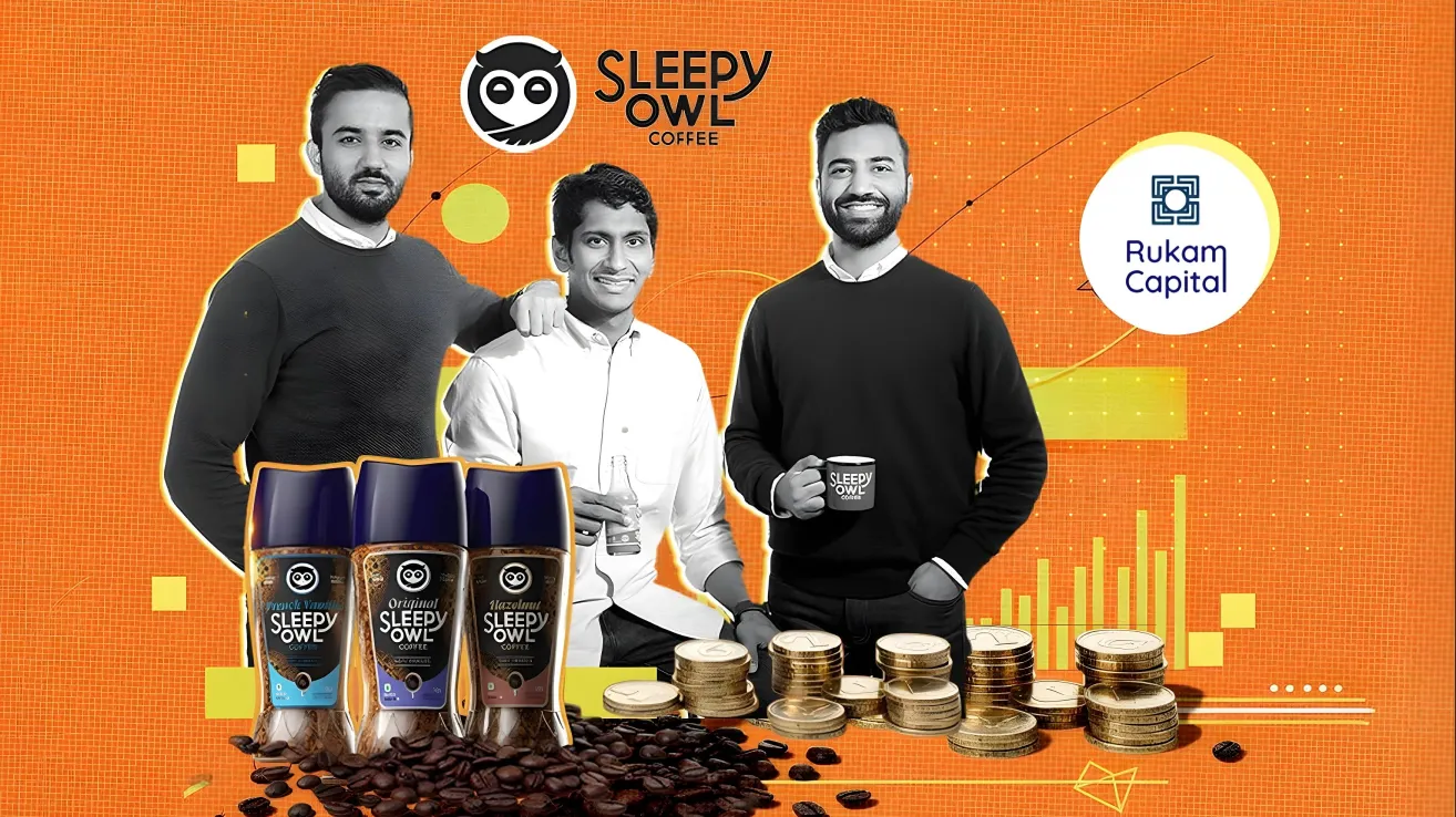
Confetti Design Studio has analysed Sleepy Owl to understand how a brand that introduced packaged cold brew to India in 2016 grew into the country's most recognised independent coffee brand, raising USD 10.7 million across four funding rounds, reaching over 200,000 monthly orders, with 40% of sales driven by subscriptions.
Very few brand names communicate the product category, the consumer moment, and the emotional promise simultaneously. Sleepy Owl manages to do all three at the same time.
The name hints at late nights and early mornings, at the moment when someone reaches for coffee because they genuinely need it. It is warm, approachable, and slightly self-deprecating, qualities that place it in the same emotional territory as the consumer it is designed for an urban millennial who drinks coffee for function as much as ritual, and who does not want to be talked down to by a brand that takes itself too seriously.
The name is also short, phonetically clean, and easy to search, almost like an oxymoron in itself. In a D2C category where discovery and word-of-mouth compound over time, those three qualities matter more than most founders appreciate at launch. Sleepy Owl built strong brand recall before it had a large marketing budget, partly because the name itself did the remembering for consumers.
Compare this to the naming conventions of most Indian coffee brands, which default to geography, founder surnames, or invented heritage. Sleepy Owl chose personality instead. In a category that is getting crowded at the premium end, a name rooted in personality ages better than one rooted in origin claims.
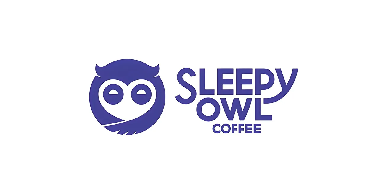
The most strategically important design decision Sleepy Owl has made in recent years is the rebrand, specifically the development of a logo that is colour-independent.
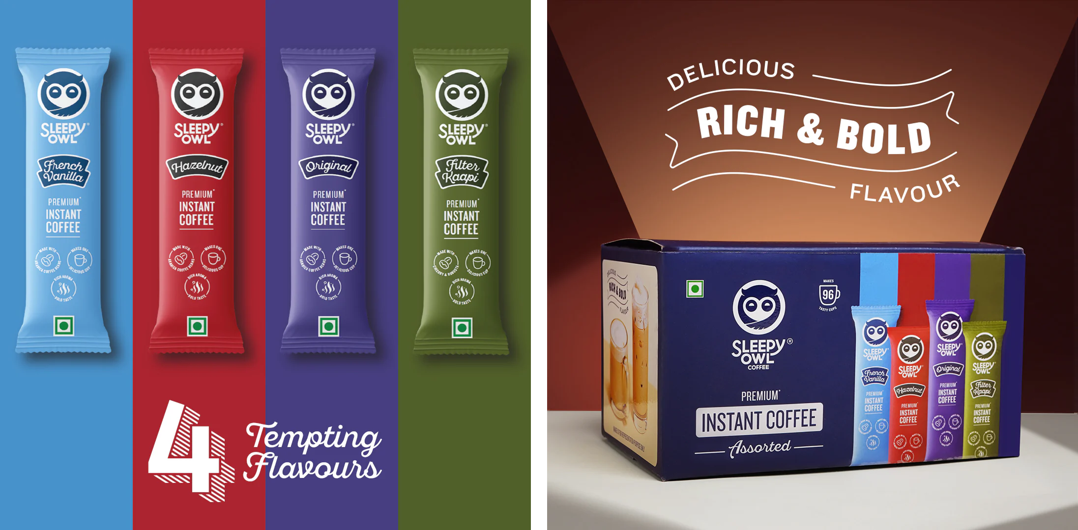
Most FMCG brands build logos that are inseparable from a specific colour palette. Remove the colour and the logo loses its identity. Sleepy Owl's updated mark, a stylised owl that incorporates a clever heart counter-form within its design, works across blue, green, red, and neutral palettes without losing recognition. This places it in the same category of design thinking as global icons like Nike or Adidas: marks that carry the brand regardless of what colour system they are rendered in.
This flexibility is commercially significant as it means that Sleepy Owl can differentiate products at the SKU level through colour while maintaining master brand recognition across the full range. The cold brew range can own blue, a new format can be green, a collaboration can use red. None of these choices fragments the brand because the mark holds.
For a brand with as broad a product portfolio as Sleepy Owl, ranging from cold brew bags and hot brew bags to instant coffee and ready-to-drink bottles, this kind of flexible identity system is essential infrastructure. Without it, range extensions create visual noise and along with it, they build cumulative recognition.
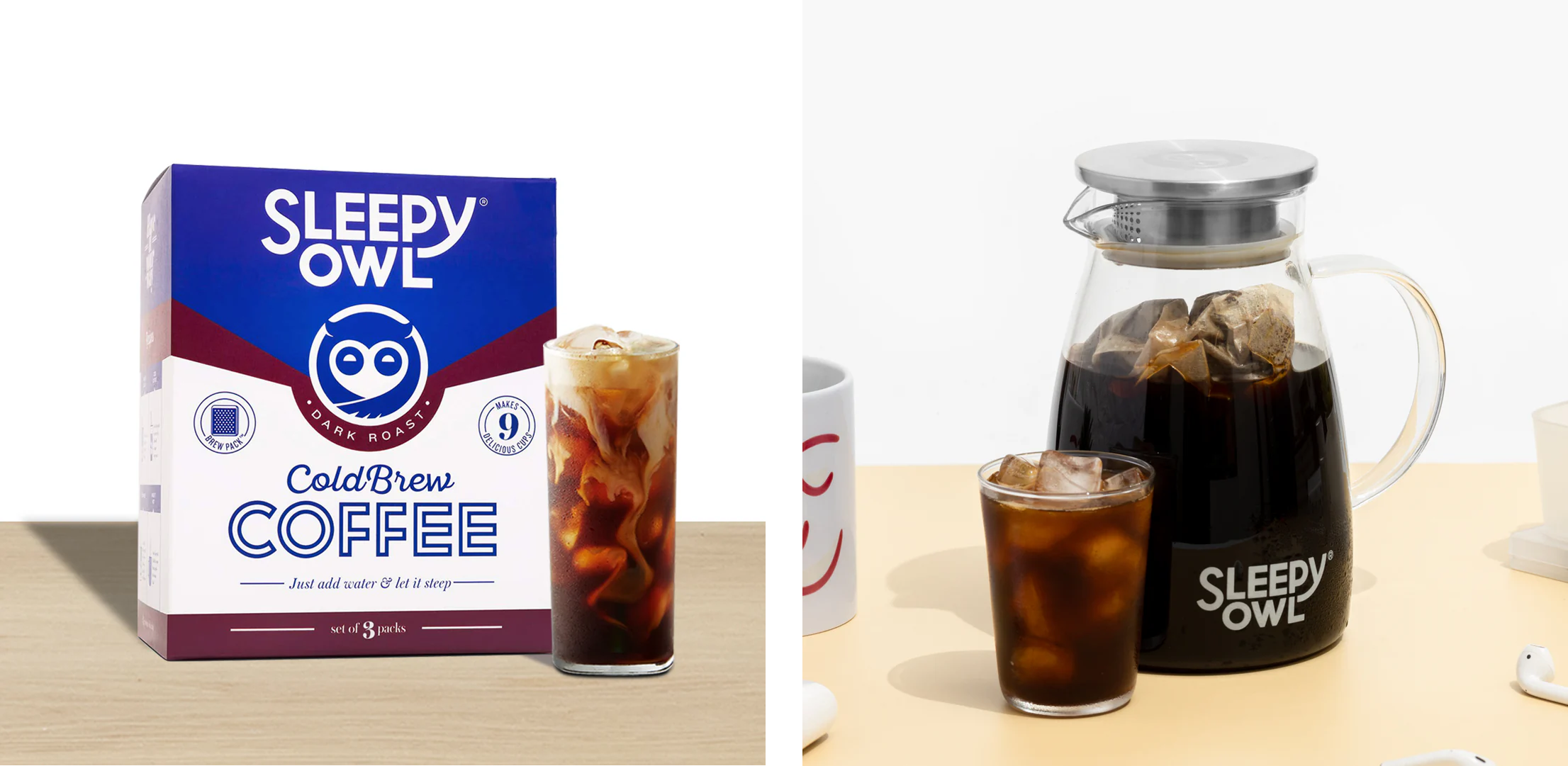
The cold brew range is where Sleepy Owl's design thinking is most fully realised, and where the brand has built its most durable visual equity.
The bold use of blue, red, and white on the cold brew packaging has become so consistently associated with the brand that, within the Indian coffee category, blue now belongs to Sleepy Owl in the way that red belongs to Coca-Cola. No other coffee brand in India owns that colour association as strongly or as clearly. This is one of the hardest things to build in branding and one of the most valuable once built.
Beyond colour, the communication built into the packaging is genuinely useful rather than decorative. Brewing instructions, usage tips, and education are integrated directly into the pack design. Inside the boxes, brochures continue that conversation. The packaging does not stop at containment or even brand communication. It actively teaches the consumer how to get the most out of the product.
This education-first approach is one of the key reasons Sleepy Owl has driven repeat purchase rather than trial-and-abandon. A consumer who learns to make a good cold brew with the pack guidance returns because the experience matches the expectation and that is also a loop that advertising spend cannot replicate.
In 2016, packaged cold brew was essentially unknown to Indian consumers. Sleepy Owl did not enter the coffee category. It created a new sub-category within it. That decision to launch with a format rather than a flavour had lasting strategic consequences. It meant that Sleepy Owl was not competing on taste comparison with Nescafe or Bru at launch. It was offering something categorically different, like cafe-quality coffee at home, without a machine, without barista knowledge, and without the price of a coffee shop visit.
The hot brew bag followed a similar logic, ground coffee for the consumer who does not own a French press. A format innovation that removes friction from the premium coffee experience without removing the quality of it. This format-first thinking extended to the instant coffee launch, which was designed not as a downgrade from the cold brew but as a different occasion: the late-night desk coffee, the quick morning before commute. Rather than cannibalising the core product, the instant range opened a new moment of consumption for the same consumer. That is smart product architecture, not just smart packaging.
Sleepy Owl's collaboration record is one of the strongest in the Indian D2C coffee space, not because of volume but because of fit. The cold brew-infused gin with Greater Than, the breakfast cereal stout with Goa Brewing Co., the coffee crunch granola with The Whole Truth, the chocolate coffee fudgesicle with NOTO, each of these partners shares an audience with Sleepy Owl without competing with it. The collaborations feel like the brand introducing its consumer to a friend rather than a brand chasing relevance through novelty.
The Sleepy Owl espresso martini mixer with Jimmy's Cocktails is a particularly strong example. Both brands target the same urban, quality-conscious consumer. The collaboration put Sleepy Owl in the cocktail occasion and put Jimmy's in the coffee occasion, expanding both brands' moments without diluting either one's identity.
Their quarterly customer survey programme is absolutely worth noting separately. The brand sends detailed 20 to 25 minute questionnaires to its highest-value customers every quarter, consistently drawing 2,000 to 3,000 responses. This is not passive data collection, but an active commitment to understanding what the most loyal segment of the audience thinks, wants, and plans to do next. It is also a brand-building act in itself as the consumer who is asked their opinion feels part of the brand's story in a way that a consumer who only receives promotions does not.
Sleepy Owl's cold brew range is visually confident. The instant coffee packaging is not. The sachets and outer boxes are clean and functional, with clear hierarchy and no visual clutter. For a brand launching into an unfamiliar market in 2016, that restraint was an asset. For a brand competing in 2025's Indian coffee market, where Blue Tokai, Third Wave Coffee, Rage Coffee, and Davidoff are all investing in distinctive packaging, that same restraint risks reading as conservative rather than considered.
The instant coffee range sits in the middle of not being forgettable, but also not being memorable enough for their target audience. It does not give the consumer a reason to pick it up on the basis of design alone, it also relies on brand recognition built through other touchpoints to do the work that the packaging itself should be doing. In a retail environment where the brand's cold brew may not always be stocked beside the instant coffee, that dependence on carry-over recognition can become a structural weakness.
India's premium coffee category is evolving from a product conversation to an experience one. Blue Tokai and Third Wave Coffee have physical cafes that give consumers a space to encounter the brand with all five senses. Starbucks has turned its retail stores into a brand world. The cafe-led brands have an inherent advantage in a category where ritual, habit, and atmosphere are part of what the consumer is actually buying.
Sleepy Owl exists entirely as a product. There is no offline brand world, no physical space where the brand's personality can be experienced beyond the packaging. This is not a flaw in what the brand has built. It is a ceiling on where the brand can go without either a physical presence strategy or a sufficiently powerful digital equivalent.
The brand's own D2C website is positioned more as a brand-building channel than a primary sales destination, which reflects an honest assessment of its current role. Quick commerce and offline retail are where the growth is coming from. The question is whether those channels can sustain the brand relationship the same way that an owned space, physical or digital, can.
Revenue fell 24% from Rs 29.1 crore in FY23 to Rs 22.2 crore in FY24 before recovering strongly to Rs 44.3 crore in FY25. The FY25 recovery is significant and real. But the FY24 dip is worth examining because it is the kind of contraction that reveals structural questions rather than cyclical ones.
The most likely combination of causes like the rising customer acquisition costs in an increasingly crowded D2C coffee market, the challenge of maintaining subscription retention as competitors offered more alternatives, and the inherent difficulty of sustaining growth momentum after the novelty of the cold brew format had been absorbed by the early adopter audience.
The FY25 recovery suggests the brand has found its footing again, likely through the quick commerce channel growth and offline retail expansion. The important question looking forward is whether that recovery is driven by a broadening customer base or by deeper penetration of the same urban early-adopter cohort that has always been the brand's core. One of those trajectories is more durable than the other.
The instant coffee range needs a packaging system that does not rely on the cold brew's blue equity to establish recognition. This means developing a distinct but related visual language for instance, one that reads as clearly Sleepy Owl while earning attention in its own right. The cold brew blue is owned. The instant range needs its own colour anchor, its own structural logic, and its own reason for a consumer to pick it up cold rather than because they already know the brand. This is a solvable design problem and the most urgent packaging opportunity the brand has right now.
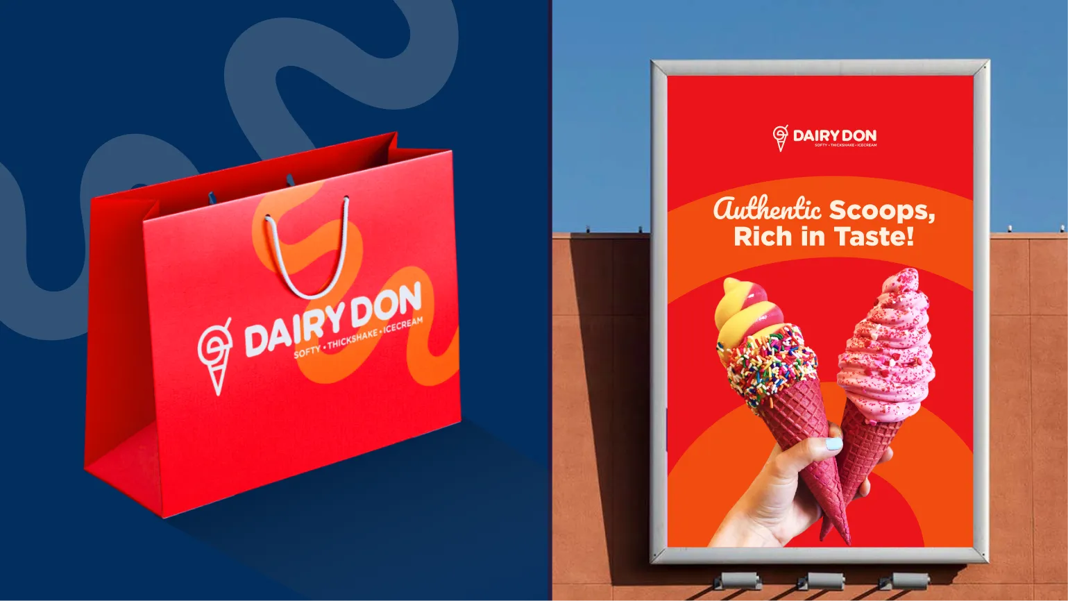
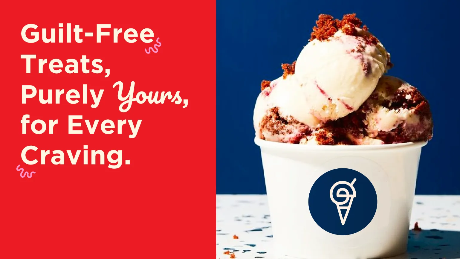
At Confetti, we explored exactly this challenge with Dairy Don, an ice cream brand where we designed not just packaging but a complete brand experience, ensuring the offline and online worlds felt equally recognisable and cohesive. Sleepy Owl needs the equivalent for coffee. Whether that takes the form of a flagship experience, a pop-up model, a curated delivery unboxing that functions as a brand world in miniature, or a content strategy that gives the brand a texture beyond product photography, the goal is the same: giving the consumer a way to inhabit the brand rather than simply purchase from it. In a category where the ritual of making coffee is part of what the consumer values, there is significant room to design that ritual more deliberately.
Sleepy Owl's positioning as accessible, clever, and convenient great coffee was differentiated in 2016. In 2025 it is a position that several well-funded competitors have moved into. The brand needs to make a clearer choice about what it owns going forward…
All three of these are true, however the brand that chooses the sharpest one will be easier to love.
Sleepy Owl built something that deserves more credit than it typically receives: a new coffee behaviour in India. The cold brew format did not exist in Indian homes in a meaningful way before Sleepy Owl put it on the shelf in 2016. The brand created the category, educated the consumer, built a visual identity strong enough to own a colour, and grew to over 200,000 monthly orders on the back of a subscription model that requires genuine loyalty rather than impulse purchase.
The challenges are real. The instant coffee packaging does not match the cold brew's design confidence. The brand exists only as a product in a category where experience is becoming a competitive advantage. And the path from Rs 44.3 crore in FY25 to the kind of scale that justifies the brand's founding ambition requires either a bolder design bet or a physical presence strategy, or both.
If you are building a coffee, beverage, or subscription-led D2C brand and want to create the kind of packaging system and brand identity that earns category leadership rather than just category participation, Confetti can help you build that.
Want strategic branding and packaging like this for your business?


Lorem ipsum dolor sit amet, consectetur adipiscing elit. Suspendisse varius enim in eros
Lorem ipsum dolor sit amet, consectetur adipiscing elit. Suspendisse varius enim in eros
Lorem ipsum dolor sit amet, consectetur adipiscing elit. Suspendisse varius enim in eros
.svg)
.svg)


.webp)
.webp)


.webp)
.webp)
.webp)
.webp)
.webp)


.svg)
.webp)
.svg)
.webp)


.webp)


.webp)


.svg)