%201.webp)
02
AI Snaps
.svg)
.svg)
01
Our Work

03
About Us
05
Contact Us
06
Client Success

07
Blogs
08
Careers
Book A Call


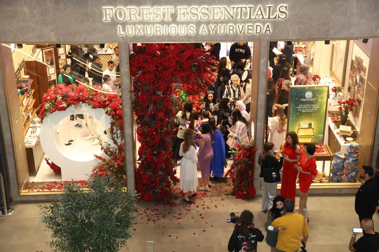
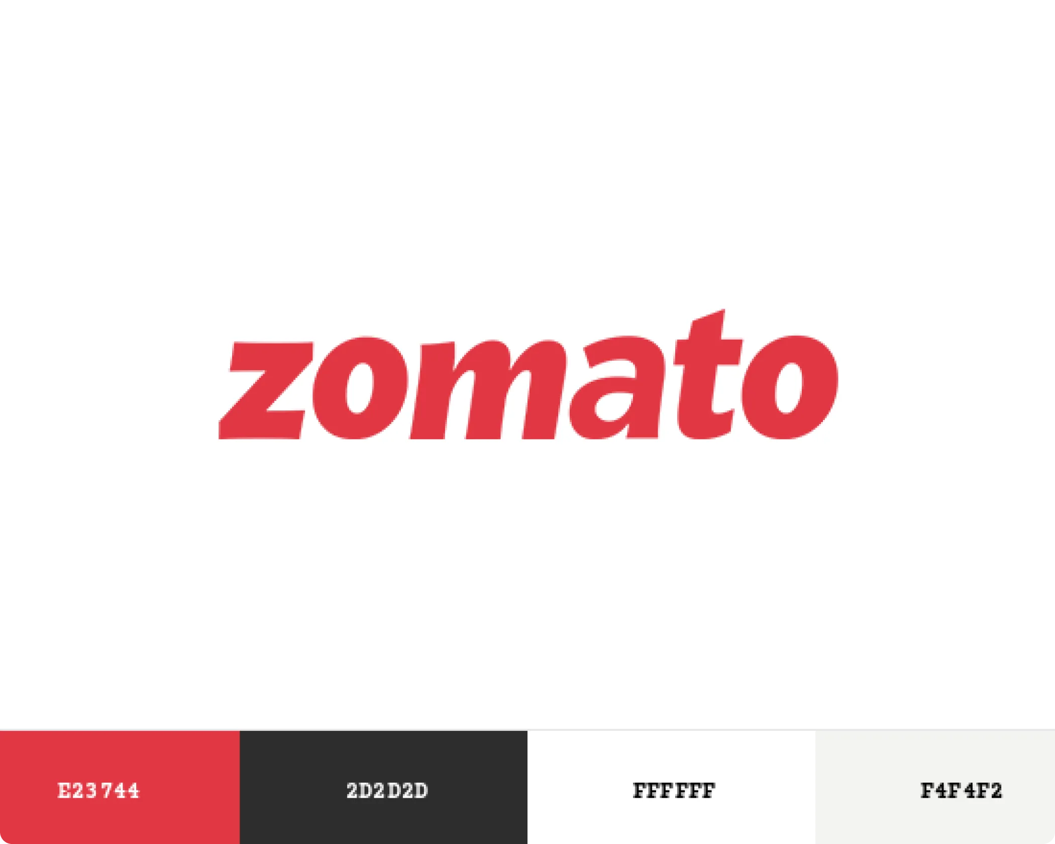
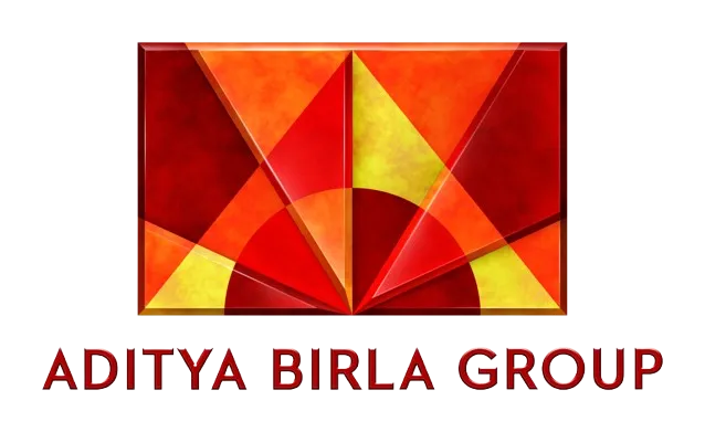
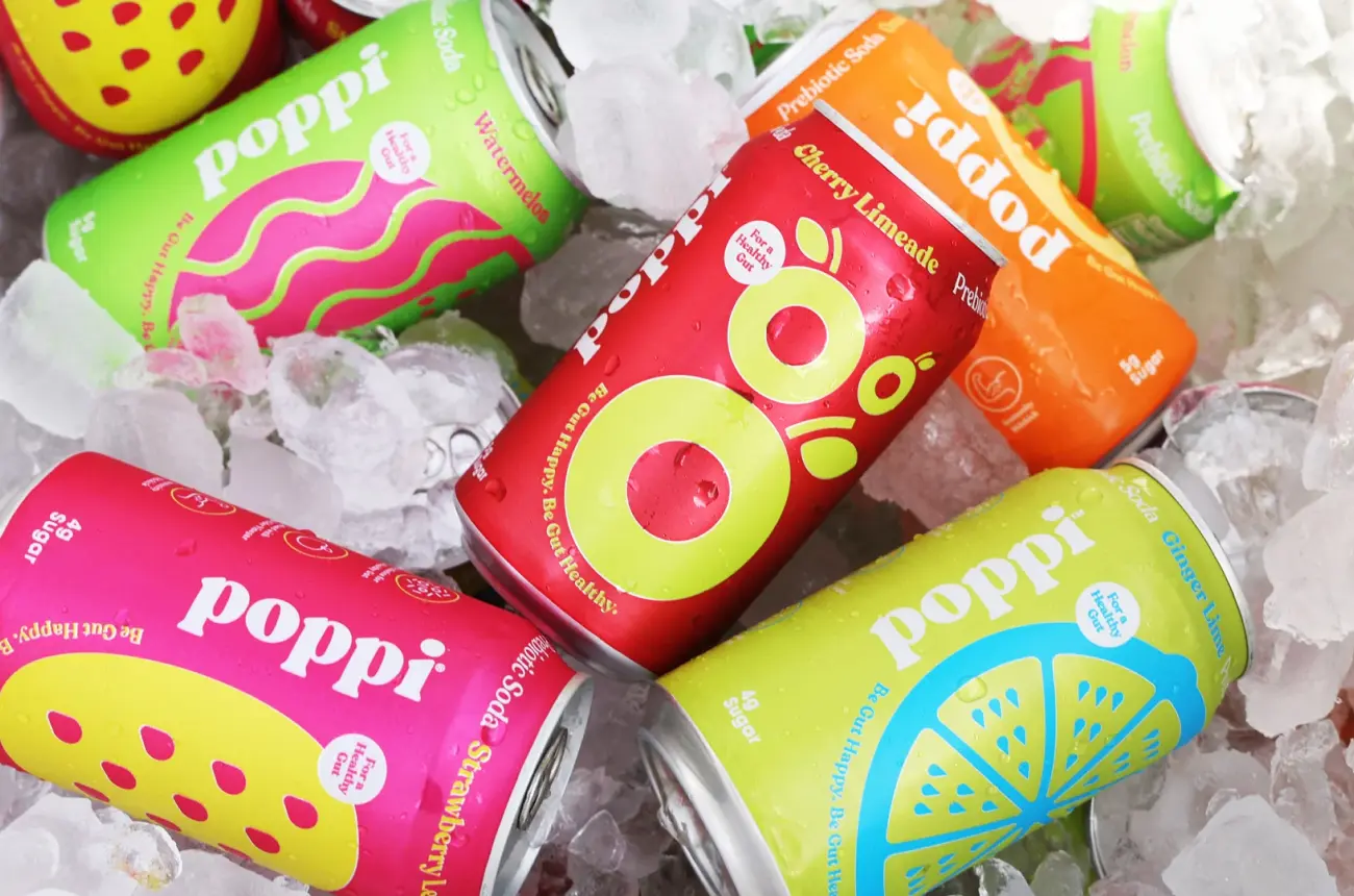
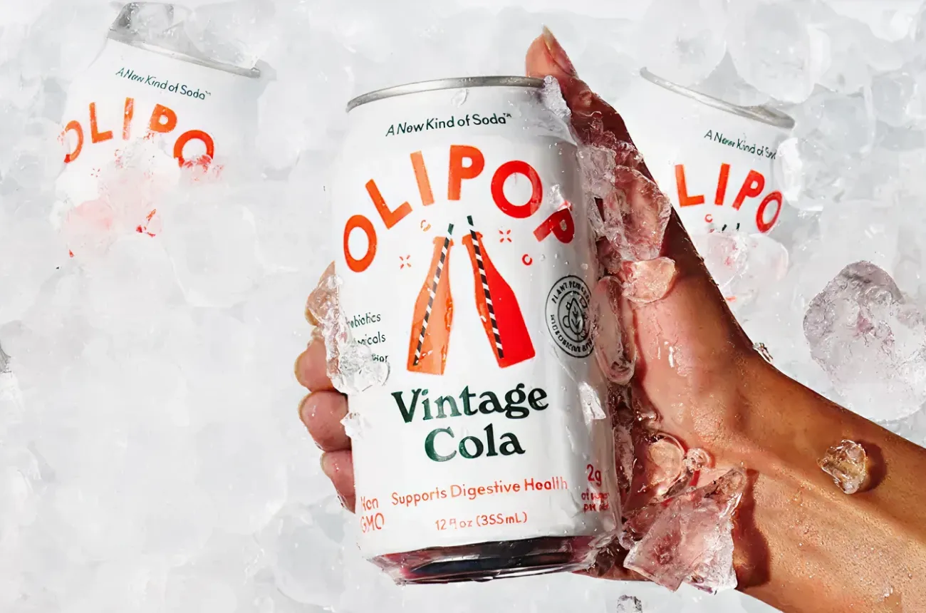
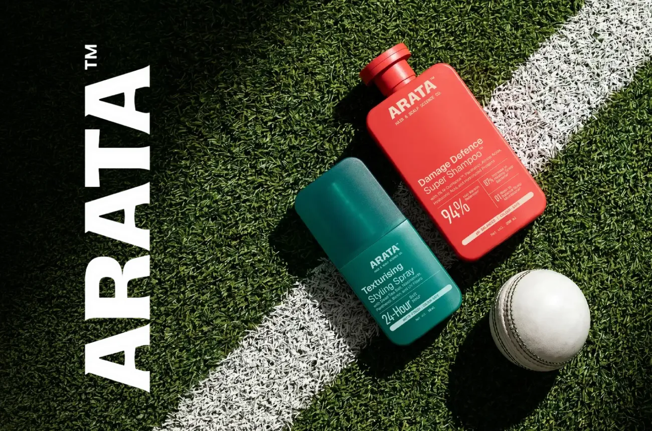
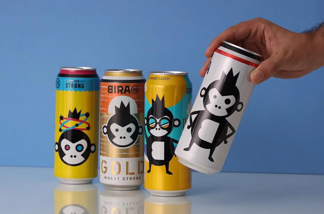
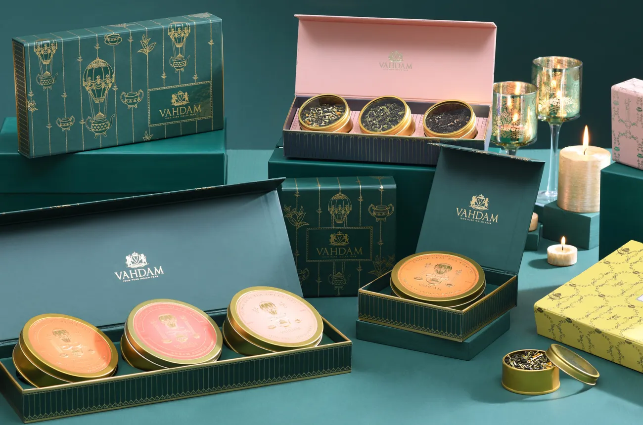
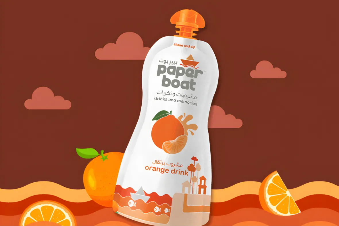
Colour palette and typography form the visual foundation of a brand. Once the mood board is approved, these are the first concrete steps towards building a recognisable and consistent identity. In India, several iconic brands are instantly identifiable through colour and type alone. Zomato's red, Swiggy's orange, Nykaa's pink, Amul's blue, and Tata's deep blue all signal specific emotions and expectations before a single word is read.
Colour and font choices influence how a brand is perceived across billboards, packaging, social media, and digital platforms. They are not decorative decisions. They are functional ones, made once and carried across every brand touchpoint for years. At Confetti Design Studio, these decisions are approached with the same strategic rigour as positioning and naming, because getting them right at this stage is what makes long-term brand consistency and recall possible.
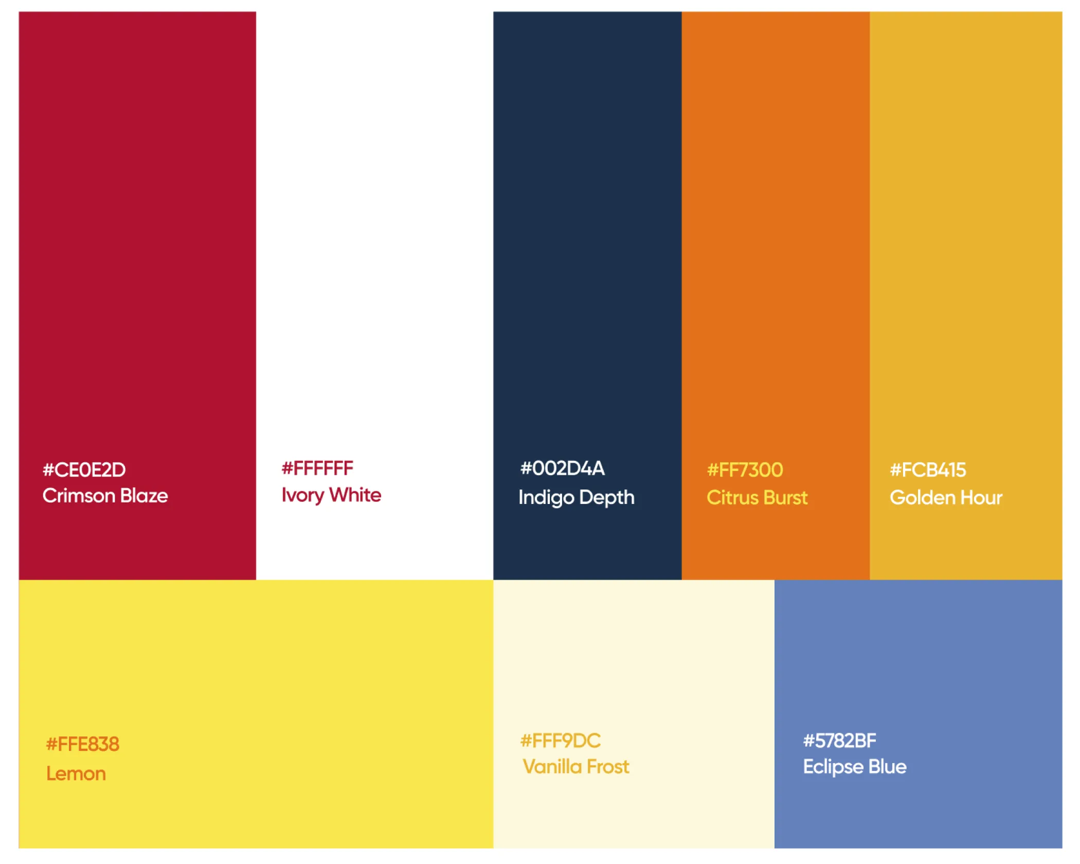
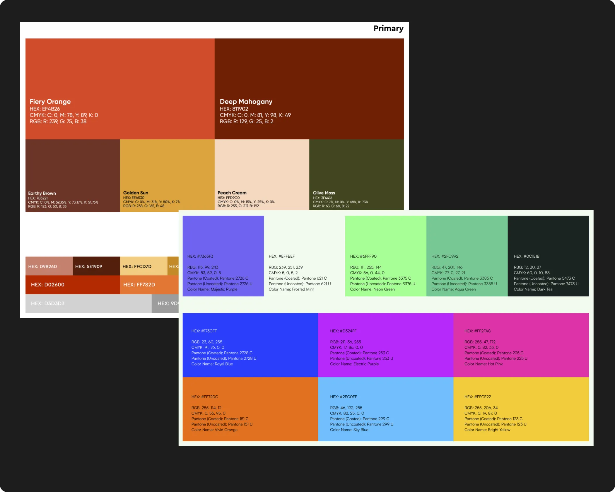
A colour palette is a defined system of colours that a brand consistently uses across all touchpoints. This typically includes primary colours, which the brand is most closely associated with, supported by secondary and accent colours that add flexibility and depth across different applications and formats.
Typography works in a similar way. Brands define a primary font for headlines and key communication, alongside secondary fonts for body copy or functional use. Together, colour and typography operate at an atomic level, meaning every piece of communication a brand produces, from a billboard to an Instagram post to a product label, is built using these foundational elements. When they are defined well, they create coherence without effort. When they are defined poorly or inconsistently, that incoherence compounds across every touchpoint the brand occupies.
At Confetti, colour and font decisions are never made in isolation or finalised on swatches alone. Once a visual direction is established through the mood board, we explore different hues, saturation levels, and tints to build a colour system that aligns with the brand's personality, positioning, and practical requirements across print and digital formats.
Rather than presenting a palette in the abstract, we apply colours and fonts to real use cases early in the process. This includes creating dummy social media posts, packaging mock-ups, and basic marketing assets using the proposed combinations. Seeing these elements in context allows both our team and the client to evaluate decisions based on how the brand will actually appear in the world, not how it looks as a swatch on a white slide.
The same approach is followed for typography. Readability, hierarchy, and tone are tested across formats before final approvals are made. A font that works beautifully in a large-format headline may not perform at small sizes on a product label or in the body copy of a digital ad. Testing across real contexts is what reveals these issues before they become expensive problems. This is the process we have applied across 200+ brand projects, including work for FMCG and retail brands trusted by names like ITC and Dabur.
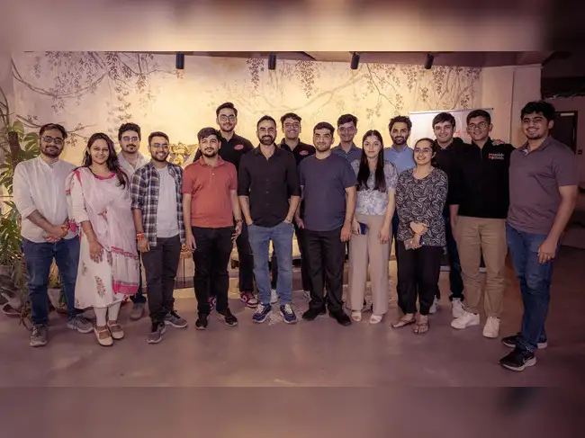
Confetti’s team is trusted by global leaders, and it’s time we join forces with you to create your Iconic brand!
Tap the button below and talk to our founders directly.
.webp)

Colour and typography decisions create the most friction when they are approached too abstractly or approved too quickly. The most common mistakes we encounter include:
By testing colour and typography through real brand assets early in the process, potential issues are identified and resolved upfront, saving significant time and reducing the likelihood of surprises at the final stage.
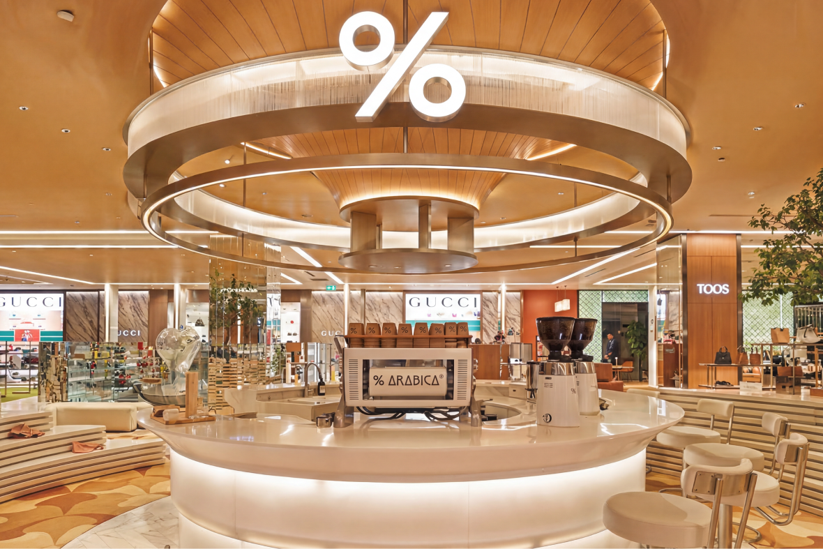
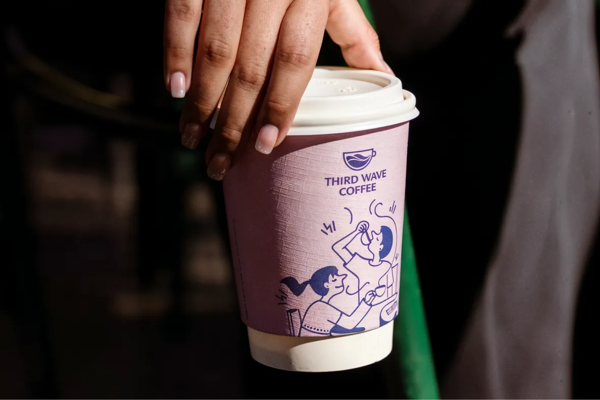
In FMCG and retail, colour and typography are doing active commercial work at every consumer touchpoint. On shelf, colour is often the first thing a consumer notices before they read the brand name or the product descriptor. Online, typography and colour are what give a brand's feed, website, or listing its immediate personality. In advertising, they are the visual shorthand that builds recognition over time.
For brands competing in high-volume, fast-moving categories, that recognition is significant. Consistent colour and typography use across every touchpoint, over time, builds the kind of visual familiarity that makes a brand feel established and trustworthy even to consumers encountering it for the first time. Inconsistency, on the other hand, signals a brand that has not thought through its identity, and in competitive retail environments that impression is difficult to recover from.
At Confetti, colour palette and typography development are built into the brand identity process rather than treated as isolated design tasks. They are defined in the context of the mood board, tested through real applications, and carried through every element of the identity system that follows.
Every colour palette and typography system Confetti develops is specific to the brand, the category, and the visual expectations of the consumer landscape our client is entering. We do not pull from generic palettes or default to safe category conventions. We build systems that are distinctive, functional, and designed to perform consistently across every format the brand will occupy.
If you are at the stage where visual identity is about to begin, or if your current colour and typography system feels inconsistent or unclear, this is where that work is done properly. A well-defined visual foundation makes every design decision that follows faster, cleaner, and more aligned with where the brand is going. Get in touch with Confetti to understand how we approach colour palette and typography development for your category.
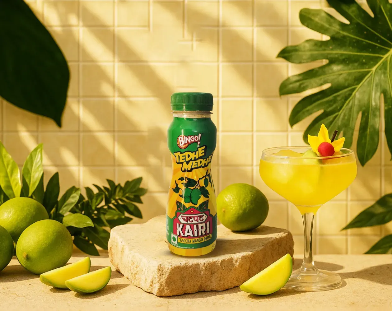
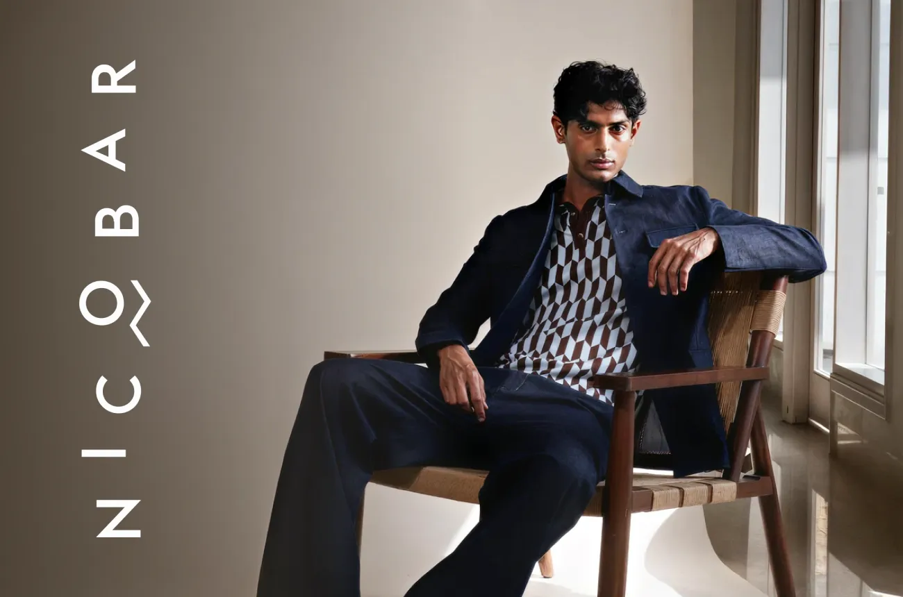
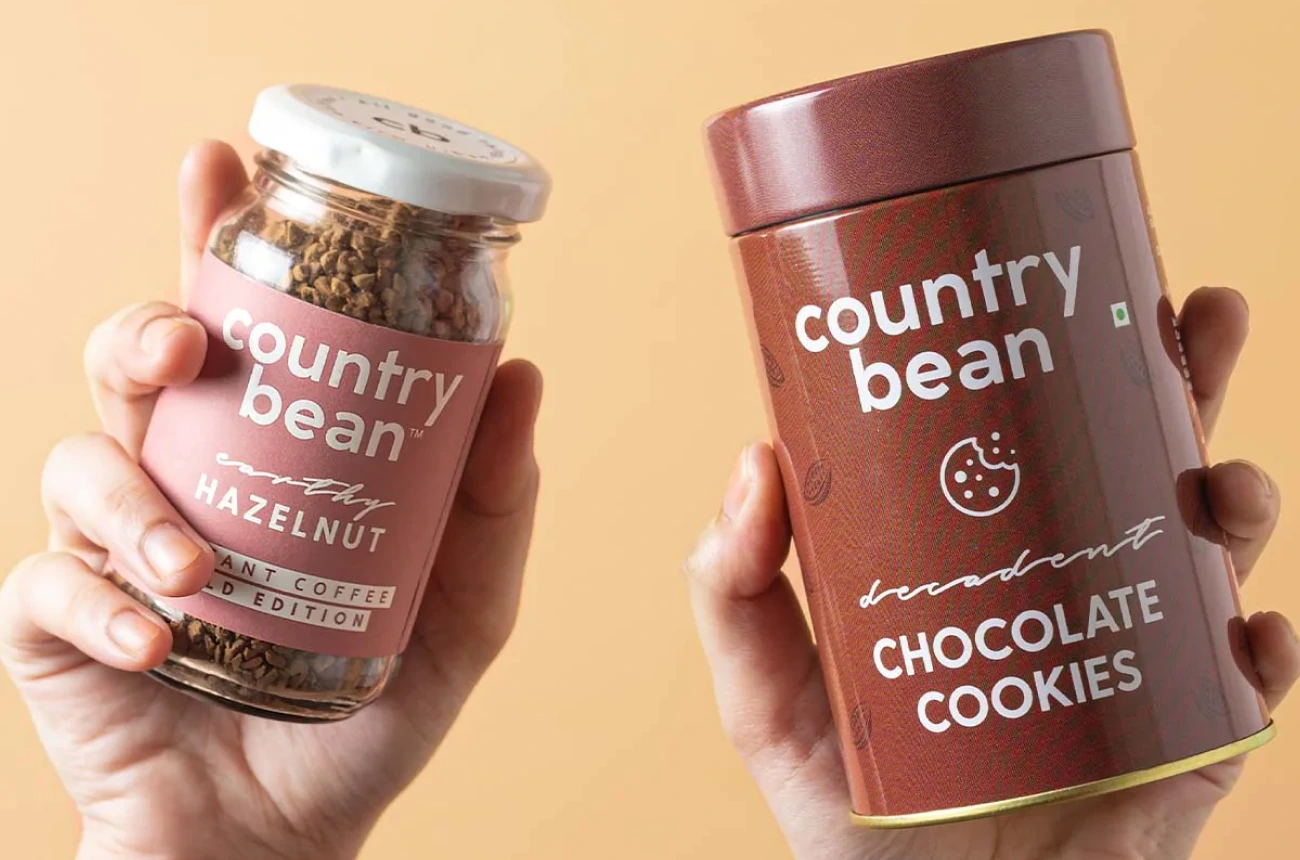
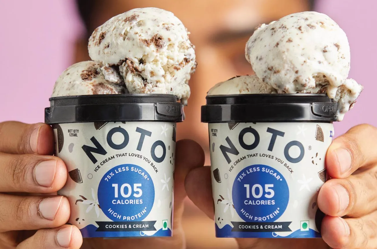
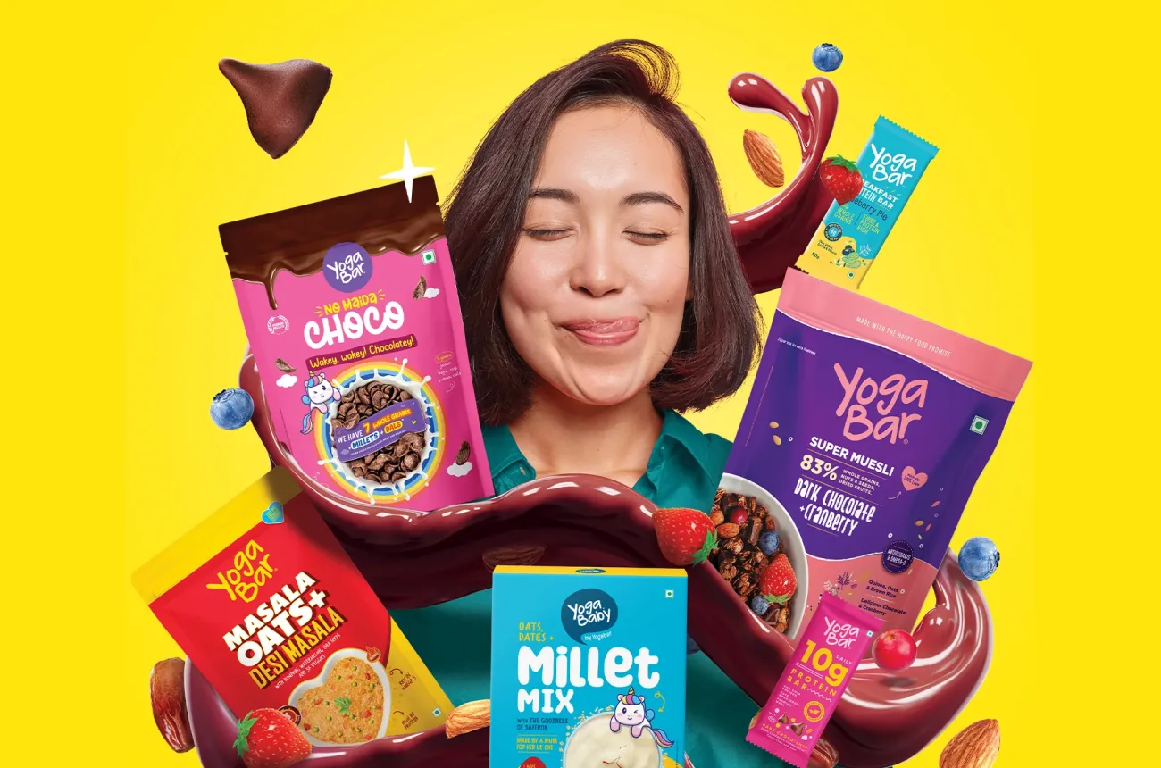
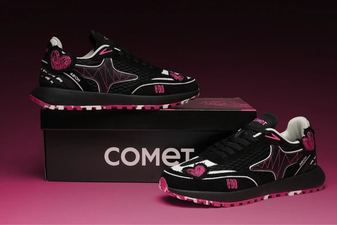
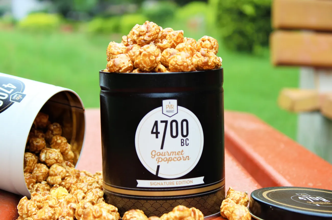
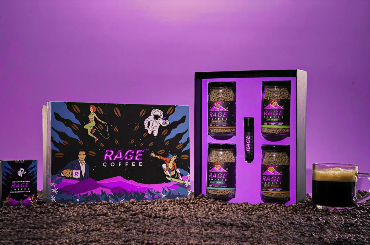
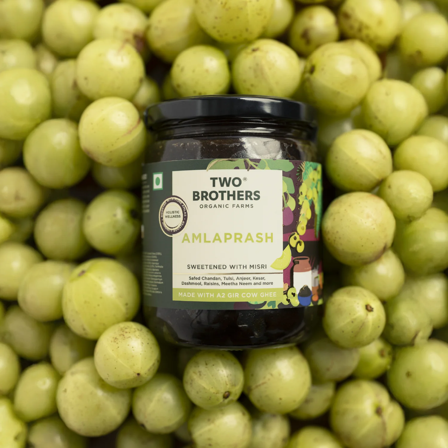
We worked with Bingo (by ITC) to help them launch India’s next viral beverage; Aam Panna
%201.webp)
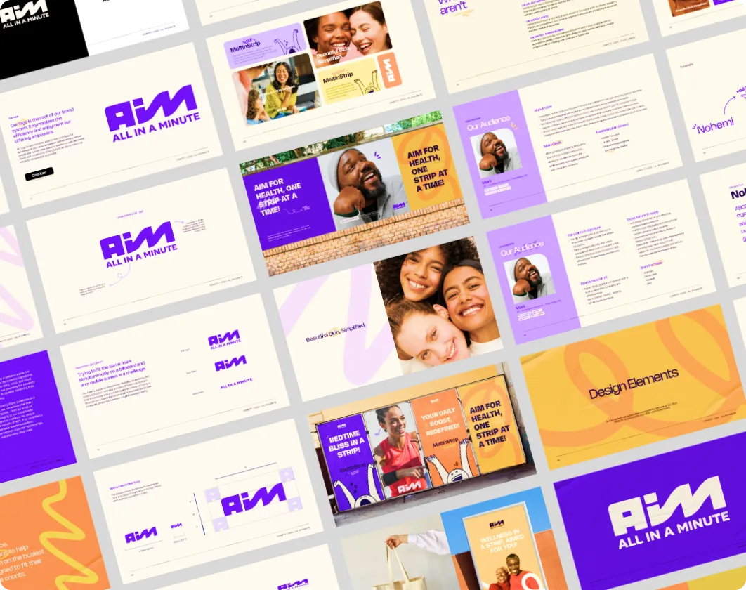
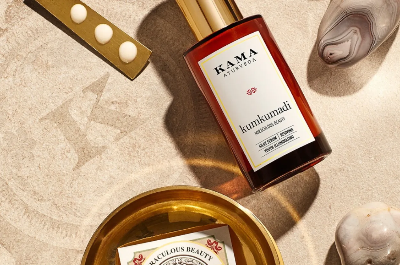
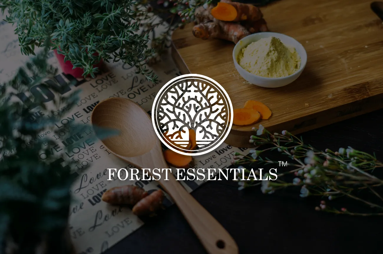
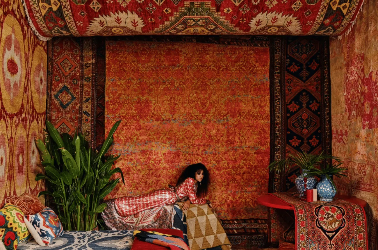
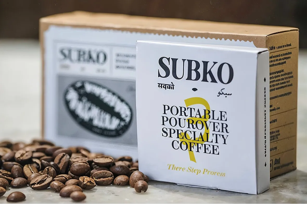
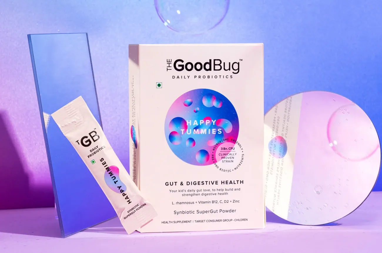
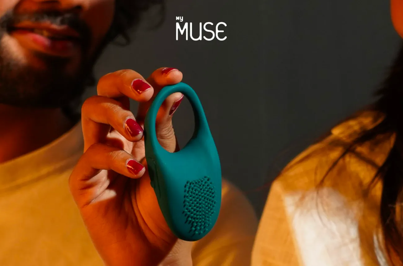
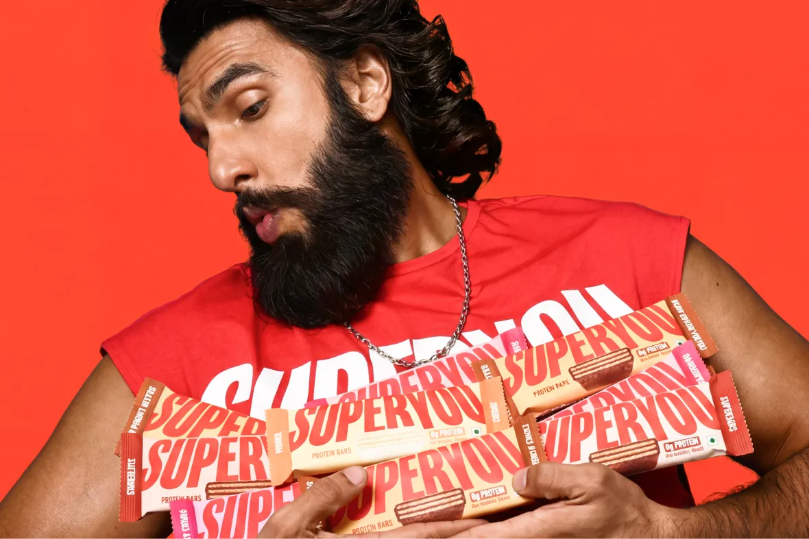
Global award-winning Identity & packaging design for US's health & lifestyle startup AIM Nutrition
-p-2000%201.webp)
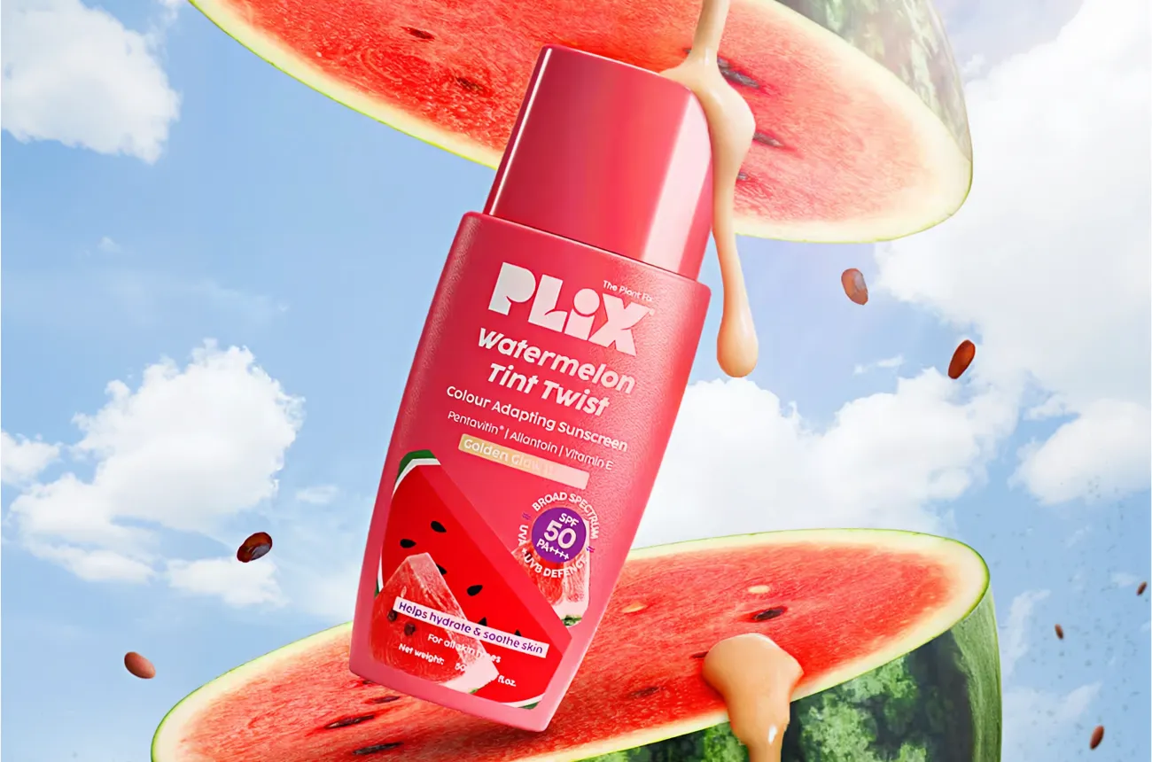
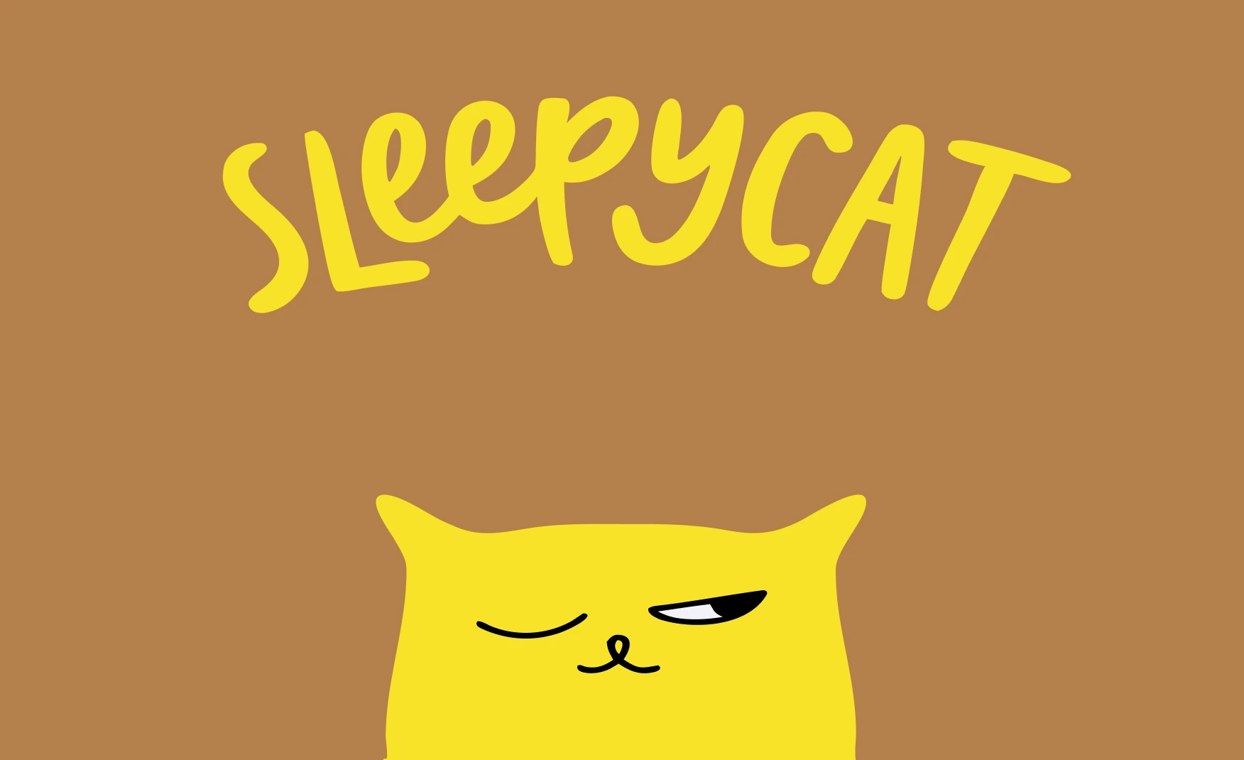
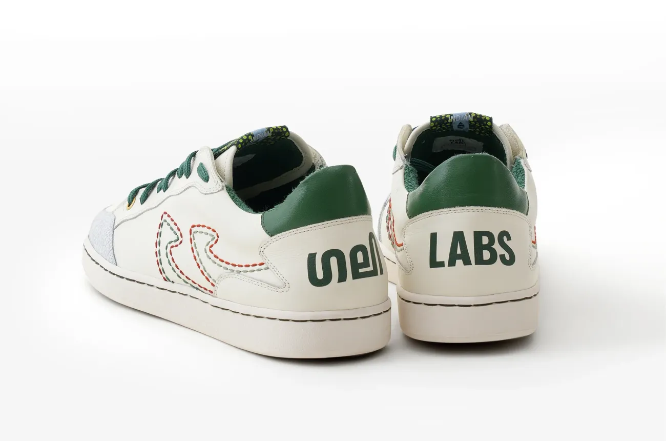
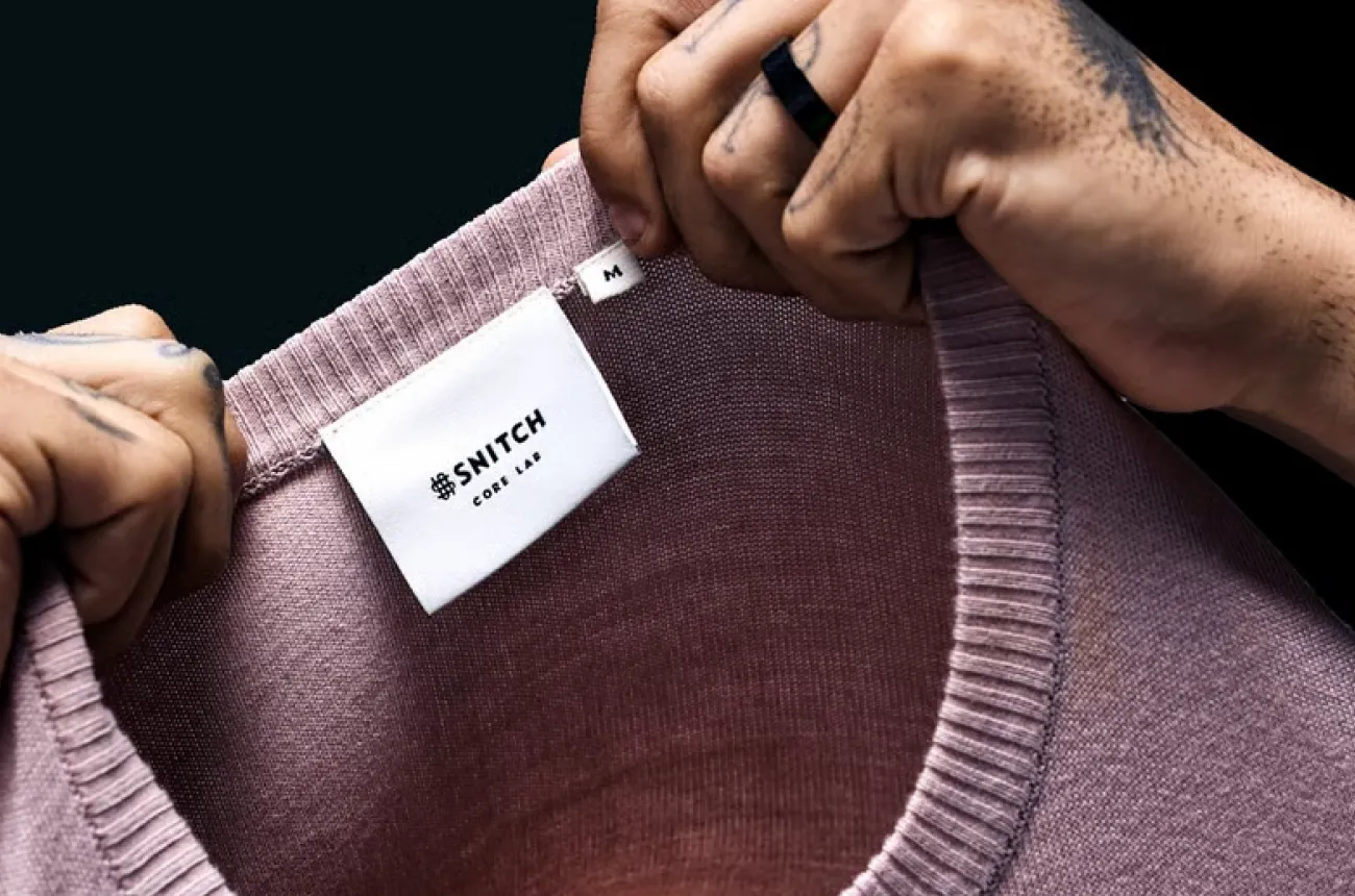
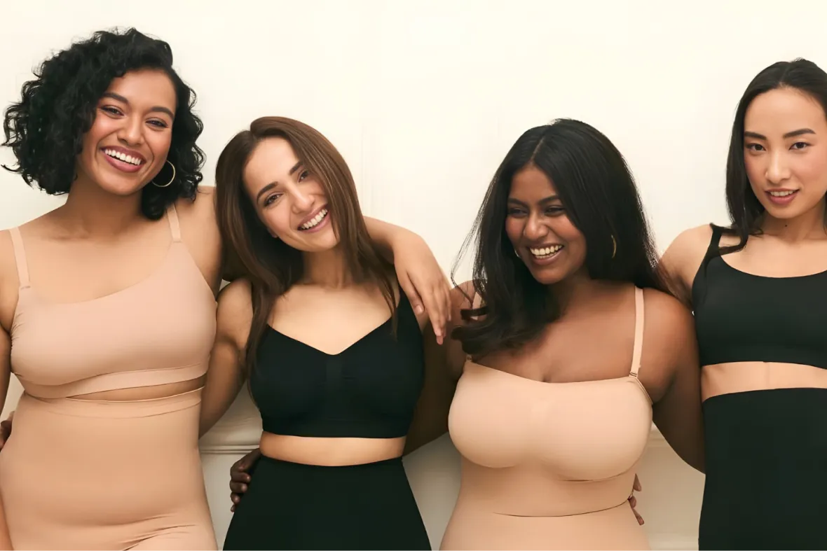
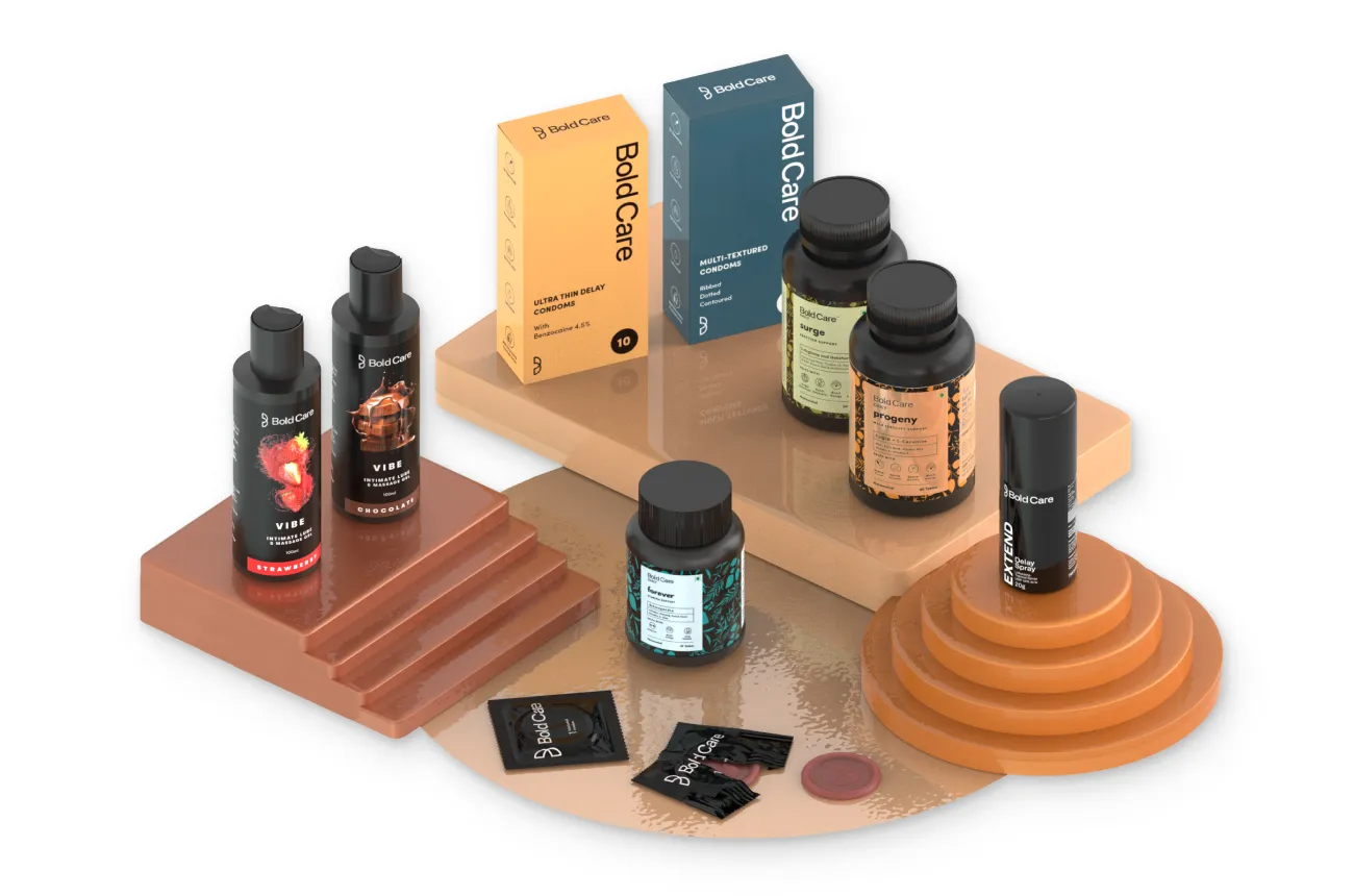
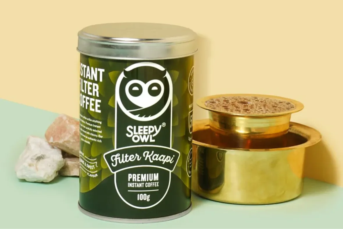
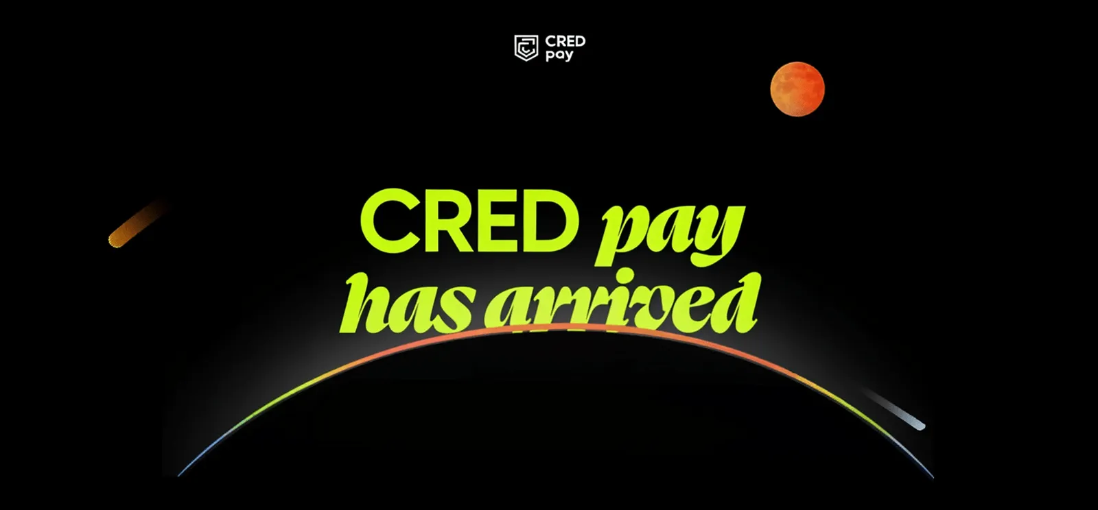
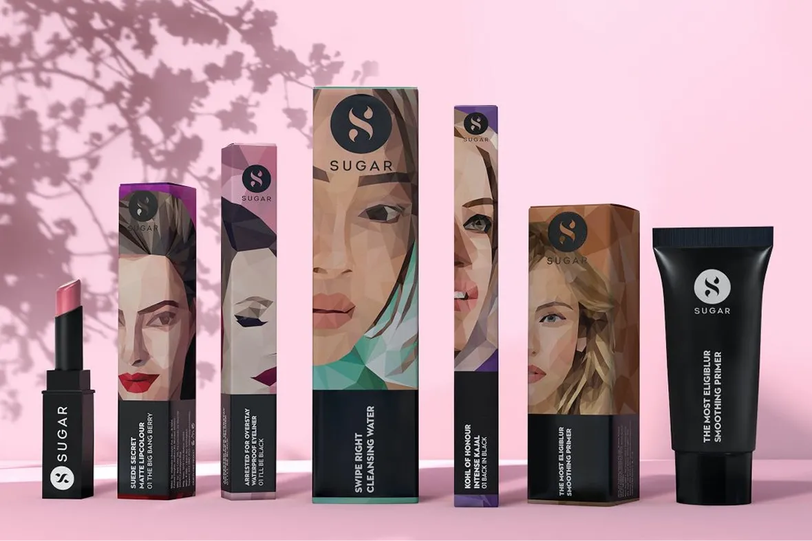
Building India’s fastest growing D2C supplements brand, Miduty by redesigning their branding, packaging & e-commerce website
.svg)
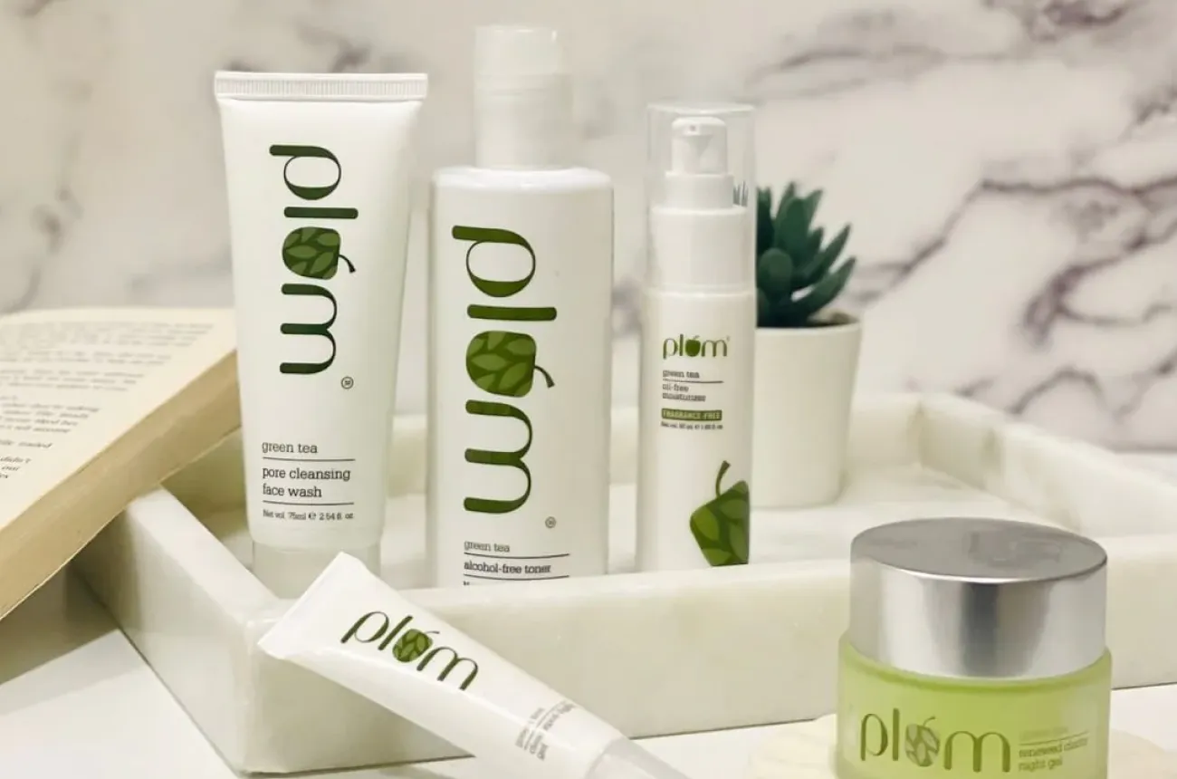
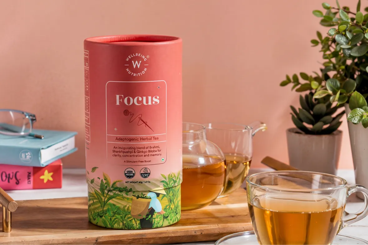
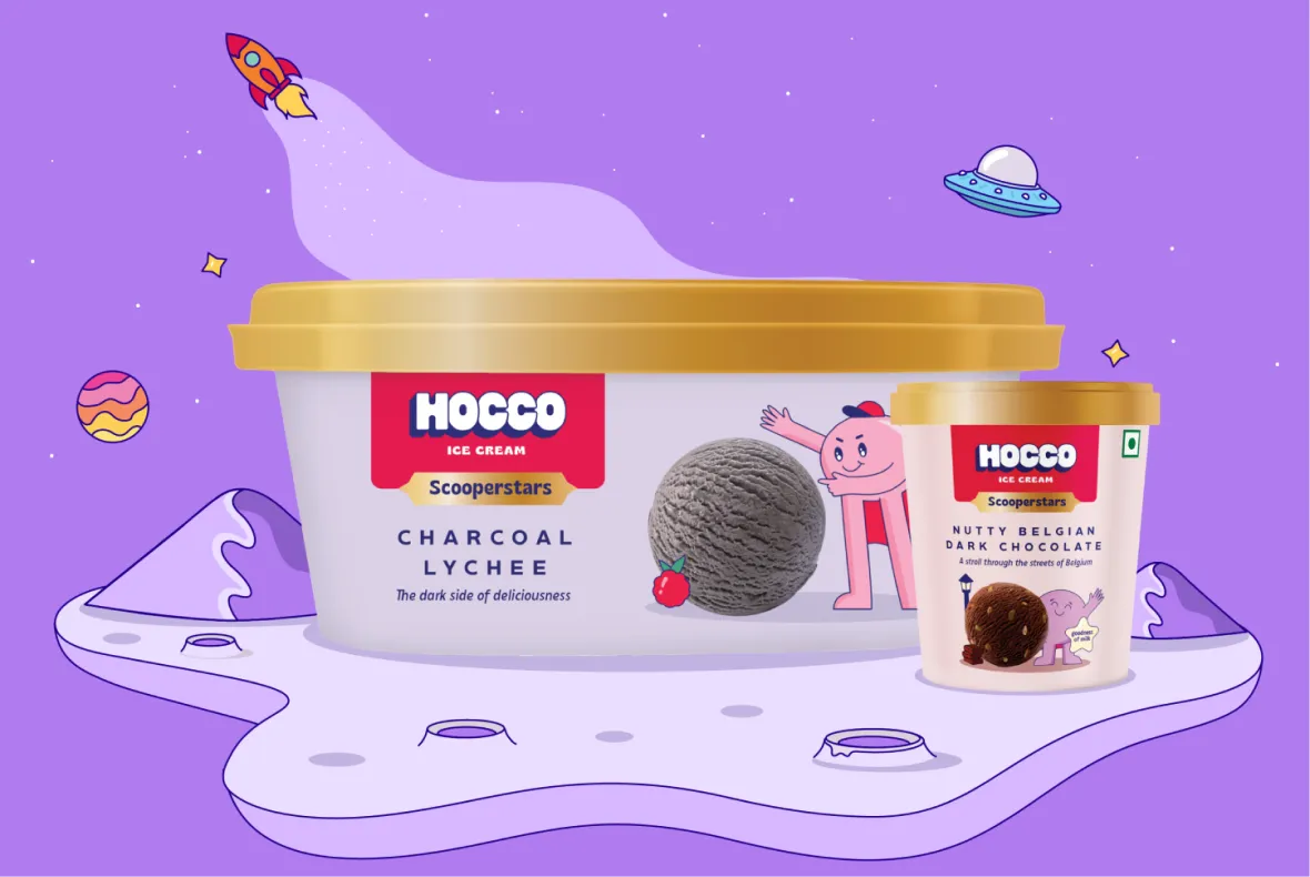
Colour palettes and fonts do a lot of work before a single word is processed. They shape how a brand is felt in the first few seconds, whether it comes across as confident, approachable, premium, or trustworthy. Over time, these visual cues also become shortcuts for recognition. People may not remember the exact message, but they remember how the brand looked and how it made them feel.
You can see this clearly with brands like Olly, known for its bright, optimistic colours, or Minimalist, which leans into clinical typography and restraint to signal transparency and focus. At Confetti, colour and type exploration typically takes four to six days, allowing us to test how different directions land emotionally and visually. If you want to explore what your brand should communicate at first glance, this is a conversation worth having early on with our team on a quick call.
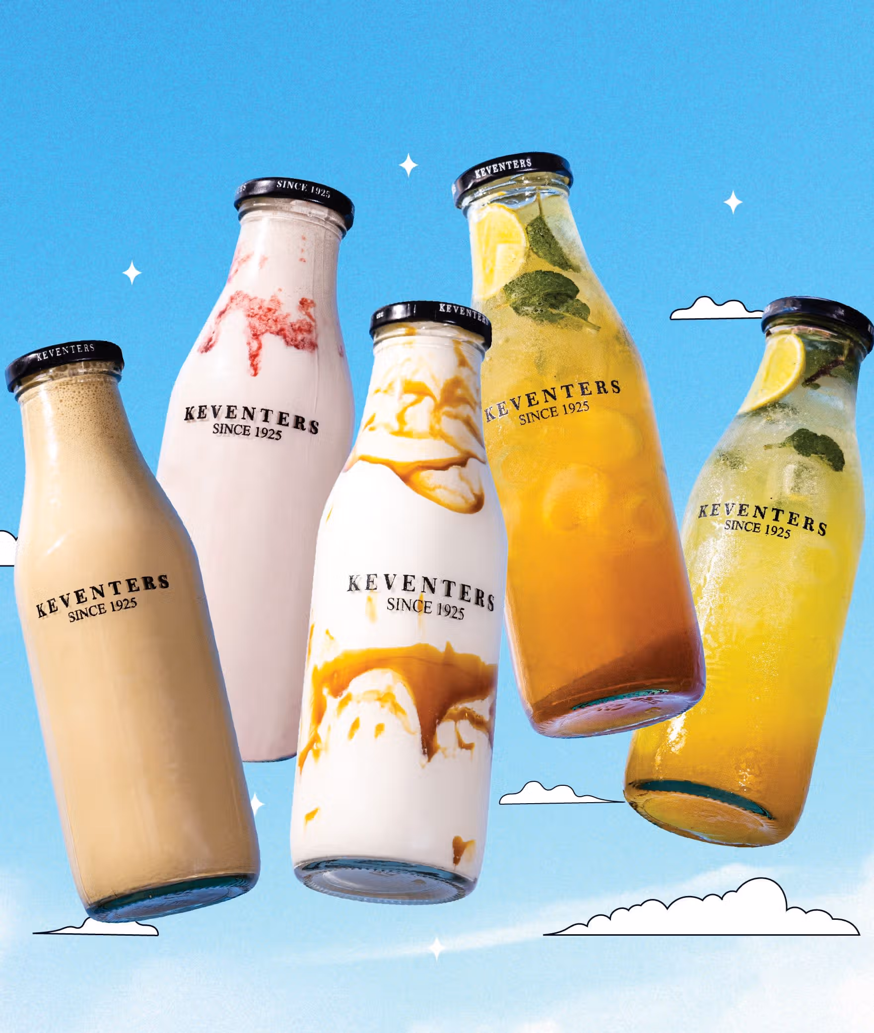
Most brands work best with a restrained system rather than an overloaded one. Typically, that means one primary colour palette, one or two supporting palettes, and two font families that work well together. This keeps the identity flexible without becoming messy. When too many colours or typefaces are introduced, consistency starts to slip, and the brand becomes harder to recognise across different touchpoints.
You can see the power of restraint in brands like Skims, which keeps its palette deliberately minimal to maintain a calm, premium feel across everything it puts out. At Confetti, we also go deeper by defining colours separately for digital and print, because they behave very differently in real-world use. If you’re worried about overdesigning or overcomplicating your identity, a quick call with our experts at Confetti can help sense-check what’s truly needed and what can be left out.
Colours and fonts only work if they hold up in real use, not just on a presentation slide. That’s why they need to be tested across the places they’ll actually live, from packaging and social media to websites and printed material. Many D2C brands run into trouble when colours that look great on screen fall flat on packaging, or when type that reads well digitally loses impact in print.
At Confetti, this testing is built directly into the design phase. We define separate colour values for digital and physical use so the identity stays consistent across every touchpoint. This helps avoid unpleasant surprises once things go live. If you want to pressure-test how your colours and fonts will perform in the real world, it’s worth hopping on a call with our experts and walking through your use cases together.
Trends can be useful as reference points, but they shouldn’t be the foundation of a brand’s visual identity. Trend-led colours and typefaces tend to date quickly, which can force brands into frequent refreshes and erode recognition over time. Consistency is what builds familiarity and trust, especially when a brand is growing and needs to be recognised across many touchpoints.
A good example is Glossier. Its look has evolved gradually over time, but it has never abandoned the visual cues that make it instantly recognisable. At Confetti, we design identity systems with a five to seven-year horizon in mind, so they can adapt without losing their core. If you’re trying to balance staying relevant with building something that lasts, a short call with our team can help you make those choices with confidence.
Colour and typography should be finalised once the logo direction is clear, but before the identity is rolled out across assets. At this stage, the brand’s visual logic is taking shape, which makes it the right moment to lock the elements that will appear everywhere. When colours and type are left too late, teams often end up revisiting work or making compromises just to keep things moving.
Most strong D2C brands finalise these choices early for exactly that reason. It reduces rework and gives everyone a clear system to design within. At Confetti, colour and typography are typically locked by Week 2 of identity design, once direction is established, but before execution scales. If you want to make sure the order of decisions in your project is working for you rather than against you, we can help plan that sequence together in a short call.


Lorem ipsum dolor sit amet, consectetur adipiscing elit. Suspendisse varius enim in eros
Lorem ipsum dolor sit amet, consectetur adipiscing elit. Suspendisse varius enim in eros
Lorem ipsum dolor sit amet, consectetur adipiscing elit. Suspendisse varius enim in eros
.svg)
.svg)


.svg)
.webp)


.webp)


.webp)


.webp)