%201.webp)
02
AI Snaps
.svg)
.svg)
01
Our Work

03
About Us
05
Contact Us
06
Client Success

07
Blogs
08
Careers
Book A Call


When someone walks into a store, they are not browsing. They are moving, scanning, and making decisions in seconds. Offline packaging has to earn attention from across the aisle, hold it once the product is picked up, and still make sense when it is turned over and read. That is a different brief from designing something that photographs well on a white background, and it demands a different approach entirely.
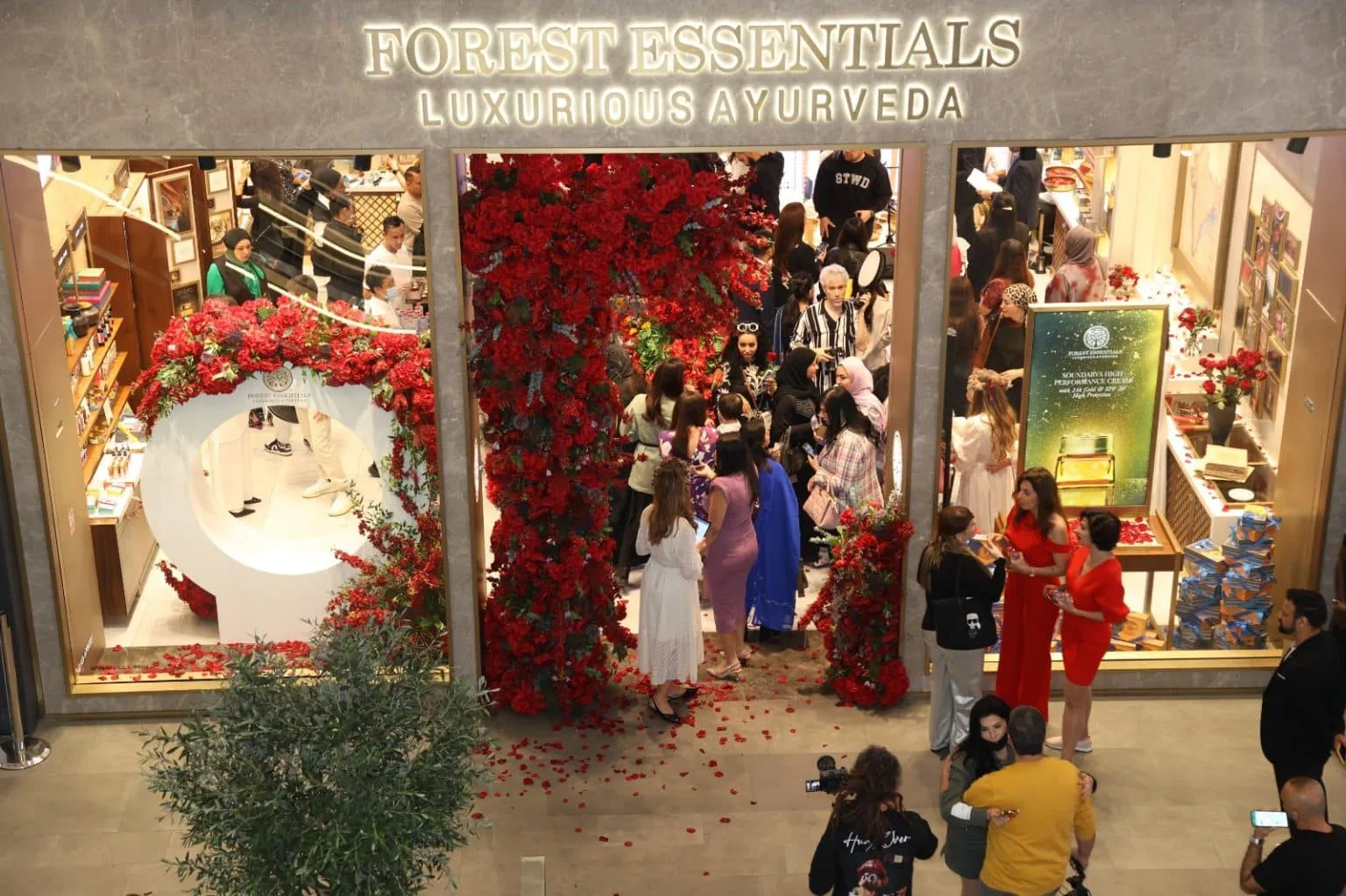
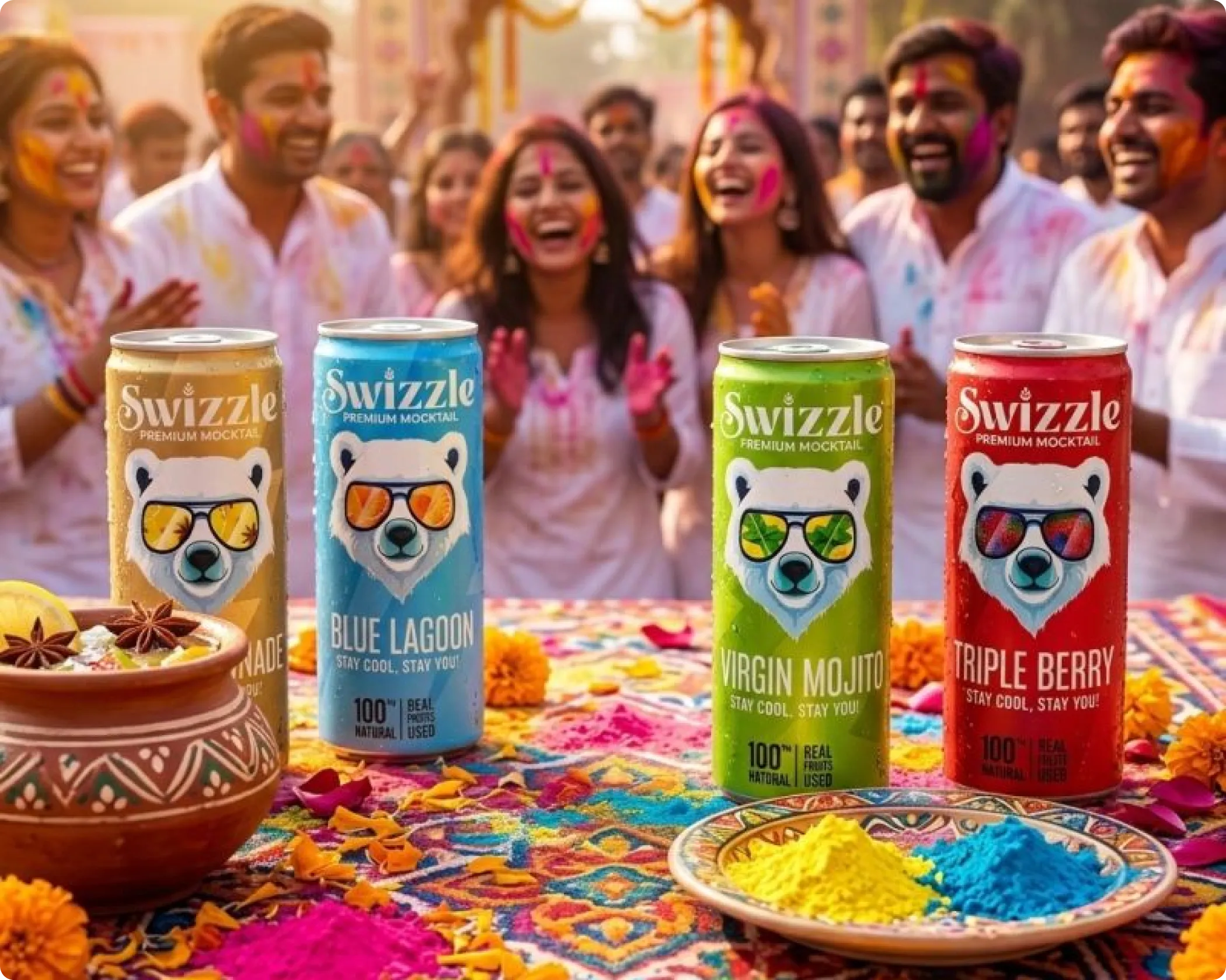
Look at how well this works when it is done right. Kama Ayurveda's glass bottles and cream jars communicate calm, ritual, and authenticity before the label is even read. Forest Essentials' heavier containers and refined detailing signal luxury and craftsmanship at a glance. Plum's lighter materials and brighter colour systems do the opposite just as effectively, conveying accessibility and modernity to a different consumer entirely. In food and beverage, Vahdam's rigid tea tins feel premium and giftable. Sleepy Owl balances bold shelf visibility with everyday functionality. The Whole Truth's protein bars use clean layouts and honest information hierarchy to stand out in a nutrition aisle full of exaggerated claims.
None of these outcomes happened by accident. They are the result of packaging designed specifically for the physical environment it lives in. At Confetti Design Studio, this is the only way we know how to approach it.
Offline packaging is judged through more than just sight. Material quality, weight, finish, and structural form all shape how a product is perceived the moment it is handled. A consumer may not consciously register that a bottle feels heavier than expected or that a surface has a particular texture, but those details inform their sense of quality and trust in ways that visuals alone cannot replicate.
Online, a product is seen. In store, it is experienced. The same design principles apply, but the execution has to account for store lighting, shelf placement, competitor adjacency, and the physical reality of a customer turning the product over in their hands. A pack that looks refined on screen can feel cheap, illegible, or visually lost the moment it is placed next to competing products on a real shelf. That gap between screen and shelf is where most packaging problems actually live.
In skincare, a matte-finish glass bottle communicates calm and ritual. A heavier container with refined detailing signals luxury. A lighter, brighter pack signals accessibility. In food and beverage, a rigid tin feels giftable and premium while a flexible pouch with bold typography feels functional and direct. These are not arbitrary aesthetic choices. They are responses to how consumers read quality cues in physical retail, and they only reveal themselves properly when the pack is held in the hand rather than viewed on a screen.
At Confetti, offline packaging is designed as a complete physical system, not a digital layout adapted for print at the end of the process. Everything is considered in the context of how the packaging will be noticed, handled, opened, and evaluated in actual retail conditions.
Packaging is experienced over time, not in a single glance. We design for the full physical sequence, thinking through what the customer touches first, what they see as the pack is opened, and how information reveals itself through that interaction. We apply a structured four-point unboxing framework to make sure this journey feels intentional and on-brand at every stage, not just at first impression.
Material decisions are made at the start of the process, not the end. We align substrate choices with category expectations, durability requirements, and the brand's positioning from the outset. A premium skincare brand and a functional protein snack brand have fundamentally different material needs, and those differences shape every visual and structural decision that follows.
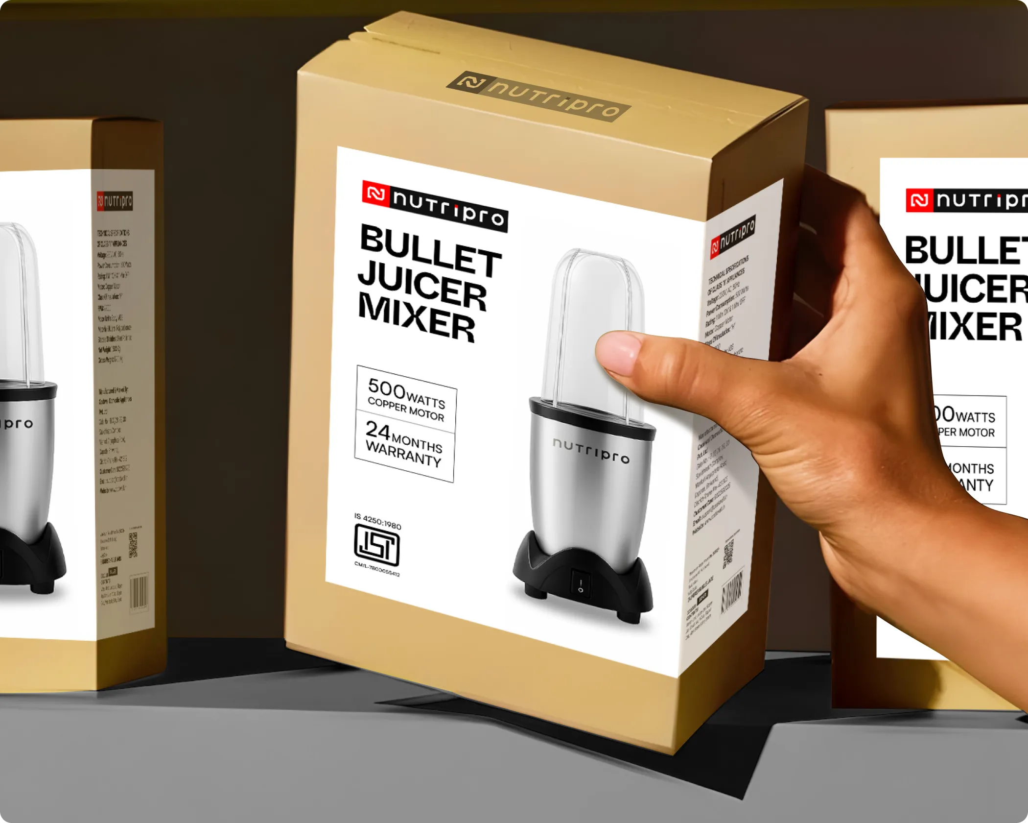
The front of the pack is designed for attention, branding, and shelf impact. It has to work from a distance, communicate the brand clearly at eye level, and give a first-time buyer enough confidence to pick the product up. Every element, from typography scale to colour contrast to imagery placement, is considered in the context of a real shelf environment.
The sides carry the weight of storytelling, range navigation, and supporting communication. In a well-designed packaging system, the sides extend the brand character established on the front without simply repeating it. For brands with multiple SKUs, the sides also play a critical role in helping consumers navigate a range on shelf.
The back of the pack handles compliance, ingredients, legal requirements, and the kind of detailed information that earns trust with a more considered buyer. Good back of pack design is not just about fitting everything in. It is about organising information so that it is readable, honest, and still feels like the brand.
This is the step most agencies skip, and it is often where the most important discoveries happen. We print the packaging and assess it as a real object before approvals are made. Colours shift between screen and print. Typography behaves differently at actual scale. Finishes like matte, gloss, embossing, and foil react to store lighting in ways no digital mockup can replicate.
We regularly place printed packs alongside competing products from the same category to evaluate true shelf presence, legibility, and differentiation. When designing for a skincare serum, for instance, we test it next to brands like Plum, Deconstruct, and others already in retail, so we know exactly how it performs in the environment it will actually occupy. This also changes the nature of client approvals. Rather than signing off on a design file, clients are reviewing a physical object that closely mirrors what their customers will encounter in store.
Confetti’s team is trusted by global leaders, and it’s time we join forces with you to create your Iconic brand!
Tap the button below and talk to our founders directly.
.webp)

Offline packaging underperforms most often when it is designed without any real engagement with the physical context it is going into. The mistakes tend to follow a familiar pattern:
Weight, texture, finish, and form can only be honestly evaluated once something exists as a physical object. When that step is skipped, packaging that looked strong in presentation falls short the moment it reaches the shelf.
Modern trade and general trade retail remain extraordinarily competitive environments. Consumers are not deliberating at the shelf the way they might when browsing online. They are moving quickly, scanning broadly, and responding to instinct as much as information. Packaging that does not interrupt that scan does not get picked up, and packaging that does not hold attention once it is picked up does not make it into the basket.
For FMCG brands with multiple SKUs across a range, offline packaging also has to work as a system. Individual packs need to feel coherent on shelf while still being distinguishable from one another. Shelf blocking, range navigation, and visual hierarchy across a lineup are considerations that only matter in a physical retail context, and they require a designer who thinks in those terms from the beginning of the process, not as an afterthought once the single-unit design is done.
At Confetti, offline packaging is built for the environment it lives in. Not the screen it was designed on.
At Confetti, offline packaging is treated as a physical experience, not a digital layout sent for print. We design packaging as a complete system that considers how it will be noticed on a shelf, picked up, handled, opened, and evaluated in real retail environments. Our work spans the full structure of the pack, from the unboxing sequence and material selection to the Front of Pack for shelf impact, the Side of Pack for continuity and storytelling, and the Back of Pack for compliance, ingredients, and mandatory information. Each layer is designed with a clear role, ensuring the pack works cohesively rather than as isolated surfaces.
A critical part of our process is physical testing. We print the packaging and assess it as a real product, because colours shift in print, typography behaves differently at scale, and finishes like matte, gloss, embossing, or foil interact with store lighting in unpredictable ways. We often test printed packs alongside competing products from the same category to evaluate true shelf presence and differentiation. This helps clients to approve a physical object that closely mirrors what customers will actually experience in-store.
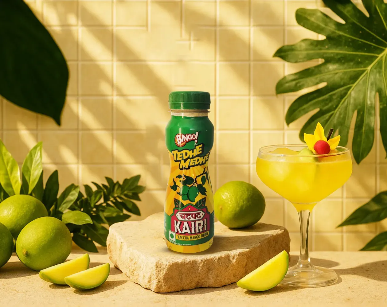
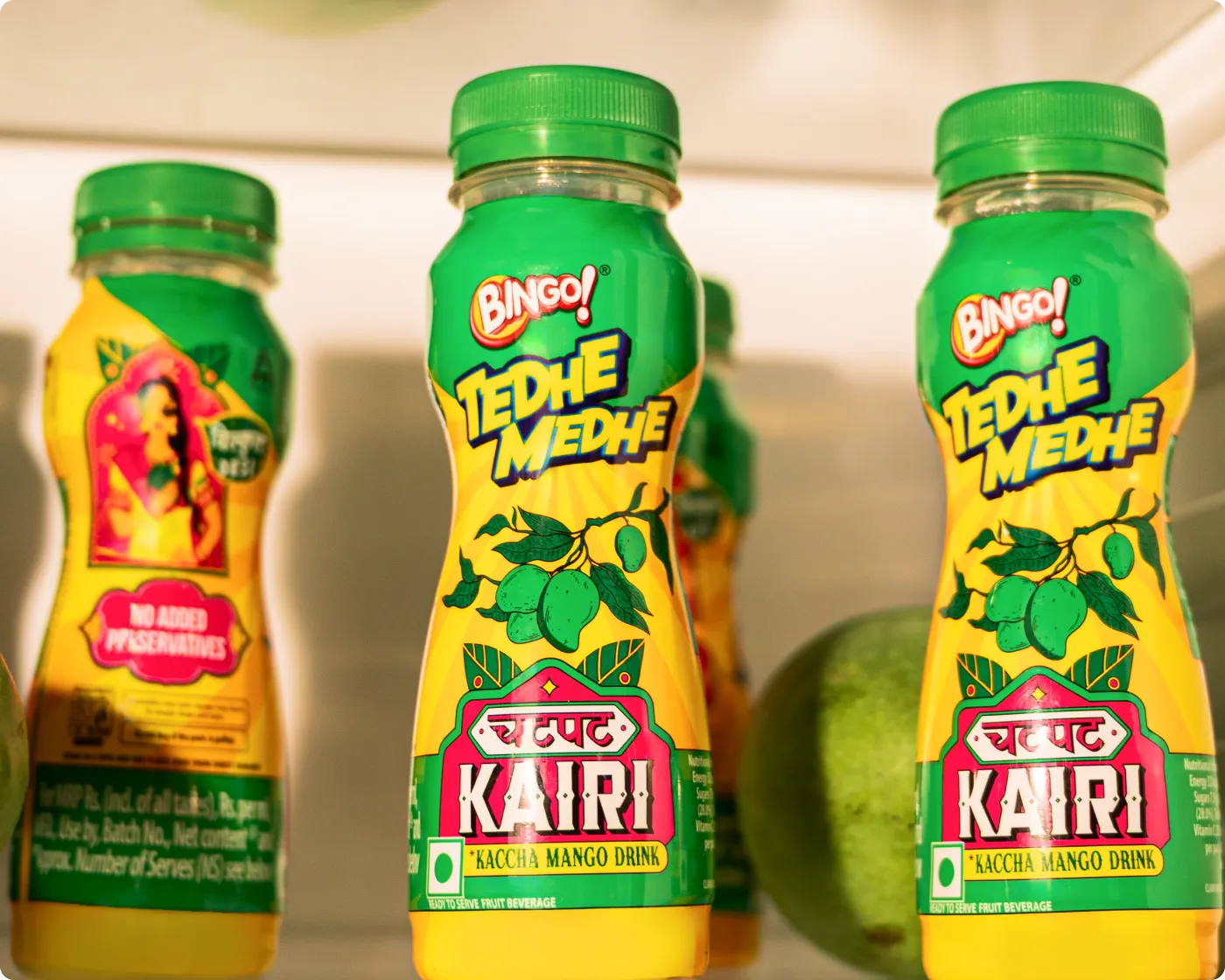
We worked with Bingo (by ITC) to help them launch India’s next viral beverage; Aam Panna
%201.webp)
Global award-winning Identity & packaging design for US's health & lifestyle startup AIM Nutrition
-p-2000%201.webp)
Building India’s fastest growing D2C supplements brand, Miduty by redesigning their branding, packaging & e-commerce website
Offline packaging has to work much harder in the real world. It competes physically from multiple angles, distances, and lighting conditions, often surrounded by similar products fighting for the same attention. Shoppers can pick it up, turn it around, feel the material, and make a decision in seconds. That makes structure, contrast, hierarchy, and material just as important as the front-facing design.
Digital or e-commerce packaging plays by different rules. There’s no true shelf, no tactile experience, and no side-on visibility. What matters most is how the pack reads on a screen, often at a small size and in isolation. At Confetti, we design offline-first packaging very differently from screen-first packs because the environments demand different thinking. If you’re unsure whether your product’s primary battle is on shelf or on screen, hopping on a short call with our experts can help you make that call before design decisions are locked in.
In physical retail, material, weight, and finish quietly shape how a product is judged before it’s even read. Heavier packs tend to feel more premium, softer finishes suggest care and comfort, and material quality often sets expectations around price. These cues work instinctively. Customers may not consciously analyse them, but they influence whether a product feels worth picking up and paying for.
You can see this in brands like Skims, where tactile packaging reinforces ideas of softness and premium comfort in-hand. At Confetti, finish and material testing are built into the design process, and we work closely with vendors to understand what’s actually achievable at scale. If you want to define how your product should feel the moment someone holds it, hopping on a short call with our experts is the best place to start that conversation.
Physical prototyping matters because screens lie. They can’t show true texture, real scale, colour shifts, or how finishes behave under store lighting. What looks balanced on a laptop can feel flat, overly busy, or completely different once printed and held. This is why many retail brands only spot issues once physical mockups are made, often far later than they’d like.
At Confetti, prototyping is built in before final approval, not treated as an optional extra. It allows us to test, adjust, and lock decisions with confidence, rather than fixing problems after production has started. If you want to plan print testing in a way that’s practical and cost-aware, hopping on a short call with our team can help map out what’s worth testing and what isn’t.
Standing out on a crowded shelf starts with understanding how customers choose, not just how competitors look. People respond to emotion first, then logic. Once we understand what a customer wants to feel in that category, we look at the unspoken rules everyone else is following and decide which ones are actually worth breaking. That’s where distinction usually comes from, not from adding more graphics or louder claims.
Olly is a good example. In a category dominated by muted, clinical palettes, it chose to own bold colour, making the brand instantly recognisable from a distance. At Confetti, shelf audits are a key part of this process. We study real retail environments to see what’s blending in and what’s being ignored. If you want to understand how your product will sit in its actual shelf context, getting on a short call with our team lets us review that environment together and spot opportunities early.
Offline packaging should be tested against competing products once the initial design direction is set, but before mass production begins. This is when the pack can be evaluated in real conditions, placed next to competitors, viewed at shelf distance, and judged under store lighting. Brands that test at this stage avoid costly redesigns later, because issues around visibility, hierarchy, or differentiation surface early. At Confetti, this testing typically happens mid–design phase and runs for around two weeks. If you want to plan this at the right moment without slowing the project down, hopping on a short call with our team can help map out a sensible testing window.


Lorem ipsum dolor sit amet, consectetur adipiscing elit. Suspendisse varius enim in eros
Lorem ipsum dolor sit amet, consectetur adipiscing elit. Suspendisse varius enim in eros
Lorem ipsum dolor sit amet, consectetur adipiscing elit. Suspendisse varius enim in eros
.svg)
.svg)


.svg)
.webp)


.webp)


.webp)


.webp)